CSS | 定位
定位有三种:
- 1.相对定位
- 2.绝对定位
- 3.固定定位
1. 相对定位
相对定位:相对于自己原来的位置定位
现象和使用:
1.如果对当前元素仅仅设置了相对定位position: relative没有与bottom、top等连用,那么与标准流的盒子没有什么区别。
2.设置相对定位之后,我们才可以使用四个方向的属性: top、bottom、left、right
特性:
- 不脱标
- 形影分离
- 老家留坑
所以说相对定位 在页面中没有什么太大的作用。影响我们页面的布局。我们不要使用相对定位来做压盖效果
用途:
- 微调元素位置
- 做绝对定位的参考(父相子绝)绝对定位会说到此内容。
参考点:自己原来的位置做参考点。
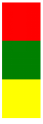
使用相对定位,移动红色方块50像素
<!DOCTYPE html><html lang="en"><head>
    <meta charset="UTF-8">
    <title>Document</title>
    <style>
        body{
            border: 1px solid green;
        }
        div{
            width: 200px;
            height: 200px;
            background-color: red;
            /*相对定位,相对自己原来的位置,跟父级没有任何关系*/
            position: relative;
            /*移动50px*/
            top: 50px;
        }
</style>
</head>
<body>
<div class="wrap"></div>
</body>
</html>
网页效果:它没有撑开body,只是超出范围了。

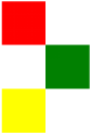
老家留坑现象:
<!DOCTYPE html>
<html lang="en">
<head>
    <meta charset="UTF-8">
    <title>Document</title>
    <style>
        .box1{
            width: 100px;
            height: 100px;
            background-color: red;
        }
        .box2{
            width: 100px;
            height: 100px;
            background-color: green;
        }
        .box3{
            width: 100px;
            height: 100px;
            background-color: yellow;
        }
</style>
</head>
<body>
    <div class="box1"></div>
    <div class="box2"></div>
<div class="box3"></div>
</body>
</html>
网页效果:
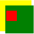
移动绿色方块
<!DOCTYPE html>
<html lang="en">
<head>
    <meta charset="UTF-8">
    <title>Document</title>
    <style>
        .box1{
            width: 100px;
            height: 100px;
            background-color: red;
        }
        .box2{
            width: 100px;
            height: 100px;
            background-color: green;
            position: relative;
            left: 100px;
        }
        .box3{
            width: 100px;
            height: 100px;
            background-color: yellow;
        }
</style>
</head>
<body>
    <div class="box1"></div>
    <div class="box2"></div>
<div class="box3"></div>
</body>
</html>
网页效果:可以看到,原来的位置占用着,黄色方块挤不上去。这就是老家留坑现象,它影响我们页面的布局
相对定位的用途:让搜索框和提交按钮在一条水平线显示
<!DOCTYPE html>
<html lang="en">
<head>
    <meta charset="UTF-8">
    <title>Document</title>
    <style>
        .where{
            font-size: 30px;
        }
        .search{
            width: 100px;
            height: 40px;
            position: relative;
            top: -5px;        往上移动5px
        }
    </style></head><body>
<div>
    <form action="" method="post">
        <input type="text" class="where">
        <input type="submit" class="search" value="搜索">
</form>
</div>
</body>
</html>
网页效果:

2. 绝对定位
特性:
- 脱标
- 做遮盖效果,提成了层级。
设置绝对定位之后,不区分行内元素和块级元素,都能设置宽高。
单独一个绝对定位的盒子
1.当我使用top属性描述的时候 是以页面的左上角(跟浏览器的左上角区分)为参考点来调整位置
2.当我使用bottom属性描述的时候。是以首屏页面左下角为参考点来调整位置。
ps:浏览器是当前显示大小,页面是下拉滚动条往下很长。
举例,使用top
<!DOCTYPE html>
<html lang="en">
<head>
    <meta charset="UTF-8">
    <title>Document</title>
    <style>
        .wrap{
            width: 400px;
            height: 400px;
            padding: 100px;
            background-color: yellow;
            /*绝对定位*/
            position: relative;
        }
        .container{
            width: 500px;
            height: 500px;
            background-color: green;
            position: relative;
            padding: 20px;
        }
        .box1{
            width: 200px;
            height: 200px;
            background-color: red;
            position: absolute;
            top: 100px;
        }
</style>
</head>
<body style='height: 2000px;'>
<div class="wrap">
    <div class="container">
        <div class="box1">
        </div>
</div>
</div>
</body>
</html>
网页效果:
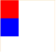
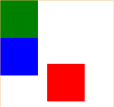
<!DOCTYPE html>
<html lang="zh-CN">
<head>
    <meta http-equiv="content-Type" charset="UTF-8">
    <meta http-equiv="x-ua-compatible" content="IE=edge">
    <meta name="viewport" content="width=device-width, initial-scale=1">
    <title>Title</title>
    <style>
        *{
            padding: 0;
            margin: 0;
        }
        div {
            width: 200px;
            height: 200px;
        }
        .father{
            width: 600px;
            height: 1000px;
            border: 1px solid darkorange;
        }

        div.box {
            background-color: red;
            position: absolute;        设置到下一个盒子上也是同样的效果
        }

        div.box2 {
            background-color: green;

        }

        div.box3 {
            background: blue;
        }
    </style>
</head>
<body>
<div class="wrap">
    <div class="father">
        <div class="box"></div>
        <div class="box2"></div>
        <div class="box3"></div>
    </div>
</div>

</body>
</html>
网页效果:红盒子设置绝对定位后脱标。红色盒子把绿色盒子遮不住了,只显示出了红盒子和蓝盒子及父元素的边框。
举例,使用bottom
<!DOCTYPE html>
<html lang="zh-CN">
<head>
    <meta http-equiv="content-Type" charset="UTF-8">
    <meta http-equiv="x-ua-compatible" content="IE=edge">
    <meta name="viewport" content="width=device-width, initial-scale=1">
    <title>Title</title>
    <style>
        *{
            padding: 0;
            margin: 0;
        }
        div {
            width: 200px;
            height: 200px;
        }

        .father{
            width: 600px;
            height: 1000px;
            border: 1px solid darkorange;
        }

        div.box {
            background-color: red;
            position: absolute;
            bottom: 30px;
            left: 250px;
        }

        div.box2 {
            background-color: green;

        }

        div.box3 {
            background: blue;
        }
    </style>
</head>
<body>
<div class="wrap">
    <div class="father">
        <div class="box"></div>
        <div class="box2"></div>
        <div class="box3"></div>
    </div>
</div>

</body>
</html>
以父辈盒子作为参考点
父辈元素设置相对定位,子元素设置绝对定位。‘父相子绝’在我们页面布局中,是常用的布局方案。因为父亲设置相对定位,不脱离标准流,子元素设置绝对定位,仅仅的是在当前父辈元素内调整该元素的位置。
还要注意,绝对定位的盒子无视父辈的padding
作用:页面布局常见的“父相子绝”,一定要会!!!!*****
绝对定位的盒子居中
设置绝对定位之后,margin:0 auto;不起任何作用,如果想让绝对定位的盒子居中。 设置子元素绝对定位,然后left:50%; margin-left等于元素宽度的一半,实现绝对定位盒子居中。当做公式记下来吧!
*{
            padding: 0;
            margin: 0;
        }
        .box{
            width: 100%;
            height: 69px;
            background: #000;
        }
        .box .c{
            width: 960px;
            height: 69px;
            background-color: pink;
            /*margin: 0 auto;*/
            position: relative;
            left: 50%;
            margin-left: -480px;
        }
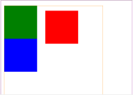
<!DOCTYPE html>
<html lang="zh-CN">
<head>
    <meta http-equiv="content-Type" charset="UTF-8">
    <meta http-equiv="x-ua-compatible" content="IE=edge">
    <meta name="viewport" content="width=device-width, initial-scale=1">
    <title>Title</title>
    <style>
        *{
            padding: 0;
            margin: 0;
        }
        div {
            width: 200px;
            height: 200px;


        }
        .wrap{
            width: 800px;
            height: 1200px;
            border: 1px solid darkmagenta;
            position: relative;
        }
        .father{
            width: 600px;
            height: 1000px;
            margin-left: 20px;
            margin-top: 30px;
            border: 1px solid darkorange;
            position: relative;
        }

        div.box {
            background-color: red;
            position: absolute;
            /*bottom: 40px;*/
            top: 30px;
            left: 250px;
        }

        div.box2 {
            background-color: green;

        }

        div.box3 {
            background: blue;
        }
    </style>
</head>
<body>
<div class="wrap">
    <div class="father">
        <div class="box"></div>
        <div class="box2"></div>
        <div class="box3"></div>
    </div>
</div>

</body>
</html>
网页效果:以最近的父盒子为参考点。
3. 固定定位
固定当前的元素不会随着页面滚动而滚动
特性:
- 脱标
- 遮盖,提升层级
- 固定不变
参考点:
设置固定定位,用top描述。那么是以浏览器的左上角为参考点
如果用bottom描述,那么是以浏览器的左下角为参考点
作用:
- 返回顶部栏
- 固定导航栏
- 小广告
使用简单的js完成回到顶部功能
<!DOCTYPE html>
<html lang="en">
<head>
    <meta charset="UTF-8">
    <title>Document</title>
    <style>
        p{
            width: 140px;
            height: 100px;
            background-color: pink;
            position: fixed;
            bottom: 0;
            right: 50px;
            line-height: 100px;
            text-align: center;
            color: white;
            border-radius: 10px;
            font-weight: bolder;
            font-size: 25px;
        }
        p a {
          text-decoration: none;
        }
        .wrap img {
            display: block;
        }
    </style>
<script src="https://cdn.bootcss.com/jquery/3.3.1/jquery.min.js"></script>
</head>
<body>
<div class="wrap">
    <p>
        <a href="#">回到顶部</a>
    </p>
    <img src="images/zly.jpg" alt="">
    <img src="images/zly.jpg" alt="">
<img src="images/zly.jpg" alt="">
</div>

<script>
    $(function(){
        $('p').click(function(){
            $('html').animate({
                "scrollTop":0                // scrollTop表示回到顶部
            },1000)                    // 1000表示1秒,单位为毫秒
       })
})
</script>
</body>
</html>
网页效果:

固定导航栏
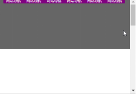
<!DOCTYPE html>
<html lang="en">
<head>
    <meta charset="UTF-8">
    <title></title>
    <style>
        *{
            padding: 0;
            margin: 0;
        }
        ul{
            list-style: none;
        }
        .nav{
            width: 960px;
            overflow: hidden;
            /*margin: 0px auto;*/
            background-color: purple;
            border-radius: 5px;
            position: fixed;
            left: 50%;
            margin-left: -480px;
        }
        .nav ul li{
            float: left;
            width: 160px;
            height: 40px;
            line-height: 40px;
            text-align: center;

        }
        .nav ul li a{
            width: 160px;
            height: 40px;
            display: block;
            color: white;
            font-size: 14px;
            text-decoration: none;

        }
        .nav ul li a:hover{
            background: yellow;
            color: green;
            text-decoration: underline;
        }

        .wrap{
            width: 100%;
            height: 400px;
            background-color: #666;
        }

</style>
</head>
<body style="height: 3000px">
<div class="nav">
    <ul>
        <li>
            <a href="#">网站导航</a>
        </li>
        <li>
            <a href="#">网站导航</a>
        </li>
        <li>
            <a href="#">网站导航</a>
        </li>
        <li>
            <a href="#">网站导航</a>
        </li>
        <li>
            <a href="#">网站导航</a>
        </li>
        <li>
            <a href="#">网站导航</a>
        </li>
</ul>
</div>
<div class="wrap"></div>

</body>
</html>
网页效果:

 浙公网安备 33010602011771号