Bootstrap4.x学习笔记【八】
Flex弹性布局
Flex弹性布局属性详解:https://www.cnblogs.com/hellocd/p/10443237.html。
一、Flex样式
1. 使用.d-flex 和.d-inline-flex 实现开启 flex 布局样式,同时也支持响应式的媒体查询:.d-*-flex
<div class="d-flex">Flex 弹性布局</div>
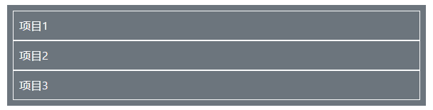
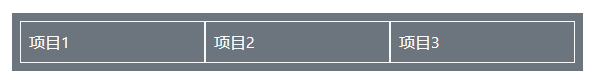
2. .flex-row 可以呈现子元素水平方向的位置,默认居左并从左到右显示(1,2,3)
<!-- 添加背景颜色更好显示出flex布局 -->
 <div class="d-flex m-2 p-2 bg-secondary text-light flex-row ">
      <div class="p-2 border border-light">项目1</div>
      <div class="p-2 border border-light">项目2</div>
      <div class="p-2 border border-light">项目3</div>
 </div>

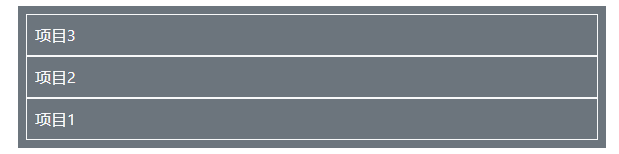
3. .flex-row-reverse 让子元素水平方向的位置居右并从左到右显示(3,2,1)
    <div class="d-flex m-2 p-2 bg-secondary text-light flex-row-reverse ">
        <div class="p-2 border border-light">项目1</div>
        <div class="p-2 border border-light">项目2</div>
        <div class="p-2 border border-light">项目3</div>
    </div>

4. .flex-column 实现子元素垂直效果,并从上往下显示(1,2,3)
    <div class="d-flex m-2 p-2 bg-secondary text-light flex-column">
        <div class="p-2 border border-light">项目1</div>
        <div class="p-2 border border-light">项目2</div>
        <div class="p-2 border border-light">项目3</div>
    </div>
5. .flex-column-reverse 实现子元素垂直效果,并从上往下显示(3,2,1)
    <div class="d-flex m-2 p-2 bg-secondary text-light flex-column-reverse">
        <div class="p-2 border border-light">项目1</div>
        <div class="p-2 border border-light">项目2</div>
        <div class="p-2 border border-light">项目3</div>
    </div>
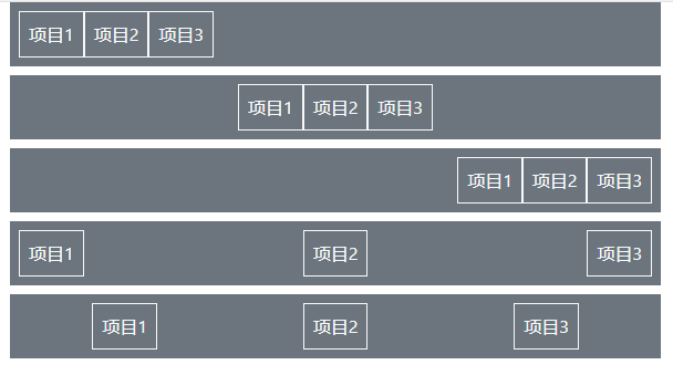
6. .justify-content-start(end、center、between、around)实现内容对齐
  <div class="d-flex m-2 p-2 bg-secondary text-light justify-content-start">
        <div class="p-2 border border-light">项目1</div>
        <div class="p-2 border border-light">项目2</div>
        <div class="p-2 border border-light">项目3</div>
    </div>
    <div class="d-flex m-2 p-2 bg-secondary text-light justify-content-center">
        <div class="p-2 border border-light">项目1</div>
        <div class="p-2 border border-light">项目2</div>
        <div class="p-2 border border-light">项目3</div>
    </div>
    <div class="d-flex m-2 p-2 bg-secondary text-light justify-content-end">
        <div class="p-2 border border-light">项目1</div>
        <div class="p-2 border border-light">项目2</div>
        <div class="p-2 border border-light">项目3</div>
    </div>
    <div class="d-flex m-2 p-2 bg-secondary text-light justify-content-between">
        <div class="p-2 border border-light">项目1</div>
        <div class="p-2 border border-light">项目2</div>
        <div class="p-2 border border-light">项目3</div>
    </div>
    <div class="d-flex m-2 p-2 bg-secondary text-light justify-content-around">
        <div class="p-2 border border-light">项目1</div>
        <div class="p-2 border border-light">项目2</div>
        <div class="p-2 border border-light">项目3</div>
    </div>
7. .align-self-start(end、center、baseline、stretch)实现单项目对齐
    <div class="d-flex m-2 p-2 bg-secondary text-light align-items-start" style="height: 100px;">
        <div class="p-2 border border-light">项目1</div>
        <div class="p-2 border border-light">项目2</div>
        <div class="p-2 border border-light">项目3</div>
    </div>

    <div class="d-flex m-2 p-2 bg-secondary text-light align-items-center" style="height: 100px;">
        <div class="p-2 border border-light">项目1</div>
        <div class="p-2 border border-light">项目2</div>
        <div class="p-2 border border-light">项目3</div>
    </div>

    <div class="d-flex m-2 p-2 bg-secondary text-light align-items-end" style="height: 100px;">
        <div class="p-2 border border-light">项目1</div>
        <div class="p-2 border border-light">项目2</div>
        <div class="p-2 border border-light">项目3</div>
    </div>

    <div class="d-flex m-2 p-2 bg-secondary text-light align-items-baseline" style="height: 100px;">
        <div class="p-2 border border-light">项目1</div>
        <div class="p-2 border border-light">项目2</div>
        <div class="p-2 border border-light">项目3</div>
    </div>

    <div class="d-flex m-2 p-2 bg-secondary text-light align-items-stretch" style="height: 100px;">
        <div class="p-2 border border-light">项目1</div>
        <div class="p-2 border border-light">项目2</div>
        <div class="p-2 border border-light">项目3</div>
    </div>
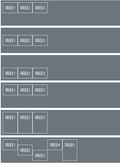
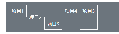
8. .align-self-start(end、center、baseline、stretch)实现单项目对齐
    <div class="d-flex m-2 p-2 bg-secondary text-light" style="height: 100px;">
        <div class="p-2 border border-light align-self-start">项目1</div>
        <div class="p-2 border border-light align-self-center">项目2</div>
        <div class="p-2 border border-light align-self-end">项目3</div>
        <div class="p-2 border border-light align-self-baseline">项目4</div>
        <div class="p-2 border border-light align-self-stretch">项目5</div>
    </div>
9. 使用.flex-fill 强制让每个元素项目占据相等的水平宽度
    <div class="d-flex m-2 p-2 bg-secondary text-light flex-row ">
        <div class="p-2 border border-light flex-fill">项目1</div>
        <div class="p-2 border border-light flex-fill">项目2</div>
        <div class="p-2 border border-light flex-fill">项目3</div>
    </div>
三个项目同时设置了.flex-fill,则它们等比例分割宽度,适合导航项目;
如果其中一个或两个没有设置.flex-fill,则没有设置的会被设置的填充宽度
10.使用.flex-grow-*,*表示 0 或 1,设置为1则能实现.flex-fill 的功能
    <div class="d-flex m-2 p-2 bg-secondary text-light flex-row ">
        <div class="p-2 border border-light flex-grow-1">项目1</div>
        <div class="p-2 border border-light flex-grow-1">项目2</div>
        <div class="p-2 border border-light flex-grow-1">项目3</div>
    </div>
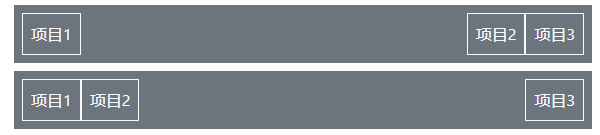
11.使用.mr-auto 等对齐方式,对 flex 元素进行浮动对齐
    <div class="d-flex m-2 p-2 bg-secondary text-light flex-row ">
        <div class="p-2 border border-light mr-auto">项目1</div>
        <div class="p-2 border border-light ">项目2</div>
        <div class="p-2 border border-light ">项目3</div>
    </div>

    <div class="d-flex m-2 p-2 bg-secondary text-light flex-row ">
        <div class="p-2 border border-light ">项目1</div>
        <div class="p-2 border border-light ">项目2</div>
        <div class="p-2 border border-light ml-auto">项目3</div>
    </div>
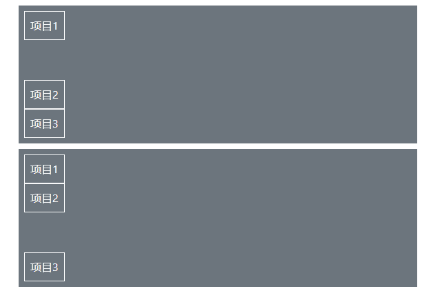
12. 对于垂直方向,也可以使用.mb-auto 和.mt-auto 来设置对象方向
    <div class="d-flex m-2 p-2 bg-secondary text-light flex-column align-items-start" style="height:200px;">
        <div class="p-2 border border-light mb-auto">项目1</div>
        <div class="p-2 border border-light ">项目2</div>
        <div class="p-2 border border-light ">项目3</div>
    </div>
    <div class="d-flex m-2 p-2 bg-secondary text-light flex-column align-items-start" style="height:200px;">
        <div class="p-2 border border-light">项目1</div>
        <div class="p-2 border border-light ">项目2</div>
        <div class="p-2 border border-light mt-auto">项目3</div>
    </div>
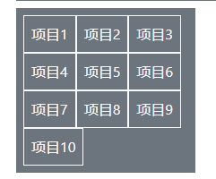
13. 使用.flex-wrap(包裹)和.flex-nowrap(不包裹,默认)来设置子元素项目
    <div class="d-flex m-2 p-2 bg-secondary text-light flex-wrap" style="width:200px;">
        <div class="p-2 border border-light">项目1</div>
        <div class="p-2 border border-light ">项目2</div>
        <div class="p-2 border border-light ">项目3</div>
        <div class="p-2 border border-light">项目4</div>
        <div class="p-2 border border-light ">项目5</div>
        <div class="p-2 border border-light ">项目6</div>
        <div class="p-2 border border-light">项目7</div>
        <div class="p-2 border border-light ">项目8</div>
        <div class="p-2 border border-light ">项目9</div>
        <div class="p-2 border border-light ">项目10</div>
    </div>
14.使用.order-*,来设置子元素项目的排序顺序,支持.order-*-*
    <div class="d-flex m-2 p-2 bg-secondary text-light ">
        <div class="p-2 border border-light order-3">项目1</div>
        <div class="p-2 border border-light order-1">项目2</div>
        <div class="p-2 border border-light order-2">项目3</div>
    </div>

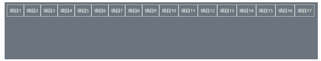
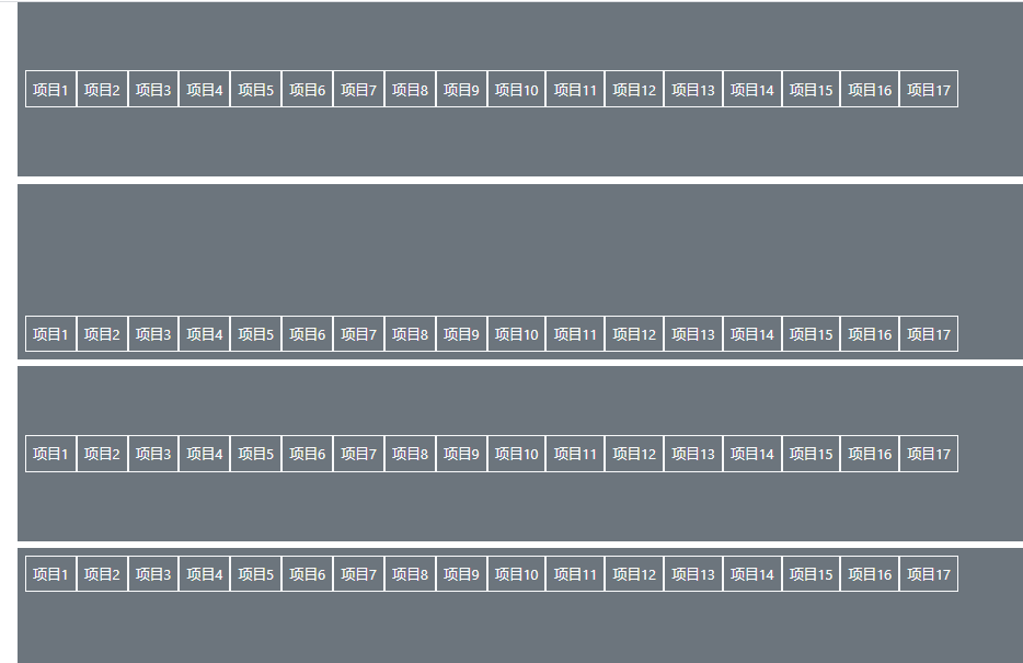
15. .align-content-start(end、center、between、around、stretch)垂直对齐
    <div class="d-flex m-2 p-2 bg-secondary text-light flex-wrap align-content-start" style="height:200px;">
        <div class="p-2 border border-light">项目1</div>
        <div class="p-2 border border-light ">项目2</div>
        <div class="p-2 border border-light ">项目3</div>
        <div class="p-2 border border-light">项目4</div>
        <div class="p-2 border border-light ">项目5</div>
        <div class="p-2 border border-light ">项目6</div>
        <div class="p-2 border border-light">项目7</div>
        <div class="p-2 border border-light ">项目8</div>
        <div class="p-2 border border-light ">项目9</div>
        <div class="p-2 border border-light ">项目10</div>
        <div class="p-2 border border-light">项目11</div>
        <div class="p-2 border border-light ">项目12</div>
        <div class="p-2 border border-light ">项目13</div>
        <div class="p-2 border border-light">项目14</div>
        <div class="p-2 border border-light ">项目15</div>
        <div class="p-2 border border-light ">项目16</div>
        <div class="p-2 border border-light ">项目17</div>
    </div>

 浙公网安备 33010602011771号