CSS入门(二)
一、CSS 三大特性
1、层叠性
相同选择器设置了相同的样式,此时一个样式就会覆盖(层叠)另一个冲突的样式。
层叠性原则:
-
样式冲突,遵循就近原则,那个样式离结构近,就执行哪一个样式
-
样式不冲突,不会层叠
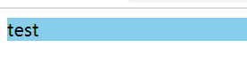
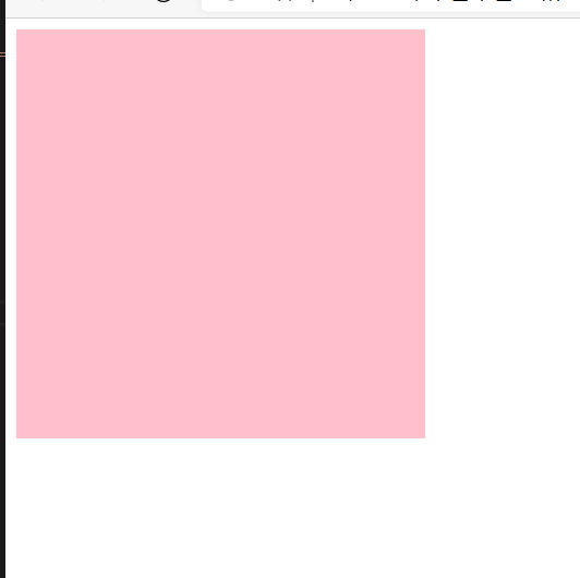
<!-- 样式 --> <style> div { background-color: pink; } div { background-color: skyblue; } </style> <div>test</div>![image-20201227194416831]()
2、继承性
子标签会继承父标签的某些样式,比如文本颜色和字号。简单的理解就是子承父业。
- 恰当的使用继承可以简化代码,降低CSS样式的复杂性
- 子元素可以继承父元素的样式(text-,font-,line-这些元素开头的可以继承,以及color属性)
3、优先级
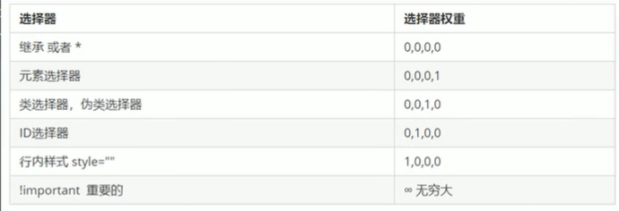
当同一个元素指定多个选择器,就会有优先级的产生
-
选择器相同,则执行层叠性
-
选择器不同,则根据选择器权重执行
![image-20201227202045576]()
-
优先级注意点:
- 权重有4组数字组成,不会有进位。
- 继承的权重是0,如果该元素没有直接选中,无论父元素的权重多高,子元素得到的权重都是0。
-
权重的叠加
二、盒子模型
组成:border、content、paddings、margin
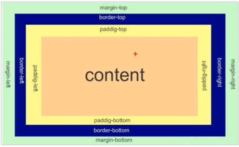
1、边框(border):边框宽度、样式、颜色
border:border-width || border-style || border-color
-
border-width:定义边框粗细,单位是px
-
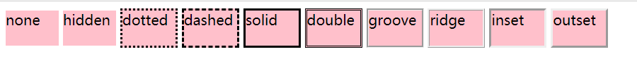
border-style:边框的样式
参数:
- none:无边框
- hidden:隐藏边框
- dotted:在MAC平台上IE4+与WINDOWS和UNIX平台上IE5.5+为点线,否则为实线
- dashed:在MAC平台上IE4+与WINDOWS和UNIX平台上IE5.5+为虚线,否则为实线
- solid:实线边框
- double:双线边框,两条线的间隔等于指定border-width值
- groove:根据border-color的值画3D凹槽
- ridge:根据border-color的值画菱形边框
- inset:根据border-color的值画3D凹边
- outset:根据border-color的值画3D凸边
![image-20201228102910842]()
-
border-color:边框颜色
-
border-collapse:控制浏览器绘制表格边框的方式,控制相邻单元格的边框
- border-collapse:collapse;表示相邻边框合并在一起
-
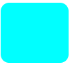
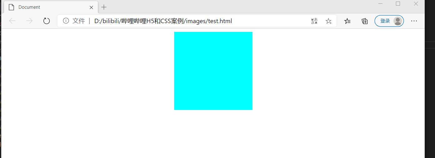
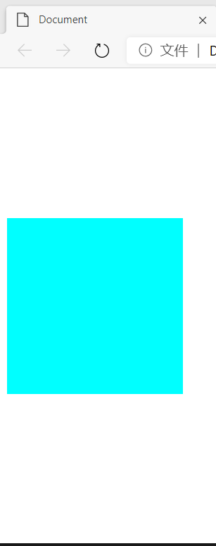
border-radius:设置元素的外边框圆角
<div style="background-color: aqua;border-radius: 10px;width: 50px; height: 50px;"></div>![image-20210103202308808]()
-
box-shadow:为盒子添加阴影
box-shadow:h-shadow v-shadow
属性值:
-
h-shadow:必需,水平阴影的位置,允许负值
-
v-shadow:必需,垂直阴影的位置,允许负值
-
blur:可选,模糊距离
-
spread:可选,阴影的尺寸
-
color:可选,阴影的颜色
-
inset:可选,将外部阴影(outset)改为内部阴影
注意:
1、默认的是外阴影(outset),但是不可以写这个单词,否则导致阴影失效。
2、盒子阴影不占空间,不会影响其他盒子排列。
-
-
text-shadow:将阴影作用于文本
text-shadow:h-shadow v-shadow
- h-shadow:必需,水平阴影的位置,允许负值
- v-shadow:必需,垂直阴影的位置,允许负值
- blur:可选,模糊距离
- color:可选,阴影的颜色
-
边框简写:
border:1px solid red;没有顺序
border-top:1px solid red;/* 只设置上边框,其余同理  */
2、内边距(paddings):设置内边距,即边框与内容之间的距离
-
padding-left:左内边距
-
padding-right:右内边距
-
padding-top:上内边距
-
padding-bottom:下内边距
-
简写:
padding: 5px; /* 一个值代表上下左右都有5px的内边距 */ padding: 5px 10px;/* 两个值代表上下5px的内边距 左右10px的内边距 */ padding: 5px 10px 20px;/* 三个值代表上5px的内边距 左右10px的内边距 下20px的内边距*/ padding: 5px 10px 15px 20px;/* 四个值代表上5px的内边距 右10px的内边距 左15px的内边距 下20px的内边距 顺时针*/ -
注意:
- 如果盒子有了指定的宽度和高度,再指定内边距,会撑大盒子(解决方法:宽度和高度减去多出来的内边距大小即可)
- 如果盒子本身没有指定width/height属性,则此时padding不会撑开盒子大小
3、外边距(margin):控制盒子与盒子之间的距离
-
margin-left:左外边距
-
margin-right:右外边距
-
margin-top:上外边距
-
margin-bottom:下外边距
-
外边距让块级盒子水平居中:
-
盒子必须指定宽度
-
盒子左右的外边距都设置为auto
.header{width:960px;margin:0 auto;}
-
-
行内元素或者行内块元素水平居中给其父元素添加 text-align:center 即可。
-
注意:
-
外边距合并:使用margin定义块元素的垂直外边距时,可能会出现外边距的合并。
-
嵌套块元素垂直外边距的塌陷:对于两个嵌套关系(父子关系)的块元素,父元素有上外边距,子元素也有上外边距,此时父元素会塌陷较大的外边距值。
-
解决方法:
1、可以为父元素定义上边框
2、可以为父元素定义上内边距
3、可以为父元素添加overflow:hidden
-
-
清除内外边距:网页元素很多带有默认的内外边距,因此在布局前,要清楚一些网页元素的内外边距。
* { padding:0; margin:0; } -
注意:行内元素为了照顾兼容性,尽量只设置左右内外边距,都是转换为块级和行内块元素就可以了。
三、浮动
1、什么是浮动
float 属性用于创建浮动框,将其移到一边,直到左边缘或右边缘触及包含块或者另一个浮动框的边缘。
语法:
选择器{ float:属性值;}
属性值:
none:元素不浮动(默认值)
left:元素向左浮动
right:元素向右浮动
eg:
 <!-- 样式 -->
    <style>
        div {
            width: 100px;
            height: 100px;
            background-color: aqua;
        }

        .right {
            float: right;
        }

        .left {
            float: left;
        }
    </style>

    <div class="right"></div>
    <div class="left"></div>
2、浮动特性(难点)
-
浮动元素会脱离标准流(脱标)
-
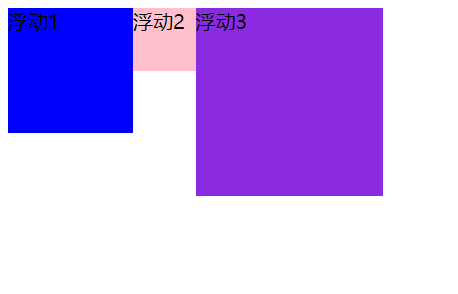
浮动元素会一行内显示并且元素顶部对齐
注意:浮动元素是互相贴靠在一起的(不会有缝隙),如果父级宽度装不下这些浮动的盒子,多出的盒子会另起一行显示。
eg
<!-- 样式 --> <style> .one { width: 100px; height: 100px; background-color: blue; float: left; } .two { width: 50px; height: 50px; background-color: pink; float: left; } .three { width: 150px; height: 150px; background-color: blueviolet; float: left; } </style> <div class="one">浮动1</div> <div class="two">浮动2</div> <div class="three">浮动3</div>![image-20210105090808427]()
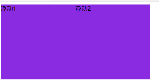
-
浮动元素会具有行内块元素的特性
<!-- 样式 --> <style> span { float: left; width: 200px; height: 200px; background-color: blueviolet; } </style> <!-- span是行内元素,不能设置宽高,但是加了浮动后,有了行内块元素的特点 --> <span>浮动1</span> <span>浮动2</span>![image-20210105091643209]()
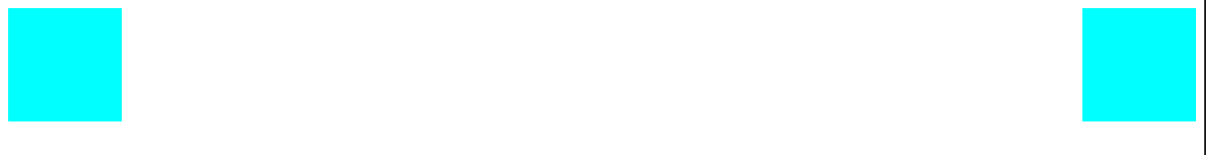
-
浮动的盒子不再保留原先的位置
eg:
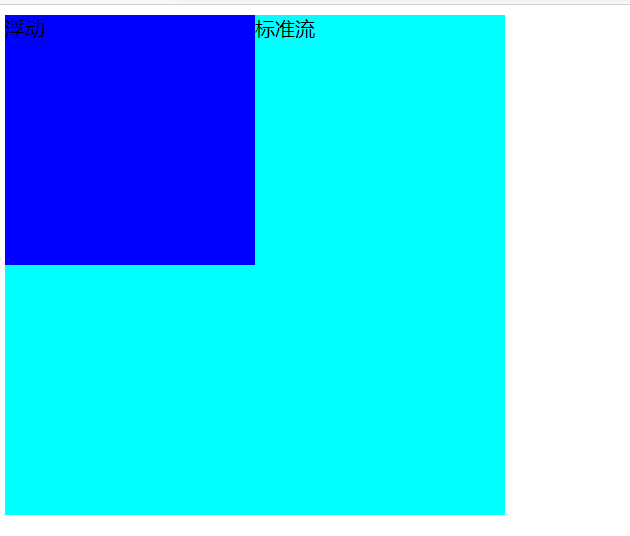
div { width: 400px; height: 400px; background-color: aqua; } .left { float: left; width: 200px; height: 200px; background-color: blue; } <div class="left">浮动</div> <div>标准流</div>![image-20210105085819910]()
3、浮动布局注意点
-
浮动元素经常和标准流父级搭配使用(先用标准流的父元素排列上下位置,之后内部子元素采取浮动排列左右位置,复合网页布局第一准则)
-
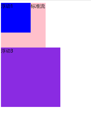
一个元素浮动了,理论上其他的兄弟元素也要浮动(浮动的盒子只会影响浮动盒子后面的标准流,不会影响前面的标准流)
eg
<!-- 样式 --> <style> .one { width: 100px; height: 100px; background-color: blue; float: left; } .two { width: 150px; height: 150px; background-color: pink; } .three { width: 200px; height: 200px; background-color: blueviolet; float: left; } </style> <div class="one">浮动1</div> <div class="two">标准流</div> <div class="three">浮动3</div>![image-20210105095154975]()
4、清除浮动
-
为什么要清除浮动?
- 由于浮动元素不在占有原文档流的位置,会对后面的元素排版产生影响,所以需要清除浮动元素造成的影响
- 如果父盒子本身有高度,则不需要清除浮动
- 清除浮动后,父级会根据浮动的子盒子自动检测高度,父级有了高度,就不会影响下面的标准流了
-
语法:
选择器{clear:属性值;}属性值:
left:不允许左侧有浮动元素(清除左侧浮动的影响)
right:不允许右侧有浮动元素(清除右侧浮动的影响)
both:同时清除左右两侧浮动的影响
-
清除浮动的方法:
-
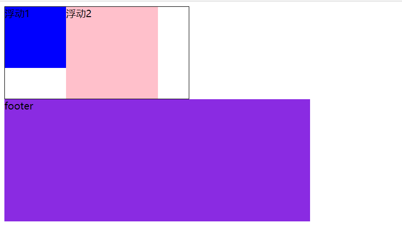
额外标签法也称隔墙法(W3C推荐)
在浮动元素末尾添加一个空的标签。例如
<div style='clear:both'></div>,或者其他标签(如<br/>等)注意:这个空的标签必须是块级元素 。
eg:
<!-- 样式 --> <style> .box { width: 300px; border: 1px black solid; } .one { width: 100px; height: 100px; background-color: blue; float: left; } .two { width: 150px; height: 150px; background-color: pink; float: left; } .three { width: 500px; height: 200px; background-color: blueviolet; float: left; } .clear { clear: both; } </style> <div class="box"> <div class="one">浮动1</div> <div class="two">浮动2</div> <div class="clear"></div> </div> <div class="three">footer</div>![image-20210105102021209]()
-
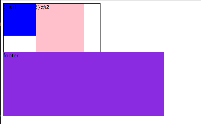
父级添加overflow属性
可以给父级添加overflow属性,将其属性值设置为
hidden、auto或scrolleg:
<!-- 样式 --> <style> .box { width: 300px; border: 1px black solid; overflow: hidden; } .one { width: 100px; height: 100px; background-color: blue; float: left; } .two { width: 150px; height: 150px; background-color: pink; float: left; } .three { width: 500px; height: 200px; background-color: blueviolet; float: left; } </style> <div class="box"> <div class="one">浮动1</div> <div class="two">浮动2</div> </div> <div class="three">footer</div>![image-20210105103516669]()
-
父级添加after伪元素
<style> .clearfix:after { content: ""; display: block; height: 0; clear: both; visibility: hidden; } .clearfix { /* IE6、7专有 */ *zoom: 1; } </style> -
父级添加双伪元素
-
四、CSS定位
1、定位组成
定位:将一个盒子定在某一个位置,所以定位也是在摆放盒子,按照定位的方式移动盒子
定位=定位模式+边偏移
2、定位模式
定位模式通过CSS的 position属性设置
属性值:
static:静态定位
relative:相对定位
absolute:绝对定位
fixed:固定定位
3、边偏移
边偏移就是定位的盒子移动到最终位置,有top、bottom、left、right 4个属性
边偏移属性:
top:顶端偏移量,定义元素相对于其父元素上边线的距离。 eg :top:80px
bottom:底部偏移量,定义元素相对于其父元素下边线的距离。 eg: bottom:80px
left:左侧偏移量,定义元素相对于其父元素左边线的距离。 eg: left:80px
right:右侧偏移量,定义元素相对于其父元素右边线的距离。 eg :right:80px
4、静态定位 static
静态定位是元素的默认定位方式,无定位的意思
语法:选择器{ position:static;}
- 静态定位按照标准流特性摆放位置,它没有边偏移
- 静态定位在布局中很少用到
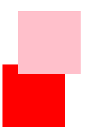
5、相对定位 relative
相对定位是元素在移动位置的时候,是相对于它原来的位置来说的
语法:选择器{ position:relative; }
-
它是相对于自己原来的位置来移动的(移动位置的时候参照点是自己原来的位置)
-
原来在标准流的位置继续占有,后面的盒子仍然以标准流的方式对待它。(不脱标,继续保留原来的位置)
eg:
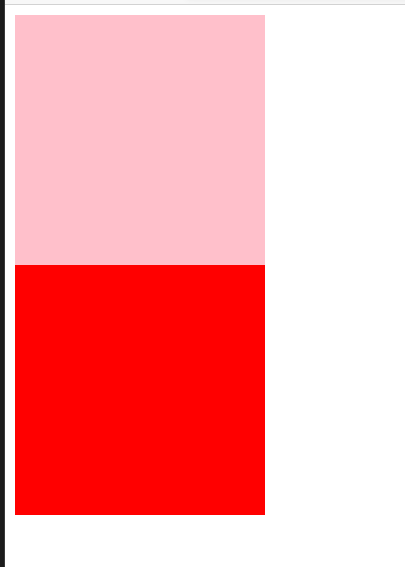
 <style>
        /* 原本的样式 */
        .pink {
            background-color: pink;
        }

        .red {
            background-color: red;
        }

        div {
            width: 200px;
            height: 200px;
        }
    </style>

      <div class="pink"></div>
    <div class="red"></div>
<style>
        /* 添加相对定位的样式 */
        .pink {
            background-color: pink;
            position: relative;
            top: 30px;
            left: 50px;
        }
        .red {
            background-color: red;
        }
        div {
            width: 200px;
            height: 200px;
        }
    </style>
    <div class="pink"></div>
    <div class="red"></div>
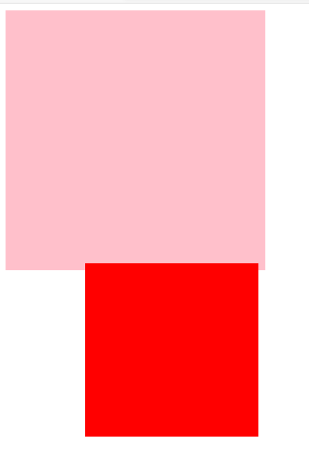
6、绝对定位 absolute(重要)
绝对定位是元素在移动位置的时候 ,是相对于它祖先元素来说的
语法:选择器{ position:absolute;}
-
如果没有祖先元素或者祖先元素没有定位,则以浏览器为准定位
-
如果祖先元素有定位(相对、绝对、固定定位),则以最近一级的有定位祖先元素为参考点移动位置
-
绝对定位不再占有原先的位置。(脱标)
eg:
<style> /* 祖先元素没有定位 */ .pink { background-color: pink; width: 300px; height: 300px; } .red { background-color: red; position: absolute; top: 300px; left: 100px; width: 200px; height: 200px; } </style> <div class="pink"> <div class="red"></div> </div>![image-20210108223548456]()
 <style>
        /* 祖先元素有定位 */

        .pink {
            background-color: pink;
            width: 300px;
            height: 300px;
            position: relative;
        }

        .red {
            background-color: red;
            position: absolute;
            top: 300px;
            left: 100px;
            width: 200px;
            height: 200px;
        }
    </style>
     <div class="pink">
        <div class="red"></div>
    </div>

7、子绝父相
- 子级绝对定位,不会占有位置,可以放到父盒子里面的任何一个地方,不会影响其它的兄弟盒子
- 父盒子需要加定位限制子盒子在父盒子内显示
- 父盒子布局时,需要占有位置,因此父亲只能是相对定位
- 相对定位经常用来作为绝对定位的父级
- 因为父级需要占有位置,因此是相对定位,子盒子不需要占有位置,则是绝对定位
8、固定定位 fixed(重要)
固定定位是元素固定于浏览器可视区的位置,主要使用场景:可以在浏览器页面滚动时元素的位置不会改变
语法:选择器:{ position:fixed}
- 以浏览器的可视窗口为参照点移动元素
- 跟父元素没有任何关系
- 不随滚动条滚动
- 固定定位不占有原先位置
- 固定定位也是脱标的,其实固定定位也可以看作一个特殊的绝对定位
9、粘性定位 sticky
语法:选择器:{position:sticky;top:10px;}
- 以浏览器的可视窗口为参照点移动元素(固定定位特点)
- 粘性定位占有原先的位置(相对定位特点)
- 必须添加top、bottom、left、right其中一个才有效
- 跟页面滚动搭配使用,兼容性较差,IE不支持
10、元素的显示与隐藏
本质:让元素在页面中显示出来或隐藏,不保留位置
-
display:显示隐藏
display属性设置元素应该如何显示
- display:none;隐藏对象,不再占有原来的位置
- display:block;除了转换为块级元素,同时还有显示元素的意思
-
visibility:显示隐藏
visibility属性用于指定一个元素应该可见还是隐藏,保留原来的位置
- visibility:visible;元素可见
- visibility:hidden;元素隐藏;元素隐藏后继续占有原来的位置
-
overflow:溢出显示隐藏
overflow属性指定了如果内容溢出元素的框(超过其指定高度及宽度)时,只对于溢出的部分处理
- overflow:visible;不剪切内容,也不添加滚动条
- overflow:auto;需要时剪切内容添加滚动条
- overflow:hidden;不显示超过对象尺寸的内容
- overflow:scroll;总是显示滚动条
11、定位叠放顺序 z-index
在使用布局定位时,可能会出现盒子重叠的情况,此时,可以使用 z-index来控制盒子的前后次序(z轴)
语法:选择器{ z-index:1; }
-
数值可以是正整数、负整数或0,默认auto,数值越大,盒子越靠上
-
如果属性值相同,则按照书写顺序,后来者居上
-
数字后面不能加单位
-
只有定位的盒子才有z-index属性
eg:
<style> /* 不加叠放顺序 */ .pink { background-color: pink; width: 300px; height: 300px; position: absolute; } .red { background-color: red; width: 300px; height: 300px; position: absolute; } </style> <div class="pink"></div> <div class="red"></div>![image-20210108233613188]()
 <style>
        /* 加叠放顺序 */

        .pink {
            background-color: pink;
            width: 300px;
            height: 300px;
            position: absolute;
             z-index: 1;
        }

        .red {
            background-color: red;
            width: 300px;
            height: 300px;
            position: absolute;
        }
    </style>
      <div class="pink"></div>
    <div class="red"></div>
12、补充拓展
-
绝对定位的盒子居中
加了绝对定位的盒子不能通过
margin:0 auto水平居中,但是可以通过下列方法实现水平和垂直居中:-
水平居中:
left:50%父容器宽度的一半,margin-left:本身盒子宽度的一半,负值,往左边走。eg:
<style> .test { position: absolute; left: 50%; margin-left: -100px; width: 200px; height: 200px; background-color: aqua; } </style> <div class="test"></div>![image-20210109121902726]()
-
垂直居中:
top:50%父容器宽度的一半,margin-top:本身盒子高度的一半,负值,往上走eg:
<style> .test { position: absolute; top: 50%; margin-top: -100px; width: 200px; height: 200px; background-color: aqua; } </style> <div class="test"></div>![image-20210109122301477]()
-
-
定位特殊特性:
- 行内元素添加绝对或者固定定位,可以直接设置高度和宽度
- 块级元素添加绝对或者固定定位,如果不给宽度或者高度,默认大小是内容大小
-
脱标的盒子不会触发外边距塌陷
浮动元素、绝对定位(固定定位)元素都不会触发外边距合并的问题
-
绝对定位(固定定位)会完全压住盒子
- 浮动元素不同,只会压住它下面标准流的盒子,但是不会压住下面标准流盒子里面的文字(图片)
- 但是绝对定位(固定定位)会压住下面标准流所有内容

 浙公网安备 33010602011771号