Web小案例
 web小案例
web小案例
HTML + CSS
-
3dTab
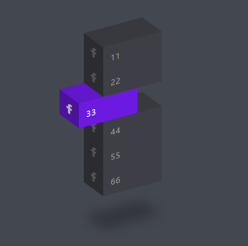
<style> *{ margin: 0; padding: 0; box-sizing: border-box; font-family: 'Oswald', sans-serif; } body { display: flex; justify-content: center; align-items: center; height: 100vh; background: #434750; } ul { position: relative; /*整体倾斜*/ transform: skewY(-15deg); } ul li { position: inherit; list-style: none; /* 清除列表默认样式 */ width: 120px; background: #3e3f46; padding: 15px; transition: 0.5s; z-index: calc(1 * var(--i)); color: #b0b0b3; } ul li:hover { transform: translateX(-50px); /* 鼠标碰到,动画*/ background: var(--clr); } /*左侧效果*/ ul li::before { content: ''; position: absolute; top: 0; left: -40px; width: 40px; height: 100%; background: #3e3f46; filter: brightness(0.7); /*不知道*/ transform-origin: right; /*不知道*/ transform: skewY(45deg); /*旋转角度*/ transition: 0.5s; } ul li:hover::before { background: var(--clr); filter: brightness(0.7); } /* 上侧效果 */ ul li::after { content: ''; position: absolute; top: -40px; left: 0px; width: 100%; height: 40px; background: #3e3f46; filter: brightness(0.9); /*不知道*/ transform-origin: bottom; /*不知道*/ transform: skewX(45deg); /*旋转角度*/ transition: 0.5s; } ul li:hover::after { background: var(--clr); filter: brightness(0.9); } /*内部字体初始色*/ ul li p { text-decoration: none; /*不知道*/ color: #999; display: block; text-transform: uppercase; /*不知道*/ letter-spacing: 0.05em; /*不知道*/ transition: 0.5s; } ul li:hover p { color: #fff; } /*阴影特性*/ ul li:last-child::after { box-shadow: -120px 120px 20px rgba(0, 0, 0, .25); } ul li span { position: absolute; top: 0; left: -40px; width: 40px; height: 100%; filter: brightness(0.7); /*不知道*/ transform-origin: right; /*不知道*/ transform: skewY(45deg); /*旋转角度*/ transition: 0.5s; font-size: 1.25em; display: flex; justify-content: center; align-items: center; opacity: .5; } ul li:hover span { opacity: 1; color: #fff; } </style> <body> <ul> <li style="--i: 10; --clr: #1877f2"><span><i class="fa-brands fa-facebook-f"></i></span><p>11</p></li> <li style="--i: 9; --clr: #25d366"><span><i class="fa-brands fa-facebook-f"></i></span><p>22</p></li> <li style="--i: 8; --clr: #6d1ae0"><span><i class="fa-brands fa-facebook-f"></i></span><p>33</p></li> <li style="--i: 7; --clr: #c32aa3"><span><i class="fa-brands fa-facebook-f"></i></span><p>44</p></li> <li style="--i: 6; --clr: #ff0000"><span><i class="fa-brands fa-facebook-f"></i></span><p>55</p></li> <li style="--i: 5; --clr: #0a6632"><span><i class="fa-brands fa-facebook-f"></i></span><p>66</p></li> </ul> </body> -
爱心动画
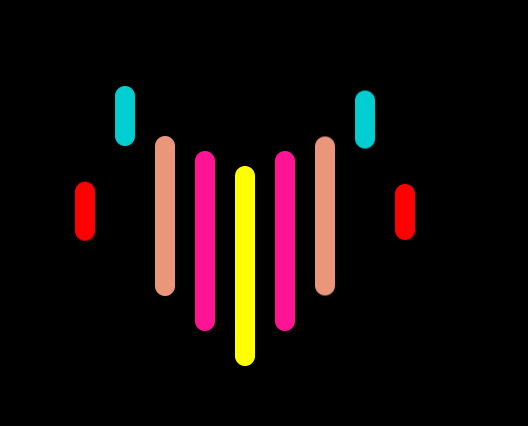
<style> * { padding: 0; margin: 0; } body { display: flex; justify-content: center; align-items: center; height: 100vh; background: #000; } ul { position: relative; display: flex; height: 200px; } li { width: 20px; height: 20px; border-radius: 10px; list-style: none; margin: 0 10px; background: var(--clr); animation: var(--dh) 5s var(--ms) infinite; } @keyframes love1 { 30%, 50% { height: 60px; transform: translateY(-30px); } 70%, 100% { height: 20px; transform: translateY(0); } } @keyframes love2 { 30%, 50% { /*眼睛*/ /*height: 60px;*/ /*transform: translateY(-125px);*/ height: 125px; transform: translateY(-60px); } 70%, 100% { height: 20px; transform: translateY(0); } } @keyframes love3 { 30%, 50% { height: 160px; transform: translateY(-75px); } 70%, 100% { height: 20px; transform: translateY(0); } } @keyframes love4 { 30%, 50% { height: 180px; transform: translateY(-60px); } 70%, 100% { height: 20px; transform: translateY(0); } } @keyframes love5 { 30%, 50% { height: 200px; transform: translateY(-45px); } 70%, 100% { height: 20px; transform: translateY(0); } } </style> <body> <ul> <li style="--ms: 0s; --dh: love1;--clr: red;"></li> <li style="--ms: .2s; --dh: love2;--clr: darkturquoise;"></li> <li style="--ms: .4s; --dh: love3;--clr: darksalmon;"></li> <li style="--ms: .6s; --dh: love4;--clr: deeppink;"></li> <li style="--ms: .8s; --dh: love5;--clr: yellow;"></li> <li style="--ms: 1s; --dh: love4;--clr: deeppink;"></li> <li style="--ms: 1.2s;--dh: love3;--clr: darksalmon;"></li> <li style="--ms: 1.4s;--dh: love2;--clr: darkturquoise;"></li> <li style="--ms: 1.6s;--dh: love1;--clr: red;"></li> </ul> </body> -
炫彩动画圈

<style> * { margin: 0; padding: 0; box-sizing: border-box; } body { display: flex; justify-content: center; align-items: center; min-height: 100vh; background: #000; animation: animateColor 8s linear infinite; } .container { display: flex; } ul { position: relative; width: 150px; height: 150px; margin: 0 -7.5px; } ul:last-child { transform: rotate(-180deg); } ul li { position: absolute; top: 0; left: 0; width: 100%; height: 100%; transform: rotate(calc(18deg * var(--i))); } ul li::before { content: ''; position: absolute; right: 0; top: calc(50% - 7.5px); width: 15px; height: 15px; background: green; border-radius: 50%; box-shadow: 0 0 10px green, 0 0 20px green, 0 0 40px green, 0 0 60px green, 0 0 80px green, 0 0 100px green; transform: scale(0.1); animation: animate 4s linear infinite; animation-delay: calc(0.1s * var(--i)); } ul:last-child li::before { animation-delay: calc(-0.1s * var(--i)); } @keyframes animate { 0% { transform: scale(1); } 50%, 100% { transform: scale(0.1); } } @keyframes animateColor { 0% { filter: hue-rotate(0deg); } 100% { filter: hue-rotate(360deg); } } </style> <body> <div class="container"> <ul class="circle"> <li style="--i: 0;"></li> <li style="--i: 1;"></li> <li style="--i: 2;"></li> <li style="--i: 3;"></li> <li style="--i: 4;"></li> <li style="--i: 5;"></li> <li style="--i: 6;"></li> <li style="--i: 7;"></li> <li style="--i: 8;"></li> <li style="--i: 9;"></li> <li style="--i: 10;"></li> <li style="--i: 11;"></li> <li style="--i: 12;"></li> <li style="--i: 13;"></li> <li style="--i: 14;"></li> <li style="--i: 15;"></li> <li style="--i: 16;"></li> <li style="--i: 17;"></li> <li style="--i: 18;"></li> <li style="--i: 19;"></li> <li style="--i: 20;"></li> </ul> <ul class="circle"> <li style="--i: 0;"></li> <li style="--i: 1;"></li> <li style="--i: 2;"></li> <li style="--i: 3;"></li> <li style="--i: 4;"></li> <li style="--i: 5;"></li> <li style="--i: 6;"></li> <li style="--i: 7;"></li> <li style="--i: 8;"></li> <li style="--i: 9;"></li> <li style="--i: 10;"></li> <li style="--i: 11;"></li> <li style="--i: 12;"></li> <li style="--i: 13;"></li> <li style="--i: 14;"></li> <li style="--i: 15;"></li> <li style="--i: 16;"></li> <li style="--i: 17;"></li> <li style="--i: 18;"></li> <li style="--i: 19;"></li> <li style="--i: 20;"></li> </ul> </div> </body> -
星星环绕
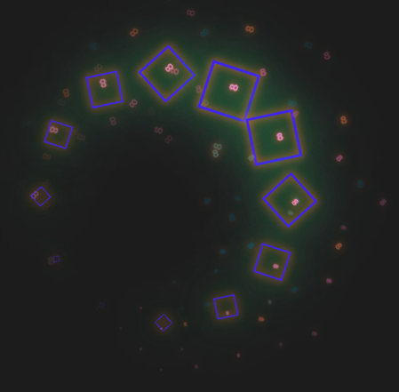
<style> body{ height: 100vh; background-color: #1c1c1c; display: flex; justify-content: center; align-items: center; } *{ margin: 0; padding: 0; box-sizing: border-box; } .loader { position: relative; width: 300px; height: 300px; display: flex; justify-content: center; align-items: center; animation: animateColor 7.2s linear infinite; } @keyframes animateColor { 0% { filter: hue-rotate(0deg); } 100% { filter: hue-rotate(360deg); } } .loader span { position: absolute; transform-origin: 150px; transform: translateX(-150px) rotate(calc(var(--i) * 30deg)); /*发光效果*/ filter: drop-shadow(0 0 5px #18f122) drop-shadow(0 0 15px #2a70d0) drop-shadow(0 0 30px #9c89dc); } .loader span::before { content: '8'; position: absolute; /*font-family: fontAwesome;*/ font-size: .75em; color: #d1ff12; animation: rotate-particle 2.4s linear infinite; animation-delay: calc(var(--i) * -.2s); } @keyframes rotate-particle { 0% { scale: 1; opacity: 0; rotate: 0deg; } 50% { scale: 1; opacity: 1; rotate: 180deg; } 100% { scale: 0; opacity: 0; rotate: 360deg; filter: drop-shadow(-150px 0 #9c89dc) drop-shadow(150px 0 #00ff00) drop-shadow(0 150px #bd26a7) drop-shadow(0 -150px #aaaa11); } } .loader span i { color: #18f122; width: 20px; height: 20px; border: 1px solid red; display: inline-block; text-align: center; line-height: 23px; animation: rotate-stars 2.4s linear infinite; animation-delay: calc(var(--i) * -0.2s); /* 旋转大小变化效果 */ } /*每个个体变大旋转再变小动画*/ @keyframes rotate-stars { 0% { transform: rotate(0deg) scale(0); } 50% { transform: rotate(180deg) scale(3); } 100% { transform: rotate(360deg) scale(0); } } </style> <body> <div class="loader"> <span style="--i:1"><i></i></span> <span style="--i:2"><i></i></span> <span style="--i:3"><i></i></span> <span style="--i:4"><i></i></span> <span style="--i:5"><i></i></span> <span style="--i:6"><i></i></span> <span style="--i:7"><i></i></span> <span style="--i:8"><i></i></span> <span style="--i:9"><i></i></span> <span style="--i:10"><i></i></span> <span style="--i:11"><i></i></span> <span style="--i:12"><i></i></span> </div> </body> -
动态箭头
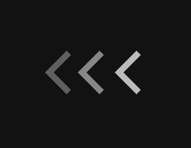
<style> /*初始化*/ * { padding: 0; margin: 0; box-sizing: border-box; } body { display: flex; justify-content: center; align-items: center; height: 100vh; background: #121212; } /*构图*/ .arows-body { position: relative; display: flex; align-items: center; justify-content: center; } .arow { position: relative; width: 60px; height: 60px; border-left: 12px solid #fff; border-top: 12px solid #fff; transform: rotate(-45deg); animation: arrow-load 2s infinite; } /*动效*/ .arow:first-child { animation-delay: -0.4s; left: 25px; } .arow:nth-child(2) { animation-delay: -0.2s; } .arow:last-child { right: 25px; } @keyframes arrow-load { 0% { opacity: 0; transform: rotate(-45deg) translate(60px, 60px); } 0% { opacity: 1; } 100% { opacity: 0; transform: rotate(-45deg) translate(-60px, -60px); } } </style> <body> <div class="arows-body"> <div class="arow"></div> <div class="arow"></div> <div class="arow"></div> </div> </body> -
液体效果

<style> * { margin: 0; padding: 0; box-sizing: border-box; } body { display: flex; justify-content: center; align-items: center; min-height: 100vh; background: linear-gradient(45deg, #00b6c6, #1ecafc); } .container { position: relative; display: flex; justify-content: center; align-items: center; filter: url(#Gooey); } ul,li { list-style: none; } li { position: absolute; background: white; border-radius: 50%; left: 0; transform-origin: 150px; animation: animate 5s ease-in-out infinite; animation-delay: calc(0.15s * var(--i)); } @keyframes animate { 0%, 10% { width: 100px; height: 100px; transform: rotate(0deg) translateX(120px); } 40%, 70% { width: 40px; height: 40px; transform: rotate(calc(360deg / 8 * var(--i))); box-shadow: 0 0 0 10px white; } 90%, 100% { width: 100px; height: 100px; transform: rotate(0deg) translateX(120px); } } svg { width: 0; height: 0; } </style> <body> <ul class="container"> <li style="--i:0"></li> <li style="--i:1"></li> <li style="--i:2"></li> <li style="--i:3"></li> <li style="--i:4"></li> <li style="--i:5"></li> <li style="--i:6"></li> <li style="--i:7"></li> </ul> <svg> <filter id="Gooey"> <feGaussianBlur in="SourceGraphic" stdDeviation="10"/> <fecolorMatrix Values=" 1 0 0 0 0 0 1 0 0 0 0 0 1 0 0 0 0 0 20 -1 "/> </filter> </svg> </body> -
手风琴
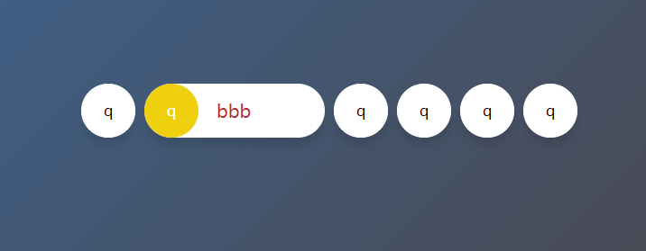
<style> * { margin: 0; padding: 0; box-sizing: border-box; } html, body { display: grid; height: 100%; width: 100%; place-items: center; background: linear-gradient(315deg, #4e4242 0%, #3b6593 94%); } ul,li { list-style: none; } ul { display: flex; } ul li { width: 60px; height: 60px; border-radius: 30px; background: white; display: flex; align-items: center; margin: 0 5px; overflow: hidden; cursor: pointer; box-shadow: 0 10px 10px rgba(0, 0, 0, 0.1); transition: all 0.3s ease-out; } ul li:hover { width: 200px; } ul li div { height: 60px; width: 60px; flex-shrink: 0; z-index: 1; line-height: 60px; background: inherit; text-align: center; border-radius: 50%; transition: all 0.3s ease-out; } ul li:hover div { background: var(---background); color: #fff; } ul li span { font-size: 20px; margin-left: 20px; } ul li:hover span { color: var(--color); } </style> <body> <ul> <li> <div style="---background:#d26028">q</div> <span style="--color:#91c934">bbb</span> </li> <li> <div style="---background:#eed00f">q</div> <span style="--color:#c12828">bbb</span> </li> <li> <div style="---background:#18e31d">q</div> <span style="--color:#2585db">bbb</span> </li> <li> <div style="---background:#179bec">q</div> <span style="--color:#bd26a7">bbb</span> </li> <li> <div style="---background:#7c13c7">q</div> <span style="--color:#e5ca11">bbb</span> </li> <li> <div style="---background:#0ef8bb">q</div> <span style="--color:#6426d4">bbb</span> </li> </ul> </body> -
伸缩导航栏
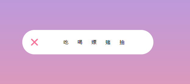
<style> * { padding: 0; margin: 0; } body { height: 100vh; background: linear-gradient(#99f, #f99); } body, .navbar, ul { position: relative; display: flex; align-items: center; justify-content: center; } .navbar { background: white; padding: 20px; border-radius: 50px; } .navbar input { width: 40px; height: 40px; opacity: 0; cursor: pointer; } .navbar span { position: absolute; left: 25px; top: calc(50% - 10px); width: 30px; height: 4px; border-radius: 15px; background: #999; pointer-events: none; /* span覆盖复选框的解决*/ transition: transform .3s ease-in-out, top .3s ease-in-out .3s; /* 先执行top .3s后执行transform */ } .navbar span:nth-of-type(2) { top: calc(50% + 6px); } .navbar ul { width: 0; overflow: hidden; transition: all 0.5s; /*叉杠切换速度太快*/ white-space: nowrap; /* 文字一行显示 */ } .navbar ul li { list-style: none; margin: 0 15px; } .navbar ul li:hover { color: #fb7299; } .navbar input:checked~ul {/* :checked 当选中复选框的时候,~ 查找其兄弟ul */ width: 350px; } /* 变叉叉*/ .navbar input:checked ~ span:nth-of-type(1) { top: calc(50% - 2px); transform: rotate(-45deg); background: #fb7299; transition: top .3s ease-in-out, transform .3s ease-in-out .3s; /* 先执行top .3s后执行transform */ } .navbar input:checked ~ span:nth-of-type(2) { top: calc(50% - 2px); transform: rotate(45deg); background: #fb7299; transition: top .3s ease-in-out, transform .3s ease-in-out .3s; /* 先执行top .3s后执行transform */ } </style> <body> <div class="navbar"> <input type="checkbox"/> <span></span> <span></span> <ul> <li>吃</li> <li>喝</li> <li>嫖</li> <li>赌</li> <li>抽</li> </ul> </div> </body> -
多层卡片
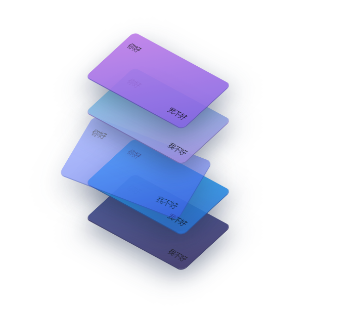
<style> * { margin: 0; padding: 0; } ul, li { list-style: none } body { height: 100vh; display: flex; justify-content: center; align-items: center; } ul { position: relative; transform-style: preserve-3d; user-select: none; /* 文字不可选 */ } ul li { position: relative; overflow: hidden; width: 280px; height: 140px; border-radius: 12px; cursor: pointer; background-image: linear-gradient(135deg, var(--startColor), var(--endColor)); box-shadow: 20px 20px 60px rgba(34, 50, 84, .5), 1px 1px 0px 1px var(--endColor); z-index: var(--zInd); opacity: .9; margin-top: -70px; /* 重叠效果 */ transform: rotateX(45deg) rotateY(-15deg) rotate(45deg); transition: all .4s ease; } ul li:hover { transform: rotateX(30deg) rotateY(-15deg) rotate(30deg) translate(-25px, 50px); opacity: .6; } ul li:hover::after { transform: translateX(100%); transition: all 1.2s ease-in-out; } ul li::after { content: ''; position: absolute; top: 0; left: 0; width: 100%; height: 100%; color: #ffffff; transform: translateX(-100%); background-image: linear-gradient(60deg, rgba(255, 255, 255, 0) 20%, rgba(255, 255, 255, .1), rgba(255, 255, 255, 0) 80%); } ul li .title { position: absolute; top: 20px; left: 16px; } ul li .content { position: absolute; bottom: 15px; right: 15px; } </style> <body> <ul class="levels"> <li class="level" style="--bgColor:#b5d481;--startColor:#bd7be8;--endColor:#8063e1;--zInd:5"> <div class="title">你好</div> <div class="content">我不好</div> </li> <li class="level" style="--bgColor:#c19a38;--startColor:#7bcfe8;--endColor:#9c89dc;--zInd:4"> <div class="title">你好</div> <div class="content">我不好</div> </li> <li class="level" style="--bgColor:#d726d4;--startColor:#7f94fc;--endColor:#3f58e3;--zInd:3"> <div class="title">你好</div> <div class="content">我不好</div> </li> <li class="level" style="--bgColor:#7aff04;--startColor:#21bbfe;--endColor:#2c6fd1;--zInd:2"> <div class="title">你好</div> <div class="content">我不好</div> </li> <li class="level" style="--bgColor:#f5522b;--startColor:#415197;--endColor:#352f64;--zInd:1"> <div class="title">你好</div> <div class="content">我不好</div> </li> </ul> </body> -
零碰撞
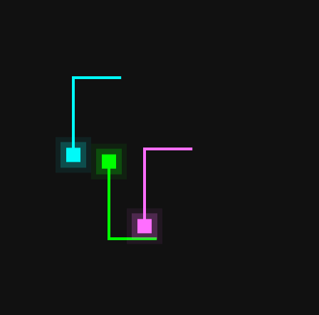
<style> * { margin: 0; padding: 0; box-sizing: border-box; } body { display: flex; justify-content: center; align-items: center; min-height: 100vh; background: #111; } .container { position: relative; width: 100%; display: flex; justify-content: center; align-items: center; } .square { position: absolute; width: 200px; height: 200px; } .square:nth-child(2) { transform: translate(-25%, -25%) rotateX(180deg); filter: hue-rotate(60deg); } .square:nth-child(3) { transform: translate(25%, 25%) rotateX(180deg); filter: hue-rotate(180deg); } .square::before { content: ''; position: absolute; width: 20px; height: 20px; background: #0f0; box-shadow: 0 0 0 8px #0f03, 0 0 0 15px #0f01; animation: animateSquare 4s linear infinite; } @keyframes animateSquare { 0% { transform: translate(2px, 2px); } 25% { transform: translate(178px, 2px); } 50% { transform: translate(178px, 178px); } 75% { transform: translate(2px, 178px); } 100% { transform: translate(2px, 2px); } } .square span { position: absolute; inset: 10px; /*未知*/ overflow: hidden; transform: rotate(calc(90deg * var(--i))); } .square span::before { content: ''; position: absolute; width: 100%; height: 4px; background: #0f0; transform: translateX(-100%); animation: animate 4s linear infinite; animation-delay: calc(1s * var(--i)); } @keyframes animate { 0% { transform: translateX(-100%); } 50%,100% { transform: translateX(100%); } } </style> <body> <div class="container"> <div class="square"> <span style="--i:0;"></span> <span style="--i:1;"></span> <span style="--i:2;"></span> <span style="--i:3;"></span> </div> <div class="square"> <span style="--i:0;"></span> <span style="--i:1;"></span> <span style="--i:2;"></span> <span style="--i:3;"></span> </div> <div class="square"> <span style="--i:0;"></span> <span style="--i:1;"></span> <span style="--i:2;"></span> <span style="--i:3;"></span> </div> </div> </body> -
文本下划线小案例
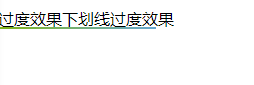
<style> span{ cursor: pointer; background: linear-gradient(to right, #82b703, #67a7d1) no-repeat right bottom; background-size: 0 2px; transition: background-size .6s; } span:hover{ background-position-x: left; background-size: 100% 2px; } </style> <body> <span>线过度效果下划线过度效果</span> </body> -
六边形布局

<style> *{ margin: 0; padding: 0; } :root{ --n: 9; --size: calc(100vw / var(--n)); } html{ overflow: hidden; } .line{ display: flex; margin-top: calc(var(--size) / -6); } .line:nth-child(even){ transform: translateX(calc(var(--size) / -2)); } .item{ background: #1ebd91; flex-shrink: 0; width: var(--size); height: var(--size); clip-path: polygon(50% 0%, 95% 25%, 95% 75%, 50% 100%, 5% 75%, 5% 25%); } </style> <body> <div class="container"> <div class="line"> <div class="item"></div> <div class="item"></div> <div class="item"></div> <div class="item"></div> <div class="item"></div> <div class="item"></div> <div class="item"></div> <div class="item"></div> <div class="item"></div> <div class="item"></div> </div> <div class="line"> <div class="item"></div> <div class="item"></div> <div class="item"></div> <div class="item"></div> <div class="item"></div> <div class="item"></div> <div class="item"></div> <div class="item"></div> <div class="item"></div> <div class="item"></div> </div> <div class="line"> <div class="item"></div> <div class="item"></div> <div class="item"></div> <div class="item"></div> <div class="item"></div> <div class="item"></div> <div class="item"></div> <div class="item"></div> <div class="item"></div> <div class="item"></div> </div> </div> </body> -
输入框特性
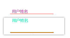
<style> .form-item{ position: relative; display: inline-block; } .form-item input { border: none; outline: none; border-bottom: 1px solid red; } .form-item input:focus~ .bar{ width: 100%; } .form-item label { position: absolute; left: .5rem; color: #bd26a7; transition: .6s ease; } .form-item input:valid~label, .form-item input:focus~label { color: #0ef8bb; transform: translateY(-40px); } .form-item .bar { position: absolute; width: 0; height: 2px; bottom: 0; left: 50%; transform: translate( -50%, -50%); background-color: #aaaa11; transition: .4s ease; } </style> <body> <div class="form-item"> <input id="username" required type="text"> <span class="bar"></span> <label for="username">用户姓名</label> </div> </body> -
字体流彩
  background-image: -webkit-linear-gradient(left, #3498db, #f47920 10%, #d71345 20%, #f7acbc 30%, #ffd400 40%,   #3498db 50%, #f47920 60%, #d71345 70%, #f7acbc 80%, #ffd400 90%, #3498db);
  color: transparent; /*文字填充色为透明*/
  -webkit-text-fill-color: transparent;
  -webkit-background-clip: text;     /*背景剪裁为文字,只将文字显示为背景*/
  background-size: 200% 100%;      /*背景图片向水平方向扩大一倍,这样background-position才有移动与变化的空间*/
  /* 动画 */
  animation: masked-animation 4s infinite linear;

  @keyframes masked-animation {
    0% {
      background-position: 0 0;  /*background-position 属性设置背景图像的起始位置。*/
    }
    100% {
      background-position: -100% 0;
    }
HTML + CSS + JavaScular
-
可拖动滑块选项卡
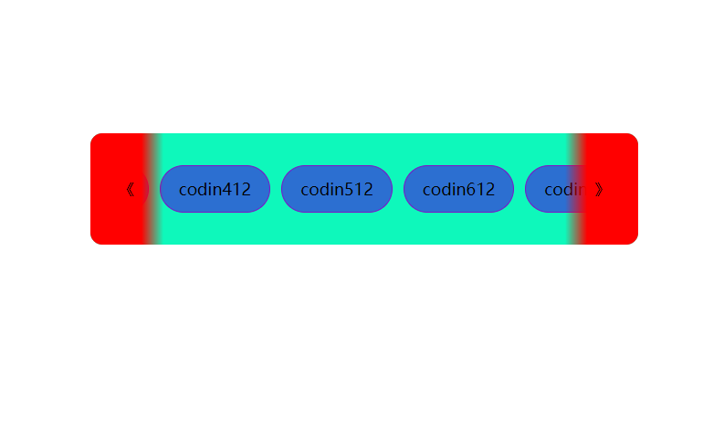
<style> * { margin: 0; padding: 0; box-sizing: border-box; } body { display: flex; justify-content: center; align-items: center; height: 100vh; } .wrapper { background: #0ef8bb; padding: 35px; width: 600px; /*用于控制长度*/ border-radius: 13px; overflow: hidden; position: relative; } .wrapper .icon { position: absolute; top: 0; height: 100%; width: 80px; display: flex; justify-content: center; align-items: center; } .icon:first-child { left: 0; display: none; background: linear-gradient(90deg, red 70%, transparent); } .icon:last-child { right: 0; background: linear-gradient(-90deg, red 70%, transparent); } .icon:hover { background: #7aff04; } .wrapper .tabs-box { display: flex; list-style: none; gap: 12px; /*网格布局的简写*/ scroll-behavior: smooth; /*事件滚动条的平滑过渡*/ overflow-x: hidden; } .tabs-box.dragging { scroll-behavior: auto; cursor: grab; } .tabs-box .tab { cursor: pointer; /*小手*/ font-size: 18px; white-space: nowrap; background: #2c6fd1; padding: 13px 20px; border-radius: 30px; border: 1px solid #7c13c7; } .tabs-box.dragging .tab { user-select: none; pointer-events: none; } .tabs-box .tab.active { color: #fff; background: #eed00f; border-color: transparent; } </style> <body> <div class="wrapper"> <div class="icon" id="left">《</div> <ul class="tabs-box"> <li class="tab">codin112</li> <li class="tab active">codin212</li> <li class="tab">codin312</li> <li class="tab">codin412</li> <li class="tab">codin512</li> <li class="tab">codin612</li> <li class="tab">codin712</li> <li class="tab">codin812</li> <li class="tab">codin912</li> <li class="tab">codin1012</li> </ul> <div class="icon" id="right">》</div> </div> </body> <script> const tabsBox = document.querySelector('.tabs-box') const arrowIcons = document.querySelectorAll('.icon') const allTabs = document.querySelectorAll('.tab') let isDragging = false; const handleIcons = () => { let scrollVla = Math.round(tabsBox.scrollLeft) let maxScrollableWith = tabsBox.scrollWidth - tabsBox.clientWidth arrowIcons[0].style.display = scrollVla > 0 ? 'flex' : 'none' arrowIcons[1].style.display = maxScrollableWith > scrollVla ? 'flex' : 'none' // .parentElement 返回父元素 } tabsBox.addEventListener('mousemove', (e) => { if (!isDragging) return; tabsBox.classList.add('dragging'); tabsBox.scrollLeft -= e.movementX; handleIcons() }) tabsBox.addEventListener('mousedown', () => isDragging = true) document.addEventListener('mouseup', () => { isDragging = false; tabsBox.classList.remove('dragging'); }) arrowIcons.forEach(icon => { icon.addEventListener('click', () => { tabsBox.scrollLeft += icon.id === 'left' ? -360 : 360; setTimeout(() => handleIcons(), 50) }) }) allTabs.forEach(tab => { tab.addEventListener('click', () => { tabsBox.querySelector('.active').classList.remove('active') tab.classList.add('active') console.log(1111) }) }) </script> -
轨道小滑块
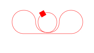
<style> .move { position: absolute; top: -9px; left: -9px; width: 18px; height: 18px; background: red; } .box { position: relative; width: 256px; margin: 70px auto; } svg{ color: red; } </style> </head> <body> <div class="box"> <div class="move"></div> <svg id="testSvg" width="256" height="112" viewBox="0 0 256 112"> <path class="path" fill="none" stroke="currentColor" stroke-width="1" d="M8,56 C8,33 25,16 48,16 C70,16 88,33 88,56 C88,78 105,92 128,92 C150,92 160,72 160,56 C160,40 148,24 128,24 C108,24 96,40 96,56 C96,72 105,92 128,92 C154,93 168,78 168,56 C168,33.90861 185,16 208,16 C230,16 248,33.90861 248,56 C248,78 230,96 208,96 L48,96 C25,96 8,78 8,56 Z"></path> </svg> </div> </body> <script> const chunk = document.querySelector('.move') const path = document.querySelector('.path') const config = { direction: 6000, // 循环速度 loop: true // 是否循环 } let progress = 0; const timers = Math.ceil(config.direction / 17); // 执行次数 // 获取当前svg的path的点信息 function point (offset) { const temp = progress + offset >= 1 ? progress + offset : 0 return path.getPointAtLength(temp) } function toDoMove () { const nowPlace = point(0); // 当前位置数据 const prevPlace = point(-1); // 上一个位置 const nextPlace = point(1); // 下一个位置 // 通过上一个点和下一个点计算平静中心点的弧度 const pointRadians = { x: nowPlace.x, y: nowPlace.y, angle: Math.atan2(nextPlace.y - prevPlace.y, nextPlace.x - prevPlace.x) * 180 / Math.PI } // 运行完一个周期,进行重置 if (config.loop && progress >= path.getTotalLength()) { progress = 0 } progress += Math.ceil(path.getTotalLength()) / timers; // 设置方块的位置和旋转角度 chunk.style.transform = `translateX(${pointRadians.x}px)translateY(${pointRadians.y}px)rotate(${pointRadians.angle}deg)` requestAnimationFrame(toDoMove) } requestAnimationFrame(toDoMove) </script> -
滑块校验
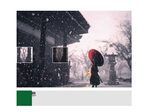
<style> *{ margin: 0; padding: 0; } .box{ position: relative; width: 375px; margin: 100px auto; } /*容器准备*/ .check{ width: 100%; height: 250px; background-size: 100% 100%; background-image: url("./picture/阁楼.jpg"); } /*滑块缺失部分 - 置灰处准备*/ .check-content { position: absolute; top: 100px; left: 280px; width: 50px; height: 50px; border: 1px solid #fff; background: rgba(0,0,0,0.5); } /*滑块 - 缺失块高亮处准备*/ .check-block{ width: 50px; height: 50px; border: 1px solid #fff; background-image: inherit; background-repeat: inherit; background-size: 375px 250px; background-position: -280px -100px; position: absolute; top: 100px; left: 10px; } /*底部划区准备*/ .drag { width: 100%; height: 50px; background-color: #e3e3e3; margin-top: 10px; position: relative; } /*底部滑块准备*/ .drag-block{ width: 50px; height: 50px; z-index: 10; position: absolute; top: 0; left: 0; background-color: #0a6632; } </style> <body> <div class="box"> <div class="check"> <div class="check-content"></div> <div class="check-block"></div> </div> <div class="drag"> <div class="drag-block"></div> <div class="drag-tips">提示信息</div> </div> </div> </body> <script> // 获取dom const drag = document.querySelector('.drag') const dragBlock = document.querySelector('.drag-block') const content = document.querySelector('.check-content') const check = document.querySelector('.check-block') // 随机生成一个x,y坐标,用于设置校验块位置 let x = parseInt(Math.random() * 325); let y = parseInt(Math.random() * 200); // 定义运动状态 let animating = false; // 存储鼠标按下位置 let startX = 0; // 存储移动的位置 let offsetX = 0; // 初始滑块位置,保证滑块和缺失位置一致 content.style.cssText = `left:${x}px; top: ${y}px` check.style.cssText = `background-position: -${x}px -${y}px; top: ${y}px` drag.addEventListener('mousemove', e => { if(!animating) return; // 判断运行状态 offsetX = e.pageX - startX; // 计算移动位置 if (offsetX < 0 || offsetX > 350) return; // 判断移动距离是否正确 dragBlock.style.transform = `translateX(${offsetX}px)` // 修改可移动盒子的x轴坐标 check.style.left = `${offsetX}px`; // 设置被验证滑块距离左边的值 }) // 鼠标按下事件 dragBlock.addEventListener('mousedown', e => { animating = true; startX = e.pageX; }); // 鼠标弹起事件 document.addEventListener('mouseup', e => { animating = false; if (offsetX >= x-2 && offsetX <= offsetX + 2) { alert('成功') } else { dragBlock.style.transform = `translateX(0px)` check.style.left = `0px` } }) </script> -
3D轮播图
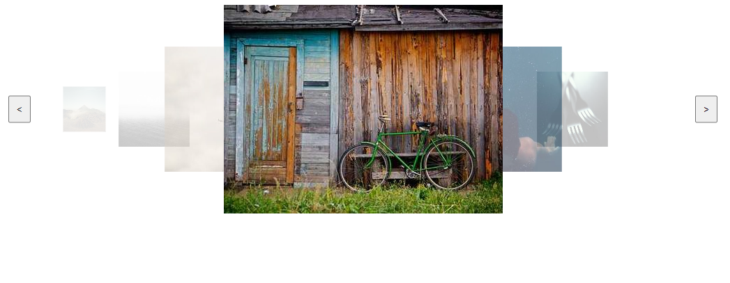
<style> html{ overflow: hidden; } .carousel{ width: 100%; height: 300px; position: relative; } .carousel-list { position: relative; left: 50%; width: 400px; transform: translateX(-50%); } .carousel-item { position: absolute; transition: all .5s; } .indicator{ position: absolute; top: 50%; transform: translateY(-50%); padding: 10px; } .prev { left: 10px; } .next { right: 10px; } </style> <body> <div class="carousel"> <div class="carousel-list"> <img class="carousel-item" src="https://picsum.photos/400/300?1"/> <img class="carousel-item" src="https://picsum.photos/400/300?2"/> <img class="carousel-item" src="https://picsum.photos/400/300?3"/> <img class="carousel-item" src="https://picsum.photos/400/300?4"/> <img class="carousel-item" src="https://picsum.photos/400/300?5"/> <img class="carousel-item" src="https://picsum.photos/400/300?6"/> </div> <button class="indicator prev"><</button> <button class="indicator next">></button> </div> </body> <script> const items = document.querySelectorAll('.carousel-item'); // 获取所有图片元素 let index = 3; // 当前选择的轮播图 // 用于处理布局的函数 function layout() { const xOffsetStep = 100; // 每两张图片间的偏移量 const count = items.length; // 轮播图总数量 const scaleStep = 0.6; // 缩放递减率 const opacityStep = 0.5; // 透明度递减倍率 for (let i = 0; i < items.length; i++) { const item = items[i]; const sign = Math.sign(i - index); // 偏移量 // 每张图片和选中图片的偏移量 let xOffset = (i - index) * xOffsetStep; if (i !== index) { xOffset = xOffset + 100 * sign; } // 旋转 const rotateY = i === index ? 0 : 45 * - sign; // 缩放倍率 const scale = scaleStep ** Math.abs(i - index); item.style.transform = `translateX(${xOffset}px) scale(${scale}) rotateY (${rotateY}deg)`; // 透明度 const opacity = opacityStep ** Math.abs(i - index); item.style.opacity = opacity; // 层级 item.style.zIndex = count - Math.abs(index - i); } } layout(); // 初始化布局 // 获取点击按钮 const prev = document.querySelector('.prev'); const next = document.querySelector('.next'); // 将按钮绑定事件 prev.addEventListener('click', () => { index--; if (index < 0) index = 0; layout(); }); next.addEventListener('click', () => { index++; if (index > items.length - 1) index = items.length - 1; layout(); }); // 将所有元素注册点击事件 items.forEach((item,i) => { item.addEventListener('click', () => { index = i; layout(); }) }) </script> -
tab导航栏
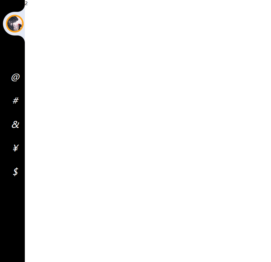
  <style>
  * {
  margin: 0;
  padding: 0;
  box-sizing: border-box;
  list-style: none;
  text-decoration: none;
  }
  body {
  background-color: white;
  }
  /* 菜单栏 */
  .content-nav{
  position: fixed;
  width: 5.25rem;
  height: 100vh;
  z-index: 1;
  transition: width .5s;
  padding-left: .625rem;
  overflow: hidden;
  background-color: #000;
  }
  .content-nav:hover{
  width: 18.75rem;
  }
  .content-nav:hover + .content-main {
  padding-left: 18.75rem;
  }
  .content-nav ul {
  position: relative;
  height: 100%;
  }
  .content-nav ul li {
  position: relative;
  padding: 5px;
  }
  .content-nav ul li:hover a .icon,
  .content-nav ul li:hover a .text {
  color: #ffa117;
  }
  .content-nav ul li a {
  position: relative;
  display: flex;
  white-space: nowrap;
  }
  .imageBox{
  position: relative;
  width: 3.125rem;
  height: 3.125rem;
  border-radius: 50%;
  overflow: hidden;
  }
  .imageBox img {
  width: 100%;
  height: 100%;
  object-fit: cover;
  }
  .active{
  background-color: #e4e9f5;
  border-top-left-radius: 3.25rem;
  border-bottom-left-radius: 3.25rem;
  }
  .active::before{
  content: '';
  position: absolute;
  top: -1.875rem;
  right: 0;
  width: 1.875rem;
  height: 1.875rem;
  border-bottom-right-radius: 1.5625rem;
  box-shadow: 5px 5px 0 5px #e4e9f5;
  background: transparent;
  }
  .active::after {
  content: '';
  position: absolute;
  bottom: -1.875rem;
  right: 0;
  width: 1.875rem;
  height: 1.875rem;
  border-top-right-radius: 1.5625rem;
  box-shadow: 5px -5px 0 5px #e4e9f5;
  background: transparent;
  }
  .active a .icon::before {
  content: '';
  position: absolute;
  inset: 5px;
  width: 3.75rem;
  background-color: #000;
  border-radius: 50%;
  transition: .5s;
  border: .5rem solid #ffa117;
  box-sizing: border-box;
  }
  #logo {
  margin: 2.5rem 0 6.25rem 0;
  }
  .icon {
  position: relative;
  display: flex;
  justify-content: center;
  align-items: center;
  min-width: 3.75rem;
  padding-left: .625rem;
  height: 4.375rem;
  color: #333;
  transition: .5s;
  color: white;
  }
  .icon i {
  font-size: 1.875rem;
  z-index: 1;
  }
  .text {
  position: relative;
  height: 4.375rem;
  display: flex;
  align-items: center;
  font-size: 1.25rem;
  color: #ffad32c1;
  padding-left: .9375rem;
  text-transform: uppercase;
  letter-spacing: 2px;
  transition: .5s;
  }

  /* 内容 */
  .content-main{
  position: relative;
  width: 100%;
  height: 100vh;
  padding-left: 5.25rem;
  transition: padding .5s;
  overflow: hidden;
  }
  .content-main > article {
  height: 100%;
  width: 100%;
  transition: .5s;
  }

  </style>
  <body>
  <nav class="content-nav">
      <ul>
      <li class="active" id="logo">
          <a href="#home">
          <div class="icon">
              <div class="imageBox">
              <img src="./picture//阁楼.jpg" alt="">
              </div>
          </div>
          <span class="text">标题</span>
          </a>
      </li>
      <li>
          <a href="#one">
          <div class="icon">
              <i>@</i>
          </div>
          <span class="text">滴滴</span>
          </a>
      </li>
      <li>
          <a href="#two">
          <div class="icon">
              <i>#</i>
          </div>
          <span class="text">滴滴</span>
          </a>
      </li>
      <li>
          <a href="#three">
          <div class="icon">
              <i>&</i>
          </div>
          <span class="text">哒哒</span>
          </a>
      </li>
      <li>
          <a href="#four">
          <div class="icon">
              <i>¥</i>
          </div>
          <span class="text">哒哒1</span>
          </a>
      </li>
      <li>
          <a href="#five">
          <div class="icon">
              <i>$</i>
          </div>
          <span class="text">哒哒2</span>
          </a>
      </li>
      </ul>
  </nav>
  <!-- 内容区 -->
  <main class="content-main">
      <article id="#home">100</article>
      <article id="one">1</article>
      <article id="two">2</article>
      <article id="three">3</article>
      <article id="four">4</article>
      <article id="five">5</article>
  </main>
  </body>
  <script>
  const nav = document.querySelectorAll('.content-nav ul li');
  function activeLink() {
  nav.forEach(item => item.classList.remove('active')); // 可以用一个变量将上一个节点存起来,当点击下一个节点时,先将上一个节点上的东西删除,然后再给当前节点加类名,最后将当前节点存起来
  this.classList.add('active');
  }
  nav.forEach(item => item.addEventListener('click', activeLink)); // 可以用事件委托来做
  </script>
功能性代码
-
文件上传
-
node + 前端
-
node
const express = require('express'); const bodyParset = require('body-parser'); const multer = require('multer'); const { writeFileSync } = require('fs'); const { resolve } = require('path'); const app = express() app.use(bodyParset.json()); const storage = multer.diskStorage({ destination(req, file, callback) { callback(null, 'uploads/') }, filename(req, file, callback) { const ext = file.originalname.split('.')[1]; callback(null, `multer_${Date.now()}.${ext}`) } }) const upload = multer({ storage }) // 跨域解决 app.all('*', (req, res, next) => { res.header('Access-Control-Allow-Origin', '*'); // 所有的源都让通过 res.header('Access-Control-Allow-Methods', 'GET,POST'); // 请求方式 res.header('Access-Control-Allow-Headers', 'Content-Type, x-ext'); // 请求方式 next(); }) // 文件上传 app.post('/file', upload.single('file'), (req, res) => { if(req.file) { res.send('上传成功'); } else { res.send('error') } }) // base64类型上传 app.post('/base64', (req, res) => { const { file, ext } = req.body; const binaryData = Buffer.from(file, 'base64'); // 解析base64 格式数据为二进制数据 try { writeFileSync(resolve(__dirname, `uploads/base64_${Date.now()}.${ext}`), binaryData, 'binary') } catch (e) { res.send(e); } res.send('上传成功') }) // 二进制 app.post('/binary', (req, res) => { const ext = req.headers['x-ext']; const buffers = []; req.on('data', chunk => { buffers.push(chunk); }).on('end', () => { const binaryData = Buffer.concat(buffers); try { writeFileSync(resolve(__dirname, `uploads/binary_${Date.now()}.${ext}`), binaryData, 'binary') } catch (e) { res.send(e); } res.send('上传成功') }) }) // 启动服务 app.listen(8080, () => console.log('启动服务')) -
前端页面
<body>
  <div>
    <input type="file" name="file" id="file">
    <button id="uploadBtn">文件上传</button>
  </div>
</body>
<script>
import axios from 'axios'; // 引入网络交互

// 获取元素
const oFile = document.querySelector('#file');
const oUploadBtn = document.querySelector('#uploadBtn');

// 绑定事件
oUploadBtn.addEventListener('click', () => {
  const file = oFile.files[0];
  if(!file) return;

// 上传方式一: multipart/form-data
//   const formData = new FormData();
//   formData.append('file', file);
//   axios.post('http://localhost:8080/file', formData, {
//     headers: {
//         'Content-Type': 'multipart/form-data'
//     }
//   }).then(val => {
//     console.log('响应', val);
//   })

// 上传方式二: base64
// const reader = new FileReader();
// const ext = file.name.split('.')[1];
// reader.onload = (e) => { // 读取完文件后执行
//     const uint8Array = new Uint8Array(e.target.result);
//     const str = uint8Array.reduce((prev, byte) =>`${prev}${String.fromCharCode(byte)}`, ''); // 拼接成字符串
//     const base64Data = btoa(str); // 将字符串转换为base64
//     axios.post('http://localhost:8080/base64', {
//         ext,
//         file: base64Data
//     }).then(val => {
//         console.log(val);
//     })
// }
// reader.readAsArrayBuffer(file); // 读取文件

// 上传方式三: 二进制上传
const reader = new FileReader();
const ext = file.name.split('.')[1];
reader.onload = (e) => { // 读取完文件后执行
    const binaryData = e.target.result;

    axios.post('http://localhost:8080/binary', binaryData, {
        headers: {
            'Content-Type': 'application/octet-stream',
            'x-ext': ext
        }
    }).then(val => {
        console.log(val);
    })
}
reader.readAsArrayBuffer(file); // 读取文件
}, false)
</script>
-
-
大文件切片上传
<body>
<input type="file">
</body>
<script>
    const input = document.querySelector('input');
    input.addEventListener('change', function (e) {
        const file = e.target.files[0];
        const chunkSize = 10 * 1024; // 一个切片的体积
        const totalChunks = Math.ceil(file.size / chunkSize); // 获取切片数量
        for (let i = 0; i < totalChunks; i++) {
            const start = i * chunkSize;
            const end = Math.min(start + chunkSize, file.size);
            const chunk = file.slice(start, end); // 获取数据块
            console.log('切片数量', chunk); // 上传
        }
    })
</script>
-
-
图片压缩
  <body>
  <input type="file" onchange="fileCompress()" >
  <img id="image1">
  <img id="image2">
  </body>
  <script>
  const images = document.getElementById('image1')
  const imagesOld = document.getElementById('image2')
  // 压缩函数
  function compress(base64, imageType) {
      const canvas = document.createElement('canvas');
      const img = new Image();
      img.src = base64;
      img.onload = () => {
      canvas.width = img.width;
      canvas.height = img.height;
      const ctx = canvas.getContext('2d');
      ctx.drawImage(img, 0,0,img.width, img.height)
      imagesOld.width = img.width;
      imagesOld.height = img.height
      imagesOld.src = base64
      images.width = img.width;
      images.height = img.height;
      images.src = canvas.toDataURL(imageType, .1) // 压缩后的base64
      }
  }
  function fileCompress() {
      const file = document.querySelector('input[type=file]').files[0]
      console.log(file)
      const readObj = new FileReader();
      readObj.readAsDataURL(file);
      readObj.onload = () => {
      compress(readObj.result, file.type)
      }
  }
  </script>

 浙公网安备 33010602011771号