IE 11 flex布局兼容性问题 ---- 不支持min-height 和flex:1
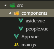
由于最近项目要嵌入其它平台,所以要做IE11 的兼容,那就用IE11打开网页看一看,一看吓一跳,页脚直接到了页眉的下面,并把主要内容覆盖了,也就是stick footer 布局失效了,我写了一个简易的代码来摸拟这种情况,这是一个vue 的项目,页面的整体布局都放到了app.vue中,页面三个部分构成: 页眉,中间内容,页脚。页眉和页脚都是固定的,中间部分由内容撑开,典型的stick footer 布局。中间部分,左右两列,新建了两个组件,在component 文件夹下。项目目录结构如下
app.vue 代码如下:
<template>
    <div class="wrapper">
      <!-- 页眉 -->
      <header>Header</header>
      <!-- 中间内容 -->
      <section class="content-wrapper">
        <side-section></side-section>
        <people class="article"/>
      </section>
      <!-- 页脚 -->
      <footer>footer</footer>
    </div>
</template>

<script>
import People from "./components/people";
import SideSection from "./components/aside";

export default {
  components: {
    People,
    SideSection
  }
};
</script>

<style>
body {
  margin: 0;
  padding: 0;
}
header {
  height: 60px;
  line-height: 60px;
  text-align: center;
  font-size: 20px;
  background: #192847;
}
footer {
  font-size: 30px;
  height: 60px;
  line-height: 60px;
  text-align: center;
  background: #151923;
}
.wrapper {
  display: flex;
  flex-direction: column;
  min-height: 100vh;
}
.content-wrapper {
  display: flex;
  flex: 1;
}
</style>
aside.vue 代码如下
<template>
  <div class="aside">
    aside
  </div>
</template>
<style scoped>
  .aside {
    width: 200px;
    height: 600px;
    background-color: #152b59;
  }
</style>
people 代码如下
<template>
  <div class="relation-people">
    dddd
  </div>
</template>

<style scoped>
.relation-people {
  background: red;
  height: 300px;
 flex:1;
}
</style>
整个项目启动运行就是如下结果
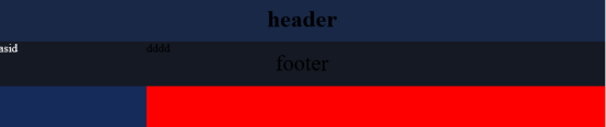
肯定是flex 布局失效了,那就是wrapper类的样式设计有问题。再看一下wrapper类,基本确定是min-height 的问题。查了一下flex min-height,找到原因,是min-height 属性在flex 容器上是无效的,同时也找到了一种解决方式是把min-height的flex 容器,再包含到一个flex 容器中。那我们就把所有的html代码包含到一个div 元素中,然后让这个元素flex 布局
  <div class="app">
    <div class="wrapper">
      <!-- 页眉 -->
      <header>Header</header>
      <!-- 中间内容 -->
      <section class="content-wrapper">
        <side-section></side-section>
        <people class="article"/>
      </section>
      <!-- 页脚 -->
      <footer>footer</footer>
    </div>

  </div>
然后的style 中增加.app 中,display:flex;
.app {
  display: flex;
}
页脚是是在下面了,但整个页面缩短了。
.wrapper {
  display: flex;
  flex-direction: column;
  min-height: 100vh;
  width: 100%; /* 增加宽度100% */
}
在IE11 下,有的元素设置flex布局后,它的宽度有时会变短,需要增加width: 100% 属性,我也不知道什么原因。这时滚动鼠标向下拉,又发现了一个问题,页脚只是位于当前窗口的下面,而不是在整个内容的下面,

看一下content-wrapper的样式,应该是flex: 1的问题,在ie11 下 flex: 1 解析为1 1 0, 而不是其他浏览器的1 1 auto, 所以这时还要对flex: 1进行修改,使用flex-grow: 1
.content-wrapper {
  display: flex;
  flex-grow: 1; /* flex:1 改变成flex-grow: 1 */
}
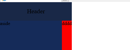
终于没有问题了

 浙公网安备 33010602011771号