
Bootstrap_表单_表单控件
一、输入框input
单行输入框,常见的文本输入框,也就是input的type属性值为text。
在Bootstrap中使用input时也必须添加type类型,如果没有指定type类型,将无法得到正确的样式,因为Bootstrap框架都是通过input[type=“?”]
(其中?号代表type类型,比如说text类型,对应的是input[type=“text”])的形式来定义样式的。
为了让控件在各种表单风格中样式不出错,需要添加类名“.form-control”。
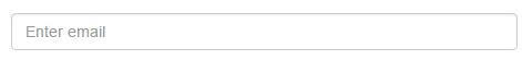
<form role="form">
<div class="form-group">
<input type="email" class="form-control" placeholder="Enter email">
</div>
</form>
二、下拉选择框select
Bootstrap框架中的下拉选择框使用和原始的一致,多行选择设置multiple属性的值为multiple。
<form role="form">
<div class="form-group">
  <select class="form-control">
    <option>1</option>
    <option>2</option>
    <option>3</option>
    <option>4</option>
    <option>5</option>
  </select>
  </div>
  <div class="form-group">
  <select multiple class="form-control">
    <option>1</option>
    <option>2</option>
    <option>3</option>
    <option>4</option>
    <option>5</option>
  </select>
</div>
</form>

三、文本域textarea
文本域和原始使用方法一样,设置rows可定义其高度,设置cols可以设置其宽度。
但如果textarea元素中添加了类名“.form-control”类名,则无需设置cols属性。
因为Bootstrap框架中的“form-control”样式的表单控件宽度为100%或auto。
  <form role="form">
    <div class="form-group">
      <textarea class="form-control" rows="3"></textarea>
    </div>
  </form>

四、复选框checkbox和单选择按钮radio
1、不管是checkbox还是radio都使用label包起来了
2、checkbox连同label标签放置在一个名为“.checkbox”的容器内
3、radio连同label标签放置在一个名为“.radio”的容器内
<form role="form">
<div class="checkbox">
<label>
<input type="checkbox" value="">
记住密码
</label>
</div>
<div class="radio">
<label>
<input type="radio" name="optionsRadios" id="optionsRadios1" value="love" checked>
喜欢
</label>
</div>
<div class="radio">
<label>
<input type="radio" name="optionsRadios" id="optionsRadios2" value="hate">
不喜欢
</label>
</div>
</form>

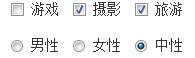
五、复选框和单选按钮水平排列
1、如果checkbox需要水平排列,只需要在label标签上添加类名“.checkbox-inline”
2、如果radio需要水平排列,只需要在label标签上添加类名“.radio-inline”
<form role="form">
  <div class="form-group">
    <label class="checkbox-inline">
      <input type="checkbox"  value="option1">游戏
    </label>
    <label class="checkbox-inline">
      <input type="checkbox"  value="option2">摄影
    </label>
    <label class="checkbox-inline">
    <input type="checkbox"  value="option3">旅游
    </label>
  </div>
  <div class="form-group">
    <label class="radio-inline">
      <input type="radio"  value="option1" name="sex">男性
    </label>
    <label class="radio-inline">
      <input type="radio"  value="option2" name="sex">女性
    </label>
    <label class="radio-inline">
      <input type="radio"  value="option3" name="sex">中性
    </label>
  </div>
</form>
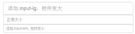
六、表单控件大小
Bootstrap框架还提供了两个不同的类名,用来控制表单控件的高度。这两个类名是:
1、input-sm:让控件比正常大小更小
2、input-lg:让控件比正常大小更大
这两个类适用于表单中的input,textarea和select控件。
<input class="form-control input-lg" type="text" placeholder="添加.input-lg,控件变大">
<input class="form-control" type="text" placeholder="正常大小">
<input class="form-control input-sm" type="text" placeholder="添加.input-sm,控件变小">

 浙公网安备 33010602011771号