CSS 实现:图片+文字的布局(综合)
☊【实现要求】:图片+文字+居中

√【实现】:
① img + 文字
普通布局
.demo2-1 {
// 文字可用demo1中的方案一布局;
line-height: $px;
text-align: center;
img {
width: $px; // 设置图片宽和高
height: $px;
position:relative;
top: $px; // 相对于父元素,text-align: center 只会把文字居中,图片还是置顶
right: $px; // 相对于文字靠左偏移(其实relative是相对于自身本来的位置进行定位)
}
}
② span + 文字
标题2222
flex 布局
*align-items 会把图片也垂直居中,而 line-height 只会把文字居中
.demo2-2 {
// 文字可用demo1中的方案二布局;
display: flex;
display: -webkit-flex;
justify-content: center;
align-items: center;
span {
display: inline-block; // 使span为块级元素,才可以设置宽和高
width: $px;
height: $px;
background: url();
background-size: 100% 100%; // 图片填充整个span,同 background-size: cover;
margin-right: 5px; // 距右边文字距离
}
}
③ 文字包含在 span 中
标题3333
普通布局
.demo2-3 {
// 文字可用demo1中的方案一布局;
line-height: $px;
text-align: center;
span {
display: inline-block; // 设置为块级元素
background: url() no-repeat; // no-repeat: 图片全部填充
background-size: 30px 30px; // 设置背景图片的大小
background-position: center left; // 第一个参数垂直布局,第二个参数水平布局
padding-left: 35px; // 距最左边距离,而非距图片距离
}
}
☋【实现要求】:左右箭头+文字

√【实现】:
标题3333
箭头可以用 ::after 和 ::before 伪类实现
相对于父元素绝对定位
.demo2-4 {
// 文字可用demo1中的方案一布局;
text-align: center;
line-height: $px;
position: relative; // 定位父元素
&:after {
content: ""; // 内容为空
display: inline-block; // 设置为块级元素,从而设定宽和高
width: $px;
height: $px;
border-right: 1px solid #00f;
border-bottom: 1px solid #00f;
transform: rotate(-45deg);
position: absolute; // 相对父元素绝对定位
top: $px;
right: $px;
}
}
☊【实现要求】:左边多行文字(宽度自适应),右边图标(固定宽度)
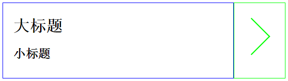
大标题
小标题
√【实现】:
(移动端,flex 布局):
.demo4-1 {
display: flex;
display: -webkit-flex;
.col-left { // 宽度自适应
flex: 1;
-webkit-flex: 1;
}
.col-right {
width: 100px; // 设定宽度
position: relative; // 定位父元素
&:after {
position: absolute; // 相对于父元素绝对定位
content: "";
display: inline-block;
width: 50px;
height: 50px;
border-right: 2px solid #0f0;
border-bottom: 2px solid #0f0;
transform: rotate(-45deg);
top: 40px;
right: 40px;
}
}
}
☋【实现要求】:左边图片(宽度固定),中间多行文字(宽度自适应),右边图标(宽度固定)
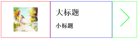
大标题
小标题
√【实现】:
(移动端,flex 布局):
.demo4-2 {
display: flex;
display: -webkit-flex;
.col-left {
width: 200px; // 设定宽度
background: url(../img/logo.png) no-repeat;
background-size: 100px 100px;
background-position: center center; // 定位图片位置
}
.col-middle {
flex: 1;
-webkit-flex: 1;
}
.col-right {
width: 100px; // 设定宽度
position: relative; // 定位父元素
&:after {
position: absolute; // 相对于父元素绝对定位
content: "";
display: inline-block;
width: 50px;
height: 50px;
border-right: 2px solid #0f0;
border-bottom: 2px solid #0f0;
transform: rotate(-45deg);
top: 40px;
right: 40px;
}
}
}


 浙公网安备 33010602011771号