CSS 实现:checkbox
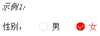
男
女
css实现:
.wrap {
label {
display: inline-block;
width: 50px;
text-align: right;
margin-right: 15px;
}
}
.cb-wrap {
display: inline-block; // 将div元素设置成行内元素,不然尽管设置的宽度较小,还是会占据一行
width: 50px;
height: 30px;
margin-right: 15px;
line-height: 30px;
position: relative; // 设置定位
input {
opacity: 0; // 设置透明度为0
width: 100%; // 设置宽度为一个checkbox(.cb-wrap)的宽度
height: 100%;
z-index: 2; // 置于最上层
position: absolute; // 相对于.cb-wrap定位
top: 0;
left: 0;
}
// 用伪类:checked,实现checkbox选中状态时改变其它元素样式
input:checked + span { // 用“相邻兄弟选择器”,改变模拟checkbox的颜色
background: red;
}
input:checked ~ .cb-label { // 用“同级元素通用选择器”,改变字体的颜色
color: red;
}
.cb-icon { // 实现模拟checkbox
display: inline-block; // span设宽,必须得设置成块级元素!
width: 16px;
height: 16px;
border: 1px solid #ddd;
border-radius: 8px;
position: relative; // 相对于自身原来的位置定位,使其与字体对齐
top: 3px;
&:after { // 伪元素实现对勾(√)部分
content: "";
display: inline-block;
width: 9px;
height: 6px;
border-left: 1px solid #fff;
border-bottom: 1px solid #fff;
transform: rotate(-45deg);
position: absolute;
top: 3px;
right: 3px;
}
}
}
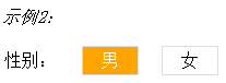
(示例2相对实例1较为简单,不需要用为元素实现模拟的checkbox,也少了一个span元素,区别在于cb-icon的实现不同)
css实现:
.cb-wrap {
display: inline-block;
width: 50px;
height: 30px;
margin-right: 15px;
line-height: 30px;
position: relative;
input {
opacity: 0;
width: 100%;
height: 100%;
z-index: 2;
position: absolute;
top: 0;
left: 0;
}
input:checked + span {
background: orange;
color: #fff;
}
.cb-icon {
display: inline-block;
width: 50px;
height: 25px;
border: 1px solid #ddd;
text-align: center;
line-height: 25px;
}
}


 浙公网安备 33010602011771号