2025年前端开发,流框架的对比及最佳实践建议
在前端开发中,UI框架的选择取决于项目需求、团队技术栈和设计风格。以下是主流框架的对比及最佳实践建议:
1. 主流UI框架推荐
React生态
-
Ant Design
功能全面、设计规范统一,适合中大型企业级应用。
官网:https://ant.design/ -
Material UI (MUI)
遵循Google Material Design,提供丰富组件和自定义选项。
官网:https://mui.com/
Vue生态
-
Element UI
简洁易用,适合管理后台类项目。
官网:https://element.eleme.io/ -
Naive UI
轻量级、现代化设计,支持暗色模式。
官网:https://www.naiveui.com/
通用框架
-
Tailwind CSS
原子化CSS框架,高度自定义,适合追求个性化设计的项目。
官网:https://tailwindcss.com/ -
Bootstrap
老牌框架,兼容性强,适合快速原型开发。
官网:https://getbootstrap.com/
2. 最佳实践指南
根据项目规模选择
- 小型项目:Tailwind CSS + Font Awesome(灵活自定义)或Bootstrap(快速上手)。
- 中大型项目:Ant Design(React)或Element UI(Vue),自带完整设计体系。
性能优化
- 按需加载:使用框架提供的按需引入功能(如
babel-plugin-import)。 - 避免全局样式污染:优先使用CSS Modules或CSS-in-JS方案。
自定义主题
- 通过框架提供的变量覆盖功能(如Ant Design的
theme.config)统一设计语言。 - 示例(Tailwind自定义主题):
// tailwind.config.js
module.exports = {
  theme: {
    extend: {
      colors: {
        primary: '#165DFF',
      },
      fontFamily: {
        inter: ['Inter', 'sans-serif'],
      },
    },
  }
}
响应式设计
- 使用框架内置的栅格系统(如Ant Design的
Col组件)或Tailwind的响应式工具类。 - 示例:
<div class="md:flex md:justify-between">
  <div class="md:w-1/2">左侧内容</div>
  <div class="md:w-1/2">右侧内容</div>
</div>
无障碍支持(a11y)
- 优先选择符合WCAG标准的组件库(如MUI)。
- 添加ARIA属性和键盘导航支持。
3. 选型决策树
- 技术栈:React → Ant Design/MUI,Vue → Element UI/Naive UI。
- 设计需求:
- 标准化设计 → Ant Design/Element UI。
- 个性化设计 → Tailwind CSS + 自定义组件。
- 性能敏感场景:考虑轻量级框架(如Naive UI)或虚拟列表组件。
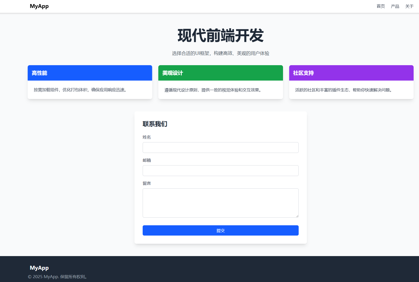
4. 示例:使用Tailwind CSS快速搭建页面
<!DOCTYPE html>
<html lang="zh-CN">
<head>
  <meta charset="UTF-8">
  <meta name="viewport" content="width=device-width, initial-scale=1.0">
  <title>Tailwind CSS 示例</title>
  <script src="https://cdn.tailwindcss.com"></script>
  <link href="https://cdn.jsdelivr.net/npm/font-awesome@4.7.0/css/font-awesome.min.css" rel="stylesheet">
  <script>
    tailwind.config = {
      theme: {
        extend: {
          colors: {
            primary: '#165DFF',
          },
        },
      }
    }
  </script>
  <style type="text/tailwindcss">
    @layer utilities {
      .content-auto {
        content-visibility: auto;
      }
    }
  </style>
</head>
<body class="bg-gray-50 font-sans">
  <!-- 导航栏 -->
  <nav class="bg-white shadow-md fixed w-full z-10">
    <div class="container mx-auto px-4 py-3 flex justify-between items-center">
      <div class="flex items-center space-x-2">
        <i class="fa fa-code text-primary text-2xl"></i>
        <span class="font-bold text-xl">MyApp</span>
      </div>
      <div class="hidden md:flex space-x-6">
        <a href="#" class="text-gray-700 hover:text-primary transition-colors">首页</a>
        <a href="#" class="text-gray-700 hover:text-primary transition-colors">产品</a>
        <a href="#" class="text-gray-700 hover:text-primary transition-colors">关于</a>
      </div>
      <button class="md:hidden text-gray-700">
        <i class="fa fa-bars text-xl"></i>
      </button>
    </div>
  </nav>

  <!-- 主内容区 -->
  <main class="container mx-auto px-4 pt-24 pb-12">
    <section class="mb-12">
      <div class="text-center mb-8">
        <h1 class="text-[clamp(2rem,5vw,3.5rem)] font-bold text-gray-800 mb-4">
          现代前端开发
        </h1>
        <p class="text-gray-600 max-w-2xl mx-auto text-lg">
          选择合适的UI框架,构建高效、美观的用户体验
        </p>
      </div>

      <!-- 卡片网格 -->
      <div class="grid grid-cols-1 md:grid-cols-3 gap-6">
        <!-- 卡片1 -->
        <div class="bg-white rounded-lg shadow-lg overflow-hidden transform hover:scale-105 transition-all duration-300">
          <div class="bg-primary p-4 text-white">
            <i class="fa fa-bolt text-2xl mb-2"></i>
            <h3 class="font-bold text-xl">高性能</h3>
          </div>
          <div class="p-6">
            <p class="text-gray-700">
              按需加载组件,优化打包体积,确保应用响应迅速。
            </p>
          </div>
        </div>

        <!-- 卡片2 -->
        <div class="bg-white rounded-lg shadow-lg overflow-hidden transform hover:scale-105 transition-all duration-300">
          <div class="bg-green-600 p-4 text-white">
            <i class="fa fa-paint-brush text-2xl mb-2"></i>
            <h3 class="font-bold text-xl">美观设计</h3>
          </div>
          <div class="p-6">
            <p class="text-gray-700">
              遵循现代设计原则,提供一致的视觉体验和交互效果。
            </p>
          </div>
        </div>

        <!-- 卡片3 -->
        <div class="bg-white rounded-lg shadow-lg overflow-hidden transform hover:scale-105 transition-all duration-300">
          <div class="bg-purple-600 p-4 text-white">
            <i class="fa fa-users text-2xl mb-2"></i>
            <h3 class="font-bold text-xl">社区支持</h3>
          </div>
          <div class="p-6">
            <p class="text-gray-700">
              活跃的社区和丰富的插件生态,帮助你快速解决问题。
            </p>
          </div>
        </div>
      </div>
    </section>

    <!-- 表单示例 -->
    <section class="bg-white rounded-lg shadow-lg p-8 max-w-2xl mx-auto">
      <h2 class="text-2xl font-bold text-gray-800 mb-6">联系我们</h2>
      <form>
        <div class="mb-4">
          <label for="name" class="block text-gray-700 font-medium mb-2">姓名</label>
          <input type="text" id="name" class="w-full px-4 py-2 border border-gray-300 rounded-md focus:outline-none focus:ring-2 focus:ring-primary focus:border-transparent transition-all">
        </div>
        <div class="mb-4">
          <label for="email" class="block text-gray-700 font-medium mb-2">邮箱</label>
          <input type="email" id="email" class="w-full px-4 py-2 border border-gray-300 rounded-md focus:outline-none focus:ring-2 focus:ring-primary focus:border-transparent transition-all">
        </div>
        <div class="mb-6">
          <label for="message" class="block text-gray-700 font-medium mb-2">留言</label>
          <textarea id="message" rows="4" class="w-full px-4 py-2 border border-gray-300 rounded-md focus:outline-none focus:ring-2 focus:ring-primary focus:border-transparent transition-all"></textarea>
        </div>
        <button type="submit" class="w-full bg-primary hover:bg-primary/90 text-white font-medium py-2 px-4 rounded-md transition-colors">
          提交
        </button>
      </form>
    </section>
  </main>

  <!-- 页脚 -->
  <footer class="bg-gray-800 text-white py-8">
    <div class="container mx-auto px-4">
      <div class="flex flex-col md:flex-row justify-between items-center">
        <div class="mb-4 md:mb-0">
          <div class="flex items-center space-x-2">
            <i class="fa fa-code text-primary text-2xl"></i>
            <span class="font-bold text-xl">MyApp</span>
          </div>
          <p class="text-gray-400 mt-2">© 2025 MyApp. 保留所有权利。</p>
        </div>
        <div class="flex space-x-6">
          <a href="#" class="text-gray-400 hover:text-white transition-colors">
            <i class="fa fa-github text-xl"></i>
          </a>
          <a href="#" class="text-gray-400 hover:text-white transition-colors">
            <i class="fa fa-twitter text-xl"></i>
          </a>
          <a href="#" class="text-gray-400 hover:text-white transition-colors">
            <i class="fa fa-linkedin text-xl"></i>
          </a>
        </div>
      </div>
    </div>
  </footer>
</body>
</html>
5. 总结
- 新手友好:Bootstrap(快速上手)或Tailwind CSS(灵活自定义)。
- 企业级应用:Ant Design(React)或Element UI(Vue)。
- 设计驱动:MUI(Material Design)或Naive UI(现代美学)。
根据项目需求选择合适的框架,并结合最佳实践优化开发流程和用户体验。
本文来自博客园,作者:张朋举,转载请注明原文链接:https://www.cnblogs.com/Running_Zhang/p/18905394

 浙公网安备 33010602011771号