Matplotlib
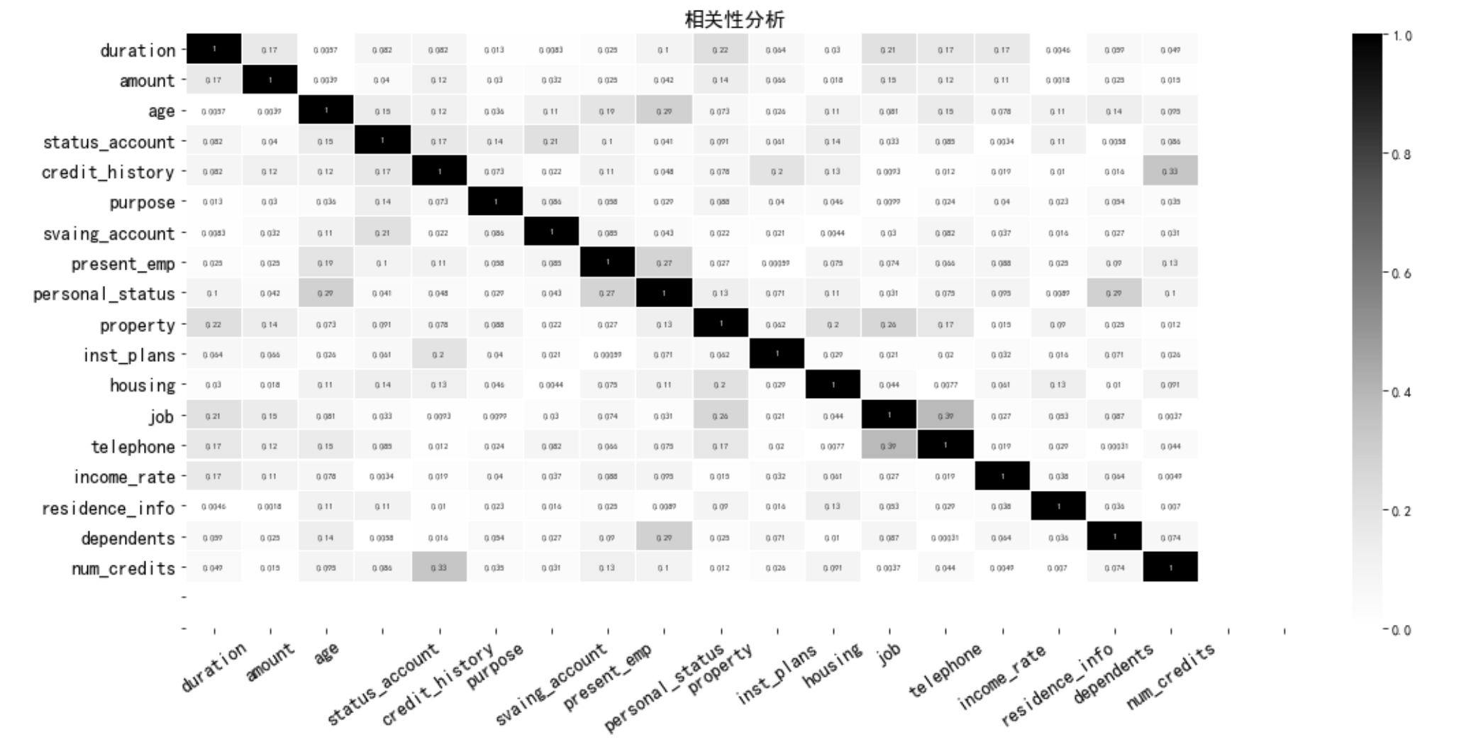
相关系数热力图
# 计算相关矩阵
correlations = abs(df_train_woe.corr())

# 相关性绘图
fig = plt.figure(figsize=(18,8))
sns.heatmap(correlations,cmap=plt.cm.Greys, linewidths=0.05,vmax=1, vmin=0 ,annot=True,annot_kws={'size':6,
                                                                                            'weight':'bold'})
plt.xticks(np.arange(20)+0.5,var_name,fontsize=14,rotation=35)
plt.yticks(np.arange(20)+0.5,var_name,fontsize=14)
plt.title('相关性分析',fontsize=15)

#    plt.xlabel('得分',fontsize=fontsize_1)
plt.show(
多子图绘制
import numpy as np
import matplotlib.pyplot as plt

# Fixing random state for reproducibility
np.random.seed(19680801)

dt = 0.01
t = np.arange(0, 30, dt)
nse1 = np.random.randn(len(t))                 # white noise 1
nse2 = np.random.randn(len(t))                 # white noise 2

# Two signals with a coherent part at 10Hz and a random part
s1 = np.sin(2 * np.pi * 10 * t) + nse1
s2 = np.sin(2 * np.pi * 10 * t) + nse2

fig, axs = plt.subplots(2, 1)
axs[0].plot(t, s1, t, s2)
axs[0].set_xlim(0, 2)
axs[0].set_xlabel('time')
axs[0].set_ylabel('s1 and s2')
axs[0].grid(True)

cxy, f = axs[1].cohere(s1, s2, 256, 1. / dt)
axs[1].set_ylabel('coherence')

fig.tight_layout()
plt.show()
plot 线图
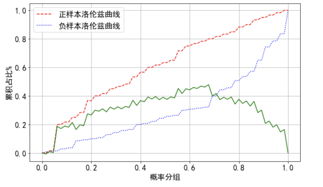
## ks曲线
plt.figure(figsize=(10,6))
plt.plot(np.linspace(0,1,len(tpr)),tpr,'--',color='red', label='正样本洛伦兹曲线')
plt.plot(np.linspace(0,1,len(tpr)),fpr,':',color='blue', label='负样本洛伦兹曲线')
plt.plot(np.linspace(0,1,len(tpr)),tpr - fpr,'-',color='green')

plt.grid()
plt.xticks( fontsize=16)
plt.yticks( fontsize=16)
plt.xlabel('概率分组',fontsize=16)
plt.ylabel('累积占比%',fontsize=16)
plt.legend(fontsize=16)
bar
phenos = [128, 20, 0, 144, 4, 16, 160, 136, 192, 52, 128, 20, 0, 4, 16, 144, 130, 136, 132, 22,
128, 160, 4, 0, 32, 36, 132, 136, 164, 130, 128, 22, 4, 0, 144, 160, 54, 130, 178, 132,
128, 4, 0, 136, 132, 68, 196, 130, 192, 8, 128, 4, 0, 20, 22, 132, 144, 192, 130, 2,
128, 4, 0, 132, 20, 136, 144, 192, 64, 130, 128, 4, 0, 144, 132, 28, 192, 20, 16, 136,
128, 6, 4, 134, 0, 130, 160, 132, 192, 2,  128, 4, 0, 132, 68, 160, 192, 36, 64,
128, 4, 0, 136, 192, 8, 160, 12, 36, 128, 4, 0, 22, 20, 144, 86, 132, 82, 160,
128, 4, 0, 132, 20, 192, 144, 160, 68, 64, 128, 4, 0, 132, 160, 144, 136, 192, 68, 20]

from collections import Counter
import numpy as np
import matplotlib.pyplot as plt
from operator import itemgetter

c = Counter(phenos).items()
c = sorted(c, key=lambda x:x[1],reverse=True) # dict_items, 降序
labels, values = zip(*c)
indexes = np.arange(len(labels))
width = 1
plt.bar(indexes, values, width)
plt.xticks(indexes + width * 0.5, labels)
plt.show()
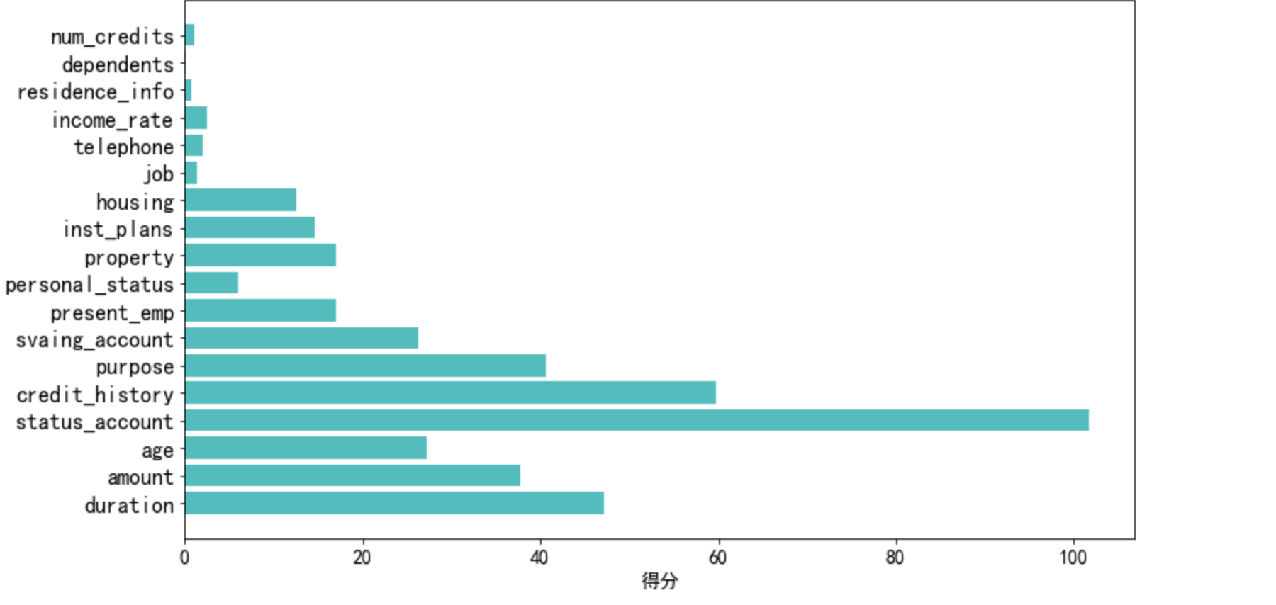
barh
有个小问题是没有从高到低
# 绘图,看不同变量的得分
len_1 = len(select_uinvar_model.scores_)

plt.figure(figsize=(12,7))
plt.barh(np.arange(0,len_1),select_uinvar_model.scores_,color = 'c',tick_label=var_name)
plt.xticks( fontsize=14)
plt.yticks( fontsize=16)
plt.xlabel('得分',fontsize=14)
plt.show()
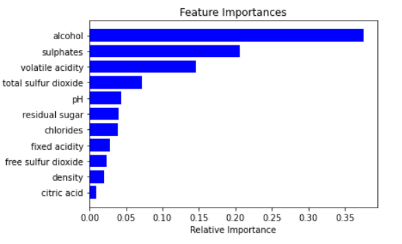
==>
importances = model.feature_importances_
indices = np.argsort(importances)

features = X_train.columns
plt.title('Feature Importances')
plt.barh(range(len(indices)), importances[indices], color='b', align='center')
plt.yticks(range(len(indices)), [features[i] for i in indices])
plt.xlabel('Relative Importance')
plt.show()
hist
plt.hist(values,
         bins=np.linspace(min_value,max_value,30),
         histtype='bar',
         rwidth=2.0,
         stacked=False,
         label=[str(i) for i in y_value],
         density=True,
         alpha=0.7)   #添加stacked即为堆叠,换为False即为多组
plt.legend(loc='upper right')
plt.title(name)
plt.show()
plt 图像大小设置
- python中如何设置subplot大小:https://www.yisu.com/zixun/603632.html

 浙公网安备 33010602011771号