CSS奇思妙想图形(心形、气泡三角形、切角、梯形、饼图等)
今天看到一篇不错文章,在原来CSS3图形创建基础上扩展了很多。
这里记录总结下
心形
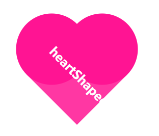
原理:利用 圆形 和 正方形实现
HTML:
<div class="heartShaped">
    <h1>heartShaped</h1>
</div>
CSS:
.heartShaped {
    position: absolute;
    top: 50%;
    left: 50%;
    transform: translate(-50%, -50%) rotate(45deg);
    background: rgba(255, 20, 147, .85);
    width: 140px;
    line-height: 140px;
    text-align: center;
    color: white;
    font-size: 12px;
}

.heartShaped:before, .heartShaped:after {
    content: '';
    position: absolute;
    top: 0;
    left: -70px;
    width: 140px;
    height: 140px;
    border-radius: 50%;
    background: rgb(255, 20, 147);
    z-index: -1;
}

.heartShaped:after {
    top: -70px;
    left: 0;
}
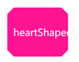
气泡三角形

原理:利用 border 的 transparent 特性实现
HTML:
<div class="bubbly">
    <p>heartShaped</p>
</div>
CSS:
.bubbly {
    position: absolute;
    top: 50%;
    left: 50%;
    transform: translate(-50%, -50%);
    background: #00aabb;
    border-radius: .4em;
    width: 260px;
    padding: 60px 20px;
    text-align: center;
    color: white;
    font-size: 200%;
}

.bubbly:after {
    content: '';
    position: absolute;
    bottom: 0;
    left: 50%;
    border: 34px solid transparent;
    border-top-color: #00aabb;
    border-bottom: 0;
    border-left: 0;
    margin: 0 0 -34px -17px;
}
切角
原理:使用线性渐变实现
HTML:
<div class="notching">
    <p>heartShaped</p>
</div>
CSS:
.notching {
            position: absolute;
            top: 50%;
            left: 50%;
            transform: translate(-50%, -50%);
            width: 160px;
            padding: 60px 20px;
            text-align: center;
            color: white;
            font-size: 200%;
        }

        .notching {
            background: linear-gradient(135deg, transparent 15px, deeppink 0) top left, linear-gradient(-135deg, transparent 15px, deeppink 0) top right, linear-gradient(-45deg, transparent 15px, deeppink 0) bottom right, linear-gradient(45deg, transparent 15px, deeppink 0) bottom left;
            background-size: 50% 50%;
            background-repeat: no-repeat;
        }
弧形切角
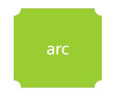
原理:使用径向渐变实现
HTML:
<div class="arc">
    <p>arc</p>
</div>
CSS:
.arc {
    position: absolute;
    top: 50%;
    left: 50%;
    transform: translate(-50%, -50%);
    width: 60px;
    padding: 60px;
    text-align: center;
    color: white;
    font-size: 200%;
}

.arc {
    background: radial-gradient(circle at top left, transparent 15px, yellowgreen 0) top left, radial-gradient(circle at top right, transparent 15px, yellowgreen 0) top right, radial-gradient(circle at bottom right, transparent 15px, yellowgreen 0) bottom right, radial-gradient(circle at bottom left, transparent 15px, yellowgreen 0) bottom left;
    background-size: 50% 50%;
    background-repeat: no-repeat;
}
单个颜色实现 hover 和 active 时的明暗变化效果
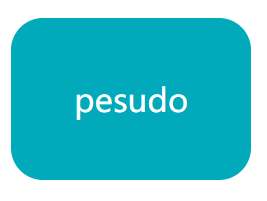
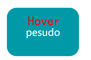
原理:利用伪类及透明度实现
HTML:
<div class="pesudo">
    <p>pesudo</p>
</div>
CSS:
.pesudo {
    position: absolute;
    top: 50%;
    left: 50%;
    transform: translate(-50%, -50%);
    width: 120px;
    padding: 60px;
    text-align: center;
    color: white;
    font-size: 200%;
    border-radius: 1em;
    background: #00aabb;
    cursor: pointer;
}

.pesudo:before {
    position: absolute;
    top: 0;
    right: 0;
    bottom: 0;
    left: 0;
    z-index: -1;
    border-radius: 1em;
    background: rgba(0, 0, 0, .1);
}

.pesudo:hover:before {
    content: "";
}

.pesudo:after {
    position: absolute;
    top: 0;
    right: 0;
    bottom: 0;
    left: 0;
    z-index: -1;
    border-radius: 1em;
    background: rgba(255, 255, 255, .2);
}

.pesudo:active:after {
    content: "";
}
梯形
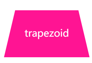
原理:利用伪类加旋转透视实现
HTML:
<div class="trapezoid">
    <p>trapezoid</p>
</div>
CSS
.trapezoid {
    position: absolute;
    top: 50%;
    left: 50%;
    transform: translate(-50%, -50%);
    width: 160px;
    padding: 60px;
    text-align: center;
    color: white;
    font-size: 200%;
}

.trapezoid:before {
    content: "";
    position: absolute;
    top: 0;
    right: 0;
    bottom: 0;
    left: 0;
    transform: perspective(40px) scaleY(1.3) rotateX(5deg);
    transform-origin: bottom;
    background: deeppink;
    z-index: -1;
}
饼图

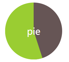
原理:利用伪类、线性渐变、旋转实现
HTML:
<div class="pie">
    <p>pie</p>
</div>
CSS
.pie {
    position: absolute;
    top: 50%;
    left: 50%;
    transform: translate(-50%, -50%);
    width: 200px;
    line-height: 200px;
    border-radius: 50%;
    text-align: center;
    color: white;
    font-size: 200%;
    background-color: yellowgreen;
    overflow: hidden;
    background-image: linear-gradient(to right, transparent 50%, #655 0);
    cursor: pointer;
}

.pie:before {
    content: "";
    position: absolute;
    top: 0;
    left: 50%;
    width: 50%;
    height: 100%;
    background-color: inherit;
    transform-origin: left;
    z-index: -1;
    transform: rotate(.1turn);
}

.pie:hover:before {
    transition: all 1s;
    transform: rotate(.45turn);
}
平行四边形
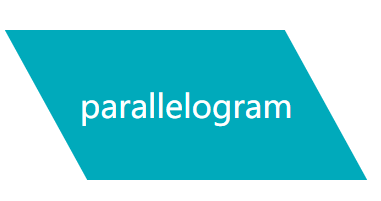
原理:利用伪类、拉伸实现
HTML:
<div class="parallelogram">
    <p>parallelogram</p>
</div>
CSS
.parallelogram {
    position: absolute;
    top: 50%;
    left: 50%;
    transform: translate(-50%, -50%);
    width: 280px;
    line-height: 150px;
    text-align: center;
    color: white;
    font-size: 200%;
}

.parallelogram:before {
    content: '';
    position: absolute;
    top: 0;
    right: 0;
    bottom: 0;
    left: 0;
    background-color: #00aabb;
    z-index: -1;
    transform: skew(.08turn);
}
菱形
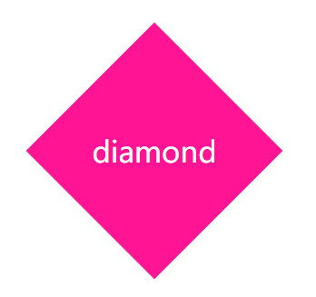
原理:利用伪类、旋转实现
HTML:
<div class="diamond">
    <p>diamond</p>
</div>
CSS
.diamond {
    position: absolute;
    top: 50%;
    left: 50%;
    transform: translate(-50%, -50%);
    width: 200px;
    line-height: 200px;
    text-align: center;
    color: white;
    font-size: 200%;
}

.diamond:before {
    content: '';
    position: absolute;
    top: 0;
    right: 0;
    bottom: 0;
    left: 0;
    background-color: deeppink;
    z-index: -1;
    transform: rotateZ(45deg);
}
折角
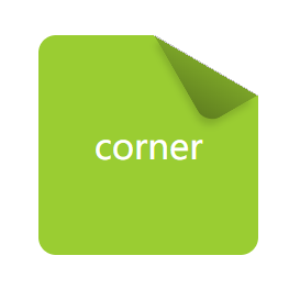
原理:利用切角、伪类、渐变、旋转实现
HTML:
<div class="corner">
    <p>corner</p>
</div>
CSS
.corner {
    position: absolute;
    top: 50%;
    left: 50%;
    transform: translate(-50%, -50%);
    width: 120px;
    line-height: 120px;
    padding: 40px;
    text-align: center;
    color: white;
    font-size: 200%;
    background: linear-gradient(-150deg, transparent 1.5em, yellowgreen 0);
    border-radius: .5em;
}

.corner:before {
    content: '';
    position: absolute;
    top: 0;
    right: 0;
    background: linear-gradient(to left bottom, transparent 50%, rgba(0, 0, 0, .2) 0, rgba(0, 0, 0, .4)) 100% 0 no-repeat;
    width: 1.73em;
    height: 3em;
    transform: translateY(-1.3em) rotate(-30deg);
    transform-origin: bottom right;
    border-bottom-left-radius: inherit;
    box-shadow: -.2em .2em .3em -.1em rgba(0, 0, 0, .15);
}
spectiveBlur
纯 CSS 方案实现背景变暗效果(hover按钮触发)
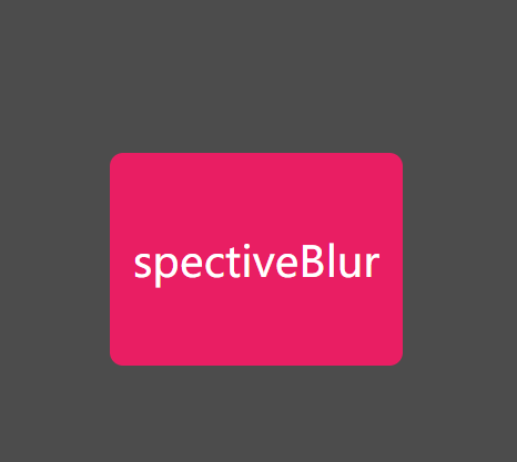
HTML:
<div class="spectiveBlur">
    <p>spectiveBlur</p>
</div>
CSS
.spectiveBlur {
    position: absolute;
    top: 50%;
    left: 50%;
    width: 220px;
    line-height: 160px;
    transform: translate(-50%, -50%);
    border-radius: 10px;
    overflow: hidden;
    background: #E91E63;
    color: #fff;
    font-size: 200%;
    text-align: center;
    cursor: pointer;
    transition: transform .2s;
}

.spectiveBlur:hover {
    box-shadow: 0 0 0 1920px rgba(0, 0, 0, .7);
    transform: translate(-50%, -50%) scale(1.2);
}
条纹背景图
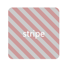
原理:利用渐变实现
HTML
<div class="stripe">
    <p>stripe</p>
</div>
CSS
.stripe {
    position: absolute;
    top: 50%;
    left: 50%;
    transform: translate(-50%, -50%);
    width: 200px;
    line-height: 200px;
    text-align: center;
    color: white;
    font-size: 200%;
    background: deeppink;
    border-radius: .5em;
    background: repeating-linear-gradient(45deg, #CC9999, #CC9999 15px, #CCCCCC 0, #CCCCCC 30px)
}
晴天(sun)(单标签实现)

原理:利用线性渐变、阴影、旋转实现
HTML:
<div class="sun">
    <p>sun</p>
</div>
CSS
.sun {
    position: absolute;
    top: 50%;
    left: 50%;
    width: 200px;
    height: 260px;
    transform: translate(-50%, -50%);
    text-align: center;
    font-size: 200%;
    color: #fff;
    background: #0BF;
    border-radius: 5px;
}

.sun:before {
    content: "";
    position: absolute;
    width: 80px;
    height: 80px;
    left: 50%;
    top: 50%;
    transform: translate(-50%, -50%);
    border-radius: 50%;
    background: rgba(255, 238, 68, 1);
    box-shadow: 0 0 0 15px rgba(255, 255, 0, 0.2), 0 0 15px #fff;
    z-index: -10;
}

.sun:after {
    content: "";
    position: absolute;
    top: 50%;
    left: 50%;
    height: 160px;
    width: 160px;
    transform: translate(-50%, -50%) rotate(30deg);
    z-index: -100;
    background-image: -webkit-linear-gradient(top, rgba(255, 255, 255, 0) 0%, rgba(255, 255, 255, 0.8) 50%, rgba(255, 255, 255, 0) 100%), -webkit-linear-gradient(left, rgba(255, 255, 255, 0) 0%, rgba(255, 255, 255, 0.8) 50%, rgba(255, 255, 255, 0) 100%);
    background-size: 20px 100%, 100% 20px;
    background-repeat: no-repeat;
    background-position: center center, center center;
    animation: sunRotate 10s linear infinite;
}

@keyframes sunRotate {
    0% {
        transform: translate(-50%, -50%) rotate(30deg);
    }
    100% {
        transform: translate(-50%, -50%) rotate(390deg);
    }
}
多云(cloudy)(单标签实现)

原理:利用线性渐变、阴影、缩放实现
HTML
<div class="cloudy">
    <p>cloudy</p>
</div>
CSS
.cloudy {
    position: absolute;
    top: 50%;
    left: 50%;
    width: 200px;
    height: 260px;
    transform: translate(-50%, -50%);
    text-align: center;
    font-size: 200%;
    color: #fff;
    background: #2EB5E5;
    border-radius: 5px;
}

.cloudy:before {
    content: "";
    text-indent: 23px;
    font-size: 22px;
    line-height: 40px;
    color: #333;
    position: absolute;
    height: 50px;
    width: 50px;
    background: #FFFFFF;
    left: 30%;
    top: 45%;
    transform: translate(-50%, -50%);
    border-radius: 50%;
    box-shadow: #FFFFFF 65px -15px 0 -5px, #FFFFFF 25px -25px, #FFFFFF 30px 10px, #FFFFFF 60px 15px 0 -10px, #FFFFFF 85px 5px 0 -5px, #C8C8C8 35px -35px, #C8C8C8 66px -27px 0 -5px, #C8C8C8 91px -10px 0 -8px;
    animation: cloudy 5s ease-in-out infinite;
}

.cloudy:after {
    content: "";
    position: absolute;
    top: 80%;
    left: 50%;
    height: 15px;
    width: 120px;
    background: rgba(0, 0, 0, .5);
    border-radius: 50%;
    transform: translate(-50%, -50%);
    animation: cloudy_shadow 5s ease-in-out infinite;
}

@keyframes cloudy {
    50% {
        transform: translate(-50%, -70%);
    }
    100% {
        transform: translate(-50%, -50%);
    }
}

@keyframes cloudy_shadow {
    50% {
        transform: translate(-50%, -50%) scale(0.8);
        background: rgba(0, 0, 0, .2);
    }
    100% {
        transform: translate(-50%, -50%) scale(1);
        background: rgba(0, 0, 0, .5);
    }
}
更多效果可以参考原网站:CSS实现各种图形
PS:这些CSS效果都是奇技淫巧,不过可以加深对CSS样式的理解,值得尝试

 浙公网安备 33010602011771号