漫威金属LOGO
原文地址:https://design.tutsplus.com/tutorials/recreate-justice-league-logo-using-adobe-photoshop-and-illustrator--cms-28774
 What You'll Be Creating
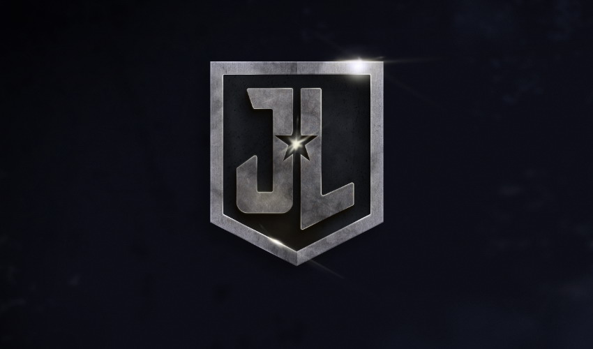
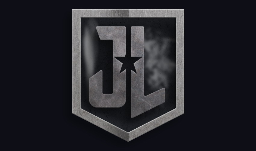
In this tutorial, we are going to recreate logo of an upcoming movie, Justice League. In the movie, the logo was probably made using 3D software. But that won't stop us from recreating it using Photoshop and Illustrator. We will use Illustrator to draw the logo's shapes and then bring them into Photoshop to enhance its appearance. Let's get started.
Get inspired with more amazing logos from GraphicRiver.
Tutorial Assets
The following assets were used in this tutorial:
1. How to Draw a Vector Outline
Step 1
First, we will draw the logo in vector software, Adobe Illustrator. You can draw it directly in Photoshop, if you want to. But personally I prefer Illustrator since it has better control for vector editing. In Illustrator, make a New Document (File > New). Any size is acceptable.

Step 2
Activate the Rectangle Tool and then click once on the empty canvas. A dialog box will pop up asking for the dimensions of the rectangle we want to make. Set it to 13 cm x 12 cm. Click the OK button to make the rectangle at exactly that size.

Step 3
Make sure you have activated the Smart Guides (View > Smart Guides). Select the rectangle shape. Using Pen Tool, click on the center of its lower edge to add a new anchor point.

Step 4
Pull the new anchor point down using the Direct Selection Tool while holding the Shift key.

Step 5
While the shape is selected, click Object > Path > Offset Path. Set a negative offset size until we have made the frame shape. Make sure the Preview option is selected, which will allow you to see the end result in real time.

Step 6
Using Direct Selection Tool, select two anchor points on top. Add a small amount of radius corner from theOption Bar.


Step 7
We're done building the frame, so let's move on to building the letters. You can try searching for a font type that matches the original letter shape, but in this tutorial we'll draw them from scratch. We start with a rectangle shape as the base for the J letter.

Step 8
Duplicate the shape (Control-C, Control-V) and then Rotate it 90°. Attach it onto the lower part of the Jletter. Duplicate another shape and use it for the upper part of the J letter.


Step 9
We need to move some anchor points using the Direct Selection Tool. Check out the following pictures for references.


Step 10
Once you're happy with the result, we need to combine all the shapes into a single letter J. Select the shapes and then click Unite on the Pathfinder panel.


Step 11
Select all the anchor points and then add Radius Corner.

Step 12
Add bigger Radius Corners to the two anchor points at the bottom of the J letter.

Step 13
Using a similar approach as in the previous steps, draw the L letter. We start with a rectangle. Make sure the rectangle shape has the same thickness as the one used in the J letter.

Step 14
Drag its right edge upward using the Direct Selection Tool.

Step 15
Add another rectangle.

Step 16
Select both shapes and Combine them into a single L letter.


Step 17
If we look closely at the vector path, we will notice that there are some unneeded anchor points, such as the two points shown below. It's a good practice to always keep your path clean and free from unused anchor points. Click both points with the Pen Tool to remove them.


Step 18
Here are some more anchor points we want to remove.


Step 19
Add a star shape using the Star Tool. Place it in the middle of the letters.


Step 20
Select the star and then Copy it (Control-C). Then, select both the star and a letter. From the Pathfinderpanel, select Subtract.


Step 21
Hit Control-F to Paste the star object that we have copied earlier in the same place. Select the star and the remaining letter and then Subtract it from the Pathfinder panel.


2. How to Export Vector Paths to Photoshop
Step 1
We are done with the vector shapes, so let's transfer them to Photoshop. Select all the shapes we have made and hit Control-C.

Step 2
Let's open up Photoshop. Make a New File (Control-N).

Step 3
Click the Add Adjustment Layer icon at the bottom of the Layers panel to add a Solid Color. In the next dialog box, select a dark color (#0e0f16) for the canvas background.


Step 4
Hit Control-V to Paste the vector path we made earlier in Illustrator. Paste it as a Shape Layer.


Step 5
Double-click the layer shape thumbnail and change its color to a dark shade of gray (#414650).

Step 6
Now, we want to move the letters and the frame into separate layers. This step will ease the editing process. Select the letters' paths and then hit Control-Shift-J.


Step 7
Change its color to a lighter shade of gray (#78757b).


Step 8
Repeat the process for its frame, and move it onto a separate layer. Keep in mind that now we have three shape layers: one for the JL letters, another for their frame, and another one for the pentagon shape background.

Step 9
Make sure the letters' layer shape is selected and then double-click the layer to add some styles. We want to add Bevel & Emboss to add a bit of 3D appearance onto the letters' surface. Inner Glow and Gradient Overlay will help add lighting onto their surface. And Drop Shadow will lift the letters off their background.


Step 10
We also need to add styles onto the frame layer. For the frame, add a large Inner Glow with a sharp white to black Gradient to add metallic lighting onto the surface.


Step 11
We also need to add styles to the logo background.


3. How to Apply Textures
Step 1
The logo appears three dimensional, but still too flat. To fix this, we need to add texture. Grab the metal texture number 4. Place it above the letters shape layer. Reduce its layer Opacity to 60% and then hit Control-Alt-G to convert the texture into a Clipping Mask.


Step 2
Add another metal texture, this time number 8. Place it above the letters shape and just like the previous texture, convert it into a Clipping Mask.


Step 3
Let's add another texture, this time a marble one, to add random wavy lines across the letters. Hit D to reset the background and foreground color to their default settings, white and black. Make a New Layerand then make a new Selection covering the letters. Click Filter > Render > Clouds.

Step 4
Click Filter > Render > Difference Clouds.

Step 5
Hit Control-F a few times to apply another Difference Clouds Filter. Once you get some interesting shapes, hit Control-Alt-G to convert it into a Clipping Mask and put the texture inside the letters shapes. In the Layers panel, change its Layer Blend Mode to Overlay and reduce its Opacity.


Step 6
And, of course, we need to add texture to the frame. This time, use a concrete texture. Place it above the frame, reduce its Opacity, and convert it into a Clipping Mask.


Step 7
Add another metal texture, place it above the frame with low Opacity, and then convert it into a Clipping Mask.


Step 8
Don't forget to add texture onto the logo background.


4. How to Add Lighting to the Background
Step 1
Add a New Layer and place it above the Justice League logo. Activate the Brush Tool. Right-click to open the list of available brushes. Select a Scatter Brush. Paint white inside the logo background.


Step 2
Soften the brush stroke by applying a Gaussian Blur filter from Filter > Blur > Gaussian Blur. Use a big Radius Size until the stroke is completely blurred. In the Layers panel, reduce its Opacity and set its Layer Blend Mode to Overlay.


Step 3
Add another white brush stroke to add more lighting into the scene.


Step 4
We still need to add stronger shadows to the letters manually. Add a New Layer and place it underneath the letters shape layer. Control-click the thumbnail of the letters layer to make a new selection based on its shape.

Step 5
Fill the selection with black. Then hit Control-D to remove the selection. Using the Move Tool, move the shadow a few pixels down. Keep the shadow soft by applying a Gaussian Blur filter (Filter > Blur > Gaussian Blur) and reducing its Opacity.


Step 6
Let's add another texture onto the logo. Make a New Layer and draw a selection covering the logo. Click Filter > Render > Clouds.

Step 7
Click Filter > Render > Difference Clouds a few times until you get an interesting texture.

Step 8
Click Image > Adjustments > Levels or hit Control-L. In the Levels dialog box, drag the white triangle until we have nice contrast inside the selection.

Step 9
To isolate the texture in the letters and its frame, we'll need masking. Control-click the letters thumbnail layer and then Shift-Control-click the frame thumbnail layers. Add a Mask to the shape layer and then set its Layer Blend Mode to Darker Color with 30% Opacity.


Step 10
We want to add depth into the scene. Paint white on a New Layer using a Soft Round Brush. If you want it to be softer, just apply a Gaussian Blur filter (Filter > Blur > Gaussian Blur). Reduce its layer Opacity and use Overlay for its Blend Mode.


Step 11
Repeat this step to add another soft highlight on the scene.

Step 12
Don't forget to add the dark area. In the top left corner, paint a random black spot and keep it subtle by making it transparent. Add some Gaussian Blur if needed.

Step 13
Let's add a grainy background to create a dark mood for the overall scene. To do this, add a New Layer and then Fill it with white. Click Filter > Noise > Add Noise. Make sure Monochromatic is selected. Click OK. Change the Layer Blend Mode to Multiply to preserve all the dark pixels and hide the white pixels from sight.


Step 14
We want to add a blue shade into the background. From the Layers panel, add a Photo Filter and select Blue for its color. By default, the Photo Filter Adjustment Layer will affect every pixel underneath it. To confine it to the background, select its Layer Mask and paint over the logo with black.


5. How to Add Lights and Reflections
Step 1
Make a New Layer. Control-click the letters' shape layer to make a new selection based on the letters shape. Click Edit > Stroke. In the dialog box, set white as its Stroke Color with a 1 px Width. Click OK to accept the result.


Step 2
Using the Eraser Tool with 0% Hardness, erase most parts of the stroke line and leave some on the letters' corners.

Step 3
Duplicate the stroke line and then apply the Gaussian Blur filter to soften the line. Reduce its layer Opacityto keep it subtle.

Step 4
Repeat the same procedure for its frame.

Step 5
Zoom in on the center of the letters, right on the empty star area. Using a Soft Round Brush, dab once on a New Layer using light yellow as its color.

Step 6
Hit Control-T to Transform the brush stroke.

Step 7
Hold the Control key and then drag its corner to skew the brush stroke. Hit the Enter key to accept the transformation result.


Step 8
Repeat the previous steps, add a quick dab of a brush stroke and then skew it. Repeat this a few times until we have enough light reflection to fill the gap.


Step 9
Behind the star reflection, paint white for a fill light on the logo background.


Step 10
We can add another light reflection on the other part of the logo where the light hits it. In this scene, the imaginary light source was placed in the top right corner. One of the best places for our next reflection is in the lower left part of the logo. Just like in the previous steps, we just need to paint a soft light yellow over the area.

Step 11
Make it more realistic by painting over it again using a smaller brush with white or another light color.


Step 12
Using the same techniques, another light reflection is added to the top right corner. Considering this is where the imaginary light source was placed, the reflection should be bigger and stronger.

Final Result
This is our final result. As you can see, we did a lot of manual painting and added some subtle highlights to keep the scene realistic. We also relied on textures to easily add realism to the shape.
Thank you for reading, and I hope you've learned some useful techniques from this simple tutorial. If you do follow along, please make sure to upload the result in the comments below—I'd love to see it.


 浙公网安备 33010602011771号