1-前端 - Flex布局
about
mdn的flex布局部分,写的很不错:https://developer.mozilla.org/zh-CN/docs/Web/CSS/CSS_Flexible_Box_Layout
csdn的两个帖子写的也很不错:
flex是flexible box的缩写,意为"弹性布局",也称伸缩布局、弹性布局、伸缩盒布局、弹性盒布局,这些都是指的flex布局。
传统布局和flex布局
- 传统布局:兼容性好、布局繁琐、局限性、不能在移动端很好的自适应。
- flex弹性布局:操作方便、布局极为简单、移动端应用广泛、PC端浏览器支持情况较差、IE 11或更低版本不支持或者仅部分支持flex布局。
建议:如果是PC端页面布局,还是建议使用传统布局。如果是移动端或者不考虑兼容性问题的PC端布局,直接flex布局就行了。
flex布局原理
采用flex布局的元素,称为flex容器(flex container),简称"容器",它的所有子元素自动成为容器的成员,称为flex项目(flex item),简称"项目"。
任何一个容器(块级元素/行内元素)都可以通过添加display:flex;属性将自己指定为flex布局。
当我们将父盒子设置为flex布局后,子元素的float、clear、vertical-align属性将失效。
简单总结:flex布局就是通过给父盒子添加flex属性,来控制子盒子的位置和排列方式。
容器的属性
主轴/交叉轴
容器默认存在两根轴,水平的主轴(main axis,别称水平轴/x轴)和垂直的交叉轴(cross axis,别称副轴/侧轴/y轴)。
主轴的开始位置叫做main start,结束位置叫做main end;交叉轴的开始位置叫做cross start,结束位置叫做cross end。
项目默认沿主轴排列,单个项目占据的主轴空间叫做main size,占据交叉轴的空间叫做cross size。

注意,主轴和交叉轴可以通过属性来调整,不是一成不变的,所以在布局之前,一定要确认好哪根轴是主轴,哪根轴是交叉轴
我们可以在容器上设置以下六个属性:
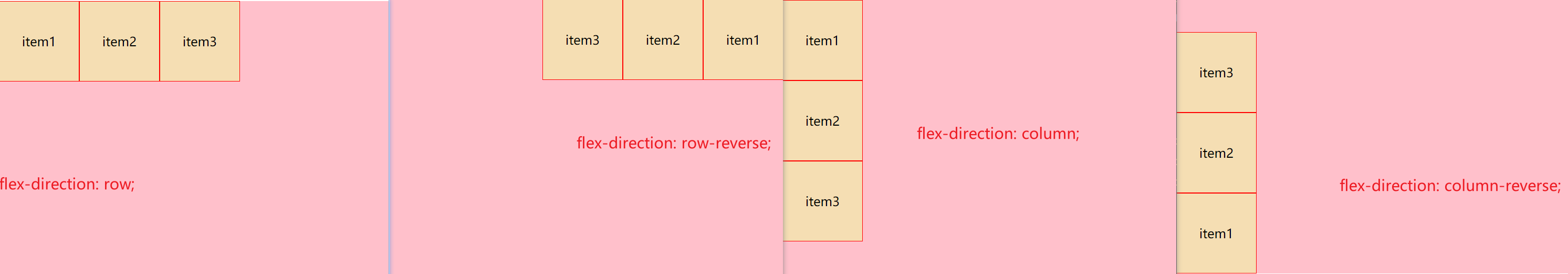
flex-direction:设置主轴的方向
flex-direction: row; 默认值,从左到右排列各项目(重要)
flex-direction: row-reverse; 从右到左排列各项目,并且各子项目排列顺序也会进行翻转
flex-direction: column; 默认值,从上到下排列各项目(重要)
flex-direction: column-reverse; 从下到上排列各项目,并且各子项目排列顺序也会进行翻转
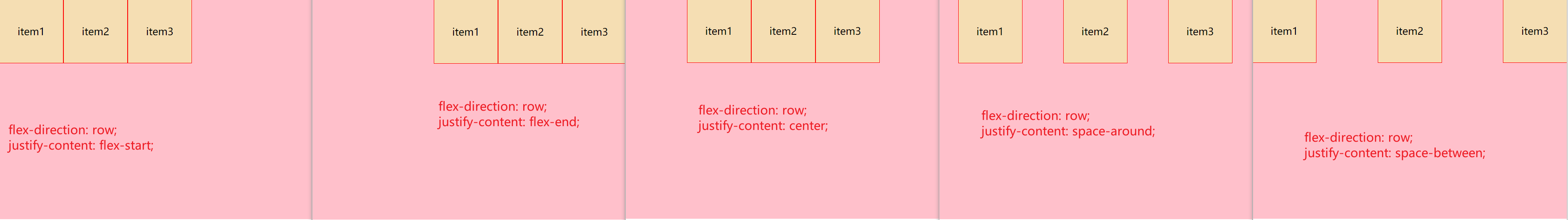
justify-content:设置主轴上的容器内部各项目排列方式,注意使用这个属性之前一定要确定主轴是哪个
justify-content: flex-start; 默认值,从头部开始,如果主轴是x轴,则是从左到右排列
justify-content: flex-end; 从尾部开始排列,但不会进行各子项目排列顺序的翻转
justify-content: center; 在主轴居中对齐(如果主轴是x轴,则水平居中)
justify-content: space-around; 所有项目平分主轴空间
justify-content: space-between; 两个项目先两边贴边,中间项目平分剩余空间(重要)
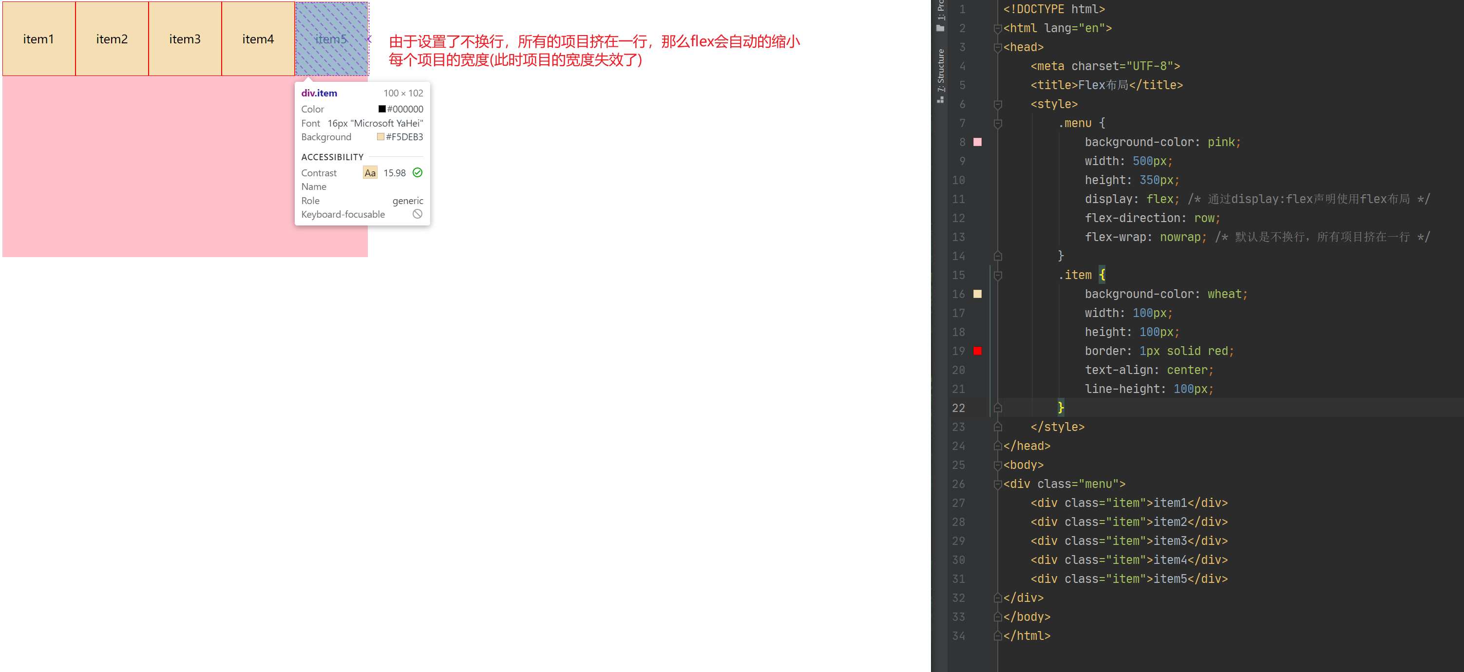
# flex布局中,默认的各项目是不会换行的,各项目都排在一条线(轴线)上,如果装不下,会缩小项目的宽度,但就是不换行
# 所以,我们通常指定flex-wrap来让其换行排列
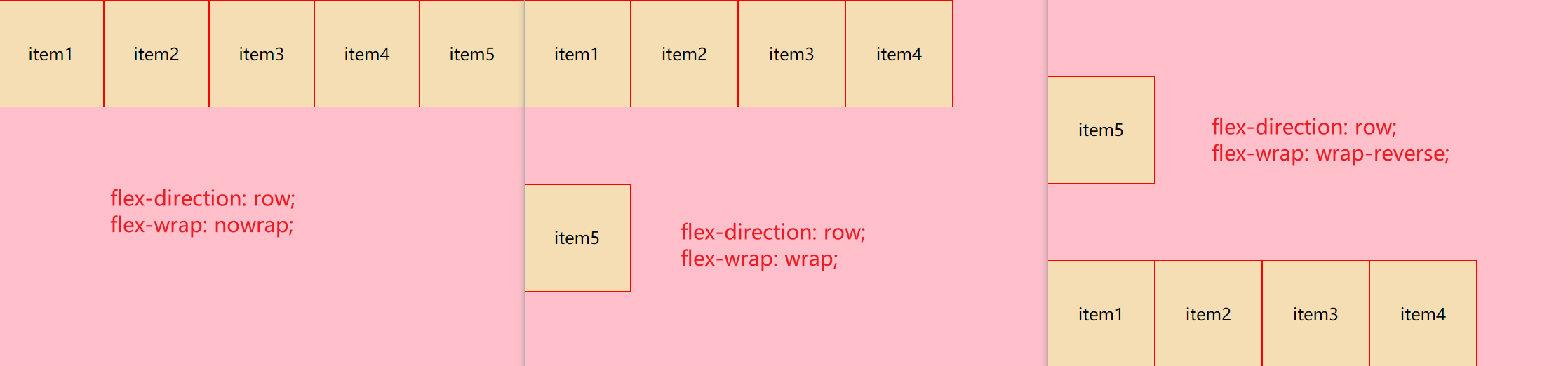
flex-wrap:设置项目是否换行
flex-wrap: nowrap; 默认值,不换行
flex-wrap: wrap; 换行
flex-wrap: wrap-reverse; 换行,但第一行在下方
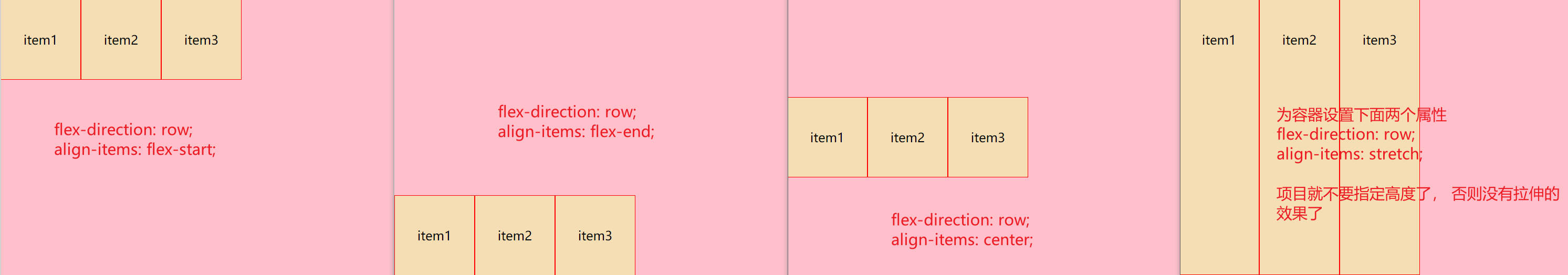
align-items:设置副轴(默认是y轴)上项目的排列方式(单行),在项目为单行的时候使用,既没有换行的时候使用
align-items: flex-start; 默认值,从上到下
align-items: flex-end; 从下到上
align-items: center; 挤在一起居中,即垂直居中
align-items: stretch; 拉伸,注意,使用这个值得话,你不要给项目设置高度,不然限制了高度,就没法拉伸了
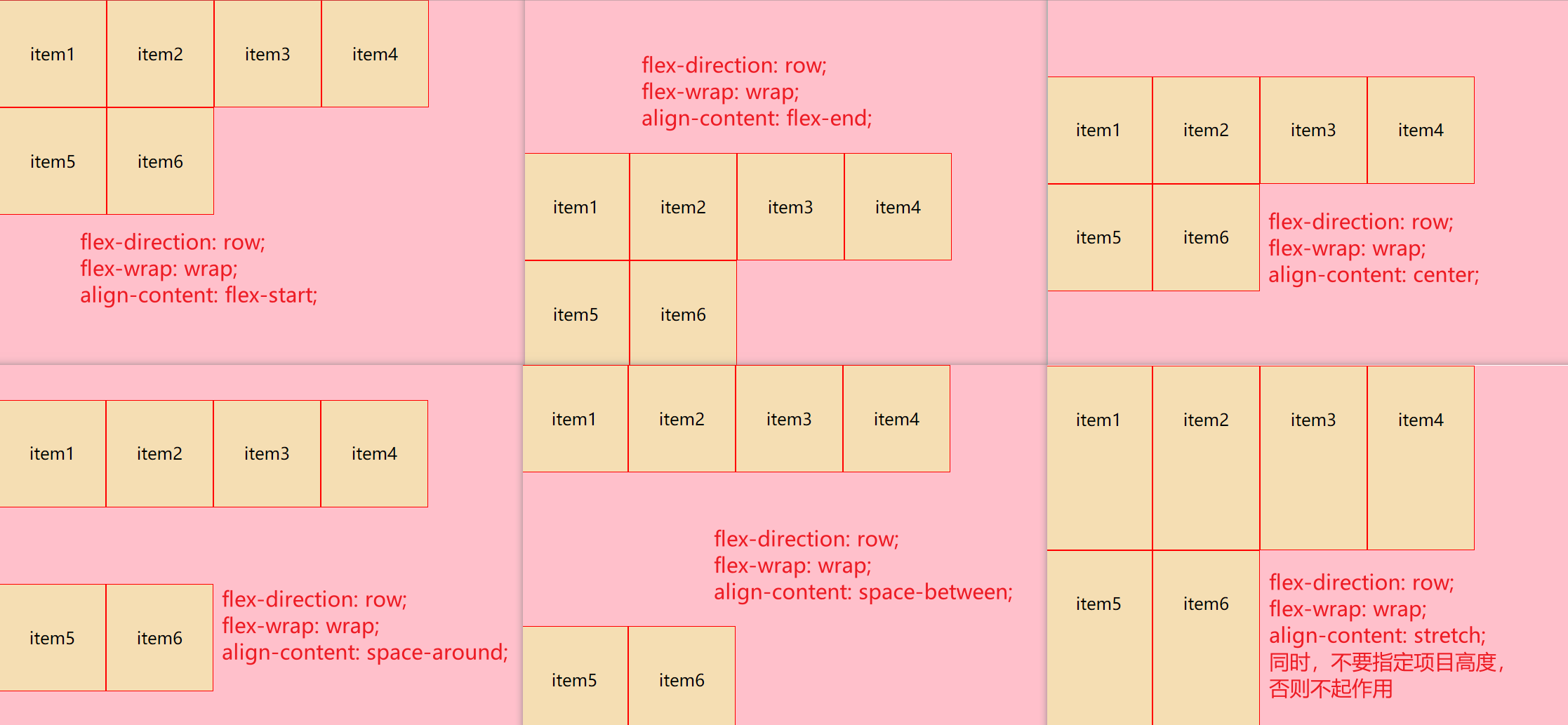
# 设置副轴(默认是y轴)上项目的排列方式(多行),在项目为多行的时候使用,即出现在换行的情况,对单行情况没有效果
# 所以align-content属性通常和flex-wrap: wrap;搭配使用
align-content:
align-content: flex-start; 默认值,在副轴的头部开始排列
align-content: flex-end; 在副轴的尾部开始排列
align-content: center; 在副轴中间排列,居中
align-content: space-around; 各项目在副轴平分剩余空间
align-content: space-between; 各项目先两边靠边,中间项目平分剩余空间
align-content: stretch; 设置各项目元素高度平分容器高度
flex-flow:复合属性,相当于同时设置flex-direction和flex-wrap,你这里可以按需使用
flex-flow: row wrap; 主轴是x轴并且换行
flex-flow: column wrap; 主轴是y轴并且换行
align-content和align-items的区别
align-items适用于单行情况,只有上对齐、下对齐、居中和拉伸。align-content适用于换行的情况,注意,单行情况下无效。可以设置上对齐、下对齐、居中、拉伸以及平均分配剩余空间等属性。- 一句话,就是单行使用
align-items,多行用align-content属性和flex-wrap: wrap;搭配使用。
元素是跟着主轴来排列的。
flex-direction属性决定主轴的方向
flex-direction属性决定主轴的方向,即项目的排列方向,可以有一下几个属性值:
flex-direction:设置主轴的方向
	flex-direction: row;  默认值,从左到右排列各项目(重要)
	flex-direction: row-reverse;  从右到左排列各项目,并且各子项目排列顺序也会进行翻转
	flex-direction: column;  默认值,从上到下排列各项目(重要)
	flex-direction: column-reverse; 从下到上排列各项目,并且各子项目排列顺序也会进行翻转
<!DOCTYPE html>
<html lang="en">
<head>
    <meta charset="UTF-8">
    <title>Flex布局</title>
    <style>
        .menu {
            background-color: pink;
            width: 500px;
            height: 350px;
            display: flex; /* 通过display:flex声明使用flex布局 */
            flex-direction: column-reverse; /* 控制主轴的方向 */
        }
        .item {
            background-color: wheat;
            width: 100px;
            height: 100px;
            border: 1px solid red;
            text-align: center;
            line-height: 100px;
        }
    </style>
</head>
<body>
<div class="menu">
    <div class="item">item1</div>
    <div class="item">item2</div>
    <div class="item">item3</div>
</div>
</body>
</html>
justify-content设置主轴上的容器内部各项目排列方式
justify-content:设置主轴上的容器内部各项目排列方式,注意使用这个属性之前一定要确定主轴是哪个
	justify-content: flex-start; 默认值,从头部开始,如果主轴是x轴,则是从左到右排列
	justify-content: flex-end; 从尾部开始排列,但不会进行各子项目排列顺序的翻转
	justify-content: center; 在主轴居中对齐(如果主轴是x轴,则水平居中)
	justify-content: space-around; 所有项目平分主轴空间
	justify-content: space-between; 两个项目先两边贴边,中间项目平分剩余空间(重要)
主轴是x轴的话
<!DOCTYPE html>
<html lang="en">
<head>
    <meta charset="UTF-8">
    <title>Flex布局</title>
    <style>
        .menu {
            background-color: pink;
            width: 500px;
            height: 350px;
            display: flex; /* 通过display:flex声明使用flex布局 */
            flex-direction: row;
            justify-content: space-between;
        }
        .item {
            background-color: wheat;
            width: 100px;
            height: 100px;
            border: 1px solid red;
            text-align: center;
            line-height: 100px;
        }
    </style>
</head>
<body>
<div class="menu">
    <div class="item">item1</div>
    <div class="item">item2</div>
    <div class="item">item3</div>
</div>
</body>
</html>
主轴是y轴的话

<!DOCTYPE html>
<html lang="en">
<head>
    <meta charset="UTF-8">
    <title>Flex布局</title>
    <style>
        .menu {
            background-color: pink;
            width: 500px;
            height: 350px;
            display: flex; /* 通过display:flex声明使用flex布局 */
            flex-direction: column;
            justify-content: space-between;
        }
        .item {
            background-color: wheat;
            width: 100px;
            height: 100px;
            border: 1px solid red;
            text-align: center;
            line-height: 100px;
        }
    </style>
</head>
<body>
<div class="menu">
    <div class="item">item1</div>
    <div class="item">item2</div>
    <div class="item">item3</div>
</div>
</body>
</html>
flex-wrap控制项目是否换行
#
# 所以,我们通常指定flex-wrap来让其换行排列
flex-wrap:设置项目是否换行
	flex-wrap: nowrap; 默认值,不换行
	flex-wrap: wrap; 换行
	flex-wrap: wrap-reverse; 换行,但第一行在下方
flex布局中,默认的各项目是不会换行的,各项目都排在一条线(轴线)上,如果装不下,会缩小项目的宽度,但就是不换行,效果大概是这样的:
来看下换行的效果,这里以主轴是x轴为例:
<!DOCTYPE html>
<html lang="en">
<head>
    <meta charset="UTF-8">
    <title>Flex布局</title>
    <style>
        .menu {
            background-color: pink;
            width: 500px;
            height: 350px;
            display: flex; /* 通过display:flex声明使用flex布局 */
            flex-direction: row;
            flex-wrap: wrap-reverse;
        }
        .item {
            background-color: wheat;
            width: 100px;
            height: 100px;
            border: 1px solid red;
            text-align: center;
            line-height: 100px;
        }
    </style>
</head>
<body>
<div class="menu">
    <div class="item">item1</div>
    <div class="item">item2</div>
    <div class="item">item3</div>
    <div class="item">item4</div>
    <div class="item">item5</div>
</div>
</body>
</html>
align-items置副轴(默认是y轴)上项目的排列方式(单行)
设置副轴(默认是y轴)上项目的排列方式(单行),在项目为单行的时候使用,既没有换行的时候使用。
align-items:
	align-items: flex-start; 默认值,从上到下
	align-items: flex-end; 从下到上
	align-items: center; 挤在一起居中,即垂直居中
	align-items: stretch; 拉伸,注意,使用这个值得话,你不要给项目设置高度,不然限制了高度,就没法拉伸了
<!DOCTYPE html>
<html lang="en">
<head>
    <meta charset="UTF-8">
    <title>Flex布局</title>
    <style>
        .menu {
            background-color: pink;
            width: 500px;
            height: 350px;
            display: flex; /* 通过display:flex声明使用flex布局 */
            flex-direction: row;
            align-items: stretch;
        }
        .item {
            background-color: wheat;
            width: 100px;
            /* height: 100px; */
            border: 1px solid red;
            text-align: center;
            line-height: 100px;
        }
    </style>
</head>
<body>
<div class="menu">
    <div class="item">item1</div>
    <div class="item">item2</div>
    <div class="item">item3</div>
</div>
</body>
</html>
align-content置副轴(默认是y轴)上项目的排列方式(多行)
设置副轴(默认是y轴)上项目的排列方式(多行),在项目为多行的时候使用,即出现在换行的情况,对单行情况没有效果,所以align-content属性通常和flex-wrap: wrap;搭配使用。
align-content:
	align-content: flex-start; 默认值,在副轴的头部开始排列
	align-content: flex-end; 在副轴的尾部开始排列
	align-content: center; 在副轴中间排列,居中
	align-content: space-around; 各项目在副轴平分剩余空间
	align-content: space-between; 各项目先两边靠边,中间项目平分剩余空间
	align-content: stretch; 设置各项目元素高度平分容器高度,同时,不要指定项目高度,否则不起作用
<!DOCTYPE html>
<html lang="en">
<head>
    <meta charset="UTF-8">
    <title>Flex布局</title>
    <style>
        .menu {
            background-color: pink;
            width: 500px;
            height: 350px;
            display: flex; /* 通过display:flex声明使用flex布局 */
            flex-direction: row;
            flex-wrap: wrap;
            align-content: stretch; /* 同时,不要指定项目高度,否则不起作用 */
        }
        .item {
            background-color: wheat;
            width: 100px;
            /* height: 100px; */
            border: 1px solid red;
            text-align: center;
            line-height: 100px;
        }
    </style>
</head>
<body>
<div class="menu">
    <div class="item">item1</div>
    <div class="item">item2</div>
    <div class="item">item3</div>
    <div class="item">item4</div>
    <div class="item">item5</div>
    <div class="item">item6</div>
</div>
</body>
</html>
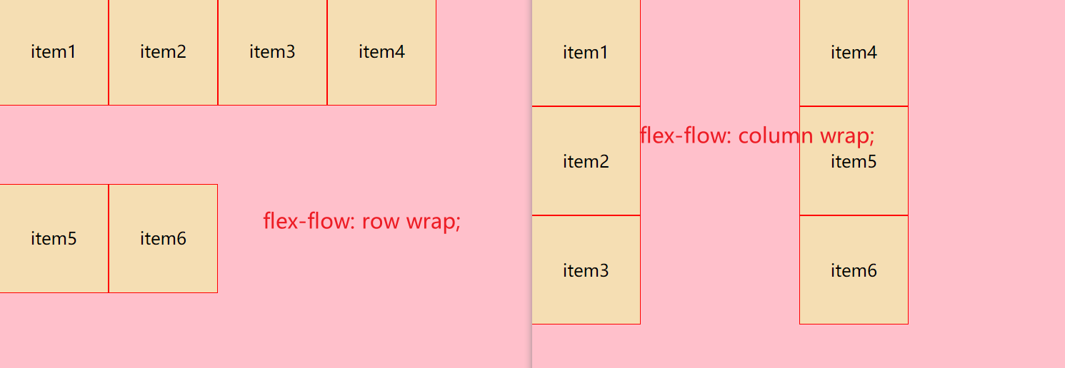
flex-flow复合属性
flex-flow:复合属性,相当于同时设置flex-direction和flex-wrap,你这里可以按需使用
	flex-flow: row wrap;  主轴是x轴并且换行
	flex-flow: column wrap;  主轴是y轴并且换行
<!DOCTYPE html>
<html lang="en">
<head>
	<meta charset="UTF-8">
	<title>Flex布局</title>
	<style>
		.menu {
			background-color: pink;
			width: 500px;
			height: 350px;
			display: flex; /* 通过display:flex声明使用flex布局 */
			/*flex-flow: row wrap;*/
			flex-flow: column wrap;
		}

		.item {
			background-color: wheat;
			width: 100px;
			height: 100px;
			border: 1px solid red;
			text-align: center;
			line-height: 100px;
		}
	</style>
</head>
<body>
<div class="menu">
	<div class="item">item1</div>
	<div class="item">item2</div>
	<div class="item">item3</div>
	<div class="item">item4</div>
	<div class="item">item5</div>
	<div class="item">item6</div>
</div>
</body>
</html>
项目常见属性
研究完了容器中的各种属性,我们再来看下容器中,各个项目上用的属性。
order属性定义项目的排列顺序
order: 0; 默认值是0,注意数值越小,排列约靠前。它和z-index不一样
align-self控制项目自己在副轴上的排列方式
align-self属性允许单个项目有与其它项目不一样的对齐方式,可以覆盖align-items属性
默认值为auto,表示继承父元素的align-items属性,如果没有父元素,则等同于stretch
align-self的属性值有flex-start/flex-end/center/stretch
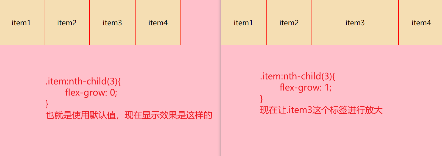
flex-grow属性用来控制当前项目是否放大显示。默认值为0,表示即使容器有剩余空间也不放大显示。如果设置为1(如果值更大,效果也一样),则平均分摊后放大显示。
其值通常有0和1
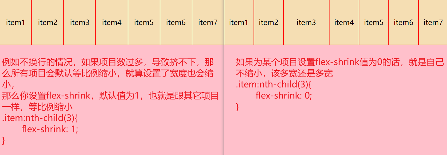
flex-shrink属性表示元素的缩小比例,默认值为1,如果空间不够用时所有的项目同比缩小。如果一个项目的该属性设置为0,则空间不足时该项目也不缩小。
flex-basis定义了该元素的空间大小(the size of that item in terms of the space),flex 容器里除了元素所占的空间以外的富余空间就是可用空间(available space)。 该属性的默认值是 auto
Flex简写形式允许你把三个数值按这个顺序书写 — flex-grow,flex-shrink,flex-basis
order定义项目的排列顺序
order属性定义项目的排列顺序
	order: 0; 默认值是0,注意数值越小,排列越靠前,它和z-index不一样
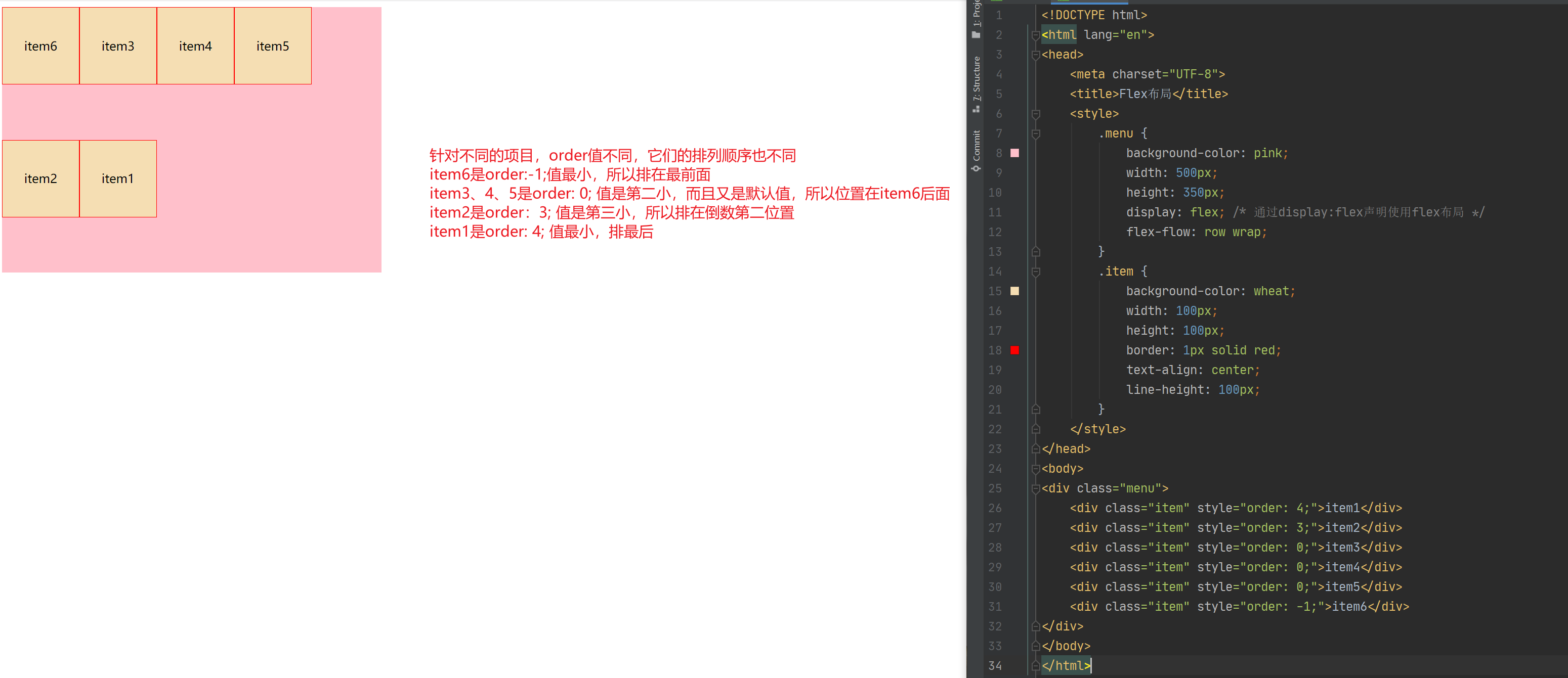
<!DOCTYPE html>
<html lang="en">
<head>
	<meta charset="UTF-8">
	<title>Flex布局</title>
	<style>
		.menu {
			background-color: pink;
			width: 500px;
			height: 350px;
			display: flex; /* 通过display:flex声明使用flex布局 */
			flex-flow: row wrap;
		}
		.item {
			background-color: wheat;
			width: 100px;
			height: 100px;
			border: 1px solid red;
			text-align: center;
			line-height: 100px;
		}
	</style>
</head>
<body>
<div class="menu">
	<div class="item" style="order: 4;">item1</div>
	<div class="item" style="order: 3;">item2</div>
	<div class="item" style="order: 0;">item3</div>
	<div class="item" style="order: 0;">item4</div>
	<div class="item" style="order: 0;">item5</div>
	<div class="item" style="order: -1;">item6</div>
</div>
</body>
</html>
补充一下,flex的order属性和css中的z-index属性的区别。
咱们flex中的order属性就是用来调整指定项目在容器中的排列顺序,而z-index通常用于定位中,调整重叠定位元素的叠放次序,什么意思呢?如下图左图,三个div都用了绝对定位,所以它们出现了层叠现象,那么如果想调整层叠顺序?怎么办?这个时候就可以用z-index来调整了。
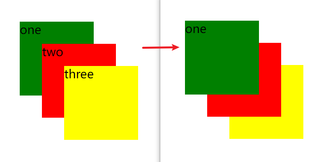
在CSS中,想调整重叠定位元素的叠放次序,可以对定位元素应用z-index层叠等级属性,其取值可为正整数、负整数和0。
例如: z-index:2;
注意:
- z-index的默认属性值为0,取值越大,定位元素在层叠元素中越居上;
- 如果取值相同,根据书写顺序,后来者居上;
- 数字后面一定不能加单位;
- 只有相对定位、绝对定位、固定定位有此属性,其余标准流、浮动、静态定位都没有这个属性,亦不可指定此属性。
<!DOCTYPE html>
<html lang="en">
<head>
    <meta charset="UTF-8">
    <meta http-equiv="X-UA-Compatible" content="IE=edge">
    <meta name="viewport" content="width=device-width, initial-scale=1.0">
    <title>Z-Index</title>
    <style>
        .c1{
            /* width: 300px;
            height: 300px;
            background-color: hotpink; */
            position: relative;
        }
        .c1 div{
            width: 100px;
            height: 100px;
        }
        .c1 div:nth-child(1){
            background-color: green;
            position: absolute;
            top:30px;
            left: 30px;
            z-index: 2;
        }
        .c1 div:nth-child(2){
            background-color: red;
            position: absolute;
            top:60px;
            left: 60px;
            z-index: 1;
        }
        .c1 div:nth-child(3){
            background-color: yellow;
            position: absolute;
            top:90px;
            left: 90px;
        }
    </style>
</head>
<body>
    <div class="c1">
        <div>one</div>
        <div>two</div>
        <div>three</div>
    </div>
</body>
</html>
参考:https://blog.csdn.net/gua222/article/details/105971947
align-self
align-self属性允许单个项目有与其他项目不一样的对齐方式,可覆盖align-items属性,默认值为auto,表示继承父元素的align-items属性,如果没有父元素,则等同于stretch。
.item {
  align-self: auto | flex-start | flex-end | center | baseline | stretch;
}
<!DOCTYPE html>
<html lang="en">
<head>
	<meta charset="UTF-8">
	<title>Flex布局</title>
	<style>
		.menu {
			background-color: pink;
			width: 500px;
			height: 350px;
			display: flex; /* 通过display:flex声明使用flex布局 */
			flex-direction: row;
		}
		.item {
			background-color: wheat;
			width: 100px;
			height: 100px;
			border: 1px solid red;
			text-align: center;
			line-height: 100px;
		}
		.item:nth-child(3){
			align-self: flex-end;
		}
	</style>
</head>
<body>
<div class="menu">
	<div class="item">item1</div>
	<div class="item">item2</div>
	<div class="item">item3</div>
	<div class="item">item4</div>
</div>
</body>
</html>
flex-grow
flex-group属性用来控制当前项目是否放大显示。默认值为0,表示即使容器有剩余空间也不放大显示。如果设置为1(如果值更大,效果也一样),则平均分摊后放大显示。
<!DOCTYPE html>
<html lang="en">
<head>
	<meta charset="UTF-8">
	<title>Flex布局</title>
	<style>
		.menu {
			background-color: pink;
			width: 500px;
			height: 350px;
			display: flex; /* 通过display:flex声明使用flex布局 */
			flex-direction: row;
		}
		.item {
			background-color: wheat;
			width: 100px;
			height: 100px;
			border: 1px solid red;
			text-align: center;
			line-height: 100px;
		}
		.item:nth-child(3){
			flex-grow: 1;
		}
	</style>
</head>
<body>
<div class="menu">
	<div class="item">item1</div>
	<div class="item">item2</div>
	<div class="item">item3</div>
	<div class="item">item4</div>
</div>
</body>
</html>
flex-shrink
flex-shrink属性表示元素的缩小比例,默认值为1,如果空间不够用时所有的项目同比缩小。如果一个项目的该属性设置为0,则空间不足时该项目也不缩小。
如果flex-shrink属性值是1,或者更大的数,则缩小比例会更大,即它比别的项目缩得更小,但宽度最小就是文本的宽度了(因为再小的话,文本都撑着不让)。
注意:flex 元素仅在默认宽度之和大于容器的时候才会发生收缩,其收缩的大小是依据 flex-shrink 的值。如果元素不是弹性盒对象的元素,则 flex-shrink 属性不起作用。另外,其值不允许为负值。
<!DOCTYPE html>
<html lang="en">
<head>
	<meta charset="UTF-8">
	<title>Flex布局</title>
	<style>
		.menu {
			background-color: pink;
			width: 500px;
			height: 350px;
			display: flex; /* 通过display:flex声明使用flex布局 */
			flex-direction: row;
		}
		.item {
			background-color: wheat;
			width: 100px;
			height: 100px;
			border: 1px solid red;
			text-align: center;
			line-height: 100px;
		}
		.item:nth-child(3){
			flex-shrink: 0;
		}
	</style>
</head>
<body>
<div class="menu">
	<div class="item">item1</div>
	<div class="item">item2</div>
	<div class="item">item3</div>
	<div class="item">item4</div>
	<div class="item">item5</div>
	<div class="item">item6</div>
	<div class="item">item7</div>
</div>
</body>
</html>
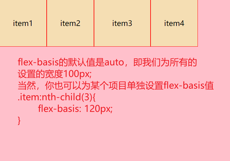
flex-basis
flex-basis 定义了该元素的空间大小(the size of that item in terms of the space)**,flex 容器里除了元素所占的空间以外的富余空间就是可用空间(available space)。 该属性的默认值是 auto 。此时,浏览器会检测这个元素是否具有确定的尺寸。 在下面的例子中,所有元素都设定了宽度(width)为 100px,所以 flex-basis 的值为 100px。
<!DOCTYPE html>
<html lang="en">
<head>
	<meta charset="UTF-8">
	<title>Flex布局</title>
	<style>
		.menu {
			background-color: pink;
			width: 500px;
			height: 350px;
			display: flex; /* 通过display:flex声明使用flex布局 */
			flex-direction: row;
		}
		.item {
			background-color: wheat;
			width: 100px;
			height: 100px;
			border: 1px solid red;
			text-align: center;
			line-height: 100px;
		}
		.item:nth-child(3){
			flex-basis: 120px;
		}
	</style>
</head>
<body>
<div class="menu">
	<div class="item">item1</div>
	<div class="item">item2</div>
	<div class="item">item3</div>
	<div class="item">item4</div>
</div>
</body>
</html>
flex属性的简写
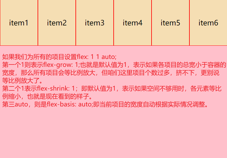
你可能很少看到 flex-grow,flex-shrink,和 flex-basis 属性单独使用,而是混合着写在 flex 简写形式中。 Flex 简写形式允许你把三个数值按这个顺序书写 — flex-grow,flex-shrink,flex-basis。
你可以在下面的实例中尝试把 flex 简写形式中的数值更改为不同数值,但要记得第一个数值是 flex-grow。赋值为正数的话是让元素增加所占空间。第二个数值是flex-shrink — 正数可以让它缩小所占空间,但是只有在 flex 元素总和超出主轴才会生效。最后一个数值是 flex-basis;flex 元素是在这个基准值的基础上缩放的。
<!DOCTYPE html>
<html lang="en">
<head>
	<meta charset="UTF-8">
	<title>Flex布局</title>
	<style>
		.menu {
			background-color: pink;
			width: 500px;
			height: 350px;
			display: flex; /* 通过display:flex声明使用flex布局 */
			flex-direction: row;
		}
		.item {
			background-color: wheat;
			width: 100px;
			height: 100px;
			border: 1px solid red;
			text-align: center;
			line-height: 100px;
			flex: 1 1 auto;
		}
	</style>
</head>
<body>
<div class="menu">
	<div class="item">item1</div>
	<div class="item">item2</div>
	<div class="item">item3</div>
	<div class="item">item4</div>
	<div class="item">item5</div>
	<div class="item">item6</div>
</div>
</body>
</html>
还有其他情况,就是这个flex有一些简写形式,下面是几种预定义的值:
flex: initialflex: autoflex: noneflex:
flex: initial 是把 flex 元素重置为 Flexbox 的初始值,它相当于 flex: 0 1 auto。在这里 flex-grow 的值为 0,所以 flex 元素不会超过它们 flex-basis 的尺寸。flex-shrink 的值为 1, 所以可以缩小 flex 元素来防止它们溢出。flex-basis 的值为 auto. Flex 元素尺寸可以是在主维度上设置的,也可以是根据内容自动得到的。
flex: auto 等同于 flex: 1 1 auto;和上面的 flex:initial 基本相同,但是这种情况下,flex 元素在需要的时候既可以拉伸也可以收缩。
flex: none 可以把 flex 元素设置为不可伸缩。它和设置为 flex: 0 0 auto 是一样的。元素既不能拉伸或者收缩,但是元素会按具有 flex-basis: auto 属性的 flexbox 进行布局。
你在其它地方也会常看到的 flex: 1 或者 flex: 2 等等。它相当于flex: 1 1 0。元素可以在flex-basis为 0 的基础上伸缩。

 浙公网安备 33010602011771号