【CSS】CSS3
边框
border-radius圆角边框
四个值: 第一个值为左上角,第二个值为右上角,第三个值为右下角,第四个值为左下角。
三个值: 第一个值为左上角, 第二个值为右上角和左下角,第三个值为右下角
两个值: 第一个值为左上角与右下角,第二个值为右上角与左下角
一个值: 四个圆角值相同
box-shadow盒阴影
box-shadow: offset-x offset-y blur spread color inset
box-shadow: X轴偏移量 Y轴偏移量 [阴影模糊半径] [阴影扩展] [阴影颜色] [投影方式]
offset-x:必需,取值正负都可。offset-x水平阴影的位置。
offset-y:必需,取值正负都可。offset-y垂直阴影的位置。
blur:可选,只能取正值。blur-radius阴影模糊半径,0即无模糊效果,值越大阴影边缘越模糊。
spread:可选,取值正负都可。spread代表阴影的周长向四周扩展的尺寸,正值,阴影扩大,负值阴影缩小。
inset:可选。关键字,将外部投影(默认outset)改为内部投影。inset 阴影在背景之上,内容之下。可以写在参数的第一个或最后一个,其他位置无效。
border-image边界图片
border-image: url(border.png) 30 round
border-image: source slice width outset repeat
border-image-sourc:用于指定要用于绘制边框的图像的位置
border-image-slice:图像边界向内偏移
border-image-width:图像边界的宽度
border-image-outset:用于指定在边框外部绘制 border-image-area 的量
border-image-repeat:用于设置图像边界是否应重复(repeat)、拉伸(stretch)或铺满(round)。
背景
background-image背景图片
不同的背景图像和图像用逗号隔开,所有的图片中显示在最顶端的为第一张。
background-image: url(flwr.gif), url(paper.gif);
background-position: right bottom, left top;
background-repeat: no-repeat, repeat;
background-size背景图片的大小
可以指定像素或百分比大小。指定的大小是相对于父元素的宽度和高度的百分比的大小。
background-origin背景图像的位置区域
content-box, padding-box,和 border-box区域内可以放置背景图像。
background-clip背景剪裁
content-box, padding-box,和 border-box
渐变
linear-gradien水平渐变
background-image: linear-gradient(to right,#e66465, #9198e5)
to bottom、to top、to right、to left、to bottom right
background-image: linear-gradient(angle, color-stop1, color-stop2)
使用透明度
background-image: repeating-linear-gradient(red, yellow 10%, green 20%)
径向渐变radial-gradient
background-image: radial-gradient(shape size at position, start-color, ..., last-color)
shape:circle 表示圆形,ellipse 表示椭圆形
background-image: radial-gradient(circle, red, yellow, green)
size :渐变的大小。closest-side、farthest-side、closest-corner、farthest-corner
background-image: radial-gradient(closest-side at 60% 55%, red, yellow, black)
background-image: radial-gradient(farthest-side at 60% 55%, red, yellow, black)
repeating-radial-gradient() 函数用于重复径向渐变
background-image: repeating-radial-gradient(red, yellow 10%, green 15%)
文本效果
text-shadow文本阴影
text-shadow: 5px 5px 5px #FF0000;
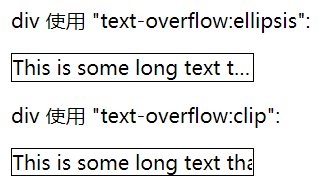
text-overflow溢出属性
ellipsis、clip
white-space:nowrap
overflow:hidden;
white-space:nowrap文本不会换行会在同一行上继续,直到遇到<br>
word-wrap(overflow-wrap)对长的不可分割的单词进行分割并换行到下一行(允许断句)
normal只在允许的断字点换行
break-word在长单词或 URL 地址内部进行换行
word-break非中日韩文本的单词换行(怎么样断句)
normal默认行为
keep-all只能在半角空格或连字符处换行
break-all允许在单词内换行
字体
@font-face 规则
@font-face { font-family: myFirstFont; src: url(sansation_light.woff); }
div { font-family:myFirstFont; }
2D转换
translate() 平移
根据左(X轴)和顶部(Y轴)位置给定的参数,从当前元素位置移动
transform: translate(50px,50px)
rotate() 旋转
在一个给定度数顺时针旋转的元素。负值是允许的,这样是元素逆时针旋转。
transform: rotate(30deg)
scale()缩放
该元素增加或减少的大小,取决于宽度(X轴)和高度(Y轴)的参数
transform: scale(2,3)
skew() 倾斜
表示X轴和Y轴倾斜的角度,如果第二个参数为空,则默认为0,参数为负表示向相反方向倾斜。
transform: skew(30deg,20deg)
matrix()
matrix 方法有六个参数,包含旋转,缩放,移动(平移)和倾斜功能。
3D转换
rotateX()
围绕其在一个给定度数X轴旋转的元素
transform: rotateX(120deg)
rotateY()
围绕其在一个给定度数Y轴旋转的元素
transform: rotateY(130deg)
过渡
从一种样式逐渐改变为另一种的效果
div {
width: 100px;
height: 100px;
background: red;
transition: width 2s, height 2s, transform 2s;
}
div:hover {
width: 200px;
height: 200px;
-webkit-transform: rotate(180deg); /* Chrome, Safari, Opera */
transform: rotate(180deg);
}
transition-property 应用过渡的 CSS 属性的名称
transition-duration 过渡效果花费的时间
transition-timing-function 过渡效果的时间曲线
transition-delay 过渡何时开始
transition: width 1s linear 2s
动画
@keyframes
@keyframes myfirst {
from {background: red;}
to {background: yellow;}
}
键词 "from" 和 "to",等同于 0% 和 100%
animation: myfirst 5s;
@keyframes myfirst { 0% {background: red;} 25% {background: yellow;} 50% {background: blue;} 100% {background: green;} }
多列
column-count: 3; // 需要分割的列数
column-width: 100px; //列的宽度,与count只有要一个存在就可以实现了
column-gap: 100px; // 列与列间的间隙
column-rule:1px solid lightblue; // 下面三的合并
column-rule-width: 30px; // 列与列间的边框厚度
column-rule-style: solid; // 列与列间的边框样式none|hidden|dotted|dashed|solid|double|groove|ridge|inset|outset
column-rule-color: greenyellow; // 列与列间的边框颜色
注意:有单词的文本实现多列记得加上
word-wrap:break-word;
word-break: break-all;
调整尺寸
使元素可以让用户调整
resize:both|horizontal|vertical|none;
overflow:auto;
box-sizing
box-sizing: content-box|border-box|inherit
border-box对元素指定宽度和高度包括了 padding 和 border
outline-offset
outline:2px solid red; // 在border外的轮廓 outline-offset:15px; //距离border外的距离
响应式图片
max-width: 100%;
height: auto;
弹性盒子
对于子元素
order:-1;设置排列顺序,数字小的排前面
设置margin:auto自动获取容器中剩余的空间
align-self:auto|flex-start|flex-end|center|baseline|stretch
flex:auto|initaial|none|inherit|[flex-grow]|[flex-shrink]|[flex-basis]
多媒体查询
@media not|only mediatype and (expressions) { CSS 代码...; }
not 排除某些类型的设备,比如@media not print
only 用来特定的某种特别的媒体类型
all 所有设备
或者不同媒体上使用不同样式文件
<link rel="stylesheet" media="mediatype and|not|only (expressions)" href="print.css">
多媒体类型:
all 用于所有多媒体类型设备
print 用于打印机
screen 用于电脑屏幕,平板,智能手机
speech 用于屏幕阅读器
@media screen and (min-width: 480px) {
}
520px-699px
@media screen and (max-width: 699px) and (min-width: 520px) {
}
opacity:value(0~1)
不透明度 0完全透明,1完全不透明
filter滤镜属性
filter: none | blur() | brightness() | contrast() | drop-shadow() | grayscale() | hue-rotate() | invert() | opacity() | saturate() | sepia() | url()
具体参考https://www.runoob.com/cssref/css3-pr-filter.html
direction文本方向
ltr | rtl
外部样式表
<head>
<link rel="stylesheet" type="text/css" href="mystyle.css">
</head>
内联样式)Inline style > (内部样式)Internal style sheet >(外部样式)External style sheet > 浏览器默认样式

 浙公网安备 33010602011771号