
CSS盒子水平垂直的几种方案
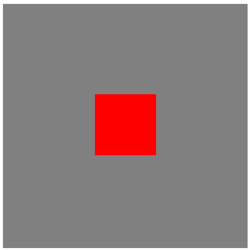
方案一:定位+margin
<!DOCTYPE html>
<html>
    <head>
        <meta charset="UTF-8">
        <title></title>
        <style type="text/css">
            #bigBox{
              width: 400px;
              height: 400px;
              background: gray;
              position: relative;
            }
            #smallBox{
              width: 100px;
              height: 100px;
              background: red;
              position: absolute;
              left: 50%;
              top: 50%;
              margin-left: -50px;
              margin-top: -50px;
            }
        </style>
    </head>
    <body>
      <div id='bigBox'>
        <div id='smallBox'></div>
      </div>
    </body>
</html>
方案二:定位+transform
<!DOCTYPE html>
<html>
    <head>
        <meta charset="UTF-8">
        <title></title>
        <style type="text/css">
            #bigBox{
              width: 400px;
              height: 400px;
              background: gray;
              position: relative;
            }
            #smallBox{
              width: 100px;
              height: 100px;
              background: red;
              position: absolute;
              left: 50%;
              top: 50%;
              transform: translate(-50%,-50%);
            }
        </style>
    </head>
    <body>
      <div id='bigBox'>
        <div id='smallBox'></div>
      </div>
    </body>
</html>
方案三:定位+margin:auto
<!DOCTYPE html>
<html>
    <head>
        <meta charset="UTF-8">
        <title></title>
        <style type="text/css">
            #bigBox{
              width: 400px;
              height: 400px;
              background: gray;
              position: relative;
            }
            #smallBox{
              width: 100px;
              height: 100px;
              background: red;
              position: absolute;
              left: 0;
              top: 0;
              right: 0;
              bottom: 0;
              margin: auto;
            }
        </style>
    </head>
    <body>
      <div id='bigBox'>
        <div id='smallBox'></div>
      </div>
    </body>
</html>
方案四:display:flex
<!DOCTYPE html>
<html>
    <head>
        <meta charset="UTF-8">
        <title></title>
        <style type="text/css">
            #bigBox{
              width: 400px;
              height: 400px;
              background: gray;
              display: flex;
              justify-content: center;
              align-items: center;
            }
            #smallBox{
              width: 100px;
              height: 100px;
              background: red;
            }
        </style>
    </head>
    <body>
      <div id='bigBox'>
        <div id='smallBox'></div>
      </div>
    </body>
</html>
方案5:display:table-cell
<!DOCTYPE html>
<html>
    <head>
        <meta charset="UTF-8">
        <title></title>
        <style type="text/css">
            #bigBox{
              width: 400px;
              height: 400px;
              background: gray;
              display: table-cell;
              text-align: center;
              vertical-align: middle;
            }
            #smallBox{
              width: 100px;
              height: 100px;
              background: red;
              display: inline-block;
            }
        </style>
    </head>
    <body>
      <div id='bigBox'>
        <div id='smallBox'></div>
      </div>
    </body>
</html>

