
Css
CSS(表现)
- CSS是什么
- CSS怎么用
- CSS选择器
- 美化页面(文字,阴影,列表,超链接,渐变)
- 盒子模型
- 浮动
- 定位
CSS是什么?
Cascading Style Sheet层叠级联样式表
CSS:表现(美化页面)
字体,颜色,边距,高宽度,背景图片,网页定位
3种CSS导入方式:
- 行内元素:在标签元素中,编写一个style属性
- 内部样式:写在html里,一般写在head标签里的style标签下
- 外部样式:最好新建一个css文件,使用外连接link的方式,提高复用性
- 优先级:就近原则 ,所以是行内》内部(外部这两个看谁离标签近)
行内:
<h1 style="color: rebeccapurple">你好啊</h1>
内部
<style>
        h1{
            color: rebeccapurple;
        }
</style>
外部:
<link rel="stylesheet" href="../CSS/css1.css">
选择器:
作用:
选择页面上某一个或某一类元素
基本选择器:
语法:选择器{
代码块;
}
-
标签选择器:选中所有相同标签
-
类选择器:选中所有得相同类名的元素,跨标签
- 优点:将多个标签分类,可以复用
- 语法 .class{}
-
id选择器:全局唯一
- 语法#id{}
    <style>
<!--   标签选择器     -->
        h1{
            color: #18d497;
        }
        /*class:定义一个类性的元素,不唯一,可以有多个*/
        .css{
            color: #f10b0b;
        }
        /*id:全局唯一,只有一个*/
        #CSS{
            color: #d4ae18;
        }
        #CSS2{
            color: black;
        }
    </style>
层级选择器:
- 后代选择器:祖爷爷,爷爷,爸爸,孙子
- 语法: 标签 标签{}
- 子选择器:选择元素后的当前一代的所有元素
- 语法:标签>标签{}
- 相邻兄弟选择器:选择元素的后一个元素
- 语法:标签+标签{}
- 通用选择器:选择元素的后面的所有兄弟元素
- 语法:标签~标签{}
    <style>
<!--    后代选择器    -->
        body p{
            background-color: #f10b0b;
        }
        /*子类选择器,就一代(同一层)*/
        body>p{
            background-color: #18d497;
        }
    /*   相邻兄弟选择器,就一个 */
        .One+p{
            background-color: rebeccapurple;
        }
    /*  通用选择器 ,当前选中元素的向下所有兄弟(同层) */
.One~p{
    background-color: aqua;
}
    </style>
结构伪类选择器:
div:nth-of-type(2)   父类:第二个{}:  以div为父类下的第二个div
div:first-child:第1个div
div:last-child:最后一个
伪类:实现选择器的特殊效果
p:first—child
p: last-child
    <style>
        <!--  ul第一个子元素  -->
        li:first-child{
            background-color: red;
        }

        <!--    ul的最后一个子元素-->
                li:last-child{
            background-color: #18d497;
                }
          /*  伪类实现,选择器的特殊效果,这里就是鼠标放上去显示颜色    */
          p:hover{
              background-color: #18d497;
          }
    </style>
属性选择器(好用):
-
属性选择器
- 语法[属性]{}
-
属性和值选择器
- 语法[属性=值]{}
-
属性和值选择器(多选)
- 语法[属性~=值]{}
-
括号里的符号的使用(正则表达式通配符)
- =绝对等于
- *=包含这个元素
- ^=以这个开头
- $=以这个结尾
    <style>
        div{
            width: 20px;
            height: 20px;
            border: 1px solid red;
        }
    /*属性选择器*/
        [class]{
            color: #18d497;
        }
    /*属性和值选择器*/
        [class ="One"]{
            color: red;
        }
    /*属性和值的选择器 - 多值*/
    [class*="Three"]{
        color: aqua;
    }
    </style>
</head>
<body>
<div>1</div>
<div class="One">2</div>
<div class="Two">3</div>
<div>4</div>
<div>5</div>
<div class="Three body">6</div>
</body>
美化页面元素:
-
span标签:重点要突出的字,用span套起来
-
字体样式:
- 设置字体(楷书等等):font-family
- 斜体,正常: italic normal
- 字体大小: font-size(常用em代替px,1em=16px)
- 颜色:color
- 粗细:font-weight
-
文本样式:
- 颜色:color rgb ,rgba
- 文本对齐方式:text-align:center
- 首行缩进:text-indent
- 行高:line-hight
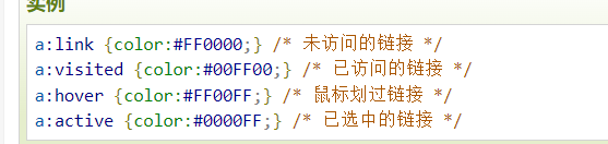
- 文本装饰(下划线):text-decoration:none(可以用来去掉a标签下划线)
- 阴影:text-shadow:(可设置成发光),百度
   /* 颜色color
       rgb:#000000(16进制,6位数分3,分别对应红绿蓝)
       rgba:(0~255,0~255,0~255,0~1) 最后一个0~1是显示深度

       text-align:   排版,一般用居中
       text-indent:缩进
       line-hight:行高,当与hight一样时,实现上下居中
       */
        h4:hover{
           color: rgba(0,0,255,0.5);
            text-indent: 1em;
            height: 10px;
            line-height: 10px;
        }
        h1{
            text-align: center;
        }
    </style>
拓展:超链接伪类
<!-- 超链接伪类--> <style> 鼠标悬浮 a:hover{ background-color:rgba(0,0,168,0.4); text-decoration: none; } </style> </head> <body> <a href="https://www.baidu.com">点击此次</a> </body> -
列表美化
list-style:none --去掉原点 list-syle:circle--空心原 其他百度 -
背景图像应用及渐变:
-
图像:
div{ width: 1000px; height: 500px; /*颜色,图片,图片位置,平铺方式*/ background:red url("../resource/img_1.png") 270px 10px no-repeat; /*background-image: url("../resource/img.png");*/ } .One{ /*向左右填充*/ background-repeat: repeat-x; } .Two{ /*向上下填充*/ background-repeat: repeat-y; } .Three{ /*不填充*/ background-repeat: no-repeat; } -
渐变:网站(grabient)
-
盒子模型
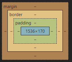
- margin:外边距
- padding:内边距
- boder边框
边框:
-
粗细
-
样式:soild实线,dashed虚线
/*boder:粗细,样式(soild实线,dashed虚线 ),颜色*/ #main{ border: 1px solid red; width: 400px; height: 150px; } -
颜色
-
圆角边框:boder-radius
<style> div{ border: 1px solid red; /*radius:顺时针===> 左上,右上,右下,左下 */ /*画圆技巧: 内容高宽相等,圆角radius一样且为内容+边框的一半 21=(40+2)/2 (内容+边框)/2 这里也可以直接用50%来表示 */ /*border-radius: 21px 21px 0px 0px;*/ border-radius: 50% 50% 50% 50%; width: 30px; height: 40px; padding-left: 10px; } </style> -
盒子阴影:box-shadow(百度)
边距:
注意:我们设置一个元素的width和height只是设置了内容的的大小
margin:外边距
   /*margin 0 0 0 0:
    顺时针:上右下左
    margin:0 0  上 左
    margin:0    4边
    */
padding:内边距
整个的盒子计算方式:margin+padding+border+内容
浮动:
标准文档流:
文档流指的是元素排版布局过程中,元素会默认自动从左往右,从上往下的流式排列方式。并最终窗体自上而下分成一行行,并在每行中从左至右的顺序排放元素。
块元素:独占一行
div,h1,p,列表。。。
行内元素:按内容撑开
span,a,img,b。。。
行内元素可以在块级里,反之不可以
转换(display):
line:块级元素转行内元素
block:行内元素转块级元素
line-block:行内块元素(能像块级元素一样撑开内容,又能像行内元素一样都在一行)
浮动(float):
-
什么是浮动?
-
CSS 的 Float(浮动),会使元素向左或向右移动,其周围的元素也会重新排列。Float(浮动),往往是用于图像,但它在布局时一样非常有用。
-
浮动会脱离文档流,也就是它不会占用空间
-
一个浮动元素会尽量向左或向右移动,直到它的外边缘碰到包含框或另一个浮动框的边框为止。浮动元素之后的元素将围绕它(当我们缩小网页比例会产生塌陷)。
-
-
浮动怎么用?
-
float:left(fight)
-
清除浮动:clear:both;
-
-
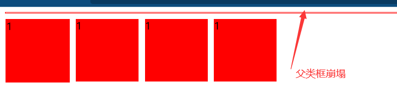
浮动产生的塌陷问题
![1642324755694]()
-
如果父元素只包含浮动元素,且父元素未设置高度和宽度的时候,那么它的高度就会踏缩为零。这是因为浮动元素脱离了文档流,包围它们的父块中没有内容了,所以“”塌陷“”了。
-
解决
- 由于没有设置父类宽高度,那我们就设置宽高度(设置了高宽,限制了,不推荐)
- 使用一个空标签div,并使用clear清除上下浮动,并且div是块级元素会把父类撑起来(有一个空div,不推荐)
- overflow=auto(一些下拉的场景避免使用,不推荐)
- 用伪类:after(推荐)
<style>
      div:first-child{
          /*1.设置父类宽高度*/
          /*width: 1000px;*/
          /*height: 1000px;*/
          border: 1px solid red;
          /*3.设置overflow清除溢出*/
          /*overflow: auto;*/
      }
      /*4使用伪类(最好的方式)*/
      div:first-child:after{
          content: "";
          display: block; /*使它变成块级元素,然后就是跟第2种方法一样,但是不需要一个空div*/
          clear: both;
      }
      div>div{
          width: 100px;
          height: 100px;
          background-color: red;
          margin-right: 10px;
          margin-top: 10px;
          float: left;
          }
      /*2.设置一个空div使用clear:both,情况左右浮动,凭借div是块级元素撑起父元素*/
      #CLEAR{
          clear: both;
      }
  </style>
</head>
<body>
<div>
    <div>1</div>
    <div>1</div>
    <div>1</div>
    <div>1</div>
</div>
<!--<div id="CLEAR"></div>-->
</body>
对比:
-
display:方向不能控制
-
float:脱离了标准文本流
-
定位:
相对定位:(relative)
- 相对于自己之前的位置
- 依然是文档流
- 原来的位置还在
<head>
    <meta charset="UTF-8">
    <title>Title</title>
    <style>
        *{
            text-decoration: none;
        }
        div{
            height: 150px;
            width: 150px;
            border: 1px solid red;
        }
        a{
            display: block;
            width: 43px;
            height: 43px;
            border: 1px solid;
            background-color: #ffcae5;
            line-height: 43px;
        }
        a:hover{
            background-color: blue;
        }
        a:nth-child(2){
            position: relative;
            left: 100px;
            top:-45px;
        }
        a:nth-child(3){
            position: relative;
            top: 10px;
        }
        a:nth-child(4){
            position: relative;
            left: 100px;
            top: -35px;
        }
        a:nth-child(5){
            position: relative;
            left: 50px;
            top: -130px;
        }
    </style>
</head>
<body>
<div>
  <a href="">链接1</a>
  <a href="">链接2</a>
  <a href="">链接3</a>
  <a href="">链接4</a>
  <a href="">链接5</a>
</div>
绝对定位(absolute):
- 当我们没有定义父类相对定位的情况下,相对于浏览器定位
- 假设父类存在定位,就会以最近父类元素进行偏移
- 原来的位置不会保留
    <style>
        #father{
            width: 1000px;
            height: 100px;
            border: 1px solid red;
            position: relative;
        }
        #father>div{
            width: 100px;
            height: 30px;
            border: 1px solid;
            line-height: 30px;
            text-align: center;
            float: left;
            margin-left: 20px;
            margin-top: 20px;
            position: relative;
        }
       #Two{
           width: 60px;
           height: 15px;
           line-height: 15px;
           border: 1px solid;
           position: absolute;
           left: 10px;
       }
        #father>div:nth-child(1){
            /*当我们没用定义父类的相对定位时,就是以浏览器为父类*/
            position: absolute;
            right: 100px;
        }
    </style>
</head>
<body>
<div id="father">
    <div>1
        <div id="Two">2</div>
    </div>
    <div>3</div>
    <div>4</div>
</div>
</body>
固定定位(fixed):
    <style>
        body{
            height: 1000px;
        }
        div{
            height: 100px;
            width: 100px;
            position: fixed;
            left: 10px;
            top: 20px;
            border: 1px solid;
        }
    </style>
</head>
<body>
<div>
    <p>点击我</p>
</div>
总结:
-
首先知道CSS是干什么的
- 对HTML的结构标签进行修饰
- 修饰哪些呢?
- 文字,图片,布局
-
既然是修饰标签那就要选中,又有哪些选中方式呢
- 基础选择器:标签,id,class
- 层级选择器:后代(空格),子代(>),兄弟(+)
- 结构伪类选择器:
- nth-child(n)/nth-of-type(n)
- 伪类:使用冒号:和选择器连在一起
- hover:触碰生成的效果
- 其他百度
- 属性选择器
- [属性名]
- 有属性名相同时:[属性名="内容"]
- 当内容只是包含时:[属性名*="内容 其他内容"]
-
现在已经选中了,又有哪些修饰呢
- 基础修饰:
- 大小,颜色
- 文本,文字:
- 文字:类型(楷体),粗斜体,
- 文本:text-align排版(居中),text-indent:缩进,line-hight:行高,text-shadow:阴影
- 对超链接:超链接伪类和去掉下划线
- 列表:去掉前面的图标
- 背景图像:渐变
- 基础修饰:
-
还有最重要的修饰,就是布局
- 说到布局,就要说说盒子模型
- 什么是盒子模型? 标签元素就像是一个个盒子一样
- 盒子有哪些组成
- 外边框margin
- 内填充:padding
- 内容:content
- 边框:border
- 说说边框:有boder-radius可以使边框变成圆
- 内容呢就是我们设置的高宽:height,width
- 一个盒子的总宽高:(边框border+外边框margin+内填充padding)*2+内容content
- 说到布局,就要说说盒子模型
-
现在有了一个个盒子了,我们该怎么布局呢
- 浮动
- 标准流:就是网页从上到下,从左到右的排序
- 块元素:独为一行,根据设置高宽撑开
- 行内元素:宽高由内容决定,由内容高宽撑起来,并且可以和其他元素排成一行
- display
- block(块):将行内元素转化成块
- line:将块元素转换成行内元素
- line-block:以块元素撑开,但又是以行内元素排列
- 用途:可以做导航栏,使垂直变成横向排列
- float(浮动)
- 会使标签元素摆脱文档流,不占用页面空间
- float:left(左)right(右)
- 当我们的父类元素没有设置高宽,由子元素撑起来,但是子元素又全浮动的时候,就会产生父元素崩塌
- 解决办法4种
- 标准流:就是网页从上到下,从左到右的排序
- 定位(position)
- 相对定位(relative):
- 以自己之前的位置为相对位置
- 绝对定位(absolute)
- 在没用定义父类的相对定位时,以浏览器的位置定位
- 固定定位(fixed)
- 以一个页面的位置为准,不管你往下滑多少,始终在浏览器的那个位置上
- 相对定位(relative):
- 浮动

 浙公网安备 33010602011771号