

弹性盒子——(flex,align-xxx,justify-content)样式,定位,换行
前提
把display: flex的div容器叫做flexBox,被浮动的叫做flexItem
样式————宽度——flex 属性是 flex-grow、flex-shrink 和 flex-basis 属性的简写
语法:felx: grow|shrink|basis ;  //任选一个而不是都写,一般就只用grow:number 或者 basis:百分比两种。shrink是收缩,不好控制
设置在每个flexItem上可以为其按比例分配宽度
felx: 1;    or    flex: 10%;  //basis如果所有flexItem的和大于了100%是要被换行的
样式————排列方式felx-flow
是flex-direction和flex-warp的简写
语法
flex-flow: flex-direction flex-wrap;
方向flex-direction
| 值 | 描述 |
|---|---|
| row | 默认值。生的,顺着排。 |
| row-reverse | 倒序排。 |
| column | 竖着排 |
| column-reverse | 竖着 + 倒序 |
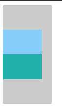
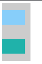
| flex-direction和justify-content倒序排的区别:flex-direction是方向倒叙,justify-content是位置倒叙,如下 | <div color="green">1</div> <div color="blue">2</div> |
| flex-direction | justify-content |
 |
 |
换行felx-warp
nowrap,warp,wrap-reverse
定位align-content,align-items,这两个的属性名&描述都是一样的
align-content是用于定义多行的,就是flex-warp的那种,定义全部元素,相对于整个容器而言的;这个和align-items的区别在center上展现的非常明显
align-content实时效果看这里 https://www.runoob.com/try/playit.php?f=playcss_align-content&preval=stretch
align-items实时效果看这里 https://www.runoob.com/try/playit.php?f=playcss_align-items&preval=center
| 值 | 描述 |
|---|---|
| center | 元素位于容器的中心。 |
| flex-start | 元素位于容器的开头。 |
| flex-end | 元素位于容器的结尾。 |
| space-between | 元素位于各行之间留有空白的容器内。 |
| space-around | 元素位于各行之前、之间、之后都留有空白的容器内。 |
align-content的center:两个div形成的整体在容器的中间居中
align-items的center,各个div在各自warp所得的行内居中
综上所述:content是总体的居中、倒叙...;items是行内的居中、倒叙...

 浙公网安备 33010602011771号