WPF 模板Template
一、定义:
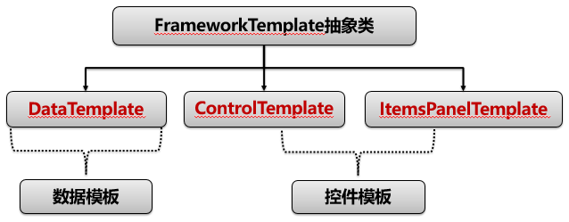
Template:在WPF中,Template通常指的是控件的模板,用于定义控件的外观和结构。每个控件都有一个默认的模板,但我们可以通过自定义模板来完全改变控件的外观,而不改变其行为。Template通常通过设置控件的Template属性来指定。
- ControlTemplate:控件模板,用于定义控件的视觉结构和外观。
- DataTemplate:数据模板,用于定义数据对象的视觉表现。
- ItemsPanelTemplate:项面板模板,用于定义ItemsControl的布局面板。
二、使用
- 数据模板:数据内容的表现形式(决定数据外观):DataTemplate 通常用于内容控件(如ContentControl)或列表控件(如ListBox、ComboBox)中,以指定如何显示数据对象。
<!-- 例如,如果你有一个Person类,你可以创建一个DataTemplate来定义如何显示Person对象的属性。-->
<Window.Resources>
    <DataTemplate x:Key = "carInfoTemplate" DataType="{x:Type local:Person}">
        <StackPanel Orientation="Horizontal">
            <TextBlock Text="{Binding Name}" FontWeight="Bold"/>
            <TextBlock Text="{Binding Age}" Margin="10,0,0,0"/>
        </StackPanel>
    </DataTemplate>
</Window.Resources>
<UserControl ContentTemplate="{StaticResource carInfoTemplate}"/>
- 控件模板:算法内容的表现形式(决定控件外观):
- ControlTemplate 通过定义一组元素(如Border、Grid、ContentPresenter等)来构建控件的视觉树。ControlTemplate不改变控件的逻辑行为,只改变其外观。
- ItemsPanelTemplate :用于定义ItemsControl(如ListBox、ItemsControl)的项布局面板。默认情况下,ItemsControl使用StackPanel作为项布局面板,但你可以通过ItemsPanelTemplate将其改为其他面板,如WrapPanel、UniformGrid等。
<!--例如,你可以通过ControlTemplate将一个按钮的外观从默认的矩形改为圆形。-->
<ControlTemplate x:Key="RoundButtonTemplate" TargetType="Button">
    <Grid>
        <Ellipse Fill="{TemplateBinding Background}" Stroke="{TemplateBinding BorderBrush}" StrokeThickness="{TemplateBinding BorderThickness}"/>
        <ContentPresenter HorizontalAlignment="Center" VerticalAlignment="Center"/>
    </Grid>
</ControlTemplate>
<!--例如,将ListBox的项布局改为水平排列的WrapPanel -->
<ListBox>
    <ListBox.ItemsPanel>
        <ItemsPanelTemplate>
            <WrapPanel Orientation="Horizontal"/>
        </ItemsPanelTemplate>
    </ListBox.ItemsPanel>
</ListBox>
三、拓展
- ContentPresenter(内容呈现器): 是一个用于显示内容的控件。它通常在ControlTemplate中使用,作为占位符,表示控件的内容应该显示的位置。ContentPresenter会自动应用相应的DataTemplate来显示内容。
<!--例如,在Button的ControlTemplate中,我们使用ContentPresenter来显示Button的Content属性。-->
<ControlTemplate TargetType="Button">
    <Border Background="{TemplateBinding Background}" BorderBrush="{TemplateBinding BorderBrush}" BorderThickness="{TemplateBinding BorderThickness}">
        <ContentPresenter HorizontalAlignment="{TemplateBinding HorizontalContentAlignment}" VerticalAlignment="{TemplateBinding VerticalContentAlignment}"/>
    </Border>
</ControlTemplate>
- DataTemplate中的DataContext:
常见问题:在DataTemplate中绑定的命令,全部来自于ViewModel。但是这些命令却始终无法生效,调试发现这些命令根本没有绑定上。
解决方案:因为DataTemplate中无法访问到DataTemplate控件层以外的资源,包括ViewModel中的命令。为了访问到ViewModel中的命令,我们需要改变命令源,通过指定父级来访问全局的DataContext。
<Setter Property="ItemTemplate">
    <Setter.Value>
        <DataTemplate>
            <Border x:Name="relateItemboder" >
                <StackPanel Orientation="Horizontal" >
                    <Button Command="{Binding ElementName=drdMapping,Path=DataContext.RemoveCommand}"/>
                </StackPanel>
            </Border>
        </DataTemplate>
    </Setter.Value>
</Setter>
四、使用场景
-
当你想要改变一个控件的外观(如按钮、文本框)时,使用ControlTemplate。
-
当你想要自定义数据对象在界面上的显示方式时,使用DataTemplate。
-
当你想要改变一个ItemsControl的项布局方式时,使用ItemsPanelTemplate。
-
当你在ControlTemplate中需要显示控件的内容时,使用ContentPresenter。
<!--下面是一个简单的示例,展示如何在一个自定义的Button控件中结合使用ControlTemplate和ContentPresenter,并且为Button的内容设置DataTemplate。-->
<Window.Resources>
    <!-- DataTemplate for the content of the button -->
    <DataTemplate x:Key="ButtonContentTemplate">
        <StackPanel Orientation="Horizontal">
            <Image Source="icon.png" Stretch="None"/>
            <TextBlock Text="{Binding}" Margin="5,0,0,0"/>
        </StackPanel>
    </DataTemplate>

    <!-- ControlTemplate for the button -->
    <ControlTemplate x:Key="CustomButtonTemplate" TargetType="Button">
        <Border Background="{TemplateBinding Background}" BorderBrush="{TemplateBinding BorderBrush}" BorderThickness="{TemplateBinding BorderThickness}" CornerRadius="5">
            <ContentPresenter x:Name="contentPresenter"
                              ContentTemplate="{TemplateBinding ContentTemplate}"
                              HorizontalAlignment="{TemplateBinding HorizontalContentAlignment}"
                              VerticalAlignment="{TemplateBinding VerticalContentAlignment}"/>
        </Border>
        <ControlTemplate.Triggers>
            <Trigger Property="IsMouseOver" Value="True">
                <Setter TargetName="contentPresenter" Property="TextElement.Foreground" Value="Red"/>
            </Trigger>
        </ControlTemplate.Triggers>
    </ControlTemplate>
</Window.Resources>

<Button Template="{StaticResource CustomButtonTemplate}"
        ContentTemplate="{StaticResource ButtonContentTemplate}"
        Content="Click Me"
        Width="100" Height="30"/>

 浙公网安备 33010602011771号