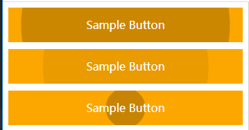
hover特效


<!DOCTYPE html>
<html lang="en">
<head>
    <meta charset="UTF-8">
    <meta name="viewport" content="width=device-width, initial-scale=1, maximum-scale=1, minimum-scale=1"/>
    <title>Title</title>
    <style>

        .set_4_button1 {
            position: relative;
            text-align: center;
            padding: 0 25px;
            line-height: 450px;
            overflow: hidden;
            z-index: 0;  /*使得z-index为负数的子元素不被普通文档流元素覆盖*/
            color: #fff;
            transition: all .1s;
            background: #FCA700;
        }

        /* hover 值后出现的效果,一开始没有宽高,位于父元素中间 */
        .anim {
            position: absolute;
            overflow: hidden;
            top: 50%;
            left: 50%;
            z-index: -1;
            transform: translate(-50%, -50%);
            border-radius: 50%;
        }

        .anim::before {
            position: relative;
            display: block;
            content: '';
            /*margin-top: 100%;*/
            padding-top: 100%;
            /* 当hover时,父元素的width会增大,而子元素margin/padding为百分比时会参照父元素宽度,
            这时,margin或padding增加都会使得父元素高度增加,如果是padding的话,伪元素before会有高度。 */
        }

        /* 伪元素 after 是用于背景色的过渡,其实可以不用 after,背景色、宽高的动画都归到父元素即可*/
        .anim::after {
            position: absolute;
            content: '';
            top: 0;
            left: 0;
            right: 0;
            bottom: 0;
        }

        /* 分开设 start */
        .hoverable:hover > .anim {
            animation: anim-out 3s infinite;

        }
        .hoverable:hover > .anim:after {
            animation: anim-out-pseudo 3s infinite;
        }

        @keyframes anim-out {
            0% { width: 0%;}
            100% { width: 100%;}
        }

        @keyframes anim-out-pseudo {
            0% { background: rgba(0,0,0,.25); }
            100% { background: transparent; }
        }
        /* 分开设 end */

        /* 合并设 start */
        .hoverable:hover > .anim {
            animation: merge 3s infinite;}

        @keyframes merge {
            0% {
                width: 0;
                background: rgba(0,0,0,.25);
            }
            100% {
                width: 100%;
                background: transparent;
            }
        }
        /* 合并设 end */

    </style>
</head>
<body>
    <div class="set_4_button1 raised hoverable">
        <div class="anim"></div>
        <span>Sample Button</span>
    </div>
</body>
</html>
更简单实现方式:
说明padding / margin 为百分比时值是参照父元素:

 浙公网安备 33010602011771号