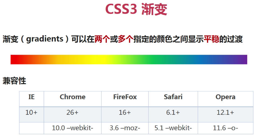
CSS3背景,渐变
1,有利于代码维护,有利于使用debug进行调试打断点。
2,后面三个都存在计算,所以分开写最好。
背景复合属性最好的写法,
background:#abcdef url() no-repeat 50px 100px scroll;
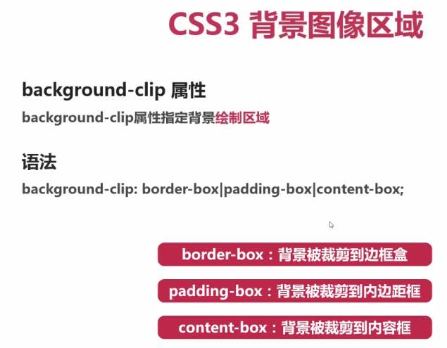
background-clip:border-box/padding-box/content-box;
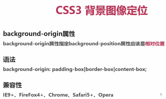
background-origin:border-box/padding-box/content-box;
background-size:cover/contain/length/percentage;
background-color:color/rgb/#000/transparent; 最后一个是透明。
background-image: url(); 背景图片
background-repeat: no-repeat/repeat/x-repeat/y-repeat; 背景重复
background-position: length/% length/%; 水平位移 垂直位移。此外还有 top center,top right,top left,bottom center,bottom right,bottom left,bottom center,如果只有一个值,left=left center。
background-attachment: scroll/fixed; 跟随滚动条(默认) 固定。
background: #abcdef url() no-repeat 50px 100px scroll;
background-clip: border-box/padding-box/content-box; 背景在哪里开始显示,背景被切到哪里。
background-origin: border-box/padding-box/content-box;相对于background-position以边框(内边距,内容)盒子左上角顶点为圆点进行位置偏移。
background-size:contain; 图片遵循等比例缩放,直到整张图片刚刚在整个div中就立马停(图片和div宽高总有一个相等)
background-size:cover; 图片遵循等比例缩放,直到整张图片刚刚好覆盖整个div就立马停(图片和div宽高总有一个相等)
background-size: 50%; 默认设置两个值:width:50%; height:auto;。如只设置一个,默认height:auto; 图片的高等比例缩放,并不等于50%,这里50%是相对父元素div的宽度进行计算。
background-size有如下值:
A、length,设置背景图片的高和宽
B、cover,把背景图片扩展至足够大,以使背景图片完全覆盖区域
C、percentage,以父元素的百分比来设置图像的宽度和高度
D、contain,把图像扩展至最大尺寸,以使其宽度和高度完全适应内容区域
A、background-clip指定背景显示的范围 border-box padding-box content-box
B、background-size属性指定背景图片的尺寸大小
C、background-origin属性指定背景图片的绘制起点 border-box padding-box content-box
D、background-position属性是CSS2的,用来定位图片的位置
background-clib: border-box;
A、border-box,背景被剪裁到边框盒
B、padding-box,背景被剪裁到内边距框
C、content-box,背景被剪裁到内容框
border:20px solid transparent; 20px的实线边框是透明的。
background: url('image/1.jpeg') no-repeat 0px 0px scroll;
background-clip: border-box; 边框,内边距,内容显示背景图 默认值。
background-clip: padding-box; 内边距,内容显示背景图,边框不显示。
background-clip: content-box; 内容显示内景图,边框和内边距不显示背景图,即内边距是透明的。或者是父元素的背景。
================================
border:20px solid transparent; 20px的实线边框是透明的。
background: url('image/1.jpeg') no-repeat 10px 10px scroll;
background-clip: border-box; 边框,内边距,内容显示背景图 默认值。
background-clip: padding-box; 内边距,内容显示背景图,边框不显示。
background-clip: content-box; 内容显示内景图,边框和内边距不显示背景图,即内边距是透明的。或者是父元素的背景。
上面图片background-postion:10px 10px; 水平和垂直位移相对于边框盒子,内边距盒子,内容盒子进行定位的:
background-origin: border-box; 图片相对于边框盒子进行定位
background-origin: padding-box; 图片相对于内边距盒子进行定位
background-origin: content-box; 图片相对于内容盒子进行定位
-------------------
background-size:contain; 图片遵循等比例缩放,直到整张图片刚刚在整个div中就立马停(图片和div宽高总有一个相等),不是width留白,就是height高留白,也可能刚刚好覆盖,而不留白。如果图片很小,那么图片的宽会放大到和div的宽一样大,或者是放大图片的高等于div的高。
background-size:cover; 图片遵循等比例缩放,直到整张图片刚刚好覆盖整个div就立马停(图片和div宽高总有一个相等),不留白。不是width溢出,就是height溢出。不过也可能存在刚刚好覆盖整个div不溢出。不是图片的宽等于div的宽,就是图片的高等于div的高。图片基本上都存在溢出,但是也可能刚刚整张图片通过缩放刚刚好覆盖整个div。
background-size: 50%; 默认设置两个值:width height。如只设置一个,默认height:auto; 图片的高等比例缩放,并不等于50%,这里50%是相对复原度div的宽度进行计算。
background-size: 50% 50%; 这里的百分比是相对父元素div的 width 和 height 而言的。跟上面一个不相等。
background-size:100%; 等于background-size:100% auto; 这里的100%是相对父元素div本身宽度而设定的,即等于图片原始宽度。高度也等于原始高度。
当只设置width一个值时,height的值为:auto。根据宽度等比例缩放,确保不变形。
background-size: 600px; 等于:background-size:600px auto; 这里图片的高度是根据图片大小等比例缩放的。
A、length,设置背景图片的高和宽
B、cover,把背景图片扩展至足够大,以使背景图片完全覆盖区域
C、percentage,以父元素的百分比来设置图像的宽度和高度
D、contain,把图像扩展至最大尺寸,以使其宽度和高度完全适应内容区域

----------------------------------

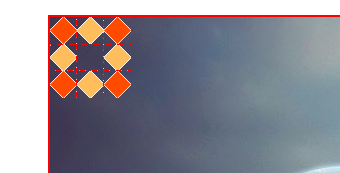
多张背景图片一般是使用多张png图片在前,其他图片在后,多张图片重合形成一个更好看的效果图。
background-image: url("image/1.gif"),url('image/1.jpeg'); 前面一张图片会覆盖后面一张图片
"image/1.gif" 小图
image/1.jpeg 大图
如下图:
=============================================
background: -webkit-linear-gradient(#ff0,#f0f,#fff,pink);
background: -moz-linear-gradient(#ff0,#f0f,#fff,pink);
background: -o-linear-gradient(#ff0,#f0f,#fff,pink);
background: linear-gradient(#ff0,#f0f,#fff,pink);
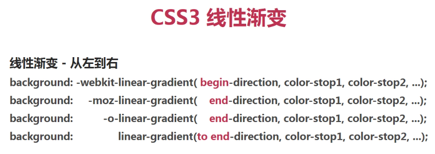
从左到右渐变,左是开始 , 右是结束。
begin 表示写开始 ,从左到右,在-webkit-内核中写 left.
end 表示写结束, 从左到右,在-moz-内核中写 right.
to end,从左到右,所以标准写法应该是 to right. 这是标准写法。
-----如下从左到右渐变-------
background: -webkit-linear-gradient(left,#ff0,#f0f,#fff,pink);
background: -moz-linear-gradient(right,#ff0,#f0f,#fff,pink);
background: -o-linear-gradient(right,#ff0,#f0f,#fff,pink);
background: linear-gradient(to right,#ff0,#f0f,#fff,pink);

begin-level 开始水平线 begin-vertical 开始垂直线 即:两线交点就是渐变起点。(适用 -webkit- 内核浏览器)
end-level 结束水平线 begin-vertical 结束垂直线 即:两线交点就是渐变终点(使用 -moz- 和 -o- 内核浏览器)
to end-level end-vertical 结束点(水平线和垂直线交点) 这是标准写法。
---------
<!DOCTYPE html>
<html lang="en">
<head>
<meta charset="UTF-8">
<title>Document</title>
<style type="text/css">
*{
padding: 0;
margin: 0;
margin: 0 auto;
}
.container{
width: 800px;
margin: 0 auto;
text-align: center;
}
.container>div{
width: 200px;
height: 200px;
/* background: #ff0; */
}
.one{
float: left;
}
.two{
margin: 0 auto;
display: inline-block;
}
.three{
float: right;
}
.one{
/*上到下渐变。默认从上到下,所以不用写方向。直接写颜色即可*/
background: -webkit-linear-gradient(red,yellow,#00f,blue,orange);
background: -moz-linear-gradient(red,yellow,#00f,blue,orange);
background: -o-linear-gradient(red,yellow,#00f,blue,orange);
background: linear-gradient(red,yellow,#00f,blue,orange);
}
.two{
/*左到右渐变。只有webkit浏览器是写开始begin,其他都是写结束end,标准:to end*/
/*begin/end-direction 开始/结束方向
webkit 写 begin-direction
moz 和 o 浏览器都是写 end-direction
标准写法 to end-direction
*/
background: -webkit-linear-gradient(left,red,yellow,#00f,blue,orange);
background: -moz-linear-gradient(right,red,yellow,#00f,blue,orange);
background: -o-linear-gradient(right,red,yellow,#00f,blue,orange);
background: linear-gradient(to right,red,yellow,#00f,blue,orange);
}
.three{
/*左上角到右下角渐变*/
/*begin/end-level 起始/结束点
webkit 写 begin-level 起始点
moz 和 o 浏览器都是写 end-level 结束点
标准写法 to end-level 结束点
*/
background: -webkit-linear-gradient(top left,red,yellow,#00f,blue,orange);
background: -moz-linear-gradient(bottom right,red,yellow,#00f,blue,orange);
background: -o-linear-gradient(bottom right,red,yellow,#00f,blue,orange);
background: linear-gradient(to bottom right,red,yellow,#00f,blue,orange);
}
</style>
</head>
<body>
<div class="container">
<div class="one">1</div>
<div class="two">2</div>
<div class="three">3</div>
</div>
</body>
</html>
=================以上是线性渐变实例,上到下,左到右,左上角到右下角======================
============================================================================
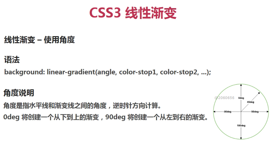
角度确定:十字架,上是0deg,顺时针右90deg,下是180deg,左是270deg。
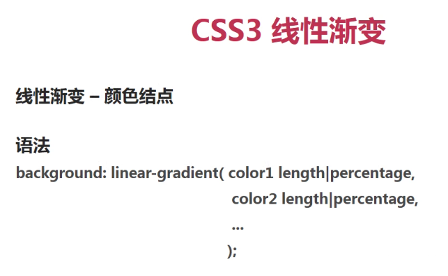
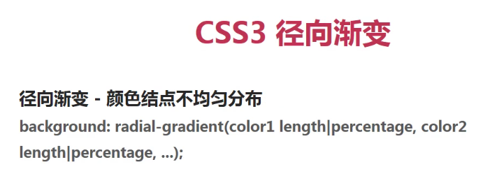
background: linear-gradient(111deg,red,yellow 20%,blue 50%,orange 85%,blue 8%);
/*第一个不写百分比值:默认0%,最后一个不写百分比值:默认100%,如果orange 百分比 小于等于 blue 百分比,渐变线85%之后全部蓝色。如果最后一个blue 百分比 小于 100% 那么 blue 百分比之后的全部都是纯blue,没有渐变,如果语法错误,则恢复默认从上到下渐变。使用角度写渐变不存在兼容性,所以可以使用这个代替所有线性渐变。*/
background: linear-gradient(111deg,rgba(255, 0, 0, 0),rgba(255,0,0,.3) 20%,rgba(255, 0, 0, 1) 80%);
/*Alpha透明度,取值0~1之间。其他语法一毛一样*/
===========================
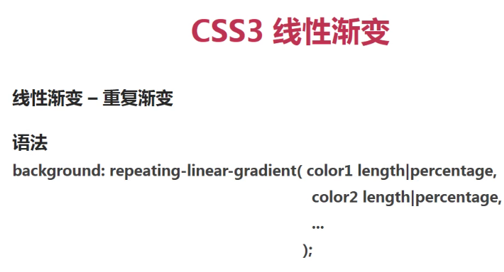
background: repeating-linear-gradient(90deg,red,yellow,blue);
重复渐变只在属性前增加了:repeating。其他一毛一样。
==============================================================
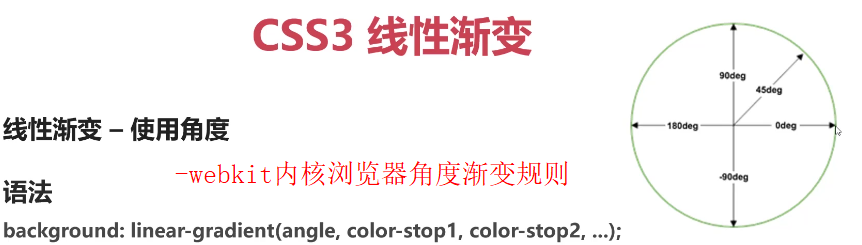
-webkit-内核浏览器使用角度渐变的规则:如图上图:X轴,Y轴
1,以X轴正半轴为起始点,逆时针旋转,度数变大。
-moz-,-ms-,-o-内核浏览器使用角度渐变的规则:如图下图:X轴,Y轴
1,以Y轴正半轴为起始点,顺时针旋转,度数变大。
在写代码时,一定要把带-webkit-内核的浏览器样式写在前面如下:
background: -webkit-linear-gradient(top left,red,yellow,#00f,blue,orange);
background: -moz-linear-gradient(bottom right,red,yellow,#00f,blue,orange);
background: -o-linear-gradient(bottom right,red,yellow,#00f,blue,orange);
background: linear-gradient(to bottom right,red,yellow,#00f,blue,orange);

==============================================================
好看的重复渐变:只添加了一个repeating,其他一毛一样。
-webkit-background: repeating-linear-gradient(90deg,red ,yellow 10%,red 20%);
-moz-background: repeating-linear-gradient(90deg,red ,yellow 10%,red 20%);
-ms-background: repeating-linear-gradient(90deg,red ,yellow 10%,red 20%);
-o-background: repeating-linear-gradient(90deg,red ,yellow 10%,red 20%);
background: repeating-linear-gradient(90deg,red ,yellow 10%,red 20%);
-webkit-background: repeating-linear-gradient(90deg,red ,yellow 33px,blue 69px,green 85px,red 117px);
-moz-background: repeating-linear-gradient(90deg,red ,yellow 33px,blue 69px,green 85px,red 117px);
-ms-background: repeating-linear-gradient(90deg,red ,yellow 33px,blue 69px,green 85px,red 117px);
-o-background: repeating-linear-gradient(90deg,red ,yellow 33px,blue 69px,green 85px,red 117px);
=================
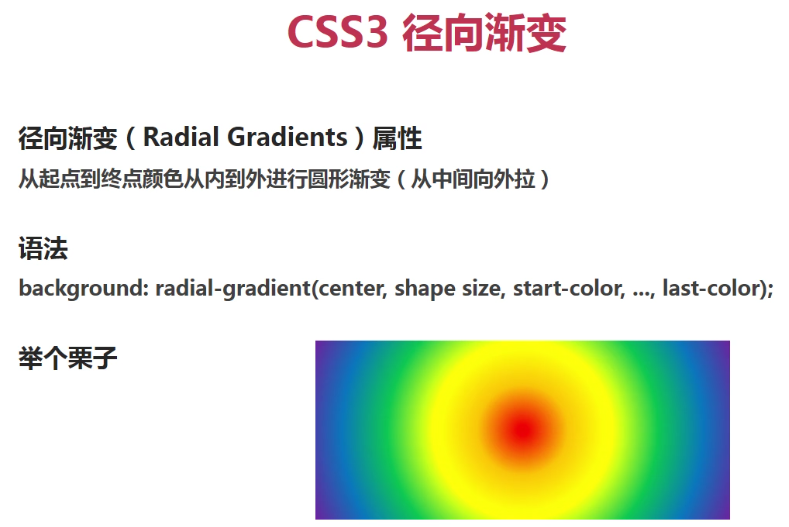
.two{
/*默认径向渐变*/
width: 300px;/*width != height时,circle圆形,ellipse椭圆*/
height: 600px;
margin: 0 auto;
margin-top: 100px;
/*默认div中心就是圆心,默认径向渐变图形为椭圆ellipse*/
background: -webkit-radial-gradient(red 20%,green 50%,blue 80%);
background: -moz-radial-gradient(red 20%,green 50%,blue 80%);
background: -ms-radial-gradient(red 20%,green 50%,blue 80%);
background: -o-radial-gradient(red 20%,green 50%,blue 80%);
background: -radial-gradient(red 20%,green 50%,blue 80%);
}
.one{
width: 300px;/*width=height*/
height: 300px;
margin: 0 auto;
margin-top: 100px;
/*width=height时,决定了是circle渐变,所以下面设置成ellipse都是没用的。*/
background: -webkit-radial-gradient(ellipse,red 20%,green 50%,blue 80%);
background: -moz-radial-gradient(ellipse,red 20%,green 50%,blue 80%);
background: -ms-radial-gradient(ellipse,red 20%,green 50%,blue 80%);
background: -o-radial-gradient(ellipse,red 20%,green 50%,blue 80%);
background: -radial-gradient(ellipse,red 20%,green 50%,blue 80%);
}
.main{
width: 300px;
height: 500px;
margin: 0 auto;
margin-top: 100px;
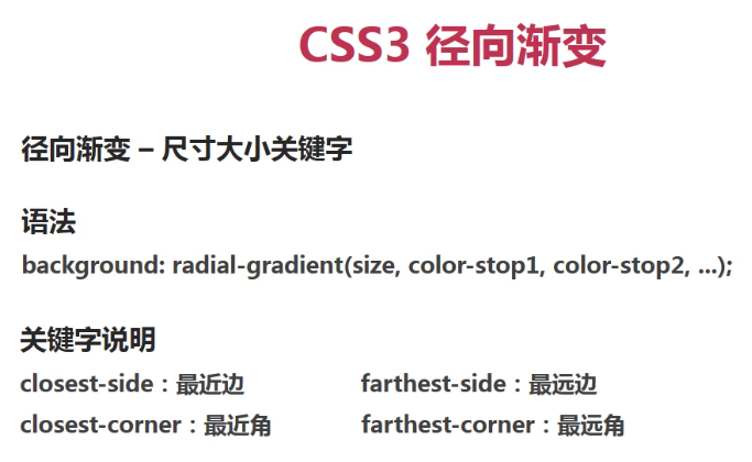
/*完整径向渐变属性如下:
20% 40% 设置圆心。
closest-side ellipse/circle 设置半径为:距离圆心最近的边,进行椭圆/正圆渐变。
closest-corner ellipse/circle 设置半径为:距离圆心最近的角,进行椭圆/正圆渐变。
farthest-side ellipse/circle 设置半径为:距离圆心最远的边,进行椭圆/正圆渐变。
farthest-conrner ellipse/circle 设置半径为:距离圆心最远的角,进行椭圆/正圆渐变。
渐变形状两个值:
circle 圆形
ellipse 椭圆
*/
background: -webkit-radial-gradient(20% 40%,farthest-corner ellipse,red 20%,green 50%,blue 80%);
background: -moz-radial-gradient(20% 40%,farthest-corner ellipse,red 20%,green 50%,blue 80%);
background: -ms-radial-gradient(20% 40%,farthest-corner ellipse,red 20%,green 50%,blue 80%);
background: -o-radial-gradient(20% 40%,farthest-corner ellipse,red 20%,green 50%,blue 80%);
background: -radial-gradient(20% 40%,farthest-corner ellipse,red 20%,green 50%,blue 80%);
}
.three{
width: 300px;
height: 500px;
margin: 0 auto;
margin-top: 100px;
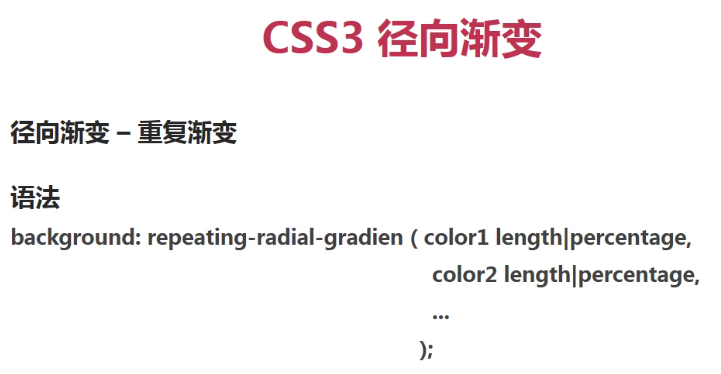
/*重复径向渐变:repeating-radia-gradient*/
background: -webkit-repeating-radial-gradient(red 10%,green 20%);
background: -moz-repeating-radial-gradient(red 10%,green 20%);
background: -ms-repeating-radial-gradient(red 10%,green 20%);
background: -o-repeating-radial-gradient(red 10%,green 20%);
background: -repeating-radial-gradient(red 10%,green 20%);
}


HTML背景透明
opacity:0.5;/*这样设置背景颜色为透明,那么里面的字体也会变成半透明*/
background:rgba(255,255,255,0.2);/*这样只设置背景颜色,里面内容不是透明*/
background: transparent; 背景透明,且文字不透明
filter:Alpha(opacity=50);/* 只支持IE6、7、8、9 */
position:static; /* IE6、7、8只能设置position:static(默认属性) ,否则会导致子元素继承Alpha值 */
zoom:1; /* 激活IE6、7的haslayout属性,让它读懂Alpha */
-webkit-
-moz-
-ms-
-o-

 浙公网安备 33010602011771号