

BI大屏自适应的构建
对于大屏自适应,网上有基于Vue编写的大屏自适应逻辑代码,本文讲解如何在一个初始化大屏的页面中使用自适应逻辑代码,以及如何解决自适应后大屏左右两边留白的问题。
首先,在编写的初始化html文件中,需要引入离线版的vue JS包和大屏自适应的js代码:
1 <script src="./assets/js/frameworkjs/vue-global-prod.js"></script>
1 <script src="./scale-screen/index.js"></script>
然后编写js逻辑代码,通过vue挂载根节点,并绑定自定义组件scaleScreen:
 1 <script>
 2     //引入vue
 3     const { createApp, ref } = Vue;
 4     const app = createApp({
 5         setup() {
 6             return {};
 7         }
 8     });
 9     app.component('scaleScreen', scaleScreen);
10     app.mount('#app');
11
12 </script>
之后编写在html 中使用<scale-screen>标签把根节点内部的div块整体包起来,html完整代码如下:
 1 <!DOCTYPE html>
 2 <html>
 4 <head>
 5     <meta charset="utf-8" />
 6     <meta http-equiv="X-UA-Compatible" content="IE=edge" />
 7     <meta name="description" content="" />
 8     <meta name="viewport" content="width=device-width, initial-scale=1" />
 9      <link rel="stylesheet" href="./assets/css/index.css" type="text/css" />
10
11     <!-- vue/datav/seamless-scroll资源本地化 -->
12     <script src="./assets/js/frameworkjs/vue-global-prod.js"></script>
15     <script src="./assets/js/frameworkjs/jquery-3.7.1.min.js"></script>
16     <script src="./assets/js/frameworkjs/echarts-4.8.0.min.js"></script>
17
18     <title>测试总控系统可视化平台</title>
19 </head>
20
21 <body>
22   <div id="app"><!--用于vue挂载-->
23     <scale-screen>
24      <!--具体的逻辑DIV划分-->
25         <div id="main">
26             <div id="top">
27             hehe
28             </div>
29             <div id="middle">
30                 haha
31             </div>
32             <div id="bottom">
33 ll
34             </div>
35         </div>
38     </scale-screen>
39   </div>
41 </body>
42
44 <script src="./scale-screen/index.js"></script>
45
46 <script>
47     //引入vue 和 datav
48     const { createApp, ref } = Vue;
49
50     const app = createApp({
51         setup() {
52             return {};
53         }
54     });
55     app.component('scaleScreen', scaleScreen);
56     app.mount('#app');
58 </script>
63 </html>
为了看效果,编写index.css代码:
 1 html,
 2 body {
 3   overflow: hidden;
 4   background:#041a21;
 5   width: 100vw;
 6   height: 100vh;
 7 }
 8
 9 #app,#main
10 {
11   height: 100%;
12   width: 100%;
13   color:aliceblue
14 }
15
16 #top
17 {
18   border: 1px solid red;
19   width: 99%;
20   height:10%;
21 }
22
23 #middle
24 {
25   border: 1px solid red;
26   width: 99%;
27   height:86%;
28 }
29
30 #bottom
31 {
32   border: 1px solid red;
33   width: 99%;
34   height:2%;
35 }
scale-screen下的index.js自适应源码如下(以下代码是咨询了gpt对之前已有的自适应代码修复,解决了大屏页面左右两边留白问题)
  1 const scaleScreen = {
  2     props: {
  3         delay: {
  4             type: Number,
  5             default: 500
  6         },
  7     }, // 声明接收名为 message 的 prop
  8     setup() {
  9         const autoScaleBoleen = true
 10         const screenWrapper = Vue.ref()
 11
 12         console.log(document.getElementById('screenWrapper'))
 13
 14         const state = Vue.reactive({
 15             originalWidth: window.innerWidth,
 16             originalHeight: window.innerHeight,
 17         });
 18
 19         const styles = {
 20             box: {
 21                 overflow: 'hidden',
 22                 backgroundSize: `100% 100%`,
 23                  background: `#000`,
 24                 //background: `#031b37`,
 25                 width: `100vw`,
 26                 height: `100vh`
 27             },
 28             wrapper: {
 29                 transitionProperty: `all`,
 30                 transitionTimingFunction: `cubic-bezier(0.4, 0, 0.2, 1)`,
 31                 transitionDuration: `500ms`,
 32                 position: `relative`,
 33                 overflow: `hidden`,
 34                 zIndex: 100,
 35                 transformOrigin: `left top`
 36             }
 37         };
 38
 39         const box = Vue.ref();
 40
 41         /**
 42          * 更新大屏容器宽高
 43          */
 44         const updateSize = () => {
 45             if (screenWrapper.value) {
 46                 screenWrapper.value.style.width = `${state.originalWidth}px`;
 47                 screenWrapper.value.style.height = `${state.originalHeight}px`;
 48             }
 49         };
 50
 51         const autoScale = (scale) => {
 52             if (screenWrapper.value) {
 53                 screenWrapper.value.style.transform = `scale(${scale})`;
 54                 const mx = (window.innerWidth - (state.originalWidth * scale)) / 2;
 55                 const my = (window.innerHeight - (state.originalHeight * scale)) / 2;
 56                 screenWrapper.value.style.margin = `${my}px ${mx}px`;
 57             }
 58         };
 59
 60         const updateScale = () => {
 61             const currentWidth = window.innerWidth;
 62             const currentHeight = window.innerHeight;
 63
 64             const widthScale = currentWidth / state.originalWidth;
 65             const heightScale = currentHeight / state.originalHeight;
 66             const scale = Math.min(widthScale, heightScale);
 67             autoScale(scale);
 68         };
 69
 70
 71         const onResize = () => {
 72             state.originalWidth = window.innerWidth;
 73             state.originalHeight = window.innerHeight;
 74             updateSize();
 75             updateScale();
 76         };
 77
 78
 79
 80         const clearListener = () => {
 81             window.removeEventListener('resize', onResize);
 82             // state.observer?.disconnect();
 83         };
 84
 85         const addListener = () => {
 86             window.addEventListener('resize', onResize);
 87             // initMutationObserver();
 88         };
 89
 90         Vue.onMounted(() => {
 91             screenWrapper.value = document.getElementById('screenWrapper')
 92             box.value = document.getElementById('box')
 93
 94             Vue.nextTick(async () => {
 95                 //await initSize();
 96                 updateSize();
 97                 updateScale();
 98                 addListener();
 99                 // initMutationObserver();
100             });
101         });
102         Vue.onUnmounted(() => {
103             clearListener();
104             // state.observer?.disconnect();
105         });
106         return {
107             styles,
108         };
109     },
110     template: `
111      <section :style="{ ...styles.box }" class="v-screen-box" id="box">
112     <div :style="{ ...styles.wrapper }" class="screen-wrapper" id="screenWrapper">
113       <slot></slot>
114     </div>
115   </section>
116       `,
117 };
以上使用修复后的自适应代码的效果图,当点击浏览器的放大、缩小或者将大屏移动到分辨率不一样的显示屏,0.5s内都会重新进行自适应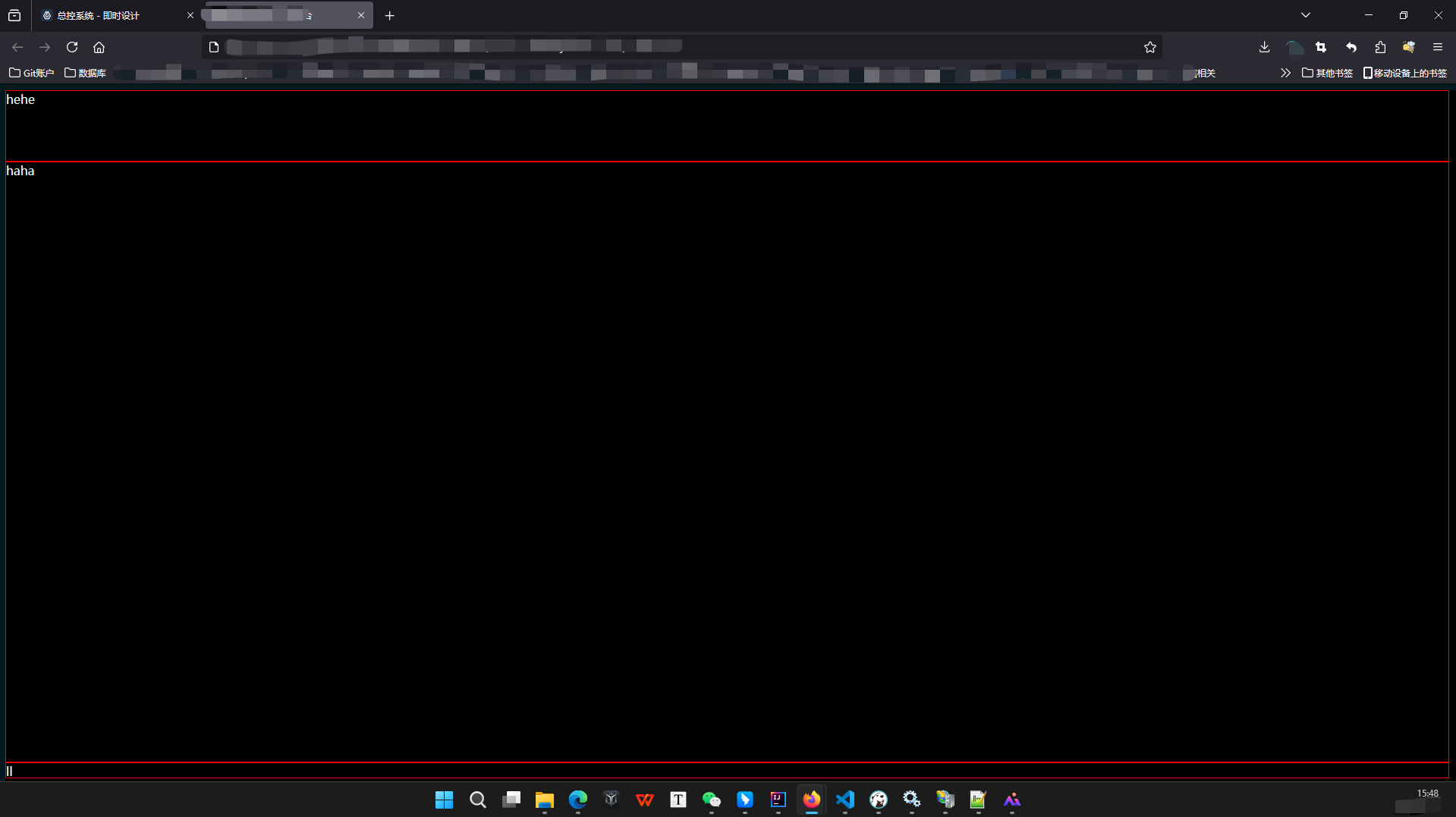
附:原有完成项目的自适应左右两边留白问题效果图:

附:原有完成项目的自适应留白问题解决效果图:
另:网上还有直接使用另一种方式实现的布局自适应(pink老师),有时间可以研究学习一下:
https://www.bilibili.com/video/BV1v7411R7mp/?buvid=ZD419DDD1F5678F6481DA50A7E1CDCF3EEC0&from_spmid=search.search-result.0.0&is_story_h5=false&mid=8HVZ%2FBZGzIaku9HIHWIhnA%3D%3D&p=3&plat_id=116&share_from=ugc&share_medium=iphone&share_plat=ios&share_session_id=70E20FD8-C5DA-455A-8D4E-30F4B3F646ED&share_source=WEIXIN&share_tag=s_i&spmid=united.player-video-detail.0.0×tamp=1739372661&unique_k=Rndelnd&up_id=415434293&vd_source=9e0160ddf037e13ef69048dc349dd419

 浙公网安备 33010602011771号