Angular 2 to Angular 4 with Angular Material UI Components
Content
Part 2: Filter/Search using Angular2 pipe, Global Error handling, Debugging Client side
Part 3: Angular 2 to Angular 4 with Angular Material UI Components
Introduction
In this article, we will continue enhancing the User Management application by upgrading the Angular version from Angular 2 to Angular 4 and using Angular Material 2 components instead of traditional HTML and third-party components (e.g. ng2-bs3-modal modal pop up we used for Add/Update/Delete User).
Angular 4 has couple of new cool features, I don’t want to go over them since you can easily find them online. Check here for quick review. We will use Email Validator and If-else Template conditions in User Management application.
Angular Material is Angular compatible components that we mostly use to design the web application’s UI e.g. Input, Autocomplete, dropdown, checkbox etc. Click here to review the Angular Material components. We will replace all current HTML and third-party components with the Angular Material components.
Background
This article is the third part of Angular2 in ASP.NET MVC & Web API - Part 2. In previous articles, we used ng3-bs3-modal third-party modal pop up components and traditional HTML controls. In this article, we will be replacing all controls with Angular Material components. It is highly recommended that you go through Part 1 & Part 2 before reading this article.
Let’s Start
Before starting the actual development, let me show what would be the final output of this article. You can compare it with Angular2 in ASP.NET MVC & Web API - Part 2 to get an idea what we are going to build.


You can see, we added few more form controls on Add User modal pop up and look & feel of each control is very different from Part 1 & Part 2. Let’s start the development:
As this article is continuation of Angular2 in ASP.NET MVC & Web API - Part 2 article, let’s download the attached project from here.
Restore the Angular 4 Packages
- Open the
Angular2MVC_p2.slnin Visual Studio 2017 Community Edition (Preferably), it is also recommended to rename the solution.
- Edit the
package.jsonfile and replace the file content with the following packages:
 Copy Code
{
  "name": "angular-quickstart",
  "version": "1.0.0",
  "description": "QuickStart package.json from the documentation for visual studio 2017 & WebApi",
  "scripts": {
    "start": "tsc && concurrently \"tsc -w\" \"lite-server\" ",
    "lint": "tslint ./app/**/*.ts -t verbose",
    "lite": "lite-server",
    "pree2e": "webdriver-manager update",
    "test": "tsc && concurrently \"tsc -w\" \"karma start karma.conf.js\"",
    "test-once": "tsc && karma start karma.conf.js --single-run",
    "tsc": "tsc",
    "tsc:w": "tsc -w"
  },
  "keywords": [],
  "author": "",
  "license": "MIT",
  "dependencies": {
    "@angular/common": "4.0.2",
    "@angular/compiler": "4.0.2",
    "@angular/core": "4.0.2",
    "@angular/forms": "4.0.2",
    "@angular/http": "4.0.2",
    "@angular/platform-browser": "4.0.2",
    "@angular/platform-browser-dynamic": "4.0.2",
    "@angular/router": "4.0.2",

    "angular-in-memory-web-api": "0.2.4",
    "systemjs": "0.19.40",
    "core-js": "2.4.1",
    "rxjs": "5.0.1",
    "zone.js": "0.7.4"
  },
  "devDependencies": {
    "concurrently": "3.2.0",
    "lite-server": "2.2.2",
    "typescript": "2.0.10",

    "canonical-path": "0.0.2",
    "tslint": "3.15.1",
    "lodash": "4.16.4",
    "jasmine-core": "2.4.1",
    "karma": "1.3.0",
    "karma-chrome-launcher": "2.0.0",
    "karma-cli": "1.0.1",
    "karma-jasmine": "1.0.2",
    "karma-jasmine-html-reporter": "0.2.2",
    "protractor": "4.0.14",
    "rimraf": "2.5.4",

    "@types/node": "6.0.46",
    "@types/jasmine": "2.5.36",
    "@angular/material": "2.0.0-beta.6",
    "@angular/animations": "4.1.3"
  },
  "repository": {}
}
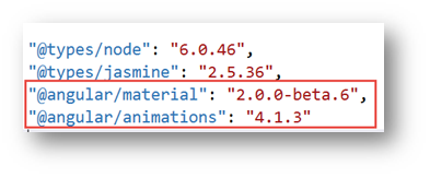
- You can see in the
dependenciessection, we are upgrading the Angular & other helping packages version to4.0.2.

- In the
devDependenciessection, you can see we are importing the Angular Material package:
- Right click on
package.jsonfile and select optionRestore Packages, it will take few minutes to download all the package. Wait until you get package restore complete message. - Save the file and click on the menu
Build -> Rebuild Solutionoption. It will take few seconds or minute to download all packages (.Net & Angular). That’s it with Angular 4 packages restore.
Upgrade the user Table in Database
- In previous articles, we had only three fields in
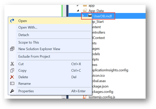
Usertable, let’s add some more to better understand the Angular Material components. - Go to
App_Datafolder, right click and selectOpenor double click onUserDB.mdffile to edit it:
- Expand the
TablesfromData Connections -> UserDBEntitieshierarchy, right click onTblUserand select optionOpen Table Defination:

- You would see only four fields (
Id,FirstName,LastName,Gender), let's manually update the table according to the following screen shot:

- Once you are done, click on top
Updatebutton. It will take few moments and you will end up with the following screen, click onUpdate Databasebutton:

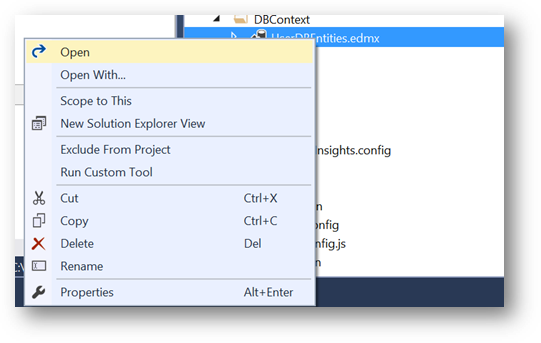
- Next let’s update the
Userentity, go toDBContextfolder, right click onUserDBEntities.edmxand select optionOpenor double click to edit it:
- Right click anywhere on the screen and select option
Update Model from Database…

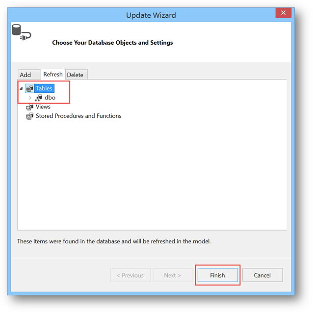
- On
Update Wizardscreen, go toRefreshtab, selectTablesand click onFinishbutton:
- After few moment, you would see
TblUserwould be updated as follow:

We are all set with Database update, let move to next steps.
Angular 4 & Angular Material Components Update
Let’s update our User Management application to use Angular Material components and few features of Angular 4.
- Edit the
app -> app.module.tsand add following import statements for Angular Material. Also add theBrowserAnimationsModule,MaterialModule,MdNativeDateModulemodules in import section:
<span id="ArticleContent">import { BrowserAnimationsModule } from '@angular/platform-browser/animations';
import { MaterialModule, MdNativeDateModule } from '@angular/material';</span>
- Next add the Material and Animation reference in
systemjs.config.jsfile.
<span id="ArticleContent">'@angular/animations': 'npm:@angular/animations/bundles/animations.umd.js',
'@angular/animations/browser': 'npm:@angular/animations/bundles/animations-browser.umd.js',
'@angular/platform-browser/animations': 'npm:@angular/platform-browser/bundles/platform-browser-animations.umd.js',
'@angular/material': 'npm:@angular/material/bundles/material.umd.js',
</span>
- Now that we added the Angular Material module in our
AppModule, our application is ready to use Angular Material components. First let’s modify thehomepage. Edit theapp -> Components -> home.component.tsfile. - Instead of plain image, let’s use the
Cardfrom Angular Material, go to Angular Material Card page to understand what is Card, where and how to use it? - On the Angular Material
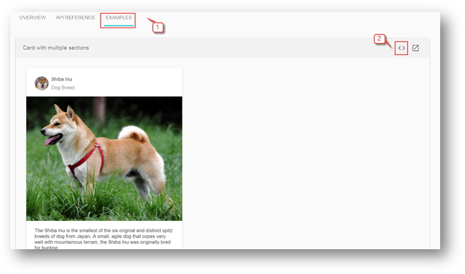
Cardpage and for any other component, you can see there are three tabsOVERVIEW,API REFERENCEandEXAMPLEthat give us following information:OVERVIEW: Component description, architecture and it’s use. HTML, TS and CSS code and link to working Plunker.API REFERENCE: How to import component, Module and Directive information.EXAMPLE: Running example with almost all feature of specific component and Plunker link with HTML, TS and CSS code.
- Since we are on card page, click on
ExampleTab then click on View Source< >link.
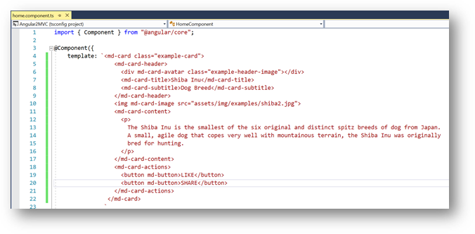
- You would land to following view with three tabs
HTML,TSandCSS.

- We will just copy the
HTML,Typescript(if required any) andCSSfrom here to our application for all components where we would need them. Of course, we will modify it according to our requirements but DO NOT shy to copy, this really help us to take full advantage of Angular Material components without any effort. So, copy the entiremd-cardHTML and replace it withhome.component.tstemplate’s HTML:
- For Angular Material components, we may need
CSSfor many components, so let’s create stylesheet. Right click onContentfolder and selectAdd -> Style Sheet:

- Enter the name
style.cssand click onOKbutton:

- Replace the
style.csscontent with followingCSS:
<span id="ArticleContent">.example-card {
  width: 400px;
}
.example-header-image {
  background-image: url('../images/users.png');
  background-size: cover;
}</span>
- Next, edit the
App_Start -> BundleConfig.csand update theContent/cssbundle as follow to add and use the newly addedstyle.cssin our application:
<span id="ArticleContent">bundles.Add(new StyleBundle("~/Content/css").Include(
                      "~/Content/style.css",
                      "~/Content/bootstrap.css"));</span>
- Now, our style sheet is ready to use, we will keep adding the CSS classes for other components as we move forward in our development.
- Let’s go back to our
home.component.tsand modify it. Change themd-card-titlee.g. "Users",md-card-subtitleas "Sample Image" etc. Update the image URL inmd-card-imagetosrc="../../images/users.png". The finalhome.component.tstemplate should look like following:

- Compile and Run the project, your home page should be as following:
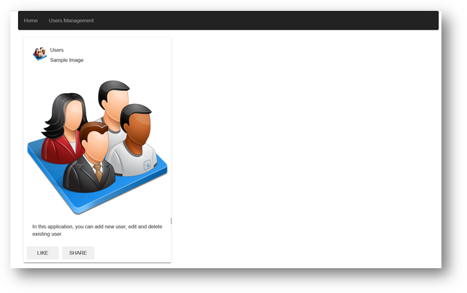
- Great, so we successfully used our first Angular Material component.
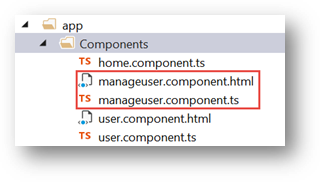
- Next, let’s move to
user.component.tsand update it with the Angular Material components. To make it simple and use Dialog component, we need to break it in two components. TheUserComponentwill only have User list whereasAdd,UpdateandDeletefunctionality will be moved toManageUsercomponent that we going to create in next steps. - In previous articles, we were using
ng2-bs3-modalmodal pop up control for add, update and delete screen that is not needed any more, so remove all of its references fromapp.module.ts,systemjs.config.jsanduser.component.tsfiles. - Next, let’s create the
ManageUsercomponent and then we will come back toUserComponentto clean it. Right click onapp -> Componentsand selectAdd -> TypeScriptfile:

- Enter the name
manageuser.component.tsand click onOKbutton. Also create themanageuser.component.htmlfile:
- In the previous steps, we updated the
Usertable with few additional columns, let’s update ouruser.tsaccordingly. Edit theapp-> Model -> user.tsand update it as following:
<span id="ArticleContent">export interface IUser {
    Id: number,
    FirstName: string,
    LastName: string,
    Email:string,
    Gender: string,
    DOB: string,
    City: string,
    State: string,
    Zip: string,
    Country:string
}</span>
- In
manageuser.component.html, we will add Angular Material Dialog. We will simply go to Dialog Plunker and copy thedialog-result-example-dialog.htmlfile content tomanageuser.component.html. From this file, you can see there are three main section of Dialog,title,contentandaction buttonsthat is quite self-explanatory. The other Angular Material components correspond touser.tsmodel fields that will go insidemd-dialog-contentdiv are as follow:- mdInput: For FirstName, LastName, Email, City and Zip
- md-radio-button: For Gendder (Male/Female)
- md-datepicker: Date picker control for Date of Birth (DOB)
- md-autocomplete: Auto complete dropdown for states, it filters state as soon we start typing. (Same as our Search User functionality we developed through pipe)
- md-select: Dropdown for Country.
- md-raised-button: Cancel and Add/Update/Delete buttons.
- You can go to
Plunkerlink for each component to see running example, I personally prefer Plunker to get the code for each component. - Copy the following HTML in
manageuser.component.htmlfile:
Copy Code<span id="ArticleContent"><form novalidate (ngSubmit)="onSubmit(userFrm)" [formGroup]="userFrm">
<div>
<h1 md-dialog-title><span><md-icon>create</md-icon>{{modalTitle}}</span></h1>
</div>
<div style="padding-bottom:1px; padding: 0px; border: 0px; color: rgb(0, 0, 255);">></div>
<div md-dialog-content class="md-dialog-container">
<div class="frm-ctrl">
<md-input-container>
<input mdInput placeholder="First Name" formControlName="FirstName">
</md-input-container>
<div *ngIf="formErrors.FirstName" class="text-danger">
{{ formErrors.FirstName }}
</div>
</div>
<div class="frm-ctrl">
<md-input-container>
<input mdInput placeholder="Last Name" formControlName="LastName">
</md-input-container>
<div *ngIf="formErrors.LastName" class="text-danger">
{{ formErrors.LastName }}
</div>
</div>
<div class="frm-ctrl">
<md-input-container>
<input type="email" mdInput placeholder="Email" formControlName="Email">
</md-input-container>
<div *ngIf="formErrors.Email" class="text-danger">
{{ formErrors.Email }}
</div>
</div>
<div class="frm-ctrl">
<md-radio-group formControlName="Gender">
<md-radio-button *ngFor="let gndr of gender" [value]="gndr">
{{gndr}}
</md-radio-button>
</md-radio-group>
<div *ngIf="formErrors.Gender" class="text-danger">
{{ formErrors.Gender }}
</div>
</div