flex 布局
What will you see?
- 可以在flex container上设置的属性
- flex-direction:决定主轴的方向,即项目主要的排列方向。
- flex-wrap:决定一条轴线放不下时该如何换行。
- flex-flow:flex-direction flex-wrap的简写
- justify-content:决定flex item在main axis的对齐方式。
- align-items:决定flex item在cross axis的对齐方式。
- align-content:决定有多条轴线时,轴线的对齐方式。
- stretch: 默认值,轴线平均的分布,如果没有设置flex item的高度,flex item会被尽可能的拉伸到两条轴线间的空间。
- flex-start: 轴线会与cross axis的起点对齐,如果没有设置flex-item的高度,flex item维持本身的高度,不会被拉伸。轴线之间的间隔是由flex item的高度决定的。
- flex-end:轴线会与cross axis的终点对齐,如果没有设置flex-item的高度,flex item维持本身的高度,不会被拉伸。轴线之间的间隔是由flex item的高度决定的。
- center:轴线会与cross axis的中点对齐,如果没有设置flex-item的高度,flex item维持本身的高度,不会被拉伸。轴线之间的间隔是由flex item的高度决定的。
- space-between: 轴线会平均的分布在cross axis中,轴线与边框没有距离,如果没有设置flex-item的高度,flex item维持本身的高度,不会被拉伸。
- space-around: 轴线两侧的距离相等,所以轴线之间的距离是轴线与边框的距离的两倍。如果没有设置flex-item的高度,flex item维持本身的高度,不会被拉伸。
- 可以在flex item上设置的属性
- order: 定义flex item的排列顺序,数值越小,排列越靠前,默认为0。
- flex-grow: 定义flex item的放大比例,默认为0,即如果存在剩余空间,也不会放大。
- flex-shrink: 定义flex item的缩小比例,默认为1,即如果空间不足,该flex item会被缩小。
- flex-basis:定义在分配多余空间之前,项目占据的主轴空间,浏览器根据这个属性,计算主轴是否有多余空间。
- flex: flex-grow flex-shrink flex-basis的简写
- align-self: 定义单个项目有与其他项目不一样的对齐方式,可以覆盖在flex container添加的align-item属性
- flex中的特殊高度问题
- flex布局不能解决的问题及对应的解决方案
一、flex container的属性
1.flex-direction:决定主轴的方向,即项目主要的排列方向。
可以取的4个值:
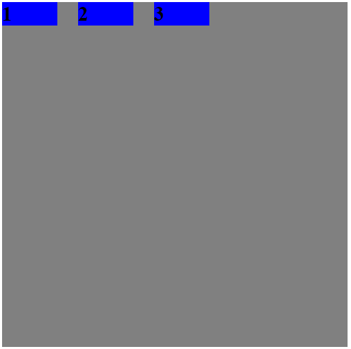
row: 默认值,主轴是水平方向的,起点在左端。
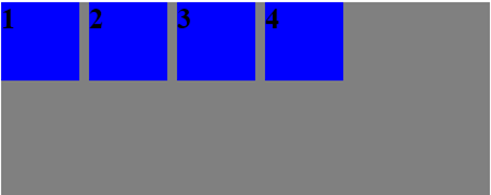
 1 <style>
 2     div {
 3         font-size: 30px;
 4         font-weight: 900;
 5     }
 6     .flex-container {
 7         width: 500px;
 8         height: 200px;
 9         background-color: gray;
10
11
12         display: flex;
13         /* 默认的主轴方向是水平的,并且起点是左端 */
14         flex-direction: row;
15     }
16     .flex-item {
17         width: 80px;
18         height: 80px;
19         margin-right: 10px;
20         background-color: blue;
21     }
22 </style>
23 <div class="flex-container">
24     <div class="flex-item">1</div>
25     <div class="flex-item">2</div>
26     <div class="flex-item">3</div>
27     <div class="flex-item">4</div>
28 </div>
row-reverse: 主轴是水平方向的,起点在右端。
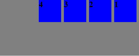
 1 <style>
 2     div {
 3         font-size: 30px;
 4         font-weight: 900;
 5     }
 6     .flex-container {
 7         width: 500px;
 8         height: 200px;
 9         background-color: gray;
10
11
12         display: flex;
13         /* 主轴方向是水平的,并且起点是右端 */
14         flex-direction: row-reverse;
15     }
16     .flex-item {
17         width: 80px;
18         height: 80px;
19         margin-right: 10px;
20         background-color: blue;
21     }
22 </style>
23 <div class="flex-container">
24     <div class="flex-item">1</div>
25     <div class="flex-item">2</div>
26     <div class="flex-item">3</div>
27     <div class="flex-item">4</div>
28 </div>
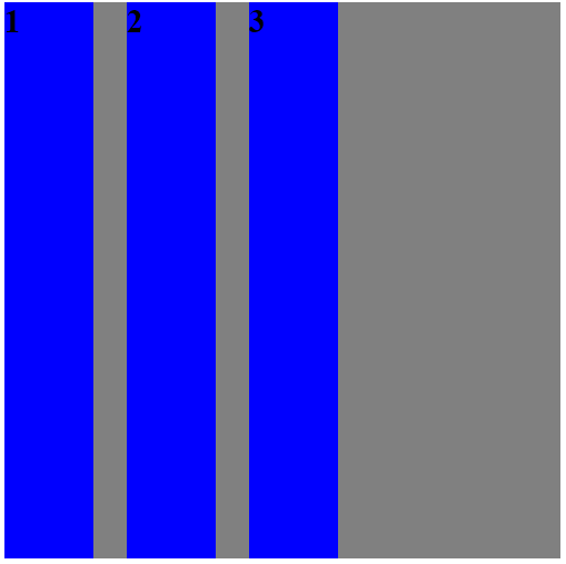
coloum:主轴是垂直方向的,起点在上方。
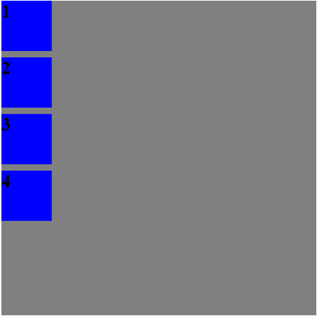
 1 <style>
 2     div {
 3         font-size: 30px;
 4         font-weight: 900;
 5     }
 6     .flex-container {
 7         width: 500px;
 8         height: 500px;
 9         background-color: gray;
10
11
12         display: flex;
13         /* 主轴方向是垂直的,并且起点是上端 */
14         flex-direction: column;
15     }
16     .flex-item {
17         width: 80px;
18         height: 80px;
19         margin-right: 10px;
20         margin-bottom: 10px;
21         background-color: blue;
22     }
23 </style>
24 <div class="flex-container">
25     <div class="flex-item">1</div>
26     <div class="flex-item">2</div>
27     <div class="flex-item">3</div>
28     <div class="flex-item">4</div>
29 </div>
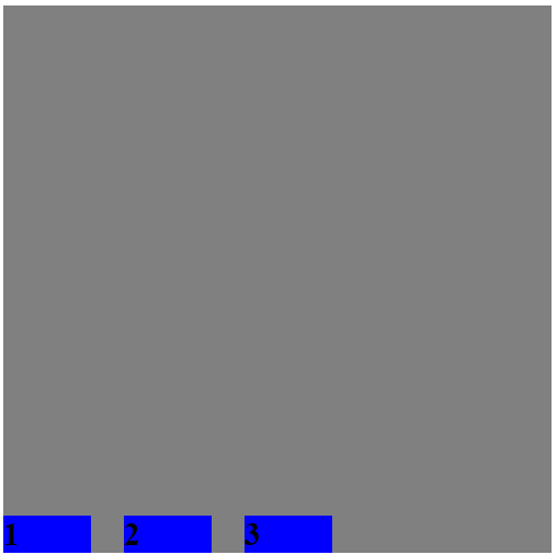
coloum-reverse:主轴是垂直方向的,起点在下方。
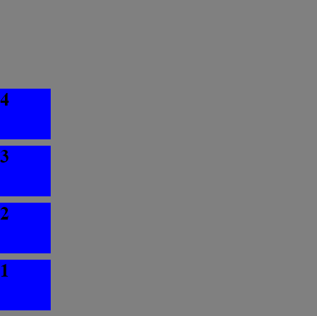
 1 <style>
 2     div {
 3         font-size: 30px;
 4         font-weight: 900;
 5     }
 6     .flex-container {
 7         width: 500px;
 8         height: 500px;
 9         background-color: gray;
10
11
12         display: flex;
13         /* 主轴方向是垂直的,并且起点是下端 */
14         flex-direction: column-reverse;
15     }
16     .flex-item {
17         width: 80px;
18         height: 80px;
19         margin-right: 10px;
20         margin-bottom: 10px;
21         background-color: blue;
22     }
23 </style>
24 <div class="flex-container">
25     <div class="flex-item">1</div>
26     <div class="flex-item">2</div>
27     <div class="flex-item">3</div>
28     <div class="flex-item">4</div>
29 </div>
2.flex-wrap属性:默认情况下,flex-item都会排布在一条轴线上。flex-wrap属性定义,如果一条轴线排不下时,该如何换行。
可以取的4个值:
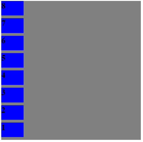
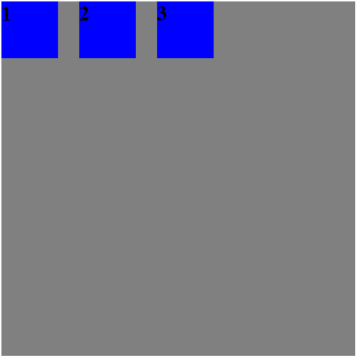
nowrap 默认值,默认不换行,flex-item会被压缩。
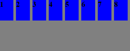
 1 <style>
 2     div {
 3         font-size: 30px;
 4         font-weight: 900;
 5     }
 6     .flex-container {
 7         width: 500px;
 8         height: 200px;
 9         background-color: gray;
10
11
12         display: flex;
13         /* 主轴是水平的,起点是左端 */
14         flex-direction: row;
15         /* 默认是不换行的,flex-item如果有空间的话会被压缩 */
16         flex-wrap: nowrap;
17     }
18     .flex-item {
19         width: 80px;
20         height: 80px;
21         margin-right: 10px;
22         margin-bottom: 10px;
23         background-color: blue;
24     }
25 </style>
26 <div class="flex-container">
27     <div class="flex-item">1</div>
28     <div class="flex-item">2</div>
29     <div class="flex-item">3</div>
30     <div class="flex-item">4</div>
31     <div class="flex-item">5</div>
32     <div class="flex-item">6</div>
33     <div class="flex-item">7</div>
34     <div class="flex-item">8</div>
35 </div>
这里提到如果在flex item有压缩空间的话会被压缩,那么如果flex item没有压缩空间呢?
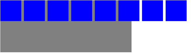
 1 <style>
 2     div {
 3         font-size: 30px;
 4         font-weight: 900;
 5     }
 6     .flex-container {
 7         width: 500px;
 8         height: 200px;
 9         background-color: gray;
10
11
12         display: flex;
13         /* 主轴是水平的,起点是左端 */
14         flex-direction: row;
15         /* 默认是不换行的,flex-item如果有空间的话会被压缩 */
16         flex-wrap: nowrap;
17     }
18     .flex-item {
19         width: 80px;
20         height: 80px;
21         margin-right: 10px;
22         margin-bottom: 10px;
23         background-color: blue;
24     }
25     /* flex item中的内容,正好充满整个flex item的空间 */
26     .flex-item-content {
27         width: 80px;
28         height: 80px;
29     }
30 </style>
31 <div class="flex-container">
32     <div class="flex-item"><div class="flex-item-content"></div></div>
33     <div class="flex-item"><div class="flex-item-content"></div></div>
34     <div class="flex-item"><div class="flex-item-content"></div></div>
35     <div class="flex-item"><div class="flex-item-content"></div></div>
36     <div class="flex-item"><div class="flex-item-content"></div></div>
37     <div class="flex-item"><div class="flex-item-content"></div></div>
38     <div class="flex-item"><div class="flex-item-content"></div></div>
39     <div class="flex-item"><div class="flex-item-content"></div></div>
40 </div>
可以看到:nowrap的规则是可以压缩时压缩,不能压缩时还是按照一条轴线排布,这是溢出了,这个时候可以配合overflow时调整。
wrap 换行,第一行在上面
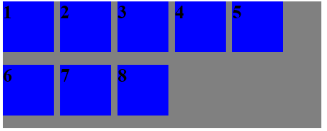
 1 <style>
 2     div {
 3         font-size: 30px;
 4         font-weight: 900;
 5     }
 6     .flex-container {
 7         width: 500px;
 8         height: 200px;
 9         background-color: gray;
10
11
12         display: flex;
13         /* 主轴是水平的,起点是左端 */
14         flex-direction: row;
15         /* 换行,第一行在上面 */
16         flex-wrap: wrap;
17     }
18     .flex-item {
19         width: 80px;
20         height: 80px;
21         margin-right: 10px;
22         margin-bottom: 10px;
23         background-color: blue;
24     }
25 </style>
26 <div class="flex-container">
27     <div class="flex-item">1</div>
28     <div class="flex-item">2</div>
29     <div class="flex-item">3</div>
30     <div class="flex-item">4</div>
31     <div class="flex-item">5</div>
32     <div class="flex-item">6</div>
33     <div class="flex-item">7</div>
34     <div class="flex-item">8</div>
35 </div>
可以看到,就算flex item有多余的空间,flex-wrap等于wrap时也不会被压缩。
wrap-reverse 换行,第一行在下面
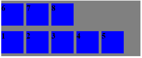
 1 <style>
 2     div {
 3         font-size: 30px;
 4         font-weight: 900;
 5     }
 6     .flex-container {
 7         width: 500px;
 8         height: 200px;
 9         background-color: gray;
10
11
12         display: flex;
13         /* 主轴是水平的,起点是左端 */
14         flex-direction: row;
15         /* 换行,第一行在下面 */
16         flex-wrap: wrap-reverse;
17     }
18     .flex-item {
19         width: 80px;
20         height: 80px;
21         margin-right: 10px;
22         margin-bottom: 10px;
23         background-color: blue;
24     }
25 </style>
26 <div class="flex-container">
27     <div class="flex-item">1</div>
28     <div class="flex-item">2</div>
29     <div class="flex-item">3</div>
30     <div class="flex-item">4</div>
31     <div class="flex-item">5</div>
32     <div class="flex-item">6</div>
33     <div class="flex-item">7</div>
34     <div class="flex-item">8</div>
35 </div>
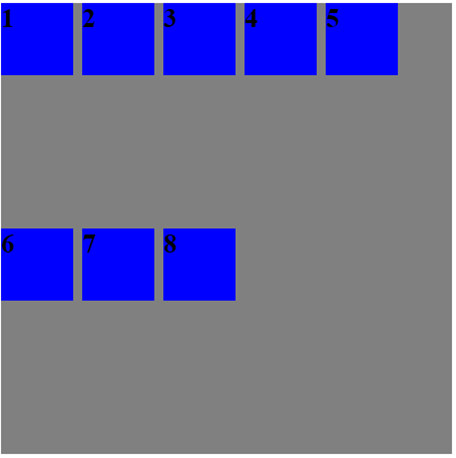
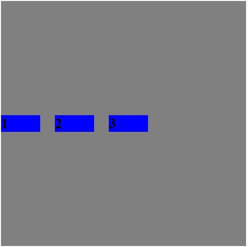
上面的例子演示的是默认水平方向为主轴,下面演示一下垂直方向为main axis,并且起点是在下面的。
 1 <style>
 2     div {
 3         font-size: 30px;
 4         font-weight: 900;
 5     }
 6     .flex-container {
 7         width: 500px;
 8         height: 500px;
 9         background-color: gray;
10
11
12         display: flex;
13         /* 主轴是垂直的,起点是下面 */
14         flex-direction: column-reverse;
15         /* 默认不换行,*/
16         /* flex-wrap: nowrap; */
17     }
18     .flex-item {
19         width: 80px;
20         height: 80px;
21         margin-right: 10px;
22         margin-bottom: 10px;
23         background-color: blue;
24     }
25 </style>
26 <div class="flex-container">
27     <div class="flex-item">1</div>
28     <div class="flex-item">2</div>
29     <div class="flex-item">3</div>
30     <div class="flex-item">4</div>
31     <div class="flex-item">5</div>
32     <div class="flex-item">6</div>
33     <div class="flex-item">7</div>
34     <div class="flex-item">8</div>
35 </div>
 1 <style>
 2     div {
 3         font-size: 30px;
 4         font-weight: 900;
 5     }
 6     .flex-container {
 7         width: 500px;
 8         height: 500px;
 9         background-color: gray;
10
11
12         display: flex;
13         /* 主轴是垂直的,起点是下面 */
14         flex-direction: column-reverse;
15         /* 换行,第一行在前面*/
16         flex-wrap: wrap;
17     }
18     .flex-item {
19         width: 80px;
20         height: 80px;
21         margin-right: 10px;
22         margin-bottom: 10px;
23         background-color: blue;
24     }
25 </style>
26 <div class="flex-container">
27     <div class="flex-item">1</div>
28     <div class="flex-item">2</div>
29     <div class="flex-item">3</div>
30     <div class="flex-item">4</div>
31     <div class="flex-item">5</div>
32     <div class="flex-item">6</div>
33     <div class="flex-item">7</div>
34     <div class="flex-item">8</div>
35 </div>
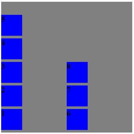
这个就比较奇怪了,为什么会是这样的呢,为什么第一列和第二列没有紧挨着呢?
其实,这是align-content属性在搞事情,默认情况下,align-content的值是stretch,意思是轴线会平均地占满整个空间,我们添加属性align-content: flex-start;
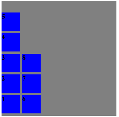
就得到我们需要的了,另外,你可能会疑问,为什么主轴是水平方向的时候,没有出现这样的情况,就是下面这个例子:
这个啊,是因为flex container的height就只有200px, 不是500px,我修改为500px看看效果:
这样就符合我们的认知了。
3.flex-flow属性是flex-direction属性和flex-wrap属性的简写,默认值是row nowrap
这个就不说了,没什么好说的。
4.justify-content属性定义了flex-item在main-axis的对齐方式
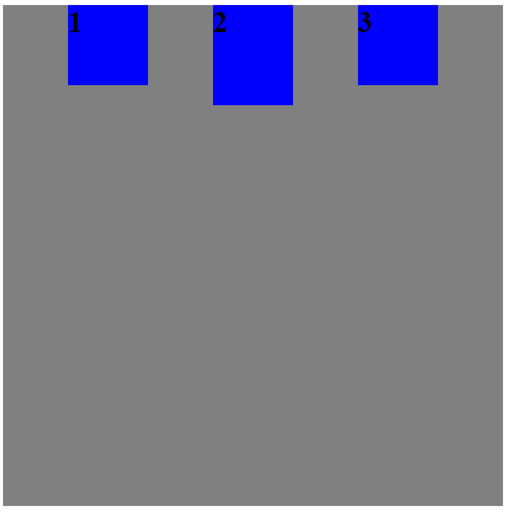
flex-start: 默认值,从主轴行首开始排列。每行第一个弹性元素与行首对齐,同时所有后续的弹性元素与前一个对齐。
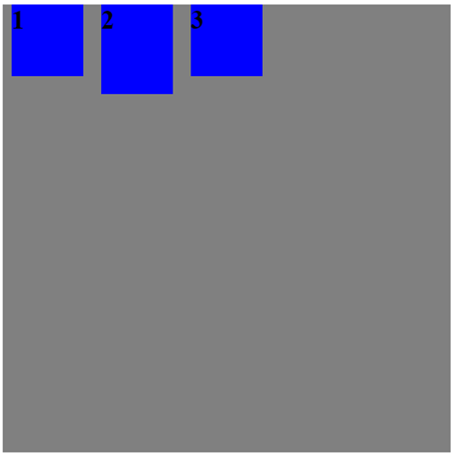
 1 <style>
 2     div {
 3         font-size: 30px;
 4         font-weight: 900;
 5     }
 6     .flex-container {
 7         width: 500px;
 8         height: 500px;
 9         background-color: gray;
10
11
12         display: flex;
13         /* 主轴是水平的,起点是左端 */
14         flex-direction: row;
15         /* 默认值,从主轴行首开始排列。每行第一个弹性元素与行首对齐,同时所有后续的弹性元素与前一个对齐*/
16         justify-content: flex-start;
17     }
18     .flex-item {
19         width: 80px;
20         height: 80px;
21         margin: 0 10px;
22         background-color: blue;
23     }
24     .special {
25         height: 100px;
26     }
27 </style>
28 <div class="flex-container">
29     <div class="flex-item">1</div>
30     <div class="flex-item special">2</div>
31     <div class="flex-item">3</div>
32 </div>
flex-end:从主轴行尾开始排列。每行最后一个弹性元素与行尾对齐,其他元素将与后一个对齐。
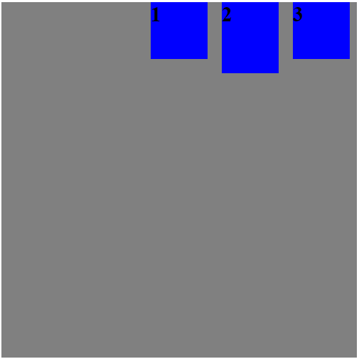
 1 <style>
 2     div {
 3         font-size: 30px;
 4         font-weight: 900;
 5     }
 6     .flex-container {
 7         width: 500px;
 8         height: 500px;
 9         background-color: gray;
10
11
12         display: flex;
13         /* 主轴是水平的,起点是左端 */
14         flex-direction: row;
15         /* 从主轴行尾开始排列。每行最后一个弹性元素与行尾对齐,其他元素将与后一个对齐*/
16         justify-content: flex-end;
17     }
18     .flex-item {
19         width: 80px;
20         height: 80px;
21         margin: 0 10px;
22         background-color: blue;
23     }
24     .special {
25         height: 100px;
26     }
27 </style>
28 <div class="flex-container">
29     <div class="flex-item">1</div>
30     <div class="flex-item special">2</div>
31     <div class="flex-item">3</div>
32 </div>
center: 伸缩元素向每行中点排列。每行第一个元素到行首的距离将与每行最后一个元素到行尾的距离相同。
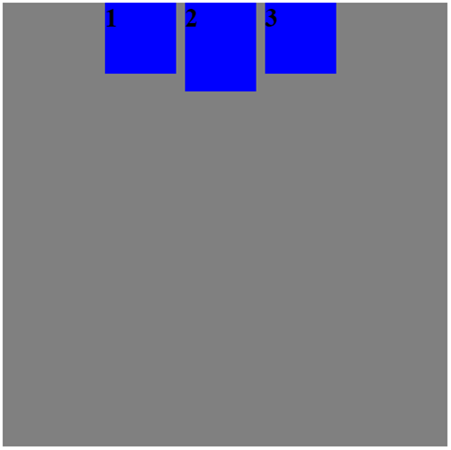
 1 <style>
 2     div {
 3         font-size: 30px;
 4         font-weight: 900;
 5     }
 6     .flex-container {
 7         width: 500px;
 8         height: 500px;
 9         background-color: gray;
10
11
12         display: flex;
13         /* 主轴是水平的,起点是左端 */
14         flex-direction: row;
15         /* 伸缩元素向每行中点排列。每行第一个元素到行首的距离将与每行最后一个元素到行尾的距离相同。 */
16         justify-content: center;
17     }
18     .flex-item {
19         width: 80px;
20         height: 80px;
21         margin: 0 10px 0 0;
22         background-color: blue;
23     }
24     .special {
25         height: 100px;
26     }
27 </style>
space-between:两端对齐,flex-item之间的间隔是相等的。
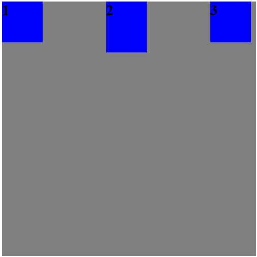
 1 <style>
 2     div {
 3         font-size: 30px;
 4         font-weight: 900;
 5     }
 6     .flex-container {
 7         width: 500px;
 8         height: 500px;
 9         background-color: gray;
10
11
12         display: flex;
13         /* 主轴是水平的,起点是左端 */
14         flex-direction: row;
15         /* 两端对齐,flex-item之间的间隔是相等的 */
16         justify-content: space-between;
17     }
18     .flex-item {
19         width: 80px;
20         height: 80px;
21         margin: 0 10px 0 0;
22         background-color: blue;
23     }
24     .special {
25         height: 100px;
26     }
27 </style>
28 <div class="flex-container">
29     <div class="flex-item">1</div>
30     <div class="flex-item special">2</div>
31     <div class="flex-item">3</div>
32 </div>
space-around:每个项目两侧的间隔是相等的,所以项目之间的间隔比项目与边框的间隔大一倍。
 1 <style>
 2     div {
 3         font-size: 30px;
 4         font-weight: 900;
 5     }
 6     .flex-container {
 7         width: 500px;
 8         height: 500px;
 9         background-color: gray;
10
11
12         display: flex;
13         /* 主轴是水平的,起点是左端 */
14         flex-direction: row;
15         /* 每个项目两侧的间隔是相等的,所以项目之间的间隔比项目与边框的间隔大一倍。 */
16         justify-content: space-around;
17     }
18     .flex-item {
19         width: 80px;
20         height: 80px;
21         margin: 0 10px 0 0;
22         background-color: blue;
23     }
24     .special {
25         height: 100px;
26     }
27 </style>
28 <div class="flex-container">
29     <div class="flex-item">1</div>
30     <div class="flex-item special">2</div>
31     <div class="flex-item">3</div>
32 </div>
space-evenly: flex item之间的距离和flex item与边框的距离是相同的。
 1 <style>
 2     div {
 3         font-size: 30px;
 4         font-weight: 900;
 5     }
 6     .flex-container {
 7         width: 500px;
 8         height: 500px;
 9         background-color: gray;
10
11
12         display: flex;
13         /* 主轴是水平的,起点是左端 */
14         flex-direction: row;
15         /* flex item之间的距离和flex item与边框的距离是相同的。 */
16         justify-content: space-evenly;
17     }
18     .flex-item {
19         width: 80px;
20         height: 80px;
21         margin: 0 0 0 0;
22         background-color: blue;
23     }
24     .special {
25         height: 100px;
26     }
27 </style>
 1 <style>
 2     div {
 3         font-size: 30px;
 4         font-weight: 900;
 5     }
 6     .flex-container {
 7         width: 500px;
 8         height: 500px;
 9         background-color: gray;
10
11
12         display: flex;
13         /* 主轴是水平的,起点是左端 */
14         flex-direction: row;
15         /* flex item之间的距离和flex item与边框的距离是相同的。 */
16         justify-content: space-evenly;
17     }
18     .flex-item {
19         width: 80px;
20         height: 80px;
21         /* margin对于布局的影响 */
22         margin: 0 30px 0 0;
23         background-color: blue;
24     }
25     .special {
26         height: 100px;
27     }
28 </style>
29 <div class="flex-container">
30     <div class="flex-item">1</div>
31     <div class="flex-item special">2</div>
32     <div class="flex-item">3</div>
33 </div>
可以看到,浏览器在计算剩余空间时是把margin也计算在内的。
5.align-items属性:定义flex-item在cross axis的对齐方式
stretch默认值:如果项目没有设置高度或者设置为auto,将自动占满容器的cross axis的方向。
 1 <style>
 2     div {
 3         font-size: 30px;
 4         font-weight: 900;
 5     }
 6     .flex-container {
 7         width: 500px;
 8         height: 500px;
 9         background-color: gray;
10
11
12         display: flex;
13         /* 主轴是水平的,起点是左端 */
14         flex-direction: row;
15         align-items: stretch;
16     }
17     .flex-item {
18         width: 80px;
19         height: 80px;
20         /* margin对于布局的影响 */
21         margin: 0 30px 0 0;
22         background-color: blue;
23     }
24     .special {
25         height: 100px;
26     }
27 </style>
28 <div class="flex-container">
29     <div class="flex-item">1</div>
30     <div class="flex-item">2</div>
31     <div class="flex-item">3</div>
32 </div>
上面的例子是flex item设置了height,这个时候,flex item就是设置的这个height,
我们来把height去掉,flex item将会充满整个cross axis。
 1 <style>
 2     div {
 3         font-size: 30px;
 4         font-weight: 900;
 5     }
 6     .flex-container {
 7         width: 500px;
 8         height: 500px;
 9         background-color: gray;
10
11
12         display: flex;
13         /* 主轴是水平的,起点是左端 */
14         flex-direction: row;
15         /* default value, 如果flex item没有设置height,flex item将会充满整个cross axis*/
16         align-items: stretch;
17     }
18     .flex-item {
19         width: 80px;
20         /* height: 80px; */
21         /* margin对于布局的影响 */
22         margin: 0 30px 0 0;
23         background-color: blue;
24     }
25     .special {
26         height: 100px;
27     }
28 </style>
29 <div class="flex-container">
30     <div class="flex-item">1</div>
31     <div class="flex-item">2</div>
32     <div class="flex-item">3</div>
33 </div>
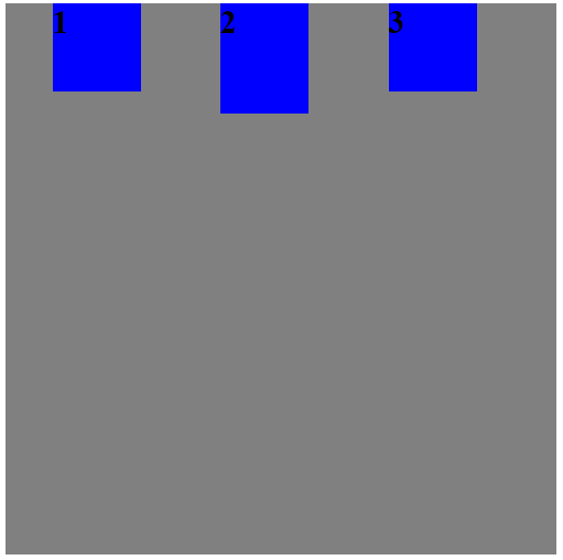
flex-start:cross axis的起点对齐。
 1 <style>
 2     div {
 3         font-size: 30px;
 4         font-weight: 900;
 5     }
 6     .flex-container {
 7         width: 500px;
 8         height: 500px;
 9         background-color: gray;
10
11
12         display: flex;
13         /* 主轴是水平的,起点是左端 */
14         flex-direction: row;
15         /* 与cross axis的起点对齐 */
16         align-items: flex-start;
17     }
18     .flex-item {
19         width: 80px;
20         /* height: 80px; */
21         /* margin对于布局的影响 */
22         margin: 0 30px 0 0;
23         background-color: blue;
24     }
25     .special {
26         height: 100px;
27     }
28 </style>
29 <div class="flex-container">
30     <div class="flex-item">1</div>
31     <div class="flex-item">2</div>
32     <div class="flex-item">3</div>
33 </div>
如果没有设置height,和普通的block 元素一样,父级元素的height由内部的元素的height决定。这里,flex item的高度由内部的字体高度决定。
flex-end:cross axis的终点对齐。
 1 <style>
 2     div {
 3         font-size: 30px;
 4         font-weight: 900;
 5     }
 6     .flex-container {
 7         width: 500px;
 8         height: 500px;
 9         background-color: gray;
10
11
12         display: flex;
13         /* 主轴是水平的,起点是左端 */
14         flex-direction: row;
15         /* 与cross axis的终点对齐 */
16         align-items: flex-end;
17     }
18     .flex-item {
19         width: 80px;
20         /* height: 80px; */
21         /* margin对于布局的影响 */
22         margin: 0 30px 0 0;
23         background-color: blue;
24     }
25     .special {
26         height: 100px;
27     }
28 </style>
29 <div class="flex-container">
30     <div class="flex-item">1</div>
31     <div class="flex-item">2</div>
32     <div class="flex-item">3</div>
33 </div>
center:cross axis的中点对齐。
 1 <style>
 2     div {
 3         font-size: 30px;
 4         font-weight: 900;
 5     }
 6     .flex-container {
 7         width: 500px;
 8         height: 500px;
 9         background-color: gray;
10
11
12         display: flex;
13         /* 主轴是水平的,起点是左端 */
14         flex-direction: row;
15         /* 与cross axis的中点对齐 */
16         align-items: center;
17     }
18     .flex-item {
19         width: 80px;
20         /* height: 80px; */
21         /* margin对于布局的影响 */
22         margin: 0 30px 0 0;
23         background-color: blue;
24     }
25     .special {
26         height: 100px;
27     }
28 </style>
29 <div class="flex-container">
30     <div class="flex-item">1</div>
31     <div class="flex-item">2</div>
32     <div class="flex-item">3</div>
33 </div>
baseline: flex-item的第一行文字的基线对齐。
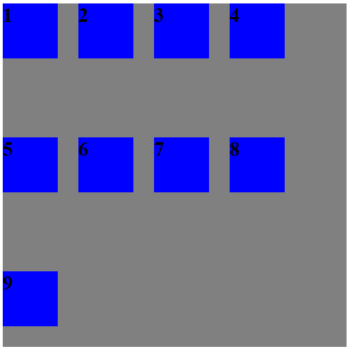
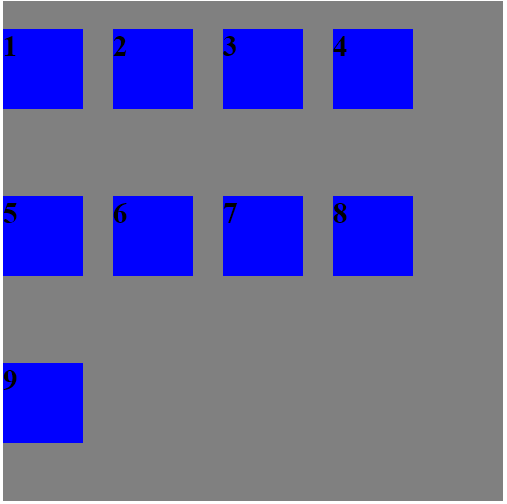
6.align-content属性定义了多根轴线的对齐方式,如果只有一条轴线,该属性不起作用。
stretch:默认值,轴线占满整个cross axis
 1 <style>
 2     div {
 3         font-size: 30px;
 4         font-weight: 900;
 5     }
 6     .flex-container {
 7         width: 500px;
 8         height: 500px;
 9         background-color: gray;
10
11
12         display: flex;
13         /* 主轴是水平的,起点是左端 */
14         flex-direction: row;
15         flex-wrap: wrap;
16         /*默认情况下,轴线占满整个cross axis(如果没有设置flex item的高度,flex item会被拉伸到轴线占满的空间)*/
17         align-content: stretch;
18     }
19     .flex-item {
20         width: 80px;
21         /* height: 80px; */
22         /* margin对于布局的影响 */
23         margin: 0 30px 30px 0;
24         background-color: blue;
25     }
26     .special {
27         height: 100px;
28     }
29 </style>
30 <div class="flex-container">
31     <div class="flex-item">1</div>
32     <div class="flex-item">2</div>
33     <div class="flex-item">3</div>
34     <div class="flex-item">4</div>
35     <div class="flex-item">5</div>
36     <div class="flex-item">6</div>
37     <div class="flex-item">7</div>
38     <div class="flex-item">8</div>
39     <div class="flex-item">9</div>
40 </div>
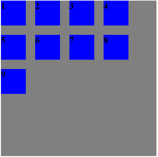
默认情况下,轴线会均匀分布在cross axis上,如果flex item没有设置height,flex item会被拉伸到轴线占满的空间。下面我们来看看flex item设置height的情况。
这种情况下,轴线还是均匀地分布在cross axis上,但是,flex item不会被拉伸。
 1 <style>
 2     div {
 3         font-size: 30px;
 4         font-weight: 900;
 5     }
 6     .flex-container {
 7         width: 500px;
 8         height: 500px;
 9         background-color: gray;
10
11
12         display: flex;
13         /* 主轴是水平的,起点是左端 */
14         flex-direction: row;
15         flex-wrap: wrap;
16         /* 默认情况下,轴线占满整个cross axis(与align-items的stretch一样,同样,如果flex item设置了height,则没有作用。) */
17         align-content: stretch;
18     }
19     .flex-item {
20         width: 80px;
21         height: 80px;
22         /* margin对于布局的影响 */
23         margin: 0 30px 30px 0;
24         background-color: blue;
25     }
26     .special {
27         height: 100px;
28     }
29 </style>
30 <div class="flex-container">
31     <div class="flex-item">1</div>
32     <div class="flex-item">2</div>
33     <div class="flex-item">3</div>
34     <div class="flex-item">4</div>
35     <div class="flex-item">5</div>
36     <div class="flex-item">6</div>
37     <div class="flex-item">7</div>
38     <div class="flex-item">8</div>
39     <div class="flex-item">9</div>
40 </div>
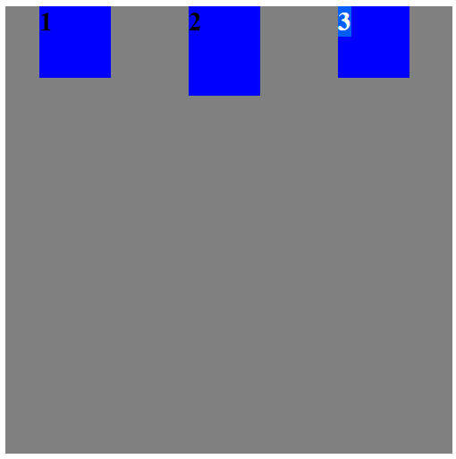
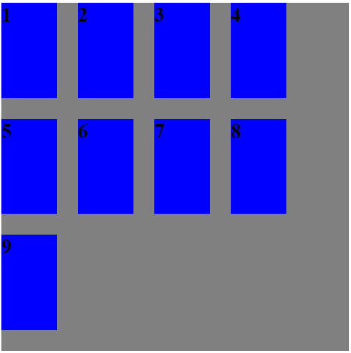
flex-start:cross axis的起点对齐。(会根据flex item的height来排布轴线)
 1 <style>
 2     div {
 3         font-size: 30px;
 4         font-weight: 900;
 5     }
 6     .flex-container {
 7         width: 500px;
 8         height: 500px;
 9         background-color: gray;
10
11
12         display: flex;
13         /* 主轴是水平的,起点是左端 */
14         flex-direction: row;
15         flex-wrap: wrap;
16         /* cross axis的起点对齐 */
17         align-content: flex-start;
18     }
19     .flex-item {
20         width: 80px;
21         height: 80px;
22         /* margin对于布局的影响 */
23         margin: 0 30px 30px 0;
24         background-color: blue;
25     }
26     .special {
27         height: 100px;
28     }
29 </style>
30 <div class="flex-container">
31     <div class="flex-item">1</div>
32     <div class="flex-item">2</div>
33     <div class="flex-item">3</div>
34     <div class="flex-item">4</div>
35     <div class="flex-item">5</div>
36     <div class="flex-item">6</div>
37     <div class="flex-item">7</div>
38     <div class="flex-item">8</div>
39     <div class="flex-item">9</div>
40 </div>
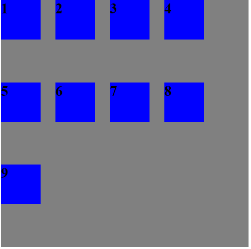
flex-end:cross axis的终点对齐。(会根据flex item的height来排布轴线)
 1 <style>
 2     div {
 3         font-size: 30px;
 4         font-weight: 900;
 5     }
 6     .flex-container {
 7         width: 500px;
 8         height: 500px;
 9         background-color: gray;
10
11
12         display: flex;
13         /* 主轴是水平的,起点是左端 */
14         flex-direction: row;
15         flex-wrap: wrap;
16         /* cross axis的终点对齐 */
17         align-content: flex-end;
18     }
19     .flex-item {
20         width: 80px;
21         height: 80px;
22         /* margin对于布局的影响 */
23         margin: 0 30px 30px 0;
24         background-color: blue;
25     }
26     .special {
27         height: 100px;
28     }
29 </style>
30 <div class="flex-container">
31     <div class="flex-item">1</div>
32     <div class="flex-item">2</div>
33     <div class="flex-item">3</div>
34     <div class="flex-item">4</div>
35     <div class="flex-item">5</div>
36     <div class="flex-item">6</div>
37     <div class="flex-item">7</div>
38     <div class="flex-item">8</div>
39     <div class="flex-item">9</div>
40 </div>
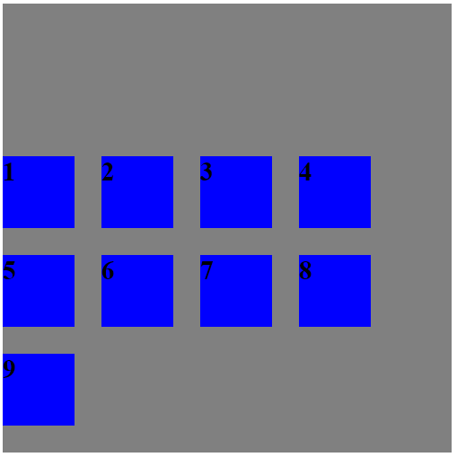
center: cross axis的中点对齐。(会根据flex item的height来排布轴线)

 1 <style>
 2     div {
 3         font-size: 30px;
 4         font-weight: 900;
 5     }
 6     .flex-container {
 7         width: 500px;
 8         height: 500px;
 9         background-color: gray;
10
11
12         display: flex;
13         /* 主轴是水平的,起点是左端 */
14         flex-direction: row;
15         flex-wrap: wrap;
16         /* cross axis的中点对齐 */
17         align-content: center;
18     }
19     .flex-item {
20         width: 80px;
21         height: 80px;
22         /* margin对于布局的影响 */
23         margin: 0 30px 30px 0;
24         background-color: blue;
25     }
26     .special {
27         height: 100px;
28     }
29 </style>
30 <div class="flex-container">
31     <div class="flex-item">1</div>
32     <div class="flex-item">2</div>
33     <div class="flex-item">3</div>
34     <div class="flex-item">4</div>
35     <div class="flex-item">5</div>
36     <div class="flex-item">6</div>
37     <div class="flex-item">7</div>
38     <div class="flex-item">8</div>
39     <div class="flex-item">9</div>
40 </div>
space-between: cross axis的两端对齐,轴线之间间隔平均分布。
 1 <style>
 2     div {
 3         font-size: 30px;
 4         font-weight: 900;
 5     }
 6     .flex-container {
 7         width: 500px;
 8         height: 500px;
 9         background-color: gray;
10
11
12         display: flex;
13         /* 主轴是水平的,起点是左端 */
14         flex-direction: row;
15         flex-wrap: wrap;
16         /* cross axis的两端对齐,轴线之间间隔平均分布 */
17         align-content: space-between;
18     }
19     .flex-item {
20         width: 80px;
21         height: 80px;
22         /* margin对于布局的影响 */
23         margin: 0 30px 30px 0;
24         background-color: blue;
25     }
26     .special {
27         height: 100px;
28     }
29 </style>
30 <div class="flex-container">
31     <div class="flex-item">1</div>
32     <div class="flex-item">2</div>
33     <div class="flex-item">3</div>
34     <div class="flex-item">4</div>
35     <div class="flex-item">5</div>
36     <div class="flex-item">6</div>
37     <div class="flex-item">7</div>
38     <div class="flex-item">8</div>
39     <div class="flex-item">9</div>
40 </div>
space-around:轴线的两侧的间隔是相等的,所以,轴线之间的间隔比轴线与边框的间隔大一倍。
 1 <style>
 2     div {
 3         font-size: 30px;
 4         font-weight: 900;
 5     }
 6     .flex-container {
 7         width: 500px;
 8         height: 500px;
 9         background-color: gray;
10
11
12         display: flex;
13         /* 主轴是水平的,起点是左端 */
14         flex-direction: row;
15         flex-wrap: wrap;
16         /* 轴线的两侧的间隔是相等的,所以,轴线之间的间隔比轴线与边框的间隔大一倍。 */
17         align-content: space-around;
18     }
19     .flex-item {
20         width: 80px;
21         height: 80px;
22         /* margin对于布局的影响 */
23         margin: 0 30px 30px 0;
24         background-color: blue;
25     }
26     .special {
27         height: 100px;
28     }
29 </style>
30 <div class="flex-container">
31     <div class="flex-item">1</div>
32     <div class="flex-item">2</div>
33     <div class="flex-item">3</div>
34     <div class="flex-item">4</div>
35     <div class="flex-item">5</div>
36     <div class="flex-item">6</div>
37     <div class="flex-item">7</div>
38     <div class="flex-item">8</div>
39     <div class="flex-item">9</div>
40 </div>

 浙公网安备 33010602011771号