

封装一个Vue3的弹框组件
设计思路:
1、组件结构: 基础弹框包含header、body、footer三部分。
2、功能设计:支持自定义内容、可以拖拽、多种预设类型的(如提示框,确认框,警告框等等)。
3、实现方式:使用Teleport将弹框渲染到body标签下面,避免父组件的css有影响。
4、状态管理:通过响应式的ref控制弹框显隐状态。
5、交互设计:支持多种关闭的方式(按钮的关闭、点击遮罩层关闭、ESC按键关闭)。
第一步创建组件
<template>
    <!-- 弹框组件 -->
    <Teleport to="body">
        <Transition name="modal-fade">
            <div v-if="modelValue" class="modal-overlay" @click="handleOverlayClick">
                <div class="modal-container" :style="modalSyle" @mousedown="startDrag" @mousemove="onDrag"
                    @mouseup="stopDrag" @mouseleave="stopDrag">
                    <!-- 头部标题栏 -->
                    <div class="modal-header">
                        <!-- 左边的标题栏 -->
                        <slot name="header-title">
                            {{ title }}
                        </slot>
                        <!-- 右边的按钮栏 -->
                        <button class="modal-close" @click="close">X</button>
                    </div>
                    <!-- body内容区 -->
                    <div class="modal-body">
                        <slot>
                            {{ content }}
                        </slot>
                    </div>
                    <!-- 底部按钮区 -->
                    <div class="modal-footer">
                        <slot name="footer">
                            <button class="modal-btn cancel" v-if="showCancel" @click="cancel">{{ cancelBtnTitle
                                }}</button>
                            <button class="modal-btn confirm" @click="confirm">{{ confirmBtnTitle }}</button>
                        </slot>
                    </div>
                </div>
            </div>
        </Transition>
    </Teleport>
</template>
<script lang="ts" setup>
import { computed, onMounted, onUnmounted, ref } from 'vue';
const props = defineProps({
    modelValue: Boolean, //v-modelValue绑定值
    title: { //标题
        type: String,
        default: '提示'
    },
    content: String, //中间的内容
    cancelBtnTitle: { //取消的按钮文字
        type: String,
        default: '取消'
    },
    confirmBtnTitle: { //确认的按钮文字
        type: String,
        default: '确认'
    },
    showCancel: { //是否显示取消按钮
        type: Boolean,
        default: true
    },
    width: { //弹框宽度
        type: [String, Number],
        default: '500px'
    },
    height: { //弹框高度
        type: [String, Number],
        default: 'auto'
    },
    closeOnClickOverlay: {
        type: Boolean,
        default: true
    },
    draggable: { //是否拖拽
        type: Boolean,
        default: true
    },
})

const emit = defineEmits(['update:modelValue', 'confirm', 'cancel'])
//处理拖拽逻辑
const isDragging = ref(false);
const dragOffset = ref({ x: 0, y: 0 });
const position = ref({ x: 0, y: 0 });

const modalSyle = computed(() => {
    return {
        width: typeof props.width === 'number' ? `${props.width}px` : props.width,
        height: typeof props.height === 'number' ? `${props.height}px` : props.height,
        transform: `translate(${position.value.x}px, ${position.value.y}px)`
    }
})
//开始拖拽
const startDrag = (event: any) => {
    if (!props.draggable) return;

    //只有点击标题栏时才可以拖动
    if (event.target.closest('.modal-header')) {
        isDragging.value = true;
        dragOffset.value = {
            x: event.clientX - position.value.x,
            y: event.clientY - position.value.y
        };
    }
}
const onDrag = (event: any) => {
    if (isDragging.value) {
        position.value = {
            x: event.clientX - dragOffset.value.x,
            y: event.clientY - dragOffset.value.y
        }
    };
}
//结束拖拽
const stopDrag = () => {
    isDragging.value = false;
}
//取消
const cancel = () => {
    emit('cancel');
    close();
}
//确认
const confirm = () => {
    emit('confirm');
    close();
}
//关闭
const close = () => {
    emit('update:modelValue', false);
}
const handleOverlayClick = (event: any) => {
    if (props.closeOnClickOverlay && event.target.classList.contains('modal-overlay')) {
        close();
    }
}

//判断按ESC键关闭弹框
const handleKeyDown = (event: any) => {
    if (event.key === 'Escape' && props.modelValue) {
        close();
    }
}
//监听按键
onMounted(() => {
    window.addEventListener('keydown', handleKeyDown);
})
//移除按键
onUnmounted(() => {
    window.removeEventListener('keydown', handleKeyDown);
})
</script>
<style lang="scss" scoped>
.modal-overlay {
    position: fixed;
    top: 0;
    left: 0;
    width: 100%;
    height: 100%;
    background-color: rgba(0, 0, 0, 0.5);
    display: flex;
    justify-content: center;
    align-items: center;
    z-index: 1000;
}

.modal-container {
    background-color: #fff;
    border-radius: 4px;
    box-shadow: 0 2px 12px rgba(0, 0, 0, 0.15);
    overflow: hidden;
    display: flex;
    flex-direction: column;
    max-width: 90%;
    max-height: 90%;
}

.modal-header {
    display: flex;
    justify-content: space-between;
    align-items: center;
    padding: 12px 16px;
    border-bottom: 1px solid #e8e8e8;

    .modal-close {
        border: none;
        background: transparent;
        font-size: 20px;
        cursor: pointer;
        outline: none;
    }
}

.modal-body {
    padding: 16px;
    overflow-y: auto;
    flex: 1;
}

.modal-footer {
    padding: 12px 16px;
    border-top: 1px solid #e8e8e8;
    text-align: right;

    .modal-btn {
        padding: 8px 15px;
        margin-left: 10px;
        border-radius: 4px;
        border: 1px solid #dcdfe6;
        background: #fff;
        cursor: pointer;
    }

    .confirm {
        background: #409eff;
        color: #fff;
        border-color: #409eff;
    }
}

.modal-fade-enter-active,
.modal-fade-leave-active {
    transition: opacity 0.3s;
}

.modal-fade-enter-from,
.modal-fade-leave-to {
    opacity: 0;
}
</style>
第二步创建全局弹框服务
//注册并使用弹框组件
import { createApp, h, ref } from "vue";
import Modal from '../components/Modal.vue';

export function createModal() {
    //全局实列存储
    const instances: any = [];


    //封装了弹框内容
    function modal(options: any = {}) {
        //创建div元素
        const container = document.createElement('div');
        document.body.appendChild(container);

        const visible = ref(true);

        const app = createApp({
            setup() {
                const onClose = () => {
                    visible.value = false;
                    setTimeout(() => {
                        app.unmount();
                        container.remove();
                        const index = instances.findIndex((instance: any) => instance === app)
                        if (index !== -1) {
                            instances.splice(index, 1)
                        }
                    }, 300); //给过渡动画留时间
                };

                return () => h(Modal, {
                    modelValue: visible.value,
                    'onUpdate:modelValue': (val: any) => {
                        visible.value = val;
                        if (!val) onClose();
                    },
                    onConfirm: () => {
                        if (options.onConfirm) options.onConfirm();
                        onClose();
                    },
                    onClancel: () => {
                        if (options.onClancel) options.onClancel();
                        onClose();
                    },
                    ...options
                }, options.slots || {})

            }
        });

        instances.push(app);
        app.mount(container);

        return {
            close: () => {
                visible.value = false;
            }
        }
    }


    //alert弹框
    modal.alert = (content: any, title: any = '提示', onConfirm: any) => {
        return modal({
            title,
            content,
            showCancel: false,
            onConfirm
        })
    };

    //confirm弹框
    modal.onfirm = (content: any, title: any = '确认', onConfirm: any, onClancel: any) => {
        return modal({
            title,
            content,
            onConfirm,
            onClancel
        })
    };

    //关闭所有的弹框
    modal.closeAll = () => {
        instances.forEach((instance: any) => {
            const vm = instance._instance.subTree.component.ctx;
            if (vm?.close) vm.close();
        })
    };

    return modal;

}

export default {
    install(app: any) {
        const modal = createModal();
        app.config.globalProperties.$modal = modal;
        app.provide('modal', modal)
    }
}
第三步在main里面注册全局插件
import { createApp } from 'vue'
import App from './App.vue'
import ModalPlugin from './util/modal'

const app = createApp(App);
app.use(ModalPlugin);
app.mount('#app');
第四步在页面中使用该组件
<template>
<div class="container">
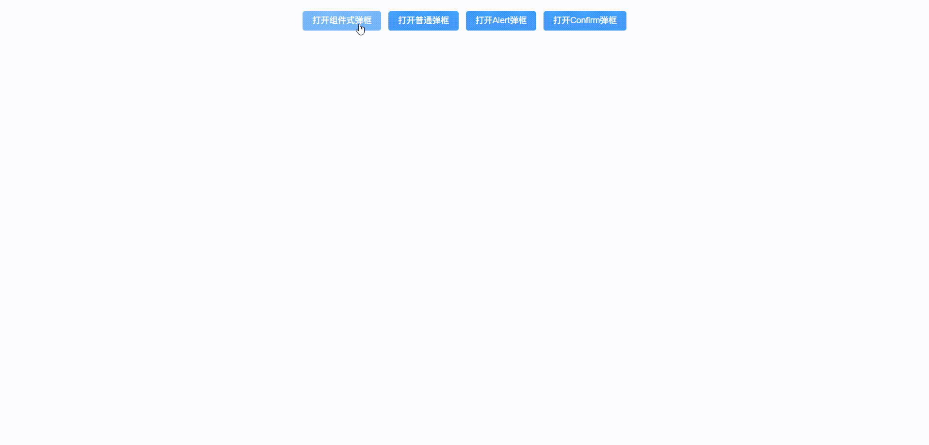
<el-button type="primary" @click="visible = true">打开组件式弹框</el-button>
<el-button type="primary" @click="openModal">打开普通弹框</el-button>
<el-button type="primary" @click="showAlert">打开Alert弹框</el-button>
<el-button type="primary" @click="showConfirm">打开Confirm弹框</el-button>
<Modal v-model="visible" title="组件方式弹框">
<p>这是一个组件方式打开的弹框</p>
<template #footer>
<el-button @click="visible = false">取消</el-button>
<el-button type="primary" @click="visible = false">确认</el-button>
</template>
</Modal>
</div>
</template>
<script setup lang="ts">
import Modal from '../components/Modal.vue';
import { inject, ref } from 'vue';
const visible = ref(false);
const modal: any = inject('modal');
const openModal = () => {
modal({
title: '自定义弹框',
content: '这是一个打开的弹框',
width: 600,
onConfirm: () => {
console.log('点击了确定')
},
onCancel: () => {
console.log('点击了取消')
}
})
}
const showAlert = () => {
modal.alert('这是提示框', '提示', () => {
console.log('alert确认')
})
}
const showConfirm = () => {
modal.onfirm('确认要执行操作吗?', '确认操作', () => {
console.log('confirm确认')
}, () => {
console.log('confirm取消')
})
}
</script>
<style scoped lang="scss">
.container {
text-align: center;
margin-top: 20px;
width: 100%;
}
</style>
本文来自博客园,作者:小珍珠在河里敲代码,转载请注明原文链接:https://www.cnblogs.com/Jansens520/p/18829997

 浙公网安备 33010602011771号