

卡片旋转动画效果
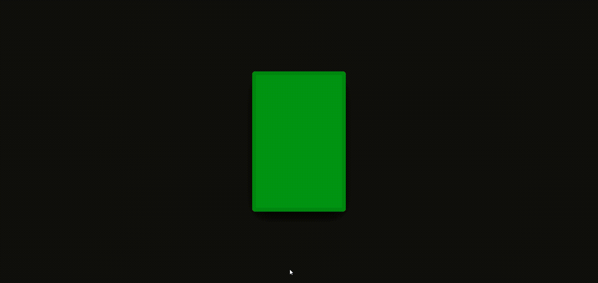
效果图如下:
html页面
<!DOCTYPE html>
<html>
	<head>
		<meta charset="utf-8">
		<title></title>
		<link rel="stylesheet" href="css/index.css" />
	</head>
	<body>
		<div class="container">
			<div class="card" style="--i:-4;">1</div>
			<div class="card" style="--i:-3;">2</div>
			<div class="card" style="--i:-2;">3</div>
			<div class="card" style="--i:-1;">4</div>
			<div class="card" style="--i:0;">5</div>
			<div class="card" style="--i:1;">6</div>
			<div class="card" style="--i:2;">7</div>
			<div class="card" style="--i:3;">8</div>
			<div class="card" style="--i:4;">9</div>
		</div>
	</body>
</html>
css样式
* {
	margin: 0;
	padding: 0;
	box-sizing: border-box;
}
body{
	display: flex;
	justify-content: center;
	align-items: center;
	min-height: 100vh;
	overflow: hidden;
	background: #0f0f0f;
}

.container{
	position: relative;
	width: 100%;
	display: flex;
	justify-content: center;
	align-items: center;
}

.container .card{
	position: absolute;
	width: 240px;
	height: 360px;
	background: #5e5cfc;
	border-radius: 8px;
	display: flex;
	justify-content: center;
	align-items: center;
	color: rgba(0, 0, 0, 0);
	font-size: 8em;
	font-weight: 700;
	border: 10px solid rgba(0, 0, 0, .1);
	transition: .5s;
	transform-origin: 50% 100%;
	filter: hue-rotate(calc(var(--i)* 60deg));
	box-shadow: 0 15px 50px rgba(0, 0, 0, .1);
}

.container:hover .card{
	transform: rotate(calc(var(--i)* 5deg))
	           translate(calc(var(--i) * 120px), -50px);
	box-shadow: 0 15px 50px rgba(0, 0, 0, .25);
	color: rgba(255, 255, 255, .25);
	cursor: pointer;
}

.container:active .card:not(:active){
	background: #333;
}

.container .card:active{
	translate: calc(var(--i) * 20px) -50px;
	z-index: 999;
	color: rgba(255, 255, 255, 1);
}
本文来自博客园,作者:小珍珠在河里敲代码,转载请注明原文链接:https://www.cnblogs.com/Jansens520/p/18166973

 浙公网安备 33010602011771号