布局-两列布局(一列定宽,一列自适应)
结构:
1 <div class="parent">
2         <div class="left">
3             <p>left</p>
4         </div>
5         <div class="right">
6             <p>right</p>
7             <p>right</p>
8         </div>
9     </div>
样式:
1.解决方案一:float +margin
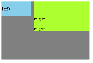
 1 .parent {
 2         background-color: grey;
 3         width: 300px;
 4         height: 200px;
 5
 6     }
 7     .left {
 8         float: left;/*元素脱离文档流,但是内容在文档流中*/
 9         width: 100px;
10         background-color: skyblue;
11 12     }
13     .right {
14         margin-left: 110px;
15         background-color: greenyellow;
16     }
17     /*优点:易理解
18     缺点:(1)兼容性有点问题,因为left有浮动,right没有浮动,所以right会有3px的bug,即两个right文字会想右缩3px,可在left上加margin-right:-100px;来解决,这类似于hack
            (2)也因为left有浮动,right没有,所以在第一个<p>right</p>上清除浮动,right就会掉下去,即在left水平线下
.right p:first-child::before{
clear: both;
content: " ";
display: block;
height: 0;
overflow: hidden;
visibility: hidden;
}*/
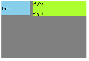
2.解决方案二:float+ margin + fix(上面方法的改进)
结构:
<div class="parent">
        <div class="left">
            <p>left</p>
        </div>
        <div class="right-fix">
            <div class="right">
                <p>right</p>
                <p>right</p>
            </div>
        </div>
    </div>
样式:
 1 .parent {
 2         background-color: grey;
 3         width: 300px;
 4         height: 200px;
 5
 6     }
 7     .left {
 8         float: left;/*元素脱离文档流,但是内容在文档流中*/
 9         width: 100px;
10         background-color: skyblue;
11         position: relative;/*提高left层级*/
12     }
13     .right-fix {
14         float: right;
15         width: 100%;
16         margin-left: -100px;
17     }
18     .right {
19         margin-left: 110px;
20         background-color: greenyellow;
21         }
22     p {
23         margin: 0;
24     }
3.解决方案三:float+ overflow
结构是最上面的结构
样式:
.parent {
        background-color: grey;
        width: 300px;
        height: 200px;
    }
    .left {
        float: left;/*元素脱离文档流,但是内容在文档流中*/
        width: 100px;
        background-color: skyblue;
        margin-right: 10px;
    }
    .right {
        overflow: hidden;/*触发BFC模式(Block Formating context块级的格式化文本),产生的效果是:BFC模式下的容器里面的内容与外界隔离,外面的内容如:浮动元素是不会影响BFC里的内容的*/
        background-color: greenyellow;
    }
    /*IE6不支持*/
4.解决方案四:table+table-cell (两列自然等高)
结构:最上面的结构
样式:
.parent {
        background-color: grey;
        width: 300px;
        height: 200px;
        display: table;
        table-layout: fixed;/*加速table的渲染,实现布局优先*/
    }
    .left {
        display: table-cell;
        width: 100px;
        background-color: skyblue;

        border-right: 10px solid transparent;
        background-clip: padding-box;/*设置列之间的间距*/
    }
    .right {
        display: table-cell;
        background-color: greenyellow;
    }
5.解决方案五:flex+ flex:1 (两列自然等高)
结构:最上面的结构
样式:
.parent {
        background-color: grey;
        width: 300px;
        height: 200px;
        display: flex;
    }
    .left {
        width: 100px;
        background-color: skyblue;
        margin-right: 10px;
    }
    .right {
        flex: 1;/*.right适应到剩下的所有部分*/
        background-color: greenyellow;
    }
/*flex是css3新增的内容,兼容性低。
flex根据内容去自适应,所以性能是一个问题,通常用flex作小范围的布局,而不是大范围的布局,即right中的内容不要太复杂,太多,太多会影响flex的性能*/

 浙公网安备 33010602011771号