background-image属性image-set()和srcset
background语法:
image-set() = image-set( <image-set-option># )

<image-set-option> = [ <image> | <string> ] <resolution>
image-set() 可以根据用户设备的分辨率匹配合适的图像-为不同的设备分配合适得图像
div {
	background-image: -webkit-image-set( "test.png" 1x, "test-2x.png" 2x, "test-print.png" 600dpi );
    background-image: image-set( "test.png" 1x, "test-2x.png" 2x, "test-print.png" 600dpi );
}
//上述代码将会为普通屏幕使用 test.png,为高分屏使用 test-2x.png,如果更高的分辨率则使用 test-print.png,比如印刷

//------------或者url------------------
body {
    background-image: -webkit-image-set( url(../images/pic-1.jpg) 1x, url(../images/pic-2.jpg) 2x, url(../images/pic-3.jpg) 600dpi);
    background-image:         image-set( url(../images/pic-1.jpg) 1x, url(../images/pic-2.jpg) 2x, url(../images/pic-3.jpg) 600dpi);
}
兼容性:

需要注意的是,目前这些浏览器支持的语法是:image-set( <url> | <string> ),写法如下
div {
	background-image: image-set( url(test.png) 1x, url(test-2x.png) 2x );
}
css image-set 让浏览器自动切换1x,2x图片
方法一:
<img src="img.png" srcset="path/img.png 2x,path/img.png.png 3x"/>

方法二:
background-image: url(img.jpg');
background-image:image-set( url(img.jpg) 1x, url(img@2x.jpg) 2x );
操作实例代码
<!-- 方式一 -->
<div class="image-set-by-zxx"></div>
<!-- 方式二 -->
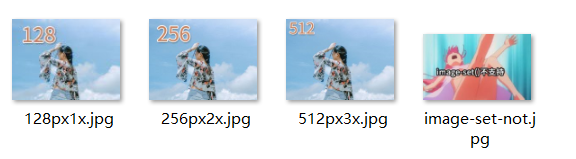
<img src="../images/image-set-not.jpg" srcset="../images/128px1x.jpg 1x,../images/256px2x.jpg 2x,../images/512px3x.jpg 3x"/>样式
.image-set-by-zxx {
	width: 128px;
	height: 96px;
	background: url(../images/image-set-not.jpg);
	background: -webkit-image-set(url(../images/128px1x.jpg) 1x, url(../images/256px2x.jpg) 2x, url(../images/512px3x.jpg) 3x);
	background: image-set(url(../images/128px1x.jpg) 1x, url(../images/256px2x.jpg) 2x, url(../images/512px3x.jpg) 3x);
	background-size: cover;
}

img srcset 属性
img 元素的 srcset 属性用于浏览器根据宽、高和像素密度来加载相应的图片资源。
属性格式:图片地址 宽度描述w 像素密度描述x,多个资源之间用逗号分隔。
<img src="small.jpg " srcset="big.jpg 1440w, middle.jpg 800w, small.jpg 1x" />上面的例子表示浏览器宽度达到 800px 则加载 middle.jpg ,达到 1400px 则加载 big.jpg。注意:像素密度描述只对固定宽度图片有效
img 元素的 size 属性给浏览器提供一个预估的图片显示宽度。
属性格式:媒体查询 宽度描述(支持px),多条规则用逗号分隔
<img src="images/gun.png" alt="img元素srcset属性浅析"
         srcset="images/bg_star.jpg 1200w, images/share.jpg 800w, images/gun.png 320w"
         sizes="(max-width: 320px) 300w, 1200w"/>
上面的例子表示浏览器视口为 320px 时图片宽度为 300px,其他情况为 1200px

本文来自博客园,作者:JackieDYH,转载请注明原文链接:https://www.cnblogs.com/JackieDYH/p/17634366.html

 浙公网安备 33010602011771号