echarts中appendData的详细讲解
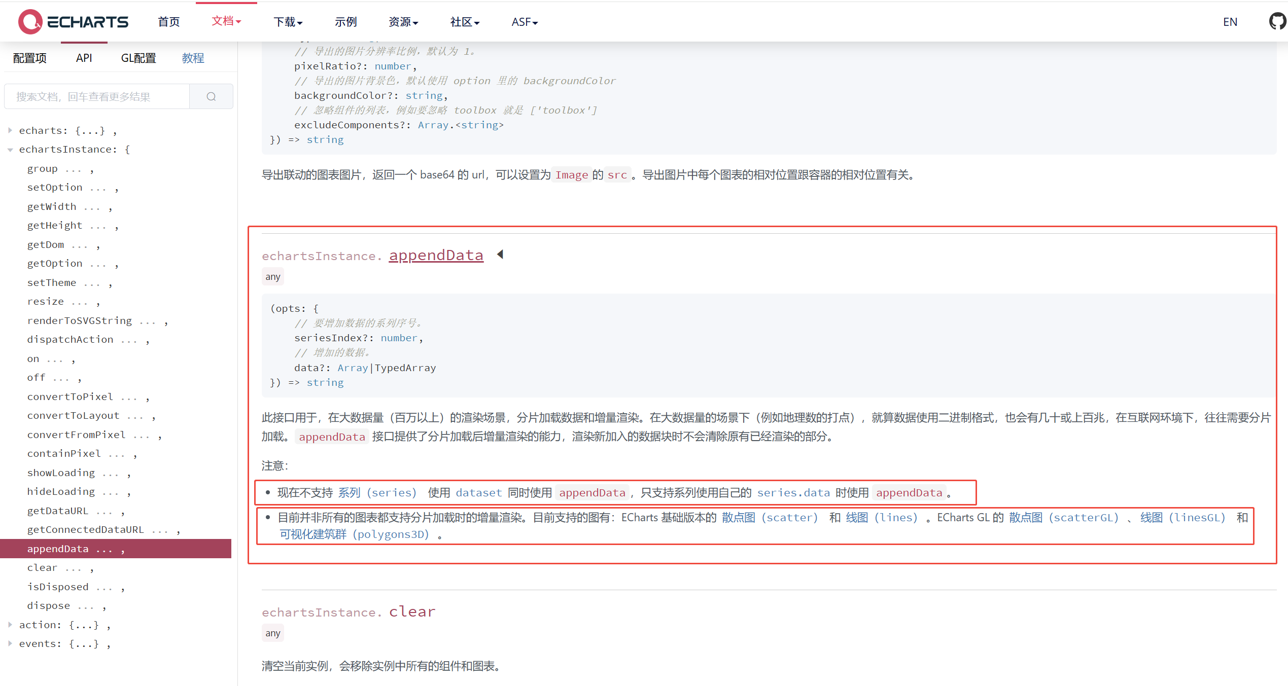
appendData 的说明
appendData 接口提供了分片加载后,增量渲染的能力。
appendData在大数据量(如:百万以上)的渲染场景,分片加载数据和增量渲染。
在大数据量的场景下(例如地理数的打点),就算数据使用二进制格式。
也会有几十或上百兆,在互联网环境下,往往需要分片加载。
渲染新加入的数据块时不会清除原有已经渲染的部分。
上面这一段话,是echarts官网中对appendData的描述。
文字地址说明: https://echarts.apache.org/zh/api.html#echartsInstance.appendData
需要注意的是:
现在不支持系列(series) 使用 dataset 同时使用 appendData。
只支持系列使用自己的 series.data 时使用 appendData。
目前并非所有的图表都支持分片加载时的增量渲染。【重要】
目前支持的图有:ECharts 基础版本的 散点图(scatter) 和 线图(lines)。
ECharts GL 的 散点图(scatterGL)、线图(linesGL) 和 可视化建筑群(polygons3D)。
appendData 的语法
chart.appendData({
  seriesIndex?: number, // 必须是已存在的系列索引,说明:不能够添加新的折线。
  // 增加的数据。
  data?: Array|TypedArray // 要追加的数据点
})
通过上面的语法说明一个问题(appendData 不能新增一条线)
appendData 方法只能用于向已存在的数据系列追加数据点,而不能添加新的数据系列(即新的线条)。
也就是说:appendData 不能新增一条线。
原因:根据这个方法的参数可以推断除不能够新增1条折线。原因如下:
appendData 方法用于向图表中追加数据,它接受一个对象作为参数,该对象包含 seriesIndex 和 data 两个属性。
seriesIndex: number, // 必须是已存在的系列索引
appendData 的特别说明
appendData 方法不会自动更新x轴,因此我们需要手动更新x轴的数据。
所以:如果我们要使用 appendData 跟新折线图,柱状图的数据。
必须要配合:setOption 来跟新 x轴。
看到这里是是不是感觉到很扯~~~~~
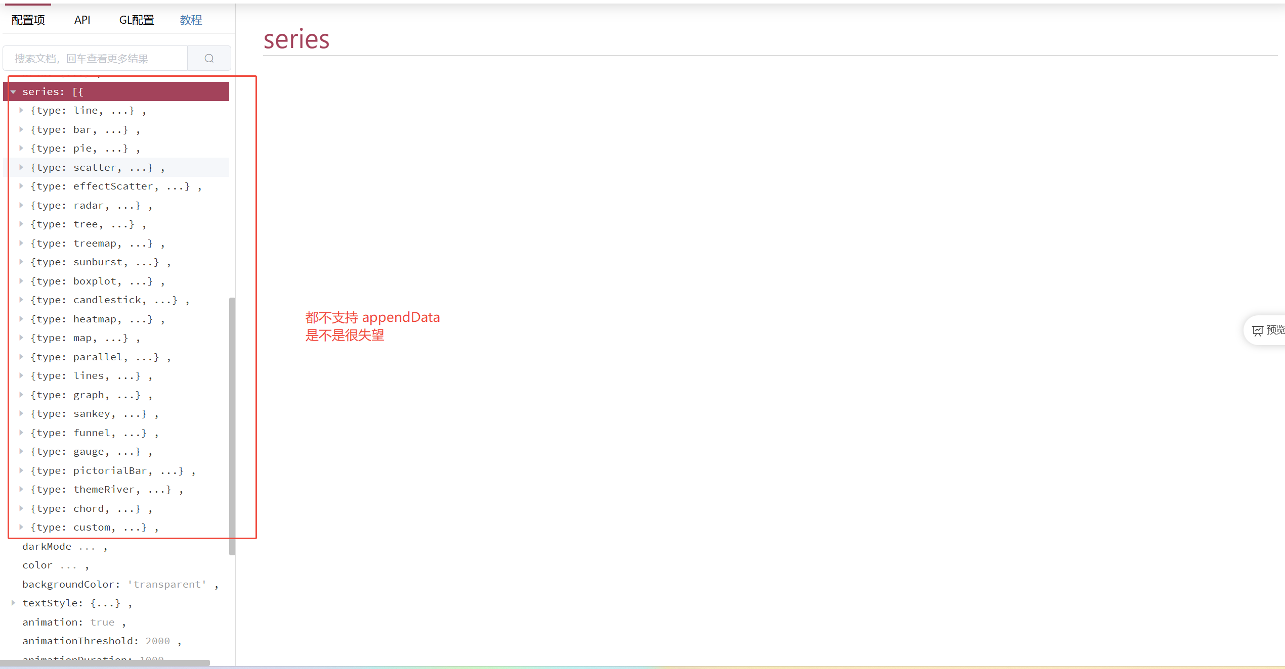
其实并不扯,appendData 就不能用在 series 系列的图表中。
网上其他文章使用 appendData 跟新折线图,柱状图的,一定也使用了 setOption 来跟新 x轴。
那我们思考一下,我都使用了 setOption 来更新X轴,为啥还要多使用 appendData 呢?
因此:appendData不能用在折线图,柱状图中。
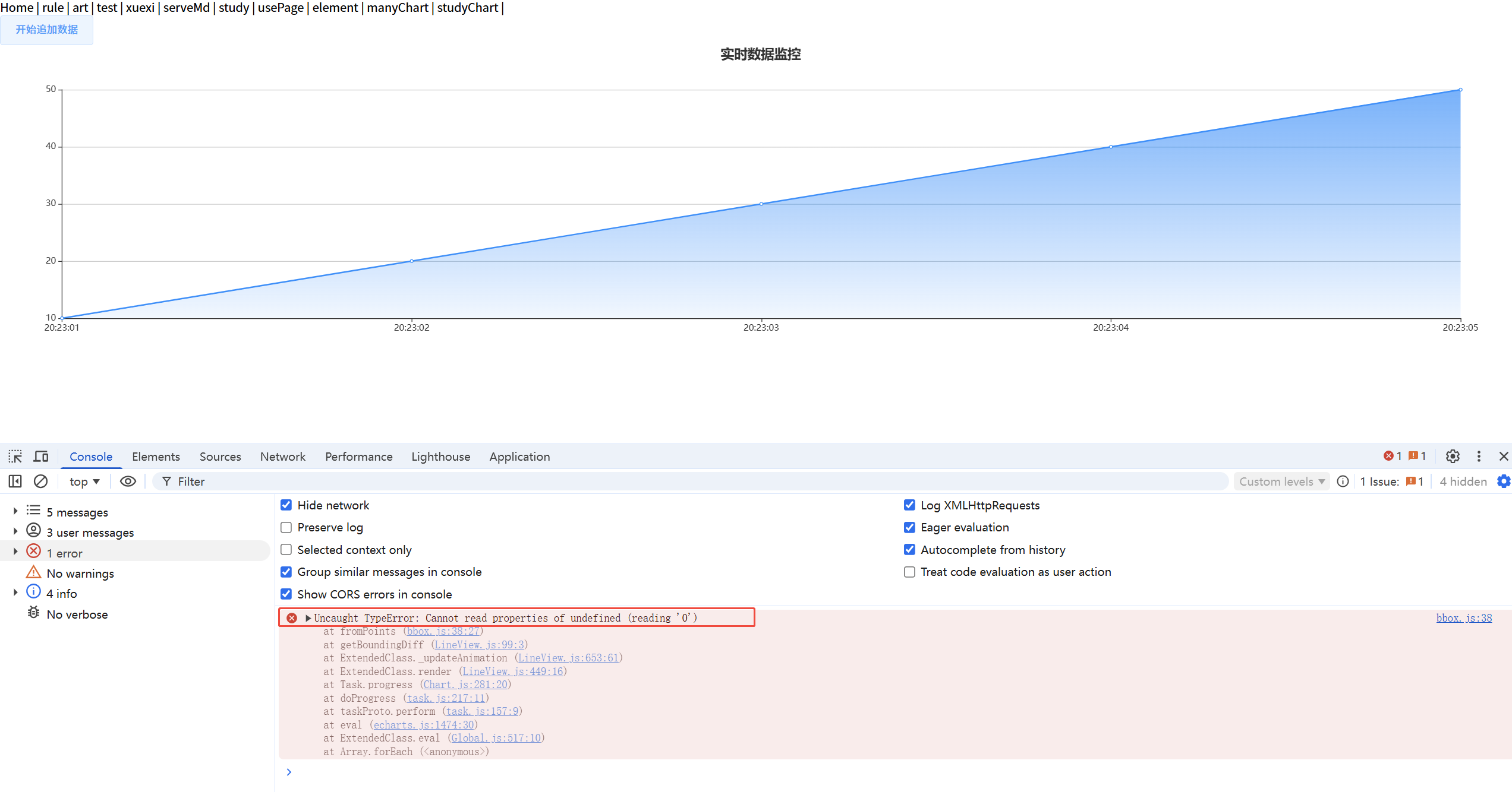
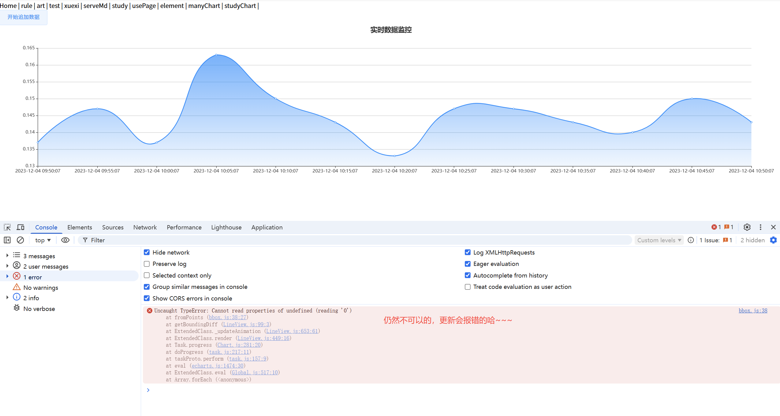
折线图单独使用 appendData 会引发错误 Uncaught TypeError: Cannot read properties of undefined (reading '0')
<template>
  <div>
    <el-button @click="startStream">开始追加数据</el-button>
    <div ref="chart" style="width: 100%; height: 400px;"></div>
  </div>
</template>

<script>
import echarts from 'echarts'

export default {
  name: 'RealtimeLineChart',
  data() {
    return {
      myChart: null,
      xAxisData: ["20:23:01", "20:23:02", "20:23:03", "20:23:04","20:23:05"],
      seriesData: [10, 20, 30, 40, 50]
    };
  },
  mounted() {
    this.initChart();
  },
  methods: {
    // 初始化图表
    initChart() {
      console.log('xAxisData',this.xAxisData)
      // 确保DOM元素已渲染
        this.myChart = echarts.init(this.$refs.chart);
        const option = {
          title: {
            text: '实时数据监控',
            left: 'center'
          },
          tooltip: {
            trigger: 'axis',
            formatter: (params) => {
              return `时间: ${params[0].name}<br/>值: ${params[0].value}`;
            }
          },
          xAxis: {
            type: 'category',
            boundaryGap: false,
            // xAxisData 表示 X轴的数据值
            data: this.xAxisData
          },
          yAxis: {
            type: 'value',
            scale: true
          },
          series: [{
            name: '数据值',
            type: 'line',
            smooth: true,
            itemStyle: {
              color: '#1890ff'
            },
            areaStyle: {
              color: new echarts.graphic.LinearGradient(0, 0, 0, 1, [
                { offset: 0, color: '#1890ff' },
                { offset: 1, color: 'rgba(24, 144, 255, 0.1)' }
              ])
            },
            // Y轴对于的数据
            data: this.seriesData
          }],
          grid: {
            left: '3%',
            right: '4%',
            bottom: '3%',
            containLabel: true
          }
        };
        this.myChart.setOption(option);
    },
    // 启动实时数据流
    startStream() {
      if(!this.xAxisData.includes("20:23:06")){
        // 向X轴添加数据
        this.xAxisData.push("20:23:06")
        // 我们可以理解为:向Y轴追加数据
        this.myChart.appendData({
          seriesIndex: 0,
          data: [1000]
        });
      }
    }
  }
};
</script>
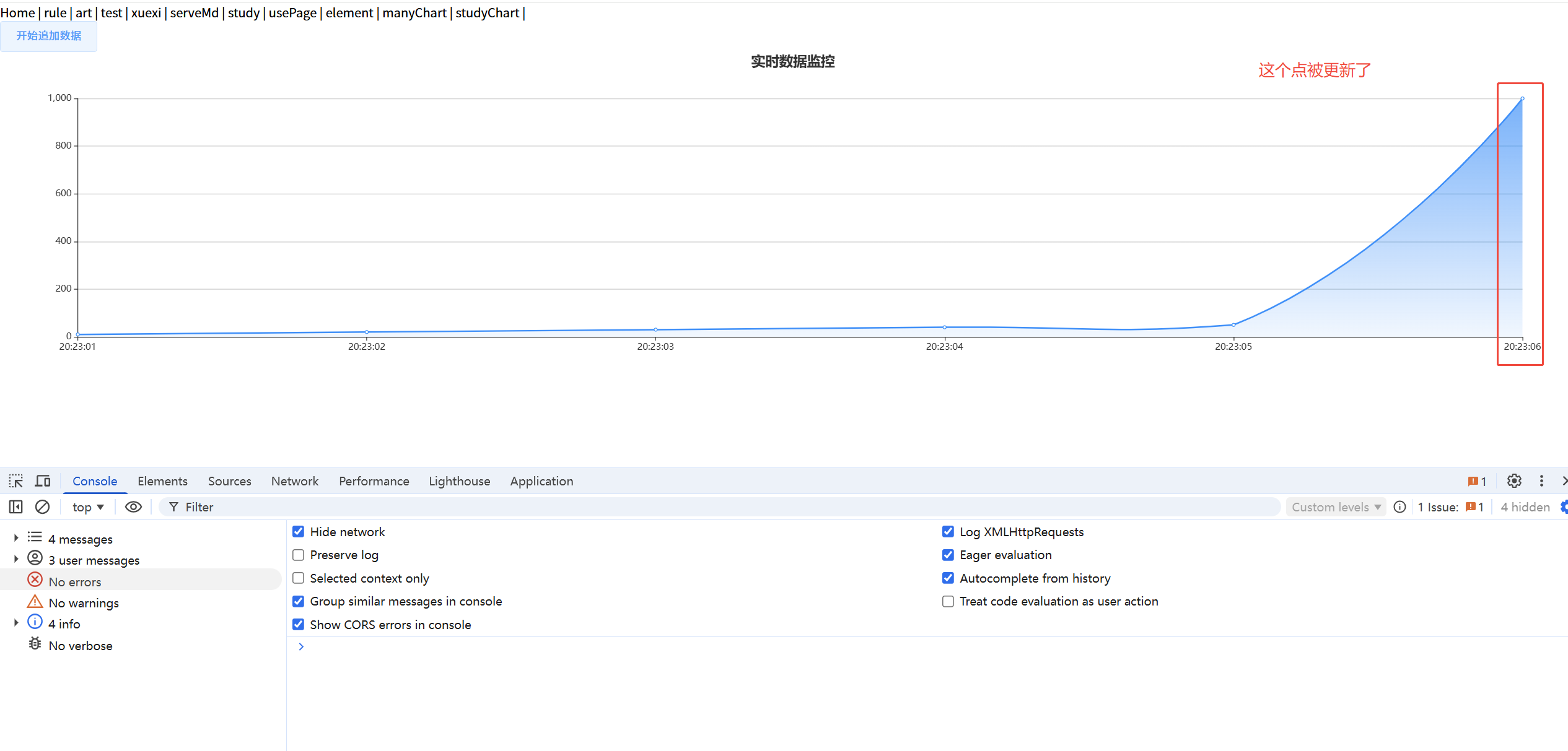
appendData 更新Y轴数据,setOption来跟新X轴
... 单独使用 appendData 会引发错误 Uncaught TypeError: Cannot read properties of undefined (reading '0')...
... 其他代码不变 ...
  methods: {
    // 启动实时数据流
    startStream() {
      if(!this.xAxisData.includes("20:23:06")){
        // 向X轴添加数据
        this.xAxisData.push("20:23:06")
        // 我们可以理解为:向Y轴追加数据。appendData只能跟新Y轴数据。
        this.myChart.appendData({
          seriesIndex: 0,
          data: [1000]
        });

        // 更新X轴数据
        this.myChart.setOption({
          xAxis: {
            data: this.xAxisData
          }
        });
      }
    }
  }
</script>
[x轴的数,y轴数据]这样形式的数据appendData可以更新嘛?
有机智的小伙伴会说:appendData 方法不会自动更新x轴。
那么如果我们的数据是下面这种形式:
seriesData:  [
  [ "2023-12-04 09:50:07", "0.137"],
  ................................,
  [ "2023-12-04 10:50:07", "0.143"],
  ]
是不是就可以使用appendData 跟新折线图的数据了?
答案是:不可以。下面我们可以来看下
<template>
  <div>
    <el-button @click="startStream">开始追加数据</el-button>
    <div ref="chart" style="width: 100%; height: 400px;"></div>
  </div>
</template>

<script>
import echarts from 'echarts'

export default {
  name: 'RealtimeLineChart',
  data() {
    return {
      myChart: null,
      seriesData:  [
        [ "2023-12-04 09:50:07", "0.137"],
        [ "2023-12-04 09:55:07", "0.147"],
        [ "2023-12-04 10:00:07", "0.137"],
        [ "2023-12-04 10:05:07", "0.163"],
        [ "2023-12-04 10:10:07", "0.150"],
        [ "2023-12-04 10:15:07", "0.143"],
        [ "2023-12-04 10:20:07", "0.133"],
        [ "2023-12-04 10:25:07", "0.147"],
        [ "2023-12-04 10:30:07", "0.147"],
        [ "2023-12-04 10:35:07", "0.143"],
        [ "2023-12-04 10:40:07", "0.140"],
        [ "2023-12-04 10:45:07", "0.150"],
        [ "2023-12-04 10:50:07", "0.143"],
      ]
    };
  },
  mounted() {
    this.initChart();
  },
  methods: {
    // 初始化图表
    initChart() {
      // 确保DOM元素已渲染
      this.myChart = echarts.init(this.$refs.chart);
      const option = {
        title: {
          text: '实时数据监控',
          left: 'center'
        },
        tooltip: {
          trigger: 'axis',
        },
        xAxis: {
          type: 'category',
          boundaryGap: false,
        },
        yAxis: {
          type: 'value',
          scale: true
        },
        series: [{
          name: '数据值',
          type: 'line',
          smooth: true,
          itemStyle: {
            color: '#1890ff'
          },
          areaStyle: {
            color: new echarts.graphic.LinearGradient(0, 0, 0, 1, [
              { offset: 0, color: '#1890ff' },
              { offset: 1, color: 'rgba(24, 144, 255, 0.1)' }
            ])
          },
          // Y轴对于的数据
          data: this.seriesData
        }],
        grid: {
          left: '3%',
          right: '4%',
          bottom: '3%',
          containLabel: true
        }
      };
      this.myChart.setOption(option);
    },
    // 启动实时数据流,使用appendData更新数据会报错的哈
    startStream() {
      this.myChart.appendData({
        seriesIndex: 0,
        data: ["2023-12-04 10:55:07", "14.3"]
      });
    },
  }
};
</script>
折线图追加数据使用 setOption
<template>
  <div>
    <el-button @click="startStream">开始追加数据</el-button>
    <div ref="chart" style="width: 100%; height: 400px;"></div>
  </div>
</template>

<script>
import echarts from 'echarts'

export default {
  name: 'RealtimeLineChart',
  data() {
    return {
      myChart: null,
      seriesData:  [
        [ "2023-12-04 09:50:07", "0.137"],
        [ "2023-12-04 09:55:07", "0.147"],
        [ "2023-12-04 10:00:07", "0.137"],
        [ "2023-12-04 10:05:07", "0.163"],
        [ "2023-12-04 10:10:07", "0.150"],
        [ "2023-12-04 10:15:07", "0.143"],
        [ "2023-12-04 10:20:07", "0.133"],
        [ "2023-12-04 10:25:07", "0.147"],
        [ "2023-12-04 10:30:07", "0.147"],
        [ "2023-12-04 10:35:07", "0.143"],
        [ "2023-12-04 10:40:07", "0.140"],
        [ "2023-12-04 10:45:07", "0.150"],
        [ "2023-12-04 10:50:07", "0.143"],
      ]
    };
  },
  mounted() {
    this.initChart();
  },
  methods: {
    // 初始化图表
    initChart() {
      // 确保DOM元素已渲染
      this.myChart = echarts.init(this.$refs.chart);
      const option = {
        title: {
          text: '实时数据监控',
          left: 'center'
        },
        tooltip: {
          trigger: 'axis',
        },
        xAxis: {
          type: 'category',
          boundaryGap: false,
        },
        yAxis: {
          type: 'value',
          scale: true
        },
        series: [{
          name: '数据值',
          type: 'line',
          smooth: true,
          itemStyle: {
            color: '#1890ff'
          },
          areaStyle: {
            color: new echarts.graphic.LinearGradient(0, 0, 0, 1, [
              { offset: 0, color: '#1890ff' },
              { offset: 1, color: 'rgba(24, 144, 255, 0.1)' }
            ])
          },
          // Y轴对于的数据
          data: this.seriesData
        }],
        grid: {
          left: '3%',
          right: '4%',
          bottom: '3%',
          containLabel: true
        }
      };
      this.myChart.setOption(option);
    },
    // 启动实时数据流,使用 setOption 更新数据
    startStream() {
      this.seriesData.push(["2023-12-04 10:55:07", "0.19"]);
      this.myChart.setOption({
        series:[{
          data: this.seriesData
        }]
      });
    },
  }
};
</script>
遇见问题,这是你成长的机会,如果你能够解决,这就是收获。
出处:https://www.cnblogs.com/IwishIcould/
想问问题,打赏了卑微的博主,求求你备注一下的扣扣或者微信;这样我好联系你;(っ•̀ω•́)っ✎⁾⁾!
如果觉得这篇文章对你有小小的帮助的话,记得在右下角点个“推荐”哦,或者关注博主,在此感谢!
万水千山总是情,打赏5毛买辣条行不行,所以如果你心情还比较高兴,也是可以扫码打赏博主(っ•̀ω•́)っ✎⁾⁾!
想问问题,打赏了卑微的博主,求求你备注一下的扣扣或者微信;这样我好联系你;(っ•̀ω•́)っ✎⁾⁾!


如果文中有什么错误,欢迎指出。以免更多的人被误导。

 浙公网安备 33010602011771号