

【javafx 官方文档翻译 四】Working with Layouts in JavaFX
介绍
近期接到公司需求,需要做一个桌面系统,但由于自己java出身。前期做了可行性分析,可以用java1.8+javafx实现功能需求。但是在网上搜到的javafx相关文档较少。因此只能从官方文档下手。本人英文水平有限,特此将英文文档摘录下来,并用百度翻译逐步翻译。中间难免有些错误,还望理解。也欢迎大家一起讨论,共同进步。
官方目录
官方地址 Working with Layouts in JavaFX
- Title and Copyright Information
- Preface
- 1 Using Built-in Layout Panes
- 2 Tips for Sizing and Aligning Nodes
- 3 Styling Layout Panes with CSS
- Creating Style Definitions
- Styling the Layout Sample
- Using a Background Image
- Additional Resources
- Application Files
- A LayoutSample.java
- B LayoutSizingAligning.java
- C LayoutSampleCSS.java
- D layoutstyles.css
内容
Title and Copyright Information
Working with Layouts in JavaFX
Release 8
E50476-01
March 2014
Learn how to use the Layout API and built-in layout panes to lay out the interface for your JavaFX application.
JavaFX Working with Layouts in JavaFX, Release 8
E50476-01
Copyright © 2011, 2014, Oracle and/or its affiliates. All rights reserved.
Primary Author: Joni Gordon
This software and related documentation are provided under a license agreement containing restrictions on use and disclosure and are protected by intellectual property laws. Except as expressly permitted in your license agreement or allowed by law, you may not use, copy, reproduce, translate, broadcast, modify, license, transmit, distribute, exhibit, perform, publish, or display any part, in any form, or by any means. Reverse engineering, disassembly, or decompilation of this software, unless required by law for interoperability, is prohibited.
The information contained herein is subject to change without notice and is not warranted to be error-free. If you find any errors, please report them to us in writing.
If this is software or related documentation that is delivered to the U.S. Government or anyone licensing it on behalf of the U.S. Government, the following notice is applicable:
U.S. GOVERNMENT END USERS: Oracle programs, including any operating system, integrated software, any programs installed on the hardware, and/or documentation, delivered to U.S. Government end users are "commercial computer software" pursuant to the applicable Federal Acquisition Regulation and agency-specific supplemental regulations. As such, use, duplication, disclosure, modification, and adaptation of the programs, including any operating system, integrated software, any programs installed on the hardware, and/or documentation, shall be subject to license terms and license restrictions applicable to the programs. No other rights are granted to the U.S. Government.
This software or hardware is developed for general use in a variety of information management applications. It is not developed or intended for use in any inherently dangerous applications, including applications that may create a risk of personal injury. If you use this software or hardware in dangerous applications, then you shall be responsible to take all appropriate fail-safe, backup, redundancy, and other measures to ensure its safe use. Oracle Corporation and its affiliates disclaim any liability for any damages caused by use of this software or hardware in dangerous applications.
Oracle and Java are registered trademarks of Oracle and/or its affiliates. Other names may be trademarks of their respective owners.
Intel and Intel Xeon are trademarks or registered trademarks of Intel Corporation. All SPARC trademarks are used under license and are trademarks or registered trademarks of SPARC International, Inc. AMD, Opteron, the AMD logo, and the AMD Opteron logo are trademarks or registered trademarks of Advanced Micro Devices. UNIX is a registered trademark of The Open Group.
This software or hardware and documentation may provide access to or information on content, products, and services from third parties. Oracle Corporation and its affiliates are not responsible for and expressly disclaim all warranties of any kind with respect to third-party content, products, and services. Oracle Corporation and its affiliates will not be responsible for any loss, costs, or damages incurred due to your access to or use of third-party content, products, or services.
Preface
This preface describes the document accessibility features and conventions used in this tutorial - Working with Layouts in JavaFX
About This Document
This tutorial provides information on using layout panes to create graphical user interfaces for your JavaFX applications
This tutorial contains the following topics:
- Using Built-in Layout Panes - Describes the built-in layout panes and provides an example of each pane.
- Tips for Sizing and Aligning Nodes - Provides examples of overriding the default size and position of nodes.
- Styling Layout Panes with CSS - Describes how to customize layout panes using CSS.
Audience
This document is intended for JavaFX developers.
Documentation Accessibility
For information about Oracle's commitment to accessibility, visit the Oracle Accessibility Program website at http://www.oracle.com/pls/topic/lookup?ctx=acc&id=docacc.
Access to Oracle Support
Oracle customers have access to electronic support through My Oracle Support. For information, visit http://www.oracle.com/pls/topic/lookup?ctx=acc&id=info or visit http://www.oracle.com/pls/topic/lookup?ctx=acc&id=trs if you are hearing impaired.
Related Documents
For more information, see the following documents in the JavaFX documentation set:
Conventions
The following text conventions are used in this document:
| Convention | Meaning |
|---|---|
| boldface | Boldface type indicates graphical user interface elements associated with an action, or terms defined in text or the glossary. |
| italic | Italic type indicates book titles, emphasis, or placeholder variables for which you supply particular values. |
monospace |
Monospace type indicates commands within a paragraph, URLs, code in examples, text that appears on the screen, or text that you enter. |
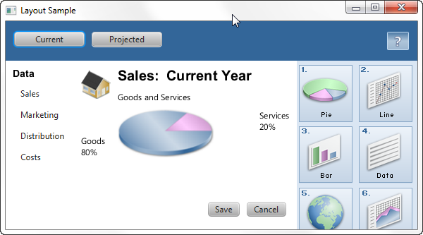
1 Using Built-in Layout Panes
This topic describes the layout container classes, called panes, that are available with the JavaFX SDK. Use layout panes to easily manage the user interface for your JavaFX application.
本主题描述了JavaFX SDK中可用的布局容器类,称为窗格。使用布局窗格轻松管理JavaFX应用程序的用户界面。
A JavaFX application can manually lay out the UI by setting the position and size properties for each UI element. However, an easier option is to make use of layout panes. The JavaFX SDK provides several layout panes for the easy setup and management of classic layouts such as rows, columns, stacks, tiles, and others. As a window is resized, the layout pane automatically repositions and resizes the nodes that it contains according to the properties for the nodes.
JavaFX应用程序可以通过设置每个UI元素的位置和大小属性来手动布局UI。然而,一个更简单的选择是使用布局窗格。JavaFX SDK提供了几个布局窗格,用于轻松设置和管理经典布局,如行、列、堆栈、图块等。调整窗口大小时,布局窗格会根据节点的属性自动重新定位和调整其包含的节点的大小。
This topic provides an overview and a simple example of each of the layout panes provided by the JavaFX layout package. The LayoutSample.java file contains the source code for the UI built in this topic. The LayoutSample.zip file contains the NetBeans IDE project for the sample application.
本主题提供JavaFX布局包提供的每个布局窗格的概述和简单示例。LayoutSample.java文件包含本主题中构建的UI的源代码。LayoutSample.zip 该文件包含示例应用程序的NetBeans IDE项目。
BorderPane
The BorderPane layout pane provides five regions in which to place nodes: top, bottom, left, right, and center. Figure 1-1 shows the type of layout that you can create with a border pane. The regions can be any size. If your application does not need one of the regions, you do not need to define it and no space is allocated for it.
“边框窗格”布局窗格提供了五个区域来放置节点:顶部、底部、左侧、右侧和中心。图1-1显示了可以使用边框窗格创建的布局类型。区域可以是任何大小。如果您的应用程序不需要其中一个区域,则不需要定义它,也不需要为它分配空间。
Figure 1-1 Sample Border Pane
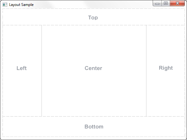
Description of "Figure 1-1 Sample Border Pane"
A border pane is useful for the classic look of a tool bar at the top, a status bar at the bottom, a navigation panel on the left, additional information on the right, and a working area in the center.
边框窗格对于顶部工具栏、底部状态栏、左侧导航面板、右侧附加信息和中心工作区的经典外观非常有用。
If the window is larger than the space needed for the contents of each region, the extra space is given to the center region by default. If the window is smaller than the space needed for the contents of each region, the regions might overlap. The overlap is determined by the order in which the regions are set. For example, if the regions are set in the order of left, bottom, and right, when the window is made smaller, the bottom region overlaps the left region and the right region overlaps the bottom region. If set in the order of left, right, and bottom, when the window is made smaller, the bottom region overlaps both the left and right regions.
如果窗口大于每个区域内容所需的空间,则默认情况下,额外的空间将提供给中心区域。如果窗口小于每个区域内容所需的空间,则区域可能会重叠。重叠由设置区域的顺序决定。例如,如果按左、下、右的顺序设置区域,则当窗口变小时,底部区域与左侧区域重叠,右侧区域与底部区域重叠。如果按左、右和底部的顺序设置,当窗口变小时,底部区域会与左、右区域重叠。
Example 1-1 shows the code for creating the border pane that is used for the UI that is built by the Layout Sample application. The methods that create the layout panes used in each region are described in the remaining sections of this topic.
示例1-1显示了创建用于布局示例应用程序构建的UI的边框窗格的代码。本主题的其余部分介绍了创建每个区域中使用的布局窗格的方法。
Example 1-1 Create a Border Pane
BorderPane border = new BorderPane();
HBox hbox = addHBox()
border.setTop(hbox);
border.setLeft(addVBox());
addStackPane(hbox);         // Add stack to HBox in top region

border.setCenter(addGridPane());
border.setRight(addFlowPane());
Note that the bottom region of the border pane is not used in this sample. If you want to add something to the bottom region, use the following statement and replace node with the control of your choice:
请注意,此示例中未使用边框窗格的底部区域。如果你想在底部区域添加一些东西,请使用以下语句,并用你选择的控件替换node:
border.setBottom(node);
HBox
The HBox layout pane provides an easy way for arranging a series of nodes in a single row. Figure 1-2 shows an example of an HBox pane.
HBox布局窗格提供了一种在单行中排列一系列节点的简单方法。图1-2显示了“HBox”窗格的示例。
Figure 1-2 Sample HBox Pane

Description of "Figure 1-2 Sample HBox Pane"
The padding property can be set to manage the distance between the nodes and the edges of the HBox pane. Spacing can be set to manage the distance between the nodes. The style can be set to change the background color.
可以设置padding属性来管理节点和“HBox”窗格边缘之间的距离。可以设置间距来管理节点之间的距离。可以设置样式以更改背景颜色。
Example 1-2 creates an HBox pane for a tool bar that contains two buttons.
示例1-2为包含两个按钮的工具栏创建一个“HBox”窗格。
Example 1-2 Create an HBox Pane
public HBox addHBox() {
    HBox hbox = new HBox();
    hbox.setPadding(new Insets(15, 12, 15, 12));
    hbox.setSpacing(10);
    hbox.setStyle("-fx-background-color: #336699;");

    Button buttonCurrent = new Button("Current");
    buttonCurrent.setPrefSize(100, 20);

    Button buttonProjected = new Button("Projected");
    buttonProjected.setPrefSize(100, 20);
    hbox.getChildren().addAll(buttonCurrent, buttonProjected);

    return hbox;
}
The setTop() method in Example 1-1 adds the HBox pane to the top region of the border pane. The result is shown in Figure 1-3.
示例1-1中的setTop()方法将“HBox”窗格添加到边框窗格的顶部区域。结果如图1-3所示.
Figure 1-3 HBox Pane in a Border Pane
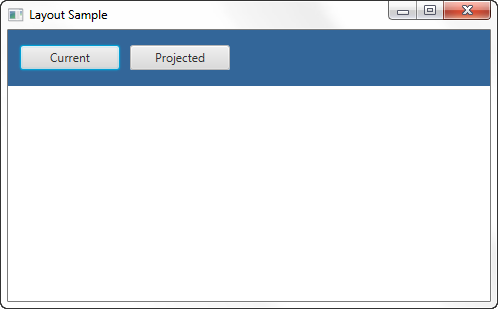
Description of "Figure 1-3 HBox Pane in a Border Pane"
VBox
The VBox layout pane is similar to the HBox layout pane, except that the nodes are arranged in a single column. Figure 1-4 shows an example of a VBox pane.
VBox布局窗格类似于“HBox”布局窗格,除了节点排列在一列中。图1-4显示了“VBox”窗格的示例。
Figure 1-4 Sample VBox Pane

Description of "Figure 1-4 Sample VBox Pane"
The padding property can be set to manage the distance between the nodes and the edges of the VBox pane. Spacing can be set to manage the distance between the nodes. Margins can be set to add additional space around individual controls.
可以设置padding属性来管理节点和“VBox”窗格边缘之间的距离。可以设置间距来管理节点之间的距离。可以设置边距,以在单个控件周围添加额外的空间。
Example 1-3 creates a VBox pane for a list of options.
示例1-3为选项列表创建一个“VBox”窗格。
Example 1-3 Create a VBox Pane
public VBox addVBox(); {
    VBox vbox = new VBox();
    vbox.setPadding(new Insets(10));
    vbox.setSpacing(8);

    Text title = new Text("Data");
    title.setFont(Font.font("Arial", FontWeight.BOLD, 14));
    vbox.getChildren().add(title);

    Hyperlink options[] = new Hyperlink[] {
        new Hyperlink("Sales"),
        new Hyperlink("Marketing"),
        new Hyperlink("Distribution"),
        new Hyperlink("Costs")};

    for (int i=0; i<4; i++) {
        VBox.setMargin(options[i], new Insets(0, 0, 0, 8));
        vbox.getChildren().add(options[i]);
    }

    return vbox;
}
The setLeft() method in Example 1-1 adds the VBox pane to the left region of the border pane. The result is shown in Figure 1-5.
示例1-1中的setLeft()方法将“VBox”窗格添加到边框窗格的左侧区域。结果如图1-5所示.
Figure 1-5 VBox Pane in a Border Pane
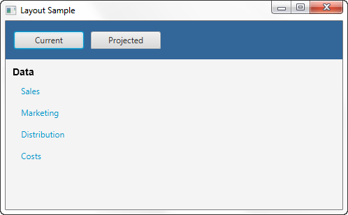
Description of "Figure 1-5 VBox Pane in a Border Pane"
StackPane
The StackPane layout pane places all of the nodes within a single stack with each new node added on top of the previous node. This layout model provides an easy way to overlay text on a shape or image or to overlap common shapes to create a complex shape. Figure 1-6 shows a help icon that is created by stacking a question mark on top of a rectangle with a gradient background.
“StackPane”布局窗格将所有节点放置在一个堆栈中,每个新节点都添加在前一个节点的顶部。这种布局模型提供了一种简单的方法,可以将文本叠加在形状或图像上,或者叠加常见形状以创建复杂的形状。图1-6显示了一个帮助图标,该图标是通过在具有渐变背景的矩形顶部堆叠一个问号而创建的。
Figure 1-6 Sample Stack Pane

Description of "Figure 1-6 Sample Stack Pane"
The alignment property can be set to manage how children are positioned in the stack pane. This property affects all children, so margins can be set to adjust the position of individual children in the stack.
可以设置对齐属性来管理子项在堆栈窗格中的位置。此属性影响所有子项,因此可以设置边距以调整堆栈中单个子项的位置。
Example 1-4 creates a stack pane for a help icon.
示例1-4为帮助图标创建堆栈窗格。
Example 1-4 Create a Stack Pane
public void addStackPane(HBox hb) {
    StackPane stack = new StackPane();
    Rectangle helpIcon = new Rectangle(30.0, 25.0);
    helpIcon.setFill(new LinearGradient(0,0,0,1, true, CycleMethod.NO_CYCLE,
        new Stop[]{
        new Stop(0,Color.web("#4977A3")),
        new Stop(0.5, Color.web("#B0C6DA")),
        new Stop(1,Color.web("#9CB6CF")),}));
    helpIcon.setStroke(Color.web("#D0E6FA"));
    helpIcon.setArcHeight(3.5);
    helpIcon.setArcWidth(3.5);

    Text helpText = new Text("?");
    helpText.setFont(Font.font("Verdana", FontWeight.BOLD, 18));
    helpText.setFill(Color.WHITE);
    helpText.setStroke(Color.web("#7080A0"));

    stack.getChildren().addAll(helpIcon, helpText);
    stack.setAlignment(Pos.CENTER_RIGHT);     // Right-justify nodes in stack
    StackPane.setMargin(helpText, new Insets(0, 10, 0, 0)); // Center "?"

    hb.getChildren().add(stack);            // Add stack pane to HBox object
    HBox.setHgrow(stack, Priority.ALWAYS);    // Give stack any extra space
}
The last lines of code in Example 1-4 add the stack pane to the HBox pane created in Example 1-2 and position it to always be at the right-most edge of the pane. The result is shown in Figure 1-7.
示例1-4中的最后一行代码将堆栈窗格添加到示例1-2中创建的“HBox”窗格中并将其放置在窗格的最右侧边缘。结果如图1-7所示.
Figure 1-7 Stack Pane in an HBox Pane
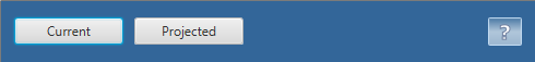
Description of "Figure 1-7 Stack Pane in an HBox Pane"
GridPane
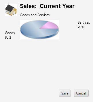
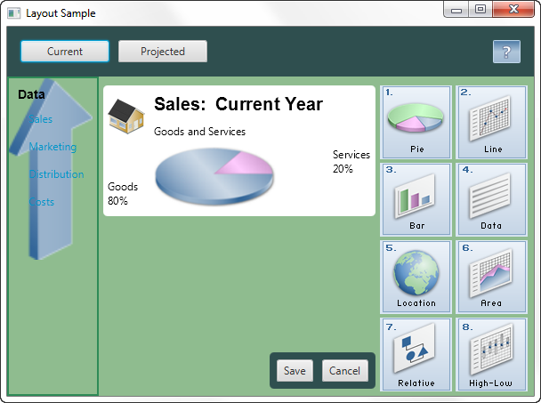
The GridPane layout pane enables you to create a flexible grid of rows and columns in which to lay out nodes. Nodes can be placed in any cell in the grid and can span cells as needed. A grid pane is useful for creating forms or any layout that is organized in rows and columns. Figure 1-8 shows a grid pane that contains an icon, title, subtitle, text and a pie chart. In this figure, the gridLinesVisible property is set to display grid lines, which show the rows and columns and the gaps between the rows and columns. This property is useful for visually debugging your GridPane layouts.
“网格窗格”布局窗格使您能够创建灵活的行和列网格,在其中布局节点。节点可以放置在网格中的任何单元格中,并且可以根据需要跨越单元格。网格窗格可用于创建表单或按行和列组织的任何布局。图1-8显示了一个包含图标、标题、副标题、文本和饼图的网格窗格。在此图中,gridLinesVisible属性设置为显示网格线,网格线显示行和列以及行和列之间的间隙。此属性对于直观调试“GridPane”布局非常有用。
Figure 1-8 Sample Grid Pane
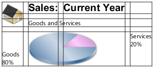
Description of "Figure 1-8 Sample Grid Pane"
Gap properties can be set to manage the spacing between the rows and columns. The padding property can be set to manage the distance between the nodes and the edges of the grid pane. The vertical and horizontal alignment properties can be set to manage the alignment of individual controls in a cell.
可以设置间隙属性来管理行和列之间的间距。可以设置padding属性来管理节点和网格窗格边缘之间的距离。可以设置垂直和水平对齐属性来管理单元格中单个控件的对齐。
Example 1-5 creates the grid pane shown in Figure 1-8.
Example 1-5 Create a Grid Pane
public GridPane addGridPane() {
    GridPane grid = new GridPane();
    grid.setHgap(10);
    grid.setVgap(10);
    grid.setPadding(new Insets(0, 10, 0, 10));

    // Category in column 2, row 1
    Text category = new Text("Sales:");
    category.setFont(Font.font("Arial", FontWeight.BOLD, 20));
    grid.add(category, 1, 0);

    // Title in column 3, row 1
    Text chartTitle = new Text("Current Year");
    chartTitle.setFont(Font.font("Arial", FontWeight.BOLD, 20));
    grid.add(chartTitle, 2, 0);

    // Subtitle in columns 2-3, row 2
    Text chartSubtitle = new Text("Goods and Services");
    grid.add(chartSubtitle, 1, 1, 2, 1);

    // House icon in column 1, rows 1-2
    ImageView imageHouse = new ImageView(
      new Image(LayoutSample.class.getResourceAsStream("graphics/house.png")));
    grid.add(imageHouse, 0, 0, 1, 2);

    // Left label in column 1 (bottom), row 3
    Text goodsPercent = new Text("Goods\n80%");
    GridPane.setValignment(goodsPercent, VPos.BOTTOM);
    grid.add(goodsPercent, 0, 2);

    // Chart in columns 2-3, row 3
    ImageView imageChart = new ImageView(
     new Image(LayoutSample.class.getResourceAsStream("graphics/piechart.png")));
    grid.add(imageChart, 1, 2, 2, 1);

    // Right label in column 4 (top), row 3
    Text servicesPercent = new Text("Services\n20%");
    GridPane.setValignment(servicesPercent, VPos.TOP);
    grid.add(servicesPercent, 3, 2);

    return grid;
}
The setCenter() method in Example 1-1 adds the grid pane to the center region of the border pane. The result is shown in Figure 1-9.
示例1-1中的setCenter()方法将网格窗格添加到边框窗格的中心区域。结果如图1-9所示.
Figure 1-9 Grid Pane in a Border Pane
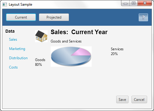
Description of "Figure 1-9 Grid Pane in a Border Pane"
As the window is resized, the nodes within the grid pane are resized according to their layout constraints.
当调整窗口大小时,网格窗格中的节点会根据其布局约束调整大小。
FlowPane
The nodes within a FlowPane layout pane are laid out consecutively and wrap at the boundary set for the pane. Nodes can flow vertically (in columns) or horizontally (in rows). A vertical flow pane wraps at the height boundary for the pane. A horizontal flow pane wraps at the width boundary for the pane. Figure 1-10 shows a sample horizontal flow pane using numbered icons. By contrast, in a vertical flow pane, column one would contain pages one through four and column two would contain pages five through eight.
FlowPane中的节点布局窗格是连续布局的,并包裹在为窗格设置的边界处。节点可以垂直(按列)或水平(按行)流动。垂直流窗格包裹在窗格的高度边界处。水平流窗格包裹在窗格的宽度边界处。图1-10显示了一个使用编号图标的示例水平流窗格。相比之下,在垂直流窗格中,第一列将包含第一至第四页,第二列将包含第五至第八页。
Figure 1-10 Sample Horizontal Flow Pane
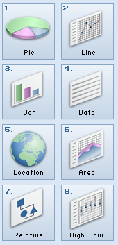
Description of "Figure 1-10 Sample Horizontal Flow Pane"
Gap properties can be set to manage the spacing between the rows and columns. The padding property can be set to manage the distance between the nodes and the edges of the pane. Example 1-6 creates a horizontal flow pane for a series of page icons.
可以设置间隙属性来管理行和列之间的间距。可以设置padding属性来管理节点和窗格边缘之间的距离。示例1-6为一系列页面图标创建水平流窗格。
Example 1-6 Create a Flow Pane
public FlowPane addFlowPane() {
    FlowPane flow = new FlowPane();
    flow.setPadding(new Insets(5, 0, 5, 0));
    flow.setVgap(4);
    flow.setHgap(4);
    flow.setPrefWrapLength(170); // preferred width allows for two columns
    flow.setStyle("-fx-background-color: DAE6F3;");

    ImageView pages[] = new ImageView[8];
    for (int i=0; i<8; i++) {
        pages[i] = new ImageView(
            new Image(LayoutSample.class.getResourceAsStream(
            "graphics/chart_"+(i+1)+".png")));
        flow.getChildren().add(pages[i]);
    }

    return flow;
}
The setRight() method in Example 1-1 adds the flow pane to the right region of the border pane. The result is shown in Figure 1-11.
示例1-1中的setRight()方法将流窗格添加到边框窗格的右侧区域。结果如图1-11所示.
Figure 1-11 Flow Pane in a Border Pane
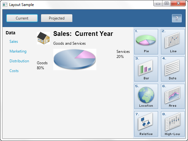
Description of "Figure 1-11 Flow Pane in a Border Pane"
TilePane
A tile pane is similar to a flow pane. The TilePane layout pane places all of the nodes in a grid in which each cell, or tile, is the same size. Nodes can be laid out horizontally (in rows) or vertically (in columns). Horizontal tiling wraps the tiles at the tile pane's width boundary and vertical tiling wraps them at the height boundary. Use the prefColumns and prefRows properties to establish the preferred size of the tile pane.
平铺窗格类似于流窗格。“TilePane”布局窗格将所有节点放置在网格中,其中每个单元格或图块的大小相同。节点可以水平(按行)或垂直(按列)布局。水平平铺在平铺窗格的宽度边界处包裹平铺,垂直平铺在高度边界处包裹它们。使用“prefColumns”和“prefRows”属性来确定磁贴窗格的首选大小。
Gap properties can be set to manage the spacing between the rows and columns. The padding property can be set to manage the distance between the nodes and the edges of the pane.
可以设置间隙属性来管理行和列之间的间距。可以设置padding属性来管理节点和窗格边缘之间的距离。
Example 1-7 creates a horizontal tile pane that produces the same layout shown in Figure 1-10.
示例1-7创建一个水平平铺窗格,其布局与图1-10所示相同.
Example 1-7 Create a Tile Pane
TilePane tile = new TilePane();
tile.setPadding(new Insets(5, 0, 5, 0));
tile.setVgap(4);
tile.setHgap(4);
tile.setPrefColumns(2);
tile.setStyle("-fx-background-color: DAE6F3;");

ImageView pages[] = new ImageView[8];
for (int i=0; i<8; i++) {
     pages[i] = new ImageView(
        new Image(LayoutSample.class.getResourceAsStream(
        "graphics/chart_"+(i+1)+".png")));
     tile.getChildren().add(pages[i]);
}
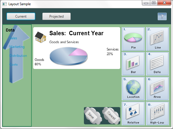
AnchorPane
The AnchorPane layout pane enables you to anchor nodes to the top, bottom, left side, right side, or center of the pane. As the window is resized, the nodes maintain their position relative to their anchor point. Nodes can be anchored to more than one position and more than one node can be anchored to the same position. Figure 1-12 shows an anchor pane with the grid pane from GridPane anchored to the top and an HBox pane with two buttons anchored to the bottom and the right side.
“锚窗格”布局窗格允许您将节点锚定到窗格的顶部、底部、左侧、右侧或中心。调整窗口大小时,节点将保持其相对于锚点的位置。节点可以锚定到多个位置,也可以锚定多个节点到同一位置。图1-12显示了一个锚窗格,其中包含来自GridPane的网格窗格固定在顶部的“HBox”窗格,底部和右侧有两个按钮。
Figure 1-12 Sample Anchor Pane
Description of "Figure 1-12 Sample Anchor Pane"
Example 1-8 creates an anchor pane with a node anchored to the top of the pane and a node anchored to the bottom right of the pane. The grid that was created in Example 1-5 is used for the top node.
示例1-8创建一个锚定窗格,其中一个节点锚定在窗格的顶部,另一个节点锚固在窗格的右下角。在示例1-5中创建的网格用于顶部节点。
Example 1-8 Create an Anchor Pane
public AnchorPane addAnchorPane(GridPane grid) {
    AnchorPane anchorpane = new AnchorPane();
    Button buttonSave = new Button("Save");
    Button buttonCancel = new Button("Cancel");

    HBox hb = new HBox();
    hb.setPadding(new Insets(0, 10, 10, 10));
    hb.setSpacing(10);
    hb.getChildren().addAll(buttonSave, buttonCancel);

    anchorpane.getChildren().addAll(grid,hb);   // Add grid from Example 1-5
    AnchorPane.setBottomAnchor(hb, 8.0);
    AnchorPane.setRightAnchor(hb, 5.0);
    AnchorPane.setTopAnchor(grid, 10.0);

    return anchorpane;
}
The following statement replaces the center region of the border pane with the anchor pane:
以下语句将边框窗格的中心区域替换为锚点窗格:
border.setCenter(addAnchorPane(addGridPane()));
The result is shown in Figure 1-13.
Figure 1-13 Anchor Pane in a Border Pane

Description of "Figure 1-13 Anchor Pane in a Border Pane"
As the window is resized, the nodes maintain their position in the pane according to their anchor points. Figure 1-14 shows how the buttons, which are anchored to the bottom of the pane, move closer to the sales information as the window is made smaller.
当调整窗口大小时,节点会根据其锚点在窗格中保持其位置。图1-14显示了随着窗口变小,锚定在窗格底部的按钮如何靠近销售信息。
Figure 1-14 Resized Anchor Pane
Description of "Figure 1-14 Resized Anchor Pane"
Additional Resources
To learn more about the layout panes in JavaFX, see the information for the javafx.scene.layout package in the JavaFX API Documentation.
要了解有关JavaFX中布局窗格的更多信息,请参阅JavaFX.scene.layout的信息JavaFX API文档中的程序包.
Application Files
Source Code
LayoutSample.java
NetBeans Projects
2 Tips for Sizing and Aligning Nodes
This topic describes techniques for controlling the size and alignment of nodes when placed in a JavaFX layout pane.
本主题描述了在放置在JavaFX布局窗格中时控制节点大小和对齐的技术。
A main advantage of using the built-in JavaFX layout panes is that the size and alignment of nodes is handled by the pane. As the pane is resized, the nodes are resized according to their preferred size range preferences. Note that not all node classes are resizable. UI controls and layout panes are resizable, but shapes, Text objects, and Group objects are not resizable and are treated as rigid objects in a layout.
使用内置JavaFX布局窗格的一个主要优点是,节点的大小和对齐由窗格处理。调整窗格大小时,节点将根据其首选大小范围首选项调整大小。请注意,并非所有节点类都可以调整大小。UI控件和布局窗格可以调整大小,但形状、“文本”对象和“组”对象不可调整大小,在布局中被视为刚性对象。
If you want more control over the size of controls in your UI, you can set their preferred size range directly. The layout pane then uses your settings to determine the size of the control. To manage the position of the controls, you can use the alignment properties for the layout panes.
如果你想对UI中控件的大小有更多的控制,你可以直接设置它们的首选大小范围。布局窗格然后使用您的设置来确定控件的大小。要管理控件的位置,可以使用布局窗格的对齐属性。
This topic provides simple examples for sizing and aligning nodes in a pane. The LayoutSizingAligning.java file contains the source code for the samples described in this topic. The LayoutSizingAligning.zip file contains the NetBeans IDE project for the sample.
本主题提供了调整窗格中节点大小和对齐的简单示例。LayoutSizingAligning.java文件包含本主题中描述的示例的源代码。LayoutSizingAligning.zip该文件包含示例的NetBeans IDE项目。
Sizing Nodes
Layouts query the preferred size of their nodes by invoking the prefWidth(height) and prefHeight(width) methods. By default, UI controls compute default values for their preferred size that is based on the content of the control. For example, the computed size of a Button object is determined by the length of the text and the size of the font used for the label, plus the size of any image. Typically, the computed size is just big enough for the control and the label to be fully visible.
布局通过调用prefWidth(height)和prefHeight(width)方法来查询其节点的首选大小。默认情况下,UI控件根据控件的内容计算其首选大小的默认值。例如,Button对象的计算大小由文本长度和标签所用字体大小加上任何图像的大小决定。通常,计算出的大小刚好足够控件和标签完全可见。
UI controls also provide default minimum and maximum sizes that are based on the typical usage of the control. For example, the maximum size of a Button object defaults to its preferred size because you don't usually want buttons to grow arbitrarily large. However, the maximum size of a ScrollPane object is unbounded because typically you do want them to grow to fill their spaces.
UI控件还提供基于控件典型用法的默认最小和最大大小。例如,“Button”对象的最大大小默认为其首选大小,因为您通常不希望按钮任意变大。但是,“ScrollPane”对象的大小是无限的,因为通常您确实希望它们增长以填充其空间。
You can use the default size constraints of nodes, or you can set them to provide the look that you want. For example, Figure 2-1 shows the default size of several buttons and a list view in a border pane.
您可以使用节点的默认大小约束,也可以设置它们以提供所需的外观。例如,图2-1显示了几个按钮的默认大小和边框窗格中的列表视图。
Figure 2-1 Computed Sizes
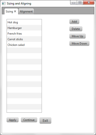
Description of "Figure 2-1 Computed Sizes"
Suppose that the look that you want is the screen shown in Figure 2-2, which shows the UI controls sized according to desired constraints.
假设您想要的外观是图2-2中显示的屏幕,其显示了根据所需约束调整大小的UI控件。
Figure 2-2 Desired Sizes
Description of "Figure 2-2 Desired Sizes"
Applications often need to directly set the minimum, preferred, and maximum size constraints on controls. The following sections provide tips for overriding the computed sizes to get the look that you want.
应用程序通常需要直接设置控件的最小、首选和最大大小限制。以下部分提供了覆盖计算尺寸以获得所需外观的提示。
Making Buttons the Same Size
You can go through the trouble of determining the height and width of each button and then setting the preferred size of each button to the greatest height and width of the buttons in the set. An easier option is to let the layout panes do the work. The layout pane that you want to use is determined by the effect that you want to achieve.
您可以麻烦地确定每个按钮的高度和宽度,然后将每个按钮的首选大小设置为集合中按钮的最大高度和宽度。一个更简单的选择是让布局窗格完成工作。要使用的布局窗格取决于要实现的效果。
Using a VBox
The scene in Figure 2-1 uses a VBox layout pane for the buttons on the right and uses the computed sizes for the buttons. The buttons already have the same height, so only the width needs to be changed.
图2-1中的场景对右侧的按钮使用“VBox”布局窗格,并使用计算出的按钮大小。按钮的高度已经相同,因此只需要更改宽度。
The scene in Figure 2-2 uses a VBox pane to take advantage of the default behavior that makes the width of the VBox pane the same as the preferred width of its widest element. To enable all of the buttons to be resized to the width of the VBox pane, the maximum width of each button is set to the Double.MAX_VALUE constant, which enables a control to grow without limit. An alternative to using the maximum value constant is to set the maximum width to a specific value, such as 80.0.
图2-2中的场景使用“VBox”窗格来利用默认行为,使“VBox“窗格的宽度与其最宽元素的首选宽度相同。为了将所有按钮的大小调整为“VBox”窗格的宽度,每个按钮的最大宽度设置为“Double”。MAX_VALUE`常量,它使控件能够无限制地增长。使用最大值常数的另一种方法是将最大宽度设置为特定值,例如80.0。
Example 2-1 shows how to make a column of buttons the same width using a VBox pane.
示例2-1显示了如何使用“VBox”窗格使一列按钮具有相同的宽度。
Example 2-1 Set a Column of Buttons to the Same Width
BorderPane border = new BorderPane();
border.setPadding(new Insets(20, 0, 20, 20));

Button btnAdd = new Button("Add");
Button btnDelete = new Button("Delete");
Button btnMoveUp = new Button("Move Up");
Button btnMoveDown = new Button("Move Down");

btnAdd.setMaxWidth(Double.MAX_VALUE);
btnDelete.setMaxWidth(Double.MAX_VALUE);
btnMoveUp.setMaxWidth(Double.MAX_VALUE);
btnMoveDown.setMaxWidth(Double.MAX_VALUE);

VBox vbButtons = new VBox();
vbButtons.setSpacing(10);
vbButtons.setPadding(new Insets(0, 20, 10, 20));
vbButtons.getChildren().addAll(btnAdd, btnDelete, btnMoveUp, btnMoveDown);
In the Layout Sizing and Aligning sample, the elements of the UI are laid out using a border pane. The column of buttons is put in the right region of the border pane to limit the size of the buttons to the preferred width of the widest button. The center region of a border pane expands to fill any space available so if you put the VBox pane in the center region, the VBox pane and the buttons also expand.
在“布局大小和对齐”示例中,UI的元素使用边框窗格进行布局。按钮列放在边框窗格的右侧区域,以将按钮的大小限制在最宽按钮的首选宽度。边框窗格的中心区域会展开以填充任何可用空间,因此如果将“VBox”窗格放在中心区域,“VBox“窗格和按钮也会展开。
Using a TilePane
The scene in Figure 2-1 uses an HBox layout pane for the buttons on the bottom and uses the computed sizes for those buttons. The buttons have different widths and heights.
图2-1中的场景为底部的按钮使用“HBox”布局窗格,并为这些按钮使用计算出的大小。按钮有不同的宽度和高度。
The scene in Figure 2-2 uses a horizontal TilePane layout pane to take advantage of the default behavior that makes each cell (tile) the same size. The size of each tile is the size needed to hold the preferred size of the largest node in the tile pane.
图2-2中的场景使用水平的“TilePane”布局窗格来利用使每个单元格(图块)大小相同的默认行为。每个图块的大小是容纳图块窗格中最大节点的首选大小所需的大小。
To enable the buttons to be resized to the size of the tile, set the maximum width and height to the Double.MAX_VALUE constant. Example 2-2 shows how make a row of buttons the same width and height using a tile pane.
要将按钮的大小调整为互动程序的大小,请将最大宽度和高度设置为Double.MAX_VALUE常数。示例2-2显示了如何使用互动程序窗格使一行按钮具有相同的宽度和高度。
Example 2-2 Set a Row of Buttons to the Same Size
Button btnApply = new Button("Apply");
Button btnContinue = new Button("Continue");
Button btnExit = new Button("Exit");
btnExit.setStyle("-fx-font-size: 15pt;");

btnApply.setMaxSize(Double.MAX_VALUE, Double.MAX_VALUE);
btnContinue.setMaxSize(Double.MAX_VALUE, Double.MAX_VALUE);
btnExit.setMaxSize(Double.MAX_VALUE, Double.MAX_VALUE);

TilePane tileButtons = new TilePane(Orientation.HORIZONTAL);
tileButtons.setPadding(new Insets(20, 10, 20, 0));
tileButtons.setHgap(10.0);
tileButtons.setVgap(8.0);
tileButtons.getChildren().addAll(btnApply, btnContinue, btnExit);
Tiles are not resized as the window size changes so the buttons don't change size when set in a tile pane. Note that if the width of the window is reduced, the buttons in the tile pane change position, but do not get smaller.
平铺不会随着窗口大小的变化而调整大小,因此在平铺窗格中设置按钮时不会改变大小。请注意,如果窗口的宽度减小,互动程序窗格中的按钮会改变位置,但不会变小。
Keeping Nodes at Their Preferred Size
As a stage is resized, layout panes within the stage might have more or less space to allocate to the controls that they contain. Each layout pane has its own rules for allocating space according to the minimum, preferred, and maximum size ranges of the controls.In general, controls that have a default maximum size of Double.MAX_VALUE expand to fill their space while controls with constrained maximum sizes do not expand. For example, a ListView object has an unbounded maximum. If you want to limit the height to its preferred size, you can set the maximum size to the Control.USE_PREF_SIZE constant, as shown in Example 2-3.
随着阶段大小的调整,阶段内的布局窗格可能有更多或更少的空间分配给它们包含的控件。每个布局窗格都有自己的规则,用于根据控件的最小、首选和最大大小范围分配空间。一般来说,默认最大大小为Double.MAX_VALUE 的控件。展开以填充其空间,而具有受限最大大小的控件不展开。例如,“ListView”对象具有无界最大值。如果要将高度限制为首选大小,可以将最大大小设置为Control.USE_PREF_SIZE常数,如示例2-3所示.
Example 2-3 Set Maximum Height to Preferred Height
ListView<String> lvList = new ListView<>();
ObservableList<String> items = FXCollections.observableArrayList (
        "Hot dog", "Hamburger", "French fries",
        "Carrot sticks", "Chicken salad");
lvList.setItems(items);
lvList.setMaxHeight(Control.USE_PREF_SIZE);
By default, buttons grow only to their preferred size. However, buttons shrink to where the label is shown as three dots (...) if the minimum width is not overridden. To prevent a button from becoming smaller than its preferred width, set its minimum width to its preferred width as shown in Example 2-4.
默认情况下,按钮只会增长到其首选大小。但是,如果不覆盖最小宽度,按钮会缩小到标签显示为三个点(…)的位置。为防止按钮变得小于其首选宽度,请将其最小宽度设置为首选宽度,如示例2-4所示.
Example 2-4 Set Minimum Width to Preferred Width
Button btnMoveDown = new Button("Move Down");
btnMoveDown.setMinWidth(Control.USE_PREF_SIZE);
The preferred size of a control is initially based on the computed size. You can override the default preferred size by setting the preferred size constraint to the size of your choice. The following statement overrides the preferred width of a list view:
控件的首选大小最初基于计算出的大小。通过将首选尺寸约束设置为所选尺寸,可以覆盖默认首选尺寸。以下语句覆盖了列表视图的首选宽度:
lvList.setPrefWidth(150.0);
Preventing Resizing
If you do not want the size of a node to change, set the minimum, maximum, and preferred sizes to the same size. To prevent only the width or height from changing, set the width or height constraints to the same value. In Example 2-5, a list is created with all size constraints set to the same width and height values so that the size of the list doesn't change as the size of the window changes. A button is created with all width constraints set to the same value.
如果不希望更改节点的大小,请将最小、最大和首选大小设置为相同的大小。要防止仅更改宽度或高度,请将宽度或高度约束设置为相同的值。在示例2-5中,创建一个列表,将所有大小约束设置为相同的宽度和高度值,这样列表的大小就不会随着窗口大小的变化而变化。创建按钮时,所有宽度约束都设置为相同的值。
Example 2-5 Set Size Constraints to Prevent Resizing
ListView<String> lvList = new ListView<String>();
lvList.setMinSize(150.0, Control.USE_PREF_SIZE);
lvList.setMaxSize(150.0, Control.USE_PREF_SIZE);

Button btnDelete = new Button("Delete");
btnDelete.setMinWidth(80.0);
btnDelete.setPrefWidth(80.0);
btnDelete.setMaxWidth(80.0);
Aligning Content
Each layout pane has a default way of aligning the nodes within the pane. For example, in HBox and VBox layout panes, nodes are top-justified and left-justified. In TilePane and FlowPane layout panes, nodes are centered. The panes themselves by default are typically top-justified and left-justified.
每个布局窗格都有一种默认的方式来对齐窗格中的节点。例如,在“HBox”和“VBox”布局窗格中,节点是上对齐和左对齐的。在“TilePane”和“FlowPane”布局窗格中,节点居中。默认情况下,窗格本身通常是上对齐和左对齐的。
You can manage the alignment of nodes and panes by using the setAlignment() method for the panes. Alignment constants are available in the following enum types in the javafx.geometry package:
您可以通过使用窗格的setAlignment()方法来管理节点和窗格的对齐。对齐常量在javafx.geometry包中的以下enum类型中可用:
-
HPos- Values for specifying horizontal alignment.“HPos”-用于指定水平对齐的值。
-
Pos- Values for specifying vertical and horizontal alignment. The value to the left of the underscore specifies the vertical alignment, the value to the right of the underscore specifies the horizontal alignment. For example,Pos.BOTTOM_LEFTaligns a node at the bottom of the space vertically and at the left edge of the space horizontally.“Pos”-用于指定垂直和水平对齐的值。下划线左侧的值指定垂直对齐方式,下划线右侧的值指定水平对齐方式。例如,
Pos.BOTTOM_LEFT将空间底部的节点垂直对齐,将空间左边缘的节点水平对齐。 -
VPos- Values for specifying vertical alignment.“VPos”-用于指定垂直对齐的值。
Figure 2-3 is created by the code shown in Example 2-6. Without any alignment constraints specified, the layout pane is placed in the top left corner.
图2-3由示例2-6中所示的代码创建. 如果没有指定任何对齐约束,布局窗格将放置在左上角。
Figure 2-3 Default Positions
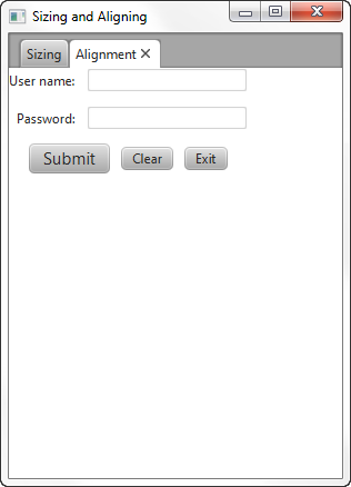
Description of "Figure 2-3 Default Positions"
Example 2-6 Create a UI with Default Alignment
GridPane grid = new GridPane();
    grid.setHgap(10);
    grid.setVgap(12);

    HBox hbButtons = new HBox();
    hbButtons.setSpacing(10.0);

    Button btnSubmit = new Button("Submit");
    Button btnClear = new Button("Clear");
    Button btnExit = new Button("Exit");
    btnSubmit.setStyle("-fx-font-size: 15pt;");

    Label lblName = new Label("User name:");
    TextField tfName = new TextField();
    Label lblPwd = new Label("Password:");
    PasswordField pfPwd = new PasswordField();

    hbButtons.getChildren().addAll(btnSubmit, btnClear, btnExit);
    grid.add(lblName, 0, 0);
    grid.add(tfName, 1, 0);
    grid.add(lblPwd, 0, 1);
    grid.add(pfPwd, 1, 1);
    grid.add(hbButtons, 0, 2, 2, 1);
}
Suppose the look that you want is the screen shown in Figure 2-4, which centers the layout pane in the screen and changes the default alignment of the controls.
假设您想要的外观是图2-4中显示的屏幕,它将布局窗格居中显示在屏幕上,并更改控件的默认对齐方式。
Figure 2-4 Desired Positions
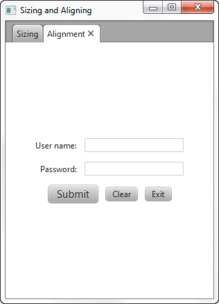
Description of "Figure 2-4 Desired Positions"
The following sections provide tips for overriding the default positions.
以下部分提供了覆盖默认位置的提示。
Centering the Grid
To center the grid from Example 2-6 in the scene, use the following statement:
将网格居中示例2-6在场景中,使用以下语句:
grid.setAlignment(Pos.CENTER);
Aligning Controls in the Columns
In the desired layout, the labels are right-justified and the fields are left-justified. To achieve this in a grid, define each column using the ColumnConstraints class and set the horizontal alignment constraint. Example 2-7 defines the columns for the grid from Example 2-6.
在所需的布局中,标签右对齐,字段左对齐。要在网格中实现这一点,请使用“ColumnConstraints”类定义每一列,并设置水平对齐约束。示例2-7定义了示例2-6中网格的列.
Example 2-7 Define the Columns in the Grid
GridPane grid = new GridPane();
grid.setAlignment(Pos.CENTER);
grid.setHgap(10);
grid.setVgap(12);

ColumnConstraints column1 = new ColumnConstraints();
column1.setHalignment(HPos.RIGHT);
grid.getColumnConstraints().add(column1);

ColumnConstraints column2 = new ColumnConstraints();
column2.setHalignment(HPos.LEFT);
grid.getColumnConstraints().add(column2);
An alternative for right-justifying controls in a column is to use a VBox layout pane. Use the setAlignment() method as shown in the following statements:
在列中正确调整控件的另一种方法是使用“VBox”布局窗格。使用setAlignment()方法,如以下语句所示:
VBox vbox = new VBox;
vbox.setAlignment(Pos.CENTER_RIGHT);
Centering the Buttons
The buttons are laid out in an HBox layout pane that spans both columns in the grid. The following statement centers the buttons in the grid from Example 2-6:
按钮布局在跨越网格中两列的“HBox”布局窗格中。以下语句将按钮置于网格的中心示例2-6:
hbButtons.setAlignment(Pos.CENTER);
The setAlignment() method for the HBox pane centers the HBox pane within its layout area and also centers the nodes within the HBox pane. You might prefer to center the HBox pane within the row but bottom-justify the buttons within the HBox pane as shown in Figure 2-5.
“HBox”窗格的“setAlign()”方法将“HBox”窗格居中放置在其布局区域内,并将节点居中放置在HBox窗格内。您可能更喜欢将“HBox”窗格居中放置在行中,但底部对齐“HBox“窗格中的按钮,如图2-5所示.
Figure 2-5 Override Positions and Bottom-Justify the Buttons

Description of "Figure 2-5 Override Positions and Bottom-Justify the Buttons"
For this arrangement, place the HBox pane in an inner grid with a single cell and place that grid in the third row of the outer grid. Set the alignment constraint for the inner grid to center the grid and set the alignment constraint for the HBox pane to bottom-justify the contents as shown in Example 2-8.
对于这种排列,将“HBox”窗格放置在具有单个单元格的内部网格中,并将该网格放置在外部网格的第三行。将内部网格的对齐约束设置为网格的中心,并将“HBox”窗格的对齐约束设置为底部对齐内容,如示例2-8所示.
Example 2-8 Center and Bottom-Justify the Buttons
hbButtons.setAlignment(Pos.BOTTOM_CENTER);
hbButtons.getChildren().addAll(btnSubmit, btnClear, btnExit);

GridPane innergrid = new GridPane();
innergrid.setAlignment(Pos.CENTER);
innergrid.add(hbButtons, 0, 0);
grid.add(innergrid, 0, 2, 2, 1);
Additional Resources
To learn more about the layout panes in JavaFX, see the information for the javafx.scene.layout package in the API Documentation.
要了解有关JavaFX中布局窗格的更多信息,请参阅JavaFX.scene.layout的信息API文档中的程序包.
Application Files
Source Code
LayoutSizingAligning.java
NetBeans Projects
3 Styling Layout Panes with CSS
This topic describes how use CSS to style the layout panes that are available with the JavaFX SDK.
本主题介绍如何使用CSS为JavaFX SDK提供的布局窗格设置样式。
Layout panes use properties such as padding, spacing, and alignment to manage elements of how the panes appear. Cascading style sheets (CSS) enable you to define a set of properties and assign them to multiple layout panes to provide a standard look to your JavaFX application. You can also use CSS to customize individual layout panes.
布局窗格使用填充、间距和对齐等属性来管理窗格显示方式的元素。级联样式表(CSS)使您能够定义一组属性并将其分配给多个布局窗格,为JavaFX应用程序提供标准外观。您还可以使用CSS自定义单个布局窗格。
This topic uses the sample from Using Built-in Layout Panes to provide examples of styling the different layout panes with CSS. Figure 3-1 shows the new look that is created.
本主题使用使用内置布局窗格中的示例以提供使用CSS对不同布局窗格进行样式设置的示例。图3-1显示创建的新外观。
Figure 3-1 Layout Sample with Custom Styling
Description of "Figure 3-1 Layout Sample with Custom Styling"
The LayoutSampleCSS.java file contains the source code for building this user interface. The LayoutSampleCSS.zip file contains the NetBeans IDE project for the sample application.
LayoutSampleCSS.java文件包含构建此用户界面的源代码。LayoutSampleCSS.zip 该文件包含示例应用程序的NetBeans IDE项目。
Creating Style Definitions
Unlike controls such as the button and check box, which have the respective style classes.button and.check-box, no style classes are predefined for the layout panes. To style your layout panes, you must create a style sheet and define the style classes that you want. Then in the code for your application, assign the appropriate style class to layout panes as you create them.
与按钮和复选框等控件不同,它们具有各自的样式类“.button”和“.checkbox”,布局窗格没有预定义样式类。要设置布局窗格的样式,必须创建样式表并定义所需的样式类。然后,在应用程序的代码中,在创建布局窗格时为其分配适当的样式类。
For example, if you want all of your HBox panes to have the same background color, padding, and spacing properties, create a style named.hbox as shown in Example 3-1.
例如,如果您希望所有“HBox”窗格具有相同的背景颜色、填充和间距属性,请创建一个名为“.HBox”的样式,如示例3-1.
Example 3-1 Sample Style for an HBox Pane
.hbox {
    -fx-background-color: #2f4f4f;
    -fx-padding: 15;
    -fx-spacing: 10;
}
Use this style for each HBox pane that you create by assigning the style class to the pane. Example 3-2 shows the style assigned to two panes.
通过将样式类指定给窗格,为您创建的每个“HBox”窗格使用此样式。示例3-2显示分配给两个窗格的样式。
Example 3-2 Assigning the Style to HBox Panes
HBox hbox = new HBox();
hbox.getStyleClass().add("hbox");

HBox hb = new HBox();
hb.getStyleClass().add("hbox");
Style Properties for Layout Panes
You can use CSS to set the background, border, and padding properties for all types of layout panes. Some types of layout panes have additional properties that can be set. For example, you can set the spacing and alignment properties for HBox and VBox panes, and you can set the orientation, preferred number of rows, preferred number of columns, and other properties for tile panes. Images can be used for the background and border of a pane.
您可以使用CSS为所有类型的布局窗格设置背景、边框和填充属性。某些类型的布局窗格具有可以设置的其他属性。例如,您可以设置“HBox”和“VBox”窗格的间距和对齐属性,还可以设置平铺窗格的方向、首选行数、首选列数和其他属性。图像可用于窗格的背景和边框。
See the JavaFX CSS Reference Guide for a list of the properties that are available for each type of layout pane. Properties listed for the Region class can be used by all layout panes, which are descendents of the Region class.
请参阅JavaFX CSS参考指南查看每种布局窗格可用的属性列表。为“Region”类列出的属性可供所有布局窗格使用,这些窗格是“Region”类别的后代。
Assigning a Style Sheet to the Scene
After you have your style sheet prepared, you must add the style sheet to the scene for your application. All nodes then have access to the styles defined in the style sheet. Example 3-3 shows how to add the style sheet for the Layout Sample. In this sample, the style sheet is in the same directory as the class file for the application.
准备好样式表后,必须将样式表添加到应用程序的场景中。然后,所有节点都可以访问样式表中定义的样式。示例3-3显示了如何为布局示例添加样式表。在此示例中,样式表与应用程序的类文件位于同一目录中。
Example 3-3 Adding a Style Sheet
Scene scene = new Scene(border);
scene.getStylesheets().add("layoutsamplecss/layoutstyles.css");
Styling the Layout Sample
The Layout Sample has examples of the built-in layout panes that are provided by the JavaFX layout package. Styling this sample provides examples of how CSS can be used with the different layout panes.
布局示例包含JavaFX布局包提供的内置布局窗格的示例。此示例的样式提供了如何将CSS用于不同布局窗格的示例。
The style sheet layoutstyles.css contains the styles used for Figure 3-1.
样式表layoutstyles.css包含用于图3-1的样式.
Defining a Style for Shared Properties
All layout panes have a set of basic properties that can be managed with CSS. These include properties for the background, border, padding, and shape of the pane. If you have several panes that share common styling for these properties, you can define a single style class and assign that class to each of the panes.
所有布局窗格都有一组可以用CSS管理的基本属性。这些属性包括窗格的背景、边框、填充和形状。如果有多个窗格共享这些属性的通用样式,则可以定义一个样式类并将该类分配给每个窗格。
In the customized Layout Sample, several of the layout panes use the same background color. The .pane style class shown in Example 3-4 is used to set this color.
在自定义的布局示例中,几个布局窗格使用相同的背景颜色。示例3-4中所示的“.pane”样式类用于设置此颜色。
Example 3-4 .pane Style Class
.pane {
    -fx-background-color: #8fbc8f;
}
If setting the background color is all that is needed for a pane, then only the .pane style needs to be assigned. If additional styling is desired, more than one style can be assigned to a pane. Example 3-5 shows just the .pane style added to an anchor pane and the .pane and .grid styles added to a grid pane.
如果设置背景颜色是窗格所需的全部内容,则只需指定“.pane”样式。如果需要其他样式,可以为窗格指定多个样式。示例3-5只显示了添加到锚点窗格的.pane样式以及添加到网格窗格的.panel和.grid样式。
Example 3-5 Assigning the .pane Style to a Layout Pane
AnchorPane anchorpane = new AnchorPane();
anchorpane.getStyleClass().add("pane");

GridPane grid = new GridPane();
grid.getStyleClass().addAll("pane","grid");
Styling the Border Pane
Border panes do not have any additional properties beyond the basic set mentioned in Defining a Style for Shared Properties. In the Layout Sample, the border pane is not styled. However, to style a border pane, define a style class and assign it to the pane in the same way that is done for other panes.
除了定义共享属性的样式中提到的基本集之外,边框窗格没有任何其他属性. 在布局示例中,边框窗格未设置样式。但是,要设置边框窗格的样式,请定义一个样式类,并将其分配给窗格,方法与其他窗格相同。
Styling the HBox Panes
In addition to the basic set of properties for all layout panes, HBox panes have properties for alignment, spacing, and fill height.
除了所有布局窗格的基本属性集外,“HBox”窗格还具有对齐、间距和填充高度的属性。
The Layout Sample shown in Figure 3-1 contains two HBox panes. The first HBox pane is at the top and contains the Current and Projected buttons. The second HBox pane is near the bottom and contains the Save and Cancel buttons.
布局示例如图3-1所示包含两个“HBox”窗格。第一个“HBox”窗格位于顶部,包含“当前”和“投影”按钮。第二个“HBox”窗格位于底部附近,包含“保存”和“取消”按钮。
For the customized Layout Sample, both HBox panes have the same background color and spacing. These properties are set in the style definition shown in Example 3-1.
对于自定义的布局示例,两个“HBox”窗格具有相同的背景颜色和间距。这些属性在示例3-1中所示的样式定义中设置.
The second HBox, which contains the Save and Cancel buttons, also has rounded corners and less padding as shown in Figure 3-2.
第二个“HBox”包含保存和取消按钮,也有圆角和较少的填充,如图3-2所示.
Figure 3-2 Styled HBox Pane

Description of "Figure 3-2 Styled HBox Pane"
To use the defined styling for HBox panes, the .hbox style is assigned to the pane. To override the padding and set the additional property for rounding the corners, the style definition shown in Example 3-6 is used and an ID is set for the second HBox pane.
要为“HBox”窗格使用定义的样式,请将“.HBox”样式分配给窗格。要覆盖填充并设置圆角的附加属性,请使用示例3-6中所示的样式定义并为第二个“HBox”窗格设置ID。
Example 3-6 Custom HBox Style
#hbox-custom {
    -fx-background-radius: 5.0;
    -fx-padding: 8;
}
Example 3-7 shows how the styles are assigned to the second HBox pane.
示例3-7显示了如何将样式分配给第二个“HBox”窗格。
Example 3-7 Assigning the Custom HBox Style to a Pane
HBox hb = new HBox();
hb.getStyleClass().add("hbox");
hb.setId("hbox-custom");
Styling the VBox Pane
In addition to the basic set of properties for all layout panes, VBox panes have properties for alignment, spacing, and fill width.
除了所有布局窗格的基本属性集外,“VBox”窗格还具有对齐、间距和填充宽度的属性。
The VBox pane in the left region of Figure 3-1 uses the background from the .pane style class. The border, padding, and spacing are set in the .vbox style class shown in Example 3-8.
图3-1左侧区域的“VBox”窗格使用“.pane”样式类中的背景。边框、填充和间距在示例3-8中所示的.vbox样式类中设置.
Example 3-8 .vbox Style Class
.vbox {
    -fx-border-color: #2e8b57;
    -fx-border-width: 2px;
    -fx-padding: 10;
    -fx-spacing: 8;
}
Example 3-9 shows how the styles are assigned to the VBox pane.
示例3-9显示了如何将样式分配给“VBox”窗格。
Example 3-9 Assigning Styles to the VBox Pane
VBox vbox = new VBox();
vbox.getStyleClass().addAll("pane", "vbox");
Styling the Stack Pane
In addition to the basic set of properties for all layout panes, stack panes have a property for alignment. In the Layout Sample, the stack pane is not styled. However, to style a stack pane, define a style class and assign it to the pane in the same way that is done for other panes.
除了所有布局窗格的基本属性集外,堆栈窗格还具有对齐属性。在布局示例中,堆栈窗格未设置样式。但是,要设置堆栈窗格的样式,请定义一个样式类,并将其分配给窗格,方法与其他窗格相同。
Styling the Grid Pane
In addition to the basic set of properties for all layout panes, grid panes have properties for spacing between the rows and columns, alignment of the grid, and visibility of the grid lines.
除了所有布局窗格的基本属性集外,网格窗格还具有行和列之间的间距、网格对齐和网格线可见性的属性。
The grid in the center region of Figure 3-1 has rounded corners and a white background that is slightly smaller than the grid itself. The .grid style class shown in Example 3-10 provides this styling and sets the properties for padding and for spacing between the rows and columns.
图3-1中心区域的网格具有圆角和比网格本身稍小的白色背景。示例3-10中所示的“.grid”样式类提供此样式,并设置填充和行与列之间间距的属性。
Example 3-10 .grid Style Class
.grid {
    -fx-background-color: white;
    -fx-background-radius: 5.0;
    -fx-background-insets: 0.0 5.0 0.0 5.0;
    -fx-padding: 10;
    -fx-hgap: 10;
    -fx-vgap: 10;
}
Example 3-11 shows how the style is assigned to the grid.
示例3-11显示了如何将样式指定给网格。
Example 3-11 Assigning a Style to the Grid
GridPane grid = new GridPane();
grid.getStyleClass().add("grid");
Note that the grid does not have the background color that is used by other layout panes in the sample. However, the anchor pane that contains the grid uses the background color. To prevent the grid from having the background color of its parent, you must to set the background for the grid to the desired color.
请注意,网格没有示例中其他布局窗格使用的背景颜色。但是,包含网格的锚点窗格使用背景颜色。为了防止网格具有其父级的背景颜色,您必须将网格的背景设置为所需的颜色。
Styling the Flow Pane or Tile Pane
In addition to the basic set of properties for all layout panes, flow panes have properties for alignment, orientation, and spacing between the rows and columns. Tile panes have properties for alignment, orientation, spacing between the rows and columns, preferred number of rows and columns, and preferred width and height.
除了所有布局窗格的基本属性集外,流窗格还具有行和列之间的对齐、方向和间距属性。平铺窗格具有对齐、方向、行和列之间的间距、首选行数和列数以及首选宽度和高度的属性。
In the Layout Sample, either a flow pane or a tile pane can be used for the right region of Figure 3-1. The properties set in the style class are common to both types of panes, so the same style class is used in the sample. The .flow-tile style class shown in Example 3-12 sets the properties for padding and for spacing between the rows and columns.
在布局示例中,流窗格或平铺窗格可用于图3-1的右侧区域. 样式类中设置的属性对两种类型的窗格都是通用的,因此示例中使用了相同的样式类。示例3-12所示的“.flow tile”样式类设置填充和行与列之间间距的属性。
Example 3-12 .flow-tile Style Class
.flow-tile {
    -fx-padding: 10.0 3.0 5.0 0.0;
    -fx-hgap: 4;
    -fx-vgap: 4;
}
The flow pane and tile pane also use the .pane style class for the background color. Example 3-13 shows how the styles are assigned to the flow pane and tile pane.
流窗格和平铺窗格还使用“.pane”样式类作为背景颜色。示例3-13显示了如何将样式分配给流窗格和互动程序窗格。
Example 3-13 Assigning Styles to the Flow Pane and Tile Pane
FlowPane flow = new FlowPane();
flow.getStyleClass().addAll("pane", "flow-tile");

TilePane tile = new TilePane();
tile.getStyleClass().addAll("pane", "flow-tile");
Styling the Anchor Pane
Anchor panes do not have any additional properties beyond the basic set of properties for all layout panes.
除了所有布局窗格的基本属性集之外,锚点窗格没有任何其他属性。
The anchor pane in the center region of Figure 3-1 contains a grid and an HBox pane, each of which has its own styling. The only styling applied to the anchor pane is the background color set by the .pane style class shown in Example 3-4.
图3-1中心区域的锚窗格包含一个网格和一个“HBox”窗格,每个窗格都有自己的样式。应用于锚点窗格的唯一样式是示例3-4中所示的“.pane”样式类设置的背景颜色.
Example 3-14 shows how the style is assigned to the anchor pane.
示例3-14显示了如何将样式指定给锚点窗格。
Example 3-14 Assigning a Style to the Anchor Pane
AnchorPane anchorpane = new AnchorPane();
anchorpane.getStyleClass().add("pane");
Using a Background Image
Images can be used as the background for a layout pane by setting the background image properties. You can specify the image, size, position, and repetition in a style class. Figure 3-3 shows another version of the Layout Sample user interface that uses background images for the VBox pane on the left and the HBox pane that contains the Save and Cancel buttons.
通过设置背景图像属性,可以将图像用作布局窗格的背景。您可以在样式类中指定图像、大小、位置和重复。图3-3显示了另一个版本的布局示例用户界面,该界面为左侧的“VBox”窗格和包含“保存”和“取消”按钮的“HBox”窗格使用背景图像。
Figure 3-3 Styled with Images
Description of "Figure 3-3 Styled with Images"
Example 3-15 shows the style class definitions for adding the background images.
示例3-15显示了添加背景图像的样式类定义。
Example 3-15 Styles Using Background Images
.vbox {
    -fx-background-image: url("graphics/arrow_t_up_right.png");
    -fx-background-size: 96, 205;
    -fx-background-repeat: no-repeat;
    -fx-border-color: #2e8b57;
    -fx-border-width: 2px;
    -fx-padding: 10;
    -fx-spacing: 8;
}

#hbox-custom {
    -fx-background-image: url("graphics/cloud.png");
    -fx-background-size: 64,64;
    -fx-padding: 18 4 18 6;
    -fx-spacing: 25;
    -fx-background-radius: 5.0;
}

#button-custom {
    -fx-rotate: 45;
    -fx-text-alignment: center;
}
Note the following:
-
The images are located in the /graphics directory, which is at the same level as the class file for the application.
图像位于/graphics目录中,该目录与应用程序的类文件处于同一级别。
-
The arrow image was smaller than desired and the cloud image was larger than desired, so the images were resized using the
-fx-background-sizeproperty.箭头图像小于期望值,云图像大于期望值,因此使用“-fx background size”属性调整了图像的大小。
-
To prevent the arrow from repeating in the background of the
VBoxpane, the-fx-background-repeatproperty is set tono-repeat.为了防止箭头在“VBox”窗格的背景中重复,“-fx background repeat”属性设置为“no repeat(无重复)”。
-
To angle the buttons, a new style class named
#button-customis defined, and the ID for the Save and Cancel buttons is set tobutton-custom.为了调整按钮的角度,定义了一个名为“#button custom”的新样式类,并将“保存”和“取消”按钮的ID设置为“按钮自定义”。
Additional Resources
For more information on CSS and JavaFX, see the following documents:
有关CSS和JavaFX的更多信息,请参阅以下文档:
Application Files
Source Code
LayoutSampleCSS.javalayoutstyles.css
NetBeans Projects
A LayoutSample.java
For a description, see Using Built-in Layout Panes.
Legal Terms and Copyright Notice
/*
 * Copyright (c) 2012, 2014, Oracle and/or its affiliates.
 * All rights reserved. Use is subject to license terms.
 *
 * This file is available and licensed under the following license:
 *
 * Redistribution and use in source and binary forms, with or without
 * modification, are permitted provided that the following conditions
 * are met:
 *
 *  - Redistributions of source code must retain the above copyright
 *    notice, this list of conditions and the following disclaimer.
 *  - Redistributions in binary form must reproduce the above copyright
 *    notice, this list of conditions and the following disclaimer in
 *    the documentation and/or other materials provided with the distribution.
 *  - Neither the name of Oracle nor the names of its
 *    contributors may be used to endorse or promote products derived
 *    from this software without specific prior written permission.
 *
 * THIS SOFTWARE IS PROVIDED BY THE COPYRIGHT HOLDERS AND CONTRIBUTORS
 * "AS IS" AND ANY EXPRESS OR IMPLIED WARRANTIES, INCLUDING, BUT NOT
 * LIMITED TO, THE IMPLIED WARRANTIES OF MERCHANTABILITY AND FITNESS FOR
 * A PARTICULAR PURPOSE ARE DISCLAIMED. IN NO EVENT SHALL THE COPYRIGHT
 * OWNER OR CONTRIBUTORS BE LIABLE FOR ANY DIRECT, INDIRECT, INCIDENTAL,
 * SPECIAL, EXEMPLARY, OR CONSEQUENTIAL DAMAGES (INCLUDING, BUT NOT
 * LIMITED TO, PROCUREMENT OF SUBSTITUTE GOODS OR SERVICES; LOSS OF USE,
 * DATA, OR PROFITS; OR BUSINESS INTERRUPTION) HOWEVER CAUSED AND ON ANY
 * THEORY OF LIABILITY, WHETHER IN CONTRACT, STRICT LIABILITY, OR TORT
 * (INCLUDING NEGLIGENCE OR OTHERWISE) ARISING IN ANY WAY OUT OF THE USE
 * OF THIS SOFTWARE, EVEN IF ADVISED OF THE POSSIBILITY OF SUCH DAMAGE.
 */
Code
package layoutsample;

import javafx.application.Application;
import javafx.geometry.Insets;
import javafx.geometry.Pos;
import javafx.geometry.VPos;
import javafx.scene.Scene;
import javafx.scene.control.Button;
import javafx.scene.control.Hyperlink;
import javafx.scene.image.Image;
import javafx.scene.image.ImageView;
import javafx.scene.layout.AnchorPane;
import javafx.scene.layout.BorderPane;
import javafx.scene.layout.FlowPane;
import javafx.scene.layout.GridPane;
import javafx.scene.layout.HBox;
import javafx.scene.layout.Priority;
import javafx.scene.layout.StackPane;
import javafx.scene.layout.TilePane;
import javafx.scene.layout.VBox;
import javafx.scene.paint.Color;
import javafx.scene.paint.CycleMethod;
import javafx.scene.paint.LinearGradient;
import javafx.scene.paint.Stop;
import javafx.scene.shape.Rectangle;
import javafx.scene.text.Font;
import javafx.scene.text.FontWeight;
import javafx.scene.text.Text;
import javafx.stage.Stage;


/**
 * Sample application that shows examples of the different layout panes
 * provided by the JavaFX layout API.
 * The resulting UI is for demonstration purposes only and is not interactive.
 */


public class LayoutSample extends Application {


    /**
     * @param args the command line arguments
     */
    public static void main(String[] args) {
        launch(LayoutSample.class, args);
    }

    @Override
    public void start(Stage stage) {


// Use a border pane as the root for scene
        BorderPane border = new BorderPane();

        HBox hbox = addHBox();
        border.setTop(hbox);
        border.setLeft(addVBox());

// Add a stack to the HBox in the top region
        addStackPane(hbox);

// To see only the grid in the center, uncomment the following statement
// comment out the setCenter() call farther down
//        border.setCenter(addGridPane());

// Choose either a TilePane or FlowPane for right region and comment out the
// one you aren't using
        border.setRight(addFlowPane());
//        border.setRight(addTilePane());

// To see only the grid in the center, comment out the following statement
// If both setCenter() calls are executed, the anchor pane from the second
// call replaces the grid from the first call
        border.setCenter(addAnchorPane(addGridPane()));

        Scene scene = new Scene(border);
        stage.setScene(scene);
        stage.setTitle("Layout Sample");
        stage.show();
    }

/*
 * Creates an HBox with two buttons for the top region
 */

    private HBox addHBox() {

        HBox hbox = new HBox();
        hbox.setPadding(new Insets(15, 12, 15, 12));
        hbox.setSpacing(10);   // Gap between nodes
        hbox.setStyle("-fx-background-color: #336699;");

        Button buttonCurrent = new Button("Current");
        buttonCurrent.setPrefSize(100, 20);

        Button buttonProjected = new Button("Projected");
        buttonProjected.setPrefSize(100, 20);

        hbox.getChildren().addAll(buttonCurrent, buttonProjected);

        return hbox;
    }

/*
 * Creates a VBox with a list of links for the left region
 */
    private VBox addVBox() {

        VBox vbox = new VBox();
        vbox.setPadding(new Insets(10)); // Set all sides to 10
        vbox.setSpacing(8);              // Gap between nodes

        Text title = new Text("Data");
        title.setFont(Font.font("Arial", FontWeight.BOLD, 14));
        vbox.getChildren().add(title);

        Hyperlink options[] = new Hyperlink[] {
            new Hyperlink("Sales"),
            new Hyperlink("Marketing"),
            new Hyperlink("Distribution"),
            new Hyperlink("Costs")};

        for (int i=0; i<4; i++) {
            // Add offset to left side to indent from title
            VBox.setMargin(options[i], new Insets(0, 0, 0, 8));
            vbox.getChildren().add(options[i]);
        }

        return vbox;
    }

/*
 * Uses a stack pane to create a help icon and adds it to the right side of an HBox
 *
 * @param hb HBox to add the stack to
 */
    private void addStackPane(HBox hb) {

        StackPane stack = new StackPane();
        Rectangle helpIcon = new Rectangle(30.0, 25.0);
        helpIcon.setFill(new LinearGradient(0,0,0,1, true, CycleMethod.NO_CYCLE,
            new Stop[]{
            new Stop(0,Color.web("#4977A3")),
            new Stop(0.5, Color.web("#B0C6DA")),
            new Stop(1,Color.web("#9CB6CF")),}));
        helpIcon.setStroke(Color.web("#D0E6FA"));
        helpIcon.setArcHeight(3.5);
        helpIcon.setArcWidth(3.5);

        Text helpText = new Text("?");
        helpText.setFont(Font.font("Verdana", FontWeight.BOLD, 18));
        helpText.setFill(Color.WHITE);
        helpText.setStroke(Color.web("#7080A0"));

        stack.getChildren().addAll(helpIcon, helpText);
        stack.setAlignment(Pos.CENTER_RIGHT);
        // Add offset to right for question mark to compensate for RIGHT
        // alignment of all nodes
        StackPane.setMargin(helpText, new Insets(0, 10, 0, 0));

        hb.getChildren().add(stack);
        HBox.setHgrow(stack, Priority.ALWAYS);

    }

/*
 * Creates a grid for the center region with four columns and three rows
 */
    private GridPane addGridPane() {

        GridPane grid = new GridPane();
        grid.setHgap(10);
        grid.setVgap(10);
        grid.setPadding(new Insets(0, 10, 0, 10));

        // Category in column 2, row 1
        Text category = new Text("Sales:");
        category.setFont(Font.font("Arial", FontWeight.BOLD, 20));
        grid.add(category, 1, 0);

        // Title in column 3, row 1
        Text chartTitle = new Text("Current Year");
        chartTitle.setFont(Font.font("Arial", FontWeight.BOLD, 20));
        grid.add(chartTitle, 2, 0);

        // Subtitle in columns 2-3, row 2
        Text chartSubtitle = new Text("Goods and Services");
        grid.add(chartSubtitle, 1, 1, 2, 1);

        // House icon in column 1, rows 1-2
        ImageView imageHouse = new ImageView(
                    new Image(LayoutSample.class.getResourceAsStream("graphics/house.png")));
        grid.add(imageHouse, 0, 0, 1, 2);

        // Left label in column 1 (bottom), row 3
        Text goodsPercent = new Text("Goods\n80%");
        GridPane.setValignment(goodsPercent, VPos.BOTTOM);
        grid.add(goodsPercent, 0, 2);

        // Chart in columns 2-3, row 3
        ImageView imageChart = new ImageView(
                    new Image(LayoutSample.class.getResourceAsStream("graphics/piechart.png")));
        grid.add(imageChart, 1, 2, 2, 1);

        // Right label in column 4 (top), row 3
        Text servicesPercent = new Text("Services\n20%");
        GridPane.setValignment(servicesPercent, VPos.TOP);
        grid.add(servicesPercent, 3, 2);

//        grid.setGridLinesVisible(true);
        return grid;
    }

/*
 * Creates a horizontal flow pane with eight icons in four rows
 */
    private FlowPane addFlowPane() {

        FlowPane flow = new FlowPane();
        flow.setPadding(new Insets(5, 0, 5, 0));
        flow.setVgap(4);
        flow.setHgap(4);
        flow.setPrefWrapLength(170); // preferred width allows for two columns
        flow.setStyle("-fx-background-color: DAE6F3;");

        ImageView pages[] = new ImageView[8];
        for (int i=0; i<8; i++) {
            pages[i] = new ImageView(
                    new Image(LayoutSample.class.getResourceAsStream(
                    "graphics/chart_"+(i+1)+".png")));
            flow.getChildren().add(pages[i]);
        }

        return flow;
    }

/*
 * Creates a horizontal (default) tile pane with eight icons in four rows
 */
    private TilePane addTilePane() {

        TilePane tile = new TilePane();
        tile.setPadding(new Insets(5, 0, 5, 0));
        tile.setVgap(4);
        tile.setHgap(4);
        tile.setPrefColumns(2);
        tile.setStyle("-fx-background-color: DAE6F3;");

        ImageView pages[] = new ImageView[8];
        for (int i=0; i<8; i++) {
            pages[i] = new ImageView(
                    new Image(LayoutSample.class.getResourceAsStream(
                    "graphics/chart_"+(i+1)+".png")));
            tile.getChildren().add(pages[i]);
        }

        return tile;
    }

/*
 * Creates an anchor pane using the provided grid and an HBox with buttons
 *
 * @param grid Grid to anchor to the top of the anchor pane
 */
    private AnchorPane addAnchorPane(GridPane grid) {

        AnchorPane anchorpane = new AnchorPane();

        Button buttonSave = new Button("Save");
        Button buttonCancel = new Button("Cancel");

        HBox hb = new HBox();
        hb.setPadding(new Insets(0, 10, 10, 10));
        hb.setSpacing(10);
        hb.getChildren().addAll(buttonSave, buttonCancel);

        anchorpane.getChildren().addAll(grid,hb);
        // Anchor buttons to bottom right, anchor grid to top
        AnchorPane.setBottomAnchor(hb, 8.0);
        AnchorPane.setRightAnchor(hb, 5.0);
        AnchorPane.setTopAnchor(grid, 10.0);

        return anchorpane;
    }
}
B LayoutSizingAligning.java
For a description, see Tips for Sizing and Aligning Nodes.
Legal Terms and Copyright Notice
/*
 * Copyright (c) 2012, 2014, Oracle and/or its affiliates.
 * All rights reserved. Use is subject to license terms.
 *
 * This file is available and licensed under the following license:
 *
 * Redistribution and use in source and binary forms, with or without
 * modification, are permitted provided that the following conditions
 * are met:
 *
 *  - Redistributions of source code must retain the above copyright
 *    notice, this list of conditions and the following disclaimer.
 *  - Redistributions in binary form must reproduce the above copyright
 *    notice, this list of conditions and the following disclaimer in
 *    the documentation and/or other materials provided with the distribution.
 *  - Neither the name of Oracle nor the names of its
 *    contributors may be used to endorse or promote products derived
 *    from this software without specific prior written permission.
 *
 * THIS SOFTWARE IS PROVIDED BY THE COPYRIGHT HOLDERS AND CONTRIBUTORS
 * "AS IS" AND ANY EXPRESS OR IMPLIED WARRANTIES, INCLUDING, BUT NOT
 * LIMITED TO, THE IMPLIED WARRANTIES OF MERCHANTABILITY AND FITNESS FOR
 * A PARTICULAR PURPOSE ARE DISCLAIMED. IN NO EVENT SHALL THE COPYRIGHT
 * OWNER OR CONTRIBUTORS BE LIABLE FOR ANY DIRECT, INDIRECT, INCIDENTAL,
 * SPECIAL, EXEMPLARY, OR CONSEQUENTIAL DAMAGES (INCLUDING, BUT NOT
 * LIMITED TO, PROCUREMENT OF SUBSTITUTE GOODS OR SERVICES; LOSS OF USE,
 * DATA, OR PROFITS; OR BUSINESS INTERRUPTION) HOWEVER CAUSED AND ON ANY
 * THEORY OF LIABILITY, WHETHER IN CONTRACT, STRICT LIABILITY, OR TORT
 * (INCLUDING NEGLIGENCE OR OTHERWISE) ARISING IN ANY WAY OUT OF THE USE
 * OF THIS SOFTWARE, EVEN IF ADVISED OF THE POSSIBILITY OF SUCH DAMAGE.
 */
Code
package layoutsizingaligning;

import java.util.Iterator;
import javafx.application.Application;
import javafx.geometry.HPos;
import javafx.geometry.Insets;
import javafx.geometry.Orientation;
import javafx.scene.control.Control;
import javafx.scene.Scene;
import javafx.collections.FXCollections;
import javafx.collections.ObservableList;
import javafx.geometry.Pos;
import javafx.scene.control.Button;
import javafx.scene.control.Label;
import javafx.scene.control.ListView;
import javafx.scene.control.PasswordField;
import javafx.scene.control.Tab;
import javafx.scene.control.TabPane;
import javafx.scene.control.TextField;
import javafx.scene.layout.*;
import javafx.stage.Stage;


/**
 * Sample application that shows how the sized of controls can be managed.
 * Sample is for demonstration purposes only, most controls are inactive.
 */
public class LayoutSizingAligning extends Application {

    // Define buttons here for access by multiple methods
    private final Button btnApply = new Button("Apply");
    private final Button btnContinue = new Button("Continue");
    private final Button btnExit = new Button("Exit");

    /**
     * @param args the command line arguments
     */
    public static void main(String[] args) {
        Application.launch(LayoutSizingAligning.class, args);
    }

    @Override
    public void start(Stage primaryStage) {

        // Make Exit button bigger by using larger font for label
        btnExit.setStyle("-fx-font-size: 15pt;");

        // Use tab pane with one tab for sizing UI and one tab for alignment UI
        TabPane tabs = new TabPane();
        Tab tabSize = new Tab();
        tabSize.setText("Sizing");
        tabSize.setContent(sizingSample());

        Tab tabAlign = new Tab();
        tabAlign.setText("Alignment");
        tabAlign.setContent(alignmentSample());

        tabs.getTabs().addAll(tabSize, tabAlign);

        Scene scene = new Scene(tabs, 300, 400); // Manage scene size
        primaryStage.setTitle("Sizing and Aligning");
        primaryStage.setScene(scene);
        primaryStage.show();
    }

/*
 * Creates the UI for the sizing sample, which demonstrates ways to manage
 * the size of controls when you don't want the default sizes.
 */
    private Pane sizingSample() {

        BorderPane border = new BorderPane();
        border.setPadding(new Insets(20, 0, 20, 20));

        ListView<String> lvList = new ListView<>();
        ObservableList<String> items = FXCollections.observableArrayList (
                 "Hot dog", "Hamburger", "French fries",
                 "Carrot sticks", "Chicken salad");
        lvList.setItems(items);
        lvList.setMaxHeight(Control.USE_PREF_SIZE);
        lvList.setPrefWidth(150.0);

        border.setLeft(lvList);
        border.setRight(createButtonColumn());
        border.setBottom(createButtonRow());  // Uses a tile pane for sizing
//        border.setBottom(createButtonBox());  // Uses an HBox, no sizing

        return border;
    }

/*
 * Creates the UI for the alignment sample, which demonstrates ways to manage
 * the alignment of controls when you don't want the default alignment.
 */
    private Pane alignmentSample() {

        GridPane grid = new GridPane();
        grid.setAlignment(Pos.CENTER);  // Override default
        grid.setHgap(10);
        grid.setVgap(12);

        // Use column constraints to set properties for columns in the grid
        ColumnConstraints column1 = new ColumnConstraints();
        column1.setHalignment(HPos.RIGHT);  // Override default
        grid.getColumnConstraints().add(column1);

        ColumnConstraints column2 = new ColumnConstraints();
        column2.setHalignment(HPos.LEFT);  // Override default
        grid.getColumnConstraints().add(column2);

        HBox hbButtons = new HBox();
        hbButtons.setSpacing(10.0);
        hbButtons.setAlignment(Pos.CENTER);  // Aligns HBox and controls in HBox


        Button btnSubmit = new Button("Submit");
        Button btnClear = new Button("Clear");
        Button btnExit2 = new Button("Exit");
        btnSubmit.setStyle("-fx-font-size: 15pt;");

        Label lblName = new Label("User name:");
        TextField tfName = new TextField();
        Label lblPwd = new Label("Password:");
        PasswordField pfPwd = new PasswordField();

        hbButtons.getChildren().addAll(btnSubmit, btnClear, btnExit2);
        grid.add(lblName, 0, 0);
        grid.add(tfName, 1, 0);
        grid.add(lblPwd, 0, 1);
        grid.add(pfPwd, 1, 1);
        grid.add(hbButtons, 0, 2, 2, 1);

        /* Uncomment the following statements to bottom-align the buttons */
//        hbButtons.setAlignment(Pos.BOTTOM_CENTER);
//        GridPane innergrid = new GridPane();
//        innergrid.setAlignment(Pos.CENTER);
//        innergrid.add(hbButtons, 0, 0);
//        grid.add(innergrid, 0, 2, 2, 1);

        return grid;
    }

/*
 * Creates a column of buttons and makes them all the same width as the
 * largest button.
 */
    private VBox createButtonColumn() {

        Button btnAdd = new Button("Add");
        Button btnDelete = new Button("Delete");
        Button btnMoveUp = new Button("Move Up");
        Button btnMoveDown = new Button("Move Down");

        // Comment out the following statements to see the default button sizes
        btnAdd.setMaxSize(Double.MAX_VALUE, Double.MAX_VALUE);
        btnDelete.setMaxSize(Double.MAX_VALUE, Double.MAX_VALUE);
        btnMoveUp.setMaxSize(Double.MAX_VALUE, Double.MAX_VALUE);
        btnMoveDown.setMaxSize(Double.MAX_VALUE, Double.MAX_VALUE);
        btnMoveDown.setMinWidth(Control.USE_PREF_SIZE);

        VBox vbButtons = new VBox();
        vbButtons.setSpacing(10);
        vbButtons.setPadding(new Insets(0, 20, 10, 20));

        vbButtons.getChildren().addAll(
                btnAdd, btnDelete, btnMoveUp, btnMoveDown);

        return vbButtons;
    }

/*
 * Creates a row of buttons and makes them all the same size.
 */
    private TilePane createButtonRow() {

        // Let buttons grow, otherwise they will be different sizes based
        // on the length of the label
        btnApply.setMaxSize(Double.MAX_VALUE, Double.MAX_VALUE);
        btnContinue.setMaxSize(Double.MAX_VALUE, Double.MAX_VALUE);
        btnExit.setMaxSize(Double.MAX_VALUE, Double.MAX_VALUE);

        TilePane tileButtons = new TilePane(Orientation.HORIZONTAL);
        tileButtons.setPadding(new Insets(20, 10, 20, 0));
        tileButtons.setHgap(10.0);
        tileButtons.setVgap(8.0); // In case window is reduced and buttons
                                  // require another row
        tileButtons.getChildren().addAll(btnApply, btnContinue, btnExit);

        return tileButtons;
    }

/*
 * Creates a row of buttons with the default sizes.
 */
    private HBox createButtonBox() {

        HBox hbButtons = new HBox();
        hbButtons.setSpacing(10);
        hbButtons.setPadding(new Insets(20, 10, 20, 0));
        hbButtons.getChildren().addAll(btnApply, btnContinue, btnExit);

        return hbButtons;
    }
}
C LayoutSampleCSS.java
For a description, see Styling Layout Panes with CSS.
Legal Terms and Copyright Notice
/*
 * Copyright (c) 2012, 2014, Oracle and/or its affiliates.
 * All rights reserved. Use is subject to license terms.
 *
 * This file is available and licensed under the following license:
 *
 * Redistribution and use in source and binary forms, with or without
 * modification, are permitted provided that the following conditions
 * are met:
 *
 *  - Redistributions of source code must retain the above copyright
 *    notice, this list of conditions and the following disclaimer.
 *  - Redistributions in binary form must reproduce the above copyright
 *    notice, this list of conditions and the following disclaimer in
 *    the documentation and/or other materials provided with the distribution.
 *  - Neither the name of Oracle nor the names of its
 *    contributors may be used to endorse or promote products derived
 *    from this software without specific prior written permission.
 *
 * THIS SOFTWARE IS PROVIDED BY THE COPYRIGHT HOLDERS AND CONTRIBUTORS
 * "AS IS" AND ANY EXPRESS OR IMPLIED WARRANTIES, INCLUDING, BUT NOT
 * LIMITED TO, THE IMPLIED WARRANTIES OF MERCHANTABILITY AND FITNESS FOR
 * A PARTICULAR PURPOSE ARE DISCLAIMED. IN NO EVENT SHALL THE COPYRIGHT
 * OWNER OR CONTRIBUTORS BE LIABLE FOR ANY DIRECT, INDIRECT, INCIDENTAL,
 * SPECIAL, EXEMPLARY, OR CONSEQUENTIAL DAMAGES (INCLUDING, BUT NOT
 * LIMITED TO, PROCUREMENT OF SUBSTITUTE GOODS OR SERVICES; LOSS OF USE,
 * DATA, OR PROFITS; OR BUSINESS INTERRUPTION) HOWEVER CAUSED AND ON ANY
 * THEORY OF LIABILITY, WHETHER IN CONTRACT, STRICT LIABILITY, OR TORT
 * (INCLUDING NEGLIGENCE OR OTHERWISE) ARISING IN ANY WAY OUT OF THE USE
 * OF THIS SOFTWARE, EVEN IF ADVISED OF THE POSSIBILITY OF SUCH DAMAGE.
 */
Code
package layoutsamplecss;

import javafx.application.Application;
import javafx.geometry.Insets;
import javafx.geometry.Pos;
import javafx.geometry.VPos;
import javafx.scene.Scene;
import javafx.scene.control.Button;
import javafx.scene.control.Hyperlink;
import javafx.scene.image.Image;
import javafx.scene.image.ImageView;
import javafx.scene.layout.AnchorPane;
import javafx.scene.layout.BorderPane;
import javafx.scene.layout.FlowPane;
import javafx.scene.layout.GridPane;
import javafx.scene.layout.HBox;
import javafx.scene.layout.Priority;
import javafx.scene.layout.StackPane;
import javafx.scene.layout.TilePane;
import javafx.scene.layout.VBox;
import javafx.scene.paint.Color;
import javafx.scene.paint.CycleMethod;
import javafx.scene.paint.LinearGradient;
import javafx.scene.paint.Stop;
import javafx.scene.shape.Rectangle;
import javafx.scene.text.Font;
import javafx.scene.text.FontWeight;
import javafx.scene.text.Text;
import javafx.stage.Stage;

/**
 * Sample application that shows the use of CSS with the different layout panes
 * provided by the JavaFX layout API.
 * The resulting UI is for demonstration purposes only and is not interactive.
 */
public class LayoutSampleCSS extends Application {


    /**
     * @param args the command line arguments
     */
    public static void main(String[] args) {
        launch(LayoutSampleCSS.class, args);
    }

    @Override
    public void start(Stage stage) {

// Use a border pane as the root for scene
        BorderPane border = new BorderPane();

// Create HBox for use here and with stack pane
        HBox hbox = addHBox();
        border.setTop(hbox);
        border.setLeft(addVBox());

// Add a stack to the HBox in the top region
        addStackPane(hbox);

// Choose either a TilePane or FlowPane for right region and comment out the
// one you aren't using
        border.setRight(addFlowPane());
//        border.setRight(addTilePane());

// Add an anchor pane with a grid pane and HBox to the center region
        border.setCenter(addAnchorPane(addGridPane()));

        Scene scene = new Scene(border);
// Add a style sheet to the scene
        scene.getStylesheets().add("layoutsamplecss/layoutstyles.css");
        stage.setScene(scene);
        stage.setTitle("Layout Sample");
        stage.show();
    }

/*
 * Creates an HBox with two buttons for the top region
 */

    private HBox addHBox() {

        HBox hbox = new HBox();
//        hbox.setPadding(new Insets(15, 12, 15, 12));
//        hbox.setSpacing(10);   // Gap between nodes
//        hbox.setStyle("-fx-background-color: #336699;");
// Use style class to set properties previously set above (with some changes)
        hbox.getStyleClass().add("hbox");

        Button buttonCurrent = new Button("Current");
        buttonCurrent.setPrefSize(100, 20);

        Button buttonProjected = new Button("Projected");
        buttonProjected.setPrefSize(100, 20);

        hbox.getChildren().addAll(buttonCurrent, buttonProjected);

        return hbox;
    }

/*
 * Creates a VBox with a list of links for the left region
 */
    private VBox addVBox() {

        VBox vbox = new VBox();
//        vbox.setPadding(new Insets(10)); // Set all sides to 10
//        vbox.setSpacing(8);              // Gap between nodes
// Use style classes to set properties previously set above
        vbox.getStyleClass().addAll("pane", "vbox");

        Text title = new Text("Data");
        title.setFont(Font.font("Arial", FontWeight.BOLD, 14));
        vbox.getChildren().add(title);

        Hyperlink options[] = new Hyperlink[] {
            new Hyperlink("Sales"),
            new Hyperlink("Marketing"),
            new Hyperlink("Distribution"),
            new Hyperlink("Costs")};

        for (int i=0; i<4; i++) {
            // Add offset to left side to indent from title
            VBox.setMargin(options[i], new Insets(0, 0, 0, 8));
            vbox.getChildren().add(options[i]);
        }

        return vbox;
    }

/*
 * Uses a stack pane to create a help icon and adds it to the right side of an HBox
 *
 * @param hb HBox to add the stack to
 */
    private void addStackPane(HBox hb) {

        StackPane stack = new StackPane();
        Rectangle helpIcon = new Rectangle(30.0, 25.0);
        helpIcon.setFill(new LinearGradient(0,0,0,1, true, CycleMethod.NO_CYCLE,
            new Stop[]{
            new Stop(0,Color.web("#4977A3")),
            new Stop(0.5, Color.web("#B0C6DA")),
            new Stop(1,Color.web("#9CB6CF")),}));
        helpIcon.setStroke(Color.web("#D0E6FA"));
        helpIcon.setArcHeight(3.5);
        helpIcon.setArcWidth(3.5);

        Text helpText = new Text("?");
        helpText.setFont(Font.font("Verdana", FontWeight.BOLD, 18));
        helpText.setFill(Color.WHITE);
        helpText.setStroke(Color.web("#7080A0"));

        stack.getChildren().addAll(helpIcon, helpText);
        stack.setAlignment(Pos.CENTER_RIGHT);
        // Add offset to right for question mark to compensate for RIGHT
        // alignment of all nodes
        StackPane.setMargin(helpText, new Insets(0, 10, 0, 0));

        hb.getChildren().add(stack);
        HBox.setHgrow(stack, Priority.ALWAYS);

    }

/*
 * Creates a grid for the center region with four columns and three rows
 */
    private GridPane addGridPane() {

        GridPane grid = new GridPane();
//        grid.setHgap(10);
//        grid.setVgap(10);
//        grid.setPadding(new Insets(0, 10, 0, 10));
// Use style classes to set properties previously set above (with some changes)
        grid.getStyleClass().add("grid");

        // Category in column 2, row 1
        Text category = new Text("Sales:");
        category.setFont(Font.font("Arial", FontWeight.BOLD, 20));
        grid.add(category, 1, 0);

        // Title in column 3, row 1
        Text chartTitle = new Text("Current Year");
        chartTitle.setFont(Font.font("Arial", FontWeight.BOLD, 20));
        grid.add(chartTitle, 2, 0);

        // Subtitle in columns 2-3, row 2
        Text chartSubtitle = new Text("Goods and Services");
        grid.add(chartSubtitle, 1, 1, 2, 1);

        // House icon in column 1, rows 1-2
        ImageView imageHouse = new ImageView(
                    new Image(LayoutSampleCSS.class.getResourceAsStream("graphics/house.png")));
        grid.add(imageHouse, 0, 0, 1, 2);

        // Left label in column 1 (bottom), row 3
        Text goodsPercent = new Text("Goods\n80%");
        GridPane.setValignment(goodsPercent, VPos.BOTTOM);
        grid.add(goodsPercent, 0, 2);

        // Chart in columns 2-3, row 3
        ImageView imageChart = new ImageView(
                    new Image(LayoutSampleCSS.class.getResourceAsStream("graphics/piechart.png")));
        grid.add(imageChart, 1, 2, 2, 1);

        // Right label in column 4 (top), row 3
        Text servicesPercent = new Text("Services\n20%");
        GridPane.setValignment(servicesPercent, VPos.TOP);
        grid.add(servicesPercent, 3, 2);

//        grid.setGridLinesVisible(true);
        return grid;
    }

/*
 * Creates a horizontal flow pane with eight icons in four rows
 */
    private FlowPane addFlowPane() {

        FlowPane flow = new FlowPane();
//        flow.setPadding(new Insets(5, 0, 5, 0));
//        flow.setVgap(4);
//        flow.setHgap(4);
//        flow.setStyle("-fx-background-color: DAE6F3;");
// Use style classes to set properties previously set above
        flow.getStyleClass().addAll("pane", "flow-tile");
        flow.setPrefWrapLength(170); // preferred width allows for two columns

        ImageView pages[] = new ImageView[8];
        for (int i=0; i<8; i++) {
            pages[i] = new ImageView(
                    new Image(LayoutSampleCSS.class.getResourceAsStream(
                    "graphics/chart_"+(i+1)+".png")));
            flow.getChildren().add(pages[i]);
        }

        return flow;
    }

/*
 * Creates a horizontal (default) tile pane with eight icons in four rows
 */
    private TilePane addTilePane() {

        TilePane tile = new TilePane();
//        tile.setPadding(new Insets(5, 0, 5, 0));
//        tile.setVgap(4);
//        tile.setHgap(4);
//        tile.setStyle("-fx-background-color: DAE6F3;");
// Use style classes to set properties previously set above (with some changes)
        tile.getStyleClass().addAll("pane", "flow-tile");
        tile.setPrefColumns(2);

        ImageView pages[] = new ImageView[8];
        for (int i=0; i<8; i++) {
            pages[i] = new ImageView(
                    new Image(LayoutSampleCSS.class.getResourceAsStream(
                    "graphics/chart_"+(i+1)+".png")));
            tile.getChildren().add(pages[i]);
        }

        return tile;
    }

/*
 * Creates an anchor pane using the provided grid and an HBox with buttons
 *
 * @param grid Grid to anchor to the top of the anchor pane
 */
    private AnchorPane addAnchorPane(GridPane grid) {

        AnchorPane anchorpane = new AnchorPane();
        anchorpane.getStyleClass().add("pane");

        Button buttonSave = new Button("Save");
        buttonSave.setId("button-custom");
        Button buttonCancel = new Button("Cancel");
        buttonCancel.setId("button-custom");

        HBox hb = new HBox();
//        hb.setPadding(new Insets(0, 10, 10, 10));
//        hb.setSpacing(10);
// Use style classes to set properties previously set above (with some changes)
        hb.getStyleClass().add("hbox");
        hb.setId("hbox-custom");
        hb.getChildren().addAll(buttonSave, buttonCancel);

        anchorpane.getChildren().addAll(grid,hb);
        // Anchor buttons to bottom right, anchor grid to top
        AnchorPane.setBottomAnchor(hb, 8.0);
        AnchorPane.setRightAnchor(hb, 5.0);
        AnchorPane.setTopAnchor(grid, 10.0);

        return anchorpane;
    }
}
D layoutstyles.css
For a description, see Styling Layout Panes with CSS.
Legal Terms and Copyright Notice
/*
 * Copyright (c) 2012, 2014, Oracle and/or its affiliates.
 * All rights reserved. Use is subject to license terms.
 *
 * This file is available and licensed under the following license:
 *
 * Redistribution and use in source and binary forms, with or without
 * modification, are permitted provided that the following conditions
 * are met:
 *
 *  - Redistributions of source code must retain the above copyright
 *    notice, this list of conditions and the following disclaimer.
 *  - Redistributions in binary form must reproduce the above copyright
 *    notice, this list of conditions and the following disclaimer in
 *    the documentation and/or other materials provided with the distribution.
 *  - Neither the name of Oracle nor the names of its
 *    contributors may be used to endorse or promote products derived
 *    from this software without specific prior written permission.
 *
 * THIS SOFTWARE IS PROVIDED BY THE COPYRIGHT HOLDERS AND CONTRIBUTORS
 * "AS IS" AND ANY EXPRESS OR IMPLIED WARRANTIES, INCLUDING, BUT NOT
 * LIMITED TO, THE IMPLIED WARRANTIES OF MERCHANTABILITY AND FITNESS FOR
 * A PARTICULAR PURPOSE ARE DISCLAIMED. IN NO EVENT SHALL THE COPYRIGHT
 * OWNER OR CONTRIBUTORS BE LIABLE FOR ANY DIRECT, INDIRECT, INCIDENTAL,
 * SPECIAL, EXEMPLARY, OR CONSEQUENTIAL DAMAGES (INCLUDING, BUT NOT
 * LIMITED TO, PROCUREMENT OF SUBSTITUTE GOODS OR SERVICES; LOSS OF USE,
 * DATA, OR PROFITS; OR BUSINESS INTERRUPTION) HOWEVER CAUSED AND ON ANY
 * THEORY OF LIABILITY, WHETHER IN CONTRACT, STRICT LIABILITY, OR TORT
 * (INCLUDING NEGLIGENCE OR OTHERWISE) ARISING IN ANY WAY OUT OF THE USE
 * OF THIS SOFTWARE, EVEN IF ADVISED OF THE POSSIBILITY OF SUCH DAMAGE.
 */
Code
/*
 * Style sheet for LayoutSampleCSS
 */

.pane {
    -fx-background-color: #8fbc8f;


}

.grid {
    -fx-background-color: white;
    -fx-background-radius: 5.0;
    -fx-background-insets: 0.0 5.0 0.0 5.0;
    -fx-padding: 10;
    -fx-hgap: 10;
    -fx-vgap: 10;
}


.vbox {
/*    -fx-background-image: url("graphics/arrow_t_up_right.png");
    -fx-background-size: 96, 205;
    -fx-background-repeat: no-repeat;*/
    -fx-border-color: #2e8b57;
    -fx-border-width: 2px;
    -fx-padding: 10;
    -fx-spacing: 8;
}

.hbox {
    -fx-background-color: #2f4f4f;
    -fx-padding: 15;
    -fx-spacing: 25;
}

#hbox-custom {
/*    -fx-background-image: url("graphics/cloud.png");
    -fx-background-size: 64,64;
    -fx-padding: 18 4 18 6;
    -fx-spacing: 25;*/
    -fx-padding: 8;
    -fx-background-radius: 5.0;
}

.flow-tile {
    -fx-padding: 10.0 3.0 5.0 0.0;
    -fx-hgap: 4;
    -fx-vgap: 4;
}

#button-custom {
/*    -fx-rotate: 45;*/
    -fx-text-alignment: center;
}
本文来自博客园,作者:积跬步小流臹千里江海,转载请注明原文链接:https://www.cnblogs.com/Hloveandshare/p/18847969

 浙公网安备 33010602011771号