

【javafx 官方文档翻译 二】JavaFX Scene Builder User Guide
介绍
近期接到公司需求,需要做一个桌面系统,但由于自己java出身。前期做了可行性分析,可以用java1.8+javafx实现功能需求。但是在网上搜到的javafx相关文档较少。因此只能从官方文档下手。本人英文水平有限,特此将英文文档摘录下来,并用百度翻译逐步翻译。中间难免有些错误,还望理解。也欢迎大家一起讨论,共同进步。
官方目录
官方地址 JavaFX Scene Builder User Guide
- Title and Copyright Information
- Preface
- 1 Introduction
- 2 Starting Up Scene Builder
- 3 Getting to Know the Main Window
- 4 Using the Menu Bar Commands
- 5 Using the Path, Selection and Message Bar
- 6 Working with the Content Panel
- 7 Using the Document Panel
- 8 Designing GUI with the Library Panel
- 9 Defining Properties in the Inspector Panel
- 10 Internationalizing Your FXML Layout
- 11 Styling with CSS and the CSS Analyzer
- 12 Next Step
内容
Title and Copyright Information
User Guide
Release 2.0
E51279-01
April 2014
This user guide introduces you to and describes how to use the JavaFX Scene Builder features and graphical user interface (GUI).
JavaFX Scene Builder User Guide Release 2.0
E51279-01
Copyright © 2012, 2014 Oracle and/or its affiliates. All rights reserved.
Primary Author: Cindy Castillo
Contributor: Yves Joan
This software and related documentation are provided under a license agreement containing restrictions on use and disclosure and are protected by intellectual property laws. Except as expressly permitted in your license agreement or allowed by law, you may not use, copy, reproduce, translate, broadcast, modify, license, transmit, distribute, exhibit, perform, publish, or display any part, in any form, or by any means. Reverse engineering, disassembly, or decompilation of this software, unless required by law for interoperability, is prohibited.
The information contained herein is subject to change without notice and is not warranted to be error-free. If you find any errors, please report them to us in writing.
If this is software or related documentation that is delivered to the U.S. Government or anyone licensing it on behalf of the U.S. Government, the following notice is applicable:
U.S. GOVERNMENT RIGHTS Programs, software, databases, and related documentation and technical data delivered to U.S. Government customers are "commercial computer software" or "commercial technical data" pursuant to the applicable Federal Acquisition Regulation and agency-specific supplemental regulations. As such, the use, duplication, disclosure, modification, and adaptation shall be subject to the restrictions and license terms set forth in the applicable Government contract, and, to the extent applicable by the terms of the Government contract, the additional rights set forth in FAR 52.227-19, Commercial Computer Software License (December 2007). Oracle America, Inc., 500 Oracle Parkway, Redwood City, CA 94065.
This software or hardware is developed for general use in a variety of information management applications. It is not developed or intended for use in any inherently dangerous applications, including applications that may create a risk of personal injury. If you use this software or hardware in dangerous applications, then you shall be responsible to take all appropriate fail-safe, backup, redundancy, and other measures to ensure its safe use. Oracle Corporation and its affiliates disclaim any liability for any damages caused by use of this software or hardware in dangerous applications.
Oracle and Java are registered trademarks of Oracle and/or its affiliates. Other names may be trademarks of their respective owners.
Intel and Intel Xeon are trademarks or registered trademarks of Intel Corporation. All SPARC trademarks are used under license and are trademarks or registered trademarks of SPARC International, Inc. AMD, Opteron, the AMD logo, and the AMD Opteron logo are trademarks or registered trademarks of Advanced Micro Devices. UNIX is a registered trademark of The Open Group.
This software or hardware and documentation may provide access to or information on content, products, and services from third parties. Oracle Corporation and its affiliates are not responsible for and expressly disclaim all warranties of any kind with respect to third-party content, products, and services. Oracle Corporation and its affiliates will not be responsible for any loss, costs, or damages incurred due to your access to or use of third-party content, products, or services.
Preface
This preface gives an overview about this tutorial and also describes the document accessibility features and conventions used in this tutorial - JavaFX Scene Builder User Guide.
About This Tutorial
This guide introduces you to the graphical user interface (GUI) and describes the features of the JavaFX Scene Builder, a design tool for the JavaFX platform.
Audience
This document is intended for JavaFX developers.
Documentation Accessibility
For information about Oracle's commitment to accessibility, visit the Oracle Accessibility Program website at http://www.oracle.com/pls/topic/lookup?ctx=acc&id=docacc.
Access to Oracle Support
Oracle customers have access to electronic support through My Oracle Support. For information, visit http://www.oracle.com/pls/topic/lookup?ctx=acc&id=info or visit http://www.oracle.com/pls/topic/lookup?ctx=acc&id=trs if you are hearing impaired.
Related Documents
For more information, see the following documents in the JavaFX Scene Builder and JavaFX documentation sets:
- JavaFX Scene Builder Installation Guide
- JavaFX Scene Builder Release Notes
- Getting Started with JavaFX Scene Builder
- Using JavaFX Scene Builder with Java IDEs
- Mastering FXML
Conventions
The following text conventions are used in this document:
| Convention | Meaning |
|---|---|
| boldface | Boldface type indicates graphical user interface elements associated with an action, or terms defined in text or the glossary. |
| italic | Italic type indicates book titles, emphasis, or placeholder variables for which you supply particular values. |
monospace |
Monospace type indicates commands within a paragraph, URLs, code in examples, text that appears on the screen, or text that you enter. |
1 Introduction
This chapter discusses what is required before using this JavaFX Scene Builder User Guide and gives a brief introduction on what is covered in the document.
本章讨论了使用本JavaFX场景生成器用户指南之前需要什么,并简要介绍了文档中涵盖的内容。
It is assumed that you have already installed Java SE Development Kit 8 (JDK 8) and the JavaFX Scene Builder product on your system. You also should have downloaded the Scene Builder samples bundle file that is provided at the same download site. See the JavaFX Scene Builder Installation Guide for more detailed information.
假设您已经在系统上安装了Java SE Development Kit 8(JDK 8)和JavaFX Scene Builder产品。您还应该下载了同一下载站点上提供的场景生成器示例捆绑文件。请参阅JavaFX场景生成器安装指南了解更多详细信息。
The following topics describe the different JavaFX Scene Builder features.
以下主题描述了JavaFX场景生成器的不同功能。
- Starting Up Scene Builder
- Getting to Know the Main Window
- Using the Menu Bar Commands
- Using the Path, Selection and Message Bar
- Working with the Content Panel
- Designing GUI with the Library Panel
- Using the Document Panel
- Defining Properties in the Inspector Panel
- Styling with CSS and the CSS Analyzer
- Internationalizing Your FXML Layout
- Next Step
2 Starting Up Scene Builder
This chapter describes how to start JavaFX Scene Builder and how to open an existing FXML file, such as the IssueTrackingLite sample provided with the downloadable Scene Builder samples.
本章介绍如何启动JavaFX场景生成器以及如何打开现有的FXML文件,例如可下载的场景生成器示例中提供的IssueTrackingLite示例。
You start a standalone version of JavaFX Scene Builder by using one of the following methods:
您可以使用以下方法之一启动JavaFX Scene Builder的独立版本:
-
On Windows 7 or earlier platforms, do one of the following steps:
在Windows 7或更早版本的平台上,执行以下步骤之一:
-
Double-click the JavaFX Scene Builder 2.0 desktop icon.
双击JavaFX Scene Builder 2.0桌面图标。
-
Select Start, then All Program, then JavaFX Scene Builder, and finally, JavaFX Scene Builder 2.0.
选择开始,然后选择所有程序,然后选择JavaFX场景生成器,最后选择JavaFX Scene Builder 2.0。
-
-
On Windows 8 platform, use the Search field and type any part of
JavaFX Scene Builder 2.0to locate it. Alternatively, use theApps Viewto locate JavaFX Scene Builder from the list of installed applications on your system.在Windows 8平台上,使用搜索字段并键入“JavaFX Scene Builder 2.0”的任何部分来定位它。或者,使用“应用程序视图”从系统上已安装的应用程序列表中定位JavaFX Scene-Builder。
-
On the Mac OS X platform, double-click the JavaFX Scene Builder 2.0 shortcut in the Applications folder.
在Mac OS X平台上,双击Applications文件夹中的JavaFX Scene Builder 2.0快捷方式。
-
On the Ubuntu platform, Scene Builder appears in the Dash desktop search utility after it is installed. Alternatively, you can launch the Scene Builder executable from /opt/JavaFXSceneBuilder2.0/JavaFXSceneBuilder2.0.
在Ubuntu平台上,场景生成器在安装后出现在Dash桌面搜索实用程序中。或者,您可以从/opt/JavaFXSceneBuilder2.0/JavaFXSiteBuilder2.0启动场景生成器可执行文件。
The initial window that you see is the main window, as shown in Figure 2-1. It displays an empty and untitled FXML file.
您看到的初始窗口是主窗口,如图2-1所示. 它显示一个空的、无标题的FXML文件。
An element is a principal visual object that you can add to the Content panel and manipulate when editing an application's GUI layout in JavaFX Scene Builder. An element can be dragged from the Library panel of predefined GUI elements onto the Content or Hierarchy panel. You can also group elements so that you can assign property and layout values on multiple elements at the same time.
元素是一个主要的视觉对象,您可以将其添加到“内容”面板中,并在JavaFX场景生成器中编辑应用程序的GUI布局时对其进行操作。可以将元素从预定义GUI元素的库面板拖动到内容或层次结构面板上。您还可以对元素进行分组,以便同时为多个元素指定属性和布局值。
Figure 2-1 JavaFX Scene Builder Startup Window
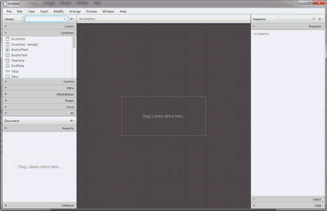
Description of "Figure 2-1 JavaFX Scene Builder Startup Window"
From within Scene Builder, you can also open an existing FXML document from the Menu bar using one of the following steps:
在场景生成器中,您还可以使用以下步骤之一从菜单栏打开现有的FXML文档:
-
From the File menu, select Open.
从“文件”菜单中,选择“打开”。
-
From the File menu, select Open Recent and select the file from the list of recently opened FXML files.
从“文件”菜单中,选择“最近打开”,然后从最近打开的FXML文件列表中选择文件。
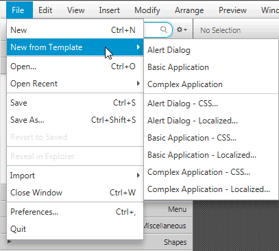
You can also open a new FXML file from an opened Scene Builder window using the following steps:
您还可以使用以下步骤从打开的“场景生成器”窗口打开新的FXML文件:
-
From the File menu, select New.
从“文件”菜单中,选择“新建”。
-
From the File menu, select New from Template and select from the list of available FXML templates, as shown in Figure 2-2.
从File菜单中,选择New From Template,然后从可用FXML模板列表中选择,如图2-2所示.
Figure 2-2 New from Template File Command
For illustration purposes, use the IssueTrackingLite.fxml sample file that is included with the JavaFX Scene Builder samples bundle.
为了便于说明,请使用JavaFX场景生成器示例包中包含的IssueTrackingLite.fxml示例文件。
-
Go to where you extracted the
javafx_scenebuilder_samples-2_0.zipfile.转到提取
javafx_scenebuilder_samples-2_0.zip文件的位置。 -
Expand the IssueTrackingLite, src, and issuetrackinglite folders.
展开IssueTrackingLite、src和issuestrackinglite文件夹。
-
Open the
IssueTrackingLite.fxmlfile.打开“IssueTrackingLite.fxml”文件。
The file is opened in Scene Builder, if you have Scene Builder properly installed.
如果已正确安装场景生成器,则会在场景生成器中打开该文件。
You can also use Scene Builder with one of the Java IDEs, such as NetBeans IDE, Eclipse, or IntelliJ IDEA, to create a new FXML file or open an existing one. Use the information in Using JavaFX Scene Builder with Java IDEs to learn more.
您还可以将场景生成器与其中一个Java IDE(如NetBeans IDE、Eclipse或IntelliJ IDEA)一起使用,以创建新的FXML文件或打开现有文件。使用使用JavaFX场景生成器和Java IDE中的信息了解更多。
3 Getting to Know the Main Window
This chapter discusses the different major parts of the main window that appears after Scene Builder is started up.
本章讨论启动场景生成器后出现的主窗口的不同主要部分。
After you open the FXML file to work with, it's contents are displayed in the Content panel of the main window, similar to what is shown in Figure 3-1.
打开要使用的FXML文件后,其内容将显示在主窗口的“内容”面板中,类似于图3-1所示.
Figure 3-1 Main Window of JavaFX Scene Builder
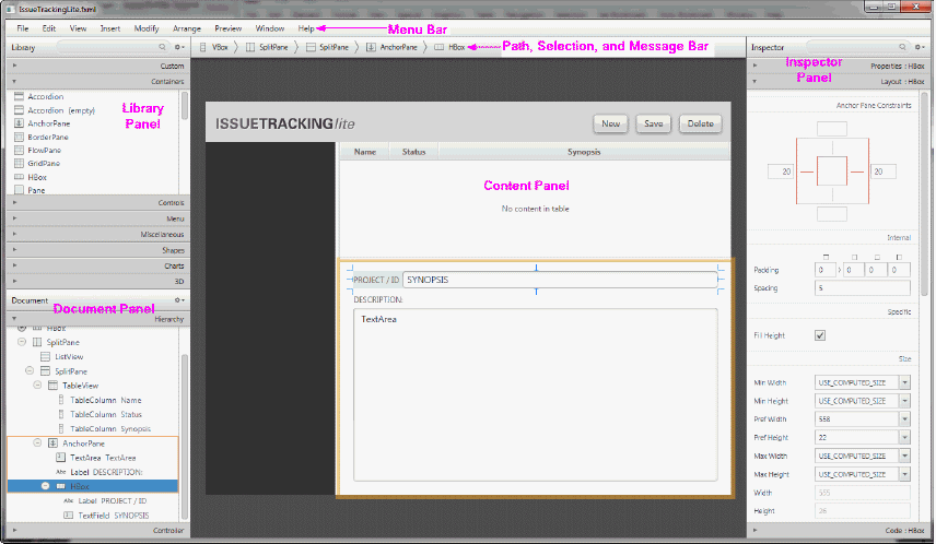
Description of "Figure 3-1 Main Window of JavaFX Scene Builder"
By default, the main window of JavaFX Scene Builder includes the following sections, which are labeled in Figure 3-1.
默认情况下,JavaFX Scene Builder的主窗口包括以下部分,这些部分在图3-1中标记.
-
Menu Bar: Provides access to the menu of commands available in JavaFX Scene Builder.
菜单栏:提供对JavaFX场景生成器中可用命令菜单的访问。
-
Path, Selection and Message Bar: Displays the path to a selected element and allows you to select an element to put into focus. It also displays any error or status messages.
路径、选择和消息栏:显示选定元素的路径,并允许您选择要聚焦的元素。它还显示任何错误或状态消息。
-
Content Panel: The scene container for the GUI elements that make up your FXML layout. By default, a new empty FXML file is opened in JavaFX Scene Builder.
内容面板:构成FXML布局的GUI元素的场景容器。默认情况下,在JavaFX场景生成器中打开一个新的空FXML文件。
-
Library Panel: Lists the available JavaFX GUI elements or controls, including custom controls, that you can use to build your FXML layout. You select the GUI elements from this panel and add them to the Content panel or the Hierarchy panel.
库面板:列出可用于构建FXML布局的可用JavaFX GUI元素或控件,包括自定义控件。您可以从该面板中选择GUI元素,并将其添加到“内容”面板或“层次”面板中。
-
Document Panel: Contains the Hierarchy and Controller sections. The Hierarchy section displays a tree view representation of the FXML layout that you are building in the Content panel. Elements that are not visible in the Content panel can be placed into focus by selecting it in the Hierarchy panel. The Controller section enables you to manage the controller source information and gives information about assigned fx:id values.
文档面板:包含层次结构和控制器部分。层次结构部分显示您在内容面板中构建的FXML布局的树视图表示。通过在“层次”面板中选择“内容”面板中不可见的元素,可以将其置于焦点。控制器部分使您能够管理控制器源信息,并提供有关分配的fx:id值的信息。
-
Inspector Panel: Contains the Properties, Layout, and Code sections. The Properties and Layout sections help you manage the properties of the currently selected GUI element in the Content panel or in the Hierarchy panel. The Code section enables you to manage the event handling actions to use for the selected GUI element. The Inspector panel also contains a Search text field that enables you to isolate specific properties that you want to modify.
检查器面板:包含属性、布局和代码部分。属性和布局部分可帮助您管理“内容”面板或“层次结构”面板中当前选定GUI元素的属性。代码部分使您能够管理用于所选GUI元素的事件处理操作。检查器面板还包含一个搜索文本字段,使您能够隔离要修改的特定属性。
The following panel is also displayed in the main window when you select View from the Main menu and then Show CSS Analyzer.
当您从主菜单中选择“查看”,然后选择“显示CSS分析器”时,主窗口中也会显示以下面板。
-
CSS Analyzer Panel: Allows you to explore all the CSS properties available for a JavaFX component on your FXML layout and helps you to build the CSS rules
CSS分析器面板:允许您探索FXML布局上JavaFX组件的所有可用CSS属性,并帮助您构建CSS规则
The next chapters describe the parts listed above in more detail.
接下来的章节将更详细地描述上面列出的部分。
4 Using the Menu Bar Commands
This chapter describes the commands that are available from the Scene Builder main Menu bar.
本章介绍场景生成器主菜单栏中可用的命令。
The Menu bar displays the menus of commands that you can perform with an FXML layout file. The following sections describe the list of subcommands available when you select a command from the Menu bar. Table 4-1 describes the subcommands for the File command.
菜单栏显示可以使用FXML布局文件执行的命令菜单。以下部分描述了从菜单栏中选择命令时可用的子命令列表。表4-1描述了File命令的子命令。
Note:
The shortcut key shown in the tables below are for Windows platform. Replace the Ctrl key with the Cmd key to use the equivalent shortcut key for the Mac OS X platform.
下表所示的快捷键适用于Windows平台。将Ctrl键替换为Cmd键,以使用Mac OS X平台的等效快捷键。
Table 4-1 List of File Subcommands
| Command (Shortcut Key) | Description |
|---|---|
| New (Ctrl+N) | Create a new FXML file and opens it in a separate Scene Builder window. 创建一个新的FXML文件,并在单独的“场景生成器”窗口中打开它 |
| New from Template | Create a new FXML layout using one of the available templates: Alert Dialog, Basic Application, Complex Application, Alert Dialog - CSS, Alert Dialog - Localized, Basic Application - CSS, Basic Application - Localized, Complex Application - CSS, and Complex Application - Localized layouts. 使用以下可用模板之一创建新的FXML布局:警报对话框、基本应用程序、复杂应用程序、警报对话框-CSS、警报对话框-本地化、基本应用-CSS、基础应用-本地化、复杂应用-CSS和复杂应用-本地化布局 |
| Open (Ctrl+O) | From an Open FXML dialog box, select the existing FXML file to open. 从打开FXML对话框中,选择要打开的现有FXML文件 |
| Open Recent | Select the file to open from a list of recently opened FXML files. 从最近打开的FXML文件列表中选择要打开的文件 |
| Save (Ctrl+S) | Save the changes made since the last Save action was performed. If it is a new FXML document, you are prompted to provide the new file name. If it is an existing FXML file, the current file name is retained. 保存自上次执行保存操作以来所做的更改。如果是新的FXML文档,系统会提示您提供新的文件名。如果是现有的FXML文件,则保留当前文件名 |
| Save As (Ctrl+Shift+S) | Save the current FXML file you are working on, with the option to save the changes to a different file. 保存您正在处理的当前FXML文件,并可选择将更改保存到其他文件 |
| Revert to Saved | Undo the changes made since the last Save action was performed. 撤消自上次执行保存操作以来所做的更改 |
| Reveal in Explorer (Windows), Reveal on Desktop (Linux), Reveal in Finder (Mac OS X) | Open a native file browser, which displays the folder containing the current FXML file and gives you the opportunity to open the file. 打开本机文件浏览器,该浏览器显示包含当前FXML文件的文件夹,并让您有机会打开该文件 |
| Import | Import an existing image, FXML, or media file. The Import > FXML command inserts the content of the imported file into the current FXML file you are working on. An image or media file should be imported into Scene Builder from inside your project sources directory. If the image or media file you are importing is located somewhere other than your project sources directory, you need to move or copy the file. Scene Builder does not copy the imported image or media file for you. It makes a link to the imported media or image file using a path relative to the location of the FXML file currently being worked on. Consequently, if the relative location of the imported image or media file is different at runtime, then your FXML file may not load properly. You need to ensure all imported files are packaged properly by your IDE and that their relative location at runtime and edit time are the same. The simplest way to achieve this is to only import image or media files which are already located under your project sources directory and to instruct your IDE to include these files in the packaging, which is usually done by default. 导入现有图像、FXML或媒体文件。Import>FXML命令将导入文件的内容插入到您正在处理的当前FXML文件中。图像或媒体文件应从项目源目录中导入到Scene Builder中。如果要导入的图像或媒体文件位于项目源目录以外的某个位置,则需要移动或复制该文件。场景生成器不会为您复制导入的图像或媒体文件。它使用相对于当前正在处理的FXML文件位置的路径链接到导入的媒体或图像文件。因此,如果导入的图像或媒体文件的相对位置在运行时不同,则您的FXML档案可能无法正确加载。您需要确保所有导入的文件都由IDE正确打包,并且它们在运行时和编辑时的相对位置是相同的。实现这一点的最简单方法是只导入已经位于项目源代码目录下的图像或媒体文件,并指示IDE在打包中包含这些文件,这通常是默认情况 |
| Include | Insert FXML, Edit the Included File, or Reveal the Included File. Insert FXML command inserts an fx:include construct into your FXML document. Edit the Included File command allows you to edit any imported or included FXML file that is referenced by an fx:include statement defined for the selected element. When you edit an included FXML file, a new JavaFX Scene Builder window is opened. Changes you save in the included FXML file are reflected in the FXML layout file from which you opened the included FXML file. Reveal Included File command opens a native file browser to show the folder that contains the included file. 插入FXML、编辑包含的文件或显示包含的文件。Insert FXML命令将fx:include构造插入到FXML文档中。编辑包含的文件命令允许您编辑为选定元素定义的fx:include语句引用的任何导入或包含的FXML文件。编辑包含的FXML文件时,将打开一个新的JavaFX场景生成器窗口。您在所包含的FXML文件中保存的更改会反映在您打开所包含FXML文件的FXML布局文件中。“显示包含的文件”命令打开本机文件浏览器,显示包含包含的文件的文件夹 |
| Close Window (Ctrl+W) | Close the current window. If you have any unsaved changes, you are prompted to save the file first before the window is closed. All other active windows remain open until they are closed or you exit the tool. 关闭当前窗口。如果您有任何未保存的更改,系统会提示您在关闭窗口之前先保存文件。所有其他活动窗口将保持打开状态,直到它们被关闭或您退出该工具 |
| Preferences (Ctrl+,) | Set the preferred values to use for certain properties in the tool. You can change the default values for the root container's width and height, the image to use for the tool's background, the colors to use for the alignment guides and drop/parent rings, the theme to use for the Scene Builder tool, the default display mode to use for the Hierarchy and Library panels, the order in which the CSS Analyzer columns are displayed, and the number of files to list in the Open > Recent Items command. You can reset to the default values by clicking Reset to Built-in Default Values. 设置工具中某些属性的首选值。您可以更改根容器的宽度和高度的默认值、用于工具背景的图像、用于对齐参考线和落环/父环的颜色、用于场景生成器工具的主题、用于层次和库面板的默认显示模式、CSS分析器列的显示顺序以及在“打开”>“最近使用的项目”命令中列出的文件数量。通过单击“重置为内置默认值”,可以重置为默认值 |
| Quit | Exit the tool. All opened Scene Builder windows are closed. You are prompted to save any unsaved changes. 退出工具。所有打开的“场景生成器”窗口都将关闭。系统会提示您保存任何未保存的更改 |
Selecting the Edit command menu displays the subcommands that enable you to select the Undo or Redo command on the last action that you made in the current FXML layout. In addition, you can select the Cut, Copy, Paste, Paste Into, Duplicate, and Delete commands that you can apply to the selected elements in the Content or Hierarchy panel. The Cut, Copy, and Paste commands use the native editor and clipboard, unless a text field element is selected. This means that when you copy or cut an element and paste it on a text editor, what is actually copied and pasted is the FXML code that defines a Group element that wraps the selected element and all its children elements. If the focus is on a text field element then the select, copy, and paste commands are performed from and to the text field element. With the Paste Into command, you need to first select where you want to paste an item into before selecting the Paste Into command.
选择“编辑”命令菜单将显示子命令,这些子命令使您能够在当前FXML布局中执行的最后一个操作上选择“撤消”或“重做”命令。此外,您可以选择剪切、复制、粘贴、粘贴到、复制和删除命令,这些命令可以应用于“内容”或“层次”面板中的选定图元。除非选择了文本字段元素,否则剪切、复制和粘贴命令将使用本机编辑器和剪贴板。这意味着,当您复制或剪切一个元素并将其粘贴到文本编辑器上时,实际复制和粘贴的是FXML代码,该代码定义了一个Group元素,该元素包裹了所选元素及其所有子元素。如果焦点在文本字段元素上,则从文本字段元素执行选择、复制和粘贴命令。使用“粘贴到”命令,您需要先选择要将项目粘贴到的位置,然后再选择“粘贴到“”命令。
Select the Select All command to select all of the elements in your FXML layout, while the Select None command deselects any selected elements. The Select Parent command selects the parent container of the selected element. Select Next and Select Previous commands allow you to select next and previous element in the hierarchy, respectively.
选择Select All命令以选择FXML布局中的所有元素,而Select None命令则取消选择任何选定的元素。“选择父对象”命令选择选定图元的父容器。“选择下一个”和“选择上一个”命令允许您分别选择层次结构中的下一个和上一个元素。
Select the Trim Document to Selection command to delete all of the elements up to the selected row in the Hierarchy panel. When you select the Trim Document to Selection command and the selected element is for a container element, that selected container element becomes the new root node container of your FXML document.
选择“修剪文档以选择”命令,删除“层次”面板中选定行之前的所有元素。当您选择“将文档修剪为选择”命令并且所选元素用于容器元素时,所选容器元素将成为FXML文档的新根节点容器。
Table 4-2 describes the subcommands available when you select the View command from the Menu bar.
表4-2描述了从菜单栏中选择“查看”命令时可用的子命令。
Table 4-2 List of View Subcommands
| Command (Shortcut key) | Description |
|---|---|
| Content (Ctrl+0) | Place focus on the Content panel. 将焦点放在“内容”面板上 |
| Properties (Ctrl+1) | Open the Properties section of the Inspector panel and place the current focus on it. 打开“检查器”面板的“属性”部分,并将当前焦点放置在其上 |
| Layout (Ctrl+2) | Open the Layout section of the Inspector panel and place focus on it. 打开“检查器”面板的“布局”部分,并将焦点放在其上 |
| Code (Ctrl+3) | Open the Code section of the Inspector panel and place focus on it. 打开“检查器”面板的“代码”部分并将焦点放在它上面 |
| Hide/Show Library (Ctrl+4) | Hide or show the Library panel on the left side of the current window. If the Document panel is still visible, it automatically adjusts to occupy the entire left side of the window. If the Document panel is not visible, the Content panel adjusts to occupy the rest of the window's left side. 隐藏或显示当前窗口左侧的库面板。如果“文档”面板仍然可见,它会自动调整以占据窗口的整个左侧。如果“文档”面板不可见,则“内容”面板会调整以占据窗口左侧的其余部分 |
| Hide/Show Document (Ctrl+5) | Hide or show the Document panel. If the Library panel is still visible, it is automatically adjusted to occupy the entire left side of the window. If the Library panel is not visible, the Content panel is automatically adjusted to occupy the rest of the window's left side. 隐藏或显示“文档”面板。如果“库”面板仍然可见,则会自动调整以占据窗口的整个左侧。如果“库”面板不可见,则“内容”面板会自动调整以占据窗口左侧的其余部分 |
| Show/Hide CSS Analyzer (Ctrl+6) | Show or hide the CSS Analyzer panel. The panel appears at the bottom of the window. 显示或隐藏CSS分析器面板。面板出现在窗口底部 |
| Hide/Show Left Panel (Ctrl+7) | Hide or show the panels on the left side of the window. Both the Library and Document panels are displayed with the Show Left command, regardless if the Document or Library panel was the only left panel active when the Hide Left Panel command was last executed. 隐藏或显示窗口左侧的面板。无论上次执行“隐藏左侧面板”命令时,“文档”或“库”面板是否是唯一活动的左侧面板,“库”和“文档”面板都会使用“显示左侧”命令显示 |
| Hide/Show Right Panel (Ctrl+8) | Hide or show the Inspector Panel on the right side of the window. 隐藏或显示窗口右侧的检查器面板 |
| Show/Hide Outlines (Ctrl+E) | Show or hide the outline of each element in your entire layout, as shown in Figure 4-1. The outline shows the LayoutBounds property of each element. See the API documentation for more information about the LayoutBounds property of the Node class in the javafx.scene package.显示或隐藏整个布局中每个元素的轮廓,如图4-1所示. 轮廓显示了每个元素的LayoutBounds属性。请参阅API文档有关“javafx.scene”包中“Node”类的“LayoutBounds”属性的更多信息 |
| Show/Hide Sample Data | Show or hide demonstration data for those elements, such as a tree view, that have some sample data associated with them. The sample data is not saved in your FXML layout file. 显示或隐藏与某些示例数据关联的元素(如树视图)的演示数据。示例数据未保存在FXML布局文件中 |
| Disable/Enable Alignment Guides | Disable or enable the alignment guidelines that help you align the elements with one another. 禁用或启用帮助您将元素彼此对齐的对齐参考线 |
| Zoom | Provides a drop-down list of percentage values into which you can zoom the current layout. 提供一个百分比值的下拉列表,您可以将当前布局缩放到其中 |
| Show Sample Controller Skeleton | Open a window that displays sample skeleton code that you can use to create a controller class for the FXML layout you are building 打开一个显示示例骨架代码的窗口,您可以使用该代码为正在构建的FXML布局创建控制器类 |
Figure 4-1 Show Outlines
Description of "Figure 4-1 Show Outlines"
Select the Insert command from the Menu bar to enable you to select GUI elements, such as containers, controls, menu content, shapes, charts, custom components, 3D, and miscellaneous elements, that you can add to the current FXML layout. These are the same GUI elements available from the Library panel. If none of the existing GUI elements in the layout is selected, the insertion point for the new element is the center of the Content panel. If one of the elements is selected before selecting the Insert command, the new element being added is placed slightly off to the side, but over the selected element. The Insert submenu displays only the valid GUI controls that can be inserted to the selected element or container.
从菜单栏中选择插入命令,使您能够选择可以添加到当前FXML布局的GUI元素,如容器、控件、菜单内容、形状、图表、自定义组件、3D和其他元素。这些是库面板中可用的相同GUI元素。如果布局中没有选择任何现有的GUI元素,则新元素的插入点是“内容”面板的中心。如果在选择“插入”命令之前选择了其中一个图元,则添加的新元素将略微偏侧,但位于选定图元上方。插入子菜单仅显示可以插入到所选元素或容器的有效GUI控件。
The subcommands displayed when you select Modify from the Menu bar are described in Table 4-3.
从菜单栏中选择“修改”时显示的子命令如表4-3所述.
Table 4-3 List of Modify Subcommands
| Command (Shortcut Key) | Description |
|---|---|
| Fit to Parent (Ctrl+K) | Resize a selected element to fill the area that its parent container occupies. The element is also anchored to each of the sides of the parent. This feature is only available when the parent container is an AnchorPane element. 调整选定元素的大小以填充其父级容器所占的区域。该元素也锚定到父元素的每一侧。此功能仅在父容器是AnchorPane元素时可用 |
| Use Computed Sizes (Ctrl+Shift+K) | Reset the selected element's layout property values to the default values. The USE_COMPUTED_SIZE value is used for the Min Width, Min Height, Pref Width, Pref Height, Max Width, or Max Height layout properties. (See the API documentation for the Region class in the javafx.scene.layout package for more information.)将选定元素的布局属性值重置为默认值。USE_COMPUTED_SIZE值用于最小宽度、最小高度、预宽度、预高度、最大宽度或最大高度布局属性。(请参阅API文档如需更多信息,请访问 javafx.scene.layout包中的Region类。) |
| Grid Pane | Display all the subcommands available for working with the selected Grid Pane component in your layout. You can delete, move, add, or resize rows or columns in the selected Grid Pane. 显示布局中可用于使用选定网格窗格组件的所有子命令。您可以在所选网格窗格中删除、移动、添加或调整行或列的大小 |
| Add Effect | Apply effects, such as a drop shadow or a reflection, to the selected element or group of elements in the layout.The Effect editor allows you to set chain of effects to an object. 将效果(如阴影或反射)应用于布局中的选定元素或元素组。效果编辑器允许您为对象设置效果链 |
| Add Popup Control | Add a Context Menu or a Tooltip element to the selected element in your layout. Note that the added Popup control is only selectable in the Hierarchy panel. 向布局中的选定元素添加上下文菜单或工具提示元素。请注意,添加的Popup控件仅在“层次”面板中可选 |
| Scene Size | Set the screen size by selecting from the list of pre-defined dimensions. 通过从预定义尺寸列表中选择来设置屏幕大小 |
Use the Arrange menu, which is shown in Figure 4-2, to bring the selected element to the front, send it back, or move it forward or backward. Selecting the Wrap In subcommand places the selected elements into one of the available containers, such as an Anchor Pane, HBox, or a Grid Pane container. The Unwrap command removes the currently selected container, but leaves the GUI elements it contains untouched.
使用排列菜单,如图4-2所示,将所选元素带到前面,将其发送回去,或向前或向后移动。选择“换行”子命令会将所选元素放入其中一个可用容器中,例如锚点窗格、HBox或网格窗格容器。Unwrap命令删除当前选定的容器,但保留其包含的GUI元素不变。
Figure 4-2 Menu Bar with Arrange Menu Opened
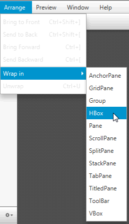
Description of "Figure 4-2 Menu Bar with Arrange Menu Opened"
The subcommands displayed when you select the Preview command from the Menu Bar are described in Table 4-4.
从菜单栏中选择预览命令时显示的子命令如表4-4所述.
Table 4-4 List of Preview Subcommands
| Command (Shortcut Key) | Description |
|---|---|
| Show Preview in Window (Ctrl+P) | Display the window that lets you preview the user interface design rendered by your current FXML code when it is deployed. 显示允许您预览当前FXML代码在部署时呈现的用户界面设计的窗口 |
| JavaFX Theme | Set the JavaFX Theme to use on the FXML layout being previewed. The drop-down list shows the available selection. 设置要在预览的FXML布局上使用的JavaFX主题。下拉列表显示可用选项 |
| Scene Style Sheets | Open a submenu that displays commands that enable you to add a new style sheet that you can apply to your current layout, remove a style sheet from the list of style sheets being used, or open an existing style sheet in a separate editor window specified for the style sheet file type. The layout is immediately updated. 打开一个子菜单,其中显示的命令使您能够添加可以应用于当前布局的新样式表,从正在使用的样式表列表中删除样式表,或在为样式表文件类型指定的单独编辑器窗口中打开现有样式表。布局会立即更新 |
| Internationalization | Enables you to set, remove, or reveal a resource file in the native file browser. 允许您在本机文件浏览器中设置、删除或显示资源文件 |
| Preview Size | Allows you to set the size of the Preview window to one of the predefined scene sizes as an alternative to the preferred size defined in the FXML document. 允许您将预览窗口的大小设置为预定义的场景大小之一,作为FXML文档中定义的首选大小的替代 |
Selecting the Window menu gives you a list of the names of the FXML file s that are currently opened in JavaFX Scene Builder windows. When you select one of the file names in the list, the name is marked with a check mark, and its corresponding Scene Builder window becomes active.
选择“窗口”菜单,您将看到当前在JavaFX场景生成器窗口中打开的FXML文件的名称列表。当您在列表中选择一个文件名时,该名称将被标记为复选标记,其相应的“场景生成器”窗口将处于活动状态。
Selecting Help and then Scene Builder Help opens your default web browser and displays the web site that contains the available JavaFX Scene Builder documentation. Select the About Scene Builder command to open a window that displays the release information for the JavaFX Scene Builder you are using.
选择“帮助”,然后选择“场景生成器帮助”将打开默认的web浏览器,并显示包含可用JavaFX场景生成器文档的网站。选择“关于场景生成器”命令打开一个窗口,显示您正在使用的JavaFX场景生成器的发布信息。
5 Using the Path, Selection and Message Bar
This chapter describes the Selection and Message bar that is located just above the Content panel of the Scene Builder main window.
本章介绍位于“场景生成器”主窗口“内容”面板正上方的“选择和消息栏”。
The Path, Selection and Message bar is shown in Figure 5-1 and Figure 5-2. It serves the following purposes:
路径、选择和消息栏如图5-1所示和图5-2. 它具有以下目的:
-
It displays the containment path of the selected GUI element. It enables you to easily go to and place focus on a specific element by clicking that element's name in the containment path. When you hover the cursor over an element's name, it is underlined, as shown in Figure 5-1.
它显示所选GUI元素的包含路径。它使您能够通过在包含路径中单击特定元素的名称,轻松地转到该元素并将焦点放在该元素上。当您将光标悬停在元素名称上时,它会加下划线,如图5-1所示.
Figure 5-1 Selection Bar
-
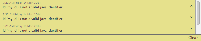
The same area that is used to display the containment path is also used to display informational and warning messages. After a warning message is displayed for a couple of seconds, the warning icon remains on the right end of the Message bar. Click the triangular warning icon, circled in Figure 5-2, to view the list of warning messages. The number shown in the icon indicates the number of warning messages that are available for viewing. Informational messages do not persist after being displayed and are not viewable in the Message Panel.
用于显示安全壳路径的同一区域也用于显示信息和警告消息。警告消息显示几秒钟后,警告图标仍保留在消息栏的右端。点击图5-2中圈出的三角形警告图标,查看警告消息列表。图标中显示的数字表示可供查看的警告消息的数量。信息性消息在显示后不会持续存在,也无法在消息面板中查看。
The appearance of the document-looking icon, shown to the right of the warning icon in Figure 5-2, indicates that changes have been made to the document since the last save action was performed.
文档查看图标的外观,显示在图5-2中警告图标的右侧,表示自上次执行保存操作以来已对文档进行了更改。
Figure 5-2 Message Bar Displaying a Warning Message
![Image of Message Bar]()
Description of "Figure 5-2 Message Bar Displaying a Warning Message"Figure 5-3 shows a sample of the Message Panel with several messages listed. You can clear one or all of the messages in the list view.
图5-3显示了消息面板的示例,其中列出了几条消息。您可以清除列表视图中的一条或所有消息。
Figure 5-3 Message Panel Displaying a List of Warning Messages
![Description of Figure 5-3 follows]()
Description of "Figure 5-3 Message Panel Displaying a List of Warning Messages"Figure 5-4 illustrates an example of the Message Bar displaying an informational message.
图5-4示出了显示信息性消息的消息栏的示例。
Figure 5-4 Message Bar Displaying an Informational Message
![Description of Figure 5-4 follows]()
Description of "Figure 5-4 Message Bar Displaying an Informational Message"


6 Working with the Content Panel
This chapter describes the Content panel of the JavaFX Scene Builder.
本章介绍JavaFX场景生成器的“内容”面板。
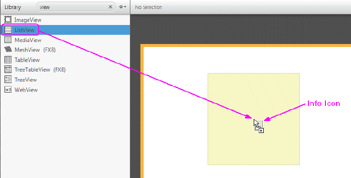
The Content panel is the rectangular area that occupies the center of the JavaFX Scene Builder window. It is empty by default when you create a new FXML file. It is your design canvas and gives you a view of what you are designing. It enables you to directly manipulate the graphical elements used in your FXML layout. One way to add a GUI element to your layout is to drag it from the Library panel and place it in a chosen location in the Content panel. As you drag an object onto the Content panel, the drop target area is highlighted, as shown in Figure 6-1. An info icon is also displayed to identify the GUI element being dragged.
内容面板是占据JavaFX场景生成器窗口中心的矩形区域。默认情况下,当您创建新的FXML文件时,它是空的。它是你的设计画布,让你看到你正在设计的东西。它使您能够直接操纵FXML布局中使用的图形元素。将GUI元素添加到布局中的一种方法是将其从“库”面板中拖动,并将其放置在“内容”面板中的选定位置。当您将对象拖动到Content面板上时,拖放目标区域将突出显示,如图6-1所示. 还显示了一个信息图标,用于标识正在拖动的GUI元素。
Figure 6-1 Dropping a ListView Element into the Content Panel
Description of "Figure 6-1 Dropping a ListView Element into the Content Panel"
The selected elements have special handles that enable you to scale or resize the elements. You move the selected element by using the mouse to drag it to a different location. Right-clicking anywhere in the Content panel displays a contextual menu of commands that can be used on the currently selected element, as shown in Figure 6-2.
所选元素具有特殊的控制柄,使您能够缩放或调整元素的大小。通过使用鼠标将选定元素拖动到其他位置来移动它。右键单击“内容”面板中的任意位置,将显示可用于当前选定元素的命令上下文菜单,如图6-2所示.
Figure 6-2 Contextual Menu in Content Panel
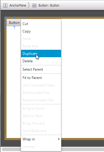
Description of "Figure 6-2 Contextual Menu in Content Panel"
Double-clicking on a GUI element in the Content panel places that element in an inline editing mode. If a GUI element with a Text property is selected, pressing Return also places the element in an inline editing mode.
双击“内容”面板中的GUI元素会将该元素置于内联编辑模式。如果选择了具有Text属性的GUI元素,按Return键也会将该元素置于内联编辑模式。
GUI elements in a FlowPane, TextFlow, TilePane, ToolBar, HBox, and VBox containers can be re-ordered. A grey line guides you with the placement or order location of the selected object.
FlowPane、TextFlow、TilePane、ToolBar、HBox和VBox容器中的GUI元素可以重新排序。灰线将引导您确定所选对象的放置或顺序位置。
7 Using the Document Panel
This chapter describes the Document panel of the JavaFX Scene Builder tool.
本章介绍JavaFX场景生成器工具的“文档”面板。
The Document panel, shown in Figure 7-1, is located at the lower left side of the tool's window. It is comprised of the Hierarchy and Controller sections. You can hide the Document panel by selecting View from the Main menu and then selecting Hide Document, or Hide Left Side Panel to hide it along with the Library panel.
文档面板,如图7-1所示,位于工具窗口的左下侧。它由层次结构和控制器部分组成。您可以通过从主菜单中选择“查看”,然后选择“隐藏文档”,或选择“隐藏左侧面板”将其与“库”面板一起隐藏来隐藏“文档”面板。
Figure 7-1 Document Panel
Description of "Figure 7-1 Document Panel"
Hierarchy Section
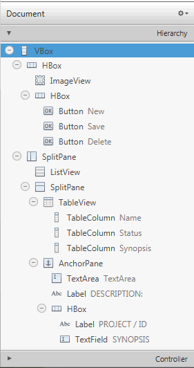
The Hierarchy section shows all the GUI elements that comprise your FXML layout, including those that are not visible in the Content panel. You can use the Hierarchy panel to focus on one specific GUI element, whether it is a parent node or a leaf node. After the element is isolated, you can use the Content panel or the Inspector panel to focus your work on that particular element and its properties. The path from the root of the FXML layout to a particular GUI element is displayed in the Path and Selection bar when a GUI element is isolated in the Hierarchy panel. The selected GUI object is highlighted in the Hierarchy panel and in the Content panel.
层次结构部分显示了构成FXML布局的所有GUI元素,包括在内容面板中不可见的元素。您可以使用“层次结构”面板专注于一个特定的GUI元素,无论是父节点还是叶节点。隔离元素后,您可以使用“内容”面板或“检查器”面板将工作重点放在该特定元素及其属性上。当在层次结构面板中隔离GUI元素时,从FXML布局的根到特定GUI元素的路径显示在路径和选择栏中。所选GUI对象在“层次”面板和“内容”面板中突出显示。
You can also add a new GUI element to your FXML layout by dragging it from the Library panel to the desired location in the Hierarchy panel. This is especially helpful when adding a Popup control, such as a Tooltip or ContextMenu. For example, to add a Tooltip to a Button element, drag the Tooltip control from the Library panel to the target Button element in the Hierarchy panel. The Tooltip becomes a child of that Button element.
您还可以通过将新的GUI元素从库面板拖动到层次结构面板中的所需位置,将其添加到FXML布局中。这在添加Popup控件(如工具提示或上下文菜单)时特别有用。例如,要将工具提示添加到Button元素,请将工具提示控件从“库”面板拖动到“层次”面板中的目标Button元素。工具提示将成为该Button元素的子元素。
You can rearrange the position of a GUI element in your layout by dragging it in and out of containers within the Hierarchy panel. You can select multiple elements at once in the Hierarchy panel and drag and drop them into a single location.
您可以通过将GUI元素拖入和拖出“层次”面板中的容器来重新排列其在布局中的位置。您可以在“层次”面板中一次选择多个元素,并将它们拖放到单个位置。
The Hierarchy panel is also useful for adding a graphic element to a GUI element that has the graphic property, per its API. For example, you can add a graphic element to a Button element, but not to a GridPane element. Use the following steps to add a Circle graphic element to a Button element using the Hierarchy panel:
“层次结构”面板还可用于根据API将图形元素添加到具有图形属性的GUI元素中。例如,您可以将图形元素添加到Button元素,但不能添加到GridPane元素。使用以下步骤,使用“层次”面板将圆形图形元素添加到按钮元素中:
-
From the Library panel, drag a Circle element to the target Button layer in the Hierarchy panel.
从“库”面板中,将“圆”元素拖动到“层次”面板中的目标按钮层。
-
Without releasing the mouse cursor, hover over the Button layer for a second and you will notice a new sub-layer is created for the Circle.
在不释放鼠标光标的情况下,将鼠标悬停在按钮层上一秒钟,您会注意到为圆圈创建了一个新的子层。
-
Release your mouse cursor and the Circle appears in the Content panel, with its default radius of size 100.
释放鼠标光标,圆圈将出现在“内容”面板中,其默认半径为100。
-
In the Layout section of the Inspector panel, reduce the circle's radius size to 6 so that it fits more appropriately in the Button.
在检查器面板的布局部分,将圆的半径大小减小到6,使其更适合按钮。
You can only have one graphic element added to a Button element at any one time. To add a new graphic, you must first delete the existing one. If the element is a container, then it can contain any number of graphical elements.
一次只能将一个图形元素添加到Button元素中。要添加新图形,必须先删除现有图形。如果元素是一个容器,那么它可以包含任意数量的图形元素。
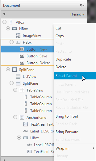
Right-clicking an element in the Content panel or a specific element layer in the Hierarchy panel displays a contextual menu of commands that you can use for the selected element, as shown in Figure 7-2. These commands are a subset of the commands that are available from the Menu Bar. You can click on the right side of the row for the GUI element listed in the Hierarchy panel to activate the inline property editor.
右键单击Content面板中的元素或Hierarchy面板中的特定元素层,将显示可用于所选元素的命令上下文菜单,如图7-2所示. 这些命令是菜单栏中可用命令的子集。您可以单击“层次”面板中列出的GUI元素的行的右侧,以激活内联属性编辑器。
Figure 7-2 Hierarchy Panel with Drop-down List of Commands
Description of "Figure 7-2 Hierarchy Panel with Drop-down List of Commands"
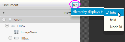
When you click the drop-down arrow, which is circled on the top right corner in Figure 7-3, and select Hierarchy displays, you can select Info, fx:id, or Node Id to display next to each of the elements listed in the Hierarchy panel. The default display mode is Info, which displays any related information for the element, or the text property value if the element has a text property. The fx:id display mode shows the value of each element's fx:id property, which is used by the application controller class. When you select Node Id, the Hierarchy panel shows the same node names used in the Selection bar for each element.
当您单击下拉箭头时,该箭头在图7-3中的右上角被圈出,然后选择“层次显示”,您可以选择“信息”、“fx:id”或“节点id”显示在“层次”面板中列出的每个元素旁边。默认显示模式为Info,它显示元素的任何相关信息,或者如果元素具有文本属性,则显示文本属性值。fx:id显示模式显示每个元素的fx:id属性的值,该属性由应用程序控制器类使用。当您选择“节点Id”时,“层次”面板将显示每个元素在选择栏中使用的相同节点名称。
Figure 7-3 Hierarchy Display Menu in Document Panel
Description of "Figure 7-3 Hierarchy Display Menu in Document Panel"
Controller Section
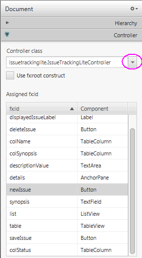
The Controller section, shown in Figure 7-4, enables you to manage the controller class you want to use with your FXML document. The controller class provides the logic to handle the behavior of the objects in your FXML layout. In the Controller class text field, you set the fully qualified Java class name of the controller class file you want to use. This file must be in the same folder, a sub-folder, or a parent folder in which the FXML file is also located. If the controller class file already exists in the same folder as the FXML file you are working with, you can select the controller class from the drop-down list by clicking the down arrow that is circled in Figure 7-4. If you are using NetBeans IDE with JavaFX Scene Builder and your FXML file is located in a NetBeans project, then the Controller class java file can be located in any java package inside your NetBeans project's src folder.
控制器部分,如图7-4所示,使您能够管理要与FXML文档一起使用的控制器类。控制器类提供了处理FXML布局中对象行为的逻辑。在控制器类文本字段中,设置要使用的控制器类文件的完全限定Java类名。此文件必须位于FXML文件所在的同一文件夹、子文件夹或父文件夹中。如果控制器类文件与您正在使用的FXML文件已存在于同一文件夹中,您可以通过单击图7-4中圈出的向下箭头从下拉列表中选择控制器类. 如果您将NetBeans IDE与JavaFX Scene Builder一起使用,并且您的FXML文件位于NetBeans项目中,那么Controller类java文件可以位于NetBeans工程的src文件夹中的任何java包中。
The list of all the fx:id values used in the FXML document is listed in a table view. Also included in the Controller section is the fx:root construct checkbox that creates a reference to a previously defined root element. To learn more about the <fx:root> element, refer to the JavaFX API document.
FXML文档中使用的所有fx:id值的列表都列在表视图中。控制器部分还包括fx:root构造复选框,用于创建对先前定义的根元素的引用。要了解有关<fx:root>元素的更多信息,请参阅JavaFX API文档.
Figure 7-4 Controller Section of the Document Panel
Description of "Figure 7-4 Controller Section of the Document Panel"
8 Designing GUI with the Library Panel
This chapter describes JavaFX Scene Builder's Library panel and the JavaFX GUI objects that are accessible from it. Information is provided about working with some of the container elements available. Also discussed in this chapter is how to import custom GUI objects into JavaFX Scene Builder.
本章介绍JavaFX Scene Builder的库面板和可从中访问的JavaFX GUI对象。提供了有关使用一些可用容器元素的信息。本章还讨论了如何将自定义GUI对象导入JavaFX场景生成器。
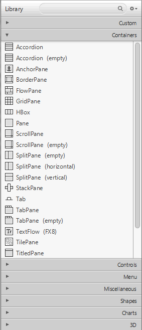
The Library panel, shown in Figure 8-1, is located on the left side of the Main window. You can hide the Library panel by selecting View from the Main menu and then selecting Hide Library or Hide Left Side Panel to hide it along with the Document panel. The Library panel is comprised of collapsible sections for Containers, Controls, Menus, Shapes, Charts, 3D, and Miscellaneous elements that are available for your use to build your FXML layout. These GUI elements are the same JavaFX GUI elements that are delivered with the Java SE release. To locate the GUI components, such as TextFlow, SwingNode, and 3D objects, that were introduced with the JDK 8 release, type FX8 in the Library panel's Search text field.
库面板,如图8-1所示,位于主窗口的左侧。通过从主菜单中选择“视图”,然后选择“隐藏库”或“隐藏左侧面板”将其与“文档”面板一起隐藏,可以隐藏“库”面板。库面板由容器、控件、菜单、形状、图表、3D和杂项元素的可折叠部分组成,可用于构建FXML布局。这些GUI元素与Java SE版本提供的JavaFX GUI元素相同。要定位JDK 8版本中引入的GUI组件,如TextFlow、SwingNode和3D对象,请在库面板的搜索文本字段中键入“FX8”。
There is also a Custom section, which lists the custom GUI components that have been imported into the Library. Custom type elements are those GUI components that were not delivered with the JavaFX API libraries in JDK 8. See Managing Custom GUI Elements for more information on how to import your own or third-party custom GUI components.
还有一个自定义部分,其中列出了已导入库的自定义GUI组件。自定义类型元素是指JDK8中未使用JavaFX API库提供的GUI组件。请参阅管理自定义GUI元素有关如何导入自己或第三方自定义GUI组件的更多信息。
Support for 3D GUI elements is limited. You can open FXML files that contain 3D objects, but you can only edit some of their properties via the Inspector panel and you can not directly manipulate the objects in the Content panel. Pre-defined 3D shapes (Box, Sphere, and Cylinder) that are available in the JavaFX API are provided in the Shapes section of the Library panel. In the 3D section are objects related to lights and cameras. These are available in the Library so that you can edit their properties and add their fx:id so that they can be referenced from your controller source code.
对3D GUI元素的支持是有限的。您可以打开包含3D对象的FXML文件,但只能通过“检查器”面板编辑其某些属性,并且不能直接在“内容”面板中操纵对象。JavaFX API中提供的预先定义的三维形状(长方体、球体和圆柱体)在“库”面板的“形状”部分中提供。在3D部分中,有与灯光和摄影机相关的对象。这些在库中可用,因此您可以编辑它们的属性并添加它们的fx:id,以便从控制器源代码中引用它们。
Figure 8-1 Library Panel
Description of "Figure 8-1 Library Panel"
When you open a new FXML layout in Scene Builder, it is an empty file. You start building your layout by selecting the top root container from the Containers section and adding it to the Content or Hierarchy panel. You can then add into that root container as many containers or GUI elements that are needed for your FXML layout.
在场景生成器中打开新的FXML布局时,它是一个空文件。您可以通过从“容器”部分选择顶部根容器并将其添加到“内容”或“层次结构”面板来开始构建布局。然后,您可以将FXML布局所需的多个容器或GUI元素添加到该根容器中。
To add one of the GUI elements from the Library panel, do one of the following:
要从库面板添加一个GUI元素,请执行以下操作之一:
-
Select an item from the list on the Library panel and drag it onto the Content panel or the Hierarchy panel.
从“库”面板上的列表中选择一个项目,并将其拖动到“内容”面板或“层次”面板上。
-
Select an item from the Library panel and press the Enter key.
从库面板中选择一个项目,然后按Enter键。
-
Double-click a selected item in the Library panel and it gets added to the Content panel.
双击“库”面板中的选定项目,它将被添加到“内容”面板中。
-
Click the Insert command on the Menu bar and select one of the available GUI elements from the drop-down list. If the layout is currently empty, the element is added as the root element. If a root element already exists and nothing is currently selected in the Hierarchy or Content panel, the element is added inside the root element. Otherwise, it is added next to the currently selected element.
单击菜单栏上的插入命令,然后从下拉列表中选择一个可用的GUI元素。如果布局当前为空,则将该元素添加为根元素。如果根元素已经存在,并且当前在“层次结构”或“内容”面板中未选择任何内容,则该元素将添加到根元素中。否则,它将添加到当前选定的元素旁边。
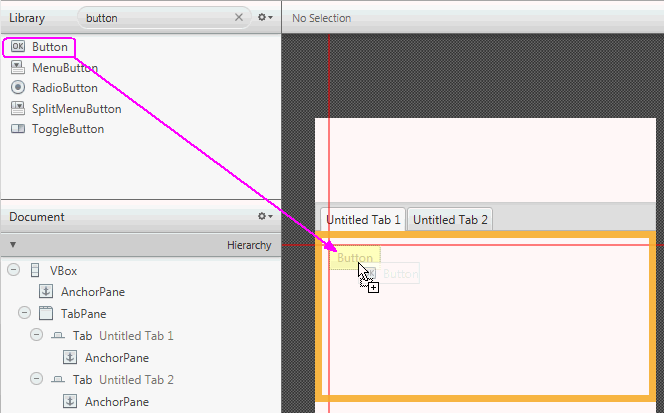
Use the Search text field, located at the top of the panel, to filter the list of GUI elements available in the Library. For example, typing button in the Search field displays all the GUI elements with the button in its name.
使用面板顶部的搜索文本字段过滤库中可用的GUI元素列表。例如,在搜索字段中键入“button”将显示所有名称中包含该按钮的GUI元素。
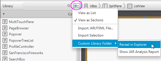
To the right of the Library panel's Search text field is a menu button which when clicked displays a menu of commands, as shown in Figure 8-2. The commands help you manage how the Library contents are to be displayed: as a long list, or as groups of elements listed in separate sections, which is the default. Also available are commands that allow you to import custom GUI components into the Library. See Managing Custom GUI Elements for more information.
在库面板的搜索文本字段的右侧是一个菜单按钮,单击该按钮会显示一个命令菜单,如图8-2所示. 这些命令可帮助您管理库内容的显示方式:默认为长列表或单独部分列出的元素组。还提供了允许您将自定义GUI组件导入库的命令。请参阅管理自定义GUI元素了解更多信息。
Selecting the Custom Library Folder menu item displays a sub-menu that includes Reveal in native file manager and the Show JAR Analysis Report commands. Selecting the Reveal in native file manager command (where native file manager is Finder for the Mac OS platform, Explorer for the Windows platform, and Desktop for the Linux platform) opens your system's file manager at the location of the folder containing the custom component JAR and/or FXML files. The command is disabled if the Custom Library folder is empty.
选择“自定义库文件夹”菜单项将显示一个子菜单,其中包括本机文件管理器中的“显示”和“显示JAR分析报告”命令。选择Reveal in native file manager命令(其中native file management是Mac OS平台的Finder、Windows平台的Explorer和Linux平台的Desktop)将在包含自定义组件JAR和/或FXML文件的文件夹位置打开系统的文件管理器。如果“自定义库”文件夹为空,则禁用该命令。
Selecting the Show JAR Analysis Report command allows you to view an analysis report for the JAR file(s) located in the Custom Library Folder. This report will list all of the Java classes which were inspected and determined as custom components that are unsuitable to be added to the Library. Also provided is an indication of the failed criteria, such as the fact that the class is not a JavaFX Node, or Scene Builder failed to instantiate the class. In the latter case, the Java exception is also listed.
选择Show JAR Analysis Report命令允许您查看位于自定义库文件夹中的JAR文件的分析报告。此报告将列出所有被检查并确定为不适合添加到库中的自定义组件的Java类。还提供了失败条件的指示,例如该类不是JavaFX节点,或者场景生成器未能实例化该类。在后一种情况下,还会列出Java异常。
Figure 8-2 Library Panel's Sub-menu of Commands
Description of "Figure 8-2 Library Panel's Sub-menu of Commands"
The following sections discuss some of the container elements that are available in the Library panel and how to maximize their usage in the JavaFX Scene Builder tool. Also described is how to manage custom types. To learn more about all the other GUI elements offered with the JavaFX SDK platform, see the JavaFX API documentation.
以下部分讨论了库面板中可用的一些容器元素,以及如何在JavaFX场景生成器工具中最大限度地使用它们。还介绍了如何管理自定义类型。要了解有关JavaFX SDK平台提供的所有其他GUI元素的更多信息,请参阅JavaFX API文档.
- Managing Custom GUI Elements
- Using a Grid Pane Container
- Working with a Border Pane Container
- Using a Tab Pane Container
- Working with Menu Controls
Managing Custom GUI Elements
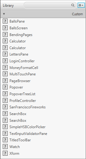
The first section displayed in the Library panel is the Custom section, as shown in Figure 8-3,. It lists all the custom GUI elements that are not part of the JavaFX 8 API libraries, but are available for your use in your GUI layout. A custom GUI element is a Java class that has been created by the user or by a third party, and added to the Library of available components you can use in your FXML layout.
库面板中显示的第一个部分是自定义部分,如图8-3所示,. 它列出了所有自定义GUI元素,这些元素不是JavaFX 8 API库的一部分,但可供您在GUI布局中使用。自定义GUI元素是由用户或第三方创建的Java类,并添加到您可以在FXML布局中使用的可用组件库中。
Figure 8-3 Custom Section of the Library Panel
Description of "Figure 8-3 Custom Section of the Library Panel"
Adding Custom Components to the Library
You can import customized GUI components by using the Library panel's Import command. You can add any simple or complex graphical object from the Hierarchy or Content panel into the Library, and make it a reusable component available from the Library panel. You can also import a graphical component from an FXML document, or import a JAR file and select a subset of the custom components it contains, to make them re-usable components permanently available in the Library.
您可以使用“库”面板的“导入”命令导入自定义的GUI组件。您可以将“层次结构”或“内容”面板中的任何简单或复杂的图形对象添加到库中,并使其成为库面板中可用的可重用组件。您还可以从FXML文档导入图形组件,或导入JAR文件并选择其中包含的自定义组件的子集,使其在库中永久可用。
-
To import custom GUI components from a JAR or FXML file:
要从JAR或FXML文件导入自定义GUI组件,请执行以下操作:
-
Select Import JAR/FXML file command from the Library panel's menu, or drag the JAR or FXML file directly from your system's native file manager (Explorer or Finder) and drop it into the Library panel
从库面板的菜单中选择导入JAR/FXML文件命令,或直接从系统的本机文件管理器(资源管理器或查找器)拖动JAR或FXML文件并将其放入库面板
-
In the Open dialog window, navigate to the location of the JAR or FXML file that you want to import.
在“打开”对话框窗口中,导航到要导入的JAR或FXML文件的位置。
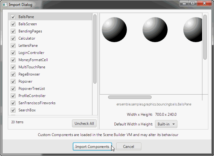
The Import Dialog, similar to what is shown in Figure 8-4, is displayed. The JAR file's contents are inspected and all the Java classes that are determined as being suitable custom components are displayed in the dialog window. The FXML file's contents are parsed to make sure that the component being added is valid and self-contained.
导入对话框,类似于图8-4所示,显示。检查JAR文件的内容,并在对话框窗口中显示所有被确定为合适的自定义组件的Java类。对FXML文件的内容进行解析,以确保添加的组件有效且自包含。
-
From the Import dialog window, select or unselect items from the list of items that you are able to import.
在“导入”对话框窗口中,从可导入的项目列表中选择或取消选择项目。
-
Click Import Components.
单击“导入组件”。
Imported items are added to the Custom section of the Library panel. They can be used immediately and they persist in the Library even after Scene Builder is restarted
导入的项目将添加到“库”面板的“自定义”部分。它们可以立即使用,即使在场景生成器重新启动后,它们也会保留在库中
Figure 8-4 Dialog Window for Importing JAR/FXML File
![Description of Figure 8-4 follows]()
Description of "Figure 8-4 Dialog Window for Importing JAR/FXML File"
-
-
To add custom GUI objects from your current layout to the Library panel:
要将当前布局中的自定义GUI对象添加到库面板中,请执行以下操作:
-
Using the Hierarchy or Content panel, select the self-contained component in your current layout.
使用“层次结构”或“内容”面板,在当前布局中选择自包含的组件。
-
From the Library panel's menu, select the Import Selection command. Alternatively, drag the selected component from the Content or Hierarchy panel and drop it in the Library panel.
从“库”面板的菜单中,选择“导入选择”命令。或者,从“内容”或“层次”面板中拖动选定的组件,并将其放入“库”面板中。
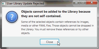
The selected item is inspected and if there are issues encountered, an error dialog similar to Figure 8-5 is displayed. If no errors are encountered, the custom component is added to the Library and a message is displayed in the Message bar. The name of the FXML file created for the imported selection is based on the name of the root element. For example, if in your selection the root element is of the
Buttonclass, then the file created when you import the element for the first time isButton_1.fxml.检查所选项目,如果遇到问题,将显示类似于图8-5的错误对话框显示。如果没有遇到错误,则将自定义组件添加到库中,并在消息栏中显示一条消息。为导入的选择创建的FXML文件的名称基于根元素的名称。例如,如果在您的选择中,根元素属于“Button”类,则首次导入该元素时创建的文件为“Button_1.fxml”。
You can also import multiple selections made in the Content or Hierarchy panel. For example, you can select a
Buttonand aCheckBoxelement in the Content panel, and drag and drop both elements into the Library. Two rows for the imported elements appear in the Custom section of the Library panel: one namedButton_1and the other namedCheckBox_1. Both are stored into corresponding FXML files,Button_1.fxmlandCheckBox_1.fxml, respectively and are created in the Custom Library folder.您还可以导入在“内容”或“层次”面板中所做的多个选择。例如,您可以在“内容”面板中选择“按钮”和“复选框”元素,然后将这两个元素拖放到库中。导入元素的两行显示在“库”面板的“自定义”部分:一行名为“Button_1”,另一行将名为“CheckBox_1”。这两个文件分别存储在相应的FXML文件“Button_1.FXML”和“CheckBox_1.FXML”中,并在“自定义库”文件夹中创建。
Figure 8-5 Sample Error Message When Importing GUI Objects into the Library
![Description of Figure 8-5 follows]()
Description of "Figure 8-5 Sample Error Message When Importing GUI Objects into the Library"
-
When you import the same JAR or FXML file at another time, the newly imported version of that file replaces the previously imported version. If you import the same self-contained GUI element from the Content or Hierarchy panel at another time, then the FXML file created is named with a version number. For example, if a selection with a Button element as its root has been previously imported, then when it is imported a second time, the new FXML file created for the custom element is named Button_2.fxml.
当您在其他时间导入相同的JAR或FXML文件时,该文件的新导入版本将替换之前导入的版本。如果您在其他时间从“内容”或“层次结构”面板导入相同的自包含GUI元素,则创建的FXML文件将使用版本号命名。例如,如果之前导入了以Button元素为根的选择,那么在第二次导入时,为自定义元素创建的新FXML文件名为“Button_2.FXML”。
If you decide you no longer need the custom GUI components, you can directly remove the JAR and FXML files from your Custom Library folder, or delete the whole folder. This can be safely done even as the Scene Builder tool is running. The Scene Builder tool periodically checks the content of the Custom Library folder and will update the content of the Library accordingly.
如果您决定不再需要自定义GUI组件,可以直接从自定义库文件夹中删除JAR和FXML文件,也可以删除整个文件夹。即使场景生成器工具正在运行,也可以安全地完成此操作。场景生成器工具会定期检查自定义库文件夹的内容,并相应地更新库的内容。
To work with the Custom Library folder, open the Library panel's menu, click Custom Library Folder, and select Reveal in native file manager, where native file manager is Finder for the Mac OS platform, Explorer for the Windows platform and Desktop for the Linux platform.
要使用“自定义库”文件夹,请打开“库”面板的菜单,单击“自定义库文件夹”,然后在本机文件管理器中选择“显示”,其中本机文件管理员是Mac OS平台的Finder、Windows平台的Explorer和Linux平台的Desktop。
Using a Grid Pane Container
The Grid Pane container enables you to create a flexible layout of GUI elements that are organized in rows and columns. Use the Grid Pane in your layout by selecting Grid Pane from the Container section of the Library panel and dragging it to the Content or Hierarchy panel. You can then add other GUI elements within the Grid Pane container, and elements are automatically arranged based on the padding, gap, and other properties.
网格窗格容器使您能够创建按行和列组织的GUI元素的灵活布局。通过从“库”面板的“容器”部分选择“网格窗格”并将其拖动到“内容”或“层次结构”面板,在布局中使用网格窗格。然后,您可以在网格窗格容器中添加其他GUI元素,元素将根据填充、间隙和其他属性自动排列。
You can also add a Grid Pane container element so that it contains the GUI elements that you have already added to your layout. Use the following steps:
您还可以添加一个网格窗格容器元素,使其包含您已经添加到布局中的GUI元素。使用以下步骤:
-
Select Edit and then Select All from the Main menu to select all of the elements in your layout.
从主菜单中选择编辑,然后全选,以选择布局中的所有元素。
-
Add the Grid Pane container by selecting Arrange from the Main menu, Wrap in, and then Grid Pane from the list of containers.
通过从主菜单中选择“排列”、“换行”,然后从容器列表中选择“网格窗格”来添加网格窗格容器。
An empty and unselected grid pane is not visible in the Content panel. To make its borders visible, click the corresponding layer in the Hierarchy panel for that Grid Pane element. To work with a specific grid pane, click directly within its perimeter, but not on any of the elements that it contains. When selected, a Grid Pane is surrounded by a light blue colored border tabs and each corresponding index number is displayed, as shown in Figure 8-6. To select either a single column or row, click within the selection border tab. The tabs of a selected column or row acquires a yellow background, as shown by column 1 in Figure 8-6. You can also select multiple rows or multiple columns simultaneously so that you can edit the values for those selected items at once. You can not, however, select a combination of rows or columns at the same time.
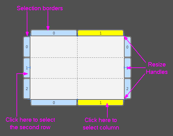
在“内容”面板中看不到空的未选中网格窗格。要使其边框可见,请在“层次”面板中单击该网格窗格元素的相应图层。要使用特定的网格窗格,请直接在其周界内单击,但不要单击它包含的任何元素。选中后,网格窗格将被淡蓝色的边框选项卡包围,并显示每个相应的索引号,如图8-6所示. 要选择单个列或行,请在选择边框选项卡内单击。所选列或行的选项卡将显示黄色背景,如图8-6中的列1所示. 您还可以同时选择多行或多列,以便一次编辑这些选定项目的值。但是,您不能同时选择行或列的组合。
Figure 8-6 Grid Pane in Selected Mode
Description of "Figure 8-6 Grid Pane in Selected Mode"
To see the submenu of actions that you can take on a Grid Pane, do one of the following:
要查看可以在网格窗格上执行的操作的子菜单,请执行以下操作之一:
-
Right-click anywhere over the grid pane, select a command from the contextual menu.
在网格窗格上的任意位置单击鼠标右键,从上下文菜单中选择命令。
-
From the Main menu, select Modify and then Grid Pane.
从主菜单中,选择“修改”,然后选择“网格窗格”。
You can move a row up or down, and move a column left or right. You can also delete or add a row or column, and increase or decrease the span for a row or column.
您可以向上或向下移动行,向左或向右移动列。您还可以删除或添加行或列,并增加或减少行或列的跨度。
The Layout section of the Inspector panel also enables you to modify the currently selected Grid Pane. The properties related to the selected row or column are displayed and can be managed in the GridPane Row or GridPane Column sections.
检查器面板的布局部分还允许您修改当前选定的网格窗格。与所选行或列相关的属性将显示出来,可以在GridPane行或GridPane列部分进行管理。
You can move an element from one grid cell to another existing grid cell. In the Content panel, select the element that you want to relocate, and with the mouse button pressed, drag the element to the target grid cell, as shown in Figure 8-7. Notice that the target grid cell changes to have a gray background as soon as you hover your cursor over it. When you release the mouse button, the element is moved to the target grid cell location in the Grid Pane.
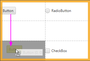
可以将图元从一个网格单元移动到另一个现有网格单元。在Content面板中,选择要重新定位的元素,按下鼠标按钮,将元素拖动到目标网格单元格,如图8-7所示. 请注意,一旦将光标悬停在目标网格单元格上,该单元格就会变为灰色背景。松开鼠标按钮后,该元素将移动到网格窗格中的目标网格单元格位置。
Figure 8-7 Moving an Element to Another Grid Cell
Description of "Figure 8-7 Moving an Element to Another Grid Cell"
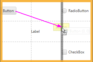
To move an element to a new row or column that has not yet been created, select the element in the Content panel and drag it to the divider line that is between the rows or columns where you want the new row or column to be inserted. As you hover the mouse over the cell divider, the cell divider line becomes thicker and gray. When you release the cursor, the new row or column is created, and the element is dropped in the target grid cell. Figure 8-8 shows a Button element being dragged to a new grid cell on the second row of a new column that is about to be inserted.
要将元素移动到尚未创建的新行或列,请在“内容”面板中选择该元素,并将其拖动到要插入新行或列的行或列之间的分隔线。当您将鼠标悬停在单元格分隔符上时,单元格分隔符线会变粗变灰。释放光标时,将创建新行或列,并将元素放入目标网格单元格中。图8-8显示了一个Button元素被拖动到即将插入的新列的第二行上的新网格单元格中。
Figure 8-8 Moving an Element to a New Row or Column
Description of "Figure 8-8 Moving an Element to a New Row or Column"
Working with a Border Pane Container
The Border Pane container enables you to layout GUI elements in the top, right, left, bottom, and center positions of the container. Use the Border Pane in your layout by selecting the BorderPane element from the Container section of the Library panel and dragging it to the Content panel. Figure 8-9 shows the Hierarchy panel after the BorderPane element is added.
边框窗格容器使您能够在容器的顶部、右侧、左侧、底部和中心位置布局GUI元素。通过从库面板的容器部分选择BorderPane元素并将其拖动到内容面板,在布局中使用边框窗格。图8-9显示了添加BorderPane元素后的“层次结构”面板。
Figure 8-9 Hierarchy Panel After BorderPane Container Is Added
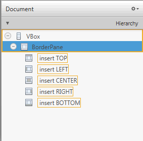
Description of "Figure 8-9 Hierarchy Panel After BorderPane Container Is Added"
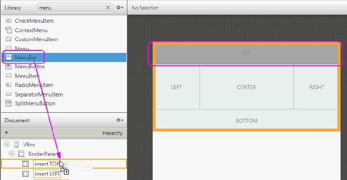
You can add a GUI element to the Border Pane container by dragging the element from the Library panel onto the specific position in the Border Pane. You can also drag an element from the Library panel to the Hierarchy panel, as shown in Figure 8-10. Notice that when the element is dragged over a target layer in the Hierarchy panel, the layer's corresponding position in the Border Pane changes to a darker shade of color, as shown on the right side of Figure 8-10.
通过将GUI元素从库面板拖动到边框窗格中的特定位置,可以将该元素添加到边框窗格容器中。您还可以将元素从“库”面板拖动到“层次”面板,如图8-10所示. 请注意,当将元素拖动到“层次”面板中的目标层上时,该层在“边框窗格”中的对应位置会变为较深的颜色,如图8-10右侧所示.
Figure 8-10 Add Menu Bar Element to the BorderPane
Description of "Figure 8-10 Add Menu Bar Element to the BorderPane"
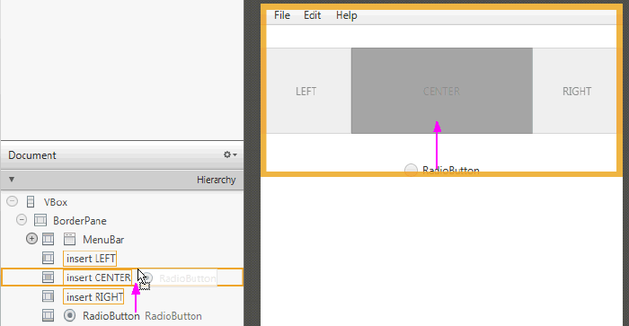
You can move an element from one position to another in the Border Pane. In the Content panel or the Hierarchy panel, select the element that you want to relocate and drag the element to the target position, as shown in Figure 8-11. Notice that the background color of the target position gets darker as soon as you hover your cursor over it. When you release the mouse button, the element is moved to the target position in the Border Pane.
您可以在边框窗格中将元素从一个位置移动到另一个位置。在Content面板或Hierarchy面板中,选择要重新定位的元素,并将元素拖动到目标位置,如图8-11所示. 请注意,一旦将光标悬停在目标位置上,目标位置的背景颜色就会变暗。松开鼠标按钮后,元素将移动到边框窗格中的目标位置。
Figure 8-11 Moving an Element to Another Position
Description of "Figure 8-11 Moving an Element to Another Position"
Using a Tab Pane Container
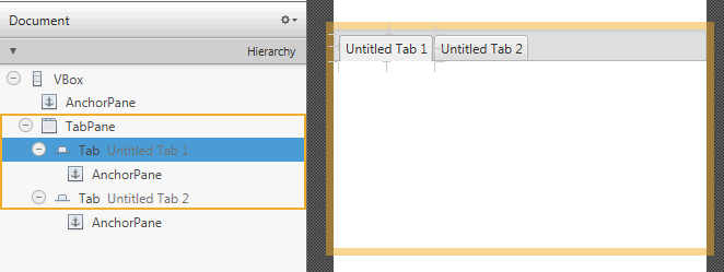
By default, the Tab Pane comes with two Tab elements, each of which contain an Anchor Pane element, as shown in Figure 8-12.
默认情况下,Tab Pane有两个Tab元素,每个元素都包含一个Anchor Pane元素,如图8-12所示.
Figure 8-12 Tab Pane Element Added in the Hierarchy Panel and Content Panel
Description of "Figure 8-12 Tab Pane Element Added in the Hierarchy Panel and Content Panel"
You can change a Tab element's default title by double-clicking the tab and directly editing its Text property in the Content panel. To add another Tab element to a Tab Pane container, drag and drop a Tab element from the Library panel to the Tab Pane in the Content panel or Hierarchy panel. The new Tab element is added to the right of any existing Tab elements. To change the order of the Tab elements within the Tab Pane, use the Hierarchy panel. Drag and drop the Tab element's row in the Hierarchy panel to the target location within the Tab Pane container. You can also use the Content panel to drag its tab to the target location within the Tab Pane container.
通过双击选项卡并在“内容”面板中直接编辑其“文本”属性,可以更改选项卡元素的默认标题。要将另一个Tab元素添加到Tab Pane容器中,请将Tab元素从库面板拖放到内容面板或层次结构面板中的Tab窗格。新的Tab元素将添加到任何现有Tab元素的右侧。要更改选项卡窗格中选项卡元素的顺序,请使用“层次”面板。将“层次”面板中的Tab元素行拖放到Tab Pane容器中的目标位置。您还可以使用“内容”面板将其选项卡拖动到“选项卡窗格”容器中的目标位置。
To add GUI elements to a Tab element's Anchor Pane, click the title of the target Tab element to select it. Drag and drop the GUI element that you want to add from the Library panel to the Tab element, as shown in Figure 8-13.
要将GUI元素添加到Tab元素的锚窗格中,请单击目标Tab元素的标题将其选中。将要添加的GUI元素从库面板拖放到Tab元素中,如图8-13所示.
Figure 8-13 Add GUI Elements from Library Panel to the Tab Element in Content Panel
Description of "Figure 8-13 Add GUI Elements from Library Panel to the Tab Element in Content Panel"
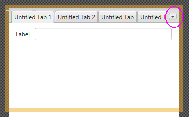
Depending on the length of each Tab element's title and the number of Tab elements in your Tab Pane container, there comes a point when some Tabs become hidden. When this occurs, a drop-down menu is automatically added to the Tab Pane container's menu bar, as shown in Figure 8-14. This drop-down menu enables the tab of choice to be selected. This menu is not active in the Content panel, but is functional when you view the layout in the Preview window. If the Tab Pane container is resized so that all the Tab elements are fully visible, the drop-down menu is automatically removed from the Tab Pane's menu bar.
根据每个Tab元素标题的长度和Tab窗格容器中Tab元素的数量,某些Tab会隐藏起来。发生这种情况时,下拉菜单会自动添加到Tab Pane容器的菜单栏中,如图8-14所示. 此下拉菜单允许选择选项卡。此菜单在“内容”面板中未处于活动状态,但在“预览”窗口中查看布局时可以使用。如果调整选项卡窗格容器的大小,使所有选项卡元素完全可见,则下拉菜单将自动从选项卡窗格的菜单栏中删除。
Figure 8-14 Tab Pane with Multiple Tab Elements and a Drop-Down Menu
Description of "Figure 8-14 Tab Pane with Multiple Tab Elements and a Drop-Down Menu"
Working with Menu Controls
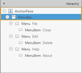
The Controls section of the Library panel contains three menu-related control elements: MenuBar, Menu Button, and Split Menu Button. When you drag and drop a MenuBar from the Library panel onto the Content panel, it comes populated with Menu elements that are labeled File, Edit, and Help. By default, each of these Menu elements contains one Menu Item element, as shown in Figure 8-15.
库面板的控件部分包含三个与菜单相关的控件元素:菜单栏、菜单按钮和拆分菜单按钮。当您将菜单栏从“库”面板拖放到“内容”面板上时,它将填充标记为“文件”、“编辑”和“帮助”的菜单元素。默认情况下,这些菜单元素中的每一个都包含一个菜单项元素,如图8-15所示.
Figure 8-15 Menu Bar and Its Contents Displayed in the Hierarchy Panel
Description of "Figure 8-15 Menu Bar and Its Contents Displayed in the Hierarchy Panel"
The Menu and Menu Item elements do not have graphical representations that are visible in the Content panel, so you can only use the Hierarchy panel to select and manage these elements. You can change the order of how the Menu elements are displayed in the Menu bar by selecting the Menu element in the Hierarchy panel and dragging it to a new location within the Menu where you want it to appear. You can directly modify the text property of the Menu or Menu Item element by selecting it and clicking on the text area, which puts you into edit mode. You can also use the Properties section of the Inspector panel to modify the Text field.
菜单和菜单项元素没有在“内容”面板中可见的图形表示,因此您只能使用“层次”面板来选择和管理这些元素。您可以通过在“层次”面板中选择“菜单”元素并将其拖动到“菜单”中要显示的新位置,来更改“菜单”图元在“菜单栏”中的显示顺序。您可以直接修改菜单或菜单项元素的文本属性,方法是选择它并单击文本区域,这将使您进入编辑模式。您还可以使用“检查器”面板的“属性”部分修改“文本”字段。
You can add other menu-related items, such as another Menu Item or a Separator Menu Item, by dragging the element from the Library panel to the desired Menu location in the Hierarchy panel. To create a second-level menu, drop a Menu element within an already existing Menu element in the Hierarchy panel.
通过将元素从“库”面板拖动到“层次”面板中的所需菜单位置,可以添加其他与菜单相关的项目,例如另一个菜单项或分隔符菜单项。要创建二级菜单,请在“层次”面板中的现有菜单元素中拖放一个菜单元素。
Use the Preview menu to see your Menu bar in action. From the Preview window, you can click a Menu item and any of its submenus.
使用预览菜单查看菜单栏的运行情况。在预览窗口中,您可以单击菜单项及其任何子菜单。
9 Defining Properties in the Inspector Panel
This chapter describes the JavaFX Scene Builder tool's Inspector panel, including its Properties, Layout, and Code sections.
本章介绍JavaFX场景生成器工具的检查器面板,包括其属性、布局和代码部分。
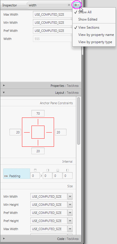
On the right side of the Content panel is the Inspector panel, as shown in Figure 9-1 with the Layout section expanded and the Inspector menu displayed. The Inspector panel is also referred to as the Right Side panel. It contains an Accordion container with multiple sections. The top section contains a Search text field, which you can use to quickly locate the properties you would like to edit. The search results are displayed in the top section, as shown in Figure 9-1. You can directly modify the properties by using the Search Results section. You can display the Inspector menu by clicking the drop-down arrow at the top right corner, which is circled in Figure 9-1. By default, the Show All and View Sections modes are chosen. selecting the Show Edited mode displays only the properties that appears explicitly in the FXML file. For example, only the Text, LayoutX, and LayoutY properties are displayed in the Inspector panel when a Button element is dropped from the Library panel. selecting the View by property name or the View by property type modes display all the properties in a single tabbed section, ordered either by name or type.
内容面板的右侧是检查器面板,如图9-1所示展开布局部分并显示检查器菜单。检查器面板也称为右侧面板。它包含一个具有多个部分的Accordion容器。顶部包含一个搜索文本字段,您可以使用它快速定位要编辑的属性。搜索结果显示在顶部,如图9-1所示. 您可以使用“搜索结果”部分直接修改属性。您可以通过单击右上角的下拉箭头来显示检查器菜单,该箭头在图9-1中被圈出. 默认情况下,选择“显示全部”和“查看截面”模式。选择“显示已编辑”模式仅显示FXML文件中明确显示的属性。例如,当从库面板中删除按钮元素时,检查器面板中只显示文本、布局X和布局Y属性。选择“按属性名称查看”或“按属性类型查看”模式,所有属性都将显示在一个选项卡部分中,按名称或类型排序。
The Properties, Layout, and Code sections give you access to properties for the selected GUI element. Each displayed property name shown in the sections is a representation of the corresponding given property name in the JavaFX API. For example, minWidth property in the JavaFX API is displayed in the Inspector panel as Min Width. When you click on the property name, a browser window is opened and displays the corresponding JavaFX API name for the property and its description.
属性、布局和代码部分允许您访问所选GUI元素的属性。各节中显示的每个显示的属性名称都是JavaFX API中相应给定属性名称的表示。例如,JavaFX API中的minWidth属性在“检查器”面板中显示为Min Width。单击属性名称时,将打开浏览器窗口,并显示属性的相应JavaFX API名称及其说明。
You can hide the Inspector panel by selecting View from the Main menu and then selecting Hide Right Side Panel. This feature enables you to have more room for the Content panel. Select View and then Show Right Side Panel to make the panel visible again.
您可以通过从主菜单中选择“视图”,然后选择“隐藏右侧面板”来隐藏“检查器”面板。此功能使您能够为“内容”面板提供更多空间。选择“视图”,然后选择“显示右侧面板”以使面板再次可见。
Figure 9-1 Inspector Panel with the Search Results Displayed and Layout Section Opened
Properties Section
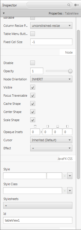
The Properties section of the Inspector panel, shown in Figure 9-2, enables you to define the style of the selected element in the Hierarchy panel or the Content panel.
检查器面板的属性部分,如图9-2所示,使您能够在“层次”面板或“内容”面板中定义选定元素的样式。
Figure 9-2 Properties Section of the Inspector Panel
Description of "Figure 9-2 Properties Section of the Inspector Panel"
When the fx:id value is assigned for the selected GUI element via the Code Section, that same value is also assigned to the Id field in the CSS subsection of the Properties section only if that Id field is null.
当通过代码部分为所选GUI元素分配fx:id值时,只有当Id字段为“null”时,该值才会分配给Properties部分CSS子部分中的Id字段。
The Style, Style Class, and Stylesheets text areas in the JavaFX CSS subsection enable you to specify the style rule and style sheet to use for a particular GUI component and all of its children components. You can add, delete, and put in order the style sheets that will be applied. See the Styling with CSS and the CSS Analyzer chapter in this document for additional information.
JavaFX CSS小节中的样式、样式类和样式表文本区域使您能够指定用于特定GUI组件及其所有子组件的样式规则和样式表。您可以添加、删除和整理将要应用的样式表。请参阅使用CSS和CSS分析器进行样式设置本文档中的第章提供了更多信息。
A property value can be overridden by a CSS styling defined in a CSS file or in the Style property. A CSS icon is added to the left side of the affected property whose property value is overridden by a CSS file definition, as shown in Figure 9-3. You can navigate to the CSS file or Style property by clicking the property field.
属性值可以被CSS文件或Style属性中定义的CSS样式覆盖。CSS图标被添加到受影响属性的左侧,其属性值被CSS文件定义覆盖,如图9-3所示. 您可以通过单击属性字段导航到CSS文件或样式属性。
Figure 9-3 CSS Icon for Overridden Property Value
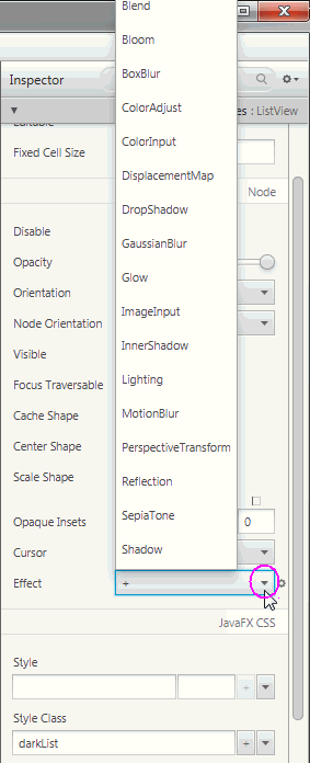
You can go from one property to another by pressing the Tab key. A new value for a property is saved when you press Enter or when you move to another property field. You can manipulate the look of the selected GUI element by directly changing the value of its properties that are available and editable. For example, you can define the effects of a selected list view element by clicking the down arrow button to display the menu of available effects, as shown in Figure 9-4. From the list of effects available, you can select one or more effects to apply to the selected GUI element.
按Tab键可以从一个属性转到另一个属性。按Enter键或移动到另一个特性字段时,将保存特性的新值。您可以通过直接更改所选GUI元素的可用和可编辑属性的值来操纵其外观。例如,您可以通过单击向下箭头按钮显示可用效果的菜单来定义所选列表视图元素的效果,如图9-4所示. 从可用效果列表中,您可以选择一个或多个效果应用于所选GUI元素。
Figure 9-4 Effects Menu in the Properties Section of the Inspector Panel
Description of "Figure 9-4 Effects Menu in the Properties Section of the Inspector Panel"
The remaining properties displayed on the Properties section of the Inspector panel depend on the type of GUI element that is selected in either the Content panel or in the Hierarchy panel. For example, if you select a radio button, toggle button, or radio menu item in the Content panel, the Properties section shows the Toggle Group property. You can use this property to assign the same ToggleGroup id for each toggle control that you want to add to a toggle group.
在“检查器”面板的“属性”部分显示的其余属性取决于在“内容”面板或“层次结构”面板中选择的GUI元素的类型。例如,如果在“内容”面板中选择单选按钮、切换按钮或单选菜单项,则“属性”部分将显示“切换组”属性。您可以使用此属性为要添加到切换组的每个切换控件分配相同的“切换组id”。
When an invalid value is entered for a property, a dialog window appears and prompts you to select one of these commands: Fix the Value or Revert to Previous Value. The focus returns to the text field with the invalid property value if you select the Fix the Value command.
当为属性输入无效值时,会出现一个对话框窗口,提示您选择以下命令之一:“修复值”或“还原为上一个值”。如果选择“修复值”命令,焦点将返回到具有无效属性值的文本字段。
If a property is allowed to have a value list assigned to it, a single empty item is initially shown by default. To add an item, click the + button and enter or select the value. Click the down arrow to display the menu that allows you to remove, move up or move down an item for the value list.
如果允许为属性分配值列表,则默认情况下最初会显示一个空项。要添加项目,请单击+按钮并输入或选择值。单击向下箭头显示菜单,允许您删除、向上移动或向下移动值列表中的项目。
When multiple objects of the same type (for example, two button elements) are selected in the Content panel or the Hierarchy panel, and if any of the properties have a different value, the minus sign (-) is displayed in the text field for that property. If a new value is entered, then the new value is set for all the selected objects.
在“内容”面板或“层次”面板中选择多个相同类型的对象(例如,两个按钮元素)时,如果任何属性具有不同的值,则该属性的文本字段中会显示减号(-)。如果输入了新值,则会为所有选定对象设置新值。
If multiple objects of different types are selected in the Content or Hierarchy panel, the properties which are common to all objects are displayed.
如果在“内容”或“层次”面板中选择了不同类型的多个对象,则将显示所有对象共有的属性。
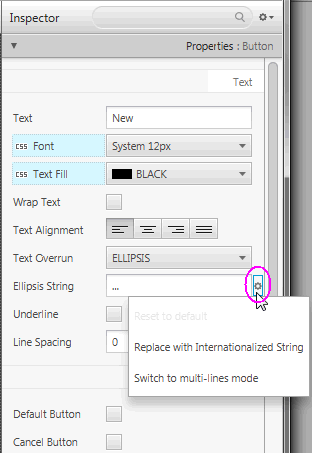
There are some properties that have a cog menu that appears on the right side of the property field when the mouse hovers over the property value editor, as shown in Figure 9-5. The cog menu provides specific actions that can be used for that editor. For example, you can reset the current property value to the default value in the JavaFX API by selecting Reset to default command. Figure 9-5 shows actions available for an Ellipsis String.
有些属性有一个齿轮菜单,当鼠标悬停在属性值编辑器上时,该菜单会出现在属性字段的右侧,如图9-5所示. 齿轮菜单提供了可用于该编辑器的特定操作。例如,您可以通过选择“重置为默认值”命令,在JavaFX API中将当前属性值重置为默认的值。图9-5显示了椭圆字符串可用的操作。
Figure 9-5 Cog Menu for Property Value Editors
Description of "Figure 9-5 Cog Menu for Property Value Editors"
Any numeric value can be increased or decreased using the Up or Down arrow keys, respectively. Using the Shift-Up and Shift-Down keys increase and decrease the number value by 10, respectively.
分别使用向上或向下箭头键可以增加或减少任何数值。使用Shift Up和Shift Down键分别将数值增加和减少10。
The editor for the Insets, Margins, and Padding properties allows you to enter the first value (Top) and set the same value to the remaining three text fields (Right, Bottom, Left) using the following steps:
“插入、边距”和“填充”属性的编辑器允许您输入第一个值(顶部),并使用以下步骤为其余三个文本字段(右侧、底部、左侧)设置相同的值:
-
Enter the value in the first property text field.
在第一个属性文本字段中输入值。
-
Press the Tab key and the focus is placed on the link button.
按Tab键,焦点将放在链接按钮上。
-
Press the Enter key to apply the property value you just entered to the remaining three property text fields.
按Enter键将刚才输入的属性值应用于其余三个属性文本字段。
Figure 9-6 illustrates the uniform values assigned to the Margin property for the Buttons in an HBox.
图9-6说明了为HBox中按钮的Margin属性分配的统一值。
Figure 9-6 Margin Property Editor
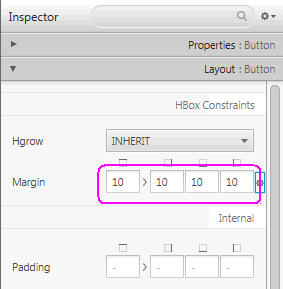
Auto Suggest editors are available for all properties that have predefined values. When you click in the property's text field, a list of suggested values are displayed. The list is filtered as you start typing in the text field.
自动建议编辑器可用于具有预定义值的所有属性。当您在属性的文本字段中单击时,将显示建议值的列表。当您开始在文本字段中键入时,列表会被过滤。
Some property values require paths to external resource files, such as image files or CSS files. You can specify the file paths using one of the formats listed in Table 9-1.
某些属性值需要指向外部资源文件(如图像文件或CSS文件)的路径。您可以使用表9-1中列出的格式之一指定文件路径.
Table 9-1 File Path Formats for External Resource Files
| File Format Types | Example |
|---|---|
| Absolute path | C:/johndoe/css/myCss.css |
| Path relative to the current FXML document's location | @../css/myCss.css |
| Path relative to the class or resource file location | @/com/oracle/myProject/resources/myCss.css |
A Paint Editor is available for properties that can have color for its value. When you click on the property value field, the Paint Editor window appears. In Figure 9-7 the Paint Editor window is displayed for the Text Fill color property of the selected Button element. You can change the color value for the GUI element by moving the cursor along the color palette.
绘制编辑器可用于可以为其值设置颜色的属性。单击特性值字段时,将显示“绘制编辑器”窗口。如图9-7所示将显示所选Button元素的“文本填充”颜色属性的“绘制编辑器”窗口。通过沿调色板移动光标,可以更改GUI元素的颜色值。
Figure 9-7 Paint Editor for Color
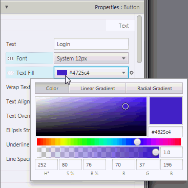
Description of "Figure 9-7 Paint Editor for Color"
When you click on the Linear Gradient or Radial Gradient tab, the Text Fill property value is changed accordingly to Linear Gradient or Radiant Gradient. The Linear or Radial editor section of the Paint Editor is displayed. Figure 9-8 shows the Linear section for the Text Fill property. From that section, you can adjust the gradient values by moving the available sliders on sides until you see the desired color hues you are trying to achieve. Values for additional properties are displayed and can be edited from the editor as well.
当您单击“线性渐变”或“径向渐变”选项卡时,“文本填充”属性值会相应地更改为“线性梯度”或“辐射梯度”。将显示“绘制编辑器”的“线性”或“径向”编辑器部分。图9-8显示了“文本填充”属性的“线性”部分。从该部分,您可以通过移动侧面的可用滑块来调整渐变值,直到看到您想要实现的所需色调。显示其他属性的值,也可以从编辑器中编辑。
As you adjust the color, linear gradient, or radiant gradient for the particular GUI element, the adjustments are also simultaneously reflected on the GUI element that is displayed in the Content panel.
当您调整特定GUI元素的颜色、线性渐变或辐射渐变时,这些调整也会同时反映在“内容”面板中显示的GUI元素上。
Figure 9-8 Linear Gradient Editor
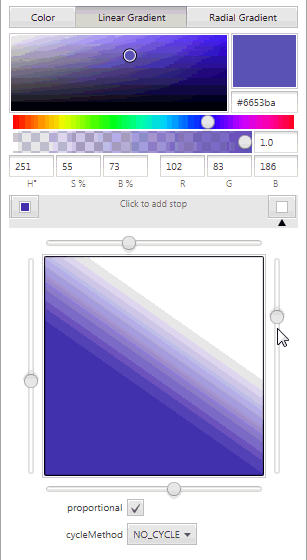
Description of "Figure 9-8 Linear Gradient Editor"
Layout Section
The Layout section of the Inspector panel, shown in Figure 9-9, helps you to specify the runtime behavior of the layout when the application's window is resized. It also enables you to change the size (such as, Pref Width and Pref Height) and position (such as, Layout X and Layout Y) of the selected element. Some of the information displayed in the Layout section pertains to the selected element itself (such as Min Width, Max Height, or Pref Width), and some of the information depends on the type of the container element. If the selected element is contained in an AnchorPane container, then an AnchorPane section is present in the Layout section. If the selected element is contained in a Grid Pane container, then there is a Grid Pane subsection in the Layout section of the Inspector panel. Some containers, however, do not have any associated contextual information, and so no contextual container subsection appears in the Layout section.
检查器面板的布局部分,如图9-9所示,帮助您指定调整应用程序窗口大小时布局的运行时行为。它还允许您更改所选元素的大小(如“预置宽度”和“预置高度”)和位置(如“布局X”和“布局Y”)。“布局”部分中显示的一些信息与所选元素本身有关(如“最小宽度”、“最大高度”或“预置宽度”),一些信息取决于容器元素的类型。如果所选元素包含在AnchorPane容器中,则布局部分中会出现AnchorPanes部分。如果所选元素包含在网格窗格容器中,则检查器面板的布局部分中有一个网格窗格子部分。但是,某些容器没有任何关联的上下文信息,因此布局部分中不会出现上下文容器子部分。
The AnchorPane Constraints subsection only appears when a selected element has an AnchorPane as its most immediate container. For example, in Figure 9-9, the selected HBox element's container is an AnchorPane. You can use either the diagram or the text fields in the AnchorPane Constraint subsection to manage the anchor pane's anchors. The anchors help you manage the behavior of the selected GUI element when you resize the window. You can click the anchor lines to specify whether the object's size changes as the application's window is adjusted. The lines change from solid black lines to solid red lines when you click them. You can also specify the numerical values in the fields around the diagram. A grayed out numerical value means the anchor is disabled. You can use the Tab key to navigate between the anchor fields.
仅当选定元素的最直接容器为AnchorPane时,才会显示AnchorPane-约束子部分。例如,在图9-9中,所选HBox元素的容器是AnchorPane。您可以使用“锚点窗格约束”子部分中的图表或文本字段来管理锚点窗格的锚点。锚点可帮助您在调整窗口大小时管理所选GUI元素的行为。您可以单击定位线来指定对象的大小是否会随着应用程序窗口的调整而更改。单击线条时,线条会从纯黑线变为纯红线。您还可以在图表周围的字段中指定数值。灰色数值表示锚点已禁用。您可以使用Tab键在锚点字段之间导航。
If the HBox element's most immediate container is a StackPane element, then the top subsection of the Layout section will be labeled as StackPane Constraints and different editable properties will be displayed.
如果HBox元素最直接的容器是StackPane元素,则布局部分的顶部子部分将被标记为StackPane约束,并显示不同的可编辑属性。
The Transforms subsection enable you to define settings for different types of transformations, such as rotation, scaling, and translation.
“变换”子部分允许您定义不同类型变换的设置,如旋转、缩放和平移。
Figure 9-9 Layout Section of the Inspector Panel
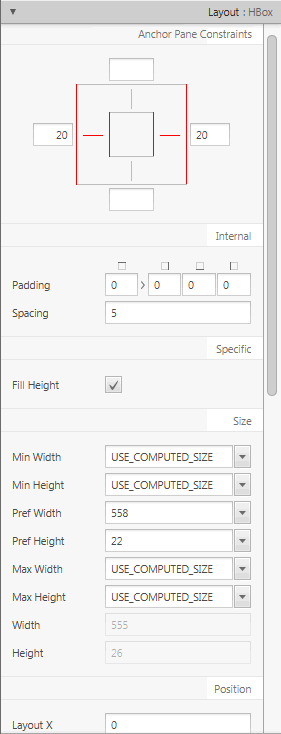
Description of "Figure 9-9 Layout Section of the Inspector Panel"
Code Section
Figure 9-10 displays the opened Code section when the New button element is selected in the Hierarchy panel. In the fx:id field, you can assign a unique value for the selected GUI element. You can select from the drop-down list of available variables if you already assigned the controller source class to use with your FXML layout.
图9-10在“层次”面板中选择“新建”按钮元素时,显示打开的“代码”部分。在fx:id字段中,您可以为所选GUI元素分配一个唯一的值。如果您已经指定了与FXML布局一起使用的控制器源类,则可以从可用变量的下拉列表中进行选择。
Figure 9-10 Code Section of the Inspector Panel When the New Button is Selected
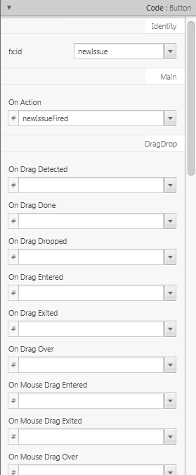
Description of "Figure 9-10 Code Section of the Inspector Panel When the New Button is Selected"
The Code section enables you to specify the action that should be taken when a drag-and-drop, keyboard, mouse, or any other event occurs on the selected element. From the drop-down list on the event text field, select the corresponding command that should be executed when a specific event or events occur for that GUI element. The given command is a call to the controller method event handler. It is specified by a leading number sign (#), which is already added by default, followed by the name of the handler method. The method is expected to conform to the signature of a standard event handler, which means that it takes a single argument of a type that extends the javafx.event.Event class and should return void. For example, Figure 9-10 shows that when the OnAction event occurs on the button, the newIssueFired() controller method is executed.
代码部分允许您指定在所选元素上发生拖放、键盘、鼠标或任何其他事件时应采取的操作。从事件文本字段的下拉列表中,选择当该GUI元素发生特定事件时应执行的相应命令。给定的命令是对控制器方法事件处理程序的调用。它由前导数字符号(#)指定,默认情况下已经添加了前导数字符号,后面是处理程序方法的名称。该方法应符合标准事件处理程序的签名,这意味着它接受扩展javafx.event.Event的单个参数。事件类,应返回void。例如,图9-10显示了当按钮上发生OnAction事件时,将执行newIssueFired()控制器方法。
When you click View from the Menu bar and then select Show Sample Controller Skeleton, a text editor window appears and displays the source file example of what the method should look like in your controller source code. You can copy the contents of the skeleton source file to customize as you please.
当您从菜单栏中单击“查看”,然后选择“显示示例控制器骨架”时,将出现一个文本编辑器窗口,显示该方法在控制器源代码中应该是什么样子的源文件示例。您可以复制骨架源文件的内容进行自定义。
10 Internationalizing Your FXML Layout
This chapter discusses the internationalization support that is provided with JavaFX Scene Builder.
本章讨论JavaFX场景生成器提供的国际化支持。
The JavaFX Scene Builder tool enables you to adapt your FXML layout to various languages and regions through the use of resource bundle files. When you add a new element to the Content panel, the element's visible property values are set to default values. For example, a button element has a default Text property value of Button. This default value can be changed with an internationalized string by hovering the cursor over the right of the Text property text field, clicking the round cog icon that appears, and then selecting Replace with Internationalized String, as shown in Figure 10-1. Notice that the default value is then replaced by %key.unspecified, which you need to replace with the appropriate resource key name that is defined in your resource file. The percent sign (%) prefix is a visible indicator that the Text property value following it is a resource key name. You can still use the percent sign as a first character for the Text property value. If you have not selected the Replace with Internationalized String setting, then in the FXML file, the percent sign will appear as %. This indicates that the rest of the property value has no link with internationalization and that it is not a key name.
JavaFX场景生成器工具使您能够通过使用资源包文件使FXML布局适应各种语言和地区。将新元素添加到“内容”面板时,元素的可见属性值将设置为默认值。例如,按钮元素的默认Text属性值为button。通过将光标悬停在Text属性文本字段的右侧,单击出现的圆形齿轮图标,然后选择替换为国际化字符串,可以使用国际化字符串更改此默认值,如图10-1所示. 请注意,默认值随后被%key.unspecified替换,您需要将其替换为资源文件中定义的相应资源键名。百分号(%)前缀是一个可见的指示符,表示其后的Text属性值是资源键名。您仍然可以将百分号用作Text属性值的第一个字符。如果您没有选择“替换为国际化字符串”设置,则在FXML文件中,百分号将显示为%。这表示属性值的其余部分与国际化无关,也不是键名。
Figure 10-1 Internationalizing a Button Element
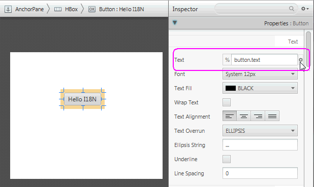
Description of "Figure 10-1 Internationalizing a Button Element"
The HelloI18N sample can help show the internationalization support. The sample is included with the JavaFX Scene Builder samples bundle. Its Main class shows how to load the resource bundle. The sample includes the Bundle.properties and Bundle_fr_FR.properties files. When you open the <javafx-scenebuilder-samples-2_0-install-dir>/HelloI18N/src/helloi18n/HelloI18N.fxml file, the FXML file is opened in its own window and you see a button that is labeled %button.text. To localize this label, select Preview from the Menu bar, select Internationalization, Set Resource, and then open the <javafx-scenebuilder-samples-2_0-install-dir>/HelloI18N/src/helloi18n Bundle.properties file.
HelloI18N示例可以帮助展示国际化支持。该示例包含在JavaFX场景生成器示例包中。它的Main类显示了如何加载资源包。该示例包括Bundle.properties和Bundle_fr_fr属性文件。当您打开<javafx-seneubuilder-samples-2_0-install-dir>/HelloI18N/src/HelloI18N/HelloI18N.fxml文件时,fxml文件将在其自己的窗口中打开,您会看到一个标记为%button.text的按钮。要本地化此标签,请从菜单栏中选择“预览”,选择“国际化”,“设置资源”,然后打开<javafx-scenebuilter-samples-2_0-install-dir>/HelloI18N/src/HelloI18N Bundle.properties文件。
Figure 10-2 shows that the button element's Text property value was set to use the button.text resource key, which is defined in the Bundle.properties file as having the value of HelloI18N. The percent sign in front of the Text property's text field is a visible indicator that the value in the text field is a resource name. If you replace the value assigned to button.text in the Bundles.properties file and save the change, the new value is immediately reflected in the button displayed on the Content panel. You can define additional resource keys in your resource bundle files and use them in the FXML layout you are building.
图10-2显示按钮元素的Text属性值已设置为使用button.Text资源键,该资源键在Bundle.properties文件中定义为具有HelloI18N的值。Text属性文本字段前的百分号是一个可见的指示器,表示文本字段中的值是资源名称。如果替换Bundles.properties文件中分配给button.text的值并保存更改,则新值将立即反映在“内容”面板上显示的按钮中。您可以在资源包文件中定义其他资源键,并在您正在构建的FXML布局中使用它们。
Select the Preview from the Main menu, then Internationalization command, and then Set Resource. In the select Internationalization Resource File dialog box, select the Bundle_fr_FR.properties file to see how the HelloI18N sample application appears when using the French resource file. Notice that the text displayed on the button is now Bonjour. Changes you make and save to the resource file are reflected in the FXML layout you are working on in the JavaFX Scene Builder tool.
从主菜单中选择预览,然后选择国际化命令,再选择设置资源。在“选择国际化资源文件”对话框中,选择“Bundle_fr_fr.properties”文件,查看使用法语资源文件时HelloI18N示例应用程序的显示方式。请注意,按钮上显示的文本现在是Bonjour。您对资源文件所做的更改和保存的更改会反映在您在JavaFX场景生成器工具中正在处理的FXML布局中。
Figure 10-2 Using Resource Key Value to Internationalize the Text Property Value
Description of "Figure 10-2 Using Resource Key Value to Internationalize the Text Property Value"
11 Styling with CSS and the CSS Analyzer
This chapter describes the Cascading Style Sheet (CSS) support and describes the CSS Analyzer feature that JavaFX Scene Builder provides.
本章介绍级联样式表(CSS)支持,并介绍JavaFX场景生成器提供的CSS分析器功能。
The JavaFX GUI controls used by Scene Builder are pre-styled with the default JavaFX Modena look and feel. Scene Builder immediately renders this predefined JavaFX style when you drag the GUI control from the Library panel to the Content or Hierarchy panels. You can change the JavaFX theme used in your layout by selecting Preview from the Menu bar and selecting one of the JavaFX themes, as shown in Figure 11-1. From the drop-down list you can select a Modena-based theme specific for your target platform. You can also select Caspian-based theme, which was the default theme used in the JavaFX 2.x releases. You can also customize the style used in your application by changing the component's properties via the Properties section of the Inspector panel or by defining your own styling rules in a CSS file.
Scene Builder使用的JavaFX GUI控件采用默认的JavaFX Modena外观和感觉进行预样式设置。当您将GUI控件从“库”面板拖动到“内容”或“层次”面板时,场景生成器会立即渲染此预定义的JavaFX样式。您可以通过从菜单栏中选择Preview并选择其中一个JavaFX主题来更改布局中使用的JavaFX主题,如图11-1所示. 从下拉列表中,您可以选择特定于目标平台的基于Modena的主题。您还可以选择基于里海的主题,这是JavaFX 2.x版本中使用的默认主题。您还可以通过“检查器”面板的“属性”部分更改组件的属性,或在CSS文件中定义自己的样式规则,来自定义应用程序中使用的样式。
Figure 11-1 JavaFX Theme Menu
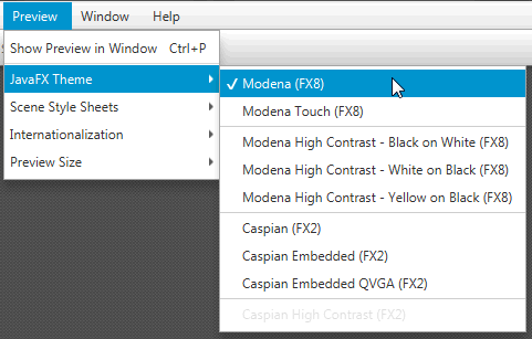
Description of "Figure 11-1 JavaFX Theme Menu"
Scene Builder currently does not generate CSS files, but enables you to use your local CSS editor to create and modify your CSS file. The changes you save in the CSS file that is used by the current FXML layout displayed in the Content panel is immediately rendered by Scene Builder.
场景生成器目前不生成CSS文件,但允许您使用本地CSS编辑器创建和修改CSS文件。保存在CSS文件中的更改由“内容”面板中显示的当前FXML布局使用,场景生成器会立即渲染这些更改。
You can add the CSS rules at the Scene level, within a given container, or by an inline styling at the Node level. By using the Stylesheets list view in the JavaFX CSS subsection of the Properties section of the Inspector panel, you can assign a CSS file to use on a selected GUI element in your FXML layout if that GUI element is either a container or a GUI control. You can attach a style sheet to any part of your FXML layout, from the topmost parent GUI element to the lowest.
您可以在场景级别、给定容器内或通过节点级别的内联样式添加CSS规则。通过使用检查器面板属性部分的JavaFX CSS小节中的样式表列表视图,您可以指定一个CSS文件,用于FXML布局中选定的GUI元素,如果该GUI元素是容器或GUI控件。您可以将样式表附加到FXML布局的任何部分,从最顶部的父GUI元素到最底部。
The left side of Figure 11-2 shows the Properties section of the Inspector panel with the IssueTracking.css file assigned to the topmost VBox container used in the layout. The right side of the figure shows the darkList style class assigned to the ListView element. The darkList style class is defined in the IssueTracking.css style sheet and inherited by the ListView element from its container parent, the topmost VBox container.
图11-2左侧显示了“检查器”面板的“属性”部分,其中IssueTracking.css文件分配给布局中使用的最顶部的VBox容器。图的右侧显示了分配给ListView元素的darkList样式类。darkList样式类在IssueTracking.css样式表中定义,并由ListView元素从其容器父级(最顶部的VBox容器)继承。
Figure 11-2 Properties Section with Style Class and Style Sheet List Views Displayed
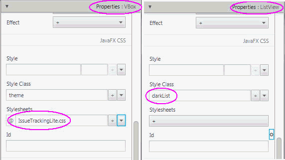
CSS rules that are defined on a parent element can be used to style the parent GUI element itself and all of its children elements. You can define the specific style class to use with a GUI element by adding it to the Style Class property in the Properties section of the Inspector panel. The CSS files referenced from the Stylesheets properties are referenced from within the FXML file and so they are deployed with the FXML file.
在父元素上定义的CSS规则可用于设置父GUI元素本身及其所有子元素的样式。通过将GUI元素添加到“检查器”面板“属性”部分的“样式类”属性中,可以定义与GUI元素一起使用的特定样式类。从Stylesheets属性引用的CSS文件是从FXML文件中引用的,因此它们与FXML文件一起部署。
In Scene Builder, you can simulate the attachment of a style sheet to an application Scene by selecting Preview, then Scene Style Sheets, and finally selecting Add a Style Sheet or Open a Style Sheet option. This Preview command is useful when the ”root” style class is defined in the style sheet. In this case, once the style sheet is attached to the Scene, the styles defined in the ”root” class are applied to the layout in the Content panel.
在场景生成器中,您可以通过选择“预览”,然后选择“场景样式表”,最后选择“添加样式表”或“打开样式表”选项来模拟样式表附着到应用程序“场景”。当在样式表中定义“根”样式类时,此预览命令非常有用。在这种情况下,一旦样式表附着到场景,在“根”类中定义的样式就会应用于“内容”面板中的布局。
You can edit an existing CSS file with your system editor by using the following steps:
您可以使用系统编辑器通过以下步骤编辑现有的CSS文件:
-
In the Properties section of the Inspector panel, locate the Stylesheets property and click on the CSS file you want to edit.
在“检查器”面板的“属性”部分,找到“样式表”属性,然后单击要编辑的CSS文件。
-
Click the drop-down arrow on the bottom right of the list view, as shown in Figure 11-3.
点击列表视图右下角的下拉箭头,如图11-3所示.
-
Select the Open command for the CSS file you want to edit.
选择要编辑的CSS文件的“打开”命令。
You can reveal the CSS file's location in your system using the Reveal command that is also available in the drop-down menu. You can also navigate to the CSS file via the CSS Analyzer panel, as explained later in Using the CSS Analyzer Panel.
您可以使用下拉菜单中的reveal命令来显示CSS文件在系统中的位置。您还可以通过CSS分析器面板导航到CSS文件,如稍后在使用CSS分析器面板中所述.
Figure 11-3 Open CSS File From the Properties Section of the Inspector Panel
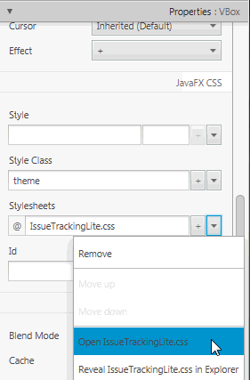
Description of "Figure 11-3 Open CSS File From the Properties Section of the Inspector Panel"
Using the CSS Analyzer Panel
The CSS Analyzer Panel enables you to understand how various possible CSS rules can affect aspects of a currently selected GUI element. It displays a synoptic view of all the possible sources for the property values. Each CSS property value assigned to a certain aspect of the selected GUI element may originate from either the API or predefined CSS rules. The sources are listed in prioritized order, which enables you to understand why a given source takes precedence over another. The panel also provides a means for you to navigate to the source of CSS property value to help you develop and troubleshoot CSS stylesheets.
CSS分析器面板使您能够了解各种可能的CSS规则如何影响当前选定GUI元素的各个方面。它显示了属性值的所有可能来源的概要视图。分配给所选GUI元素的某个方面的每个CSS属性值可以源自API或预定义的CSS规则。源按优先级顺序列出,这使您能够理解为什么给定的源优先于另一个源。该面板还为您提供了一种导航到CSS属性值源的方法,以帮助您开发和排除CSS样式表。
The CSS Analyzer panel is not displayed by default. To display the panel, select View from the Main menu and then Show CSS Analyzer, as shown in Figure 11-4.
默认情况下不显示CSS分析器面板。要显示面板,请从主菜单中选择View,然后选择Show CSS Analyzer,如图11-4所示.
Figure 11-4 Show CSS Analyzer
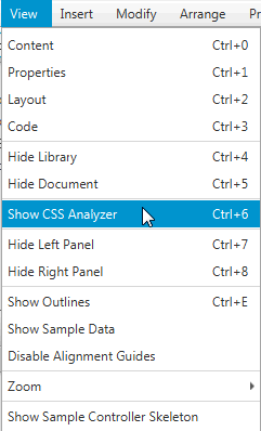
Description of "Figure 11-4 Show CSS Analyzer"
The CSS Analyzer panel appears at the bottom of the Main window, similar to what is shown in Figure 11-5.
CSS分析器面板出现在主窗口的底部,类似于图11-5所示.
Figure 11-5 CSS Analyzer Panel Displayed
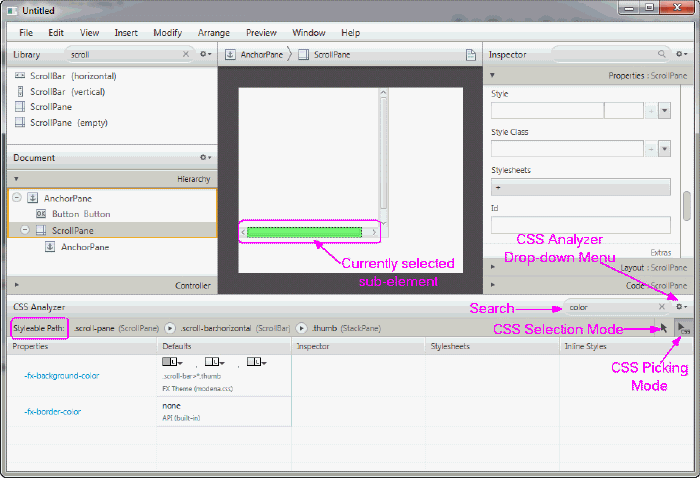
Description of "Figure 11-5 CSS Analyzer Panel Displayed"
The panel includes the following sections, most of which are highlighted in Figure 11-5.
该面板包括以下部分,其中大部分在图11-5中突出显示.
-
Search text field: Located at the top right corner of the panel. It enables you to isolate the specific properties that you want to view.
搜索文本字段:位于面板的右上角。它使您能够隔离要查看的特定属性。
-
CSS Analyzer Menu: Located to the right of the Search text field. Click on the drop-down arrow to see the menu of available commands, as shown in Figure 11-6.
CSS分析器菜单:位于搜索文本字段的右侧。点击下拉箭头查看可用命令菜单,如图11-6所示.
-
View As: Enables you to select the display format for the style properties. The default is Table view. The Rules view mode displays the properties in CSS rules formatting. The Text view mode displays the properties in text styling.
查看方式:允许您选择样式属性的显示格式。默认设置为“表”视图。“规则”视图模式以CSS规则格式显示属性。文本视图模式以文本样式显示属性。
-
Copy Styleable Path: Enables you to copy the current value in the Styleable Path text field and you can paste it into your CSS file to modify the style of the currently selected component or its sub-element.
复制可样式路径:允许您复制“可样式路径”文本字段中的当前值,并将其粘贴到CSS文件中,以修改当前选定组件或其子元素的样式。
-
Hide Properties with Default Values: Removes from view all the properties that only have default values assigned to them. Properties that have non-default values, such as Stylesheets and Inline Styles, continue to be displayed. The Show Properties with Default Values shows all the properties for the component.
隐藏具有默认值的属性:从视图中删除仅指定了默认值的所有属性。具有非默认值的属性(如样式表和内联样式)将继续显示。“显示具有默认值的属性”显示组件的所有属性。
-
Split Defaults: Refreshes the view of the properties to include two columns for the default values of the style properties: API Defaults and the FX Theme Defaults. The Join Defaults command displays the combined default values into a single column, which is the default.
拆分默认值:刷新属性视图以包含两列样式属性的默认值:API默认值和FX主题默认值。“连接默认值”命令将组合的默认值显示在一列中,这是默认值。
Figure 11-6 CSS Analyzer Menu
-
-
Styleable Path text field: Located on the top left corner of the panel. It enables you to discover the sub-elements when you click on the arrows in the path. You can copy that path using the CSS Analyzer menu and paste the path in your CSS file to assign a new style value.
可设置样式的路径文本字段:位于面板的左上角。它使您能够在单击路径中的箭头时发现子元素。您可以使用CSS分析器菜单复制该路径,并将该路径粘贴到CSS文件中以分配新的样式值。
-
CSS Picking Mode button: Located below the Search text field. This is the default mode when CSS Analyzer is opened. It allows you to select a sub-element of the currently selected component. In Figure 11-5, the CSS Picking Mode button is selected. This allowed you to select the bottom horizontal scrollbar of the ScrollPane component in the Content panel. The scrollbar is highlighted in yellow to indicate that it is the currently selected sub-element of the ScrollPane. Correspondingly, the Styleable Path shows the complete path to the currently selected element. This feature shows how skins can be styled.
CSS拣选模式按钮:位于搜索文本字段下方。这是打开CSS分析器时的默认模式。它允许您选择当前选定组件的子元素。如图11-5所示,选择CSS拾取模式按钮。这允许您在“内容”面板中选择“滚动窗格”组件的底部水平滚动条。滚动条以黄色突出显示,表示它是ScrollPane的当前选定子元素。相应地,Styleable Path显示了当前选定元素的完整路径。此功能显示了如何设置皮肤样式。
-
CSS Selection Mode button: Located next to the CSS Picking Mode button. It is the standard selection mode and allows you to select a component.
CSS选择模式按钮:位于CSS拾取模式按钮旁边。这是标准选择模式,允许您选择组件。
-
Properties column: First column in the table. Displays all of the available style properties that is available for the currently selected element.
Properties列:表中的第一列。显示当前选定图元可用的所有样式特性。
-
Defaults column: Displays the default values, both from the API and the JavaFX theme, that are delivered for the style property.
默认值列:显示API和JavaFX主题中为样式属性提供的默认值。
-
Inspector column: Displays the property value that has been set using the Inspector panel. Some properties appear in both the Properties section of the Inspector panel and the CSS Analyzer panel. To edit these properties, hover the mouse cursor in the corresponding cell of the CSS Analyzer panel and click the cog icon in the top right corner to select Reveal in Inspector. The corresponding property is highlighted with a blue ring in the Properties section of the Inspector panel.
检查器列:显示使用检查器面板设置的属性值。某些属性同时出现在“检查器”面板的“属性”部分和“CSS分析器”面板中。要编辑这些属性,请将鼠标光标悬停在CSS分析器面板的相应单元格中,然后单击右上角的齿轮图标,选择检查器中的显示。在“检查器”面板的“属性”部分中,相应的属性用蓝色环突出显示。
-
Stylesheets column: Displays the value that is defined for the property via the CSS file set in the Stylesheets text view in the Properties section of the Inspector panel. The name of the CSS file the value is derived from is included in the column. You can also click on the cog icon on the upper right corner of the cell and select the Open command to open your CSS file in your default CSS editor.
样式表列:显示通过“检查器”面板“属性”部分“样式表”文本视图中的CSS文件集为属性定义的值。从中导出值的CSS文件的名称包含在列中。您还可以单击单元格右上角的齿轮图标,然后选择“打开”命令,在默认的CSS编辑器中打开CSS文件。
-
Inline Styles column: Displays the inline style value that is defined for the property via the Style text view in the JavaFX CSS subsection of the Properties section of the Inspector panel. You can select the Reveal in Inspector command using the cell's cog icon on the upper right corner of the table cell to display the Style text view in the Inspector panel.
内联样式列:显示通过检查器面板的属性部分的JavaFX CSS子部分中的样式文本视图为属性定义的内联样式值。您可以使用表格单元格右上角的单元格齿轮图标选择“在检查器中显示”命令,以在检查器面板中显示样式文本视图。
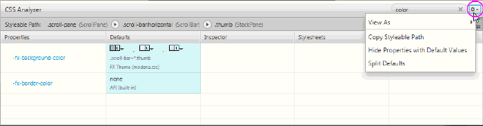
You can modify the properties values from your CSS file. Alternatively, you can use the JavaFX CSS subsection of the Properties section of the Inspector panel to either edit a CSS property or use the Style property to override any CSS property.
您可以从CSS文件中修改属性值。或者,您可以使用检查器面板的属性部分的JavaFX CSS子部分来编辑CSS属性或使用样式属性覆盖任何CSS属性。
When a CSS property value is assigned to a currently selected GUI component, the new style is immediately rendered in the Content panel.
当CSS属性值被分配给当前选定的GUI组件时,新样式会立即在“内容”面板中呈现。
To learn more about the CSS Analyzer's functionalities, use the following steps to customize the Button component to have rounded edges and use that style for all buttons that are subsequently added to your FXML layout.
要了解有关CSS分析器功能的更多信息,请使用以下步骤自定义按钮组件,使其具有圆角边缘,并对随后添加到FXML布局中的所有按钮使用该样式。
-
Drag a Button from the Library to the Content panel.
将按钮从库拖动到内容面板。
You will see the CSS Analyzer displays the value of -fx -background-radius, shown in Figure 11-7, as one of the CSS properties for the button.
您将看到CSS分析器显示-fx-背景半径的值,如图11-7所示,作为按钮的CSS属性之一。
Figure 11-7 A Button's Properties Displayed in CSS Analyzer
![Description of Figure 11-7 follows]()
Description of "Figure 11-7 A Button's Properties Displayed in CSS Analyzer " -
Click the -fx -background-radius property name in the Properties column and you are taken to the corresponding online API documentation in the
JavaFX CSS Reference Guide, which provides the syntax you can use with each property's value.单击Properties(属性)列中的-fx-background-radius属性名称,您将进入
JavaFX CSS Reference Guide中相应的在线API文档,它提供了可以用于每个属性值的语法。 -
Modify the -fx-background-radius property value.
修改-fx背景半径属性值。
-
In the Scene Builder window, click on the Properties section of the Inspector panel.
在“场景生成器”窗口中,单击“检查器”面板的“属性”部分。
-
Click in the Style text field located in the JavaFX CSS sub-section and select -fx-background-radius from the drop-down list.
单击JavaFX CSS子部分中的样式文本字段,然后从下拉列表中选择-fx背景半径。
-
Enter
10pxin the Style text field of the JavaFX CSS subsection, as shown in Figure 11-8.在JavaFX CSS小节的样式文本字段中输入“10px”,如图11-8所示.
Notice that the Button component in the Content panel is now rounded around the corners. Also, in the CSS Analyzer panel, you'll see that the row for the -fx-background-radius property now has two values: the default and the inline style value of 10px that you just entered in the Style property, as shown in Figure 11-8. That cell's background color also changed to blue, which indicates that the value is now the current value being rendered on the currently selected component
请注意,“内容”面板中的“按钮”组件现在已围绕角进行圆角处理。此外,在CSS分析器面板中,您将看到-fx background radius属性的行现在有两个值:默认值和刚刚在style属性中输入的10px内联样式值,如图11-8所示. 该单元格的背景颜色也变为蓝色,这表示该值现在是当前选定组件上渲染的当前值
Figure 11-8 Making a Button Rounded
-
-
Create a CSS rule so that you can apply the new button style to all of the buttons you add to your current FXML layout.
创建一个CSS规则,以便您可以将新的按钮样式应用于添加到当前FXML布局中的所有按钮。
-
Using your system's command, create am empty CSS file, e.g.
test.css, in the same directory that contains your current FXML layout.使用系统的命令,在包含当前FXML布局的同一目录中创建空CSS文件,例如
test.CSS。 -
In the Properties section of the Inspector panel, click the + button in the Stylesheets property, as indicated in Figure 11-8.
在检查器面板的属性部分,单击样式表属性中的+按钮,如图11-8所示.
-
In the Add Style Sheet dialog, navigate to the
test.cssfile location, select it, and click Open to add it to the Stylesheets property.在“添加样式表”对话框中,导航到“test.css”文件位置,选择它,然后单击“打开”将其添加到“样式表”属性中。
You'll see the
test.cssfile added in the Stylesheets property.您将看到在Stylesheets属性中添加了
test.css文件。 -
Edit the
test.cssfile by clicking on the down arrow in Stylesheets property and select Open test.css.通过单击Stylesheets属性中的向下箭头编辑
test.css文件,然后选择Open test.css。 -
Add the following CSS rule to
test.cssand save the file.将以下CSS规则添加到
test.CSS并保存文件。Example 11-1 Add CSS Rule for a Rounded Button
.button { -fx-background-radius: 10px; } -
Select the button again in the Content panel. Notice that in the CSS Analyzer panel, the button is now inheriting the CSS rule from the
test.cssfile because the button is a child of the AnchorPane component. Since it still has the inline style value assigned to it, that value has precedence and is the style rendered in the Content panel. If you do not have a need to change the style for this particular button, you can remove that style value from the Properties section of the Inspector panel.在“内容”面板中再次选择按钮。请注意,在CSS分析器面板中,按钮现在继承了
test.CSS文件中的CSS规则,因为按钮是AnchorPane组件的子级。由于它仍然具有指定的内联样式值,因此该值具有优先级,并且是“内容”面板中呈现的样式。如果不需要更改此特定按钮的样式,可以从“检查器”面板的“属性”部分删除该样式值。
-
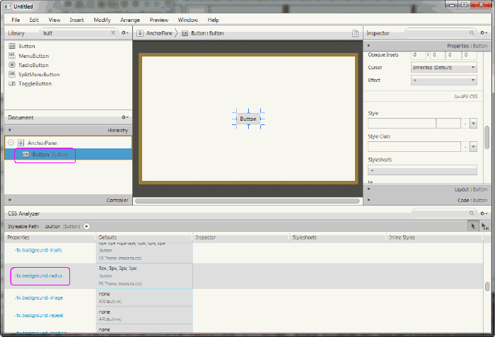
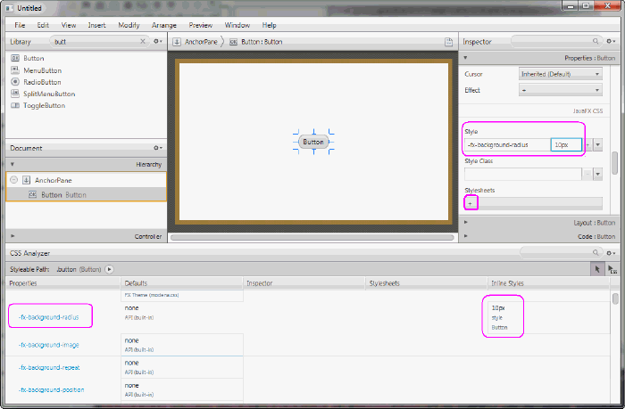
12 Next Step
Now that you are familiar with the JavaFX Scene Builder user interface, use Getting Started with JavaFX Scene Builder to create a simple issue-tracking application.
现在您已经熟悉了JavaFX场景生成器用户界面,请使用JavaFX场景构建器入门创建一个简单的问题跟踪应用程序。
本文来自博客园,作者:积跬步小流臹千里江海,转载请注明原文链接:https://www.cnblogs.com/Hloveandshare/p/18847950

 浙公网安备 33010602011771号