
关于css3的边框的border-radius和border-image用法的详解
一、圆角边框:IE9.0以前版本不支持
border-radius: 接受8个属性,前四个为x轴,后四个为y轴,以斜杠划分x轴、y轴,即border-radius:左上较 右上角 右下角 左下角 / 左上角 右上角 右下 角 左下角 ;(x轴/y轴 ),如:border-radius: 100px 0 100px 0/100px 0 100px 0。
顺序图:

原理图:
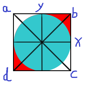

原理:
以四个角a,b,c,d 为起点,横向为x轴,纵向为y轴,以左上角x轴100px,y轴100px两点之间为弧,四个角交点为圆心的的四分之一圆,同样右下角也是,即border-radius: 100px 0 100px 0/100px 0 100px 0。
效果一:

代码:


 1 <!doctype html>
 2 <html lang="en">
 3 <head>
 4 <meta charset="UTF-8">
 5 <title>Document</title>
 6 <style type="text/css">
 7 .div1{
 8 width: 200px;
 9 height: 200px;
10 background-color: red;
11 border-radius: 100px 0 100px 0/100px 0 100px 0;
12 }
13 </style>
14 </head>
15 <body>
16 <div class="div1"></div>
17 </body>
18 </html>
效果二:

原理:
左下角x轴50px,y轴50px;border-radius: 0 0 0 50px/0 0 0 50px;
代码:
 1 <!doctype html>
 2 <html lang="en">
 3 <head>
 4 <meta charset="UTF-8">
 5 <title>Document</title>
 6 <style type="text/css">
 7 .div1{
 8 width: 200px;
 9 height: 200px;
10 background-color: red;
11 border-radius: 0 0 0 50px/0 0 0 50px;
12 }
13 </style>
14 </head>
15 <body>
16 <div class="div1"></div>
17 </body>
18 </html>
效果三:

原理:
div宽度200px,高度100px,四个角x轴100px,y轴50px,即border-radius: 100px/50px;
代码:
 1 <!doctype html>
 2 <html lang="en">
 3 <head>
 4 <meta charset="UTF-8">
 5 <title>Document</title>
 6 <style type="text/css">
 7 .div1{
 8 width: 200px;
 9 height: 100px;
10 background-color: red;
11 border-radius: 100px/50px;
12 }
13 </style>
14 </head>
15 <body>
16 <div class="div1"></div>
17 </body>
18 </html>
19
效果四:

原理:
以100px为半径:border-radius: 100px,给圆添加100px的border:border:100px solid #ccc,再把要空缺的部分颜色变透明:border-right: 100px solid transparent。
代码:
 1 <!doctype html>
 2 <html lang="en">
 3 <head>
 4 <meta charset="UTF-8">
 5 <title>Document</title>
 6 <style type="text/css">
 7 .div1{
 8 width: 0px;
 9 border-radius: 100px;
10 border:100px solid #ccc;
11 border-right: 100px solid transparent;
12 }
13 </style>
14 </head>
15 <body>
16 <div class="div1"></div>
17 </body>
18 </html>
二、图像边框:IE9.0及以下均不支持
border-image:url() 该属性用于指定边框宽度(上 右 下 左 ) 背景图的填充方式([ stretch | repeat | round ]默认值:stretch )
)
stretch: 指定用拉伸方式来填充边框背景图。
repeat: 指定用平铺方式来填充边框背景图。当图片碰到边界时,如果超过则被截断。
round: 指定用平铺方式来填充边框背景图。图片会根据边框的尺寸动态调整图片的大小直至正好可以铺满整个边框。
如:border-image: url(1.png) 49% repeat; border-image: url(1.png) 125 202 166 166 round;
例子:
使用的背景图:

效果一:

原理:
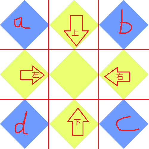
上下左右各以166px的距离分割成九块,a,b,c,d四块分别为div的四个角,且每个角的背景图大小会自适应为border的大小,然后两个角之间的背景图根据div的boder除去四个角的大小进行拉伸。
代码:
 1 <!doctype html>
 2 <html lang="en">
 3 <head>
 4 <meta charset="UTF-8">
 5 <title>Document</title>
 6 <style type="text/css">
 7 div{
 8 height: 300px;
 9 width: 300px;
10 border-width: 50px;
11 border-image: url(1.png) 166 round;
12 background: #ccc;
13 }
14 </style>
15 </head>
16 <body>
17 <div></div>
18 </body>
19 </html>
效果二:

原理:
对背景图上下左右进行100%的切割,即div四个角为整张背景图,由于切割超过50%,两个角之间的背景图没有重合部分,所以border-image无法进行拉伸。
代码:
 1 <!doctype html>
 2 <html lang="en">
 3 <head>
 4 <meta charset="UTF-8">
 5 <title>Document</title>
 6 <style type="text/css">
 7 div{
 8 height: 300px;
 9 width: 300px;
10 border-width: 50px;
11 border-image: url(1.png) 100% round;
12 background: #ccc;
13 }
14 </style>
15 </head>
16 <body>
17 <div></div>
18 </body>
19 </html>

 浙公网安备 33010602011771号