【CSS】使用CSS实现正方体并旋转
<!doctype html>
<html lang="en">
<head>
    <meta charset="UTF-8">
    <meta name="viewport"
          content="width=device-width, user-scalable=no, initial-scale=1.0, maximum-scale=1.0, minimum-scale=1.0">
    <meta http-equiv="X-UA-Compatible" content="ie=edge">
    <title>Document</title>
    <style>
        * {
            margin: 0;
            padding: 0;
        }

        .box {
            width: 600px;
            height: 600px;
            margin: 0 auto;
            border: 5px solid gray;
            transform-style: preserve-3d;
            position: relative;
            transform: rotateY(30deg) rotateX(30deg);
            animation: run 5s linear infinite;
        }
        @keyframes run {
            0%{
                transform: rotateY(30deg) rotateX(30deg);
            }
            50%{
                transform: rotateY(300deg) rotateX(300deg);
            }
            100%{
                transform: rotateY(30deg) rotateX(30deg);
            }
        }

        .box div {
            width: 200px;
            height: 200px;
            position: absolute;
            left: 50%;
            top: 50%;
            margin-left: -100px;
            margin-top: -100px;
            line-height: 200px;
            text-align: center;
            font-size: 50px;
            color: whitesmoke;
            opacity: 0.5;
        }

        .box div:nth-child(1) {
            background: #F44336;
            transform: translateZ(100px);
        }

        .box div:nth-child(2) {
            background: #9C27B0;
            transform: translateX(-100px) rotateY(-90deg);
        }

        .box div:nth-child(3) {
            background: #3F51B5;
            transform: translateY(-100px) rotateX(90deg);
        }

        .box div:nth-child(4) {
            background: #4CAF50;
            transform: translateY(100px) rotateX(-90deg);
        }

        .box div:nth-child(5) {
            background: #FDD835;
            transform: translateX(100px) rotateY(90deg);
        }

        .box div:nth-child(6) {
            background: #455A64;
            transform: translateZ(-100px);
        }

    </style>
</head>
<body>
<div class="box">
    <div>1</div>
    <div>2</div>
    <div>3</div>
    <div>4</div>
    <div>5</div>
    <div>6</div>
</div>
</body>
</html>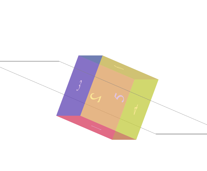
本文来自博客园,作者:木子欢儿,转载请注明原文链接:https://www.cnblogs.com/HGNET/p/16348648.html

 浙公网安备 33010602011771号