【CSS】实现折扇效果
<!doctype html>
<html lang="en">
<head>
    <meta charset="UTF-8">
    <meta name="viewport"
          content="width=device-width, user-scalable=no, initial-scale=1.0, maximum-scale=1.0, minimum-scale=1.0">
    <meta http-equiv="X-UA-Compatible" content="ie=edge">
    <title>Document</title>
    <style>
        * {
            margin: 0;
            padding: 0;
        }

        ul {
            list-style: none;
        }

        ul {
            margin: 10px auto;
            width: 600px;
            height: 400px;
            border: 5px solid gray;
            position: relative;
        }

        li {
            width: 60px;
            height: 200px;
            position: absolute;
            left: 50%;
            margin-left: -30px;
            bottom: 30px;
            text-align: center;
            /*调整旋转中心*/
            transform-origin:bottom center;
            border-radius: 10px;
            transition: all 3s;
            box-shadow: 10px 3px 10px 0.5px rgba(60, 60, 60, 0.64);
        }
        /*除了第7个其他都透明*/
        ul li:not(:nth-child(7)){
            opacity: 0;
        }
        ul:hover li{
            opacity: 1;
        }

        ul li:nth-child(1), ul li:nth-child(13) {
            background: #4A148C;
        }

        ul li:nth-child(2), ul li:nth-child(12) {
            background: #0D47A1;
        }

        ul li:nth-child(3), ul li:nth-child(11) {
            background: #D81B60;
        }

        ul li:nth-child(4), ul li:nth-child(10) {
            background: #4CAF50;
        }

        ul li:nth-child(5), ul li:nth-child(9) {
            background: #CDDC39;
        }

        ul li:nth-child(6), ul li:nth-child(8) {
            background: #FFA000;
        }

        ul li:nth-child(7) {
            background: #B71C1C;
        }
        ul:hover li:nth-child(1){
            transform: rotate(90deg);
        }
        ul:hover li:nth-child(13){
            transform: rotate(-90deg);
        }
        ul:hover li:nth-child(2){
            transform: rotate(75deg);
        }
        ul:hover li:nth-child(12){
            transform: rotate(-75deg);
        }
        ul:hover li:nth-child(3){
            transform: rotate(60deg);
        }
        ul:hover li:nth-child(11){
            transform: rotate(-60deg);
        }
        ul:hover li:nth-child(4){
            transform: rotate(45deg);
        }
        ul:hover li:nth-child(10){
            transform: rotate(-45deg);
        }
        ul:hover li:nth-child(5){
            transform: rotate(30deg);
        }
        ul:hover li:nth-child(9){
            transform: rotate(-30deg);
        }
        ul:hover li:nth-child(6){
            transform: rotate(15deg);
        }
        ul:hover li:nth-child(8){
            transform: rotate(-15deg);
        }
    </style>
</head>
<body>
<ul>
    <li>1</li>
    <li>2</li>
    <li>3</li>
    <li>4</li>
    <li>5</li>
    <li>6</li>
    <li>7</li>
    <li>8</li>
    <li>9</li>
    <li>10</li>
    <li>11</li>
    <li>12</li>
    <li>13</li>
</ul>
</body>
</html>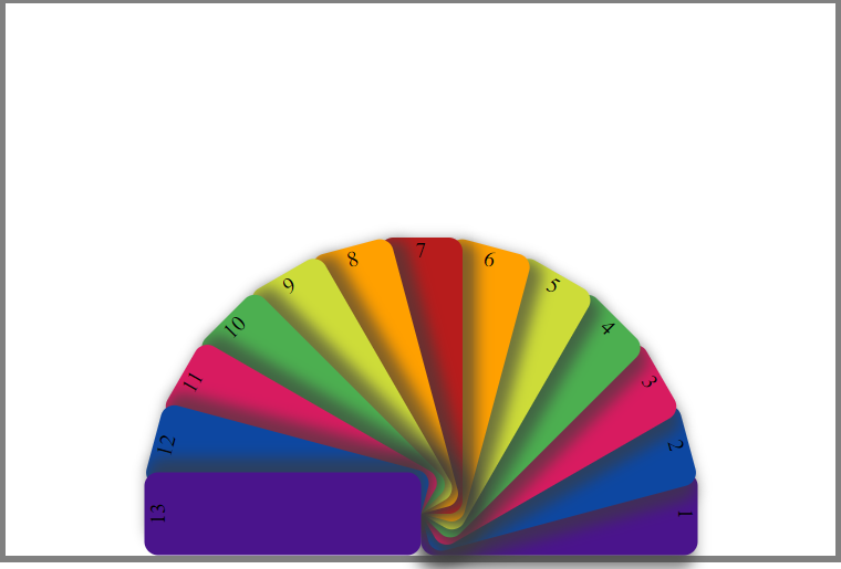
本文来自博客园,作者:木子欢儿,转载请注明原文链接:https://www.cnblogs.com/HGNET/p/16343636.html

 浙公网安备 33010602011771号