
CSS定位、布局设计
定位
1、定位组成
定位=定位模式+边偏移
1.定位模式决定元素的定位方式,通过css的positon属性来设置
| 值 | 语义 |
|---|---|
| static | 静态定位 |
| relative | 相对定位 |
| absolute | 绝对定位 |
| fixed | 固定定位 |
2.边偏移
| 边偏移属性 | 示例 | 描述 |
|---|---|---|
| top | top:88px | 顶端偏移量定义元素相对于其父元素上边框的距离 |
| bottom | bottom:80px | 顶端偏移量定义元素相对于其父元素上边框的距离 |
| left | left:80px | 顶端偏移量定义元素相对于其父元素上边框的距离 |
| right | right:80px | 顶端偏移量定义元素相对于其父元素上边框的距离 |
相对定位
相对于原来的位置来移动
不脱标,继续保留原来的位置
绝对定位
如果没有祖先元素或者祖先元素没有定位,则以浏览器为准定位.
如果祖先元素有定位(相对、绝对、固定定位),则以最近以及的有定位祖先元素为参考点移动位置。
子绝父相
因为父级需要占有位置,因此是相对定位,子盒子不需要占有位置,则是绝对定位
固定定位
- 以浏览器的可视窗口为参照点移动元素,
跟父元素没有任何关系
不随滚动条移动
固定定位不占用原先的位置
固定定位是脱标的,其实固定定位可以看做是一种特殊的绝对定位
固定定位小技巧
让固定定位的盒子left:50%,走到浏览器可视区 版心的一半位置
让固定定位的盒子margin-left:版心宽度的一半距离,多走版心宽度的一半距离就可以让固定定位的盒子贴着版心右侧对齐了
粘性定位sticky
{position:sticky;top:10px;}粘性特点:
以浏览器的可视窗口为参照点移动元素
粘性定位占有原先的位置
必须添加top、left、right、bottom其中一个才有效
3.定位小结
| 定位模式 | 是否脱标 | 移动位置 | 是否常用 |
|---|---|---|---|
| static静态定位 | 否 | 不能使用边偏移 | 很少 |
| relative相对定位 | 否(占有位置) | 相对于自身位置移动 | 常用 |
| absolute | 是(不占用位置) | 带有定位的父级 | 常用 |
| fixed固定定位 | 是(不占用位置) | 浏览器可视区 | 常用 |
| sticky粘性定位 | 否(占有位置) | 浏览器可视区 | 当前阶段少 |
2、定位叠放次序z-index
数值可以是正整数、负整数、0,默认是auto,数值越大盒子越靠上,
如果属性相同,则按照书写顺序,后来居上
数字后面不能加单位
只有定位的盒子才有z-index属性
绝对定位的盒子居中算法
加了绝对定位的盒子不能通过margin0 atuo水平居中,可以通过left:50%;
让盒子的左侧移动到父级元素的水平中心位置
margin-left:100px 让盒子向左移动自身宽度的一半
定位特殊特性
行内元素添加绝对或固定定位,可以直接设置高度和宽度。
块级元素添加绝对或者固定定位,如果不给宽度或高度,默认大小是内容的大小
脱标的盒子不会触发外边距塌陷
浮动元素、绝对定位元素的都不后悔触发外边距合并的问题
     /* 1.浮动的元素不会压住下面标准流的文字 */
            /* float: left; */
            /* 2. 绝对定位(固定定位) 会压住下面标准流所有的内容。 */
            position: absolute;
1.水平居中 绝对定位的盒子居中算法
left:50%;margin-left:width/2 ;
.promo-nav {
            position: absolute;
            bottom: 15px;
            left: 50%;
            margin-left: -35px;
            width: 70px;
            height: 13px;
            border-radius: 7px;
            background: rgba(255, 255, 255, .3);
        }
2.垂直居中
top为50% margin-top:height/2 ;
        .prev,
        .next {
            position: absolute;
            top: 50%;
            margin-top: -15px;
            width: 20px;
            height: 30px;
            line-height: 30px;
            text-decoration: none;
            color: #fff;
            background: rgba(0, 0, 0, .3);
        }
3、网页布局总结
1、标准流
可以让盒子上下排列或者左右排列,垂直的块级盒子显示就用标准流布局
2、浮动
可以让多个块级元素一行显示或者左右对齐盒子,多个块级盒子水平显示就用浮动布局
3、定位
定位最大的特点就是有层叠的概念,就是可以让多个盒子前后叠压来显示,如果元素自由的在某个盒子内移动就用定位布局
4、元素的显示与隐藏
本质: 让一个元素在页面中隐藏或者显示出来
display:none 隐藏对象
display:block;除了转换为块级元素之外,同时还有显示元素的意思
display隐藏元素后不再占有原来的位置
visibility 属性用于指定一个元素应可见还是隐藏
visibility:visible;元素可视
visibility:hidden;元素隐藏
visibility:隐藏元素后,继续占有原来的位置
 /* overflow: visible; */
            /* overflow: hidden; */
            /* scroll 溢出的部分显示滚动条  不溢出也显示滚动条 */
            /* overflow: scroll; */
            /* auto 溢出的时候才显示滚动条 不溢出不显示滚动条 */
            /* overflow: auto; */
1.土豆网显示隐藏遮罩实现
<!DOCTYPE html>
<html lang="en">

<head>
    <meta charset="UTF-8">
    <meta http-equiv="X-UA-Compatible" content="IE=edge">
    <meta name="viewport" content="width=device-width, initial-scale=1.0">
    <title>Document</title>
    <style>
        .tudou {
            position: relative;
            width: 444px;
            height: 320px;
            background-color: plum;
            margin: 30px auto;
        }

        .tudou img {
            width: 444px;
            height: 320px;
        }

        .mask {
            display: none;
            /* 绝对定位不占位置 */
            position: absolute;
            top: 0;
            left: 0;
            width: 100%;
            height: 100%;
            /* 不重复  居中 */
            background: rgba(0, 0, 0, .4) url(images/arr.png) no-repeat center;
        }

        .tudou:hover .mask {
            display: block;
        }
    </style>
</head>

<body>
    <div class="tudou">
        <div class="mask"></div>
        <img src="images/pic02.png" alt="">
    </div>
</body>

</html>
5.取消表单轮廓和防止拖拽文本域
<style>
        input, textarea {
            /* 取消表单轮廓 */
            outline: none;
        }
        textarea {
            /* 防止拖拽文本域 */
            resize: none;
        }
    </style>
</head>
<body>
    <!-- 1. 取消表单轮廓 -->
    <input type="text">
    <!-- 2. 防止拖拽文本域 -->
    <textarea name="" id="" cols="30" rows="10"></textarea>
6.用户界面鼠标样式
 <li style="cursor: default;">我是默认的小白鼠标样式</li>
        <li style="cursor: pointer;">我是鼠标小手样式</li>
        <li style="cursor: move;">我是鼠标移动样式</li>
        <li style="cursor: text;">我是鼠标文本样式</li>
        <li style="cursor: not-allowed;">我是鼠标禁止样式</li>
7.vertical-align实现行内块和文字垂直居中对齐
style="vertical-align: middle;" 图片底层默认空白缝隙 原因:行内块元素和文字的基线对齐 解决方案: 1.给图片天啊及vertical-align:middle|top|bottm等。 2.把图片转换为块级元素: display:block;
8.单行、多行溢出文字省略号显示
单行: /* 这个单词的意思是如果文字显示不开自动换行 */ /* white-space: normal; */ /* 1.这个单词的意思是如果文字显示不开也必须强制一行内显示 */ white-space: nowrap; /* 2.溢出的部分隐藏起来 */ overflow: hidden; /* 3. 文字溢出的时候用省略号来显示 */ text-overflow: ellipsis;多行 overflow: hidden; text-overflow: ellipsis; /* 弹性伸缩盒子模型显示 */ display: -webkit-box; /* 限制在一个块元素显示的文本的行数 */ -webkit-line-clamp: 3; /* 设置或检索伸缩盒对象的子元素的排列方式 */ -webkit-box-orient: vertical;
9.行内块使用

<!DOCTYPE html><html lang="en"><head> <meta charset="UTF-8"> <meta name="viewport" content="width=device-width, initial-scale=1.0"> <meta http-equiv="X-UA-Compatible" content="ie=edge"> <title>行内块的巧妙运用</title> <style> * { margin: 0; padding: 0; } .box { text-align: center; } .box a { display: inline-block; width: 36px; height: 36px; background-color: #f7f7f7; border: 1px solid #ccc; text-align: center; line-height: 36px; text-decoration: none; color: #333; font-size: 14px; } .box .prev, .box .next { width: 85px; } .box .current, .box .elp { background-color: #fff; border: none; } .box input { height: 36px; width: 45px; border: 1px solid #ccc; outline: none; } .box button { width: 60px; height: 36px; background-color: #f7f7f7; border: 1px solid #ccc; } </style></head><body> <div class="box"> <a href="#" class="prev"><<上一页</a> <a href="#" class="current">2</a> <a href="#">3</a> <a href="#">4</a> <a href="#">5</a> <a href="#">6</a> <a href="#" class="elp">...</a> <a href="#" class="next">>>下一页</a> 到第 <input type="text"> 页 <button>确定</button> </div></body></html>
10.css三角强化
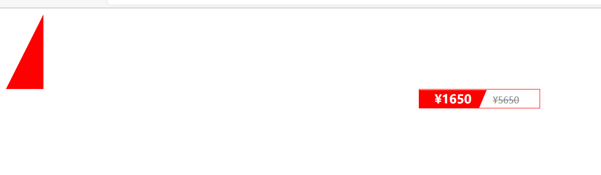
<!DOCTYPE html><html lang="en"><head> <meta charset="UTF-8"> <meta name="viewport" content="width=device-width, initial-scale=1.0"> <meta http-equiv="X-UA-Compatible" content="ie=edge"> <title>CSS三角强化的巧妙运用</title> <style> .box1 { width: 0; height: 0; /* 把上边框宽度调大 */ /* border-top: 100px solid transparent; border-right: 50px solid skyblue; */ /* 左边和下边的边框宽度设置为0 */ /* border-bottom: 0 solid blue; border-left: 0 solid green; */ /* 1.只保留右边的边框有颜色 */ border-color: transparent red transparent transparent; /* 2. 样式都是solid */ border-style: solid; /* 3. 上边框宽度要大, 右边框 宽度稍小, 其余的边框该为 0 */ border-width: 100px 50px 0 0 ; } .price { width: 160px; height: 24px; line-height: 24px; border: 1px solid red; margin: 0 auto; } .miaosha { position: relative; float: left; width: 90px; height: 100%; background-color:red; text-align: center; color: #fff; font-weight: 700; margin-right: 8px; } .miaosha i { position: absolute; right: 0; top: 0; width: 0; height: 0; border-color: transparent #fff transparent transparent; border-style: solid; border-width: 24px 10px 0 0; } .origin { font-size: 12px; color: gray; text-decoration: line-through; } </style></head><body> <div class="box1"></div> <div class="price"> <span class="miaosha"> ¥1650 <i></i> </span> <span class="origin">¥5650</span> </div></body></html>
11.css3抗锯齿形 让文字显示的更加清晰
-webkit-font-smoothing:antialiased;
12.css初始化
/* 所有标签的内外1边距清零 */ * { margin: 0; padding: 0 } /* em i的字体斜体不倾斜 */ em, i { font-style: normal } /* 去掉li的小圆点 */ li { list-style: none } img { /* border0照顾低版本浏览器 如果图片外面包含了链接会有边框的问题 */ border: 0; /* 行内块和文字垂直居中对齐 */ vertical-align: middle } button { /* 鼠标的样式为小手 */ cursor: pointer } a { color: #666; text-decoration: none } a:hover { color: #c81623 } button, input { font-family: Microsoft YaHei, Heiti SC, tahoma, arial, Hiragino Sans GB, "\5B8B\4F53", sans-serif } body { /* css3抗锯齿形,让文字显示更加的清晰 */ -webkit-font-smoothing: antialiased; background-color: #fff; font: 12px/1.5 Microsoft YaHei, Heiti SC, tahoma, arial, Hiragino Sans GB, "\5B8B\4F53", sans-serif; color: #666 } .hide, .none { display: none } .clearfix:after { visibility: hidden; clear: both; display: block; content: "."; height: 0 } .clearfix { *zoom: 1 } .mod_price { font-size: 14px; color: #e33333 }
13.多媒体标签
视频、音频
| 属性 | 值 | 描述 |
|---|---|---|
| autoplay | autoplay | 视频就绪自动播放(谷歌则需要添加muted来解决自动播放问题) |
| controls | controls | 向用户显示播放控件 |
| width | px | 设置播放器宽度 |
| height | px | 设置播放器高度 |
| loop | loop | 播放完是否继续播放改视频。,循环播放 |
| preload | auto none | 规定是否预加载视频(若有autoplay就忽略该属性) |
| src | url | 视频url地址 |
| poster | Imgurl | 加载等等的画面图片 |
| muted | muted | 静音播放 |
<video src="media/mi.mp4" autoplay="autoplay" muted="muted" loop="loop" poster="media/mi9.jpg"> <audio src="media/music.mp3" autoplay="autoplay" controls="controls">
14.H5新增属性
<form action=""> <ul> <li>邮箱: <input type="email" /></li> <li>网址: <input type="url" /></li> <li>日期: <input type="date" /></li> <li>时间: <input type="time" /></li> <li>数量: <input type="number" /></li> <li>手机号码: <input type="tel" /></li> <li>搜索: <input type="search" /></li> <li>颜色: <input type="color" /></li> <!-- 当我们点击提交按钮就可以验证表单了 --> <li><input type="search" name="sear" id="" required="required" placeholder="pink老师" autofocus="autofocus" autocomplete="off"></li> <li> <input type="file" name="" id="" multiple="multiple"></li> <li> <input type="submit" value="提交"></li> </ul> </form>
15.css属性选择器
<!DOCTYPE html><html lang="en"><head> <meta charset="UTF-8"> <meta name="viewport" content="width=device-width, initial-scale=1.0"> <meta http-equiv="X-UA-Compatible" content="ie=edge"> <title>CSS3新增属性选择器</title> <style> /* 必须是input 但是同时具有 value这个属性 选择这个元素 [] */ /* input[value] { color:pink; } */ /* 只选择 type =text 文本框的input 选取出来 */ input[type=text] { color: pink; } /* 选择首先是div 然后 具有class属性 并且属性值 必须是 icon开头的这些元素 */ div[class^=icon] { color: red; } section[class$=data] { color: blue; } div.icon1 { color: skyblue; } /* 类选择器和属性选择器 伪类选择器 权重都是 10 */ </style></head><body> <!-- 1. 利用属性选择器就可以不用借助于类或者id选择器 --> <!-- <input type="text" value="请输入用户名"> <input type="text"> --> <!-- 2. 属性选择器还可以选择属性=值的某些元素 重点务必掌握的 --> <input type="text" name="" id=""> <input type="password" name="" id=""> <!-- 3. 属性选择器可以选择属性值开头的某些元素 --> <div class="icon1">小图标1</div> <div class="icon2">小图标2</div> <div class="icon3">小图标3</div> <div class="icon4">小图标4</div> <div>我是打酱油的</div> <!-- 4. 属性选择器可以选择属性值结尾的某些元素 --> <section class="icon1-data">我是安其拉</section> <section class="icon2-data">我是哥斯拉</section> <section class="icon3-ico">哪我是谁</section></body></html>
16.结构伪类选择器
| 属性 | 描述 |
|---|---|
| first-child | /* 1. 选择ul里面的第一个孩子 小li |
| last-child | /* 1. 选择ul里面的最后一个孩子 小li |
| nth-child(n) | n可以是关键字、数字、公式、even偶数、odd奇数 |
注意:nth-child(2n)等价于even
nth-of-type和 nth-child区别
1 /* nth-child 会把所有的盒子都排列序号 */ /* 执行的时候首先看 :nth-child(1) 之后回去看 前面 div */ 2 /* nth-of-type 会把指定元素的盒子排列序号 */ /* 执行的时候首先看 div指定的元素 之后回去看 :nth-of-type(1) 第几个孩子 */nth-child对父元素里面的所有还在排序选择(序号是固定的),先找大是第n个孩子,然后看是否和E匹配无序列表常用nth-child较多,
17.伪元素选择器
before和after创建一个元素,但是属于行内元素
element::before{}
before和after必须有content属性
before在父元素内容的前面创建元素,after在父元素内容的后面插入元素
伪元素选择器和标签选择器一样,权重为1
18.css盒子模型
box-sizing:content-box 盒子的大小为width+padding+border
box-sizinh:border-box 盒子的大小为width
19.图片模糊处理
img { /* blur是一个函数 小括号里面数值越大,图片越模糊 注意数值要加px单位 */ filter: blur(15px); } img:hover { filter: blur(0); }
20.calc函数
width: calc(100% - 30px);
21.css过渡
/* transition: 变化的属性 花费时间 运动曲线 何时开始; */ /* transition: width .5s ease 0s, height .5s ease 1s; */ /* 如果想要写多个属性,利用逗号进行分割 */ /* transition: width .5s, height .5s; */ /* 如果想要多个属性都变化,属性写all就可以了 */ /* transition: height .5s ease 1s; */ /* 谁做过渡,给谁加 */ transition: all 0.5s;
22.进度条
.bar { width: 150px; height: 15px; border: 1px solid red; border-radius: 7px; padding: 1px; } .bar_in { width: 50%; height: 100%; background-color: red; /* 谁做过渡给谁加 */ transition: all .7s; } .bar:hover .bar_in { width: 100%; }

 浙公网安备 33010602011771号