
echart-图表位置改变
问题当legend比较长,图表和legend里的太近 可能会重叠挡住,效果不好
解决:
series: [
{
name:'人员级别',
type:'pie',
radius: ['35%', '70%'],
center: ['60%', '50%'],// 图表的位置 x,y方向
avoidLabelOverlap: false,
itemStyle: {
normal: {
//定义一个list,然后根据所以取得不同的值,这样就实现了,
color: function(params) {
// build a color map as your need.
var colorList = [
'#ffd733','#feb18b','#2fd0fd','#51cd97','#9151cd','#feb18b','#2fd0fd','#51cd97','#9151cd'
];
return colorList[params.dataIndex]
},
//以下为是否显示,显示位置和显示格式的设置了
label: {
show: true,
position: 'right',
formatter: '{b}\n{c}'
}
}
},
label: {
normal: {
//show: false,
//position: 'center'
},
emphasis: {
show: true,
textStyle: {
fontSize: '12',
fontWeight: 'bold'
},
rich: {
a: {
// color: '#8793a6',
fontSize: 15,
lineHeight:20
},
b: {
// color:'#464646',
fontSize: 20,
fontWeight:700
}
},
formatter: [
'{a|{b}}',
'{b|{c}}'
].join('\n')
}
},
labelLine: {
normal: {
show: true
}
},
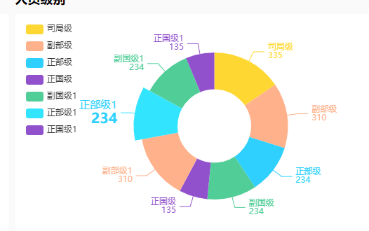
data:[
{value:335, name:'司局级'},
{value:310, name:'副部级'},
{value:234, name:'正部级'},
{value:234, name:'副国级'},
{value:135, name:'正国级'},
{value:310, name:'副部级1'},
{value:234, name:'正部级1'},
{value:234, name:'副国级1'},
{value:135, name:'正国级1'}
]
}
]
问题 Echart饼状图标注遮盖解决方案汇总

问题解决:链接

 浙公网安备 33010602011771号