两栏布局、三栏布局、水平垂直居中(良心整理,欢迎交流)
两栏布局:
1、float+margin
.block_left{
            float: left;
            width: 200px;  //左边定宽
            background-color: blue;
}
.block_right{           //右边自适应
            background-color: red;
            margin-left:200px;
}
2、定位
.content{
            position: relative;
            width: 100%;
        }
.block_left{
            position: absolute;
            width: 200px;
            background-color: blue;
}
.block_right{
            position: absolute;
            left: 200px;
            right: 0;
            background-color: red;
}
3、弹性布局
*{
            margin: 0;
            padding: 0;
        /*这是设置默认的内外边距。因为浏览器标签自带的属性是不统一的,设置为0。为了兼容所有的浏览器!*/
}
.flex-container{
            width: 100%;
            height: 300px;
            display: flex;
}
.block_left{
            background-color: blue;
            width: 20%;      //这个可以对其进行控制,左右占比
            flex:1 0 auto;   //设置其可扩展,不可压缩,且大小自适应
}
.block_right{
            background-color: red;
            width: 80%;
            flex:1 0 auto;
}
三栏布局:
1、float:left和float:right
优点:简单 缺点:中间部分最后加载,用户体验感不好
<style>
.left{ background-color: red; float: left; width: 100px; } .right{ background-color: red; width: 100px; float: right;
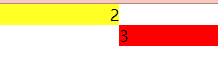
} .content{ background-color: green; margin-right: 100px; margin-left: 95px; } </style> <body> <!-- 必须要把类为content的div元素放在浮动元素之后,因为浮动元素不可以高于任何在源文档(html代码)之前的块元素或浮动元素,所以如果按照左中右的顺序摆放的话会出现以下情况-->
<div id="container"></div> <div class="left">1</div> <div class="right">3</div> <div class="content">2</div> </body>
2、BFC:即:在第一种方法的基础上,给content部分加上overflow:hidden来使其形成BFC,利用BFC不会与浮动元素重叠的规则
3、圣杯布局
<style>
        *{
            padding: 0;
            margin: 0;
        }
        #container{
            /* 让左右两栏占据container左右两边的填充 */
            padding-left:100px;
            padding-right: 100px;
            background-color: blue;
        }
        .left{
            background-color: red;
            float: left;
            position:relative;
            width: 100px;
            height: 100px;
            /* 这个100%是content部分相当于container的,就是指左列要越过中间列的宽度,跑到它前面去 */
            /* 浮动元素的margin值是相当于上一个相邻的浮动元素来计算的 */
            margin-left:-100%;
            left:-100px;
        }
        .right{
            background-color: red;
            width: 100px;
            height: 100px;
            float: left;
            position:relative;
            /* 此处的margin-left是相对于其相邻元素left的 */
            margin-left: -100px;
            right: -100px;
        }
        .content{
            float: left;
            background-color:yellow;
            width:100%;
            height: 100px;
        }
    </style>
</head>
<body>
    <!-- content部分先渲染 -->
<div id="container">
    <div class="content">2aaasadsfdff</div>
    <div class="left">1</div>
    <div class="right">3</div>
</div>
4、双飞翼布局
步骤几乎与圣杯布局一致,只是在中间部分多加了一层,通过对其设置margin值来消除遮挡
5、弹性布局
#container{
      display:flex;
}
.left{
      background-color: red;
      width: 100px;
      height: 100px;
      flex:0 1 auto;
      order:-1;  //渲染是首先渲染content部分,但是布局是要将left模块放到左边,order默认为0,所以设置其为-1,就可以位置领先于其它元素
}
.right{
      background-color: red;
      width: 100px;
      height: 100px;
      flex:0 1 auto;
}
.content{
      background-color:yellow;
      flex:1 0 auto;
      height: 100px;
}
</style>
<body>
    <!-- content部分先渲染 -->
<div id="container">
    <div class="content">2aaasadsfdff</div>
    <div class="left">1</div>
    <div class="right">3</div>
</div>
6、绝对定位:很简单,通过对三块区域设置绝对定位,然后通过left/right值来进行定位,就可以实现三栏布局
.left{
      background-color: red;
      width: 100px;
      height: 100px;
      position:absolute;
      left:0;
}
.right{
      background-color: red;
      width: 100px;
      height: 100px;
      position: absolute;
      right: 0;
}
.content{
      background-color:yellow;
      position: absolute;
      height: 100px;
      left:100px;
      right: 100px;
}
水平垂直居中:
一、文字水平垂直居中
1、单行文字:
text-align:center; /*水平居中*/
line-height: 20px; /*行距设为与div高度一致*/将行距设为和div一致,即使得每段文字都具有和div一样的高度,即:让文字利用整个div空间,有点像margin:auto
2、多行文字
text-align:center;
display:table-cell;vertical-align:middle;
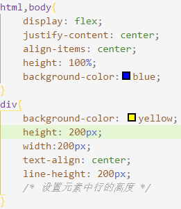
还可以用弹性布局 : display:flex;justify-content:center;align-item:center
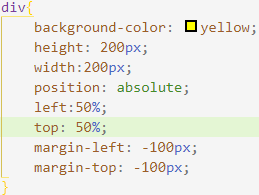
二、块状水平垂直居中:
方法1:对块元素绝对定位,然后将其位置通过margin-left和margin-top负值各拉回自身的一半
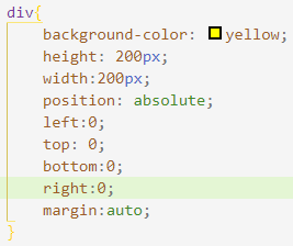
方法2:利用margin:auto
方法3:通过弹性盒(一定要保证父级元素有高度)

 浙公网安备 33010602011771号