![]()
![]()
![]()
1 <!DOCTYPE html>
2 <html lang="en">
3 <head>
4 <meta charset="UTF-8">
5 <title>Title</title>
6 <link rel="stylesheet" href="Css/index.css">
7 </head>
8 <body>
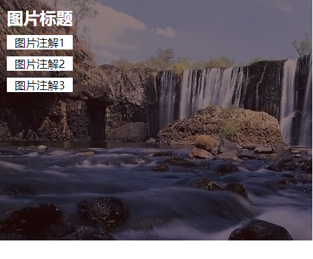
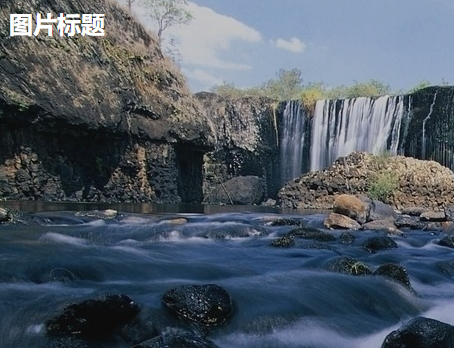
9 <figure class=".test1">
10 <img src="Images/1.jpg" />
11 <figcaption>
12 <h2>图片标题</h2>
13 <p>图片注解1</p>
14 <p>图片注解2</p>
15 <p>图片注解3</p>
16 </figcaption>
17 </figure>
18 </body>
19 </html>
View Code
 1 body,figure,figcaption,h2,p,img{
 2     margin: 0;
 3     padding: 0;
 4 }
 5 figure{
 6     width: 33.33%;
 7     /*position: absolute;*/
 8     height: 350px;
 9     overflow: hidden;    /*图片溢出的部分隐藏*/
10     /*float: left;*/
11 }
12 img{
13     opacity: 0.8;               /*透明度80%*/
14     transition: all 0.35s;       /*所有动作 0.35秒*/
15 }
16 h2,p{
17     text-align: center;
18     margin: 10px;
19 }
20 p{
21     background-color:white;
22     transform: translate(-120px,0px);         /*所有的p元素平移-120px*/
23 }
24 h2{
25     color: white;
26 }
27 figcaption{
28     position: absolute;
29     top:0;
30     left: 0;
31 }
32 .\.test1{
33     background: #2f0000;
34 }
35 .\.test1:hover figcaption p{
36      transform:translate(0px,0px);              /*当悬浮的时候 恢复到默认状态*/
37 }
38 .\.test1 figcaption p:nth-of-type(1){
39     transition-delay: 0.05s;                   /*动画所执行的时间*/
40 }
41 .\.test1 figcaption p:nth-of-type(2){
42     transition-delay: 0.1s;
43 }
44 .\.test1 figcaption p:nth-of-type(3){
45     transition-delay: 0.15s;
46 }
47 .\.test1:hover img{
48     transform:translate(-50px,0px);                 /*当悬浮的时候平移-50px*/
49     opacity: 0.5;                                   /*透明度50%*/
50 }
51 figure figcaption p,h2{
52     transition: all 0.35s;                  /*所有动画执行0.35s秒*/
53 }
![]()
![]()


 浙公网安备 33010602011771号