


CSS基础
CSS概念
CSS是Cascading Style Sheets的简称,中文称为层叠样式表,用来控制网页数据的表现,可以使网页的表现与数据内容分离。属性和属性值用冒号隔开,以分号结尾。
一、CSS的四种引入方式
1.行内式
行内式是在标签的style属性中设定CSS样式。这种方式没有体现出CSS的优势,不推荐使用。
<h1 style="color: red">CSS层叠样式表使用方法1</h1>
2.嵌入式
嵌入式是将CSS样式集中写在网页的<head></head>标签对的<style></style>标签对中。格式如下:
<head>
    <meta charset="UTF-8">
    <title>Title</title>
    <style>
        p{
            background-color: #2b99ff;
        }
    </style>
</head>
3.链接式
将一个.css文件引入到HTML文件中
<link rel="stylesheet" href="index.css" type="text/css"/>
4.导入式
将一个独立的.css文件引入HTML文件中,导入式使用@import 引入外部CSS文件,<style>标记也是写在<head>标记中。
<head>
    ...
    <style type="text/css">
        @import "My.css"; 此处注意.css文件的路径
    </style>
</head>
注意:
    导入式会在整个网页装载完后再装载CSS文件,因此这就导致了一个问题,如果网页比较大则会儿出现先显示无样式的页面,闪烁一下之后,再出现网页的样式。
    这是导入式固有的一个缺陷。使用链接式时与导入式不同的是它会以网页文件主体装载前装载CSS文件,因此显示出来的网页从一开始就是带样式的效果的,它
    不会象导入式那样先显示无样式的网页,然后再显示有样式的网页,这是链接式的优点。
二、CSS的选择器
1.基本选择器
a.通用选择器
    * 表示应用到所有的标签

    * {color: yellow}
b.标签选择器
    匹配所有使用 div 标签的元素(可以匹配所有标签)

    div {color: yellow}
c.类选择器
    匹配所有class属性中包含info的元素。
    语法:.类名{样式}(类名不能以数字开头,类名要区分大小写。)

    .Mycolor {color: yellow}
    <h3 class="Mycolor">nick</h3>
d.ID选择器
    使用id属性来调用样式,在一个网页中id的值都是唯一的(是W3C规范而不是规则,所以不会报错)。
    语法:#ID名{样式}(ID名不能以数字开头)

    #Mycolor {color: yellow}
    <h3 id="Mycolor">Nick.</h3>
2.组合选择器
a.多元素选择器
    同时匹配h3,h4标签,之间用逗号分隔。

    h3,h4 {color: yellow;}
    <h3>Nick</h3>
    <h4>Jenny</h4>
b.后代元素选择器
    匹配所有div标签里嵌套的P标签,之间用空格分隔。

    div p {color: yellow;}

    <div>
        <p>Nick</p>
        <div>
            <p>Nick</p>
        </div>
    </div>

c.子元素选择器
    匹配所有div标签里嵌套的子P标签,之间用>分隔。

    div > p {color: yellow;}

    <div>
        <p>Nick</p>
        <p>Nick</p>
    </div>

d.毗邻元素选择器
    匹配所有紧随div标签之后的同级标签P,之间用+分隔(只能匹配一个)。

    div + p {color: yellow;}

    <div>Nick</div>
    <p>Nick</p>
3.属性选择器
(1)[title] & P[title]
设置所有具有title属性的标签元素;设置所有具有title属性的P标签元素。
    [title]
    {
        color: yellow;
    }

    p[title]
    {
        color: yellow;
    }
<p title="aaa">p标签的title属性选择器</p>
<div title="bbb">div标签的title属性选择器</div>
(2)[title="aaa"]
设置所有title属性等于“aaa”的标签元素。
    [title="aaa"]
    {
        color: blue;
    }
<p title="aaa">p标签的title属性选择器</p>
(3)[title~="bbb"]
设置所有title属性具有多个空格分隔的值、其中一个值等于“bbb”的标签元素。
    [title~="bbb"]
    {
        color: red;
    }
<p title="aaa bbb">Nick</p>
<p title="bbb ccc">Nick</p>
(4)[title|="ccc"]
设置所有title属性具有多个连字号分隔(hyphen-separated)的值、其中一个值以"ccc"开头的标签元素。
    [title|="ccc"]
    {
        color: yellow;
    }
<p title="ccc-ddd">Nick</p>
(5)[title^="eee"]
设置属性值以指定值开头的每个标签元素。
    [title^="eee"]
    {
        color: green;
    }
<p title="eeeFelix">Nick</p>
(6)[title$="fff"]
设置属性值以指定值结尾的每个标签元素。
    [title$="fff"]
    {
        color: red;
    }
<p title="Jennyfff">Nick</p>
(7)[title*=""ggg"]
设置属性值中包含指定值的每个元素
    [title*="ggg"]
    {
        color: yellow;
    }
<p title="SgggJenny">Nick</p>
4.伪类选择器和伪元素选择器
(1)伪类选择器
在 CSS 定义中,a:hover 必须被置于 a:link 和 a:visited 之后,才是有效的,a:active 必须被置于 a:hover 之后,才是有效的。
由于状态是动态变化的,所以一个元素达到一个特定状态时,它可能得到一个伪类的样式;当状态改变时,它又会失去这个样式。由此可以看出,它的功能和class有些类似,
但它是基于文档之外的抽象,所以叫伪类。
:link、:hover、:active、:visited、:focus
:link(未访问的链接状态),用于定义了常规的链接状态。
:hover(鼠标放在链接上的状态),用于产生视觉效果。
:active(在链接上按下鼠标时的状态)。
:visited(已访问过的链接状态),可以看出已经访问过的链接。
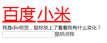
 1 <!DOCTYPE html>
 2 <html lang="zh-CN">
 3 <head>
 4     <meta charset="UTF-8">
 5     <title>伪类选择器</title>
 6     <style>
 7         /*没有访问的网站字体颜色为蓝色*/
 8         a:link {
 9             color: blue;font-size: 55px;
10         }
11         /*已经访问过的网站字体颜色红色*/
12         a:visited {
13             color: red;font-size: 38px;
14         }
15         /*鼠标在字体上颜色变为紫色*/
16         a:hover{
17             color: darkviolet;
18         }
19         /*鼠标在字体上颜色变为蓝色*/
20         #d1:hover {
21             color: blue;
22         }
23
24         /*输入框设置背景颜色*/
25         input:focus {
26             outline: 0;
27             background-color: darkviolet;
28         }
29
30     </style>
31 </head>
32 <body>
33
34 <a href="http://www.baidu.com">百度</a>
35 <a href="http://www.mi.com">小米</a>
36 <div id="d1">我是div标签,鼠标放上了看看我有什么变化?</div>
37 <input type="text" name="" id="">鼠标点我
38 </body>
39 </html>
(2)伪元素选择器
伪元素选择器,伪元素的效果是需要通过添加一个实际的元素才能达到的。
before、after、first-line、first-letter
/* 为某个元素的第一行文字使用样式。 */
:first-line
/* 为某个元素中的文字的首字母或第一个字使用样式。 */
:first-letter
/* 在某个元素之前插入一些内容。 */
:before
/* 在某个元素之后插入一些内容。 */
:after
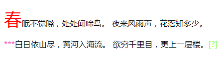
 1 <!DOCTYPE html>
 2 <html lang="zh-CN">
 3 <head>
 4     <meta charset="UTF-8">
 5     <title>伪元素选择器</title>
 6     <style>
 7         /*改变段落的第一个字字体和颜色*/
 8         p:first-letter {
 9             font-size: 36px;
10             color: red;
11         }
12
13         /*在段落前增加*号*/
14         .c1:before {
15             content: "***";
16             color: #ff3ac4;
17         }
18
19         /*在段落后增加[?]号*/
20         .c1:after {
21             content: "[?]";
22             color: #7fff35;
23         }
24     </style>
25 </head>
26 <body>
27 <p>春眠不觉晓,处处闻啼鸟。
28 夜来风雨声,花落知多少。</p>
29 <p class="c1">白日依山尽,黄河入海流。
30 欲穷千里目,更上一层楼。</p>
31
32 </body>
33 </html>
三、选择器的继承和优先级
1.选择器的继承
继承是CSS的一个主要特征,它是依赖于祖先-后代的关系的。继承是一种机制,它允许样式不仅可以应用于某个特定的元素,还可以应用于它的后代。例如一个body定义了的字体颜色值也会应用到段落的文本中。
body {
  color: red;
}
此时页面上所有标签都会继承body的字体颜色。然而CSS继承性的权重是非常低的,是比普通元素的权重还要低的0。
我们只要给对应的标签设置字体颜色就可覆盖掉它继承的样式。
p {
  color: green;
}
此外,继承是CSS重要的一部分,我们甚至不用去考虑它为什么能够这样,但CSS继承也是有限制的。有一些属性不能被继承,如:border, margin, padding, background等。
2.选择器的优先级
浏览器根据什么来决定应该应用哪个样式呢?其实是按照不同选择器的权重来决定的,具体的选择器权重计算方式如下:
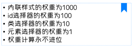
内联样式表的权值最高              style=""-------------------------1000;
统计选择符中的ID属性个数。        #id    -------------100
统计选择符中的CLASS属性个数。     .class  -------------10
统计选择符中的HTML标签名个数。    p     ------------- -1
四、CSS的常用属性
1.颜色属性
color
- HEX(十六进制色:color: #FFFF00 --> 缩写:#FF0)
- RGB(红绿蓝,使用方式:color:rgb(255,255,0)或者color:rgb(100%,100%,0%))
- RGBA(红绿蓝透明度,A是透明度在0~1之间取值。使用方式:color:rgba(255,255,0,0.5))
- HSL(CSS3有效,H表示色调,S表示饱和度,L表示亮度,使用方式:color:hsl(360,100%,50%))
- HSLA(和HSL相似,A表示Alpha透明度,取值0~1之间。)
<div style="color:blueviolet">CSS颜色属性</div>

<div style="color:#ffee33">CSS颜色属性</div>

<div style="color:rgb(255,0,0)">CSS颜色属性</div>

<div style="color:rgba(255,0,0,0.5)">CSS颜色属性</div>
transparent
全透明,使用方式:color: transparent;
opacity
元素的透明度,语法:opacity: 0.5;
属性值在0.0到1.0范围内,0表示透明,1表示不透明。
filter滤镜属性(只适用于早期的IE浏览器,语法:filter:alpha(opacity:20);)。
2.字体属性
font-style: 用于规定斜体文本
normal 文本正常显示
italic 文本斜体显示
oblique 文本倾斜显示
font-weight: 设置文本的粗细
normal(默认)
bold(加粗)
bolder(相当于<strong>和<b>标签)
lighter (常规)
100 ~ 900 整百(400=normal,700=bold)
font-size: 设置字体的大小
默认值:medium
<absolute-size>可选参数值:xx-small、 x-small、 small、 medium、 large、 x-large、 xx-large
<relative-size>相对于父标签中字体的尺寸进行调节。可选参数值:smaller、 larger
<percentage>百分比指定文字大小。
<length>用长度值指定文字大小,不允许负值。
font-family:字体名称
使用逗号隔开多种字体(优先级从前向后,如果系统中没有找到当前字体,则往后面寻找)
body {
  font-family: "Microsoft Yahei", "微软雅黑", "Arial", sans-serif
}
font:简写属性
语法:font:字体大小/行高 字体;(字体要在最后)
3. 文本属性
white-space: 设置元素中空白的处理方式
normal:默认处理方式。
pre:保留空格,当文字超出边界时不换行
nowrap:不保留空格,强制在同一行内显示所有文本,直到文本结束或者碰到br标签
pre-wrap:保留空格,当文字碰到边界时换行
pre-line:不保留空格,保留文字的换行,当文字碰到边界时换行
direction: 规定文本的方向
ltr 默认,文本方向从左到右。
rtl 文本方向从右到左。
text-align: 文本的水平对齐方式
left
center
right
line-height: 文本行高
normal 默认
vertical-align: 文本所在行高的垂直对齐方式
baseline 默认
sub 垂直对齐文本的下标,和<sub>标签一样的效果
super 垂直对齐文本的上标,和<sup>标签一样的效果
top 对象的顶端与所在容器的顶端对齐
text-top 对象的顶端与所在行文字顶端对齐
middle 元素对象基于基线垂直对齐
bottom 对象的底端与所在行的文字底部对齐
text-bottom 对象的底端与所在行文字的底端对齐
text-indent: 文本缩进
letter-spacing: 添加字母之间的空白
word-spacing: 添加每个单词之间的空白
text-transform: 属性控制文本的大小写
capitalize 文本中的每个单词以大写字母开头。
uppercase 定义仅有大写字母。
lowercase 定义仅有小写字母。
text-overflow: 文本溢出样式
clip 修剪文本。
ellipsis 显示省略符号...来代表被修剪的文本。
string 使用给定的字符串来代表被修剪的文本。
text-decoration: 文本的装饰(去除a标签的下划线 text-decoration:none)
none 默认。
underline 下划线。
overline 上划线。
line-through 中线。
text-shadow:文本阴影
第一个参数是左右位置
第二个参数是上下位置
第三个参数是虚化效果
第四个参数是颜色
text-shadow: 5px 5px 5px #888;
word-wrap:自动换行
word-wrap: break-word;
4. 背景属性
background-color: 背景颜色

background-image 设置图像为背景
    url("http://images.cnblogs.com/cnblogs_com/suoning/845162/o_ns.png");  图片地址
    background-image:linear-gradient(green,blue,yellow,red,black); 颜色渐变效果

background-position 设置背景图像的位置坐标
    background-position: center center; 图片置中,x轴center,y轴center
    1px -195px  截取图片某部分,分别代表坐标x,y轴

background-repeat 设置背景图像不重复平铺
    no-repeat 设置图像不重复,常用
    round 自动缩放直到适应并填充满整个容器
    space 以相同的间距平铺且填充满整个容器

background-attachment 背景图像是否固定或者随着页面的其余部分滚动

background 简写
    background: url("o_ns.png") no-repeat 0 -196px;
    background: url("o_ns.png") no-repeat center bottom 15px;
    background: url("o_ns.png") no-repeat left 30px bottom 15px;


 1 <!DOCTYPE html>
 2 <html lang="zh-CN">
 3 <head>
 4     <meta charset="UTF-8">
 5     <title>背景属性</title>
 6     <!--背景颜色-->
 7     <style>
 8         .c1 {
 9             background-color: grey;
10         }
11         /*背景图片*/
12         .c2 {
13             width: 800px;
14             height: 600px;
15             /*background-image: url("snow.PNG");*/
16             /*background-repeat: no-repeat;*/
17             /*background-repeat: repeat-x;*/
18             /*background-repeat: repeat-y;*/
19             /*background-position: 50% 50%;*/
20             /*background-position: center;*/
21             /*background-position: 331px 328px;*/
22             background: url("IMG_1390.JPG") no-repeat 50% 50%;
23         }
24     </style>
25 </head>
26 <body>
27
28 <div>今天下雪了</div>
29
30 <div class="c1">一起去看雪</div>
31
32 <div class="c2">
33     <div>告诉大家一个好消息,今天下雪了</div>
34
35 </div>
36 </body>
37 </html>
 1 <!DOCTYPE html>
 2 <html lang="zh-CN">
 3 <head>
 4     <meta charset="UTF-8">
 5     <title>背景图片固定</title>
 6     <style>
 7         .c1 {
 8             height: 300px;
 9             background-color: blue;
10         }
11         .c2 {
12             height: 300px;
13             background: url("IMG_1390.JPG");
14             background-attachment: fixed;
15         }
16         .c3 {
17             height: 300px;
18             background-color: red;
19         }
20
21     </style>
22 </head>
23 <body>
24 <div class="c1"></div>
25 <div class="c2"></div>
26 <div class="c3"></div>
27 </body>
28 </html>
5.列表属性
list-style-type: 列表项标志的类型
    none 去除标志
    decimal-leading-zero;  02.
    square;  方框
    circle;  空心圆
    upper-alph; & disc; 实心圆

list-style-image:将图象设置为列表项标志

list-style-position:列表项标志的位置
    inside
    outside

list-style:缩写
五、页面布局
1.border 边框
border-style:边框样式
    solid 默认,实线
    double 双线
    dotted 点状线条
    dashed 虚线

border-color:边框颜色

border-width:边框宽度

border-radius:圆角
    1个参数:四个角都应用
    2个参数:第一个参数应用于 左上、右下;第二个参数应用于 左下、右上
    3个参数:第一个参数应用于 左上;第二个参数应用于 左下、右上;第三个参数应用于右下
    4个参数:左上、右上、右下、左下(顺时针)

border: 简写
    border: 2px solid red;

box-shadow:边框阴影
    第一个参数是左右位置
    第二个参数是上下位置
    第三个参数是虚化效果
    第四个参数是颜色

box-shadow: 10px 10px 5px #888;
    第一个参数是左右位置
    第二个参数是上下位置
    第三个参数是虚化效果
    第四个参数是颜色
    box-shadow: 10px 10px 5px #888;
 1 <!DOCTYPE html>
 2 <html lang="zh-CN">
 3 <head>
 4     <meta charset="UTF-8">
 5     <title>边框</title>
 6     <style>
 7         div{
 8             height: 200px;
 9             width: 300px;
10             background-color: blue;
11             /*border-width: 5px;*/
12             /*border-color: black;*/
13             /*border-style: solid;*/
14             /*border-right: 5px solid black;*/
15             border: 5px solid black;
16         }
17     </style>
18 </head>
19 <body>
20 <div></div>
21 </body>
22 </html>
 1 <!DOCTYPE html>
 2 <html lang="en">
 3 <head>
 4     <meta charset="UTF-8">
 5     <title>Title</title>
 6     <style>
 7         div {
 8             border:2px solid;
 9             border-radius:25px;
10             width: 140px;
11         }
12     </style>
13 </head>
14 <body>
15     <div>
16          CSS边框变椭圆形
17     </div>
18 </body>
19 </html>
 1 <!DOCTYPE html>
 2 <html lang="zh-CN">
 3 <head>
 4     <meta charset="UTF-8">
 5     <title>11overflow溢出</title>
 6     <style>
 7         .header-img {
 8             width: 100px;
 9             height: 100px;
10             border: 2px solid red;
11
12             /*图片显示为圆形*/
13             border-radius: 100%;
14             /*图片超出部分隐藏*/
15             overflow: hidden;
16         }
17         img {
18             max-width: 100%;
19         }
20
21     </style>
22 </head>
23 <body>
24     <div class="header-img">
25         <img src="https://timgsa.baidu.com/timg?image&quality=80&size=b9999_10000&sec=1546078190241&di=77051d899864eb770228d764b73592c9&imgtype=0&src=http%3A%2F%2Fb-ssl.duitang.com%2Fuploads%2Fitem%2F201707%2F18%2F20170718102720_nurX5.jpeg" alt="">
26     </div>
27
28 </body>
29 </html>
 1 <!DOCTYPE html>
 2 <html lang="en">
 3 <head>
 4     <meta charset="UTF-8">
 5     <title>Title</title>
 6     <style>
 7         .radius1 {
 8             display: inline-block;
 9             width: 100px;
10             height: 100px;
11             background-color: yellow;
12             border-radius: 20px;
13         }
14         .radius2 {
15             display: inline-block;
16             width: 100px;
17             height: 100px;
18             background-color: red;
19             border-radius: 20px 35px;
20         }
21         .radius3 {
22             display: inline-block;
23             width: 100px;
24             height: 100px;
25             background-color: blue;
26             border-radius: 20px 35px 50px;
27         }
28         .radius4 {
29             display: inline-block;
30             width: 100px;
31             height: 100px;
32             background-color: green;
33             border-radius: 20px 35px 50px 60px;
34         }
35     </style>
36 </head>
37 <body>
38     <div>
39         <span class="radius1"></span>
40         <span class="radius2"></span>
41         <span class="radius3"></span>
42         <span class="radius4"></span>
43     </div>
44 </body>
45 </html>
 1 <!DOCTYPE html>
 2 <html lang="en">
 3 <head>
 4     <meta charset="UTF-8">
 5     <title>Title</title>
 6     <style>
 7         .triangle-one {
 8             display: inline-block;
 9             border-top: 50px red solid;
10             border-right: 50px green solid;
11             border-bottom: 50px yellow solid;
12             border-left: 50px blue solid;
13         }
14         .triangle-two {
15             display: inline-block;
16             border-top: 0 red solid;
17             border-right: 50px green solid;
18             border-bottom: 50px yellow solid;
19             border-left: 50px blue solid;
20         }
21         .triangle-stree {
22             display: inline-block;
23             border-top: 50px red solid;
24             border-right: 0 green solid;
25             border-bottom: 50px yellow solid;
26             border-left: 50px blue solid;
27         }
28         .triangle-four {
29             display: inline-block;
30             border-top: 50px red solid;
31             border-right: 0 green solid;
32             border-bottom: 0 yellow solid;
33             border-left: 50px blue solid;
34         }
35
36         .triangle-five {
37             display: inline-block;
38             border: 50px transparent solid;
39             border-top: 50px red solid;
40         }
41         .triangle-six {
42             display: inline-block;
43             border: 50px transparent solid;
44             border-bottom: 50px yellow solid;
45         }
46         .triangle-seven {
47             display: inline-block;
48             border: 50px transparent solid;
49             border-top: 60px red solid;
50             border-right: 0;
51         }
52         .triangle-eight {
53             display: inline-block;
54             border: 50px transparent solid;
55             border-left: 30px yellow solid;
56             border-bottom: 0;
57         }
58     </style>
59 </head>
60 <body>
61     <div class="triangle-one"></div>
62     <div class="triangle-two"></div>
63     <div class="triangle-stree"></div>
64     <div class="triangle-four"></div>
65     <div class="triangle-five"></div>
66     <div class="triangle-six"></div>
67     <div class="triangle-seven"></div>
68     <div class="triangle-eight"></div>
69 </body>
70 </html>
 1 <!DOCTYPE html>
 2 <html lang="en">
 3 <head>
 4     <meta charset="UTF-8">
 5     <title>Title</title>
 6     <style>
 7         .back {
 8             width: 1000px;
 9             height: 1000px;
10             margin: 0 auto;
11             background-color: #ddd;
12             position: relative;
13         }
14         .back-in {
15             position: absolute;
16             width: 1020px;
17             height: 45px;
18             left: -20px;
19             top: 50px;
20             background-color: #2F4F4F;
21         }
22         .back-img {
23             border: 20px solid transparent;
24             border-top: 10px solid dimgrey;
25             border-right: 0;
26             display: inline-block;
27             position: absolute;
28             top: 95px;
29             left: -20px;
30         }
31         .back-font {
32             line-height: 9px;
33             margin-left: 30px;
34             color: white;
35         }
36     </style>
37 </head>
38 <body>
39     <div class="back">
40         <div class="back-in"><h3 class="back-font">CSS边框 ^.^</h3></div>
41         <div class="back-img"></div>
42     </div>
43 </body>
44 </html>
2.display
none 不显示。
block 显示为块级元素。
inline 显示为内联元素。
inline-block 行内块元素(会保持块元素的高宽)。
list-item 显示为列表元素。
3. visibility
visible 元素可见
hidden 元素不可见
collapse 当在表格元素中使用时,此值可删除一行或一列,不会影响表格的布局。
display:"none"与visibility:hidden的区别:
visibility:hidden: 可以隐藏某个元素,但隐藏的元素仍需占用与未隐藏之前一样的空间。也就是说,该元素虽然被隐藏了,但仍然会影响布局。
display:none: 可以隐藏某个元素,且隐藏的元素不会占用任何空间。也就是说,该元素不但被隐藏了,而且该元素原本占用的空间也会从页面布局中消失。
4.盒子模型
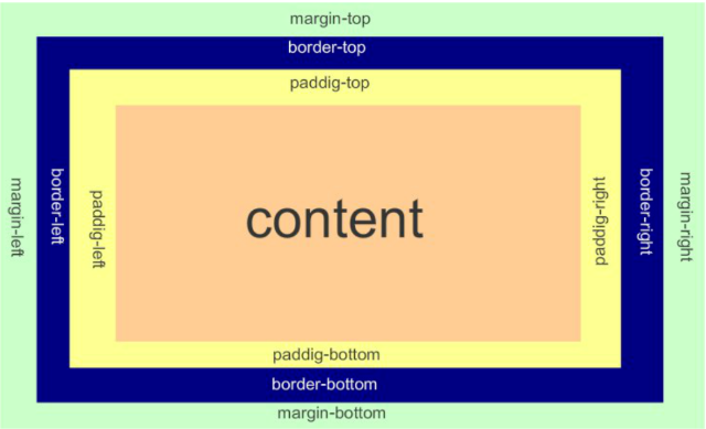
- margin(外边框): 用于控制元素与元素之间的距离;margin的最基本用途就是控制元素周围空间的间隔,从视觉角度上达到相互隔开的目的。
- padding(内填充): 用于控制内容与边框之间的距离;
- Border(边框): 围绕在内边距和内容外的边框。
- Content(内容): 盒子的内容,显示文本和图像。
margin外边距
.margin-test {
  margin-top:5px;
  margin-right:10px;
  margin-bottom:15px;
  margin-left:20px;
}

推荐使用简写:
.margin-test {
  margin: 5px 10px 15px 20px;
}

顺序:上右下左

.mycenter {
  margin: 0 auto;
}
padding内填充
.padding-test {
  padding-top: 5px;
  padding-right: 10px;
  padding-bottom: 15px;
  padding-left: 20px;
}


推荐使用简写:

.padding-test {
  padding: 5px 10px 15px 20px;
}

顺序:上右下左

补充padding的常用简写方式:

提供一个,用于四边;
提供两个,第一个用于上-下,第二个用于左-右;
如果提供三个,第一个用于上,第二个用于左-右,第三个用于下;
提供四个参数值,将按上-右-下-左的顺序作用于四边;
边框在默认情况下会定位于浏览器窗口的左上角,但是并没有紧贴着浏览器的窗口的边框,这是因为body本身也是一个盒子,外层还有html,
在默认情况下,body距离html会有若干像素的margin,所以body中的盒子不会紧贴浏览器窗口的边框了。

解决方法:
        body {
            margin: 0;
            padding: 0;
        }
<!DOCTYPE html>
<html lang="zh-CN">
<head>
    <meta charset="UTF-8">
    <title>8盒子模型</title>
    <style>

        /*body下chrom浏览器自动有8像素的距离,需要自定义设置成0*/
        * {
            margin: 0;
            padding: 0;
        }
        .c1 {
            height: 200px;
            width: 300px;
            border: 5px solid green;
            /*padding: 5px;*/
            /*margin-top: 5px;*/
            /*margin-right: 10px;*/
            /*margin-bottom: 15px;*/
            /*margin-left: 20px;*/

            /*margin: 5px 10px 15px 20px;*/
            /*margin: 20px 30px;*/
            /*margin: 10px 20px 30px;*/
            margin: 0 auto;
        }

        .c2 {
            height: 100px;
            width: 100%;
            background-color: blue;
        }
    </style>
</head>
<body>
    <div class="c1"></div>
    <div class="c2"></div>
</body>
</html>
5.float浮动
在 CSS 中,任何元素都可以浮动。
浮动元素会生成一个块级框,而不论它本身是何种元素。
关于浮动的两个特点:
浮动的框可以向左或向右移动,直到它的外边缘碰到包含框或另一个浮动框的边框为止。
由于浮动框不在文档的普通流中,所以文档的普通流中的块框表现得就像浮动框不存在一样。
float属性:
    none
    left 左浮动
    right 右浮动
<!DOCTYPE html>
<html lang="zh-CN">
<head>
    <meta charset="UTF-8">
    <title>9float页面布局</title>
    <style>
        * {
            margin: 0;
            padding: 0;
        }
        .c1 {
            height: 1000px;
            width: 20%;
            background-color: deepskyblue;
            float: left;
        }

        .c2 {
            height: 1000px;
            width: 80%;
            background-color: #ff3ac4;
            float: left;
        }
    </style>

</head>
<body>
<div class="c1"></div>
<div class="c2"></div>

</body>
</html>
6.clear清除浮动
clear属性规定元素的哪一侧不允许其他浮动元素。
none  :  默认值。允许两边都可以有浮动对象
left   :  不允许左边有浮动对象
right  :  不允许右边有浮动对象
both  :  不允许两边有浮动对象
inherit	规定应该从父元素继承 clear 属性的值。

注意:clear属性只会对自身起作用,而不会影响其他元素。
清除浮动的副作用(父标签塌陷问题)
主要有三种方式:
- 固定高度
- 伪元素清除法
- overflow:hidden
伪元素清除法(使用较多):
.clearfix:after {
  content: "";
  display: block;
  clear: both;
}
<!DOCTYPE html>
<html lang="zh-CN">
<head>
    <meta charset="UTF-8">
    <title>10清除浮动</title>
    <style>

        #d1 {
            border: 1px solid black;
        }
        .c1,
        .c2{
            float: left;
            height: 100px;
            width: 100px;
        }
        /*.c3 {*/
            /*height: 100px;*/
        /*}*/

        /*解决父标签塌陷,浮动的元素脱离了父级的div标签*/
        #d1:after {
            content: "";
            clear:left;
            display: block;
        }
    </style>
</head>
<body>
<div id="d1">
    <div class="c1">div c1</div>
    <div class="c2">div c2</div>
    <!--<div class="c3"></div>-->
</div>

</body>
</html>
7.overflow 溢出
- visible 默认值。内容不会被修剪,会呈现在元素框之外。
- hidden 内容会被修剪,并且其余内容是不可见的。
- scroll 内容会被修剪,但是浏览器会显示滚动条以便查看其余的内容。
- auto 如果内容被修剪,则浏览器会显示滚动条以便查看其余的内容。
- inherit 规定应该从父元素继承 overflow 属性的值。
overflow(水平和垂直均设置)
overflow-x(设置水平方向)
overflow-y(设置垂直方向)
<!DOCTYPE HTML>
<html>
<head>
  <meta charset="UTF-8">
  <meta http-equiv="x-ua-compatible" content="IE=edge">
  <meta name="viewport" content="width=device-width, initial-scale=1">
  <title>圆形的头像示例</title>
  <style>
    * {
      margin: 0;
      padding: 0;
      background-color: #eeeeee;
    }
    .header-img {
      width: 150px;
      height: 150px;
      border: 3px solid white;
      border-radius: 50%;
      overflow: hidden;
    }
    .header-img>img {
      max-width: 100%;
    }
  </style>
</head>
<body>

<div class="header-img">
  <img src="https://q1mi.github.io/Blog/asset/img/head_img.jpg" alt="">
</div>

</body>
</html>
8.position 定位
static
默认值,无定位,不能当作绝对定位的参照物,并且设置标签对象的left、top等值是不起作用的的。

relative
相对定位是相对于该元素在文档流中的原始位置,即以自己原始位置为参照物。有趣的是,即使设定了元素的相对定位以及偏移值,元素还占有着原来的位置,即占据文档流空间。
对象遵循正常文档流,但将依据top,right,bottom,left等属性在正常文档流中偏移位置。而其层叠通过z-index属性定义。
注意:position:relative的一个主要用法:方便绝对定位元素找到参照物。

absolute
定义:设置为绝对定位的元素框从文档流完全删除,并相对于最近的已定位祖先元素定位,如果元素没有已定位的祖先元素,那么它的位置相对于最初的包含块(即body元素)。
元素原先在正常文档流中所占的空间会关闭,就好像该元素原来不存在一样。元素定位后生成一个块级框,而不论原来它在正常流中生成何种类型的框。
重点:如果父级设置了position属性,例如position:relative;,那么子元素就会以父级的左上角为原始点进行定位。这样能很好的解决自适应网站的标签偏离问题,即父级为自适应的,
那我子元素就设置position:absolute;父元素设置position:relative;,然后Top、Right、Bottom、Left用百分比宽度表示。
另外,对象脱离正常文档流,使用top,right,bottom,left等属性进行绝对定位。而其层叠通过z-index属性定义。

fixed
对象脱离正常文档流,使用top,right,bottom,left等属性以窗口为参考点进行定位,当出现滚动条时,对象不会随着滚动。而其层叠通过z-index属性 定义。
注意点: 一个元素若设置了 position:absolute | fixed; 则该元素就不能设置float。这 是一个常识性的知识点,因为这是两个不同的流,一个是浮动流,另一个是“定位流”。
但是 relative 却可以。因为它原本所占的空间仍然占据文档流。
在理论上,被设置为fixed的元素会被定位于浏览器窗口的一个指定坐标,不论窗口是否滚动,它都会固定在这个位置。
通过以下四种属性进行定位:
left
top
right
bottom
z-index
<!DOCTYPE html>
<html lang="zh-CN">
<head>
    <meta charset="UTF-8">
    <title>定位</title>
    <style>
        * {
            margin: 0;
            padding: 0;
        }

        .c1,
        .c2,
        .c3,
        .c4,
        .c4-father{
            height: 150px;
            width: 150px;
        }

        .c1 {
            background-color: red;
        }
        /*相对定位*/
        .c2 {
            background-color: green;
            position: relative;
            left: 400px;
            top: 150px;
        }

        .c3 {
            background-color: blue;
        }

        .c4-father {
            background-color: lawngreen;
            position: relative;
            left: 150px;
        }
        /*绝对定位*/
        .c4 {
            background-color: deeppink;
            position: absolute;
            top: 150px;
            left: 400px;
        }
        .fix-position {
            position: fixed;
            right: 30px;
            bottom: 30px;
            background-color: grey;
        }
    </style>
</head>
<body>

<div class="c1"></div>
<div class="c2"></div>
<div class="c3"></div>

<div class="c4-father">
    <div class="c4"></div>
</div>

<div class="fix-position"><a href="">返回顶部</a></div>
</body>
</html>
9. z-index 元素层叠顺序
设置对象的层叠顺序。
z-index 值表示谁压着谁,数值大的压盖住数值小的,
只有定位了的元素,才能有z-index,也就是说,不管相对定位,绝对定位,固定定位,都可以使用z-index,而浮动元素不能使用z-index
z-index值没有单位,就是一个正整数,默认的z-index值为0如果大家都没有z-index值,或者z-index值一样,那么谁写在HTML后面,谁在上面压着别人,定位了元素,永远压住没有定位的元素。
从父现象:父亲怂了,儿子再牛逼也没用
<!DOCTYPE html>
<html lang="zh-CN">
<head>
    <meta charset="UTF-8">
    <title>Z-index元素层叠顺序</title>
    <style>
        .z-index1 {
            width: 100px;
            height: 100px;
            background-color: yellow;
            position: absolute;
            z-index: -1;
        }
        .z-index2 {
            width: 100px;
            height: 100px;
            background-color: red;
            position: absolute;
            top: 20px;
            left: 20px;
            z-index: 5;
        }
    </style>
</head>
<body>
    <div class="z-index1"></div>
    <div class="z-index2"></div>

</body>
</html>
<!DOCTYPE html>
<html lang="zh-CN">
<head>
    <meta charset="UTF-8">
    <title>3青春版模块示例</title>
    <style>
        .cover {
            position: absolute;
            top: 0;
            right: 0;
            bottom: 0;
            left: 0;
            background-color: rgba(0,0,0,0.5);
            z-index: 999;
        }

        .modal {
            width: 600px;
            height: 400px;
            background-color: white;
            position: fixed;
            top: 50%;
            left: 50%;
            margin-top: -200px;
            margin-left: -300px;
            z-index: 1000;
        }
    </style>

</head>
<body>
<div class="cover"></div>
<div class="modal"></div>
</body>
</html>
10. outline 边框轮廓
- outline-width 轮廓宽度
- outline-color 轮廓颜色
- outline-style 轮廓样式
<!DOCTYPE html>
<html lang="zh-CN">
<head>
    <meta charset="UTF-8">
    <title>15边框轮廓</title>
    <style>
        .c1 {
            width: 120px;
            height: 120px;
            background-color: red;
            outline-color: blue;
            outline-style:dashed;
        }
    </style>
</head>
<body>
<div class="c1"></div>

</body>
</html>
11.zoom缩放比例
.zoom1 {
zoom: 100%;
}
.zoom2 {
zoom: 150%;
}
.zoom3 {
zoom: 200%;
}
<!DOCTYPE html>
<html lang="en">
<head>
  <meta charset="UTF-8">
  <meta http-equiv="x-ua-compatible" content="IE=edge">
  <meta name="viewport" content="width=device-width, initial-scale=1">
  <title>自定义模态框</title>
  <style>
    .cover {
      background-color: rgba(0,0,0,0.65);
      position: fixed;
      top: 0;
      right: 0;
      bottom: 0;
      left: 0;
      z-index: 998;
    }

    .modal {
      background-color: white;
      position: fixed;
      width: 600px;
      height: 400px;
      left: 50%;
      top: 50%;
      margin: -200px 0 0 -300px;
      z-index: 1000;
    }
  </style>
</head>
<body>

<div class="cover"></div>
<div class="modal"></div>
</body>
</html>
12.opacity不透明度
取值 0~1
和rgba的区别:
- opacity改变元素、子元素的透明度效果
- rgba只改变背景颜色透明度效果
 1 <!DOCTYPE html>
 2 <html lang="zh-CN">
 3 <head>
 4     <meta charset="UTF-8">
 5     <title>透明度</title>
 6     <style>
 7         .c1 {
 8             width: 150px;
 9             height: 150px;
10             border: 2px solid blue;
11             background-color: black;
12             opacity: 0.5;
13             color: red;
14         }
15         .c2 {
16             width: 150px;
17             height: 150px;
18             border: 2px solid blue;
19             background-color: rgba(0,0,0,0.5);
20             color: red;
21         }
22     </style>
23 </head>
24 <body>
25 <div class="c1">我是C1,测试opacity透明度</div>
26 <div class="c2">我是C2,测试rgba透明度</div>
27 </body>
28 </html>

 浙公网安备 33010602011771号