
文本阴影与盒子阴影
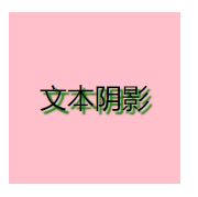
文本阴影(text-shadow)
属性: 水平阴影位置 垂直阴影位置 阴影模糊距离 阴影颜色 ;
HTML Code:
<div class="box1">
        文本阴影
</div>
CSS Code:
.box1{
    width: 100px;
    height: 100px;
    line-height: 100px;
    text-align: center;
    background: pink;
    text-shadow: 2px 2px 1px green;
}
图示:
盒子阴影 (box-shadow)
属性:
h-shadow 水平阴影位置,可负值
v-shadow 垂直阴影位置,可负值
blur 可选,模糊距离
spread 可选,阴影大小
color 可选,阴影颜色
inset 可选,内阴影
HTML Code:
<div class="box2">
    盒子阴影
</div>
CSS Code:
.box2{
    width: 100px;
    height: 100px;
    line-height: 100px;
    text-align: center;
    background: skyblue;
    margin: 0px auto;
    box-shadow: 10px 10px 5px  gray inset;
}
图示:
加上inset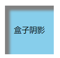 不加inset
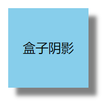

 浙公网安备 33010602011771号