python可视化工具——seaborn模块
python可视化工具——seaborn模块
-
导入模块
import seaborn as sns sns.set() #初始化图形样式,若没有该命令,图形将具有与matplotlib相同的样式 -
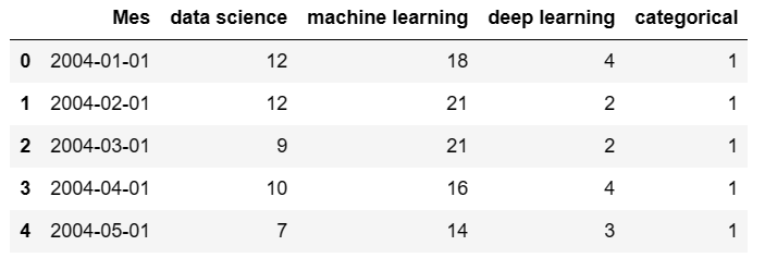
读取数据
df = pd.read_csv('D:\Graduate\python_studying\datasets-master\\temporal.csv')
df.head()
-
散点图
import pandas as pd
df['Mes'] = pd.to_datetime(df.Mes) #将Mes列的类型转换为日期,防止画图时横坐标重叠
sns.scatterplot(df['Mes'],df['data science'])

-
在同一张图中添加两个以上变量的信息,用颜色、大小来表示变量的值
sns.relplot(x='Mes', y='deep learning', hue='data science', size='machine learning', col='categorical', data=df)

-
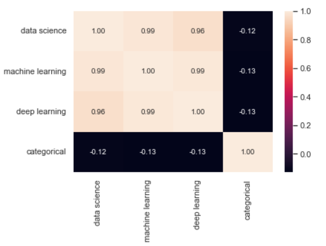
热图
sns.heatmap(df.corr(), annot=True, fmt='.2f')
-
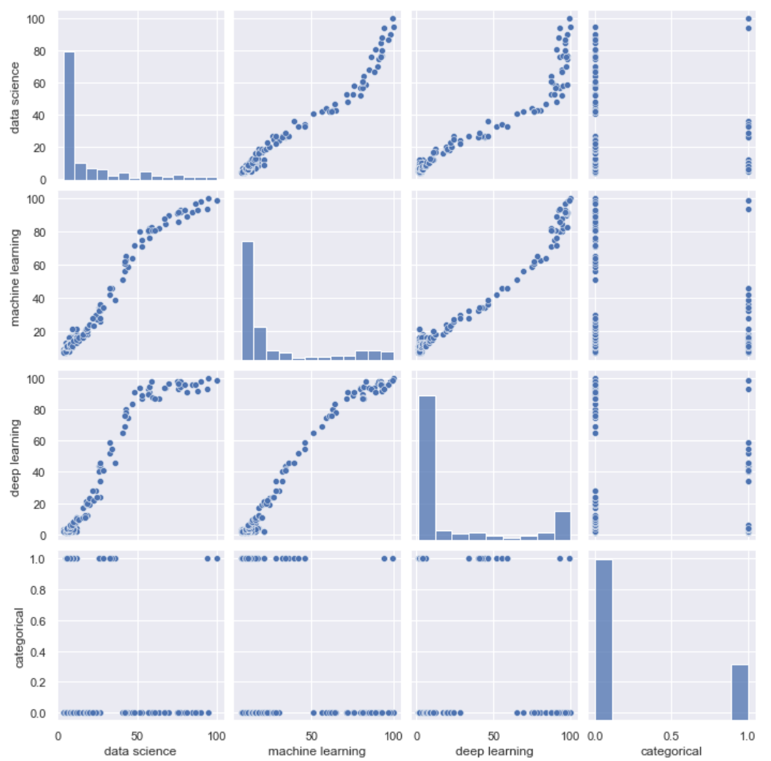
配对图,显示所有变量之间的关系
sns.pairplot(df)
-
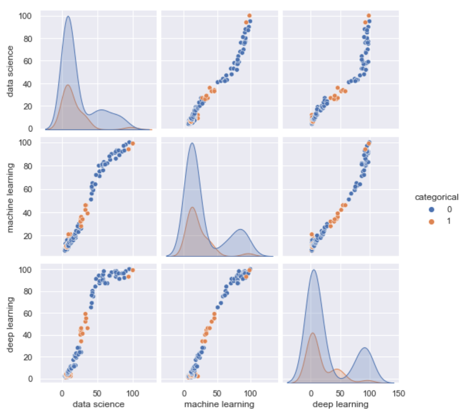
按类别做配对图
sns.pairplot(df, hue='categorical') #categorical是分类变量
-
联合图
sns.jointplot(x='data science', y='machine learning', data=df) #散点图与直方图的联合图

-
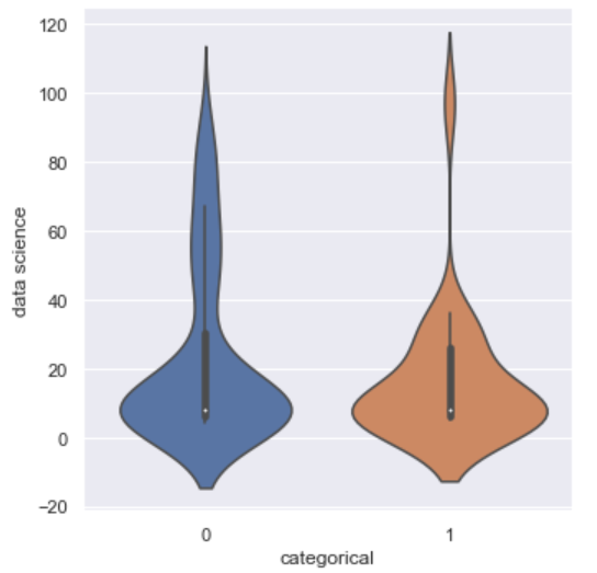
小提琴图
sns.catplot(x='categorical', y='data science', kind='violin', data=df)
小提琴图的顺序可以由参数order指定;
参数linewidth设置线宽;
参数width设置小提琴的宽。
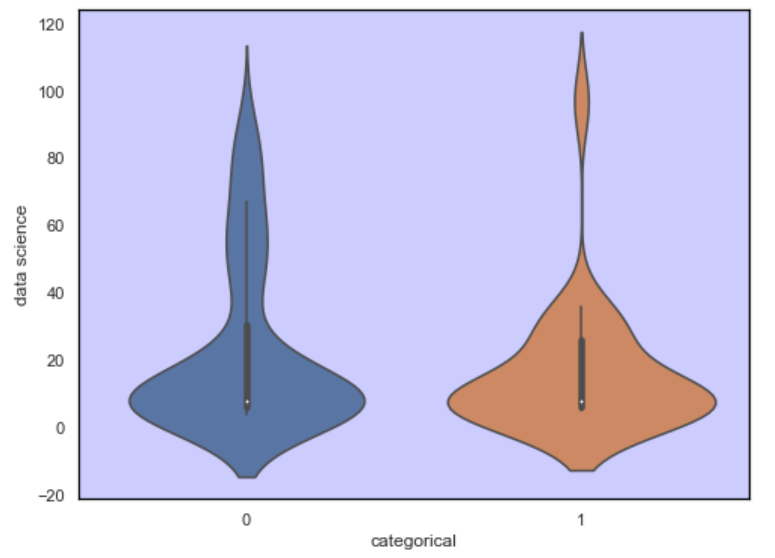
##设置网格线、背景色、边框线
plt.figure(figsize=(8,6), facecolor='white', edgecolor='black')
ax = sns.violinplot(x='categorical', y='data science', data=df)
ax.patch.set_facecolor('blue')
ax.patch.set_alpha(0.2)
ax.spines['right'].set_color('black')
ax.spines['left'].set_color('black')
ax.spines['top'].set_color('black')
ax.spines['bottom'].set_color('black')
plt.grid(False)
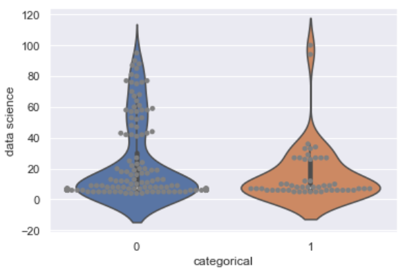
## 绘制小提琴图,并增加散点分布
ax = sns.violinplot(x='categorical', y='data science', data=df)
ax = sns.swarmplot(x='categorical', y='data science', data=df, color='gray')
-
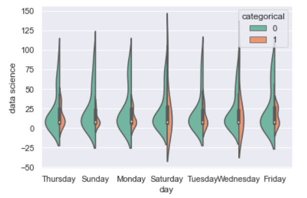
分组小提琴图
df['day'] = df['Mes'].dt.day_name() #增加一列'day',表示星期几
sns.catplot(x='day', y='data science', hue='categorical', kind='violin', data=df)
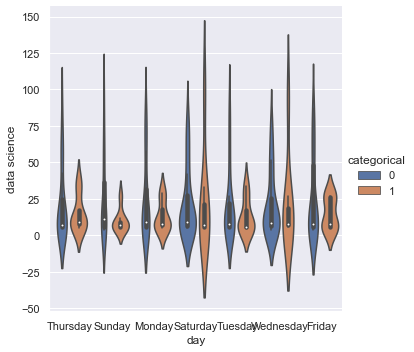
或者:
sns.violinplot(x='day', y='data science', hue='categorical', data=df, palette="Set2", split=True, scale="count", inner="box") #palette表示颜色,split表示是否把两类画到一起,inner="box"内部是箱线图
-
箱线图
sns.boxplot(),用法与小提琴图一样。
参数notch可以指定是否有缺口,值为True时有缺口。 -
创建多个图形
import matplotlib.pyplot as plt
plt.subplot(121)
sns.scatterplot(x='Mes', y='deep learning', hue='categorical', data=df)
plt.title('Deep learning')
plt.subplot(122)
sns.scatterplot(x='Mes',y='machine learning', hue='categorical', data=df)
plt.title('Machine learning')
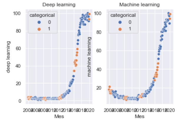
或者:
import matplotlib.pyplot as plt
fig, axes = plt.subplots(1, 2, sharey=True, figsize=(8,4))
sns.scatterplot(x='Mes', y='deep learning', hue='categorical', data=df, ax=axes[0])
axes[0].set_title('Deep learning')
sns.scatterplot(x='Mes',y='machine learning', hue='categorical', data=df, ax=axes[1])
axes[1].set_title('Machine learning')

-
柱状图
## 语法
sns.barplot(x=None, y=None, hue=None,
			data=None, order=None, hue_order=None,
			estimator=<function mean>, ci=95,
			n_boot=1000, units=None, orient=None,
			color=None, palette=None, saturation=0.75,
			errcolor='.26', errwidth=None, capsize=None,
			dodge=True, ax=None, **kwargs)
x:x轴数据
y:y轴数据
hue:分类依据
data:数据来自哪个DataFrame
order:x轴显示的顺序
hue_order:分类标签的顺序
estimator:对每个柱子的统计函数,默认是均值
ci:绘制误差条时置信区间的大小
n_boot:计算置信区间时使用的引导迭代次数
orient:图的显示方向,默认垂直
palette:调试板名称,列表或字典类型,设置hue指定的变量的不同类别的颜色
saturation:饱和度
errcolor:误差条的颜色
errwidth:误差条的宽度
capsize:误差条上横线的宽度
dodge:使用色调嵌套时,是否应沿分类轴移动元素
-
点图
## 语法 sns.pointplot(x=None, y=None, hue=None, data=None, order=None, hue_order=None, estimator=<function mean>, ci=95, n_boot=1000, units=None, markers='o', linestyles='-', dodge=False, join=True, scale=1, orient=None, color=None, palette=None, errwidth=None, capsize=None, ax=None, **kwargs) -
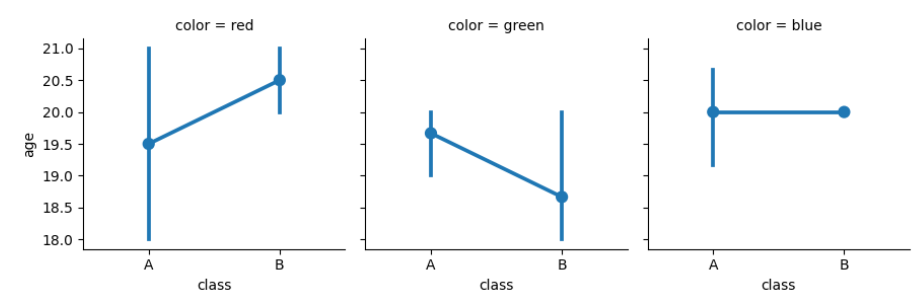
多图网络 sns.FacetGrid
## 语法
sns.FacetGrid(data,row=None,col=None,hue=None,col_wrap=None,
              sharex=True,sharey=True,height=3,aspect=1,palette=None,
              row_order=None,col_order=None,hue_order=None,hue_kws=None,
              dropna=True,legend_out=True,despine=True,margin_titles=False,
              xlim=None,ylim=None,subplot_kws=None,gridspec_kws=None,size=None)
## 示例 import pandas as pd import numpy as np import seaborn as sns df = pd.DataFrame([['red','A',18,'male'], ['green','B',20,'female'], ['blue','A',21,'female'], ['blue','A',20,'female'], ['red','B',21,'male'], ['blue','A',21,'male'], ['green','A',18,'female'], ['blue','A',20,'female'], ['blue','B',20,'female'], ['blue','A',20,'male'], ['red','A',21,'female'], ['red','B',20,'female'], ['blue','A',18,'male'], ['green','A',20,'female'], ['green','B',19,'female'], ['green','B',20,'male'], ['green','A',18,'female'] ]) df.columns = ['color','class','age','sex'] g = sns.FacetGrid(df, col='color') g.map(sns.pointplot, 'class', 'age')
-
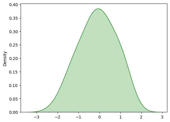
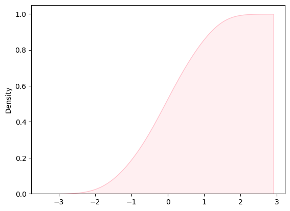
核密度估计图
## 语法
sns.kdeplot(data,data2=None,shade=False,vertical=False,kernel='gau',bw='scott',gridsize=100,cut=3,clip=None,legend=True,cumulative=False,shade_lowest=True,cbar=False, cbar_ax=None, cbar_kws=None, ax=None, *kwargs)
## 示例 import numpy as np x = np.random.randn(100) sns.kdeplot(x, shade=True, color='g')
sns.kdeplot(x, shade=True, color='pink', cumulative=True) #累积分布图

 浙公网安备 33010602011771号