css实现等高布局 两栏自适应布局 三栏自适应布局
等高布局:
HTML结构如下:
<div class="wrapper">
    <div class="box">
        <h1>...</h1>
        <p>...</p>
        <div class="bottom"></div>
    </div>
</div>
1.padding补值法
css代码如下:
.wrapper{
            width: 100%;
            overflow: hidden;
        }
        .box{
            width: 250px;
            margin-left: 20px;
            float: left;
            display: inline;
            padding: 20px;
            background: #89ac10;
            margin-bottom: -500px;
            padding-bottom:500px;
            border: 2px solid #f0c;
        }
运行结果如下:
缺点:等高的div没有底边的边框,常用解决方法是使用背景图模仿底部边框或者使用div来模仿底部边框。
2.
css代码如下:
.wrapper{
            width: 100%;
            overflow: hidden;
            position: relative;
            background: #98f59e;
        }
        .box{
            width: 250px;
            padding: 20px;
            padding-bottom: 220px;
            margin-bottom: -200px;
            margin-left: 20px;
            float: left;
            display: inline;
            background: #89ac10;
            border: 2px solid red;
        }
        .bottom{
            position:absolute;
            bottom: 0;
            height: 2px;
            width: 290px;
            background: red;
            margin-left: -20px;
        }
运行结果如下:

3.flex弹盒布局法:(简单-推荐)
css代码如下:
.wrapper{
            width: 100%;
            display: flex;
            background: #98f59e;
            align-items: stretch;
        }
        .box{
            width: 250px;
            margin-left: 20px;
            background: #89ac10;
        }
运行结果如下:
4.设置display值为table-cell
css代码如下:
.wrapper{
            width: 100%;
            background: #98f59e;
        }
        .box{
            width: 250px;
            background: #89ac10;
            display: table-cell;
            border: 1px solid red;
            /*margin 无效*/
        }
在此设置margin值是不起作用的,运行结果如下:
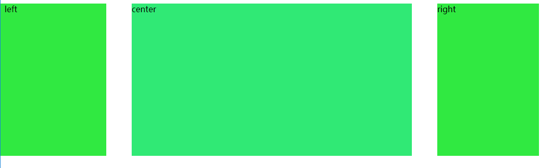
两栏自适应布局:
HTML代码如下:
<div class="left">
        left
    </div>
    <div class="right">
        right
    </div>
1.浮动布局:
css代码如下:
.left{
            float: left;
            width: 300px;
            height: 400px;
            background: #41d844;
        }
        .right{
            margin-left: 310px;
            height: 400px;
            background: #41d800;
        }
运行结果如下:

2.绝地定位布局:
css代码如下:
.left{
            position: absolute;
            margin-right: -100%;
            width: 300px;
            height: 400px;
            background: #925;
        }
        .right{
            margin-left: 310px;
            height: 400px;
            background: #41d800;
        }
运行效果如下:

三栏自适应布局:
1.float+负margin实现
HTML代码如下:
<div class="container">
        <div class="center">center</div>
    </div>
    <div class="left">left</div>
    <div class="right">right</div>
css代码如下:
.container{
            width: 100%;
            height: 300px;
            float: left;
        }
        .center{
            background: #16ea74;
            height: 300px;
            margin-left: 250px;
            margin-right: 250px;
        }
        .left{
            background: #16ea26;
            float: left;
            width: 200px;
            height: 300px;
            margin-left: -100%;
        }
        .right{
            background: #16ea26;
            float: left;
            width: 200px;
            height: 300px;
            margin-left: -200px;
        }
实现效果如下:
2.float方法:
HTML代码如下:
<div class="left">left</div>
    <div class="right">right</div>
    <div class="container">
        <div class="center">center</div>
    </div>
css代码如下:
.center{
            background: #16ea74;
            height: 300px;
            margin-left: 250px;
            margin-right: 250px;
        }
        .left{
            background: #16ea26;
            float: left;
            width: 200px;
            height: 300px;
        }
        .right{
            background: #16ea26;
            float: right;
            width: 200px;
            height: 300px;
        }
运行效果如下:

与第一种方法差距在元素书写顺序上,左右浮动后脱离文档流设置中间元素margin左右值。
我要成为酷酷的人http://www.cnblogs.com/CooLLYP/

 浙公网安备 33010602011771号