渐变色滚动数字效果实现
期望效果

滚动效果实现
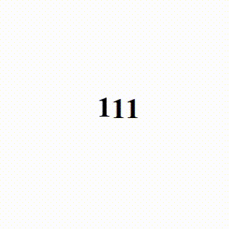
可以用轮播图的原理,通过移动竖向排列的文字实现数字滚动,可以使用position定位也可以使用transform移动元素
<!DOCTYPE html>
<html lang="en">
  <head>
    <meta charset="UTF-8" />
    <meta name="viewport" content="width=device-width, initial-scale=1.0" />
    <title>Document</title>
    <style>
      * {
        --wrapper-height: 40px;
      }
      .f {
        margin: 0 auto;
        display: flex;
        align-items: center;
        justify-content: center;
        position: relative;
        top: 400px;
        overflow: hidden;
        font-size: 32px;
        font-weight: bold;
        width: fit-content;
      }
      .s1 {
        height: var(--wrapper-height);
        /* position: relative; */
        top: 0;
        transition: all 2s ease;
      }
      .move {
        /* top: calc(-4 * var(--wrapHeight)); */
        transform: translateY(calc(-4 * var(--wrapper-height)));
      }
      .s2 {
        height: var(--wrapper-height);
        line-height: var(--wrapper-height);
      }
    </style>
  </head>
  <body>
    <div class="f">
      <div class="s1">
        <div class="s2">1</div>
        <div class="s2">2</div>
        <div class="s2">3</div>
        <div class="s2">4</div>
        <div class="s2">5</div>
      </div>
      <div class="s1">
        <div class="s2">1</div>
        <div class="s2">2</div>
        <div class="s2">3</div>
        <div class="s2">4</div>
        <div class="s2">5</div>
      </div>
      <div class="s1">
        <div class="s2">1</div>
        <div class="s2">2</div>
        <div class="s2">3</div>
        <div class="s2">4</div>
        <div class="s2">5</div>
      </div>
    </div>
  </body>
  <script>
    window.addEventListener("load", function () {
      const s1Elements = document.querySelectorAll(".s1");
      s1Elements.forEach((el, i) => {
        setTimeout(() => el.classList.add("move"), 200 * i);
      });
    });
  </script>
</html>
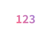
渐变色文字实现
<!DOCTYPE html>
<html lang="en">
  <head>
    <meta charset="UTF-8" />
    <meta name="viewport" content="width=device-width, initial-scale=1.0" />
    <title>Document</title>
    <style>
      * {
        --wrapper-height: 40px;
      }
      .f {
        margin: 0 auto;
        display: flex;
        align-items: center;
        justify-content: center;
        position: relative;
        top: 400px;
        overflow: hidden;
        font-size: 32px;
        font-weight: bold;
        width: fit-content;
        /* 文字渐变色 */
        background: linear-gradient(52.76deg, #ff6988 20%, #8196ff 100%);
        background-clip: text;
        -webkit-background-clip: text;
        -webkit-text-fill-color: transparent;
      }
    </style>
  </head>
  <body>
    <div class="f">
      123
    </div>
  </body>
</html>
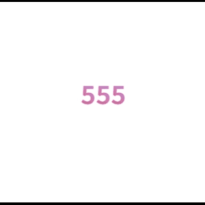
结合渐变色文字与滚动效果(出现问题)
Firefox(正常)
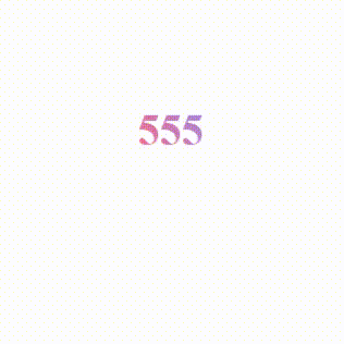
edge/chrome/safari(文字消失)

<!DOCTYPE html>
<html lang="en">
  <head>
    <meta charset="UTF-8" />
    <meta name="viewport" content="width=device-width, initial-scale=1.0" />
    <title>Document</title>
    <style>
      * {
        --wrapper-height: 40px;
      }
      .f {
        margin: 0 auto;
        display: flex;
        align-items: center;
        justify-content: center;
        position: relative;
        top: 400px;
        overflow: hidden;
        font-size: 32px;
        font-weight: bold;
        width: fit-content;
        /* 文字渐变色 */
        background: linear-gradient(52.76deg, #ff6988 20%, #8196ff 100%);
        background-clip: text;
        -webkit-background-clip: text;
        -webkit-text-fill-color: transparent;
      }
      .s1 {
        height: var(--wrapper-height);
        /* position: relative; */
        top: 0;
        transition: all 2s ease;
      }
      .move {
        /* top: calc(-4 * var(--wrapHeight)); */
        transform: translateY(calc(-4 * var(--wrapper-height)));
      }
      .s2 {
        height: var(--wrapper-height);
        line-height: var(--wrapper-height);
      }
    </style>
  </head>
  <body>
    <div class="f">
      <div class="s1">
        <div class="s2">1</div>
        <div class="s2">2</div>
        <div class="s2">3</div>
        <div class="s2">4</div>
        <div class="s2">5</div>
      </div>
      <div class="s1">
        <div class="s2">1</div>
        <div class="s2">2</div>
        <div class="s2">3</div>
        <div class="s2">4</div>
        <div class="s2">5</div>
      </div>
      <div class="s1">
        <div class="s2">1</div>
        <div class="s2">2</div>
        <div class="s2">3</div>
        <div class="s2">4</div>
        <div class="s2">5</div>
      </div>
    </div>
  </body>
  <script>
    window.addEventListener("load", function () {
      const s1Elements = document.querySelectorAll(".s1");
      s1Elements.forEach((el, i) => {
        setTimeout(() => el.classList.add("move"), 200 * i);
      });
    });
  </script>
</html>
问题分析
- 如果给
.f元素设置渐变色文字,无论文字如何移动(使用position或者transform移动)只要一动文字就会变成透明色 - 如果给
.s1元素设置渐变色文字,在主流浏览器中都会只有第一个元素有背景色渐变,并且渐变不是期望的整体从第一个文字渐变到最后一个文字,而是每个文字单独渐变

- 如果给
.s2元素设置渐变色文字,每个滚动文字都会有渐变色,但是也同样只是每个文字单独渐变的效果
解决方法
- 只有给
.s2元素添加渐变色文字才能在各个浏览器环境下,滚动的时候带上渐变色文字 - 背景渐变需要有
.f元素的宽度 - 每个
.s2元素都需要计算背景偏移,才能实现整体渐变色
<!DOCTYPE html>
<html lang="en">
  <head>
    <meta charset="UTF-8" />
    <meta name="viewport" content="width=device-width, initial-scale=1.0" />
    <title>Document</title>
    <style>
      * {
        --wrapper-height: 40px;
      }
      .f {
        margin: 0 auto;
        display: flex;
        align-items: center;
        justify-content: center;
        position: relative;
        top: 400px;
        overflow: hidden;
        font-size: 32px;
        font-weight: bold;
        width: fit-content;
      }
      .s1 {
        height: var(--wrapper-height);
        /* position: relative; */
        top: 0;
        transition: all 2s ease;
      }
      .move {
        /* top: calc(-4 * var(--wrapHeight)); */
        transform: translateY(calc(-4 * var(--wrapper-height)));
      }
      .s2 {
        height: var(--wrapper-height);
        line-height: var(--wrapper-height);
        background: linear-gradient(52.76deg, #ff6988 20%, #8196ff 100%);
        background-clip: text;
        -webkit-background-clip: text;
        -webkit-text-fill-color: transparent;
        background-size: var(--f-width) var(--wrapper-height);
        background-position: var(--offset-x) 0;
      }
    </style>
  </head>
  <body>
    <div class="f">
      <div class="s1">
        <div class="s2">1</div>
        <div class="s2">2</div>
        <div class="s2">3</div>
        <div class="s2">4</div>
        <div class="s2">5</div>
      </div>
      <div class="s1">
        <div class="s2">1</div>
        <div class="s2">2</div>
        <div class="s2">3</div>
        <div class="s2">4</div>
        <div class="s2">5</div>
      </div>
      <div class="s1">
        <div class="s2">1</div>
        <div class="s2">2</div>
        <div class="s2">3</div>
        <div class="s2">4</div>
        <div class="s2">5</div>
      </div>
    </div>
  </body>
  <script>
    window.addEventListener("load", function () {
      const fElement = document.querySelector(".f");
      const fWidth = fElement.offsetWidth;
      const s1Elements = document.querySelectorAll(".s1");
      let count = 0;
      s1Elements.forEach((el, i) => {
        el.style.setProperty("--f-width", fWidth + "px");
        el.style.setProperty("--offset-x", -el.offsetWidth * i + "px");
        setTimeout(() => el.classList.add("move"), 200 * i);
      });
    });
  </script>
</html>
"Knowledge isn't free. You have to pay attention."

 浙公网安备 33010602011771号