炫彩流光文字 html+css
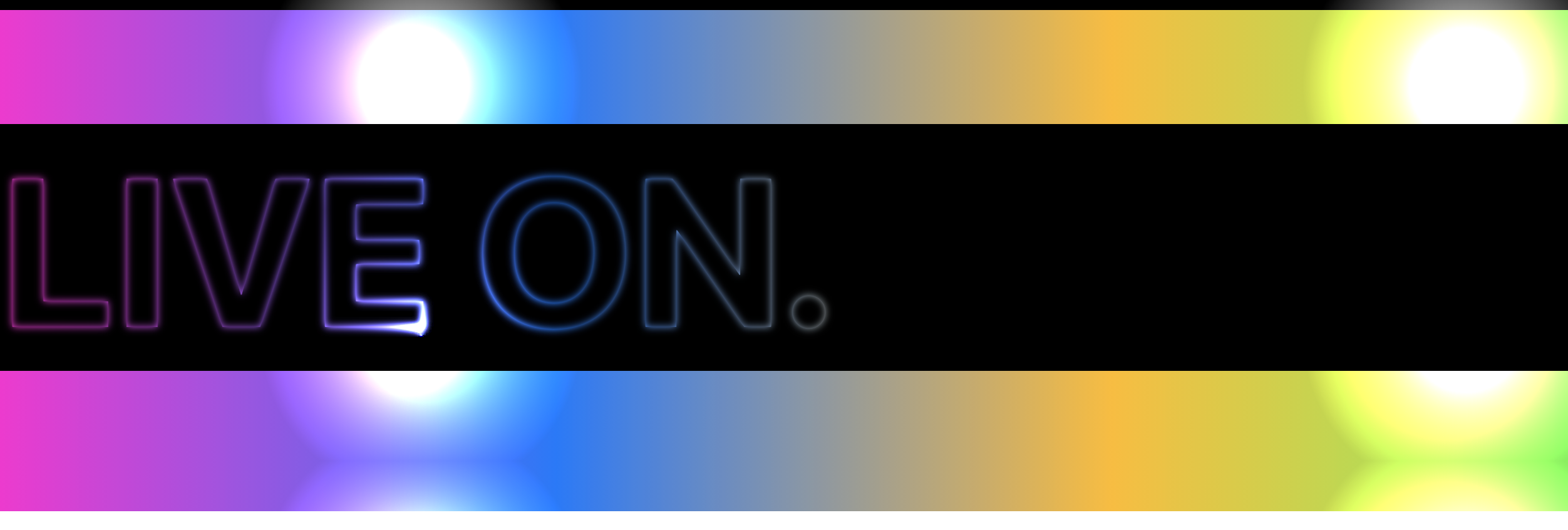
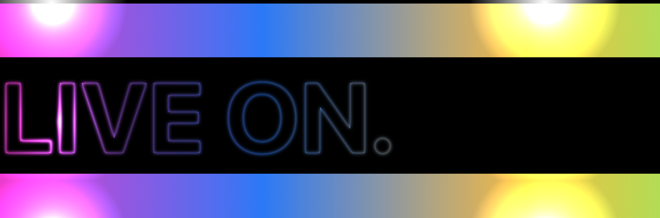
vue:
   <main>
      <h1 class="txt">live on.</h1>
      <h1 class="txt2"></h1>
      <h1 class="txt3"></h1>
    </main>

style:
main {
  position: relative;
  overflow: hidden;
}
.txt {
  color: rgb(255, 255, 255);
  text-transform: uppercase;
  font-size: 168px;
  background-color: rgb(0, 0, 0);
  user-select: none;
  width: 80%;
}

.txt::before {
  content: "live on.";
  position: absolute;
  filter: blur(3px);
  mix-blend-mode: difference;
}

.txt2 {
  position: absolute;
  top: 0;
  left: 0;
  width: 80%;
  height: 100%;
  background: linear-gradient(
    90deg,
    rgb(255, 0, 212),
    rgb(0, 119, 255),
    rgb(255, 187, 0),
    rgb(1, 255, 77)
  );
  mix-blend-mode: multiply;
}
.txt3 {
  position: absolute;
  top: -100%;
  left: -100%;
  right: 0;
  bottom: 0;
  background-image: radial-gradient(circle, white, black 30%);
  background-size: 25% 25%;
  mix-blend-mode: color-dodge;
  animation: shine 3s linear infinite;
}
@keyframes shine {
  100% {
    transform: translate(50%, 50%);
  }
}
效果:

 浙公网安备 33010602011771号