CSS进阶
一.css目标选择器
(1)设置需要的div、p、ul、li
HTML:

<div>
        <p>Lorem ipsum dolor sit amet.</p>
        <ul>
            <li>item 1</li>
            <li>
                <p>Item 2</p>
            </li>
            <li>item 3</li>
        </ul>
        <p>
            Lorem ipsum dolor sit amet.
        </p>
    </div>
    <p>Lorem ipsum dolor sit amet.</p>
设置背景颜色:
 div>p {
            background: #ddd;
        }
效果图:
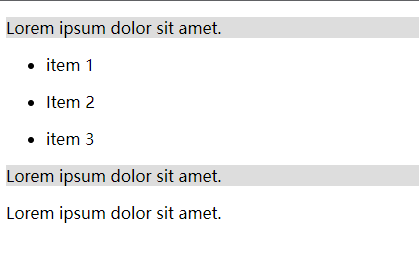
为什么item 2 并没有背景颜色?
原因:div>p
指的是所有父级元素为div的p标签,包裹item的p标签父级元素为li 所以它并没有被选择上 因此也就没有背景颜色
(2)HTML不变
增加新的CSS
div+p {
            background: #333;
            color: #FFF;
        }
效果图:
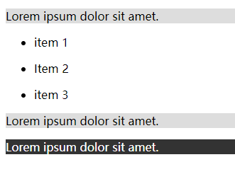
原因:div+p
指的是div和div后面紧跟着的p标签 表示的是div标签的下一个兄弟元素 并不是div和p标签
 <a href="#">第一页</a>
    <a href="#">第二页</a>
    <a href="http://baidu.com" target="_blank">百度</a>
CSS:
/* 属性选择 */
        a[target] {
            background: #ff0000;
            color: #FFF;
        }
效果图:
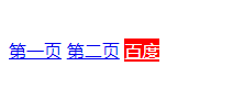
原因:a[target] 是通过选择a标签的一个属性来给设置样式
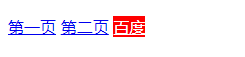
那如果 有重复属性的a标签呢
 <a href="#">第一页</a>
    <a href="#" target="_self">第二页</a>
    <a href="http://baidu.com" target="_blank">百度</a>
解决方法: 添加属性值
CSS:
/* 属性选择 */
        a[target="_blank"] {
            background: #ff0000;
            color: #FFF;
        }
效果图:依旧只给第三个百度跳转页面添加了样式
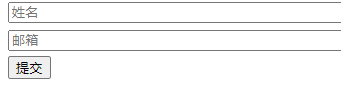
input标签修改
HTML:
 <form>
        <input type="text" placeholder="姓名">
        <input type="email" placeholder="邮箱">
        <input type="submit" placeholder="提交">
    </form>
CSS:
input[type="text"],
        input[type="email"] {
            width: 100%;
            margin-bottom: 5px;
        }
效果图:
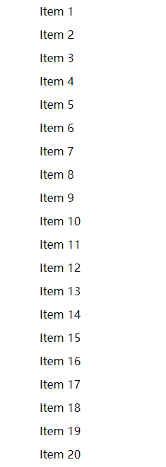
二、nth.child伪类选择器
基础HTML:
<ul>
        <li>Item 1</li>
        <li>Item 2</li>
        <li>Item 3</li>
        <li>Item 4</li>
        <li>Item 5</li>
        <li>Item 6</li>
        <li>Item 7</li>
        <li>Item 8</li>
        <li>Item 9</li>
        <li>Item 10</li>
        <li>Item 11</li>
        <li>Item 12</li>
        <li>Item 13</li>
        <li>Item 14</li>
        <li>Item 15</li>
        <li>Item 16</li>
        <li>Item 17</li>
        <li>Item 18</li>
        <li>Item 19</li>
        <li>Item 20</li>
    </ul>
CSS:
li {
            padding: 0.25rem;
            margin: 0.25rem;
            list-style: none;
        }
效果图:
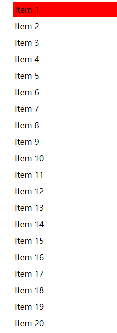
first-child以及last-child的使用
li:first-child {
            background: #ff0000;
        }
效果图:
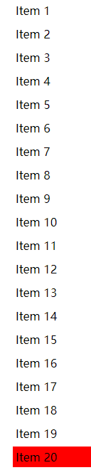
CSS:
li:last-child {
            background: #ff0000;
        }
效果图:
3.如果要选择第三个li标签:
CSS:
 /* 选择第三个li */
        li:nth-child(3) {
            background: #ff0000;
        }
需要用到:nth-child(需要设置样式的序号)
指定序号进行样式设置
如果:
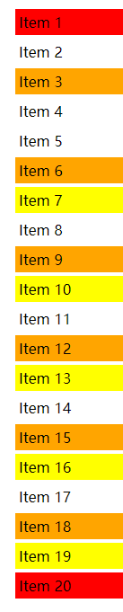
4.nth-child(3n)的效果:
li:nth-child(3n) {
            background: orange;
        }
效果图:
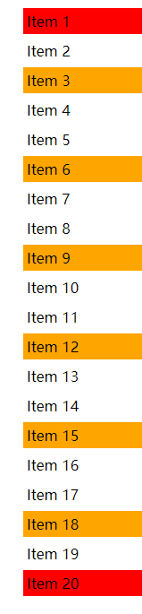
变色的行数都是3的倍数
5.:nth-child(3n+7)
 li:nth-child(3n+7) {
            background: yellow;
        }
效果图:
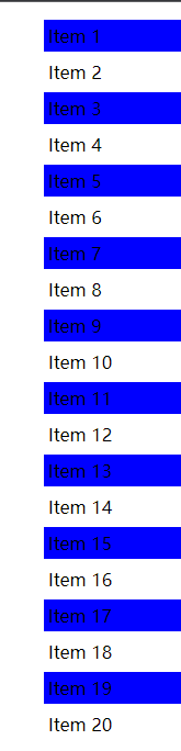
6.奇数选择
CSS:
li:nth-child(odd) {
            background: blue;
        }
效果图:
7.偶数行变色
CSS
li:nth-child(even) {
            background: pink;
        }
效果图: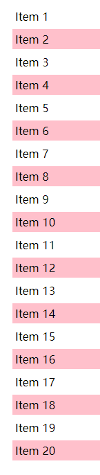
三、伪元素:after&before
当我们添加伪元素后并不会文档中生成
基础HTML:
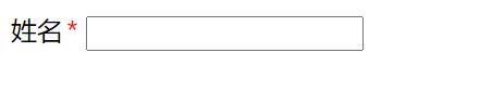
<label for="name" class="is-required ">姓名</label>
    <input type="text">
css样式:
.is-required:after {
            content: '*';
            color: red;
            padding-left: 2px;
        }
用到的伪类 :after (单冒号)
效果图:
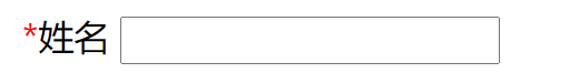
把:after改为:before
效果图:
before应用场景:图片覆盖:
基础HTML:
 <header>
        <h1>欢迎来到秋裤在线</h1>
        <p>Lorem ipsum dolor, sit amet consectetur adipisicing elit. Enim, culpa?</p>
    </header>
    <section>
        <h3>Lorem, ipsum dolor.</h3>
        <p>Lorem, ipsum dolor sit amet consectetur adipisicing elit. Voluptatibus vel dignissimos sunt sapiente atque.
            Tempore quam harum sequi, nostrum maiores itaque quidem vero officiis ab, voluptates temporibus qui
            obcaecati. Atque.
        </p>
    </section>
基本CSS样式:
body {
            font-family: Arial, Helvetica, sans-serif;
            background-color: #333;
            color: #fff;
            margin: 0;
        }

        header {
            display: flex;
            flex-direction: column;
            justify-content: center;
            align-items: center;
            text-align: center;
            height: 100vh;
        }

        header>h1 {
            font-size: 4rem;
            margin: 1rem;
        }
:before最主要的
 header {
            display: flex;
            flex-direction: column;
            justify-content: center;
            align-items: center;
            text-align: center;
            height: 100vh;

        }

        header:before {
            content: '';
            background: url('./img/111.jpg') no-repeat no-repeat center center/cover;
            opacity: 0.4;
            position: absolute;
            width: 100%;
            height: 100%;
            z-index: -1;
        }
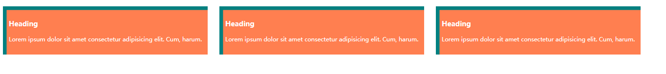
四、盒子阴影
基本HTML:
<div class="container">
        <div class="box">
            <h3>Heading</h3>
            <p>Lorem ipsum dolor sit amet consectetur adipisicing elit. Cum, harum.</p>
        </div>
        <div class="box">
            <h3>Heading</h3>
            <p>Lorem ipsum dolor sit amet consectetur adipisicing elit. Cum, harum.</p>
        </div>
        <div class="box">
            <h3>Heading</h3>
            <p>Lorem ipsum dolor sit amet consectetur adipisicing elit. Cum, harum.</p>
        </div>
    </div>
CSS:
外阴影:

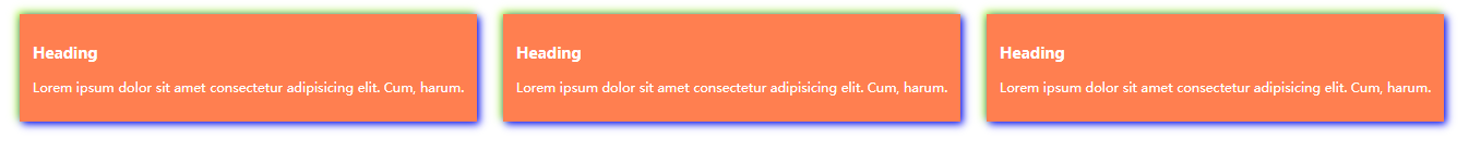
内阴影: 正负数值相反
双重阴影:
五、文字阴影:
基本HTML:
<h1 class="a">欢迎来到秋裤在线</h1>
    <h1 class="b">欢迎来到秋裤在线</h1>
    <h1 class="c">欢迎来到秋裤在线</h1>
    <h1 class="d">欢迎来到秋裤在线</h1>
text-shadow: 0.2rem 0.2rem steelblue;
text-shadow: 0.4rem 0.4rem 0.7rem olivedrab;
3.白色字体:
CSS:
h1.c {
            /* white text */
            color: #fff;
            text-shadow: 0.2rem 0.2rem 1rem tomato;
        }
4.负值
text-shadow: -0.4rem -0.3rem 0.7rem olivedrab;
六、CSS变量自定义属性
HTML:
 <header>
        <h1>欢迎来到秋裤在线</h1>
    </header>
    <div class="container">
        <div class="box box-1">
            <h3>标题</h3>
            <p>Lorem ipsum dolor sit amet consectetur adipisicing elit. Inventore nesciunt quo libero possimus aperiam
                repellat.</p>
        </div>
        <div class="box box-2">
            <h3>标题</h3>
            <p>Lorem ipsum dolor sit amet consectetur adipisicing elit. Inventore nesciunt quo libero possimus aperiam
                repellat.</p>
        </div>
    </div>
CSS:
 :root {
            /* 定义方法实例 */
            --primary-color: #333;
            --light-color: #ccc;
            --secondary-color: #f4f4f4;
            --max-width: 768px;
            --box-1-width: 3;
            --box-2-width: 2;
        }

        * {
            padding: 0;
            margin: 0;
        }

        header {
            background-color: var(--primary-color);
            color: #fff;
            border-bottom: 5px var(--secondary-color) solid;
            text-align: center;
        }

        body {
            font-family: Arial, Helvetica, sans-serif;
            line-height: 1.4;
            background: var(--light-color);

        }

        .container {
            display: flex;
            margin: 0 auto;
            width: var(--max-width);
        }

        .box {
            background-color: var(--primary-color);
            border-bottom: 5px var(--secondary-color) solid;
            color: #fff;
            padding: 1rem;
            margin: 1rem;
        }

        .box-1 {
            flex: var(--box-1-width);
        }

        .box-2 {
            flex: var(--box-2-width);
        }
最重要的是: :root
七:css动画01
HTML:
<div class="box"></div>
CSS:
body {
            background: #333;
        }

        .box {
            background: white;
            height: 200px;
            width: 200px;
            position: relative;
            /* animation-name: animate1; */
            /* 动画时间 */
            /* animation-duration: 2s; */
            /* 动画次数 */
            /* 循环 */
            /* animation-iteration-count: infinite; */
            /* animation-iteration-count: 1; */
            /* 在播放完或播放后的动画效果是否可见 */
            /* 在播放完停留 展示最终效果 */
            /* animation-fill-mode: forwards; */
            /* 动画的延迟时间 */
            /* animation-delay: 1s; */
            /* 奇数次正向播放 偶数次反向播放 */
            /* animation-direction: alternate; */
            /* 动画反向播放 */
            /* animation-direction: reverse; */
            /* 结合 */
            /* 奇数次反向播放 偶数次正向播放 */
            /* animation-direction: alternate-reverse; */
            /* 速度曲线 */
            /* 先慢后快 */
            /* animation-timing-function: ease; */
            /* 缓慢开始 */
            /* animation-timing-function: ease-in; */
            /* 缓慢结束 */
            /* animation-timing-function: ease-out; */
            /* 结合 缓慢开始缓慢结束 */
            /* animation-timing-function: ease-in-out; */
            animation: animate1 2s infinite forwards alternate-reverse ease-in-out;
        }

        @keyframes animate1 {
            form {
                width: 200px;
                top: 0;
            }

            to {
                width: 600px;
                background: red;
                top: 300px;
            }
        }
八:CSS动画02
HTML:
<div class="box"></div>
CSS:
 body {
            background: #333;
        }

        .box {
            background: #fff;
            width: 200px;
            height: 200px;
            position: relative;
            top: 0;
            left: 0;
            animation: animate1 5s forwards ease-in-out;
        }

        @keyframes animate1 {
            25% {
                top: 0;
                left: 300px;
                background: red;
                border-radius: 50% 0 0 0;
            }

            50% {
                top: 300px;
                left: 300px;
                background: blue;
                border-radius: 50% 50% 0 0;
            }

            75% {
                top: 300px;
                left: 0;
                background: green;
                border-radius: 50% 50% 50% 0;
            }

            100% {
                top: 0;
                left: 0;
                background: white;
                border-radius: 50%;

            }
        }
九:过渡
HTML:
<div class="box"></div>
CSS:
 body {
            background: #333;
            display: flex;
            justify-content: center;
            align-items: center;
            height: 100vh;
        }

        .box {
            background: white;
            width: 100px;
            height: 100px;
            /* transition-property: background; */
            /* 过渡周期 */
            /* transition-duration: 1.5s; */
            /* 过渡延迟 */
            /* transition-delay: 1s; */
            /* 时间曲线 */
            /* transition-timing-function: ease-in-out; */
            /* all代替所有属性 */
            transition: all 2s ease-in-out;
        }

        .box:hover {
            background: red;
            border-radius: 50%;
            height: 300px;
            width: 300px;
        }
十:旋转平移
HTML:
<div class="box"></div>
body {
            background: #333;
            display: flex;
            justify-content: center;
            align-items: center;
            height: 100vh;
        }

        .box {
            background: white;
            width: 300px;
            height: 300px;
            /* 旋转 25° */
            /* transform: rotate(25deg); */

            /* 扭曲 */
            /* transform: skew(25deg); */

            /* 放大两倍 */
            /* transform: scale(2); */

            transition: all 1s ease-in-out;


        }

        .box:hover {
            transform: rotate(25deg);
            transform: skew(25deg);
            transform: scale(2);
            /* 平移 */
            /* 正数向下 负数向上 */
            transform: translateY(100px);
            /* 正数向右 负数向左 */
            transform: translateX(100px);
            /* 斜着平移 */
            /* 正数右下 负数左上 */
            transform: translate(100px, 100px);
            /* 3D */
            transform: translate3d(100px, 100px, 100px)
        }

 浙公网安备 33010602011771号