鸿蒙学习实战之路-层叠布局 Stack 全攻略
鸿蒙学习实战之路-层叠布局 Stack 全攻略
最近好多朋友问我:"鸿蒙的布局除了 Row、Column 和 Grid,还有没有能让元素叠在一起的?我想做个卡片悬浮效果,咋整啊?" _
今天这篇,我就手把手带你搞定层叠布局 Stack,教你怎么让元素像叠积木一样玩出花来!全程只讲能跑的代码和避坑指南,保证看完就能用~ 🥦
什么是层叠布局?
层叠布局(Stack Layout)就是在屏幕上划一块地方,让里面的元素能重叠显示的布局方式。想象一下你在桌上摆积木,后面放的积木会挡住前面的,Stack 布局就是这个原理!
Stack 容器里的子元素会按顺序"入栈",后一个元素覆盖前一个元素,就像这样:
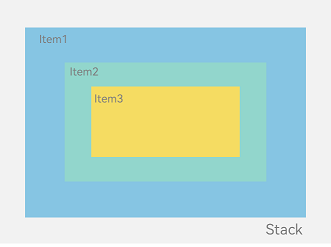
层叠布局特别适合做广告弹窗、卡片悬浮效果、底部导航栏等需要元素重叠的场景~
快速上手:第一个 Stack 布局
说了这么多,咱们直接上代码!先整个最简单的层叠布局看看效果:
// StackExample.ets
let marginTop = { 'top': 50 } // 给个上边距,让内容不贴顶
@Entry
@Component
struct StackExample {
  build() {
    Column() {
      // 1. 创建Stack容器,默认子元素居中堆叠
      Stack({ }) {
        // 2. 第一层:绿色背景(最大)
        Column().width('90%').height('100%').backgroundColor('#ff58b87c')
        // 3. 第二层:浅粉色文本(中间)
        Text('我是中间层').width('60%').height('60%').backgroundColor('#ffc3f6aa')
        // 4. 第三层:浅蓝色按钮(最小)
        Button('点我呀').width('30%').height('30%').backgroundColor('#ff8ff3eb').fontColor('#000')
      }
      .width('100%').height(150).margin(marginTop)
    }
  }
}
运行效果长这样:
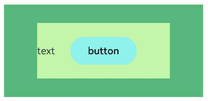
是不是超简单?Stack 默认会把所有子元素居中堆叠,咱们只需要按顺序放进去就行~
对齐方式:想咋叠就咋叠
默认居中当然不够用,Stack 提供了 9 种对齐方式,让你想咋叠就咋叠!
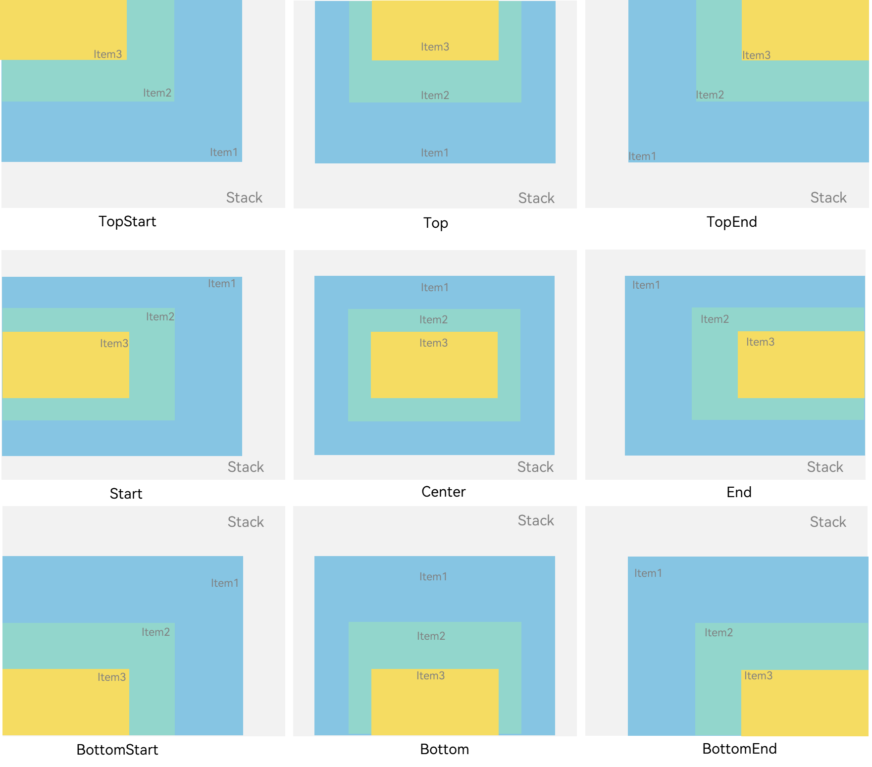
咱们用alignContent参数来控制对齐方式,比如左上角对齐:
// StackAlignExample.ets
@Entry
@Component
struct StackAlignExample {
  build() {
    // 设置对齐方式为左上角
    Stack({ alignContent: Alignment.TopStart }) {
      Text('最底层').width('90%').height('100%').backgroundColor('#e1dede')
      Text('中间层').width('70%').height('80%').backgroundColor(0xd2cab3)
      Text('最上层').width('50%').height('60%').backgroundColor(0xc1cbac)
    }
    .width('100%').height(150).margin({ top: 5 })
  }
}
🥦 西兰花小贴士:
Alignment 的取值和 CSS 的 flex 布局对齐方式很像,比如TopStart对应 CSS 的flex-start,BottomEnd对应flex-end,用过 CSS 的朋友应该秒懂~ _
Z 序控制:谁在上面谁说了算
有时候咱们需要控制哪个元素在最上面,这时候就需要用到zIndex属性了!zIndex值越大,元素层级越高,就会显示在越上面~
先看个默认情况:
// StackZIndexExample1.ets
Stack({ alignContent: Alignment.BottomStart }) {
  Column() {
    Text('子元素1').textAlign(TextAlign.End).fontSize(20)
  }
  .width(100).height(100).backgroundColor(0xffd306) // 黄色

  Column() {
    Text('子元素2').fontSize(20)
  }
  .width(150).height(150).backgroundColor(Color.Pink) // 粉色

  Column() {
    Text('子元素3').fontSize(20)
  }
  .width(200).height(200).backgroundColor(Color.Grey) // 灰色
}
.width(350).height(350).backgroundColor(0xe0e0e0)
运行效果:
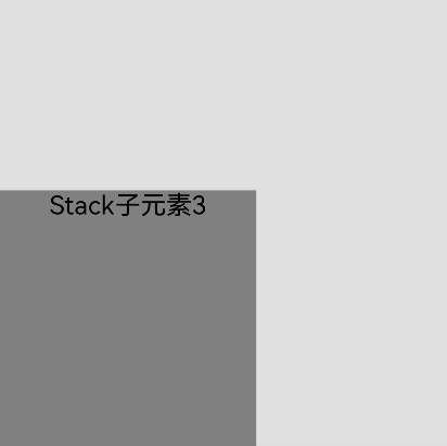
因为子元素 3 是最后一个,而且尺寸最大,所以把前面两个都挡住了!这时候咱们给前两个元素加上zIndex:
// StackZIndexExample2.ets
Stack({ alignContent: Alignment.BottomStart }) {
  Column() {
    Text('子元素1').fontSize(20)
  }
  .width(100).height(100).backgroundColor(0xffd306).zIndex(2) // 黄色,zIndex最高

  Column() {
    Text('子元素2').fontSize(20)
  }
  .width(150).height(150).backgroundColor(Color.Pink).zIndex(1) // 粉色,zIndex次之

  Column() {
    Text('子元素3').fontSize(20)
  }
  .width(200).height(200).backgroundColor(Color.Grey) // 灰色,默认zIndex最低
}
.width(350).height(350).backgroundColor(0xe0e0e0)
现在效果就变成这样了:
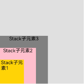
是不是超直观?zIndex 就像给元素发了个"插队卡",数值大的就能插前面~
实战案例:仿手机桌面布局
光说不练假把式,咱们整个实战案例——仿手机桌面布局,带悬浮底部导航栏:
// StackHomeExample.ets
// 定义应用信息接口
interface AppInfo {
  name: string;
  color: string;
}

@Entry
@Component
struct StackHomeExample {
  // 模拟应用列表 - 每个应用都有自己的颜色
  private apps: AppInfo[] = [
    {name: '微信', color: '#07C160'},
    {name: '微博', color: '#E6162D'},
    {name: '抖音', color: '#FE2C55'},
    {name: 'B站', color: '#00A1D6'},
    {name: '淘宝', color: '#FF5000'},
    {name: '京东', color: '#E1251B'},
    {name: '支付宝', color: '#1677FF'},
    {name: '拼多多', color: '#FFD400'}
  ];

  build() {
    // 整个页面作为Stack容器
    Stack({ alignContent: Alignment.Bottom }) {
      // 第一层:应用图标网格
      Flex({ wrap: FlexWrap.Wrap }) {
        ForEach(this.apps, (app: AppInfo) => {
          Text(app.name)
            .width(100)
            .height(100)
            .fontSize(16)
            .fontColor(0xFFFFFF)
            .margin(10)
            .textAlign(TextAlign.Center)
            .borderRadius(10)
            .backgroundColor(app.color)
        }, (app: AppInfo): string => app.name)
      }
      .width('100%').height('100%')

      // 第二层:悬浮底部导航栏
      Flex({ justifyContent: FlexAlign.SpaceAround, alignItems: ItemAlign.Center }) {
        Text('联系人').fontSize(16)
        Text('设置').fontSize(16)
        Text('短信').fontSize(16)
      }
      .width('50%')
      .height(50)
      .backgroundColor('#16302e2e')
      .margin({ bottom: 15 })
      .borderRadius(15)
    }
    .width('100%').height('100%').backgroundColor('#CFD0CF')
  }
}
运行效果:
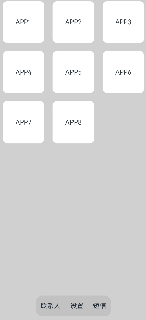
这个案例是不是很实用?底部导航栏悬浮在应用图标上方,用 Stack 布局轻松实现~
🥦 西兰花警告:
过多的嵌套 Stack 组件会导致性能问题哦!如果只是想实现简单的元素叠加,比如给按钮加个阴影,直接用组件的shadow属性会比套个 Stack 性能更好~ 官方文档里也说了,能不用嵌套就不用,咱们要做个懂优化的好厨子!_
避坑指南
-
不要过度嵌套:Stack 嵌套超过 3 层,性能就会明显下降,能用其他方式实现的效果尽量不用 Stack
-
zIndex 的使用场景:只有当元素确实需要动态调整层级时才用 zIndex,否则尽量靠元素顺序控制层级
-
对齐方式的选择:根据实际需求选择合适的对齐方式,避免用了
BottomEnd又手动加margin去调整位置,多此一举~
总结一下
今天咱们学会了:
- 层叠布局 Stack:让元素重叠显示的布局方式
- 对齐方式:用
alignContent控制元素堆叠的位置 - Z 序控制:用
zIndex控制元素的显示层级 - 实战案例:仿手机桌面布局,带悬浮底部导航栏
🥦 西兰花小贴士:
官方文档是个好东西!说三遍!关于 Stack 布局的更多细节,可以去看看官方文档~
👉 预告:《只会用基本布局?鸿蒙还有这些高级布局技巧!》
📚 推荐资料:
- 官方层叠布局文档:层叠布局 Stack
- 组件嵌套优化指南:组件嵌套优化
- 示例代码仓库:组件堆叠示例
我是盐焗西兰花,
不教理论,只给你能跑的代码和避坑指南。
下期见!🥦
需要参加鸿蒙认证的请点击 鸿蒙认证链接

 浙公网安备 33010602011771号