
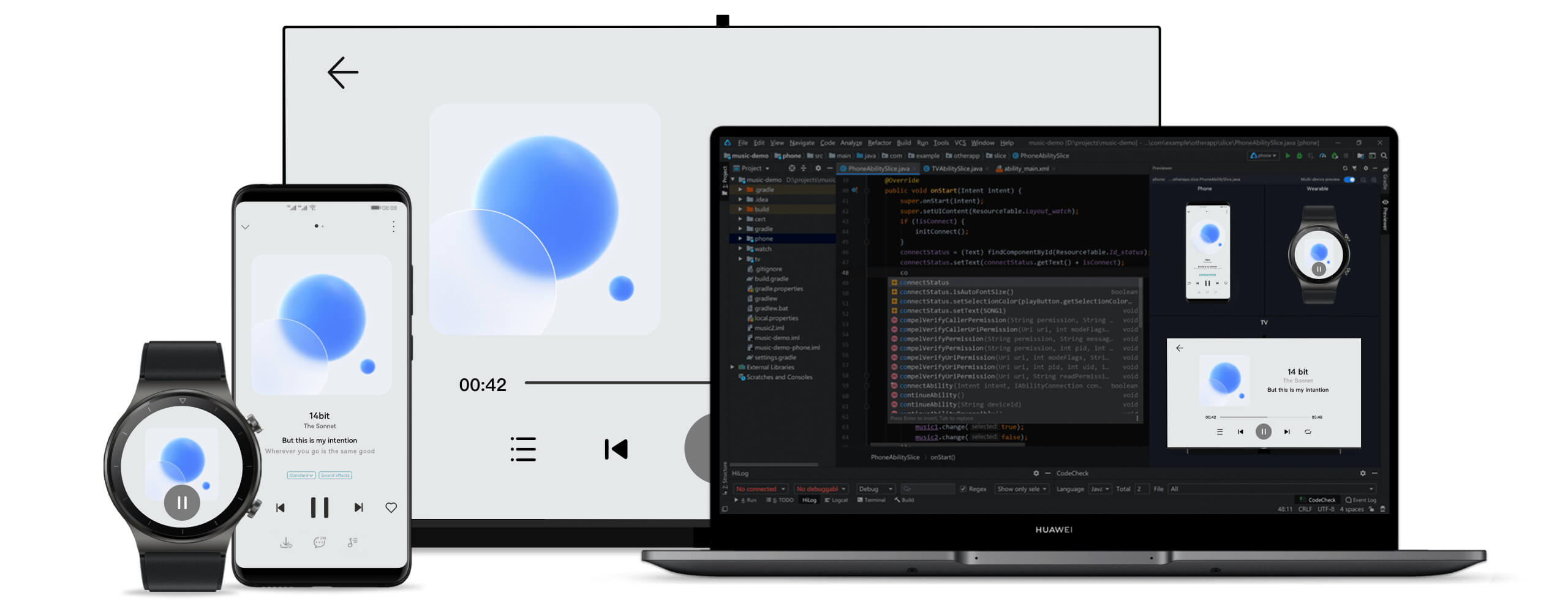
鸿蒙学习实战之路:鸿蒙一多开发:多设备适配
鸿蒙一多开发:多设备适配
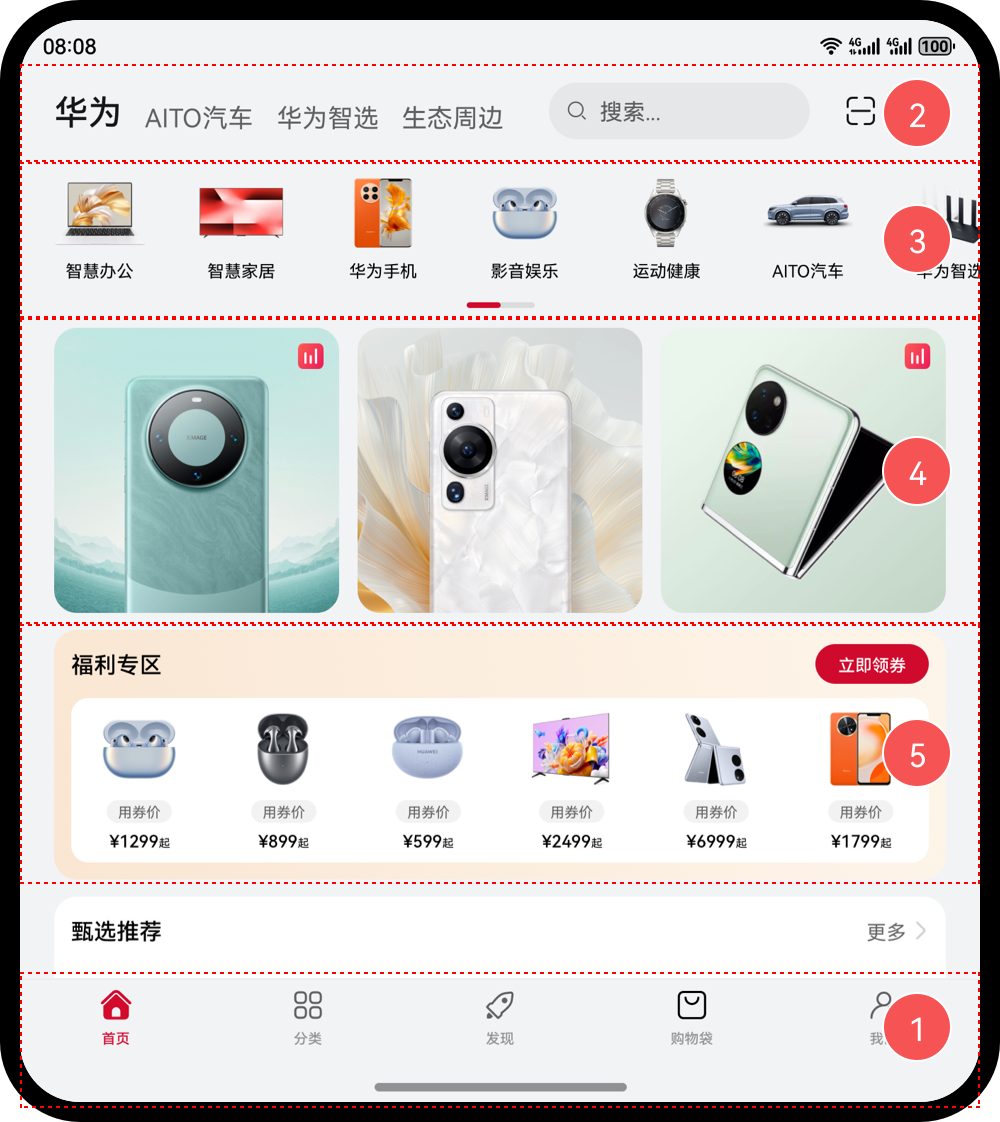
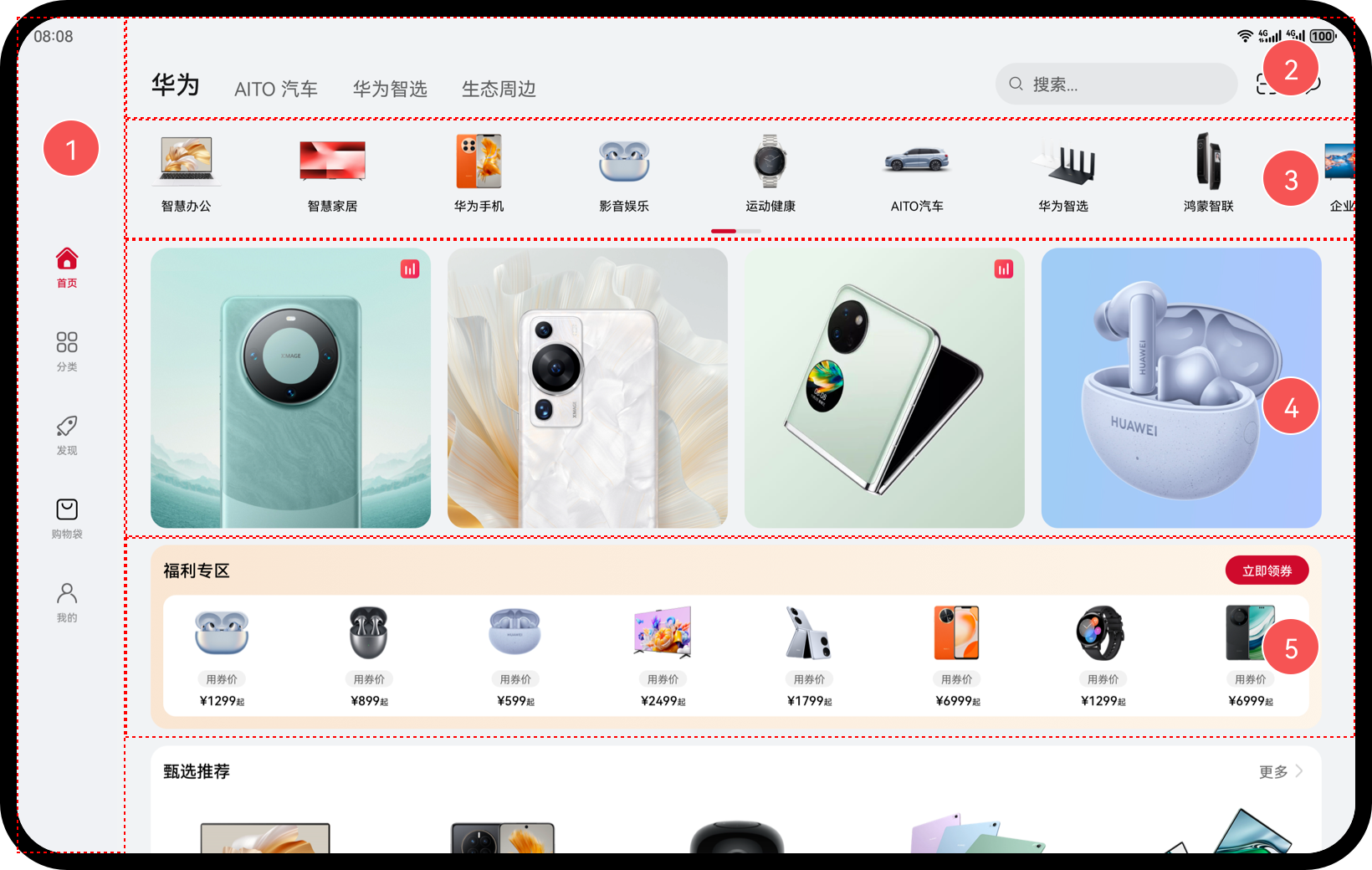
文章配套的图片素材如下
“一次开发、多端部署”简称“一多”:一套代码工程,一次开发上架,多端按需部署。
 为了实现这个目标,主要解决 3 个核心问题:

- 页面适配问题:界面级一多(重点掌握)
- 功能兼容问题:功能级一多(了解)
- 工程如何组织:工程级一多(重点掌握)
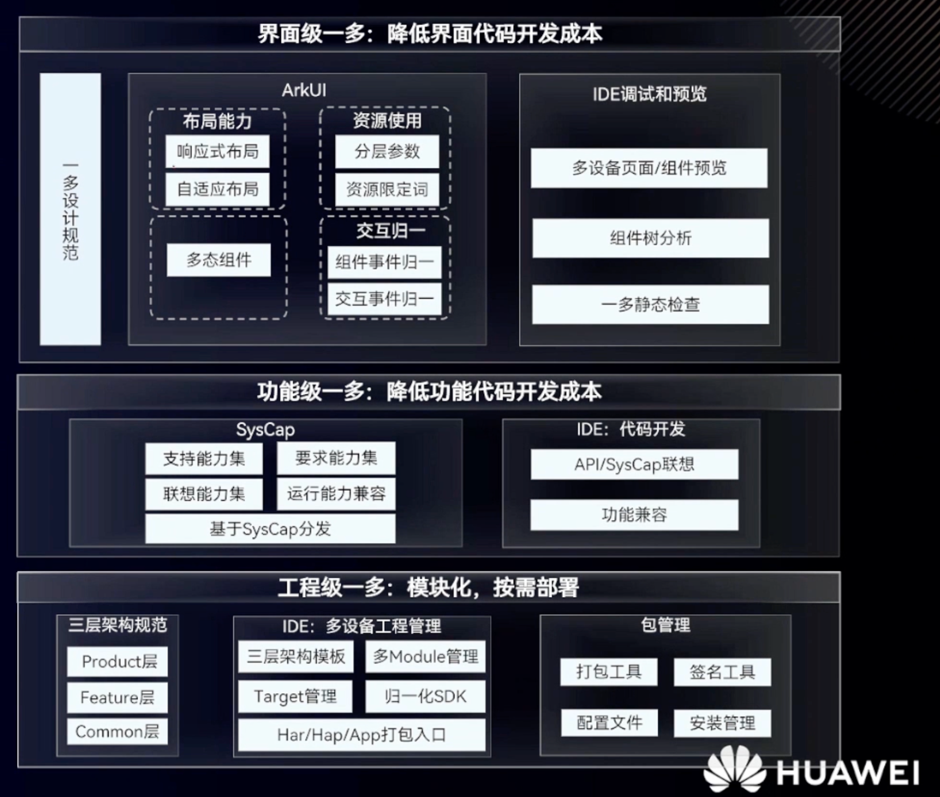
界面级一多能力(掌握)


界面级一多能力有 2 类:
- 自适应布局: 略微调整界面结构
- 响应式布局:比较大的界面调整
自适应布局
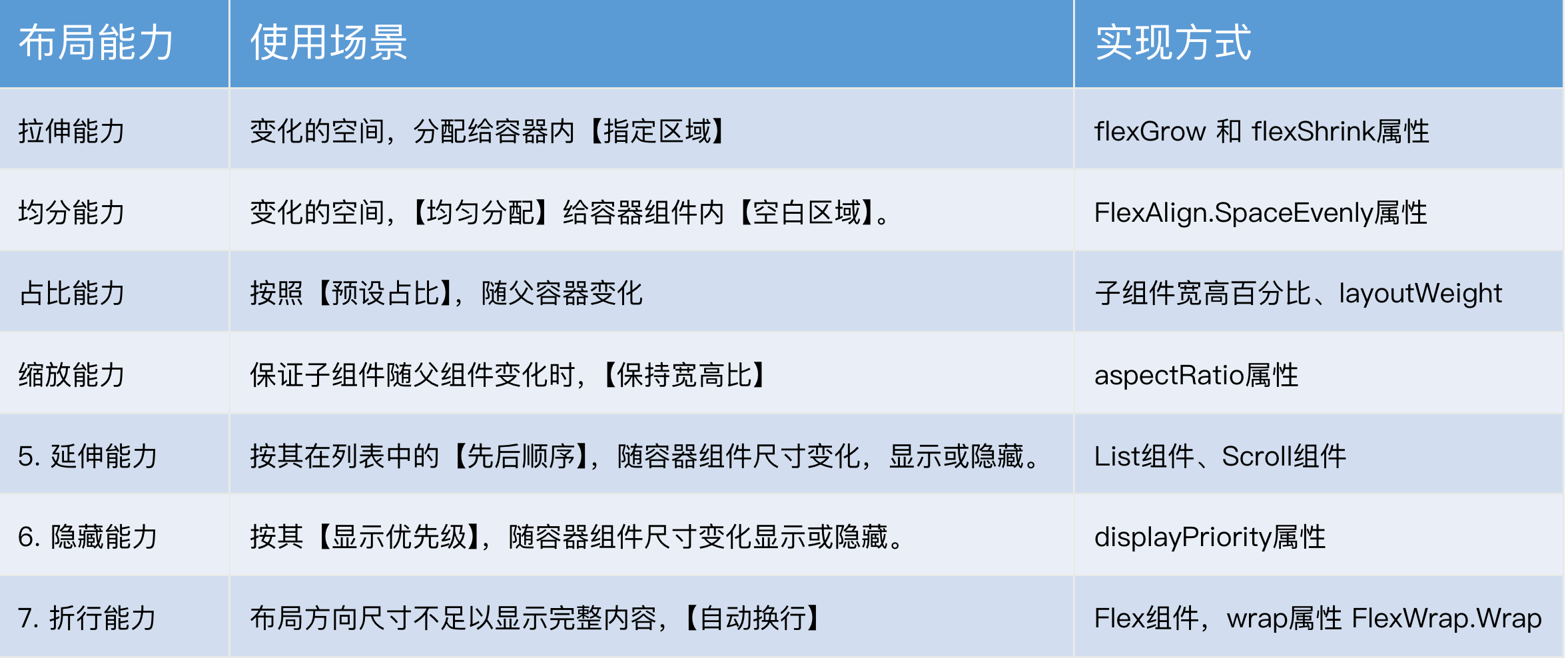
自适应布局的能力有 7 种,主要解决的是:窗口尺寸在【一定范围内】变化时,页面能够正常显示
| 自适应布局类别 | 自适应布局能力 | 使用场景 | 实现方式 |
|---|---|---|---|
| 自适应拉伸 | 拉伸能力 | 容器组件尺寸发生变化时,增加或减小的空间全部分配给容器组件内指定区域。 | Flex布局的flexGrow和flexShrink属性 |
| 均分能力 | 容器组件尺寸发生变化时,增加或减小的空间均匀分配给容器组件内所有空白区域。 | Row组件、Column组件或Flex组件的justifyContent属性设置为FlexAlign.SpaceEvenly | |
| 自适应缩放 | 占比能力 | 子组件的宽或高按照预设的比例,随容器组件发生变化。 | 基于通用属性的两种实现方式: - 将子组件的宽高设置为父组件宽高的百分比 - layoutWeight属性 |
| 缩放能力 | 子组件的宽高按照预设的比例,随容器组件发生变化,且变化过程中子组件的宽高比不变。 | 布局约束的aspectRatio属性 | |
| 自适应延伸 | 延伸能力 | 容器组件内的子组件,按照其在列表中的先后顺序,随容器组件尺寸变化显示或隐藏。 | 基于容器组件的两种实现方式: - 通过List组件实现 - 通过Scroll组件配合Row组件或Column组件实现 |
| 隐藏能力 | 容器组件内的子组件,按照其预设的显示优先级,随容器组件尺寸变化显示或隐藏。相同显示优先级的子组件同时显示或隐藏。 | 布局约束的displayPriority属性 | |
| 自适应折行 | 折行能力 | 容器组件尺寸发生变化时,如果布局方向尺寸不足以显示完整内容,自动换行。 | Flex组件的wrap属性设置为FlexWrap.Wrap |
拉伸能力
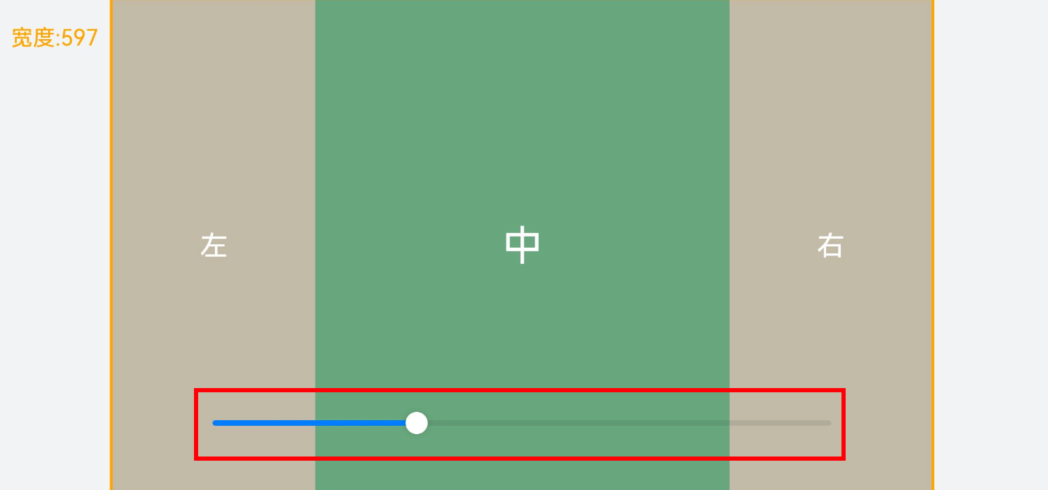
拉伸能力指的是容器尺寸发生变化时:将变化的空间,分配给容器内的【指定区域】。利用的是 2 个属性:
| 属性名 | 类型 | 必填 | 说明 |
|---|---|---|---|
| flexGrow | number | 是 | 设置父容器在主轴方向上的剩余空间分配给此属性所在组件的比例。 默认值:0 |
| flexShrink | number | 是 | 设置父容器压缩尺寸分配给此属性所在组件的比例。 父容器为Column、Row时,默认值:0 父容器为Flex时,默认值:1 |
测试代码:
@Entry
@Component
struct Demo01 {
  // 绑定的宽度-默认 600
  @State containerWidth: number = 600

  // 底部滑块,可以通过拖拽滑块改变容器尺寸。
  @Builder
  sliderBuilder() {
    Slider({
      value: this.containerWidth, // 绑定的值
      min: 400, // 最小值
      max: 1000, // 最大值
      style: SliderStyle.OutSet // 滑块在滑轨上
    })
      .onChange((value: number) => {
        this.containerWidth = value
      })
      .blockColor(Color.White)
      .width('60%')
      .position({ x: '20%', y: '80%' })
  }

  build() {
    Stack({ alignContent: Alignment.TopStart }) {
      // 标记现在的宽度
      Text('宽度:' + this.containerWidth)
        .zIndex(2)
        .translate({ x: 20, y: 20 })
        .fontColor(Color.Orange)

      // 核心区域
      Column() {
        Column() {
          Row() {
            // 布局能l力 1:拉伸能力:
            // 容器组件尺寸发生改变时,将变化的部分分配给容器内的【指定区域】
            //

            // 涉及属性:
            // flexShrink:压缩比例,默认值:Column,Row 时(0),Flex 时(1)
            // flexGrow:拉伸比例,默认值 0

            // 需求:
            // 1. 空间不足时:分配给左右,1:1
            // 2. 空间富余时:分配给中间

            // 左
            Row() {
              Text('左')
                .fontSize(20)
                .fontColor(Color.White)
            }
            .justifyContent(FlexAlign.Center)
            .width(150)
            .height(400)
            .backgroundColor('#c2baa6')
            .flexShrink(1)

            // 中
            Row() {
              Text('中')
                .fontSize(30)
                .fontColor(Color.White)
            }
            .width(300)
            .height(400)
            .backgroundColor('#68a67d')
            .justifyContent(FlexAlign.Center)
            .flexGrow(1)


            // 右
            Row() {
              Text('右')
                .fontSize(20)
                .fontColor(Color.White)
            }
            .justifyContent(FlexAlign.Center)
            .width(150)
            .height(400)
            .backgroundColor('#c2baa6')
            .flexShrink(1)
          }
          .width(this.containerWidth)
          .justifyContent(FlexAlign.Center)
          .alignItems(VerticalAlign.Center)
          .border({ width: 2, color: Color.Orange })
          .backgroundColor(Color.Black)
        }

        // 底部滑块
        this.sliderBuilder()
      }
      .width('100%')
      .height('100%')
      .backgroundColor('#F1F3F5')
      .justifyContent(FlexAlign.Center)
      .alignItems(HorizontalAlign.Center)
    }
  }
}
均分能力
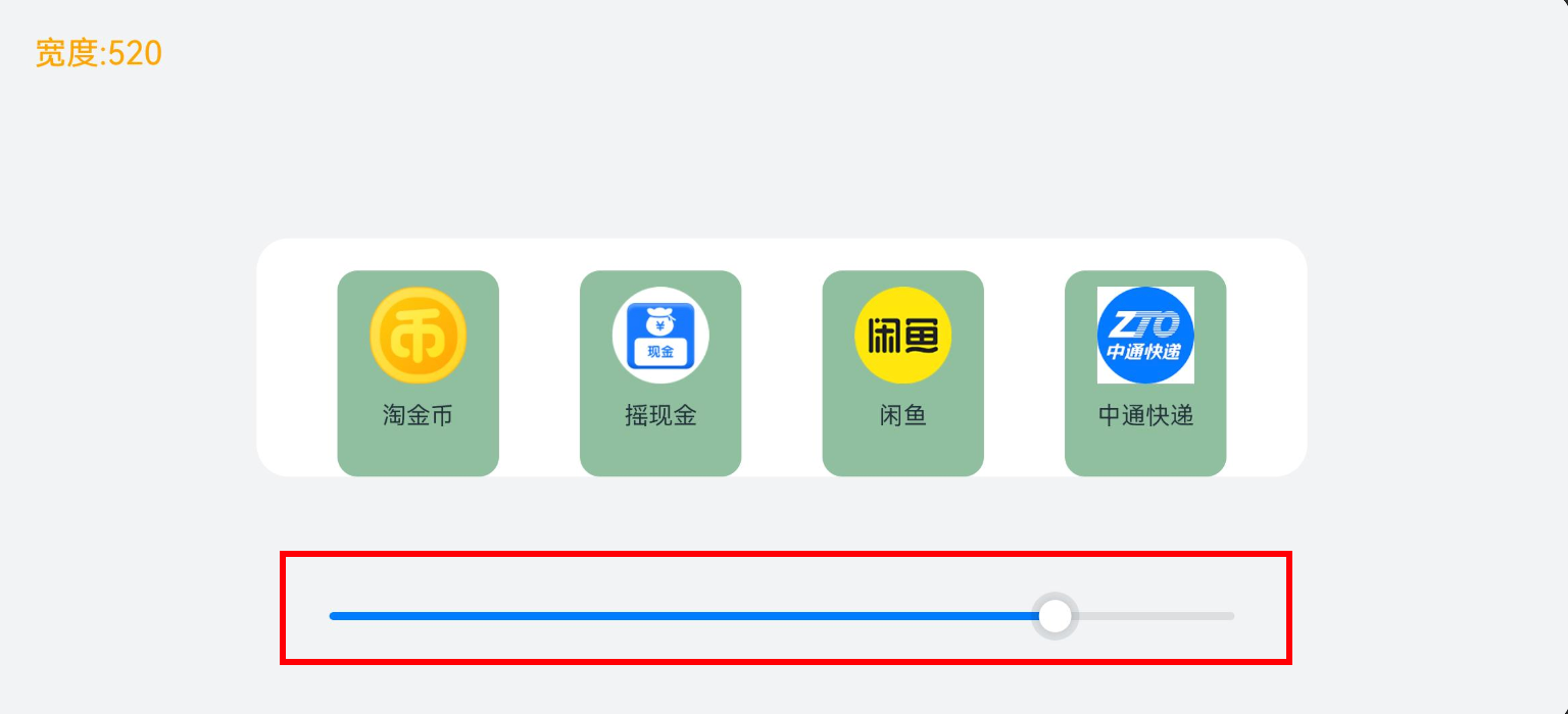
均分能力指的是容器尺寸发生变化时:将变化的空间,【均匀分配】给容器组件内【空白区域】。利用的是一个属性justifyContent,只能用在容器:Flex、Column、Row 上,将他设置为 SpaceEvenly即可
| 枚举名称 | 描述 |
|---|---|
| Start | 元素在主轴方向首端对齐,第一个元素与行首对齐,同时后续的元素与前一个对齐。 |
| Center | 元素在主轴方向中心对齐,第一个元素与行首的距离与最后一个元素与行尾距离相同。 |
| End | 元素在主轴方向尾部对齐,最后一个元素与行尾对齐,其他元素与后一个对齐。 |
| SpaceBetween | Flex主轴方向均匀分配弹性元素,相邻元素之间距离相同。第一个元素与行首对齐,最后一个元素与行尾对齐。 |
| SpaceAround | Flex主轴方向均匀分配弹性元素,相邻元素之间距离相同。第一个元素到行首的距离和最后一个元素到行尾的距离是相邻元素之间距离的一半。 |
| SpaceEvenly | Flex主轴方向均匀分配弹性元素,相邻元素之间的距离、第一个元素与行首的间距、最后一个元素到行尾的间距都完全一样。 |
测试代码:
export interface NavItem {
id: number
icon: ResourceStr
title: string
}
@Entry
@Component
struct Demo02 {
readonly list: NavItem [] = [
{ id: 1, icon: $r('app.media.ic_nav_01'), title: '淘金币' },
{ id: 2, icon: $r('app.media.ic_nav_02'), title: '摇现金' },
{ id: 3, icon: $r('app.media.ic_nav_03'), title: '闲鱼' },
{ id: 4, icon: $r('app.media.ic_nav_04'), title: '中通快递' },
]
@State rate: number = 600
// 底部滑块,可以通过拖拽滑块改变容器尺寸
@Builder
sliderBuilder() {
Slider({
value: this.rate,
min: 200,
max: 600,
style: SliderStyle.OutSet
})
.onChange((value: number) => {
this.rate = value
})
.blockColor(Color.White)
.width('60%')
.position({ x: '20%', y: '80%' })
}
build() {
Stack({ alignContent: Alignment.TopStart }) {
// 标记现在的宽度
Text('宽度:' + this.rate.toFixed(0))
.zIndex(2)
.translate({ x: 20, y: 20 })
.fontColor(Color.Orange)
Column() {
Column() {
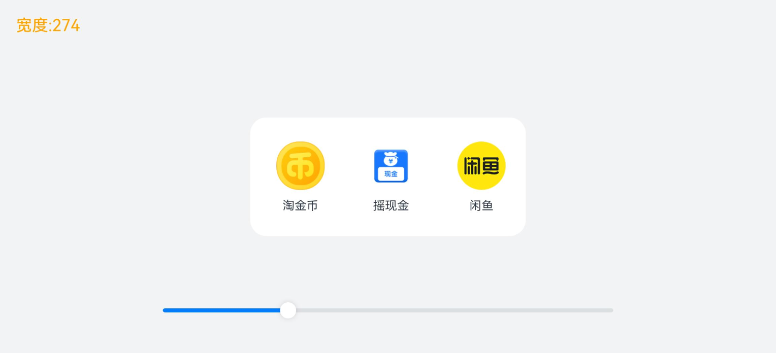
// 布局能力 2:均分能力
// 指容器组件尺寸发生变化时,增加或减小的空间均匀分配给容器组件内所有【空白区域】。
// 常用于内容数量固定、均分显示的场景,比如工具栏、底部菜单栏、导航栏等
// 涉及属性:
// Row、Column、Flex 组件的 justifyContent 属性
// justifyContent设置为 FlexAlign.SpaceEvenly即可
Row() {
ForEach(this.list, (item: NavItem) => {
Column({ space: 8 }) {
Image(item.icon)
.width(48)
.height(48)
Text(item.title)
.fontSize(12)
}
.justifyContent(FlexAlign.Center)
.width(80)
.height(102)
.backgroundColor('#8FBF9F')
.borderRadius(10)
})
}
.width('100%')
.justifyContent(FlexAlign.SpaceEvenly) // 均分
}
.width(this.rate) // 绑定滑块改变的尺寸
.padding({ top: 10, bottom: 10 })
.backgroundColor(Color.White)
.borderRadius(16)
this.sliderBuilder()
}
.width('100%')
.height('100%')
.backgroundColor(Color.Pink)
.justifyContent(FlexAlign.Center)
.alignItems(HorizontalAlign.Center)
}
}
}
占比能力
占比能力是指子组件的【宽高】按照【预设的比例】,随父容器组件发生变化。实现的方式有 2 种:
- 宽高设置为百分比
- 设置 layoutWeight
| 属性名 | 类型 | 必填 | 说明 |
|---|---|---|---|
| width | Length | 是 | 要设置的组件宽度。 单位:vp |
| height | Length | 是 | 要设置的组件高度。 单位:vp |
| layoutWeight | number | string | 是 |
测试代码:
@Entry
@Component
struct Demo03 {
  @State rate: number = 200

  // 底部滑块,可以通过拖拽滑块改变容器尺寸
  @Builder
  slider() {
    Slider({
      value: this.rate,
      min: 200,
      max: 500,
      style: SliderStyle.OutSet
    })
      .blockColor(Color.White)
      .width('60%')
      .height(50)
      .onChange((value: number) => {
        this.rate = value / 100
      })
      .position({ x: '20%', y: '80%' })
  }

  build() {
    Stack({ alignContent: Alignment.TopStart }) {
      // 显示目前容器的宽度
      Text('宽度:' + this.rate.toFixed(0))
        .zIndex(2)
        .translate({ x: 20, y: 20 })
        .fontColor(Color.Orange)


      Column() {
        // 布局能力 3:占比能力
        // 子组件的宽高按照预设的比例,随父容器组件发生变化

        // 实现方式:
        // 1. 子组件的【宽高】设置为父组件宽高的【百分比】
        // 2. 通过 layoutWeight 属性设置主轴方向【布局权重】(比例)


        // 容器 主轴横向
        Row() {
          // 上一首
          Column() {
            Image($r("app.media.ic_public_play_last"))
              .width(50)
              .height(50)
              .border({ width: 2 })
              .borderRadius(30)
              .padding(10)

          }
          .height(96)
          .justifyContent(FlexAlign.Center)
          .alignItems(HorizontalAlign.Center)
          .layoutWeight(5) // 设置子组件在父容器主轴方向的布局权重


          // 播放&暂停
          Column() {
            Image($r("app.media.ic_public_pause"))
              .width(50)
              .height(50)
              .border({ width: 2 })
              .borderRadius(30)
              .padding(10)
          }
          .height(96)
          .backgroundColor('#66F1CCB8')
          .justifyContent(FlexAlign.Center)
          .alignItems(HorizontalAlign.Center)
          .layoutWeight(5) // 设置子组件在父容器主轴方向的布局权重


          // 下一首
          Column() {
            Image($r("app.media.ic_public_play_next"))
              .width(50)
              .height(50)
              .border({ width: 2 })
              .borderRadius(30)
              .padding(10)
          }
          .height(96)
          .justifyContent(FlexAlign.Center)
          .alignItems(HorizontalAlign.Center)
          .layoutWeight(5) // 设置子组件在父容器主轴方向的布局权重

        }
        .width(this.rate) // 绑定宽度给 容器
        .height(96)
        .borderRadius(16)
        .backgroundColor('#FFFFFF')

        // 调整宽度的滑块
        this.slider()
      }
      .width('100%')
      .height('100%')
      .backgroundColor('#F1F3F5')
      .justifyContent(FlexAlign.Center)
      .alignItems(HorizontalAlign.Center)
    }

  }
}
缩放能力

缩放能力是指子组件的【宽高】按照预设的比例,随容器组件发生变化,变化过程中子组件的【宽高比不变】。使用的属性是 aspectRatio
| 属性名 | 类型 | 必填 | 说明 |
|---|---|---|---|
| aspectRatio | number | 是 | 指定当前组件的宽高比,aspectRatio = width/height。 API version 9及以前,默认值为:1.0。 API version 10:无默认值。 说明: 该属性在不设置值或者设置非法值时不生效。 例如,Row只设置宽度且没有子组件,aspectRatio不设置值或者设置成负数时,此时Row高度为0。 |
测试代码:
@Entry
@Component
struct Demo04 {
@State sliderWidth: number = 400
@State sliderHeight: number = 400
// 底部滑块,可以通过拖拽滑块改变容器尺寸
@Builder
slider() {
Slider({
value: this.sliderHeight!!,
min: 100,
max: 400,
style: SliderStyle.OutSet
})
.blockColor(Color.White)
.width('60%')
.height(50)
.position({ x: '20%', y: '80%' })
Slider({
value: $$this.sliderWidth,
min: 100,
max: 400,
style: SliderStyle.OutSet
})
.blockColor(Color.White)
.width('60%')
.height(50)
.position({ x: '20%', y: '87%' })
}
build() {
Stack({ alignContent: Alignment.TopStart }) {
Text('宽度:' + this.sliderWidth.toFixed(0) + ' 高度:' + this.sliderHeight.toFixed(0))
.zIndex(2)
.translate({ x: 20, y: 20 })
.fontColor(Color.Orange)
Column() {
// 动态修改该容器的宽高
Column() {
Column() {
Image($r("app.media.avatar"))
.width('100%')
.height('100%')
}
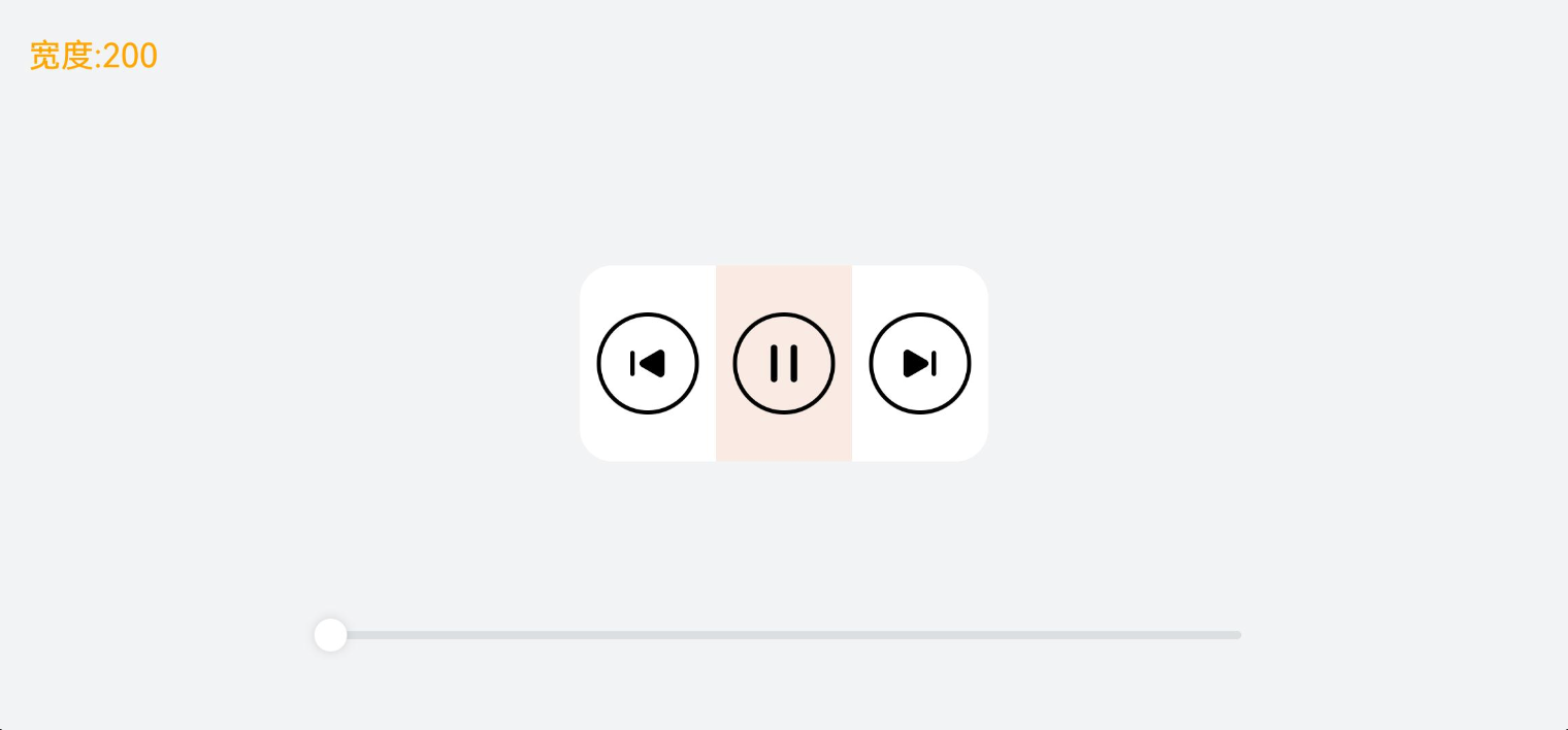
// 布局能力 4:缩放能力
// 子组件的宽高按照预设的比例,随容器组件发生变化,且变化过程中子组件的【宽高比】不变。
// 实现方式:
// 给子组件设置 aspectRatio即可 设置的值是 宽度/高度
// .aspectRatio(1 / 4) // 固定 宽 高比 1等同于 1:1
// .aspectRatio(1 / 2) // 固定 宽 高比 1等同于 1:1
.border({ width: 2, color: "#66F1CCB8" }) // 边框,仅用于展示效果
}
.backgroundColor("#FFFFFF")
.height(this.sliderHeight)
.width(this.sliderWidth)
.justifyContent(FlexAlign.Center)
.alignItems(HorizontalAlign.Center)
this.slider()
}
.width('100%')
.height('100%')
.backgroundColor("#F1F3F5")
.justifyContent(FlexAlign.Center)
.alignItems(HorizontalAlign.Center)
}
}
}
延伸能力
延伸能力是指容器组件内的子组件,按照其在列表中的先后顺序,随容器组件尺寸变化【显示或隐藏】,隐藏时可以通过滑动切换显示。实现的方式是通过 List 组件或 Scroll 组件
测试代码:
export interface NavItem {
  id: number
  icon: ResourceStr
  title: string
}

@Entry
@Component
struct Demo05 {
  @State rate: number = 100
  // 数组
  readonly appList: NavItem [] = [
    { id: 1, icon: $r('app.media.ic_nav_01'), title: '淘金币' },
    { id: 2, icon: $r('app.media.ic_nav_02'), title: '摇现金' },
    { id: 3, icon: $r('app.media.ic_nav_03'), title: '闲鱼' },
    { id: 4, icon: $r('app.media.ic_nav_04'), title: '中通快递' },
    { id: 5, icon: $r('app.media.ic_nav_05'), title: '芭芭农场' },
    { id: 6, icon: $r('app.media.ic_nav_06'), title: '淘宝珍库' },
    { id: 7, icon: $r('app.media.ic_nav_07'), title: '阿里拍卖' },
    { id: 8, icon: $r('app.media.ic_nav_08'), title: '阿里药房' },
  ]

  // 底部滑块,可以通过拖拽滑块改变容器尺寸
  @Builder
  slider() {
    Slider({
      value: this.rate!!,
      min: 100,
      max: 730,
      style: SliderStyle.OutSet
    })
      .blockColor(Color.White)
      .width('60%')
      .height(50)

      .position({ x: '20%', y: '80%' })
  }

  build() {
    Stack({ alignContent: Alignment.TopStart }) {
      // 展示宽度
      Text('宽度:' + this.rate.toFixed(0))
        .zIndex(2)
        .translate({ x: 20, y: 20 })
        .fontColor(Color.Orange)

      Column() {
        Row({ space: 10 }) {
          // 布局能力 5:延伸能力
          // 容器组件内的子组件,按照其在列表中的先后顺序,随容器组件尺寸变化【显示或隐藏】

          // 实现方式:
          // 1.List 组件
          // 2.Scroll 配合 Row 或者 Column
          // 核心:调整父容器的尺寸,让页面中显示的组件数量发生改变

          // 通过List组件实现隐藏能力
          // List({ space: 10 }) {
          //   ForEach(this.appList, (item: NavItem) => {
          //     ListItem() {
          //       Column() {
          //         Image(item.icon)
          //           .width(48)
          //           .height(48)
          //           .margin({ top: 8 })
          //         Text(item.title)
          //           .width(64)
          //           .height(30)
          //           .lineHeight(15)
          //           .fontSize(12)
          //           .textAlign(TextAlign.Center)
          //           .margin({ top: 8 })
          //           .padding({ bottom: 15 })
          //       }
          //       .width(80)
          //       .height(102)
          //     }
          //     .width(80)
          //     .height(102)
          //   })
          // }
          // .padding({ top: 16, left: 10 })
          // .listDirection(Axis.Horizontal)
          // .width('100%')
          // .height(118)
          // .borderRadius(16)
          // .backgroundColor(Color.White)

          // 通过Scroll 组件实现隐藏能力
          Scroll() {
            Row({ space: 10 }) {
              ForEach(this.appList, (item: NavItem, index: number) => {
                Column() {
                  Image(item.icon)
                    .width(48)
                    .height(48)
                    .margin({ top: 8 })
                  Text(item.title)
                    .width(64)
                    .height(30)
                    .lineHeight(15)
                    .fontSize(12)
                    .textAlign(TextAlign.Center)
                    .margin({ top: 8 })
                    .padding({ bottom: 15 })
                }
                .width(80)
                .height(102)
              })
            }
          }
          .scrollable(ScrollDirection.Horizontal) // 设置横向滚动
          .padding({ top: 16, left: 10 })
          .height(118)
          .borderRadius(16)
          .backgroundColor(Color.White)
        }
        .width(this.rate)

        this.slider()
      }
      .width('100%')
      .height('100%')
      .backgroundColor('#F1F3F5')
      .justifyContent(FlexAlign.Center)
      .alignItems(HorizontalAlign.Center)
    }

  }
}
隐藏能力
隐藏能力指的是:按其【显示优先级】,随容器组件尺寸变化显示或隐藏。通过displayPriority属性来实现
| 属性名 | 类型 | 必填 | 说明 |
|---|---|---|---|
| displayPriority | number | 是 | 设置当前组件在布局容器中显示的优先级,当父容器空间不足时,低优先级的组件会被隐藏。 小数点后的数字不作优先级区分,即区间为[x, x + 1)内的数字视为相同优先级。例如:1.0与1.9为同一优先级。 说明: 仅在Row/Column/Flex(单行)容器组件中生效。 |
测试代码:
@Entry
@Component
struct Demo06 {
  @State rate: number = 48

  // 底部滑块,可以通过拖拽滑块改变容器尺寸
  @Builder
  slider() {
    Slider({
      value: this.rate,
      min: 0,
      max: 400,
      style: SliderStyle.OutSet
    })
      .blockColor(Color.White)
      .width('60%')
      .height(50)
      .onChange((value: number) => {
        this.rate = value / 100
      })
      .position({ x: '20%', y: '80%' })
  }

  build() {
    Stack({ alignContent: Alignment.TopStart }) {
      Text('宽度:' + this.rate.toFixed(0))
        .zIndex(2)
        .translate({ x: 20, y: 20 })
        .fontColor(Color.Orange)

      Column() {
        // 布局能力 6:隐藏能力
        // 容器组件内的子组件,按照其预设的显示优先级,随容器组件尺寸变化显示或隐藏


        // 实现方式:
        // displayPriority属性:设置布局优先级来控制显隐
        // 当主轴方向剩余尺寸不足以满足全部元素时,按照布局优先级,从[小到大]依次隐藏


        Row({ space: 10 }) {
          Image($r("app.media.ic_public_favor"))
            .width(48)
            .height(48)
            .displayPriority(1) // 布局优先级

          Image($r("app.media.ic_public_play_last"))
            .width(48)
            .height(48)
            .displayPriority(2) // 布局优先级

          Image($r("app.media.ic_public_pause"))
            .width(48)
            .height(48)
            .displayPriority(3) // 布局优先级

          Image($r("app.media.ic_public_play_next"))
            .width(48)
            .height(48)
            .objectFit(ImageFit.Contain)
            .displayPriority(2) // 布局优先级

          Image($r("app.media.ic_public_view_list"))
            .width(48)
            .height(48)
            .objectFit(ImageFit.Contain)
            .displayPriority(1) // 布局优先级
        }
        .width(this.rate)
        .height(96)
        .borderRadius(16)
        .backgroundColor('#FFFFFF')
        .justifyContent(FlexAlign.Center)
        .padding(10)

        this.slider()
      }
      .width('100%')
      .height('100%')
      .backgroundColor('#F1F3F5')
      .justifyContent(FlexAlign.Center)
      .alignItems(HorizontalAlign.Center)
    }

  }
}
折行能力
折行能力是指容器组件尺寸发生变化,当布局方向尺寸不足以显示完整内容时自动换行。折行能力通过使用 Flex 折行布局 (将wrap属性设置为FlexWrap.Wrap)实现。
| 名称 | 描述 |
|---|---|
| NoWrap | Flex容器的元素单行/列布局,子项不允许超出容器。 |
| Wrap | Flex容器的元素多行/列排布,子项允许超出容器。 |
| WrapReverse | Flex容器的元素反向多行/列排布,子项允许超出容器。 |
测试代码:
import { NavItem } from './Demo02'

@Entry
@Component
struct Demo07 {
  @State rate: number = 0.7
  readonly imageList: NavItem [] = [
    { id: 1, icon: $r('app.media.ic_nav_01'), title: '淘金币' },
    { id: 2, icon: $r('app.media.ic_nav_02'), title: '摇现金' },
    { id: 3, icon: $r('app.media.ic_nav_03'), title: '闲鱼' },
    { id: 4, icon: $r('app.media.ic_nav_04'), title: '中通快递' },
    { id: 5, icon: $r('app.media.ic_nav_05'), title: '芭芭农场' },
    { id: 6, icon: $r('app.media.ic_nav_06'), title: '淘宝珍库' },
  ]

  // 底部滑块,可以通过拖拽滑块改变容器尺寸
  @Builder
  slider() {
    Slider({
      value: this.rate * 100,
      min: 10,
      max: 100,
      style: SliderStyle.OutSet
    })
      .blockColor(Color.White)
      .width('60%')
      .position({ x: '20%', y: '87%' })
      .onChange((value: number) => {
        this.rate = value / 100
      })
  }

  build() {
    Stack({ alignContent: Alignment.TopStart }) {
      Text('宽度:' + (this.rate * 100).toFixed(0) + '%')
        .zIndex(2)
        .translate({ x: 20, y: 20 })
        .fontColor(Color.Orange)
      Flex({ justifyContent: FlexAlign.Center, direction: FlexDirection.Column }) {
        Column() {
          // 布局能力 7:折行能力
          // 容器组件尺寸发生变化,当布局方向尺寸不足以显示完整内容时自动换行

          // 实现方式:
          // Flex组件将 wrp 设置为FlexWrap.Wrap即可


          // 通过Flex组件warp参数实现自适应折行
          Flex({
            direction: FlexDirection.Row,
            alignItems: ItemAlign.Center,
            justifyContent: FlexAlign.Center,
            wrap: FlexWrap.Wrap // 是否换行:  FlexWrap.Wrap 开启换行
          }) {
            ForEach(this.imageList, (item: NavItem) => {
              Column() {
                Image(item.icon)
                  .width(80)
                  .height(80)
                Text(item.title)
              }
              .margin(10)

            })
          }
          .backgroundColor('#FFFFFF')
          .padding(20)
          .width(this.rate * 100 + '%')
          .borderRadius(16)

        }
        .width('100%')

        this.slider()
      }
      .width('100%')
      .height('100%')
      .backgroundColor('#F1F3F5')
    }

  }
}
小结
响应式布局
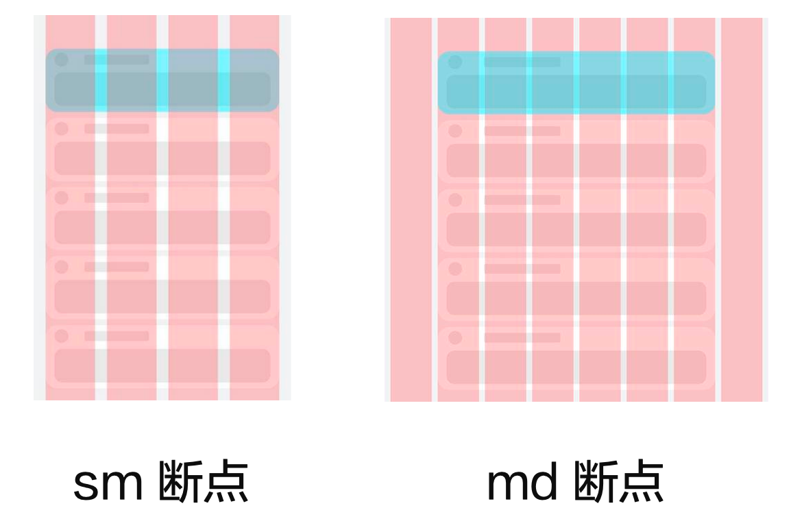
自适应布局可以保证窗口尺寸在【一定范围内变化】时,页面的显示是正常的。但是将窗口尺寸【变化较大】时(如窗口宽度从400vp变化为1000vp),仅仅依靠自适应布局可能出现图片异常放大或页面内容稀疏、留白过多等问题,此时就需要借助响应式布局能力调整页面结构。
响应式布局是指页面内的元素可以根据特定的特征(如窗口宽度、屏幕方向等)自动变化以适应外部容器变化的布局能力。
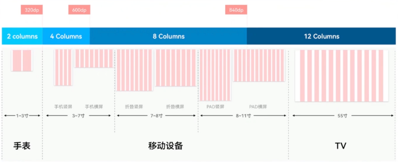
响应式布局中最常使用的特征是窗口宽度,可以将窗口宽度划分为不同的范围(下文中称为断点)。当窗口宽度从一个断点变化到另一个断点时,改变页面布局(如将页面内容从单列排布调整为双列排布甚至三列排布等)以获得更好的显示效果。
三种响应式布局能力:
| 响应式布局能力 | 简介 |
|---|---|
| 断点 | 将窗口宽度划分为不同的范围(即断点),监听窗口尺寸变化,当断点改变时同步调整页面布局。 |
| 媒体查询 | 媒体查询支持监听窗口宽度、横竖屏、深浅色、设备类型等多种媒体特征,当媒体特征发生改变时同步调整页面布局。 |
| 栅格布局 | 栅格组件将其所在的区域划分为有规律的多列,通过调整不同断点下的栅格组件的参数以及其子组件占据的列数等,实现不同的布局效果。 |
断点
断点以应用窗口宽度为切入点,将应用窗口在宽度维度上分成了几个不同的区间即不同的断点,在不同的区间下,开发者可根据需要实现不同的页面布局效果。
| 断点名称 | 取值范围(vp) | 设备 |
|---|---|---|
| xs | [0, 320) | 手表等超小屏 |
| sm | [320, 600) | 手机竖屏 |
| md | [600, 840) | 手机横屏,折叠屏 |
| lg | [840, +∞) | 平板,2in1 设备 |

系统提供了多种方法,判断应用当前处于何种断点,进而可以调整应用的布局。常见的监听断点变化的方法如下所示:
- 获取窗口对象并监听窗口尺寸变化(掌握)
- 通过媒体查询监听应用窗口尺寸变化(了解)
- 借助栅格组件能力监听不同断点的变化(掌握)
全局断点
通过窗口对象,监听窗口尺寸变化
- 在 EntryAbility 中添加监听
// MainAbility.ts
import { window, display } from '@kit.ArkUI'
import { UIAbility } from '@kit.AbilityKit'

export default class MainAbility extends UIAbility {
  private curBp: string = ''
  //...
  // 根据当前窗口尺寸更新断点
  private updateBreakpoint(windowWidth: number) :void{
    try {
      //  核心代码1: 将长度的单位由px换算为vp,(px除以像素密度得到vp)
      let windowWidthVp = windowWidth / display.getDefaultDisplaySync().densityPixels
      let newBp: string = ''
      //  核心代码2: 基于窗口宽度vp值,判断当前设备属于哪个断点范围
      if (windowWidthVp < 320) {
        newBp = 'xs'
      } else if (windowWidthVp < 600) {
        newBp = 'sm'
      } else if (windowWidthVp < 840) {
        newBp = 'md'
      } else {
        newBp = 'lg'
      }
      if (this.curBp !== newBp) {
        this.curBp = newBp
        // 核心代码3: 使用状态变量记录当前断点值
        AppStorage.setOrCreate('currentBreakpoint', this.curBp)
      }
    } catch(err) {
      console.log("getDisplayByIdSync failed err" + err.code)
    }
  }

  onWindowStageCreate(windowStage: window.WindowStage) :void{
    windowStage.getMainWindow().then((windowObj) => {
      // 获取应用启动时的窗口尺寸
      this.updateBreakpoint(windowObj.getWindowProperties().windowRect.width)
      // 注册回调函数,监听窗口尺寸变化
      windowObj.on('windowSizeChange', (windowSize)=>{
        this.updateBreakpoint(windowSize.width)
      })
    });
    // ...
  }

  //...
}
- 页面中使用断点信息
@Entry
@Component
struct Index {
  @StorageProp('currentBreakpoint') curBp: string = 'sm'

  build() {
    Flex({justifyContent: FlexAlign.Center, alignItems: ItemAlign.Center}) {
      Text(this.curBp).fontSize(50).fontWeight(FontWeight.Medium)
    }
    .width('100%')
    .height('100%')
  }
}
:::success
试一试:
- 测试根据断点调整页面结构,比如颜色,比如图片
- 考虑 2 种情况即可,比如:
- md 为红色,其他为绿色
- sm 为图片 A,其他为图片 B
- ...
- 思考,如果是 3 种情况要如何实现?
:::
系统工具-BreakPointType
上一节演示的工具可以方便的监听屏幕处于哪个断点范围,咱们可以根据断点调整页面:
- 如果是 两种的情况:用 三元表达式 即可
- 如果是 多种的情况:用 三元表达式 就不太方便啦
咱们来看一个系统提供的工具BreakPointType(参考官方示例)
// common/breakpointSystem.ets
interface BreakPointTypeOption<T> {
  xs?: T
  sm?: T
  md?: T
  lg?: T
}

export class BreakPointType<T> {
  options: BreakPointTypeOption<T>

  constructor(option: BreakPointTypeOption<T>) {
    this.options = option
  }

  getValue(currentBreakPoint: string) {
    if (currentBreakPoint === 'xs') {
      return this.options.xs
    } else if (currentBreakPoint === 'sm') {
      return this.options.sm
    } else if (currentBreakPoint === 'md') {
      return this.options.md
    } else if (currentBreakPoint === 'lg') {
      return this.options.lg
    } else {
      return undefined
    }
  }
}
核心用法:
// 1. 导入BreakPointType
import { BreakPointType } from '../../common/breakpointSystem'

@entry
@Component
struct ComB {
  // 2. 通过 AppStorage 获取断点值
  @StorageProp('currentBreakpoint') currentBreakpoint: string = 'xs'

  build() {
    Column() {
      Text(this.currentBreakpoint)
    }
    .width(200)
    .height(200)
    .backgroundColor(
      // 3. 实例化 设置不同断点的取值,并通过 getValue 根据当前断点值对应的值
      new BreakPointType({
        xs: Color.Red,
        sm: Color.Yellow,
        md: Color.Blue,
        lg: Color.Green
      })
      .getValue(this.currentBreakpoint)
    )
  }
}
案例-电影列表
使用刚刚学习的媒体查询工具,结合断点来完成一个案例效果

:::success
需求:
- xs 及 sm 2 列
- md:3 列
- lg:4 列
自行拓展:
- 设置不同的宽高
- 设置不同的圆角尺寸
- 设置不同的间隙
- 。。。。
:::
基础模版:
interface MovieItem {
  title: string
  img: ResourceStr
}

@Entry
@Component
struct Demo09_demo {
  items: MovieItem[] = [
    { title: '电影标题1', img: $r('app.media.ic_video_grid_1') },
    { title: '电影标题2', img: $r('app.media.ic_video_grid_2') },
    { title: '电影标题3', img: $r('app.media.ic_video_grid_3') },
    { title: '电影标题4', img: $r('app.media.ic_video_grid_4') },
    { title: '电影标题5', img: $r('app.media.ic_video_grid_5') },
    { title: '电影标题6', img: $r('app.media.ic_video_grid_6') },
    { title: '电影标题7', img: $r('app.media.ic_video_grid_7') },
    { title: '电影标题8', img: $r('app.media.ic_video_grid_8') },
    { title: '电影标题9', img: $r('app.media.ic_video_grid_9') },
    { title: '电影标题10', img: $r('app.media.ic_video_grid_10') },
  ]

  build() {
    Grid() {
      ForEach(this.items, (item: MovieItem) => {
        GridItem() {
          Column({ space: 10 }) {
            Image(item.img)
              .borderRadius(10)
            Text(item.title)
              .width('100%')
              .fontSize(20)
              .fontWeight(600)

          }
        }
      })
    }
    .columnsTemplate('1fr 1fr')
    .rowsGap(10)
    .columnsGap(10)
    .padding(10)
  }
}
参考代码:
// 1. 导入BreakPointType
import { BreakPointType } from '../../common/breakpointSystem'

interface MovieItem {
  title: string
  img: ResourceStr
}

@Entry
@Component
struct Demo09_demo {
  items: MovieItem[] = [
    { title: '电影标题1', img: $r('app.media.ic_video_grid_1') },
    { title: '电影标题2', img: $r('app.media.ic_video_grid_2') },
    { title: '电影标题3', img: $r('app.media.ic_video_grid_3') },
    { title: '电影标题4', img: $r('app.media.ic_video_grid_4') },
    { title: '电影标题5', img: $r('app.media.ic_video_grid_5') },
    { title: '电影标题6', img: $r('app.media.ic_video_grid_6') },
    { title: '电影标题7', img: $r('app.media.ic_video_grid_7') },
    { title: '电影标题8', img: $r('app.media.ic_video_grid_8') },
    { title: '电影标题9', img: $r('app.media.ic_video_grid_9') },
    { title: '电影标题10', img: $r('app.media.ic_video_grid_10') },
  ]
  // 获取 AppStorage 保存的全局断点(EntryAbility.ets)
  @StorageProp('currentBreakpoint') currentBreakpoint: string = 'sm'

  build() {
    Grid() {
      ForEach(this.items, (item: MovieItem) => {
        GridItem() {
          Column({ space: 10 }) {
            Image(item.img)
              .borderRadius(10)
            Text(item.title)
              .width('100%')
              .fontSize(20)
              .fontWeight(600)

          }
        }
      })
    }
    .columnsTemplate(
      new BreakPointType({
        xs: '1fr 1fr',
        sm: '1fr 1fr ',
        md: '1fr 1fr 1fr ',
        lg: '1fr 1fr 1fr 1fr '
      })
      .getValue(this.currentBreakpoint)
    )
    .rowsGap(10)
    .columnsGap(10)
    .padding(10)
  }
}
断点工具封装
基于上一步实现的效果,进行二次封装,简化后续调用
:::success
首选上来就要执行一次
获取window对象有两种方式
- EntryAbility中有一个windowStage.getMainWindow()
- window.getLastWindow(getContext() || 传入上下文)
:::
import { display, window } from "@kit.ArkUI"

export class ScreenManager {
  ctx: Context
  curBp: BreakPointEnum = BreakPointEnum.XS

  constructor(ctx: Context) {
    this.ctx = ctx
  }


  async init() {
    const win = await window.getLastWindow(this.ctx)

    const uiCtx = win.getUIContext()
    // 先计算当前的屏幕宽度
    this.updateBreakpoint(uiCtx.px2vp(display.getDefaultDisplaySync()
      .width))
    win.on("windowSizeChange", (size) => {
      this.updateBreakpoint(size.width)
    })
  }

  async off() {
    const win = await window.getLastWindow(this.ctx)
    win.off("windowSizeChange")
  }

  updateBreakpoint(windowWidth: number): void {
    try {
      // 获取vp尺寸
      let windowWidthVp = windowWidth / display.getDefaultDisplaySync()
        .densityPixels
      let newBp: BreakPointEnum = BreakPointEnum.XS
      //  核心代码2: 基于窗口宽度vp值,判断当前设备属于哪个断点范围
      if (windowWidthVp < 320) {
        newBp = BreakPointEnum.XS
      } else if (windowWidthVp < 600) {
        newBp = BreakPointEnum.SM
      } else if (windowWidthVp < 840) {
        newBp = BreakPointEnum.MD
      } else if (windowWidthVp < 1440) {
        newBp = BreakPointEnum.LG
      } else {
        newBp = BreakPointEnum.XL
      }
      if (this.curBp !== newBp) {
        this.curBp = newBp
        // 核心代码3: 使用状态变量记录当前断点值
        AppStorage.setOrCreate('currentBreakpoint', this.curBp)
      }
    } catch (err) {
    }
  }
}

export enum BreakPointEnum {
  XS = "xs",
  SM = "sm",
  MD = "md",
  LG = "lg",
  XL = "xl"
}
使用步骤
import { AbilityConstant, ConfigurationConstant, UIAbility, Want } from '@kit.AbilityKit';
import { hilog } from '@kit.PerformanceAnalysisKit';
import { window } from '@kit.ArkUI';
import { ScreenManager } from '../utils/ScreenManager';

const DOMAIN = 0x0000;

export default class EntryAbility extends UIAbility {
  screenManager?: ScreenManager
  onCreate(want: Want, launchParam: AbilityConstant.LaunchParam): void {
    this.context.getApplicationContext().setColorMode(ConfigurationConstant.ColorMode.COLOR_MODE_NOT_SET);
    hilog.info(DOMAIN, 'testTag', '%{public}s', 'Ability onCreate');

  }

  onDestroy(): void {
    hilog.info(DOMAIN, 'testTag', '%{public}s', 'Ability onDestroy');
  }

  onWindowStageCreate(windowStage: window.WindowStage): void {
    // Main window is created, set main page for this ability
    hilog.info(DOMAIN, 'testTag', '%{public}s', 'Ability onWindowStageCreate');
    this.screenManager =  new ScreenManager(this.context)
    this.screenManager.init()
    windowStage.loadContent('pages/ScreenWidth', (err) => {
      if (err.code) {
        hilog.error(DOMAIN, 'testTag', 'Failed to load the content. Cause: %{public}s', JSON.stringify(err));
        return;
      }
      hilog.info(DOMAIN, 'testTag', 'Succeeded in loading the content.');
    });
  }

  onWindowStageDestroy(): void {
    this.screenManager.off() // 窗口卸载
    // Main window is destroyed, release UI related resources
    hilog.info(DOMAIN, 'testTag', '%{public}s', 'Ability onWindowStageDestroy');
  }

  onForeground(): void {
    // Ability has brought to foreground
    hilog.info(DOMAIN, 'testTag', '%{public}s', 'Ability onForeground');
  }

  onBackground(): void {
    // Ability has back to background
    hilog.info(DOMAIN, 'testTag', '%{public}s', 'Ability onBackground');
  }
}
媒体查询
媒体查询常用于下面两种场景:
- 针对设备和应用的属性信息(比如显示区域、深浅色、分辨率),设计出相匹配的布局。
- 当屏幕发生动态改变时(比如分屏、横竖屏切换),同步更新应用的页面布局。
相比于上一节演示的 通过窗口对象监听尺寸变化,媒体查询的功能会【更为强大】
:::success
只需要查询断点值:【获取窗口对象并监听窗口尺寸】
还要额外查询其他设备信息,【媒体查询】
:::
核心用法
咱们分 2 个角度来看看如何使用媒体查询
- 整合步骤(重要)
- 调整媒体查询条件(了解)
// 导入模块
import mediaquery from '@ohos.mediaquery';

// 1. 创建监听器
listenerXS = this.getUIContext()
  .getMediaQuery()
  .matchMediaSync('(0vp<=width<320vp)');
listenerSM = this.getUIContext()
  .getMediaQuery()
  .matchMediaSync('(320vp<=width<600vp)');

// 2. 注册监听器
aboutToAppear(): void {
  // 添加回调函数
  listenerXS.on('change', (res: mediaquery.MediaQueryResult) => {
    console.log('changeRes:', JSON.stringify(res))
    // 执行逻辑
  })
  listenerSM.on('change', (res: mediaquery.MediaQueryResult) => {
    console.log('changeRes:', JSON.stringify(res))
    // 执行逻辑
  })
}

// 4. 移除监听器
aboutToDisappear(): void {
  // 移除监听 避免性能浪费
  listenerXS.off('change')
  listenerSM.off('change')
}
:::success
试一试:
- 参考示例代码:完成 4 个断点的监听
- 参考文档,增加黑暗模式查询
:::
| 断点名称 | 取值范围(vp) | 设备 |
|---|---|---|
| xs | [0, 320) | 手表等超小屏 |
| sm | [320, 600) | 手机竖屏 |
| md | [600, 840) | 手机横屏,折叠屏 |
| lg | [840, +∞) | 平板,2in1 设备 |
使用查询结果
目前查询的内容只在当前页面可以使用,如果希望应用中任意位置都可以使用,咱们可以使用AppStorage 进行共享
:::success
核心步骤:
- 事件中通过 AppStorage.set(key,value)的方式保存当前断点值
- 需要使用的位置通过 AppStorage 来获取即可
:::
// 添加回调函数
this.listenerXS.on('change', (res: mediaquery.MediaQueryResult) => {
  console.log('changeRes:', JSON.stringify(res))
  if (res.matches == true) {
    // this.breakpoint = 'xs'
    AppStorage.set('breakpoint', 'xs')
  }
})
// 组件中引入 AppStorage
@StorageProp('breakpoint') breakpoint: string = ''

// 在需要的位置使用 AppStorage 中保存的断点值
Text(this.breakpoint)
媒体查询断点工具(了解)
:::success
获取断点:
- 通过window事件获取
- 通过媒体查询获取
实际项目中选择一个使用即可
:::
import mediaQuery from '@ohos.mediaquery'

interface Breakpoint {
  name: string
  size: number
  mediaQueryListener?: mediaQuery.MediaQueryListener
}

export const BreakpointKey: string = 'currentBreakpoint'

export class BreakpointSystem {
  private currentBreakpoint: string = 'md'
  private breakpoints: Breakpoint[] = [
    { name: 'xs', size: 0 }, { name: 'sm', size: 320 },
    { name: 'md', size: 600 }, { name: 'lg', size: 840 },
     { name: 'xl', size: 1440 }
  ]

  public register() {
    this.breakpoints.forEach((breakpoint: Breakpoint, index) => {
      let condition: string
      if (index === this.breakpoints.length - 1) {
        condition = '(' + breakpoint.size + 'vp<=width' + ')'
      } else {
        condition = '(' + breakpoint.size + 'vp<=width<' + this.breakpoints[index + 1].size + 'vp)'
      }
      console.log(condition)
      breakpoint.mediaQueryListener = mediaQuery.matchMediaSync(condition)
      breakpoint.mediaQueryListener.on('change', (mediaQueryResult) => {
        if (mediaQueryResult.matches) {
          this.updateCurrentBreakpoint(breakpoint.name)
        }
      })
    })
  }

  public unregister() {
    this.breakpoints.forEach((breakpoint: Breakpoint) => {
      if (breakpoint.mediaQueryListener) {
        breakpoint.mediaQueryListener.off('change')
      }
    })
  }

  private updateCurrentBreakpoint(breakpoint: string) {
    if (this.currentBreakpoint !== breakpoint) {
      this.currentBreakpoint = breakpoint
      AppStorage.Set<string>(BreakpointKey, this.currentBreakpoint)
      console.log('on current breakpoint: ' + this.currentBreakpoint)
    }
  }
}
案例-电影列表-媒体查询版本(自行完成)
使用刚刚学习的媒体查询工具,结合断点来完成一个案例效果

:::success
需求:
- xs 及 sm 2 列
- md:3 列
- lg:4 列
自行拓展:
- 设置不同的宽高
- 设置不同的圆角尺寸
- 设置不同的间隙
- 。。。。
:::
基础模版:
interface MovieItem {
  title: string
  img: ResourceStr
}

@Entry
@Component
struct Demo09_demo {
  items: MovieItem[] = [
    { title: '电影标题1', img: $r('app.media.ic_video_grid_1') },
    { title: '电影标题2', img: $r('app.media.ic_video_grid_2') },
    { title: '电影标题3', img: $r('app.media.ic_video_grid_3') },
    { title: '电影标题4', img: $r('app.media.ic_video_grid_4') },
    { title: '电影标题5', img: $r('app.media.ic_video_grid_5') },
    { title: '电影标题6', img: $r('app.media.ic_video_grid_6') },
    { title: '电影标题7', img: $r('app.media.ic_video_grid_7') },
    { title: '电影标题8', img: $r('app.media.ic_video_grid_8') },
    { title: '电影标题9', img: $r('app.media.ic_video_grid_9') },
    { title: '电影标题10', img: $r('app.media.ic_video_grid_10') },
  ]

  build() {
    Grid() {
      ForEach(this.items, (item: MovieItem) => {
        GridItem() {
          Column({ space: 10 }) {
            Image(item.img)
              .borderRadius(10)
            Text(item.title)
              .width('100%')
              .fontSize(20)
              .fontWeight(600)

          }
        }
      })
    }
    .columnsTemplate('1fr 1fr')
    .rowsGap(10)
    .columnsGap(10)
    .padding(10)
  }
}
参考代码:
import { BreakPointType, BreakpointSystem, BreakpointKey } from '../../common/breakpointsystem'

interface MovieItem {
  title: string
  img: ResourceStr
}

@Entry
@Component
struct Demo09_demo {
  items: MovieItem[] = [
    { title: '电影标题1', img: $r('app.media.ic_video_grid_1') },
    { title: '电影标题2', img: $r('app.media.ic_video_grid_2') },
    { title: '电影标题3', img: $r('app.media.ic_video_grid_3') },
    { title: '电影标题4', img: $r('app.media.ic_video_grid_4') },
    { title: '电影标题5', img: $r('app.media.ic_video_grid_5') },
    { title: '电影标题6', img: $r('app.media.ic_video_grid_6') },
    { title: '电影标题7', img: $r('app.media.ic_video_grid_7') },
    { title: '电影标题8', img: $r('app.media.ic_video_grid_8') },
    { title: '电影标题9', img: $r('app.media.ic_video_grid_9') },
    { title: '电影标题10', img: $r('app.media.ic_video_grid_10') },
  ]
  breakpointSystem: BreakpointSystem = new BreakpointSystem()
  @StorageProp(BreakpointKey)
  currentBreakpoint: string = 'sm'

  aboutToAppear(): void {
    this.breakpointSystem.register()
  }

  aboutToDisappear(): void {
    this.breakpointSystem.unregister()
  }

  build() {
    Grid() {
      ForEach(this.items, (item: MovieItem) => {
        GridItem() {
          Column({ space: 10 }) {
            Image(item.img)
              .borderRadius(10)
            Text(item.title)
              .width('100%')
              .fontSize(20)
              .fontWeight(600)

          }
        }
      })
    }
    .columnsTemplate(new BreakPointType({
      xs: '1fr 1fr',
      sm: '1fr 1fr ',
      md: '1fr 1fr 1fr ',
      lg: '1fr 1fr 1fr 1fr '
    }).getValue(this.currentBreakpoint))
    .rowsGap(10)
    .columnsGap(10)
    .padding(10)
  }
}
栅格布局 Grid(面试会问)
栅格组件的本质是:将组件划分为有规律的多列,通过调整【不同断点】下的【栅格组件的列数】,及【子组件所占列数】实现不同布局
:::color3
通过调整总列数,及子组件所占列数,实现不同布局
:::
断点:
| 断点名称 | 取值范围(vp) | 设备 |
|---|---|---|
| xs | [0, 320) | 手表等超小屏 |
| sm | [320, 600) | 手机竖屏 |
| md | [600, 840) | 手机横屏,折叠屏 |
| lg | [840, 1440) | 平板,2in1 设备 |
| xl | (1440, +无穷 | PC、折叠PC展开态 |

比如:
参考栅格列数设置:
核心用法
// 行
GridRow(属性){
  // 列
  GridCol(属性){

  }
}
测试代码:
:::success
优先级从上往下:
- GridRow的 columns 属性、GridCol 的 span 属性(掌握)
- GridRow 的 gutter 属性、GridCol 的 offset 属性(掌握)
- GridRow breakpoints 属性 和 的 onBreakpointChange 事件(了解)
:::
@Entry
@Component
struct Demo10 {
  @State breakPoint: string = 'sm'

  // 颜色数组
  build() {
    Column() {
      // GridRow 默认支持 4 个断点
      //  xs:(0vp<=width<320vp) 智能穿戴,比如手表
      //  sm:(320vp<=width<600vp) 手机
      //  md:(600vp<=width<840vp) 折叠屏
      //  lg:(840vp<=width) 平板
      GridRow({
        // 4个断点 和默认的一样
        breakpoints: { value: ['320vp', '600vp', '840vp'] },
        gutter: 10, // 子组件间隙
        // columns: 12 // 统一设计列数 默认 12
        columns: {
          // 不同的断点分别设置不同的列数
          xs: 2, // 超小
          sm: 4, // 手机竖屏
          md: 8, // 折叠,手机横屏
          lg: 12 // 大屏
        }
      }) {
        ForEach(Array.from({ length: 2 }), (item: string, index: number) => {
          GridCol({
            // 每一行 2 个子元素,span 怎么设置(占的行数)
            // span: 2, // 占用列数 这样设置所有断点都是 2 列
            // 支持不同断点分别设置不同的占用列数
            span: {
              xs: 2,
              sm: 2,
              md: 2,
              lg: 4
            },
            // offset 偏移列数 默认为 0
            // offset: 1, // 偏移一列
            // 支持不同断点分别设置偏移不同的列数
            offset: {
              // xs: 2,
              // sm: 1
            }
          }) {
            Text(index.toString())
              .height(50)
          }
          .border({ width: 1 })
        })
      }
      .border({ width: 1, color: Color.Orange })
      .width('90%')
      .height('90%')
      // 断点发生变化时触发回调
      // breakpoint当前的断点 字符串
      .onBreakpointChange(breakpoint => {
        console.log('breakpoint:', breakpoint)
        this.breakPoint = breakpoint
      })
      Text(this.breakPoint)
        .width('100%')
        .textAlign(TextAlign.Center)
        .fontSize(30)
        .fontWeight(900)
    }
    .width('100%')
    .height('100%')

  }
}
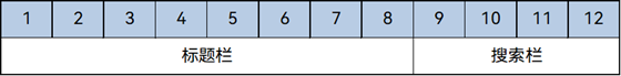
案例-标题栏与搜索栏
标题栏和搜索栏,在sm和md断点下分两行显示,在lg断点下单行显示,可以通过栅格实现。在sm和md断点下,标题栏和搜索栏占满12列,此时会自动换行显示。在lg断点下,标题栏占8列而搜索栏占4列,此时标题栏和搜索栏在同一行中显示。
| sm/md | lg | |
|---|---|---|
| 效果图 | 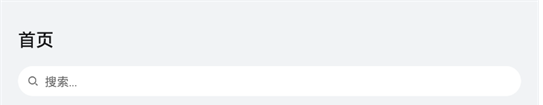 |
 |
| 栅格布局图 | 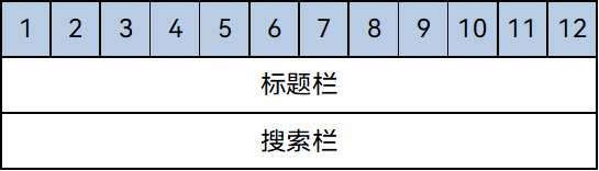 |
 |
案例-登录界面
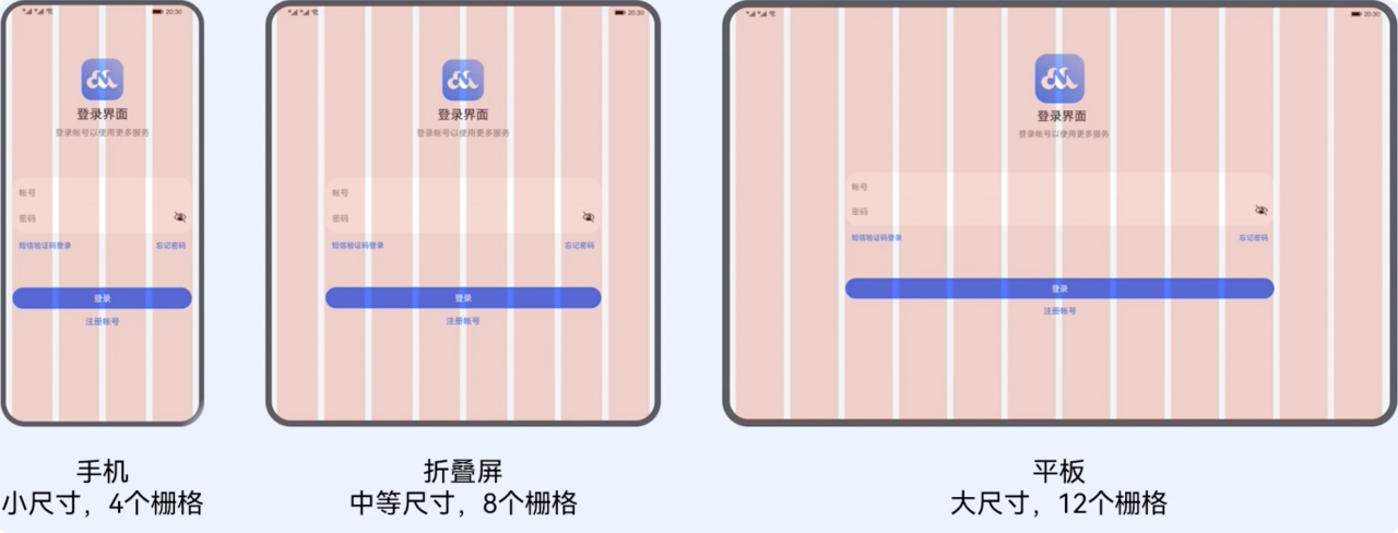
结合咱们刚刚学习的 栅格布局。来实现如下效果
:::success
需求:
- sm:4 列,占 4 列
- md:8 列,占 6 列,偏移 1
- lg: 12 列,占 8 列,偏移 2
:::
基础模版:
@Entry
@Component
struct Demo11_login {
  build() {
    Stack() {
      // 辅助用的栅格(顶层粉色区域)
      GridRow({ gutter: 10, columns: { sm: 4, md: 8, lg: 12 } }) {
        ForEach(Array.from({ length: 12 }), () => {
          GridCol()
            .width('100%')
            .height('100%')
            .backgroundColor('#baffa2b4')
        })
      }
      .zIndex(2)
      .height('100%')

      //  内容区域
      GridRow({
        // TODO 分别设置不同断点的 列数

      }) {
        // 列
        GridCol({
          // TODO 分别设置不同断点的 所占列数

          // TODO 分别设置不同断点的 偏移


        }) {
          Column() {
            // logo+文字
            LogoCom()

            // 输入框 + 底部提示文本
            InputCom()

            // 登录+注册账号按钮
            ButtonCom()

          }
        }
      }
      .width('100%')
      .height('100%')
      .backgroundColor('#ebf0f2')
    }
  }
}

@Component
struct LogoCom {
  build() {
    Column({ space: 5 }) {
      Image($r('app.media.ic_logo'))
        .width(80)
      Text('登录界面')
        .fontSize(23)
        .fontWeight(900)
      Text('登录账号以使用更多服务')
        .fontColor(Color.Gray)
    }
    .margin({ top: 100 })
  }
}

@Component
struct InputCom {
  build() {
    Column() {
      Column() {
        TextInput({ placeholder: '账号' })
          .backgroundColor(Color.Transparent)
        Divider()
          .color(Color.Gray)
        TextInput({ placeholder: '密码' })
          .type(InputType.Password)
          .backgroundColor(Color.Transparent)

      }
      .backgroundColor(Color.White)
      .borderRadius(20)
      .padding({ top: 10, bottom: 10 })

      Row() {
        Text('短信验证码登录')
          .fontColor('#006af7')
          .fontSize(14)
        Text('忘记密码')
          .fontColor('#006af7')
          .fontSize(14)
      }
      .width('100%')
      .justifyContent(FlexAlign.SpaceBetween)
      .margin({ top: 10 })

    }
    .padding(5)
    .margin({ top: 80 })

  }
}

@Component
struct ButtonCom {
  build() {
    Column({ space: 10 }) {
      Button('登录')
        .width('90%')
      Text('注册账号')
        .fontColor('#006af7')
        .fontSize(16)
    }
    .margin({ top: 60 })
  }
}
参考代码
@Entry
@Component
struct Demo11_login {
  build() {
    Stack() {
      // 辅助用的栅格(顶层粉色区域)
      GridRow({ gutter: 10, columns: { sm: 4, md: 8, lg: 12 } }) {
        ForEach(Array.from({ length: 12 }), () => {
          GridCol()
            .width('100%')
            .height('100%')
            .backgroundColor('#baffa2b4')
        })
      }
      .zIndex(2)
      .height('100%')

      //  内容区域
      GridRow({
        // TODO 分别设置不同断点的 列数
        columns: {
          sm: 4,
          md: 8,
          lg: 12
        }
      }) {
        // 列
        GridCol({
          // TODO 分别设置不同断点的 所占列数
          span: {
            sm: 4,
            md: 6,
            lg: 8
          },
          // TODO 分别设置不同断点的 偏移
          offset: {
            md: 1,
            lg: 2
          }

        }) {
          Column() {
            // logo+文字
            LogoCom()

            // 输入框 + 底部提示文本
            InputCom()

            // 登录+注册账号按钮
            ButtonCom()

          }
        }
      }
      .width('100%')
      .height('100%')
      .backgroundColor('#ebf0f2')
    }
  }
}

@Component
struct LogoCom {
  build() {
    Column({ space: 5 }) {
      Image($r('app.media.ic_logo'))
        .width(80)
      Text('登录界面')
        .fontSize(23)
        .fontWeight(900)
      Text('登录账号以使用更多服务')
        .fontColor(Color.Gray)
    }
    .margin({ top: 100 })
  }
}

@Component
struct InputCom {
  build() {
    Column() {
      Column() {
        TextInput({ placeholder: '账号' })
          .backgroundColor(Color.Transparent)
        Divider()
          .color(Color.Gray)
        TextInput({ placeholder: '密码' })
          .type(InputType.Password)
          .backgroundColor(Color.Transparent)

      }
      .backgroundColor(Color.White)
      .borderRadius(20)
      .padding({ top: 10, bottom: 10 })

      Row() {
        Text('短信验证码登录')
          .fontColor('#006af7')
          .fontSize(14)
        Text('忘记密码')
          .fontColor('#006af7')
          .fontSize(14)
      }
      .width('100%')
      .justifyContent(FlexAlign.SpaceBetween)
      .margin({ top: 10 })

    }
    .padding(5)
    .margin({ top: 80 })

  }
}

@Component
struct ButtonCom {
  build() {
    Column({ space: 10 }) {
      Button('登录')
        .width('90%')
      Text('注册账号')
        .fontColor('#006af7')
        .fontSize(16)
    }
    .margin({ top: 60 })
  }
}
功能级一多开发(了解)
一个前提
功能开发的适配主要体现在需要适配不同范类的应用,比如既要适配手机和平板,也需要适配智能穿戴设备,如果是同泛类产品,系统能力一致,无需考虑多设备上应用功能开发的差异,我们的美寇商城需要适配的是手机和Pad,属于同泛类产品,无需考虑功能开发的差异。以下是常见类型分类:
- 默认设备(一般为手机)、平板
- 车机、智慧屏
- 智能穿戴
什么是系统能力
系统能力(即SystemCapability,缩写为SysCap)指操作系统中每一个相对独立的特性,如蓝牙,WIFI,NFC,摄像头等,都是系统能力之一。每个系统能力对应多个API,随着目标设备是否支持该系统能力共同存在或消失。
:::color3
比如:display.isFoldable() 这个 api 并不是每个设备都可以使用,在调用之前就可以先判断一下
:::
如何适配系统能力
- 不同设备的系统能力有差异,如智能穿戴设备是否具备定位能力、智慧屏是否具备摄像头等,功能如何兼容。
方法1:使用canUse接口判断设备是否支持某系统能力
if (canIUse("能力集的名字")) {
  // 正常调用
} else {
  // 提示用户
   console.log("该设备不支持SystemCapability.Communication.NFC.Core")
}
方法2:通过import动态导入,配合try/catch
import controller from '@kit.ConnectivityKit';
try {
  controller.enableNfc();
  console.log("controller enableNfc success");
} catch (busiError) {
  console.log("controller enableNfc busiError: " + busiError);
}
:::warning
注意:
- 目前的开发主要是 手机及平板开发,属于统一范类,功能差别不大
- 目前 Harmony Next 的系统首发登录的肯定是手机,其他设备会逐步接入
:::
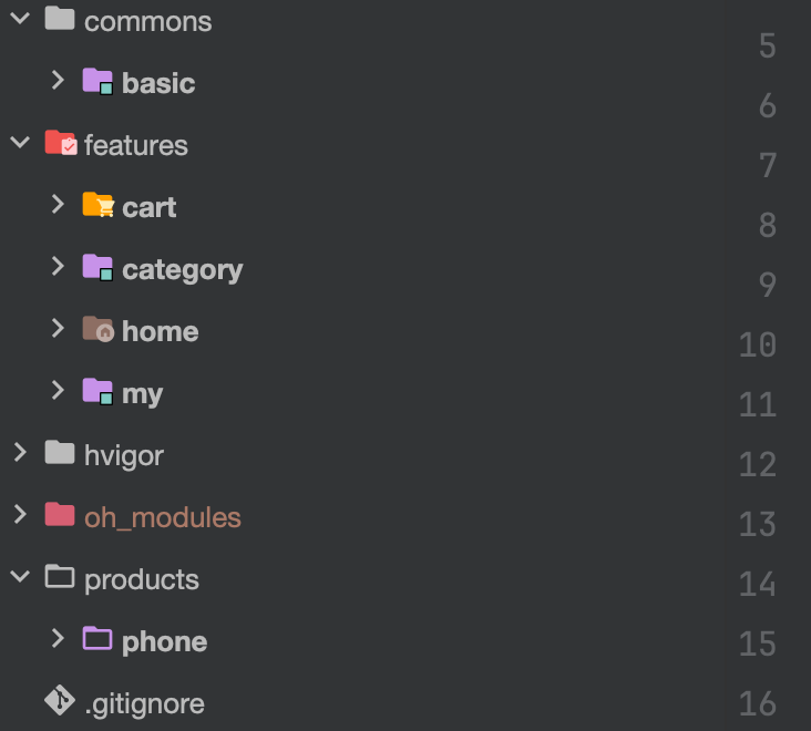
工程级一多(掌握)
概念
一多模式下,官方推荐在开发过程中采用"三层工程架构",其实就是把项目拆分成不同类型的模块,再通过模块之间的引用组合,最终实现应用功能,拆分规范如下:
- commons(公共能力层):用于存放公共基础能力合集,比如工具库,公共配置等
- features(基础特性层):用于存放应用中相对独立的各个功能的UI以及业务逻辑实现
- products(产品定制层):用于针对不同设备形态进行功能和特性集成,作为应用入口

:::success
参考官方示例:美蔻商城将进行如下拆分
:::
选择合适的包类型
HAP、HAR、HSP三者的功能和使用场景总结对比如下:
| Module类型 | 包类型 | 说明 |
|---|---|---|
| Ability | HAP | 应用的功能模块,可以独立安装和运行,必须包含一个entry类型的HAP,可选包含一个或多个feature类型的HAP。 |
| Static Library | HAR | 静态共享包,编译态复用。 - 支持应用内共享,也可以发布后供其他应用使用。 - 作为二方库,发布到OHPM私仓,供公司内部其他应用使用。 - 作为三方库,发布到OHPM中心仓,供其他应用使用。 - 多包(HAP/HSP)引用相同的HAR时,会造成多包间代码和资源的重复拷贝,从而导致应用包膨大。 - 注意:编译HAR时,建议开启混淆能力,保护代码资产。 |
| Shared Library | HSP | 动态共享包,运行时复用。 - 当前仅支持应用内共享。 - 当多包(HAP/HSP)同时引用同一个共享包时,采用HSP替代HAR,可以避免HAR造成的多包间代码和资源的重复拷贝,从而减小应用包大小。 |
需要参加鸿蒙认证的请点击 鸿蒙认证链接

 浙公网安备 33010602011771号