
柱状图
9.2 柱状图
美居柱形图组件
- APP内置组件,可直接在template中使用,不需要import导入和注册 。
以长方形长度为变量的统计图表
使用规则
长条图用来比较两个或以上的价值,只有一个变量,通常用于较小的数据集分析。
柱状图
扫码预览
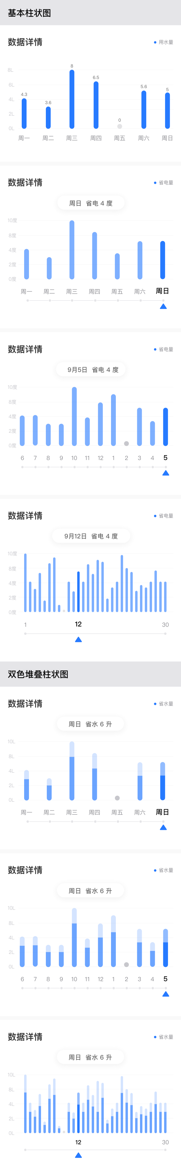
#基础用法
<template>
  <div class="wrapper">
    <dof-minibar title="柱状图" background-color="#267AFF" text-color="#ffffff" :left-button="leftButton"></dof-minibar>
    <scroller class="scroller">
      <div class="barchart-wrapper">
        <midea-barchart-view class="barchart" :data="chartData0"></midea-barchart-view>
      </div>
      <div class="barchart-wrapper">
        <midea-barchart-view class="barchart" :data="chartData1"></midea-barchart-view>
      </div>
      <div class="barchart-wrapper">
        <midea-barchart-view class="barchart" :data="chartJson"></midea-barchart-view>
      </div>
      <div class="barchart-wrapper">
        <midea-barchart-view class="barchart" :data="chartData2"></midea-barchart-view>
      </div>
      <div class="barchart-wrapper lastchart-wrapper">
        <midea-barchart-view class="barchart lastchart" :data="chartData3"></midea-barchart-view>
      </div>
    </scroller>
  </div>
</template>

<script>
import { DofMinibar } from 'dolphin-weex-ui'

const nums = function() {
  let arr = []
  for (let i = 1; i <= 30; i++) {
    arr.push(i)
  }
  return arr
}

const labels = function() {
  let arr = []
  for (let i = 1; i <= 30; i++) {
    if (i === 12 || i === 30) {
      arr.push(i + '')
    } else {
      arr.push('')
    }
  }
  return arr
}

export default {
  components: { DofMinibar },
  data() {
    return {
      leftButton: 'http://dolphin-weex-dev.msmartlife.cn/cdn/images/header/icon_back_white@3x.png',
      widgetState: 2,
      chartData0: {
        x: {
          value: [1, 2, 3, 4, 5, 6, 7],
          label: ['11.6', '11.7', '11.8', '11.9', '11.10', '11.11', '11.12']
        },
        y: [
          {
            maxValue: [4, 9, 5, 4, 7, 5, 8],
            value: [1, 6, 2, 1, 2, 3, 7],
            label: ['1次', '6次', '2次', '1次', '2次', '3次', '7次'],
            title: '冷藏室',
            color: '#605BD2FF', //柱子颜色
            maxColor: '#305BD2FF', //柱子后面颜色ARGB格式  v5.8.0
            maxHighLightColor: '#805BD2FF', //高亮颜色 v5.8.0
            background: '#FFFFFF',
            highLightColor: '#FF5BD2FF', //高亮颜色  v5.8.0
            highLightEnable: true, //点击高亮是否可用 v5.8.0
            barValueTextColor: '#2F4F4F', //柱子上文字颜色  v5.10.0
            drawGridLine: true, //是否显示格子线
            isSelectedShake: true //标杆滑动到标点,是否提供震动反馈
          }
        ],
        xAxisColor: '#000000', //x轴线的颜色,如果不设置,则默认是白色线
        xAxisLabelColor: '#000000', //x label的字体颜色,如果不设置,则默认是白色线
        yAxisColor: '#000000', //y轴线的颜色,如果不设置,则默认是白色线
        yAxisLabelColor: '#000000', // label的字体颜色,如果不设置,则默认是白色线
        background: '#ffffff', //不传,则默认使用透明背景
        borderRadius: '0',
        barSpacing: '20', //设置柱状图最小间距。间距默认为控件宽度/(柱状个数 * 2 + 1),如果默认间距小于最小间距,则使用最小间距。
        barWidth: '45', //设置柱状的宽度
        overMaxValueBarColor: '#6ba4ff', //超过最大值时柱子的颜色,V7.10增加支持
        description: '',
        legend: {
          position: 'TOP_LEFT', //"TOP_LEFT"/"TOP_RIGHT"
          orientation: 'HORIZONTAL', //"HORIZONTAL"/"BOTTOM_RIGHT"
          show: false //控制每组数据标识的显示或隐藏
        },

        unit: {
          x: '日期',
          xTextSize: 14, //字体大小,设置为0 ,不显示字体空间
          xPaddingTop: 0, //字体上预留边距
          xPaddingBottom: 0, //字体下预留边距
          y: '次数',
          yTextSize: 14, //字体大小,设置为0 ,不显示字体空间
          yPaddingTop: 0, //字体上预留边距
          yPaddingBottom: 0 //字体下预留边距
        },

        bottomBorderRadius: '10', //底部的圆角值  v5.8.0
        signPost: {
          //底部界面  v5.8.0
          lineHeight: 1, //线条的高度
          lineColor: '#5BD2FF', //标签线的颜色 如果不设置,则默认是黑色线
          linePointRadius: 3, //标签线上圆点的半径, 默认10
          lineMarginTop: '5', //线条距离X轴的距离
          lineMarginBottom: '0',
          cursorColor: '#5BD2FF', //标签(三角形)的颜色 如果不设置,则默认是黑色线
          cursorMarginTop: '5', //标签(三角形)距离线条的距离
          cursorHigh: '10', //标签(三角形)本身高度
          cursorMarginBottom: '0',
          show: true, //默认是 false 是否显示底部界面
          showType: 'all', //端点的显示样式,支持 all,ends,none 三种模式
          isSelectedDisappear: true, //是否标签 滑动到的端点消失不见
          isSelectedShake: true //选择后是否支持震动,默认不支持,因为震动体验问题,该功能仅ios支持 (5.10)
        },

        yAxisGridLine: true, //是否显示Y轴上的水平线 (5.10)
        xAxisGridLine: true, //是否显示X轴上的水平线  (5.10)
        axisGridColor: '#335BD2FF', //X/Y轴上的水平/竖直方向线颜色 (5.10)
        xAxisLabelHighLightColor: '247687', //x轴刻度选择后颜色(5.10)
        xAxisLabelHighLightThicke: true, //x轴刻度选择后字体是否加粗(5.10)
        yGraduationLabel: 'L', //y轴的刻度单位(5.10)
        barSelectIndex: '2', //选中Bar的index(从0开始),默认没有选中态(5.10)
        yAxisLabelEnable: false, //默认为true,设置 false后y轴label 不占据任何空间(5.10)
        yAxisLabelCount: 5, //安卓属性,强制显示 y轴的刻度数量(5.10)
        xLastLabelAlignmentLeft: false, //iOS 属性 设置true,x轴最后一个label文字左对齐,设置false也就是默认居中对齐柱子,默认false(7.3)
        xFistLabelAlignmentRight: false //iOS 属性 设置true,x轴第一个label文字左、右对齐,设置false也就是默认居中对齐柱子,默认false(7.3)
      },
      chartData1: {
        x: {
          value: [1, 2, 3, 4, 5, 6, 7],
          label: ['周一', '周二', '周三', '周四', '周五', '周六', '周日']
        },
        y: [
          {
            maxValue: [5, 4, 10, 9, 1, 5, 10],
            value: [3, 2, 8, 5, 0, 3, 7],
            // "label": ["1次", "6次", "2次", "1次", "2次", "3次", "7次"],   // 柱状图上方的文本
            title: '冷藏室',
            background: '#FFFFFF',
            color: '#6BA4FF', //柱子颜色
            highLightColor: '#267AFF', //高亮颜色  v5.8.0
            maxColor: '#D4E4FF', //柱子后面颜色ARGB格式  v5.8.0
            maxHighLightColor: '#92BCFF', //柱子后面高亮颜色 v5.8.0
            highLightEnable: true, //点击高亮是否可用 v5.8.0
            barValueTextColor: '#2F4F4F', //柱子上文字颜色  v5.10.0
            drawGridLine: false, //是否显示格子线
            isSelectedShake: true //标杆滑动到标点,是否提供震动反馈
          }
        ],
        xAxisColor: '#E5E5E8', //x轴线的颜色,如果不设置,则默认是白色线
        xAxisLabelColor: '#8A8A8F', //x label的字体颜色,如果不设置,则默认是白色线
        yAxisColor: 'transparent', //y轴线的颜色,如果不设置,则默认是白色线
        yAxisLabelColor: '#C7C7CC', // label的字体颜色,如果不设置,则默认是白色线
        background: '#ffffff', //不传,则默认使用透明背景
        borderRadius: '5', //柱子顶部的圆角,默认为0px
        bottomBorderRadius: '5', //底部的圆角值  v5.8.0
        // "barSpacing" : "5", //设置柱状图最小间距。间距默认为控件宽度/(柱状个数 * 2 + 1),如果默认间距小于最小间距,则使用最小间距。
        barWidth: '10', //设置柱状的宽度
        barTouchTop: true, // y轴刻度覆盖maxvalue最大值
        description: '',

        yAxisGridLine: true, //是否显示Y轴上的水平线 (5.10)
        xAxisGridLine: false, //是否显示X轴上的水平线  (5.10)
        axisGridColor: '#F2F2F2', //X/Y轴上的水平/竖直方向线颜色 (5.10)
        xAxisLabelHighLightThicke: true, //x轴刻度选择后字体是否加粗(5.10)
        xAxisLabelHighLightColor: '#000000', //x轴刻度选择后颜色(5.10)
        yGraduationLabel: 'L', //y轴的刻度单位(5.10)
        barSelectIndex: this.getTime('day') - 1, //选中Bar的index(从0开始),默认没有选中态(5.10)
        yAxisLabelEnable: true, //默认为true,设置 false后y轴label 不占据任何空间(5.10)
        yAxisLabelCount: 5, //安卓属性,强制显示 y轴的刻度数量(5.10)
        legend: {
          position: 'TOP_LEFT', //"TOP_LEFT"/"TOP_RIGHT"
          orientation: 'HORIZONTAL', //"HORIZONTAL"/"BOTTOM_RIGHT"
          show: false //控制每组数据标识的显示或隐藏
        },
        unit: {
          // "x": "日期",
          xTextSize: 0, //字体大小,设置为0 ,不显示字体空间
          xPaddingTop: 20, //字体上预留边距
          xPaddingBottom: 0, //字体下预留边距
          // "y": "次数",
          yTextSize: 0, //字体大小,设置为0 ,不显示字体空间
          yPaddingTop: 6, //字体上预留边距
          yPaddingBottom: 0 //字体下预留边距
        },
        signPost: {
          //底部界面  v5.8.0
          lineHeight: 1, //线条的高度
          lineColor: '#E5E5E8', //标签线的颜色 如果不设置,则默认是黑色线
          linePointRadius: 3, //标签线上圆点的半径, 默认10
          lineMarginTop: '5', //线条距离X轴的距离
          lineMarginBottom: '0',
          cursorColor: '#267AFF', //标签(三角形)的颜色 如果不设置,则默认是黑色线
          cursorMarginTop: '5', //标签(三角形)距离线条的距离
          cursorHigh: '20', //标签(三角形)本身高度
          cursorMarginBottom: '0',
          show: true, //默认是 false 是否显示底部界面
          showType: 'all', //端点的显示样式,支持 all,ends,none 三种模式
          isSelectedDisappear: true, //是否标签 滑动到的端点消失不见
          isSelectedShake: true //选择后是否支持震动,默认不支持,因为震动体验问题,该功能仅ios支持 (5.10)
        }
      },

      chartJson: {
        x: {
          value: [1, 2, 3, 4, 5, 6, 7],
          label: ['周一', '周二', '周三', '周四', '周五', '周六', '周日']
        },
        y: [
          {
            maxValue: [2, 3, 2, 3, 2, 3, 2],
            value: [1, 1, 1, 1, 1, 1, 1],
            // "label": ["1次", "6次", "2次", "1次", "2次", "3次", "7次"],
            title: '',
            color: '#267AFF', //柱子颜色
            highLightColor: '#267AFF',
            maxColor: '#267AFF', //柱子后面颜色ARGB格式  v5.8.0
            maxHighLightColor: '#267AFF', //高亮颜色 v5.8.0
            background: '#ffffff',
            highLightEnable: true //点击高亮是否可用 v5.8.0
          }
        ],
        barSelectIndex: this.getTime('day') - 1, //选中Bar的index(从0开始),默认没有选中态(5.10)
        xAxisColor: '#F2F2F2', //x轴线的颜色,如果不设置,则默认是白色线
        xAxisLabelColor: '#8A8A8F', //x label的字体颜色,如果不设置,则默认是白色线
        yAxisColor: '#FFFFFF', //y轴线的颜色,如果不设置,则默认是白色线
        yAxisLabelColor: '#C7C7CC', // label的字体颜色,如果不设置,则默认是白色线
        background: '#FFFFFF', //不传,则默认使用透明背景
        borderRadius: '5',
        bottomBorderRadius: '5', //底部的圆角值  v5.8.0
        // "barSpacing" : "30", //设置柱状图最小间距。间距默认为控件宽度/(柱状个数 * 2 + 1),如果默认间距小于最小间距,则使用最小间距。
        barWidth: '10',
        yAxisGridLine: true, //是否显示Y轴上的水平线 (5.10)
        xAxisGridLine: false, //是否显示X轴上的水平线  (5.10)
        axisGridColor: '#F2F2F2', //X/Y轴上的水平/竖直方向线颜色 (5.10)
        xAxisLabelHighLightColor: '#000000', //x轴刻度选择后颜色(5.10)
        xAxisLabelHighLightThicke: true, //x轴刻度选择后字体是否加粗(5.10)
        yGraduationLabel: 'L', //y轴的刻度单位(5.10)
        yAxisLabelCount: 5, //安卓属性,强制显示 y轴的刻度数量(5.10)
        barTouchTop: true,
        description: '',
        legend: {
          position: 'TOP_LEFT', //"TOP_LEFT"/"TOP_RIGHT"
          orientation: 'HORIZONTAL', //"HORIZONTAL"/"BOTTOM_RIGHT"
          show: false //控制每组数据标识的显示或隐藏
        },
        unit: {
          x: '',
          xTextSize: 0,
          xPaddingTop: 20,
          xPaddingBottom: 0,
          y: '',
          yTextSize: 0,
          yPaddingTop: 6,
          yPaddingBottom: 0
        },
        signPost: {
          //底部界面  v5.8.0
          lineHeight: 1, //线条的高度
          lineColor: '#E5E5E8', //标签线的颜色 如果不设置,则默认是黑色线
          linePointRadius: 3, //标签线上圆点的半径, 默认10
          lineMarginTop: '5', //线条距离X轴的距离
          lineMarginBottom: '0',
          cursorColor: '#267AFF', //标签(三角形)的颜色 如果不设置,则默认是黑色线
          cursorMarginTop: '5', //标签(三角形)距离线条的距离
          cursorHigh: '20', //标签(三角形)本身高度
          cursorMarginBottom: '0',
          show: true, //默认是 false 是否显示底部界面
          showType: 'all',
          isSelectedDisappear: true,
          isSelectedShake: true //选择后是否支持震动,默认不支持 (5.10)
        }
      },

      chartData2: {
        x: {
          value: [1, 2, 3, 4, 5, 6, 7, 8, 9, 10, 11, 12],
          label: ['1', '2', '3', '4', '5', '6', '7', '8', '9', '10', '11', '12']
        },
        y: [
          {
            maxValue: [4, 3, 3, 4, 4, 4, 4, 3, 3, 3, 4, 4],
            value: [3, 1, 2, 2, 3, 1, 1, 1, 1, 2, 1, 2],
            // "label": ["6L", "1L", "4L", "2.5L", "4L", "3L", "3L", "2L", "2L", "8L", "3L", "6L"],
            color: '#6BA4FF', //柱子颜色
            highLightColor: '#267AFF', //高亮颜色  v5.8.0
            maxColor: '#D4E4FF', //柱子后面颜色ARGB格式  v5.8.0
            maxHighLightColor: '#92BCFF', //柱子后面高亮颜色 v5.8.0
            background: '#ffffff',
            highLightEnable: true //点击高亮是否可用
          }
        ],
        xAxisColor: '#e5e5e8', //x轴线的颜色,如果不设置,则默认是白色线
        xAxisLabelColor: '#8a8a8f', //x label的字体颜色,如果不设置,则默认是白色线
        yAxisColor: 'transparent', //y轴线的颜色,如果不设置,则默认是白色线
        yAxisLabelColor: '#C7C7CC', // label的字体颜色,如果不设置,则默认是白色线
        xAxisLabelHighLightThicke: true, //x轴刻度选择后字体是否加粗(5.10)
        xAxisLabelHighLightColor: '#000000', //x轴刻度选择后颜色(5.10)
        // "background": "#ffffff", //不传,则默认使用透明背景
        borderRadius: '5', //柱子顶部的圆角,默认为0px
        bottomBorderRadius: '5', //底部的圆角值
        barWidth: '10', //设置柱状的宽度
        barTouchTop: true, // y轴刻度覆盖maxvalue最大值
        description: '图标描叙',

        yAxisGridLine: true, //是否显示Y轴上的水平线 (5.10)
        xAxisGridLine: false, //是否显示X轴上的水平线  (5.10)
        axisGridColor: '#F2F2F2', //X/Y轴上的水平/竖直方向线颜色 (5.10)
        yGraduationLabel: 'L', //y轴的刻度单位(5.10)
        barSelectIndex: this.getTime('month'), //选中Bar的index(从0开始),默认没有选中态(5.10)
        // barSelectIndex: '2', //选中Bar的index(从0开始),默认没有选中态(5.10)
        yAxisLabelEnable: true, //默认为true,设置 false后y轴label 不占据任何空间(5.10)
        yAxisLabelCount: 5, //安卓属性,强制显示 y轴的刻度数量(5.10)
        legend: {
          position: 'TOP_LEFT', //"TOP_LEFT"/"TOP_RIGHT"
          orientation: 'HORIZONTAL', //"HORIZONTAL"/"BOTTOM_RIGHT"
          show: false //控制每组数据标识的显示或隐藏
        },
        unit: {
          // "x": "日期",
          xTextSize: 0, //字体大小,设置为0 ,不显示字体空间
          xPaddingTop: 20, //字体上预留边距
          xPaddingBottom: 0, //字体下预留边距
          // "y": "次数",
          yTextSize: 0, //字体大小,设置为0 ,不显示字体空间
          yPaddingTop: 6, //字体上预留边距
          yPaddingBottom: 0 //字体下预留边距
        },
        signPost: {
          //底部界面  v5.8.0
          lineHeight: 1, //线条的高度
          lineColor: '#E5E5E8', //标签线的颜色 如果不设置,则默认是黑色线
          linePointRadius: 3, //标签线上圆点的半径, 默认10
          lineMarginTop: 0, //线条距离X轴的距离
          lineMarginBottom: '0',
          cursorColor: '#267AFF', //标签(三角形)的颜色 如果不设置,则默认是黑色线
          cursorMarginTop: '5', //标签(三角形)距离线条的距离
          cursorHigh: '20', //标签(三角形)本身高度
          cursorMarginBottom: '0',
          show: true, //默认是 false 是否显示底部界面
          showType: 'all', //端点的显示样式,支持 all,ends,none 三种模式
          isSelectedDisappear: true, //是否标签 滑动到的端点消失不见
          isSelectedShake: true //选择后是否支持震动,默认不支持,因为震动体验问题,该功能仅ios支持 (5.10)
        }
      },

      chartData3: {
        x: {
          value: nums(),
          label: labels()
          // label: ['1', '2', '3', '4', '5', '6', '7', '8', '9', '10','11', '12', '13', '14', '15', '16', '17', '18', '19','20','21', '22', '23', '24', '25', '26', '27', '28', '29','30']
        },
        y: [
          {
            maxValue: [4, 5, 3, 4, 3, 5, 4, 2, 2, 4, 3, 5, 4, 5, 5, 3, 3, 4, 3, 4, 4, 5, 3, 3, 3, 3, 4, 5, 4, 4],
            value: [
              3,
              2,
              1.5,
              2.5,
              0.3,
              3.8,
              2,
              0.2,
              1,
              1,
              1,
              3,
              1,
              0.5,
              3.2,
              2,
              2,
              0.5,
              1,
              1,
              3,
              2,
              2,
              0.5,
              0.8,
              1.1,
              1,
              1,
              1,
              1
            ],
            // "label": ["7L", "3L", "2.5L", "4.5L", "1.5L", "5L", "7L", "0.8L", "1L", "3L", "2L", "4L", "3L", "8L", "3.8L", "7L", "6.6L", "1.3L", "2L", "3L", "7L", "6L", "5L", "2.5L", "3L", "2.5L", "3L", "6L", "3L", "3L"],
            color: '#6BA4FF', //柱子颜色
            highLightColor: '#267AFF', //高亮颜色  v5.8.0
            maxColor: '#D4E4FF', //柱子后面颜色ARGB格式  v5.8.0
            maxHighLightColor: '#92BCFF', //柱子后面高亮颜色 v5.8.0
            background: '#ffffff',
            highLightEnable: true, //点击高亮是否可用
            yoffset: 0
          }
        ],
        barSelectIndex: this.getTime('date') - 1, //选中Bar的index(从0开始),默认没有选中态(5.10)
        xAxisColor: '#e5e5e8', //x轴线的颜色,如果不设置,则默认是白色线
        xAxisLabelColor: '#8a8a8f', //x label的字体颜色,如果不设置,则默认是白色线
        yAxisColor: 'transparent', //y轴线的颜色,如果不设置,则默认是白色线
        yAxisLabelColor: '#C7C7CC', // label的字体颜色,如果不设置,则默认是白色线
        xAxisLabelHighLightThicke: true, //x轴刻度选择后字体是否加粗(5.10)
        xAxisLabelHighLightColor: '#000000', //x轴刻度选择后颜色(5.10)
        // "background": "#ffffff", //不传,则默认使用透明背景
        borderRadius: '3', //柱子顶部的圆角,默认为0px
        bottomBorderRadius: '3', //底部的圆角值
        barWidth: '2', //设置柱状的宽度
        barTouchTop: true, // y轴刻度覆盖maxvalue最大值
        description: '图标描叙',
        // yoffset:0,
        legend: {
          position: 'TOP_LEFT', //"TOP_LEFT"/"TOP_RIGHT"
          orientation: 'HORIZONTAL', //"HORIZONTAL"/"BOTTOM_RIGHT"
          show: false //控制每组数据标识的显示或隐藏
        },
        unit: {
          // "x": "日期",
          xTextSize: 0, //字体大小,设置为0 ,不显示字体空间
          xPaddingTop: 16, //字体上预留边距
          xPaddingBottom: 0, //字体下预留边距
          // "y": "次数",
          yTextSize: 0, //字体大小,设置为0 ,不显示字体空间
          yPaddingTop: 6, //字体上预留边距
          yPaddingBottom: 0 //字体下预留边距
        },
        signPost: {
          //底部界面  v5.8.0
          lineHeight: 1, //线条的高度
          lineColor: '#E5E5E8', //标签线的颜色 如果不设置,则默认是黑色线
          linePointRadius: 3, //标签线上圆点的半径, 默认10
          lineMarginTop: '5', //线条距离X轴的距离
          lineMarginBottom: '0',
          cursorColor: '#267AFF', //标签(三角形)的颜色 如果不设置,则默认是黑色线
          cursorMarginTop: '5', //标签(三角形)距离线条的距离
          cursorHigh: '20', //标签(三角形)本身高度
          cursorMarginBottom: '0',
          show: true, //默认是 false 是否显示底部界面
          showType: 'ends', //端点的显示样式,支持 all,ends,none 三种模式
          isSelectedDisappear: true, //是否标签 滑动到的端点消失不见
          isSelectedShake: true //选择后是否支持震动,默认不支持,因为震动体验问题,该功能仅ios支持 (5.10)
        }
      }
    }
  },

  created() {},

  methods: {
    back() {},
    minibarRightButtonClick() {
      const home = 'index.js'
      this.$MID.platform.name.toLowerCase() !== 'web' && this.$MID.route.push(home)
    },

    getTime(type) {
      var now = new Date()
      var month = now.getMonth() //得到月份
      var date = now.getDate() //得到日期
      var day = now.getDay() //得到周几
      switch (type) {
        case 'month':
          return now.getMonth()
          break
        case 'date':
          return now.getDate()
          break
        default:
          return now.getDay()
          break
      }
    }
  }
}
</script>

<style scoped>
.wrapper {
  background-color: #ffffff;
}
.scroller {
  align-items: center;
  width: 750px;
  /* padding-bottom: 200px; */
}

.barchart-wrapper {
  flex-direction: row;
  justify-content: center;
  width: 686px;
  height: 480px;
  margin-top: 32px;
  background-color: #ffffff;
}
.lastchart-wrapper {
  margin-bottom: 200px;
  margin-left: -24px;
}

.barchart {
  width: 686px;
  height: 450px;
  padding-top: 40px;
}

.lastchart {
  width: 714px;
}
</style>
#Attributes
| Prop | Type | Required | Default | Description |
|---|---|---|---|---|
data |
Object |
Y |
{} |
柱状图数据配置项 |
data{x} |
Object |
Y |
{} |
x坐标轴标识配置 |
data{y} |
Array |
Y |
- |
y坐标轴标识配置 如单位、颜色等属性 |
| data | String |
N |
- |
x轴线的颜色,如果不设置,则默认是白色线 |
| data | String |
N |
- |
x label的字体颜色,如果不设置,则默认是白色线 |
| data | String |
N |
- |
y轴线的颜色,如果不设置,则默认是白色线 |
| data | String |
N |
- |
y label的字体颜色,如果不设置,则默认是白色线 |
| data | String |
N |
transparent |
不传,则默认使用透明背景 |
| data | Number |
N |
- |
圆角 |
| data | Number |
N |
- |
设置柱状图最小间距。间距默认为控件宽度/(柱状个数 * 2 + 1),如果默认间距小于最小间距,则使用最小间距。 |
| data | Number |
N |
- |
设置柱状的宽度 |
| data | String |
N |
- |
超过最大值时柱子的颜色, v7.10新增支持 |
| data | String |
N |
- |
图表描述 |
| data | Number |
N |
- |
数据标识配置 |
| data | Object |
N |
- |
坐标轴字体大小和预留边距配置 |
| data | Number |
N |
- |
底部的圆角值, 注意:borderRadius 和bottomBorderRadius 如果底部和顶部圆角同时存在,大小必须一致 |
| data | Object |
N |
- |
标签配置 |
| data | Boolean |
N |
true |
是否显示Y轴上的水平线 |
| data | Boolean |
N |
true |
是否显示X轴上的水平线 |
| data | String |
N |
- |
X/Y轴上的水平/竖直方向线颜色 |
| data | String |
N |
- |
x轴刻度选择后颜色 |
| data | Boolean |
N |
- |
x轴刻度选择后字体是否加粗 |
| data | String |
Y |
- |
y轴的刻度单位 如M,L,CM等 |
| data | Number |
N |
- |
选中Bar的index(从0开始),默认没有选中态 |
| data | Boolean |
N |
true |
默认为true,设置 false后y轴label 不占据任何空间 |
| data | String |
N |
true |
文本的颜色 |
| data | String |
N |
true |
文本的字体大小 |
#Events
| 事件名称 | 说明 | 回调参数 |
|---|---|---|
barClicked |
点击柱状图柱子回调 | event |

 浙公网安备 33010602011771号