
基础弹窗
7.3 基础弹窗
用于弹窗出现时,让用户聚焦弹窗内容
#模态弹窗
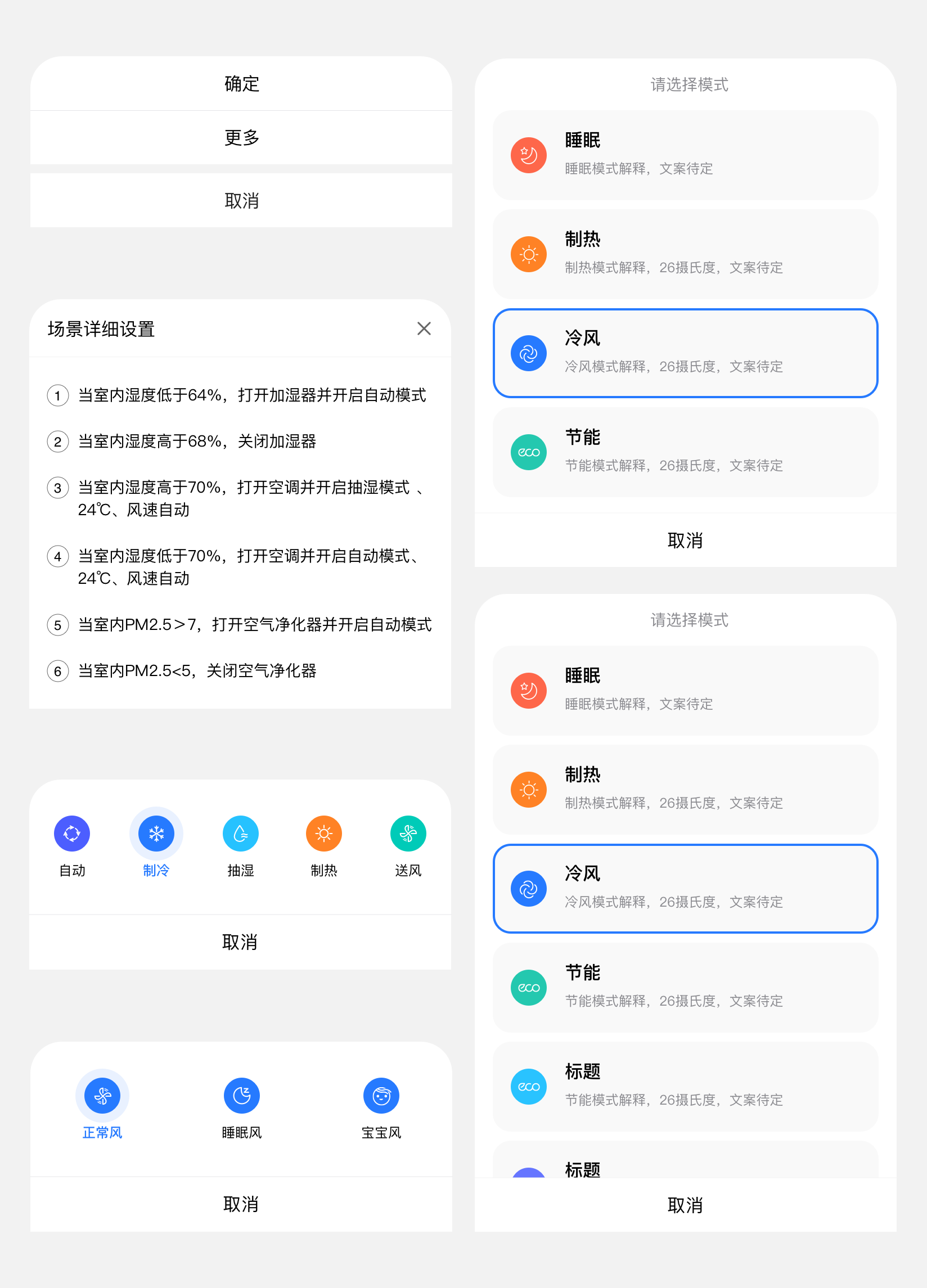
系统默认弹窗样式

#dof-modal
弹窗的模态框组件
#实例
#基础用法
<template>
  <div class="dof-modal-wrapper">
    <dof-minibar title="Modal" background-color="#267AFF" text-color="#ffffff" :left-button="leftButton"></dof-minibar>
    <scroller class="scroller">
      <dof-catalog title="使用案例" background-color="#daf9ca" :has-margin="true"></dof-catalog>
      <div class="container">
        <dof-button type="primary" class="eventBtn" text="一个按钮对话框" @dofButtonClicked="openSingleModal">
        </dof-button>
        <dof-button type="primary" class="eventBtn" text="两个按钮对话框" @dofButtonClicked="openModal"> </dof-button>

        <dof-button type="primary" class="eventBtn" text="一个按钮带描述" @dofButtonClicked="openSingleContentModal">
        </dof-button>
        <dof-button type="primary" class="eventBtn" text="两个按钮带描述" @dofButtonClicked="openContentModal">
        </dof-button>

        <dof-button type="primary" class="eventBtn" text="带描述、输入框和两个按钮" @dofButtonClicked="openPromptModal">
        </dof-button>
        <dof-button type="primary" class="eventBtn" text="带描述和多个按钮" @dofButtonClicked="openMoreBtnModal">
        </dof-button>
        <dof-button type="colmo" class="eventBtn" text="打开图片弹窗" @dofButtonClicked="showImgModal = true">
        </dof-button>
        <dof-button type="colmo" class="eventBtn" text="打开单选弹窗" @dofButtonClicked="showSelectModal = true">
        </dof-button>
      </div>
    </scroller>

    <dof-modal
      title="文本"
      :show="show"
      @close="closeModal"
      @dofModalCancelBtnClicked="dofModalCancelBtnClicked"
      @dofModalConfirmBtnClicked="dofModalConfirmBtnClicked"
      :single="single"
    >
    </dof-modal>
    <dof-modal
      title="标题"
      content="Platforma goes bigger – we added about 100 new screens."
      :show="showContent"
      @close="closeModal"
      @dofModalCancelBtnClicked="dofModalCancelBtnClicked"
      @dofModalConfirmBtnClicked="dofModalConfirmBtnClicked"
      :single="single"
    >
    </dof-modal>
    <dof-modal
      title="家的名称"
      content="Subtitle"
      :show="showPrompt"
      hasInput="true"
      :inputContent="inputContent"
      placeholder="Password"
      confirmText="修改"
      @close="closeModal"
      @dofModalCancelBtnClicked="dofModalCancelBtnClicked"
      @dofModalConfirmBtnClicked="dofModalConfirmBtnClicked"
    >
    </dof-modal>
    <dof-modal
      title="标题"
      content="Platforma goes bigger – we added about 100 new screens."
      :show="showMoreBtn"
      :btnGroup="moreBtnGroup"
      @close="closeModal"
      @btnItemClicked="moreBtnClicked"
    >
    </dof-modal>

    <dof-modal
      :show="showImgModal"
      @close="showImgModal = false"
      @dofModalConfirmBtnClicked="showImgModal = false"
      @dofModalCancelBtnClicked="showImgModal = false"
      :single="false"
      :main-btn-color="'#B35336'"
      :second-btn-color="'#71717A'"
      :modal-style="{ ...modalStyle }"
      :modal-footer-border-color="'#3D3D42'"
      :sub-text-color="'#cccccc'"
      :image="'./assets/image/modal/img.png'"
      :img-style="imgStyle"
      :modal-content-style="{ paddingLeft: '0px', paddingRight: '0px' }"
    >
      <text class="titleText" slot="title">检测到新版本</text>
      <div class="contentTextBox" slot="content">
        <text class="contentText">{{ content }}</text>
      </div>
    </dof-modal>
    <dof-modal
      :show="showSelectModal"
      @close="showSelectModal = false"
      @dofModalConfirmBtnClicked="showSelectModal = false"
      @closeIconClicked="showSelectModal = false"
      :btn-group="null"
      :modal-style="{ ...modalStyle }"
      :image="'./assets/image/modal/img.png'"
      :img-style="imgStyle"
      :modal-content-style="{ paddingLeft: '0px', paddingRight: '0px' }"
      :closeIcon="'./assets/image/modal/close.png'"
    >
      <text class="titleText" slot="title">检测到新版本</text>
      <div slot="content">
        <text class="contentTitle">狗粮小盆</text>
        <text class="contentTip">识别准确率 98%</text>

        <div class="contentTextBox">
          <text class="contentText">{{ content }}</text>
        </div>
        <div class="selectBox">
          <div>
            <div :class="['selectItem', selectVal === 1 ? 'active' : '']" @click="selectVal = 1">
              <image class="selectImg" src="./assets/image/modal/good.png"></image>
            </div>
            <text class="selectText">准确好用</text>
          </div>
          <div>
            <div :class="['selectItem', selectVal === 2 ? 'active' : '']" @click="selectVal = 2">
              <image class="selectImg" src="./assets/image/modal/bad.png"></image>
            </div>
            <text class="selectText">仍需努力</text>
          </div>
        </div>
      </div>
    </dof-modal>
  </div>
</template>

<style scoped>
.dof-modal-wrapper {
  background-color: #f2f2f2;
}

.scroller {
  flex: 1;
}

.container {
  flex-direction: column;
  align-items: center;
}

.eventBtn {
  margin: 24px auto;
}
.custom-content {
  font-family: PingFangSC-Regular;
  font-size: 32px;
  color: #000000;
  text-align: center;
  padding-bottom: 10px;
}
.titleText {
  font-family: PingFangSC-Medium;
  font-size: 34px;
  color: #ffffff;
  text-align: center;
  font-weight: 500;

  lines: 1;
  text-overflow: ellipsis;
  overflow: hidden;
  padding: 0px 50px;
}
.contentTextBox {
  display: flex;
  flex-direction: row;
  justify-content: center;
  margin-bottom: 20px;
}
.contentText {
  width: 480px;
  font-family: PingFangSC-Regular;
  font-size: 26px;
  color: #cccccc;
  text-align: center;
  font-weight: 400;
}
.contentTitle {
  font-family: PingFangSC-Medium;
  font-size: 34px;
  color: #ffffff;
  text-align: center;
  font-weight: 500;
}
.contentTip {
  font-family: PingFangSC-Light;
  font-size: 26px;
  color: #b35336;
  text-align: center;
  font-weight: 200;
  margin-top: 12px;
  margin-bottom: 16px;
}
.selectBox {
  display: flex;
  flex-direction: row;
  justify-content: space-between;
  padding-left: 86px;
  padding-right: 86px;
  margin-top: 44px;
  margin-bottom: 66px;
}
.selectItem {
  width: 96px;
  height: 96px;
  background-color: #27272a;
  display: flex;
  flex-direction: row;
  align-items: center;
  justify-content: center;
  border-radius: 48px;
}
.selectImg {
  width: 60px;
  height: 60px;
}
.active {
  background-color: #b35336;
}
.selectText {
  margin-top: 14px;
  font-family: PingFangSC-Regular;
  font-size: 24px;
  color: #ffffff;
  text-align: center;
  font-weight: 400;
}
</style>

<script>
import { DofButton, DofModal, DofMinibar, DofCatalog } from 'dolphin-weex-ui'
const modal = weex.requireModule('modal')
module.exports = {
  components: { DofButton, DofModal, DofMinibar, DofCatalog },
  data() {
    return {
      leftButton: 'http://dolphin-weex-dev.msmartlife.cn/cdn/images/header/icon_back_white@3x.png',
      show: false,
      single: false,
      showContent: false,
      showPrompt: false,
      inputContent: '',
      showMoreBtn: false, // 多个button的dialog
      showImgModal: false,
      showSelectModal: false,
      moreBtnGroup: ['确定', '更多', '取消'],
      modalStyle: {
        borderRadius: '0px', // 弹窗是否圆角
        backgroundColor: '#1A1A1C' // 弹窗背景颜色
      },
      content: '小美提醒:定期收纳整理,保持地面整齐,清洁体验更佳。',
      imgStyle: { marginTop: '40px', marginBottom: '40px', width: '540px', height: '332px' },
      selectVal: 1,
      activeTab: 0
    }
  },
  methods: {
    openModal() {
      this.single = false
      this.show = true
    },
    openSingleModal() {
      this.single = true
      this.show = true
    },

    openContentModal() {
      this.single = false
      this.showContent = true
    },
    openSingleContentModal() {
      this.single = true
      this.showContent = true
    },

    // 打开带描述和输入框的对话框
    openPromptModal() {
      this.showPrompt = true
    },

    // 打开带描述和多个按钮的对话框
    openMoreBtnModal() {
      this.showMoreBtn = true
    },

    dofModalConfirmBtnClicked(params) {
      console.log('this.inputContent', this.inputContent)
      console.log('params', params)
      this.show = false
      this.showContent = false
      this.showPrompt = false
      if (params.content) {
        modal.toast({
          message: `您点击了${params.type}按钮,修改为${params.content}`
        })
        this.inputContent = params.content
      } else {
        modal.toast({
          message: `您点击了${params.type}按钮`
        })
      }
    },

    dofModalCancelBtnClicked(params) {
      console.log('params', params)
      this.show = false
      this.showContent = false
      this.showPrompt = false
      modal.toast({
        message: '您点击了cancel按钮'
      })
    },

    //按钮组点击
    moreBtnClicked(params) {
      console.log(params)
      this.showMoreBtn = false
      modal.toast({
        message: `您点击了'${params.text}'按钮`
      })
    },

    closeModal() {
      this.show = false
    },

    back() {}
  },
  created() {
    // this.isIos = weex.config.env.platform === 'iOS';
  }
}
</script>
#Attributes
| Prop | Type | Required | Default | Description |
|---|---|---|---|---|
| show | Boolean |
N |
false |
是否显示 |
| single | Boolean |
N |
false |
modal是否为一个按钮 |
| title | String |
N |
- |
标题 |
| content | String |
N |
- |
modal的文本内容 |
| cancel-text | String |
N |
取消 |
modal的左边按钮默认label |
| confirm-text | String |
N |
确定 |
modal的右边按钮默认label,ps:single为true时默认显示的是右边的'确认按钮' |
| has-input | Boolean |
N |
- |
是否有输入框 |
| placeholder | String |
N |
- |
输入框的placeholder |
| input-content | String |
N |
- |
输入框的绑定内容 |
| btn-group | Array |
N |
[] |
竖向多按钮组 例:['确定','更多','取消'] |
| main-btn-color | String |
N |
#267AFF |
单个按钮字体颜色或者右边按钮的字体颜色 |
| second-btn-color | String |
N |
#267AFF |
两个按钮左边按钮的字体颜色或者btnGroup按钮组字体颜色 |
| modal-style | Object |
N |
{} |
modal样式自定义 |
| modal-content-style | Object |
N |
{} |
modal-content样式自定义,适用于修改内部padding等需求 |
| modal-footer-border-color | String |
N |
#c8c7cc |
底部按钮边框颜色 |
| image | String |
N |
- | 图片地址 |
| imgStyle | Object |
N |
{} |
图片样式 |
| closeIcon | String |
N |
- | 右上角关闭按钮地址 |
#Events
| 事件名 | 说明 | 回调参数 |
|---|---|---|
dofModalCancelBtnClicked |
点击左边取消按钮 | e, e.type, e.content 见注1 |
dofModalConfirmBtnClicked |
点击右边确定按钮 | e, e.type, e.content 见注1 |
btnItemClicked |
多按钮组点击事件 | e, 参数e返回列表项信息为 |
close |
模态窗关闭 | {} |
- 注1: e.type为cancel或者comfirm, e.content为返回的input内容
#底部弹窗
从底部出现的弹窗
#dof-actionsheet
动作面板(底部弹窗)
#实例
#基础用法
<template>
  <div class="wrapper">
    <dof-minibar
      title="actionSheet"
      background-color="#267AFF"
      @dofMinibarLeftButtonClicked="back"
      :left-button="leftButton"
      text-color="#ffffff"
      right-text="more"
    ></dof-minibar>
    <scroller class="scroller">
      <title title="dof-actionsheet"></title>
      <category title="使用案例"></category>
      <div class="container">
        <dof-button @dofButtonClicked="openAction1" text="actionsheet动作面板+有标题"></dof-button>
        <dof-button @dofButtonClicked="openAction2" text="actionsheet动作面板+无标题"></dof-button>
      </div>
      <dof-actionsheet :show="isBottomShow"
                  :title="title"
                  :items="items"
                  @dofPopupOverlayClicked="isBottomShow=false"
                  @dofItemClick="itemClick"
                  @dofCancelClick="cancelClick">
      </dof-actionsheet>
    </scroller>
  </div>
</template>

<style scoped>
  .wrapper {
    position: absolute;
    top: 0;
    bottom: 0;
    left: 0;
    right: 0;
    background-color: #FFFFFF;
  }
  .scroller {
    flex: 1;
  }
  .container{
    height: 400px;
    justify-content: space-around;
    align-items: center;
  }
</style>

<script>
import { DofMinibar, DofActionsheet, DofButton } from 'dolphin-weex-ui'
import Title from 'src/_mods/title.vue'
import Category from 'src/_mods/catalog'
const modal = weex.requireModule('modal');
export default {
  components: { Title, Category, DofMinibar, DofActionsheet, DofButton },
  data: () => ({
    isBottomShow: false,
    title:'',
    items:['确定', '更多']
  }),
  created() {},

  methods: {
    openAction1(){
      this.title = '我是标题'
      this.isBottomShow = true;
    },
    openAction2(){
      this.title = ''
      this.isBottomShow = true;
    },
    itemClick(params){
      modal.toast({
        message: JSON.stringify(params)
      });
    },
    cancelClick(params){
      modal.toast({
        message: JSON.stringify(params)
      });
    }
  }
}
</script>
#Attributes
| Prop | Type | Required | Default | Description |
|---|---|---|---|---|
show |
Boolean |
N |
false |
是否显示actionsheet列表 |
title |
String |
N |
- |
上拉面板的title |
button |
String |
N |
取消 |
上拉面板的默认按钮,目前只支持单个按钮,类似取消,不用了 |
items |
Array |
Y |
- |
上拉列表,例:item:['确定', '更多'] |
titleStyle |
Object |
N |
{} |
title 样式 |
defaultBtnStyle |
Object |
N |
{} |
默认按钮样式 |
itemStyle |
Objct |
N |
{} |
items 中按钮外层样式(非文本样式) |
#Events
| 事件名称 | 说明 | 回调参数 |
|---|---|---|
dofPopupOverlayClicked |
蒙层点击关闭事件 | e |
dofItemClick |
上拉列表选项点击事件 | e, 参数e返回列表项信息为{ item, index } |
dofCancelClick |
点击取消按钮事件 |
e,e.buttonText |
#Attention:
由于组件关闭是使用方法dofPopupOverlayClicked在前端更新show状态的,故使用时务必在dofPopupOverlayClicked方法中将show设置为false,否则由于不能更新当前状态导致下次不能正确打开,如下:
<script>
  <dof-actionsheet
      :show="isBottomShow"
      :items="items"
      @dofPopupOverlayClicked="isBottomShow=false">
  </dof-actionsheet>
</script>
#其他弹窗
自定义弹窗

#dof-mask弹出层
弹层组件,可定制内容
#实例
#基础用法
<template>
  <div class="wrapper">
    <dof-minibar
      title="mask"
      background-color="#267AFF"
      text-color="#ffffff"
      :left-button="leftButton"
      @dofMinibarLeftButtonClicked="back"
      left-text="返回"
    ></dof-minibar>

   <div class="container">
      <dof-button
        class="btn"
        type="primary"
        text="打开mask"
        @dofButtonClicked="openMask">
      </dof-button>
   </div>

    <dof-mask height="700"
              width="540"
              duration="300"
              mask-bg-color="#FFFFFF"
              :has-overlay="true"
              :show-close="true"
              :show="show"
              border-radius="26"
              @dofMaskSetHidden="dofMaskSetHidden">
        <div class="content">
          <dof-image :src="activityImg"
                      resize="stretch"
                      @click="imgClick"
                      class="activityImg"></dof-image>
        </div>
      </dof-mask>
  </div>
</template>

<style scoped>
 .wrapper {
   background-color: #f2f2f2;
  }

  .container {
    justify-content: center;
    align-items: center;
  }
  .btn{
    margin:40px auto;
  }

  .content{
    width: 540px;
    height: 700px;
    border-radius: 26px;
    overflow: hidden;
  }

  .activityImg{
    width: 540px;
    height: 700px;
  }
</style>

<script>
import { DofButton, DofMinibar, DofMask, DofImage } from 'dolphin-weex-ui'
const modal = weex.requireModule('modal');

export default {
  components: { DofButton, DofMinibar, DofMask ,DofImage},
  data() {
    return {
      leftButton: 'assets/img/header/TB1cAYsbv2H8KJjy0FcXXaDlFXa-30-53.png',
      show: false,
      activityImg:'assets/img/image/activity.png'
    }
  },
  methods: {
     openMask (e) {
        this.show = true;
      },

      dofMaskSetHidden () {
        this.show = false;
         modal.toast({
          message: `您点击了close按钮`
        });
      },

      imgClick(){
        modal.toast({
          message: `您点击了图片按钮`
        });
      }
  }
}
</script>
#Attributes
| Prop | Type | Required | Default | Description |
|---|---|---|---|---|
| show | Bool |
Y |
false |
是否显示 |
| width | Number |
Y |
540 |
面板的宽度 |
| height | Number |
Y |
800 |
面板的高度 |
| top | Number |
N |
0 |
面板的 top 值,为 0 时垂直居中面板 |
| border-radius | Number |
N |
32 |
弹出层的 border-radius |
| duration | String |
N |
300 |
弹层出现过渡时间 |
| show-close | Bool |
N |
true |
是否显示下面的关闭按钮 |
| has-overlay | Bool |
N |
true |
是否有蒙层 |
| mask-bg-color | String |
N |
transparent |
mask 的背景颜色 |
#Slot
<slot></slot>:mask匿名插槽,可直接在mask标签内直接使用,替换默认 slot 占位
#Events
| 事件名 | 说明 | 回调参数 |
|---|---|---|
dofMaskSetHidden |
- | 关闭mask蒙层事件 |

 浙公网安备 33010602011771号