
弹出层
7.2 弹出层
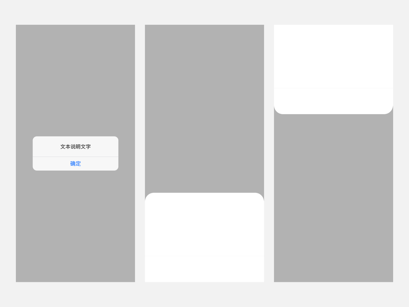
用于弹窗出现时,让用户聚焦弹窗内容
#类型
遮罩黑色 #000000 30%
#实例
### 基础用法
<template>
  <scroller class="scroller">
    <div class="container">
      <dof-button @dofButtonClicked="openTopPopup" text="点击弹出顶部面板"></dof-button>
      <dof-button @dofButtonClicked="openBottomPopup" text="点击弹出底部面板"></dof-button>
      <dof-button @dofButtonClicked="openLeftPopup" text="点击弹出左侧面板"></dof-button>
      <dof-button @dofButtonClicked="openRightPopup" text="点击弹出右侧面板"></dof-button>
      <dof-button @dofButtonClicked="openImagePopup" text="上拉面板+自定义内容"></dof-button>
      <dof-button @dofButtonClicked="openTextPopup" text="上拉面板+文字列表"></dof-button>
    </div>

    <dof-popup :show="isTopShow"
                pos="top"
                @dofPopupOverlayClicked="isTopShow=false">
    </dof-popup>
    <dof-popup :show="isBottomShow"
                @dofPopupOverlayClicked="isBottomShow=false"
                pos="bottom"
                :height="400">
      <scroller class="test">
        <text class="text" v-for="i in 10" :key="i" >匿名插槽</text>
      </scroller>
    </dof-popup>

    <dof-popup :width="500"
                :show="isLeftShow"
                @dofPopupOverlayClicked="isLeftShow=false"
                pos="left"></dof-popup>

    <dof-popup :width="400"
                :show="isRightShow"
                pos="right"
                ref="dofPopup"
                @dofPopupOverlayClicked="isRightShow=false">
      <dof-button class="hideBtn" @dofButtonClicked="onHideClick" size="medium" text="主动隐藏试试"></dof-button>
    </dof-popup>

    <!-- image popup -->
    <dof-popup :height="544"
                :show="imageShow"
                pos="bottom"
                :button="button"
                @dofPopupOverlayClicked="imageShow=false"
                @dofPopupButtonClicked="popupButtonClicked">
      <div class="contentSlot">
        <div class="subTitle">发现新设备</div>
        <dof-image v-if="itemImg&&itemImg!=''" :src="itemImg" class="itemImg"></dof-image>
      </div>
    </dof-popup>

    <!-- text popup -->
    <dof-popup :height="620"
                :show="textShow"
                pos="bottom"
                @dofPopupOverlayClicked="textShow=false">
      <div class="contentSlot">
        <text class="leftTitle">场景详细设置</text>
        <scroller class="scroller">
          <text class="listItem" :key='index' v-for="(item, index) in textlist" >{{index+1}}.{{item.text}}</text>
        </scroller>
      </div>
    </dof-popup>
  </scroller>
</template>

<style scoped>
  .dof-demo {
    position: absolute;
    top: 0;
    bottom: 0;
    left: 0;
    right: 0;
    background-color: #FFFFFF;
  }
  .scroller {
    flex: 1;
  }
  .container{
    height: 800px;
    justify-content: space-around;
    align-items: center;
  }
  .test{
    width: 750px;
    height: 360px;
  }
  .text {
    margin: 40px;
    color: #000000;
  }
  .hideBtn{
    margin-top: 120px;
    margin-left: 60px;
  }
  .contentSlot{
    flex-direction: column;
    align-items: center;
    flex: 1;
  }
  .subTitle{
    font-size: 36px;
    margin: 40px auto;
  }
  .leftTitle{
    width: 750px;
    font-size: 32px;
    line-height: 108px;
    text-align: left;
    padding-left: 32px;
    border-bottom-style: solid;
    border-bottom-width: 1px;
    border-bottom-color: #E5E5E5;
  }
  .itemImg{
    width: 280px;
    height: 280px;
    margin: 0 auto 40px;
  }

  .listItem{
    font-size: 28px;
    line-height: 70px;
    text-align: justify;
  }
</style>

<script>
import { DofPopup, DofMinibar, DofButton, DofImage } from 'dolphin-weex-ui'
const modal = weex.requireModule('modal');
export default {
  components: { DofPopup, DofMinibar, DofButton, DofImage },
  data: () => ({
    isBottomShow: false,
    isTopShow: false,
    isLeftShow: false,
    isRightShow: false,
    imageShow:false,
    button:['稍后添加', '立即添加'],
    itemImg:"../../assets/img/image/22电饭煲.png",
    textShow:false,
    textlist:[
      {text:'当室内湿度低于64%,打开加湿器并开启自动模式'},
      {text:'当室内湿度高于68%,关闭加湿器'},
      {text:'当室内湿度高于70%,打开空调并开启抽湿模式,风速自动'},
      {text:'当室内湿度低于70%,打开空调并开启自动模式'},
      {text:'当室内PM2.5>7,打开空气净化器并开启自动模式'},
      {text:'当室内PM2.5<5,关闭空气净化器'}
    ],
  }),
  methods: {
    openBottomPopup () {
      this.isBottomShow = true;
    },
    openTopPopup () {
      this.isTopShow = true;
    },
    openLeftPopup () {
      this.isLeftShow = true;
    },
    openRightPopup () {
      this.isRightShow = true;
    },


    openImagePopup(){
      this.imageShow = true;
    },
    popupButtonClicked(params){
      modal.toast({
        message: `params:${JSON.stringify(params)}`
      });
    },
    openTextPopup(){
      this.textShow = true;
    },
    onHideClick () {
      this.$refs.dofPopup.hide();
    }
  }
};
</script>
#Attributes
| Prop | Type | Required | Default | Description |
|---|---|---|---|---|
| show | Boolean |
Y |
false |
打开或关闭弹层 |
| pos | String |
N |
bottom |
弹出位置top/bottom/left/right |
| height | [Number, String] |
N |
840 |
弹出层的高度(向上向下时候设置) |
| width | [Number, String] |
N |
750 |
弹出层的宽度(向左向右时候设置) |
| button | Array |
N |
[] |
弹窗面板下方有按钮时使用, 例:['取消', '确定'] 或者: [{ text: '确定', textColor: '#f66' }, { text: '取消', textColor: '#666' }] |
| borderRadius | String |
N |
32px |
圆角大小 |
#Events
| 事件名 | 说明 | 回调参数 |
|---|---|---|
dofPopupOverlayClicked |
关闭 | e e.pos |
dofPopupButtonClicked |
下方按钮点击事件 | e e.index, e.text |
#Slot
<slot></slot>:匿名插槽,可直接在dof-popup标签内直接使用,替换默认slot占位
#主动调用关闭
在dof-popup上面绑定ref属性'refname',然后调用this.$refs[refname].hide();即可关闭,常用于自定义主动关闭,它比于直接将`show`属性设为`false`增加了过渡效果,比如在取消操作时可使用,示例代码如下:
1
<script>
  <dof-popup
      :show="show"
      ref='popup'
      @dofPopupOverlayClicked="isBottomShow=false">
     <dof-button @dofButtonClicked="onHideClick" size="medium" text="主动关闭"></dof-button>
  </dof-popup>

  onHideClick(){
    this.$refs['popup'].hide()
  }
</script>
#备注
使用面板按钮时,只需要考虑按钮和间隔条的总高度`120px`即可,组件已针对iPhoneX及其他有Home Indicator

 浙公网安备 33010602011771号