
标签页 (Tab)
3.2 标签页 (Tab)
用于让用户在不同的视图中进行切换。
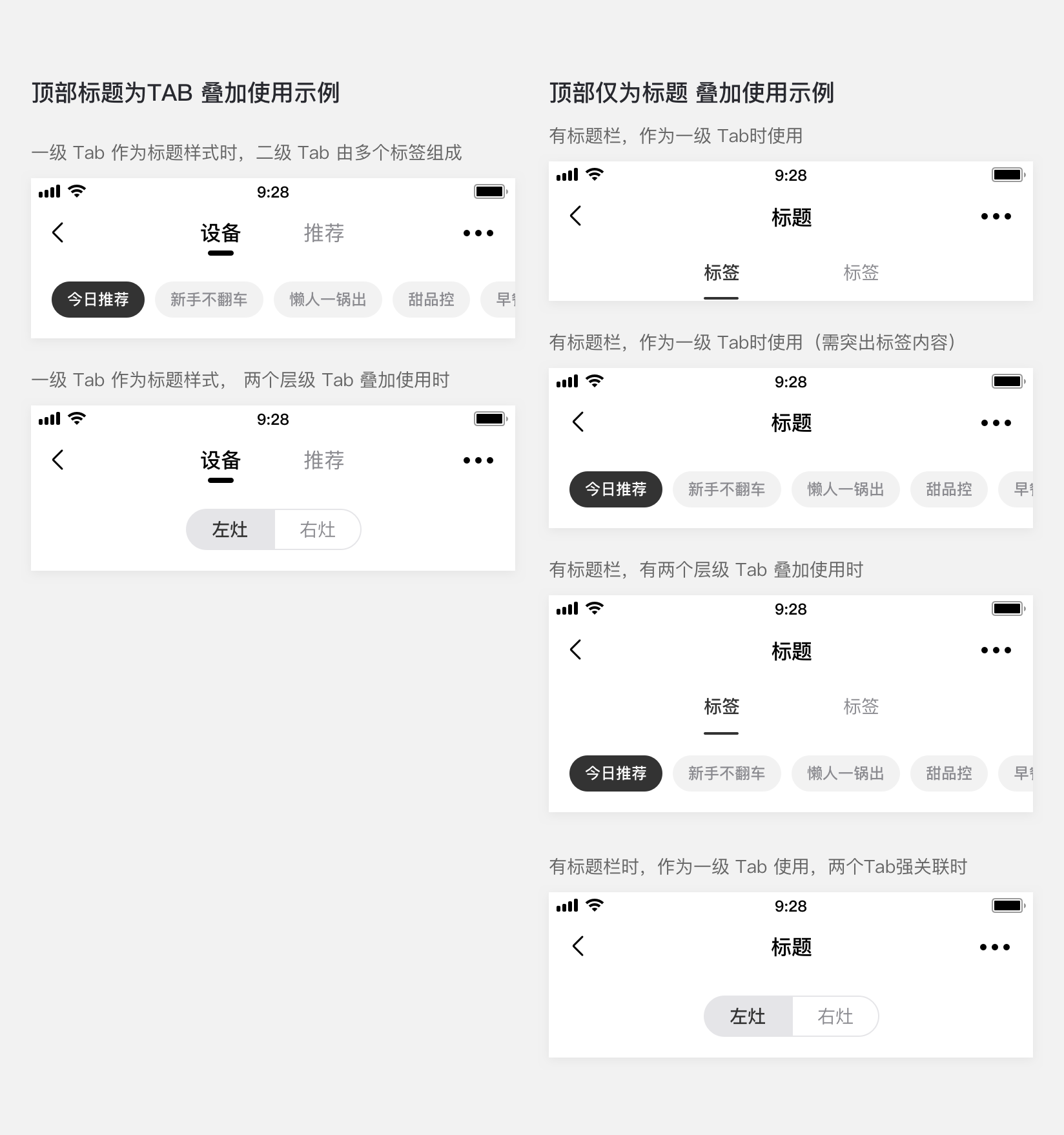
#一级 Tab(插件首页)
多用于插件页首页顶部一级导航内
标签文字:建议控制在 2-4 个字内
标签数量:2 个
文案命名:默认显示设备名称,设备命名为设备简称,例如”立式空调”;用户自定义后,优先显示用户自定义名称

#一级 Tab(二级页面中)
用于一级导航中已含有 Tab 时
标签文字:建议控制在 2-4 个字内
标签数量:超过 4 个,支持左右滑动

#二级 Tab 样式1
用于二级 tab 导航
标签文字:建议控制在 2-4 个字内
标签数量:2-5 个为固定,超过5个左右滑动

#二级 Tab 样式2
用于二级 tab 导航
标签文字:建议控制在 2-4 个字内
标签数量:最多 4 个
#组合使用应用示例
#dof-tab-page 组件
页面滑动切换组件
- 允许对头部进行配置,支持 Binding 手势跟随效果
- 常用于 Tab 切换页面,目前支持icon、text形式的顶栏,详细可见config.js
- 支持一级、二级、三级tab样式
#实例
#基础用法
<template>
<div class="wrapper">
<dof-minibar
title="Tab-page"
background-color="#267AFF"
text-color="#ffffff"
:left-button="leftButton"
@dofMinibarRightButtonClicked="reloadHandler"
>
<div slot="right" class="right-img-wrapper">
<dof-icon :iconStyle="{ fontSize: '32px', color: '#fff' }" name="refresh"></dof-icon>
</div>
</dof-minibar>
<scroller class="content-container">
<div class="split-gap"></div>
<dof-catalog title="样式一" background-color="#daf9ca" :has-margin="true"></dof-catalog>
<dof-minibar class="minibar-demo" :right-button="rightButtonBlack" @dofMinibarRightButtonClicked="reloadHandler">
<dof-tab-page
type="primary"
slot="middle"
:is-slot="true"
ref="dof-tab-page"
:tab-titles="navTabTitles"
@dofTabSelected="tabChangeHandler"
></dof-tab-page>
</dof-minibar>
<div class="split-gap"></div>
<dof-minibar
background-color="#267AFF"
text-color="#ffffff"
:left-button="leftButton"
:right-button="rightButton"
@dofMinibarRightButtonClicked="reloadHandler"
>
<dof-tab-page
type="primary"
slot="middle"
:is-slot="true"
ref="dof-tab-page"
:tab-titles="navTabTitles"
:tab-styles="tabStyles2"
@dofTabSelected="tabChangeHandler"
></dof-tab-page>
</dof-minibar>
<dof-catalog title="样式二" background-color="#daf9ca" :has-margin="true"></dof-catalog>
<dof-tab-page
v-for="(item, index) in secondaryTabTitle"
:key="index"
ref="dof-tab-page"
:tab-titles="item"
:has-margin="true"
@dofTabSelected="tabChangeHandler"
></dof-tab-page>
<dof-tab-page
v-for="(item, index) in secondaryTabTitle"
:key="index"
ref="dof-tab-page"
theme="primary"
:tab-titles="item"
:has-margin="true"
@dofTabSelected="tabChangeHandler"
></dof-tab-page>
<dof-catalog title="样式三" background-color="#daf9ca" :has-margin="true"></dof-catalog>
<dof-tab-page
ref="dof-tab-page"
type="third"
:tab-titles="thirdTabTitles1"
:tab-checked-index="0"
:has-margin="true"
@dofTabSelected="tabChangeHandler"
></dof-tab-page>
<dof-tab-page
v-for="(item, index) in colorArray" :key="index"
ref="dof-tab-page"
type="third"
:tab-titles="thirdTabTitles1"
:tab-styles="TrendStyle(index)"
:tab-checked-index="0"
:has-margin="true"
@dofTabSelected="tabChangeHandler"
></dof-tab-page>
<dof-catalog title="样式三 有图标" background-color="#daf9ca" :has-margin="true"></dof-catalog>
<dof-tab-page
ref="dof-tab-page"
type="third"
:tab-titles="thirdTabTitles2"
tab-checked-index="0"
:has-margin="true"
@dofTabSelected="tabChangeHandler"
></dof-tab-page>
<dof-tab-page
v-for="(item, index) in colorArray" :key="index"
ref="dof-tab-page"
type="third"
:tab-titles="createTabTitles(index)"
:tab-styles="TrendStyle(index)"
tab-checked-index="0"
:has-margin="true"
@dofTabSelected="tabChangeHandler"
></dof-tab-page>
<div class="split-gap"></div>
<dof-catalog title="样式四" background-color="#daf9ca" :has-margin="true"></dof-catalog>
<dof-tab-page
theme="default"
type="third-group"
:tab-checked-index="0"
:tabTitles="btnGroup[0]"
@dofTabSelected="tabChangeHandler"
></dof-tab-page>
<div v-for="(theme, index) in themeArray" :key="index">
<dof-tab-page
:theme="theme"
type="third-group"
:tab-checked-index="0"
:tabTitles="btnGroup[0]"
@dofTabSelected="tabChangeHandler"
></dof-tab-page>
<div class="split-gap"></div>
</div>
<div class="split-gap"></div>
<dof-catalog title="叠加使用示例一" background-color="#daf9ca" :has-margin="true"></dof-catalog>
<dof-minibar
background-color="#FFFFFF"
text-color="#000000"
:right-button="rightButtonBlack"
@dofMinibarRightButtonClicked="reloadHandler"
>
</dof-minibar>
<dof-tab-page
type="secondary"
ref="dof-tab-page"
:tab-titles="navTabTitles"
@dofTabSelected="tabChangeHandler"
></dof-tab-page>
<div class="split-gap"></div>
<div v-for="(item, index) in colorArray" :key="index">
<dof-minibar
:background-color="item"
text-color="#ffffff"
:left-button="leftButton"
:right-button="rightButton"
@dofMinibarRightButtonClicked="reloadHandler"
>
</dof-minibar>
<dof-tab-page
type="secondary"
:theme="themeArray[index]"
ref="dof-tab-page"
:tab-titles="navTabTitles"
:tab-styles="tabStyles2"
@dofTabSelected="tabChangeHandler"
></dof-tab-page>
<div class="split-gap"></div>
</div>
<dof-catalog title="叠加使用示例二" background-color="#daf9ca" :has-margin="true"></dof-catalog>
<dof-minibar
background-color="#FFFFFF"
text-color="#000000"
:right-button="rightButtonBlack"
@dofMinibarRightButtonClicked="reloadHandler"
>
</dof-minibar>
<dof-tab-page
ref="dof-tab-page"
type="third"
:tab-titles="thirdTabTitles1"
:tab-checked-index="0"
:has-margin="true"
@dofTabSelected="tabChangeHandler"
></dof-tab-page>
<div v-for="(item, index) in colorArray" :key="index">
<dof-minibar
:background-color="item"
text-color="#ffffff"
:left-button="leftButton"
:right-button="rightButton"
@dofMinibarRightButtonClicked="reloadHandler"
>
</dof-minibar>
<dof-tab-page
ref="dof-tab-page"
type="third"
:tab-titles="thirdTabTitles1"
:tab-styles="TrendStyle(index)"
:tab-checked-index="0"
:has-margin="true"
@dofTabSelected="tabChangeHandler"
></dof-tab-page>
</div>
<div class="split-gap"></div>
<dof-catalog title="叠加使用示例三" background-color="#daf9ca" :has-margin="true"></dof-catalog>
<div v-for="(item, index) in btnGroup" :key="index">
<dof-minibar :right-button="rightButtonBlack" @dofMinibarRightButtonClicked="reloadHandler">
<dof-tab-page
type="primary"
slot="middle"
:is-slot="true"
ref="dof-tab-page"
:tab-titles="navTabTitles"
@dofTabSelected="tabChangeHandler"
></dof-tab-page>
</dof-minibar>
<dof-tab-page
theme="default"
type="third-group"
:tab-checked-index="0"
:tabTitles="item"
@dofTabSelected="tabChangeHandler"
></dof-tab-page>
<div class="split-gap"></div>
</div>
<div v-for="(item, index) in btnGroup" :key="index">
<dof-minibar :background-color="bgColor" :left-button="leftButton" :right-button="rightButton" @dofMinibarRightButtonClicked="reloadHandler">
<dof-tab-page
type="primary"
:theme="theme"
slot="middle"
:is-slot="true"
ref="dof-tab-page"
:tab-titles="navTabTitles"
@dofTabSelected="tabChangeHandler"
></dof-tab-page>
</dof-minibar>
<dof-tab-page
:theme="theme"
type="third-group"
:tab-checked-index="0"
:tabTitles="item"
@dofTabSelected="tabChangeHandler"
></dof-tab-page>
<div class="split-gap"></div>
</div>
<dof-button type="primary" class="changeBtn" pattern="plain" text="切换主题" @dofButtonClicked="dofButtonClicked"></dof-button>
<div class="split-gap"></div>
<dof-catalog title="叠加使用示例四" background-color="#daf9ca" :has-margin="true"></dof-catalog>
<dof-minibar :right-button="rightButtonBlack" @dofMinibarRightButtonClicked="reloadHandler">
<dof-tab-page
type="primary"
slot="middle"
:is-slot="true"
ref="dof-tab-page"
:tab-titles="navTabTitles"
@dofTabSelected="tabChangeHandler"
></dof-tab-page>
</dof-minibar>
<dof-tab-page
ref="dof-tab-page"
type="third"
:tab-titles="thirdTabTitles1"
:tab-checked-index="0"
:has-margin="true"
@dofTabSelected="tabChangeHandler"
></dof-tab-page>
<div v-for="(color, index) in colorArray" :key="index">
<dof-minibar
:background-color="color"
text-color="#ffffff"
:left-button="leftButton"
:right-button="rightButton"
@dofMinibarRightButtonClicked="reloadHandler"
>
<dof-tab-page
type="primary"
slot="middle"
theme="themeArray(index)"
:is-slot="true"
ref="dof-tab-page"
:tab-titles="navTabTitles"
@dofTabSelected="tabChangeHandler"
></dof-tab-page>
</dof-minibar>
<dof-tab-page
ref="dof-tab-page"
type="third"
:tab-titles="thirdTabTitles1"
:tab-styles="TrendStyle(index)"
:tab-checked-index="0"
:has-margin="true"
@dofTabSelected="tabChangeHandler"
></dof-tab-page>
</div>
<dof-tab-page
ref="dof-tab-page"
type="third"
:tab-titles="thirdTabTitles3"
:tab-checked-index="currentTabIndex"
:has-margin="true"
@dofTabSelected="tabChangeHandler"
></dof-tab-page>
<div class="btn-container">
<dof-button text="切换 Tab" @dofButtonClicked="tabTrigger"></dof-button>
</div>
</scroller>
</div>
</template>
<style scoped>
.wrapper {
background-color: #f9f9f9;
}
.split-gap {
padding: 8px 0;
}
.minibar-demo {
margin-bottom: 16px;
}
.btn-container {
padding: 20px;
justify-content: center;
align-items: center;
}
.changeBtn{
margin-top: 48px;
margin-bottom: 48px;
margin-left: 32px;
}
</style>
<script>
import { DofMinibar, DofTabPage, DofIcon, DofCatalog, DofButton, Utils, Core } from 'dolphin-weex-ui'
import Config, { demo1, demo1x, demo2, demo2x, demo3, demo4, demo5, demo6, demo7, demo8 } from './config'
export default {
components: {
DofTabPage,
DofMinibar,
DofIcon,
DofCatalog,
DofButton
},
data: () => ({
leftButton: './assets/image/header/icon_back_white@3x.png',
rightButton: './assets/image/header/title_more_icon_white.png',
rightButtonBlack: './assets/image/header/icon_more_black@3x.png',
dolphinIcon: 'http://dolphin-weex-dev.msmartlife.cn/cdn/images/common/dolphin.png',
tabStyles: Config.tabStyles,
tabStyles2: {
bgColor: '#267aff',
titleColor: 'rgba(255,255,255,0.7)',
activeTitleColor: '#ffffff',
isActiveTitleBold: true,
activeBottomColor: '#ffffff'
},
tabTitles: demo1,
navTabTitles: demo1,
secondaryTabTitles: demo2,
secondaryTabTitles2: demo3,
secondaryTabTitles3: demo4,
thirdTabTitles1: demo5,
thirdTabTitles2: demo6,
thirdTabTitles3: demo7,
thirdTabTitles4: demo8,
currentTabIndex: 0,
secondaryTabTitle:[demo1x, demo2, demo2x, demo3, demo4],
btnGroup:[
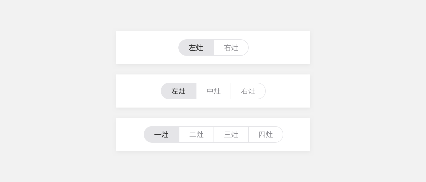
['左灶', '右灶'],['左灶', '中灶', '右灶'], ['一灶', '二灶', '三灶', '四灶']
],
colorArray:["#267AFF","#995EFC","#4F62FF","#29C3FF","#00CBB8","#FFAA10 ","#FF8225","#FF6A4C","#7C879B"],
themeArray:["primary","purple","slate","aqua","turquoise","tomato","orange","yellow","gray"],
bgColor:"#267aff",
theme:"primary",
index:0,
titleType:[]
}),
created() {},
mounted(){
console.log("secondaryTabTitle",this.secondaryTabTitle)
},
methods: {
tabChangeHandler(e) {
const self = this
const { index } = e
this.$toast(index)
},
reloadHandler() {
this.$reload()
},
tabTrigger() {
this.currentTabIndex > 6 ? (this.currentTabIndex = 0) : this.currentTabIndex++
},
dofButtonClicked(){
let { index, colorArray, themeArray } = this
index<colorArray.length-1?this.index++:this.index=0
this.bgColor = this.colorArray[index]
this.theme = this.themeArray[index]
},
// 按钮组事件
groupButtonClicked(index){
Core.toast(`btn:${index}`)
},
TrendStyle(i){
let bColor;
switch (i) {
case 0: bColor = '267AFF'; break;
case 1: bColor = '995EFC'; break;
case 2: bColor = '4F62FF'; break;
case 3: bColor = '29C3FF'; break;
case 4: bColor = '00CBB8'; break;
case 5: bColor = 'FFAA10'; break;
case 6: bColor = 'FF8225'; break;
case 7: bColor = 'FF6A4C'; break;
case 8: bColor = '7C879B'; break;
default:bColor = 'FFFFFF';
break;
}
return {
bgColor: `#${bColor}`,
titleColor: 'rgba(255,255,255,0.7)',
activeTitleColor: `#${bColor}`,
isActiveTitleBold: true,
activeBottomColor: '#ffffff',
boxBgColor: 'rgba(255,255,255,0.1)',
activeBoxBgColor: '#ffffff'
}
},
// 创建动态title 带有不同颜色图标的tabtitle
createTabTitles(i){
let currentUIColor;
switch (i) {
case 0: currentUIColor="blue"; break;
case 1: currentUIColor="violet"; break;
case 2: currentUIColor="bluish"; break;
case 3: currentUIColor="sky"; break;
case 4: currentUIColor="green"; break;
case 5: currentUIColor="yellow"; break;
case 6: currentUIColor="orange"; break;
case 7: currentUIColor="red"; break;
default: currentUIColor="gray";
break;
}
return [
{
title: '起居',
icon: 'http://dolphin-weex-dev.msmartlife.cn/cdn/images/scene/icon_scene_living_visited@3x.png',
activeIcon: `./assets/image/tabpage/icon_scene_living_${currentUIColor}@3x.png`
},
{
title: '厨房',
icon: 'http://dolphin-weex-dev.msmartlife.cn/cdn/images/scene/icon_scene_kitchen_visited@3x.png',
activeIcon: `./assets/image/tabpage/icon_scene_kitchen_${currentUIColor}@3x.png`
},
{
title: '安防',
icon: 'http://dolphin-weex-dev.msmartlife.cn/cdn/images/scene/icon_scene_security_visited@3x.png',
activeIcon: `./assets/image/tabpage/icon_scene_security_${currentUIColor}@3x.png`
},
{
title: '卫浴',
icon: 'http://dolphin-weex-dev.msmartlife.cn/cdn/images/scene/icon_scene_bathroom_visited@3x.png',
activeIcon: `./assets/image/tabpage/icon_scene_bathroom_${currentUIColor}@3x.png`
}
]
}
}
}
</script>
config.js文件内容,如下:
export const demo1 = [
  {
    title: '设备'
  },
  {
    title: '推荐'
  }
]

export const demo1x = [
  {
    title: '标签'
  },
  {
    title: '标签'
  }
]

export const demo2 = [
  {
    title: '标签'
  },
  {
    title: '标签'
  },
  {
    title: '标签'
  }
]

export const demo2x = [
  {
    title: '标签'
  },
  {
    title: '标签'
  },
  {
    title: '标签'
  },
  {
    title: '标签'
  }
]

export const demo3 = [
  {
    title: '标签'
  },
  {
    title: '标签'
  },
  {
    title: '标签'
  },
  {
    title: '标签'
  },
  {
    title: '标签'
  }
]

export const demo4 = [
  {
    title: '空调'
  },
  {
    title: '冰箱'
  },
  {
    title: '洗衣机'
  },
  {
    title: '热水器'
  },
  {
    title: '电饭煲'
  },
  {
    title: '电烤箱'
  },
  {
    title: '扫地机'
  },
  {
    title: '洗碗机'
  },
  {
    title: '油烟机'
  },
  {
    title: '净水器'
  }
]
export const demo5 = [
  {
    title: '空调'
  },
  {
    title: '冰箱'
  },
  {
    title: '洗衣机'
  },
  {
    title: '热水器'
  },
  {
    title: '电饭煲'
  },
  {
    title: '电烤箱'
  },
  {
    title: '扫地机'
  },
  {
    title: '洗碗机'
  },
  {
    title: '油烟机'
  },
  {
    title: '净水器'
  }
]
export const demo6 = [
  {
    title: '起居',
    icon: 'http://dolphin-weex-dev.msmartlife.cn/cdn/images/scene/icon_scene_living@3x.png',
    activeIcon: 'http://dolphin-weex-dev.msmartlife.cn/cdn/images/scene/icon_scene_living_visited@3x.png'
  },
  {
    title: '厨房',
    icon: 'http://dolphin-weex-dev.msmartlife.cn/cdn/images/scene/icon_scene_kitchen@3x.png',
    activeIcon: 'http://dolphin-weex-dev.msmartlife.cn/cdn/images/scene/icon_scene_kitchen_visited@3x.png'
  },
  {
    title: '安防',
    icon: 'http://dolphin-weex-dev.msmartlife.cn/cdn/images/scene/icon_scene_security@3x.png',
    activeIcon: 'http://dolphin-weex-dev.msmartlife.cn/cdn/images/scene/icon_scene_security_visited@3x.png'
  },
  {
    title: '卫浴',
    icon: 'http://dolphin-weex-dev.msmartlife.cn/cdn/images/scene/icon_scene_bathroom@3x.png',
    activeIcon: 'http://dolphin-weex-dev.msmartlife.cn/cdn/images/scene/icon_scene_bathroom_visited@3x.png'
  }
]
export const demo7 = [
  {
    title: '起居',
    icon: 'http://dolphin-weex-dev.msmartlife.cn/cdn/images/scene/icon_scene_living@3x.png',
    activeIcon: 'http://dolphin-weex-dev.msmartlife.cn/cdn/images/scene/icon_scene_living_visited@3x.png'
  },
  {
    title: '厨房',
    icon: 'http://dolphin-weex-dev.msmartlife.cn/cdn/images/scene/icon_scene_kitchen@3x.png',
    activeIcon: 'http://dolphin-weex-dev.msmartlife.cn/cdn/images/scene/icon_scene_kitchen_visited@3x.png'
  },
  {
    title: '安防',
    icon: 'http://dolphin-weex-dev.msmartlife.cn/cdn/images/scene/icon_scene_security@3x.png',
    activeIcon: 'http://dolphin-weex-dev.msmartlife.cn/cdn/images/scene/icon_scene_security_visited@3x.png'
  },
  {
    title: '卫浴',
    icon: 'http://dolphin-weex-dev.msmartlife.cn/cdn/images/scene/icon_scene_bathroom@3x.png',
    activeIcon: 'http://dolphin-weex-dev.msmartlife.cn/cdn/images/scene/icon_scene_bathroom_visited@3x.png'
  },
  {
    title: '起居',
    icon: 'http://dolphin-weex-dev.msmartlife.cn/cdn/images/scene/icon_scene_living@3x.png',
    activeIcon: 'http://dolphin-weex-dev.msmartlife.cn/cdn/images/scene/icon_scene_living_visited@3x.png'
  },
  {
    title: '厨房',
    icon: 'http://dolphin-weex-dev.msmartlife.cn/cdn/images/scene/icon_scene_kitchen@3x.png',
    activeIcon: 'http://dolphin-weex-dev.msmartlife.cn/cdn/images/scene/icon_scene_kitchen_visited@3x.png'
  },
  {
    title: '安防',
    icon: 'http://dolphin-weex-dev.msmartlife.cn/cdn/images/scene/icon_scene_security@3x.png',
    activeIcon: 'http://dolphin-weex-dev.msmartlife.cn/cdn/images/scene/icon_scene_security_visited@3x.png'
  },
  {
    title: '卫浴',
    icon: 'http://dolphin-weex-dev.msmartlife.cn/cdn/images/scene/icon_scene_bathroom@3x.png',
    activeIcon: 'http://dolphin-weex-dev.msmartlife.cn/cdn/images/scene/icon_scene_bathroom_visited@3x.png'
  }
]
#Attributes
| Prop | Type | Required | Default | Description |
|---|---|---|---|---|
| tab-titles | Array |
Y |
[] |
顶部 显示配置, 详见注1 |
| type | String |
N |
secondary |
tab类型 primary(一级)/secondary(二级)/third(三级) |
| is-slot | Boolean |
N |
false |
是否作为插槽使用,如一级tab页面中作为minibar组件的插槽中使用 |
| has-margin | Boolean |
N |
false |
是否设置margin-bottom为16px |
| tab-checked-index | Number |
N |
0 |
当前选中的的标签 |
| theme | String |
N |
default |
颜色主题:default/primary/purple/slate/aqua/turquoise/tomato/orange/yellow/gray |
| tabStyles | Object |
N |
{} |
tab自定义样式,多用于三级tab, 详见注2 |
注1: tab-titles
| Prop | Type | Required | Default | Description |
|---|---|---|---|---|
| title | String |
N |
- |
标题 |
| hasDotTip | Boolean |
N |
- |
徽标badge,显示为dot点 |
| hasDotNum | Number String |
N |
- |
徽标badge数字 |
| badgeMax | Number |
N |
- |
徽标内容最大值,如设置99, 则显示'99+' |
| badgeColor | String |
N |
red |
自定义徽标背景颜色 |
注2: tabStyles
| Prop | Type | Required | Default | Description |
|---|---|---|---|---|
| bgColor | String |
N |
#ffffff |
背景色 |
| titleColor | String |
N |
#8a8a8f |
标题色 |
| activeTitleColor | String |
N |
#000000 |
标题高亮色 |
| isActiveTitleBold | Boolean |
N |
True |
标题高亮是否加错 |
| activeBottomColor | String |
N |
#000000 |
标题下划线颜色 |
#Events
| 事件名称 | 说明 | 回调参数 |
|---|---|---|
dofTabSelected |
选择并进入当前页面事件, 返回参数为:当前选中项index | index |

 浙公网安备 33010602011771号